Welcome back!
In the previous chapters we learnt a lot about responsive design, what it is and how to apply it through modern HTML and CSS properties, like the Media Queries seen in the latest chapter (which I'm sure you loved).
Within this chapter, we will learn how to implement some of those properties and knowledge with one of the CSS preprocessors, Sass.
As always, before proceeding with elbows deep in code we must learn and become acquainted with some theory.
You may want to start and code the moment you lay your eyes on the page, but doing so will produce a coder blind to its surroundings – and that's not what I want or what the world needs.
A CSS preprocessor allows you to write CSS files in a modular way. It will be easier for you to write your code and change it in the future since you'll basically write less rules directly, through the use of concepts as variables, functions, mixins, and so on. You'll basically program your CSS, more than write it directly on the page.
It also makes maintaining complex systems easier. There are a lot of these tools available, the most famous ones being Sass and LESS.
They run on two different languages: Sass is Ruby based while LESS is a JavaScript library, so even their installation is different.
For this reason, LESS can be installed by simply linking the library in your document, while Sass requires Ruby installed on the machine and then to be called itself through the command line.
They both have variables which are constant CSS rules – such as font-type or a colors definition. It means that you can define color as a variable and simply call them through your entire document with one simple word – or CSS style and attributes, without having to remember different hex codes every time. Pretty neat, huh?
Anyway the difference here is minimal: Sass defines variables with the $ sign, while LESS uses @.
Nesting is also neat: using it you won't have to write many selectors repeatedly. I know you don't understand me still, so let me show you what I mean by nesting, since it's easier when seen than when heard:
nav {
    margin: 50px auto 0;
    width: 788px;
    height: 45px;
    ul {
        padding: 0;
        margin: 0;
    }
border: {
    style: solid;
    left: {
      width: 4px;
      color: #333333;
    }
    right: {
      width: 2px;
      color: #000000;
    }
 }
}
See what I mean? The border property is nested/taken into the nav variable – and additional border properties that we all know as left and right are nested inside the border.
Take into account that this is only possible through Sass and not through LESS – with LESS left and right should be defined outside the border definition.
When compiled it will generate a classic CSS file with the following rules:
nav {
  margin: 50px auto 0;
  width: 788px;
  height: 45px;
  border-style: solid;
  border-left-width: 4px;
  border-left-color: #333333;
  border-right-width: 2px;
  border-right-color: #000000;
}
nav ul {
  padding: 0;
  margin: 0;
}
See the potential? It was easier to read, to write, and to remember – while still giving birth to the same old CSS we and the browsers know. In the future, if you want to update or change something you'll do it just once, and compile and upload the new CSS file – without having to search and change multiple variables.
Sounds awesome? That's because it is!
Mixins in both tools are used to apply one rule to another, speeding up the writing.
Their application vary a bit from Sass to LESS, let's see how with the following example:
In Sass mixin are declared like the following:
@mixin border-radius ($values) {
    border-radius: $values;
}
nav {
    @include border-radius(10px);
    margin: 50px auto 0;
    width: 788px;
    height: 45px;
}
In LESS mixin are declared like:
.border(@radius) {
    border-radius: @radius;
}
nav {
    margin: 50px auto 0;
    width: 788px;
    height: 45px;
    .border(10px);
}
This will apply the 10px border every time the border is called.
Sass takes it a little bit further, because while copying the whole properties is useful – just copying one word is even more.
With the @extend syntax, you can take a defined rule and apply it without any additional rewriting, like the following example:
.circle {
    border: 1px solid #ccc;
    border-radius: 50px;
    overflow: hidden;
}
.avatar {
    @extend .circle;
}
When compiled, the above will result in strict CSS:
.circle, .avatar {
  border: 1px solid #ccc;
  border-radius: 50px;
  overflow: hidden;
}
See? Same properties without additional fuss.
Also, do you remember the calc() property I explained a couple of chapters ago?
Sass and LESS can do it without strict syntax, only terms.
The following code will return the result (and apply it in the CSS) between the comment tags:
$margin: 20%;
div {
    margin: $margin - 10%; /* 10% */
}For all the above reasons we choose to standardize this book and chapter to the Sass preprocessor and not LESS, as it will allow us to do more things in less (pun intended) time.
As said, installing Sass is not as straightforward as LESS – you need to install Ruby first (which on a Mac is preinstalled, on a Windows machine, unfortunately not).
Then you need to install Sass through the command line.
Luckily there are apps available to do it through a GUI. As always, some of them are paid, some of them free of cost.
The full list is available on the Sass website at: http://sass-lang.com/install
The full list in no particular order:
- CodeKit
- Compass.app (sadly abandoned)
- Ghostlab
- Hammer
- Koala
- LiveReload
- Prepros
- Scout
For this book we're going to use Koala, which is free and features a lovely, cute animal. What do you want more?
You can download the installer here: http://koala-app.com/:
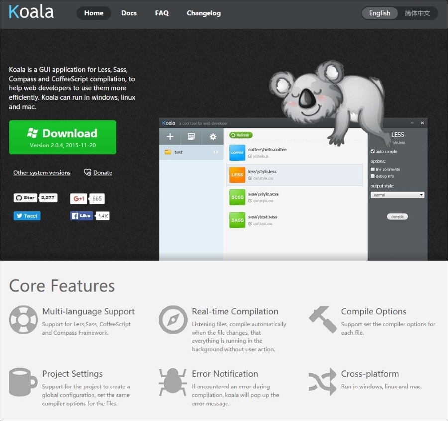
After installing it you can run it and see the principal window where you can define or add an already defined project (read it as website).
When working with Koala keep in mind you will be writing CSS as Sass, not direct CSS – and thus a .scss extension file.
To obtain the browser-readable, classic CSS, the file needs to be compiled/read as magically processed by eucalyptus-eating, cute animals.
Luckily, Koala runs the compilation in the background – and while you can set some compilation rules, the default is more than good for us and our purpose.
In fact, Koala will automatically compile in the background every time a change is being made – and save the new file in the original path.
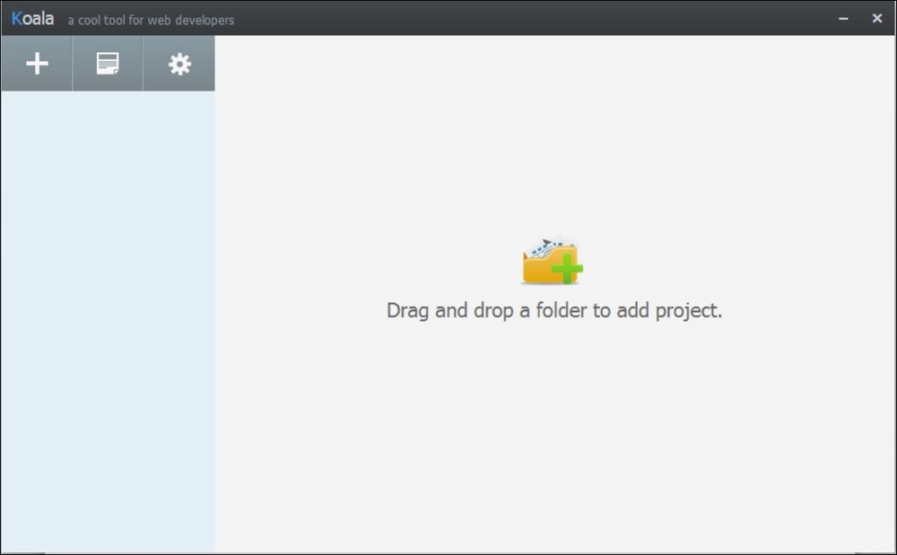
So let's start a small tutorial project. Click on the plus + icon in the upper-left and select your folder. I named it Typography.
Of course, our folder is empty and we must create a Sass file for it to compile: we'll do so in our preferred code editing software (in my case Adobe Dreamweaver).
Yes, you'll work as you always do with the software you always use – but Koala, this time, will run in the background and take the file you're working on and transform it to CSS in real time.
Awesome, isn't it?
So open your preferred code editor, create a new file and save it as .sass or .scss (They are both good and just for development, you won't need to link them to your HTML page).
You can also take an existing CSS file and rename its extension to .sass or .scss (even if I advise against it, since your previous code won't adhere to the Sass rules from the beginning).
If you created it in our Tutorial folder, Koala should now have this interface:
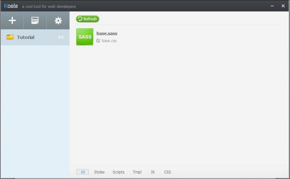
This indicates that it recognizes our file. Click on it and the sidebar will appear. Click on Auto Compile, output as nested, and you're good to go!
It will automatically create our (initially empty) CSS file!

Just keep in mind we'll be working on the Sass file and that for each change we produce, the CSS file will be automatically generated – and you're good to go!
This is a book about typography – and not Sass – but let's make a couple of functions to warm you up with it, in case it's your first encounter.
Let's start by defining a base color for a website – so in the .sass file, write this:
$blue: #08B
$fontBase: 16px

h1 {
  color: $blue;
}
p {
  color: darken($blue, 10%);
}
With this simple code we declared our level 1 headings to be blue (not the browser blue, our blue) and we asked it to be applied with a 10% darker tone to our paragraphs.
Yes, darken and lighten are basic, useful Sass functions. As saturate and desaturate, adjust-hue, tint, and shade.
As we learned earlier, doing basic operations through the same variables is possible.
What is unbelievably wonderful is the fact that you can add and subtract hex values.
Let's see what this little snippet will give us:
$blue: #08B;
$fontBase: 24px;

h1 {
  color: $blue;
}
p {
  color: $blue - #101;
  font-size: $fontBase;
}
When applied to this simple HTML document:
<!doctype html>
<html>
  <head>
    <meta charset="utf-8">
    <title>Simple tutorial</title>
    <link href="base.css" rel="stylesheet" type="text/css">
  </head>

  <body>
    <h1>I'm a simple H1 Heading</h1>
    <p>I'm a simple text, can you spot the color difference?</p>
  </body>
</html>
This is how our browser will render it:
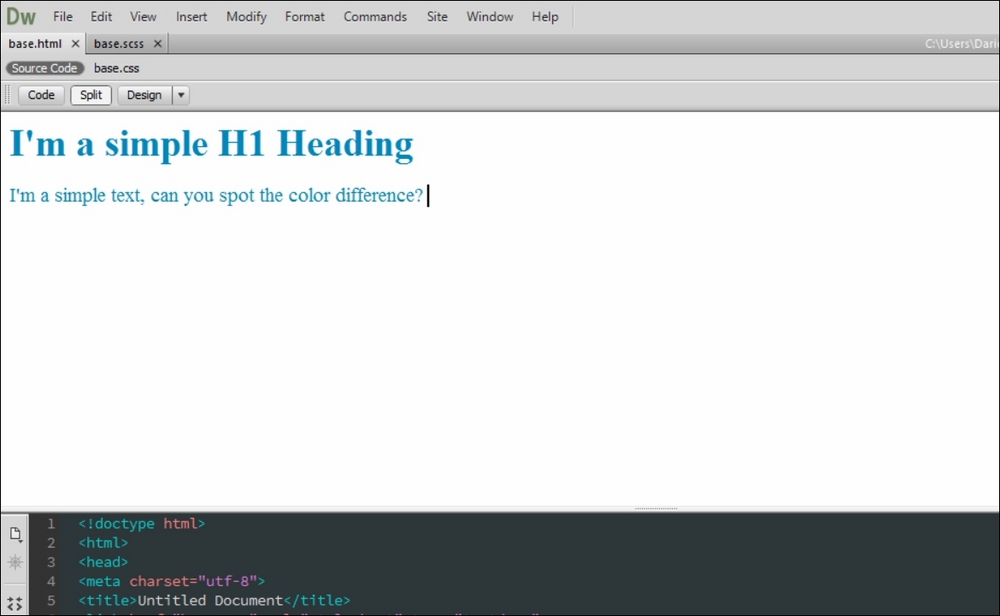
Need I say more?
Nestings, as said, are the basics of writing SASS – and a useful, visual guide for your eye and document. See the following:
nav {
  ul {
    margin: 0;
    padding: 0;
    list-style: none;
  }

  li { display: inline-block; }

  a {
    display: block;
    padding: 1%;
  }
}
This will simply become this:
nav ul {
  margin: 0;
  padding: 0;
  list-style: none;
}

nav li {
  display: inline-block;
}

nav a {
  display: block;
  padding: 1%;
}
Partials are small Sass files that will not generate a CSS file – but that can be useful to compartmentalize your development so that you'll find changes in your website sections in an easier way.
To obtain a partial inside your project, just add an underscore in front of the name file.
So you'll have this:
BigSassFile.scss
_partialSassFile.scss
You'll then use your partial with the import property.
It won't generate additional HTTP requests as its CSS counterpart would, but will generate one single CSS file with the additional properties.
If your partial contains some code, running an import in your big file will look like this:
@import 'partialSassFile'
The underscore or file extension won't be needed – and the properties contained in the partial file will be brought and written directly in your main CSS.
Mixins can be basically seen as containers that are used to group and store various declarations (including variables themselves).
You'll declare them starting with an @ - and call them through @include. Useful for code that is repeated in your CSS.
See the following:
@mixin border-radius($radius) {
  -webkit-border-radius: $radius;
     -moz-border-radius: $radius;
      -ms-border-radius: $radius;
          border-radius: $radius;
}

.box { @include border-radius(10px); }
This will transform into the following:
.box {
  -webkit-border-radius: 10px;
  -moz-border-radius: 10px;
  -ms-border-radius: 10px;
  border-radius: 10px;
}
The extend property is one of the most useful properties in Sass. It will help you share properties between one selector and another without having to write everything again.
See the following:
.message {
  border: 1px solid #ccc;
  padding: 10px;
  color: #333;
}

.success {
  @extend .message;
  border-color: green;
}

.error {
  @extend .message;
  border-color: red;
}

.warning {
  @extend .message;
  border-color: yellow;
}
This will transform into this simple, clean CSS:
.message, .success, .error, .warning {
  border: 1px solid #cccccc;
  padding: 10px;
  color: #333;
}

.success {
  border-color: green;
}

.error {
  border-color: red;
}

.warning {
  border-color: yellow;
}
Lovely, isn't it?
And as said it supports operators for simple math operations such as + - / * and %. You'll just have to input them in the object properties.
Now that we have run a little background check on Sass, it's time to see how useful it can be when working with responsive web design and typography.
As we saw with our last chapter, where we made the additional knowledge of breaking points with media queries, keeping track of vertical rhythm and size values can become a hard and long, tedious job.
But we can use Sass maps for the job. Sass maps? What are they?
Glad you asked. Introduced in Sass 3.3 is a collection of values which can be called through one single call to make our development easier and faster.
We'll write the following map with our breakpoints:
$p-font: (
  null  : 15px,
  480px : 16px,
  640px : 17px,
  1024px: 19px
);
The null value is hereby needed because without the definition of every variable, when compiled the code will give us errors – which are portrayed here as shown by Koala:
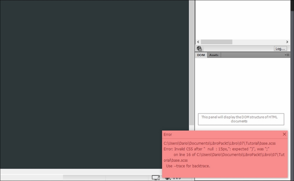
With the null value, which is a basic Sass one, we'll not have to define an additional breakpoint until, or if, needed – and they won't be compiled into our CSS (think of null as a zero render value for CSS) which will make it cleaner and weigh less.
In this case, having it as the base breakpoint won't throw any additional values, having the default point size defined through the entire site.
OK, so let's continue with our practical, vertical rhythm Sass example:
@mixin font-size($fs-map) {
  @each $fs-breakpoint, $fs-font-size in $fs-map {
    @if $fs-breakpoint == null {
      font-size: $fs-font-size;
    }
    @else {
      @media screen and (min-width: $fs-breakpoint) {
        font-size: $fs-font-size;
      }
    }
  }
}
It's time for a basic mixin which prints the breakpoints as standard CSS – and time to apply mixin to define our basic p element:
p {
  @include font-size($p-font);
}
Everything above will clearly result in the following CSS:
p {
  font-size: 15px; }
  @media screen and (min-width: 480px) {
    p {
      font-size: 16px; } }
  @media screen and (min-width: 640px) {
    p {
      font-size: 17px; } }
  @media screen and (min-width: 1024px) {
    p {
      font-size: 19px; } }
That's it!
Managing font size and breakpoints becomes a lot easier: all you have to do is create a map for every additional element you want defined, like first level headings for example:
$h1-font: (
  null  : 28px
  480px : 31px,
  640px : 33px,
  1024px: 36px
);

h1 {
  @include font-size($h1-font);
}
This will result in the following CSS:
h1 {
  font-size: 28px; }
  @media screen and (min-width: 480px) {
    h1 {
      font-size: 31px; } }
  @media screen and (min-width: 640px) {
    h1 {
      font-size: 33px; } }
  @media screen and (min-width: 1024px) {
    h1 {
      font-size: 36px; } }
In case we want our Map to be included into multiple variables we just declare them the usual way, like the following example:
p, ul, ol {
  @include font-size($p-font);
}Yes, this solution, while making writing and maintaining custom, responsive typography a lot easier, also gave birth to a fragmentation of CSS writing with too many breakpoint repetitions.
Is there a solution? I bet you already guessed it: Sass maps.
We'll define a map for our breakpoints:
$breakpoints: (
  small : 480px,
  medium: 640px,
  large : 1024px
);

$p-font: (
  null  : 15px,
  small : 16px,
  medium: 17px,
  large : 19px
);

$h1-font: (
  null  : 28px,
  small : 31px,
  medium: 33px,
  large : 36px
);
It's now time to modify our little mixin a bit, so that when it travels through the font map it will act accordingly to our breakpoint names to get their values:
@mixin font ($fs-map, $fs-breakpoints: $breakpoints) {
  @each $fs-breakpoint, $fs-font in $fs-map {
    @if $fs-breakpoint == null {
      font-size: $fs-font;
    }
    @else {
      @if map-has-key($fs-breakpoints, $fs-breakpoint) {
        $fs-breakpoint: map-get($fs-breakpoints, $fs-breakpoint);
      }
      @media screen and (min-width: $fs-breakpoint) {
        font-size: $fs-font;
      }
    }
  }
}
The Sass map-has-key is a standard Sass function that checks if a map has a specified value, in this case our breakpoints; the map-get is a standard function that gets called if the map-has-key has found values, in fact extracting them.
All of the above will result in our CSS:
p { font-size: 15px; }

@media screen and (min-width: 480px) {
  p { font-size: 16px; }
}
@media screen and (min-width: 700px) {
  p { font-size: 17px; }
}
@media screen and (min-width: 900px) {
  p { font-size: 18px; }
}
@media screen and (min-width: 1024px) {
  p { font-size: 19px; }
}
@media screen and (min-width: 1440px) {
p { font-size: 20px; }We know vertical rhythm relies heavily on line-height as well. To add it to our functions we'll simply add it as a numerical value to our P and H1 elements and we're good to go:
$p-font: (
  null  : (15px, 1.3),
  small : 16px,
  medium: (17px, 1.4),
  large : (19px, 1.45),
);
We'll then need to modify the mixin to include line-height when generating the CSS:
@mixin font ($fs-map, $fs-breakpoints: $breakpoints) {
  @each $fs-breakpoint, $fs-font in $fs-map {
    @if $fs-breakpoint == null {
      @include make-font-size($fs-font);
    }
    @else {
      @if map-has-key($fs-breakpoints, $fs-breakpoint) {
        $fs-breakpoint: map-get($fs-breakpoints, $fs-breakpoint);
      }
      @media screen and (min-width: $fs-breakpoint) {
        @include make-font-size($fs-font);
      }
    }
  }
}
@mixin make-font-size($fs-font) {
  @if type-of($fs-font) == "list" {
    font-size: nth($fs-font, 1);
    @if (length($fs-font) > 1) {
      line-height: nth($fs-font, 2);
    }
  }
  @else {
    font-size: $fs-font;
  }
}
The mixin now checks the value of font map to see whether it is a list, instead of only one size (if the values are majors of 1) and in this case get and insert the correct values by nth index, assuming the first is size and second line-length, generating the following CSS:
p {
  font-size: 15px;
  line-height: 1.3; }
  @media screen and (min-width: 480px) {
    p {
      font-size: 16px; } }
  @media screen and (min-width: 700px) {
    p {
      font-size: 17px;
      line-height: 1.4; } }
  @media screen and (min-width: 1024px) {
    p {
      font-size: 19px;
      line-height: 1.45; } }
This solution is easy to implement and enlarge, adding margins, weights and so on.
We just have to modify the make-font-size mixin and the nth index to achieve our result.
Just keep coherent writing and you'll be good to go.
Of course instead of pixels you can use viewport units, percentages and whatever you need them to be.