After our latest chapter, with a big, code-savvy consideration of the actual state of typography and responsive typography design, it's time we take a look in the ending chapters of this book – at the future state of this technology.
We are going to start with Hinting and the actual state of this property for the web.
The name refers to one of the properties of typefaces and fonts, in which the latter is adjusted for optimal reading, where Bezier curves are practically moved around to adhere to an underlying grid.
It's a project that started in the late 80's to resolve some rendering conflicts in low resolution printers – which, despite the passage of time, is still as relevant today, just moving the concept from printers to the screen.
The real problem here is that the majority of modern fonts are not designed to behave at the modern screen resolution which is limited in DPI depth – and while more true for the first screens with 72, 96 dpi – it's still true for the 400, and upward, dpi. They were designed to use more than 1500 dpi in the print world.
It's the old Raster versus Vector: Dawn of Rendering battle – where fonts are described as vector-perfect lines and curves – which are then converted to raster pixels on the screen.
Basically every letter gets drawn again at each point size, according to the pixel grid this time – all if not previously seen and done by the typographer – in an automated process by the computer.
Hinting is in fact controlling height, width of the letters, and width of their outlines as well, the angles of the diagonal stems that change every time for a better rendering and so on.
All of the above goes well while I'm typing this book: despite Times New Roman being a free, built-in-every-machine font, it's one of the most time intensive one, since it takes in account everything from hinting and so on – and it has been redesigned over and over for each point size, a tedious and expensive process.
Seriously, it's time to pay Mr. Stanley Morison and his team, and all the unnamed designers which worked on the font, a thank you and tell them how grateful we are.
To start, there are already two different hinting agents: the font itself in the older TrueType system (the .ttf font extension) – and the software which reads the font itself in the PostScript format, which explains why modern fonts which are not manually hinted still manage to look crisp and readable in modern times.
There is even a difference from Mac to Windows: the latter takes a pixel-to-pixel approach, aligning any line to the pixel grid, which is why regular weights looks lighter – and bold ones looks heavier than the ones on a Mac screen.
The Mac approach instead, is proprietary built-in software called Quartz, which renders itself at every font despite their origin, making better balanced and readable fonts on everything that it's passed to.
So for this chapter we are going to observe Hinting behavior on a Windows machine, (since we have different possibilities to analyze) in a PostScript format, which is the direction where every type, even on the web, is moving for its rendering solution.
Developed when pixels only actually had two states, on/off, it controls which pixels are active or inactive at a certain point size.
Being based on a pixel grid, every piece of the font is heavily modified to fit the grid. Usually white pixels are added by hand to make the font more legible.
Manually hinting a font this way could take, at least, 80 hours and it generated a scaled font, really similar to the 80/90 arcade games screens.
It is now obsolete.

This hinting process takes care of rendering with the antialiasing technique, introduced in Windows 98.
It adds various gray shades between the black and white pixels, so the font renders smoothly.
Manually hinting this way could take up to 72 hours for a single font; the old, bulky monitors of the nineties used it heavily.
This makes use of hinting only horizontally, not vertically – and it's a Microsoft proprietary technology. It simulates the three colors of the single pixel to achieve smoother results.
Taking care only of horizontal rendering means that scaling the text horizontally can look sharper up to three times the original size – and it also reduces by half, the time to develop a font: a single font with this technique takes up to 40 hours.

This came out first with Windows 7, it is an advancement of ClearType but with added sub-pixel vertical hinting.
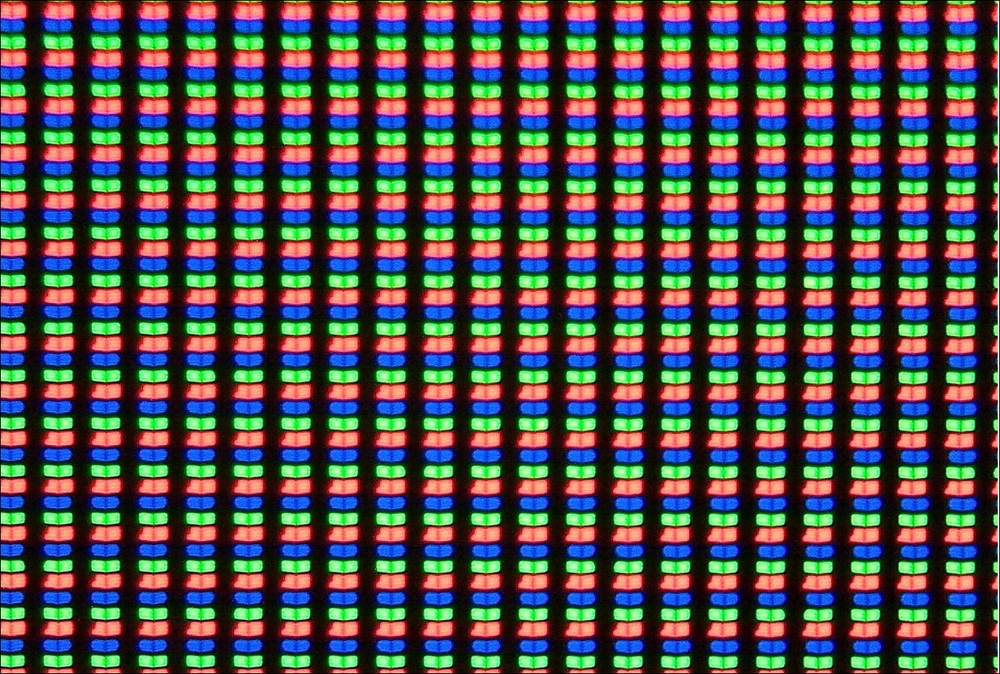
Subpixel rendering takes into account the fact that the physical pixel on the screen is actually made of three RGB colored pixels – and while they aren't directly visible to the human eye, their change in color can be perceived, hence increasing the physical pixel resolution. More on subpixel rendering can be found on Wikipedia:
https://en.wikipedia.org/wiki/Subpixel_rendering
This means that the curves are smoother – and it improves rendering of OpenType too – but it also doubles hinting time, which done manually can be back at 70 or more hours per font. It began its utilization with Internet Explorer 9.

All of the above means a more manual, tedious application for every font designer out there – and it also means that the output won't always be the desired one, since there are varieties and different platforms.
Manual hinting, to be cross compatible through various sources, would take ages for each and every font, something that I really hope no one would consider, unless it's a project very well paid.
This also bring problems with the new era of online typography rendering – even if the concepts above describe responsive typography long before our current days, since it allows the font to answer to the different resolutions and conditions – prior to online layouts.
One of the solutions for hinting on the Web which is kind of pushed right now is a sort of Macro cleaver hinting.
Called through specific media queries, it would allow special features to be called by:
- Ascenders and descenders that shrink with a reduction of line-height
- Glyphs that condense – both automatically or referring to a pre-existing condensed typeface – when the width of their container is reduced
- Subtle weight adjustment in the same font file without calling other external ones
While a joy for a web developer to hear and express such sentiments and requests, the solution would be impractical for type designers as it will add to the already long time of designing a font – it is a non-standard way which will take years to be standard and probably end up being surpassed – rather than the previous way of designing fonts.
But for professional people this would mean having to recalculate curves, straight lines, widths of every weight, and hinting for each change – something that everyone that has been through in regards to font design development, won't even come near to thinking about.
As of today, as said, we live in a world with growing and shrinking screen sizes with no standards – and the smaller screens are having a blast in screen density.
While this is a welcome change, it also brings a new problem on the table with rendering itself. While the majority of smartphones now offer higher density, a vast majority of tablets and laptops don't do this. And it's all down to the viewport width.
Let me explain it better: let's consider the Asus Zenbook Prime. A 13.3 screen version come with a 1920x1080 pixel resolution, which in depth is 168dpi. A 11.1 version has the very same resolution, which works out at 189dpi.
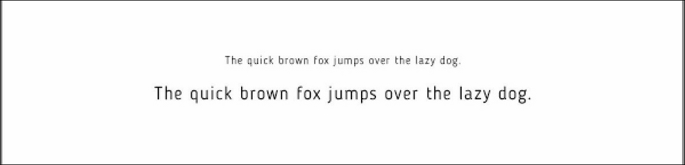
Web type at 16pt, rendered in standard non-high pixel density, render in a 1x manner, with true 16 pixels per character (and it's the same rendering in most of last year's laptops that sport a varying 96-115 depth range).
So, on one of the standard displays, a 16px renders at a physical 0.14 inches, around 10pts, a decent size for reading.
But on one of the two Zenbooks, the same text is just 0.09 inches high – 49% smaller.
See where the problem is? Same resolution, different results.
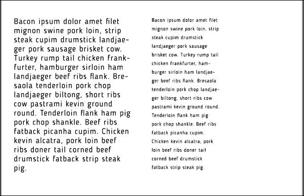
That's a difference – especially considering the resolution is the same with my laptop used for the production of the image and the Zenbook, the same 1920x1080 pixels.
Some machines, such as Windows 7 for example – which the above Zenbooks run on – don't allow the high density display to work according to their standard, thus making the above, theoretical solution, a problem.
Can you imagine shrinking the line height and the ascenders/descenders for the right provided example?
While, luckily, due to the current, always-evolving, depth of modern – even mobile – screens, the problem of hinting is vanishing, it will be a long time 'til this happens, so foremost, there must be an implementation of a theoretical solution.
Personally speaking, since hinting has been developed and implemented for almost 30 years as of today, I don't see the addition of other features like shrinking ascenders and descenders as an acceptable solution.
But I certainly see calling hinting as a variable in media queries an awesome solution. Of course, we are far from this being implemented, since we are still far from the standardization of .woff in web design as the official Web Format Font.
Since thousands of typefaces already implement hinting in one form or another – and since the movement to a 16px based web, I don't think we'll be needing hinting for much longer – at least for the web.
What I see as a solution is the standardization of a type of hinting for the web, as a media query that can be called by the web developer easily, in two or three forms to add the necessary legibility – as a border.
For example, see the following:
@media
(-webkit-min-device-pixel-ratio: 2), (min-resolution: 192dpi) {
Font-hinting: small
(Of course the font-hinting property is invented for the sake of this example and idea by me.)
The above snippet will make the addition of what is perceived by the designer for a font to be small format – of a border-like pixel addition following the current font grid (easily done since a vector standard font format will be used) of, let's say two pixels.
Yes, it will make the font seem a little bolder than usual on lighter fonts for example, but the shape won't be lost since it's a vector file – and the appearance and readability will be saved.
Instead, type the following:
Font-hinting: large
This will make the removal – of 1 or 2 pixels from the same text, where a web developer or designer will consider the text on the screen to be big/large in appearance – both based on the font or the viewport width.
The type will seem a little lighter, but since the larger type will be seen onscreen with a high number of pixel density, we won't even notice it.
Of course, everything will have to be standard – as the number of exact pixels to be removed or added, to be called through an additional query, as for example:
Hinting-remove: 2px;
Doing so will allow typographers to keep working the way they have done for almost 30 years – with the simple addition of one or two media queries for the developer/designer to remember – and the addition of one new way to be remembered by browser software developers.
Or if the coding of a media query for something that we all hope is set to vanish anytime soon (the same about hinting has been said for 20 years) is too much and I completely understand it, the developer can write code such as the following:
@media only screen and (-webkit-min-device-pixel-ratio: 1.5),
        only screen and (-o-min-device-pixel-ratio: '150/100'),
        only screen and (min-resolution: 96dpi),
        only screen and (min-resolution: 1.5dppx) {
   font-weight: 300;
}
This will simply allow high density screens to use a lighter, well rendered weight – and to use a bolder one on a smaller screen.
Or just adjusting the size like this will also work:
body {
  font-size: 100%;
}

@media screen and (min-width: 1200px) {
  body {
    font-size: 125%;
  }
}
To my mind, making the solution automatically work based on machines is not a solution – Windows 7 doesn't allow HI-DPI display to work correctly, rendering the text on 1x. Why is the machine left to do the guessing, if it can't even work correctly in the first place? I trust an experienced web designer or developer to make the call with the correct sized media queries, whether to implement a hinting solution through one simple line of code or not.