4. Crafting the Story

During your time off the grid, you brainstormed alone or perhaps with a small group of people. You stepped back to get the big picture, and you identified your core message. You now have a clearer picture of the presentation content and focus even if you do not have all the details worked out yet. The next step is to give your core message and supporting messages a logical structure. Structure will help bring order to your presentation and make it easier for you to deliver it smoothly and for your audience to understand your message easily.
Before you go from analog to digital—taking your ideas from sketches on paper and laying them out in PowerPoint or Keynote—it is important to keep in mind what makes your ideas resonate with people. What makes some presentations absolutely brilliant and others forgettable? If your goal is to create a presentation that is memorable, then you need to consider how you can craft messages that stick.
One of the components for creating sticking messages is story. We tell stories all the time. Think about times you may have been camping with a group of people, taking a tiny step back to a more primitive time, where the evening develops into long sessions of storytelling around the campfire. There is something very natural, compelling, and memorable about both telling and listening to stories.
What Makes Messages Stick?
Most of the great books that will help you make better presentations are not specifically about presentations at all, and they are certainly not about how to use slideware. One such book is Made to Stick (Random House) by Chip and Dan Heath. The Heath brothers were interested in what makes some ideas effective and memorable and others utterly forgettable. Some stick, and others fade away. Why? What the authors found—and explain simply and brilliantly in their book—is that “sticky” ideas have six key principles in common: simplicity, unexpectedness, concreteness, credibility, emotions, and stories. And yes, these six compress nicely into the acronym SUCCESs.
The six principles are relatively easy to incorporate into messages—including presentations and keynote addresses—but most people fail to use them. Why? The authors say the biggest reason most people fail to craft effective or “sticky” messages is because of what they call the “Curse of Knowledge.” The Curse of Knowledge is essentially the condition whereby the deliverer of the message cannot imagine what it’s like not to possess his level of background knowledge on the topic. When he speaks in abstractions to the audience, it makes perfect sense to him but him alone. In his mind, it seems simple and obvious. The six principles—SUCCESs—are your weapons, then, to fight your own Curse of Knowledge (we all have it).
Here’s an example the authors used early in their book to explain the difference between a good, sticky message and a weak garden-variety message. Look at these two messages, which address the same idea. One of them should seem very familiar to you.
“Our mission is to become the international leader in the space industry through maximum team-centered innovation and strategically targeted aerospace initiatives.”
Or
“…put a man on the moon and return him safely by the end of the decade.”
The first message sounds similar to CEO-speak today and is barely comprehensible, let alone memorable. The second message—which is actually from a 1961 speech by John F. Kennedy—has every element of SUCCESs, and it motivated a nation toward a specific goal that changed the world. JFK, or at least his speechwriters, knew that abstractions are not memorable, nor do they motivate. Yet how many speeches by CEOs and other leaders contain phrases such as “maximize shareholder value yada, yada, yada?” Here’s a quick summary of the six principles from Made to Stick that you should keep in mind when crystallizing your ideas and crafting your message for speeches, presentations, or any other form of communication.
Simplicity. If everything is important, then nothing is important. If everything is a priority, then nothing is a priority. You must be ruthless in your efforts to simplify—not dumb down—your message to its absolute core. We’re not talking about stupid sound bites here. Every idea can be reduced to its essential meaning if you work hard enough. For your presentation, what’s the key point? What’s the core? Why does (or should) it matter?
Unexpectedness. You can get people’s interest by violating their expectations. Surprise people. Surprise will get their interest. But to sustain their interest, you have to stimulate their curiosity. The best way to do that is to pose questions or open holes in people’s knowledge and then fill those holes. Make the audience aware that they have a gap in their knowledge, and then fill that gap with the answers to the puzzle (or guide them to the answers). Take people on a journey.
Concreteness. Use natural speech, and give real examples with real things, not abstractions. Speak of concrete images, not of vague notions. Proverbs are good, say the Heath brothers, at reducing abstract concepts to concrete, simple but powerful (and memorable) language. For example, the expression iiseki ni cho or “kill two birds with one stone” is easier than saying something like “let’s work toward maximizing our productivity by increasing efficiency across many departments.” And the phrase “go to the moon and back” by JFK (and Ralph Kramden before him)? Now that’s concrete. You can visualize that.
Credibility. If you are famous in your field, you may have built-in credibility (but even that does not go as far as it used to). Most of us, however, do not have that kind of credibility, so we reach for numbers and cold, hard data to support our claims as market leaders and so on. Statistics, say the Heath brothers, are not inherently helpful. What’s important is the context and the meaning. Put it in terms people can visualize. “Five hours of battery life” or “Enough battery life to watch your favorite TV shows nonstop on your phone during your next flight from San Francisco to New York”? There are many ways to establish credibility—a quote from a client or the press may help, for example. But a long-winded account of your company’s history will just bore your audience.
Emotions. People are emotional beings. It is not enough to take people through a laundry list of talking points and information on your slides; you must make them feel something. There are a million ways to help people feel something about your content. Images are one way to have audiences not only understand your point better but also have a more visceral and emotional connection to your idea. Explaining the devastation of the Katrina hurricane and floods in the United States, for example, could be done with bullet points, data, and talking points. But images of the aftermath and the pictures of the human suffering that occurred tell the story in ways words, text, and data alone never could. Just the words “Hurricane Katrina” conjure vivid images in your mind. Humans make emotional connections with images or stories about other people, of course, but even images without people in them hit people at an emotional level. For example, a massive tsunami hit the Tohoku region of Japan after the great earthquake of March of 2011. Images like this one, taken by my father in-law during the weeks after the tsunami, shock the senses when you realize there used to be a town where now there is nothing. The photo here shows reality in ways our words alone can not, and it impacts us emotionally.

Stories. We tell stories all day long. We tell stories with our words and even with our art and music. We express ourselves through the stories we share. We teach, we learn, and we grow through stories. In Japan, it is a custom for a senior worker (sempai) to mentor a younger worker (kohai) on various issues concerning company history and culture and how to do the job. The sempai does much of his informal teaching through storytelling although nobody calls it storytelling. Once a younger worker hears the account of what happened to the poor guy who didn’t wear his hardhat on the factory floor, for example, he never forgets the lesson (and he never forgets to wear his hardhat). Stories get our attention and are easier to remember than lists of rules. People are attracted to story. Why is it, though, that when the majority of smart, talented, story-loving people have the chance to present, they usually resort to generating streams of vaguely connected bits of information rather than stories or examples and illustrations? Great ideas and presentations have an element of story to them.
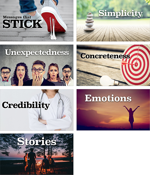
I’ve used these slides in live talks while reviewing the key ideas found in Made to Stick by Chip and Dan Heath.
I believe this nation should commit itself to achieving the goal, before this decade is out, of landing a man on the Moon and returning him safely to the Earth.
—John F. Kennedy
May 25, 1961

Story and Storytelling
Before there was the written word, humans used stories to transfer culture from one generation to the next. Stories are who we are, and we are our stories. Stories may contain analogies or metaphors, powerful tools for bringing people in and helping them understand our thoughts clearly and concretely. The best presenters illustrate their points with stories, often personal ones. The easiest way to explain complicated ideas is through examples or by sharing a story that underscores the point. If you want your audience to remember your content, then find a way to make it more relevant and memorable by strengthening your core message with good, short, stories or examples.
Good stories have interesting, clear beginnings; provocative, engaging content in the middle; and a clear conclusion. I am not talking about fiction here. I am talking about reality, regardless of the topic. Remember that documentary films, for example, “tell the story” of whatever it is they are reporting on. Documentaries do not simply tell facts; rather, they engage us with the story of war, scientific discovery, a dramatic sea rescue, climate change, and so on. We are wired to forget what our brains perceive as unimportant to our survival. Our conscious mind tells us to read the physical chemistry book over and over because we need to pass the class, but our brain keeps telling us this is dull, uninteresting, and unimportant to our survival. The brain cares about story.
The Power of Story
Story is an important way to engage the audience and appeal to people’s need for logic and structure in addition to emotion. Humans are predisposed to remembering experiences in the narrative form; we learn best with a narrative structure. Humans have been sharing information aurally and visually far longer than we have been getting information by reading lists. A 2003 Harvard Business Review article on the power of story says storytelling is the key to leadership and communication in business: “Forget PowerPoint and statistics, to involve people at the deepest level you need to tell stories.”
In an interview with the Harvard Business Review, legendary screenwriting coach Robert McKee suggests a big part of a leader’s job is to motivate people to reach certain goals. “To do that she must engage their emotions,” McKee says, “and the key to their hearts is story.” The most common way to persuade people, says McKee, is with conventional rhetoric and an intellectual process that, in the business world, often consists of a typical slide presentation in which leaders build their case with statistics and data. But people are not moved by statistics alone, nor do they always trust your data. “Statistics are used to tell lies,” says McKee, “while accounting reports are often BS in a ball gown.” McKee says rhetoric is problematic because while we are making our case, others are arguing with us in their heads using their own statistics and sources. Even if you do persuade through argument, says McKee, this is not good enough because “people are not inspired to act on reason alone.” The key, then, is to aim to unite an idea with an emotion, which is best done through story. “In a story, you not only weave a lot of information into the telling but you also arouse your listener’s emotion and energy,” he says.
Look for the Conflict
A good story is not the beginning-to-end tale of how results meet expectations, McKee says. This is boring. Instead, it’s better to illustrate the “struggle between expectation and reality in all its nastiness.” What makes life interesting is “the dark side” and the struggle to overcome the negatives—struggling against negative powers is what forces us to live more deeply, explains McKee. Overcoming negative powers is interesting, engaging, and memorable. Stories such as this are more convincing.
The biggest element a story has, then, is conflict. Conflict is dramatic. At its core, story is about a conflict between our expectations and cold reality. Story is about an imbalance and opposing forces or a problem that must be worked out. A good storyteller describes what it’s like to deal with these opposing forces such as the difficulty of working with scarce resources, making difficult decisions, or undertaking a long journey of scientific discovery, and so on. People prefer to present only the rosy (and boring) picture. “But as a storyteller, you want to position the problems in the foreground and then show how you’ve overcome them,” says McKee. If you tell the story of how you struggled with antagonists, the audience is engaged with you and your material.
Contrasts Are Compelling
Whether we are talking about graphic design or the components of a story, the principle of contrast is one of the most fundamental and important elements to include. Contrast is about differences, and we are hardwired to notice differences. You can see the principle of contrast everywhere in good storytelling, including filmmaking. For example, in Star Wars IV, there is obviously compelling contrast between the good and noble Rebel Alliance and the dark side of the Death Star and the evil empire. Yet great contrasts exist even between main characters in the story who are on the same side.
The young, naïve, idealistic Luke Skywalker character contrasts with the old, wise, and realistic Obi-Wan Kenobi. The level-headed, diplomatic, young Princess Leia contrasts with the slightly cocky, irreverant, older Han Solo. These characters are compelling to millions of fans because of their inherent contrasts and the series of negotiations they go through as they deal with their differences. Even R2-D2 and C-3PO are engaging characters, in large part because of their strikingly different personalities. In your own presentations, look for contrasts such as before/after, past/future, now/then, problem/solution, strife/peace, growth/decline, pessimism/optimism, and so on. Highlighting contrasts is a natural way to bring the audience into your story and make your message more memorable.
Using Storytelling Principles in Presentations
You do not always have a lot of time to prepare your presentation or perhaps it is difficult to see what the story is, so here are three simple steps you can use to prepare virtually any presentation relatively quickly.
Basic elements to include in your story:
Identify the problem. (This could be a problem, for example, that your product solves.)
Identify causes of the problem. (Give actual examples of the conflict surrounding the problem.)
Show how and why you solved the problem. (This is where you provide resolution to the conflict.)
Essentially, that’s it: Introduce the problem you have (or did have) and how you will solve it (or did solve it). Give examples that are meaningful and relevant to your audience. Remember, story is sequential: “This happened, and then this happened, and therefore this happened, and so on.” Take people on a journey that introduces conflict and then resolves that conflict. If you can do this, you will be miles ahead of most presenters who simply recall talking points and broadcast lists of information. Audiences tend to forget lists and bullet points, but stories come naturally to us; it’s how we’ve always attempted to understand and remember the bits and pieces of experience. Robert McKee’s point is that you should not fight your natural inclination to frame experiences into a story; instead, embrace this and tell the story of your experience of the topic to your audience.
Stories and Emotions
Our brains tend to recall experiences or stories that have a strong emotional element to them. The emotional components of stories are what helps them be remembered. Earlier this year, four students in my Japanese labor management class did a presentation on employment security in Japan. Three days later, when I asked other students to recall the most salient points of the presentation, what they remembered most vividly were not the labor laws, the principles, and the changes in the labor market in Japan but, rather, the topic of karoshi, or death from overwork, and the issue of suicides in Japan, topics that were quite minor points in the hour-long presentation. Perhaps five minutes out of the hour were spent on the issue of karoshi, but that’s what the audience remembered most. It’s easy to understand why. The issue of death from overworking and the relatively high number of suicides are extremely emotional topics that are not often discussed. The presenters cited actual cases and told stories of people who died as a result of karoshi. The stories and the connections they made with the audience caused these relatively small points to be remembered because emotions such as surprise, sympathy, and empathy were all triggered.
Kamishibai: Lessons in Visual Storytelling from Japan
Kamishibai is a form of visual and participatory storytelling that combines the use of hand-drawn visuals with the engaging narration of a live presenter. Kami (紙) means “paper” and shibai (芝居) means “play/drama.” The origins of kamishibai can be traced back to various picture storytelling traditions in Japan, which include etoki and emaki scrolls and other forms of visual storytelling dating back centuries. However, the form of kamishibai that one thinks of today developed around 1929 and was popular in the 1930s, and ’40s, all but dying out with the introduction of television later in the 1950s. Typical kamishibai consisted of a presenter who stood to the right of a small wooden box or stage that held the 12–20 cards featuring the visuals that accompanied each story. This miniature stage was attached to the storyteller’s bicycle, from which he sold candy to the small children who gathered before the show (this was originally how the storyteller could make a little money). The presenter changed the cards by hand, varying the speed of the transition to match the flow of the story he was telling. The best kamishibai presenters did not read the story, but instead kept their eyes on the audience and occasionally on the current card in the frame.

Kamishibai is as different from picture books as modern presentation visuals are different from documents. In the case of a picture book, there can be more visual details and text. However, picture books are usually read alone unlike kamishibai which is designed to be presented in front of a larger group gathered around the presenter and his visuals.
Although kamishibai is a form of visual storytelling that became popular more than 80 years ago, the lessons from this craft can be applied to modern multimedia presentations. Tara McGowan, who wrote The Kamishibai Classroom (Libraries Unlimited), says that kamishibai visuals are more like the frames in a movie: “Kamishibai pictures are designed to be seen only for a few [moments], so extraneous details detract from the story and open up the possibilities of misinterpretation.” It’s important to design each card, she says, “...to focus the audience’s attention on characters and scenery that are most important at any given moment. If clarity and economy of expression are the goals, it would be hard to find a more perfect medium.” It’s easy to imagine how we can apply the same spirit of kamishibai to our modern-day presentations that include the use of multimedia and a screen. Here are five tips from kamishibai that we can apply to our presentations today:
Visuals should be big, bold, clear, and easy to see.
Allow graphic elements to fill the frame and bleed off the edges.
Use visuals in an active way, not a decorative one.
Aim to carefully trim back the details.
Make your presentation—visuals and narration—participatory.

Stories and Authenticity
I have seen pretty good (though not great) presentations with average delivery and graphics that were relatively effective because the speaker told relevant stories in a clear, concise manner to support his points in a voice that was human, not formal. Rambling streams of consciousness will not get it done; audiences need to hear (and see) your points illustrated in real language.
A few years ago, I saw a fantastic presentation by the CEO of one of the most famous foreign companies in Japan. The CEO’s slides were of mediocre design, and he made the mistake of having not one but two assistants off to the side to advance his slides to match his talk. The assistants seemed to have difficulty with the slideware, and often the wrong slide appeared behind the presenter, but this powerful man simply shrugged his shoulders and said “…ah, doesn’t matter. My point is…” He moved forward and captivated the audience with his stories of the firm’s past failures and recent successes, stories that contained more captivating and memorable practical business lessons than most business students will get in an entire semester or more.
It is true that the presentation would have been even better if the slides had been better designed and used properly, but in this particular case, the CEO gave a powerful and memorable presentation in spite of those shortcomings. Trust me, this is very rare in the world of Chief Executive presentations. There are four essential reasons for his success that night:
He knew his material inside and out, and he knew what he wanted to say.
He stood front and center and spoke in a real, down-to-earth language that was conversational yet passionate.
He did not let technical glitches get in his way. When they occurred, he moved forward without missing a beat, never losing his engagement with the audience.
He used real, sometimes humorous, anecdotes to illustrate his points, and all his stories were supremely poignant and relevant, supporting his core message.
What made this leaders’s presentation so compelling and memorable was that it was, above all, authentic. His stories were from his heart and from his gut, not from a memorized script. We do not tell a story from memory alone; we do not need to memorize a story that has meaning to us. If it is real, then it is in us. Based on our research, knowledge, and experience, we can tell it from our gut. Internalize your story, but do not memorize it line by line. You can’t fake it. You believe in your story, or you do not. And if you do not, no amount of hyped-up, superficial enthusiasm or conviction will ever make your time with an audience meaningful. If you do not believe it, do not know it to be true, how can you connect and convince others with your words in story form? Your words will be hollow.

It’s Not Just About Information
People who possess loads of information in a particular field have historically been in hot demand and able to charge high fees for access to their stuffed, fact-filled brains. This was so because facts used to be difficult to access. Not anymore. In an era when information about seemingly anything is only a click away, just possessing information is hardly the differentiator it used to be. What is more important today than ever before is the ability to synthesize the facts and give them context and perspective. Picasso once said, “Computers are useless for they can only give answers.” Computers and Google can indeed give us routine information and facts we need. What we want from people who stand before us and give a talk is that which data and information alone cannot: meaning.
Remember we are living in a time when fundamental human talents are in great demand. Anyone—indeed any machine—can read a list of features or give a stream of facts to an audience. That’s not what we need or want. What we yearn for is to listen to an intelligent and evocative—perhaps, at times, even provocative—human being who teaches, inspires, or stimulates us with knowledge and meaning, context, and emotion in a way that is memorable.
And this is where story comes in. Information plus emotion and visualization wrapped in unforgettable anecdotes are the stuff that stories are made of. If presentations were only about following a linear, step-by-step formula for distributing information and facts, then no one would be complaining about boring presentations today; after all, the majority of presentations still follow just such a formula. And if designing visuals for your presentation were simply a matter of following a list of rules, then why on Earth should we keep wasting our time creating slides and other multimedia? Why not simply outsource our facts, outlines, and bullet points to someone who could do it more cheaply?
But presentations are not just about following a formula for transferring facts in your head to the heads of those sitting before you by reciting a list of points on a screen. (If it were, why not send an e-mail and cancel the presentation?) What people want is something fundamentally more human. They want to hear the story of your facts.
Finding Your Voice
The voice of the storyteller is also important. We pay attention to well-spoken narratives that sound human, that are spoken in a conversational voice. Why do we pay more attention to conversational speech from a storyteller or presenter? It may be because our brain—not our conscious mind—does not know the difference between listening to (or reading) a conversational narrative and actually being in a conversation with a person. When you are in a conversation with someone, you are naturally more engaged because you have an obligation to participate. Formal speech and writing devoid of any emotion is extremely difficult to stay with for more than a few minutes. Your conscious mind has to remind you to “stay awake, this is important!” But someone who speaks in a natural, conversational style is far easier to stay engaged with.

Speaking in a conversational voice is more engaging for the audience and suggests an invitation to participate.
Dana Winslow Atchley III (1941–2000) A Digital Storytelling Pioneer
Dana Atchley was a legend and pioneer in the field of digital storytelling. His clients included Coca-cola, Electronic Data Services (EDS, now part of DXC Technology), Adobe, Silicon Graphics, and many others. He even worked with Apple as a charter member of the AppleMasters program. In the ’90s, Atchley was helping senior executives create emotional, compelling talks that used the latest technology to create “digital stories” that connected with and appealed to audiences in a more visceral, visual, emotional, and memorable way. If Atchley had not passed away at age 59 in 2000, presentations—even in the world of business—might be far more appropriate, engaging, and effective today.
Dana Atchley taught that digital storytelling “combines the best of two worlds: the ‘new world’ of digitized video, photography, and art, and the ‘old world’ of telling stories.” In his vision, presentations burdened by PowerPoint slides full of bullet point statements (the “old world”) would be replaced by talks built on examples told through stories, together with evocative images and sounds (the “new world”).
Here’s what Dan Pink, writing for Fast Company, said about Dana Atchley and his mission in this excerpt from a 1999 article titled “What’s Your Story?”
“[W]hy does communication about business remain so tedious? Most business-people describe their dreams and strategies—their stories—just as they’ve been doing it for decades: stiffly, from behind a podium, and maybe with a few slides. Call it ‘Corporate Sominex.’ Digital storytelling is more than a technique. In fact, it’s become something of a movement among both artists and businesspeople.”
This bit from the Fast Company article makes the future of business presentations sound so promising. I get excited reading this and thinking about the possibilities. Yet, since 1999, how much has really changed? Some people today are indeed using digital technology in presentations the way Atchley envisioned. But there is such a long, long way to go before we rid the business world of the “corporate Sominex” phenomenon.
The Process
The problem with slideware applications—PowerPoint, in particular, because it’s been around longer and influenced a generation—is that they have, by default, guided users toward presenting in outline form with subject titles and bullet points grouped under each topic heading. This is similar to the good ol’ topic sentence in a high school composition class. It seems logical enough, but it is a structure that makes the delivery of the content utterly forgettable for the audience. Storyboarding can help. If you take the time in this part of the preparation stage to set up your ideas in a logical fashion in storyboard format, you can then visualize the sequential movement of your content narrative and the overall flow and feel of the presentation.
Because you have already identified your core message away from the computer, you can now begin to create a storyboard that will give shape to the story of your short presentation. Storyboards have their origins in the movie industry but are used often in business, particularly in the field of marketing and advertising.
One of the simplest and most useful features of applications such as PowerPoint and Keynote is the Slide Sorter view (Light Table view in Keynote). You can take your notes and sketches and create a storyboard directly in the software, or you can remain “analog” a bit longer and draft a storyboard on paper or by using Post-its or a whiteboard.
Each situation and each individual is different, and there are indeed many paths to better presentations, including better preparation. My personal approach moving from rough analog sketches to digital slides is not uncommon at all. I have been surprised, however, that for the most part, individual professionals, entrepreneurs, and students usually just open up slideware, type about a dozen subject slides, and then fill them with talking points. This is not an effective approach, nor is it a method I recommend.
Beginning on the next page is the five-step approach I usually take. I sometimes skip the third and fourth steps, but I find it works well when a group is planning the presentation. For students working on a group presentation, step 3 is vital.
Step 1
Brainstorming. Step back, go analog, get away from the computer, tap into the right brain, and brainstorm ideas. You need not show restraint here. Editing comes later. In brainstorming, quantity matters. Here, I jot ideas down on cards or sticky notes and place them on a table or whiteboard. This is something you can do either by yourself or in a group. When working in a group, do not judge others’ ideas. Simply write them down and place them with the others for the time being. At this stage, even crazy ideas are OK because the offbeat ideas may lead to more practical, yet still compelling, supporting ideas later on. As the great Linus Pauling once said, “The best way to have a good idea is to have a lot of ideas.”
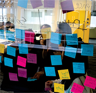
Brainstorming “off the grid” away from the computer. This is very much a nonlinear process, and the more ideas the better. Here ideas are suggested and quickly jotted down on Post-it notes and stuck to the window.
Step 2
Grouping and identifying the core. In this step, I look to identify one key idea that is central (and memorable) from the point of view of the audience. What is the “it” that I want them to get? I use “chunking” to group similar ideas while looking for a unifying theme. The presentation may be organized into three parts, so first I look for the central theme that will be the thread running through the presentation. There is no rule that says your presentation should have three sections or three “acts.” However, three is a good number to aim for because it is a manageable constraint and generally provides a memorable structure. Regardless of how many sections I use, there is only one theme. It all comes back to supporting that key message. The supporting structure—all three parts of it—is there to back up the core message and the story.
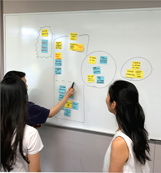
Participants in a Presentation Zen seminar at Kansai Gaidai University in Japan begin to look for patterns and group and identify core messages after their brainstorming session.
Step 3
Storyboarding off the computer. I take the Post-it notes roughly arranged in step 2 and lay them out in a sequence. The advantage of this method (compared to the Slide Sorter view in PowerPoint or the Light Table view in Keynote) is that I can easily add content by writing on an additional Post-it and sticking it under the appropriate section without ever losing sight of the structure and flow. In software, I have to switch to Slide mode to type or add an image directly on a slide and then go back to the Slide Sorter mode to see the big-picture structure. Alternatively—and this is very popular with my Japanese business students—you can print out empty slide frames, up to nine slides per sheet, which essentially gives you a larger version of a Moleskine Storyboard. If you want larger slides, you can print out six slides (see page 102). You then can tape these to the wall or spread them out on the desk, keeping them in a notebook when you’re done. As shown below, you can sketch your visuals and write down your key points in a printed version of slideware notes.
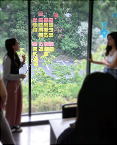
After eliminating many ideas created in their brainstorming session, these participants in Japan begin to build the structure of their presentation by arranging their messages in sequence, presenting the order of ideas to others. This part is still a bit messy as they are continuing to eliminate and add new ideas to improve their overall story based on the comments from others on the team.
Step 4
Sketch your visuals. Now that you have identified a clear theme, a core takeaway message, and two or three sections containing an appropriate amount of detail (including data, stories, quotes, facts, and so on), you can begin to think about visuals. How can you visualize your ideas to make them more memorable and accessible to your audience? Using a sketchbook and sticky notes, or even scratch paper, begin to change the words on your paper or sticky notes into rough sketches of images—images that eventually will become high-quality photography, quantitative displays, charts, slides featuring quotations, etc. You can use some of the same sticky notes to sketch the rough visualizations you used in step 3, and you can replace some of those notes with new sticky notes.

A sample of just eight slides from a section of a presentation on audience engagement, citing some of the ideas from the book Brain Rules by John Medina. (Image shown here is of the Presentation Zen Storyboarding Sketchbook (New Riders).) I am not going to win an art competition for my quick sketches, but that does not matter. These rough sketches are just for me. Later, I used them to assemble simple visuals on the computer (opposite page).
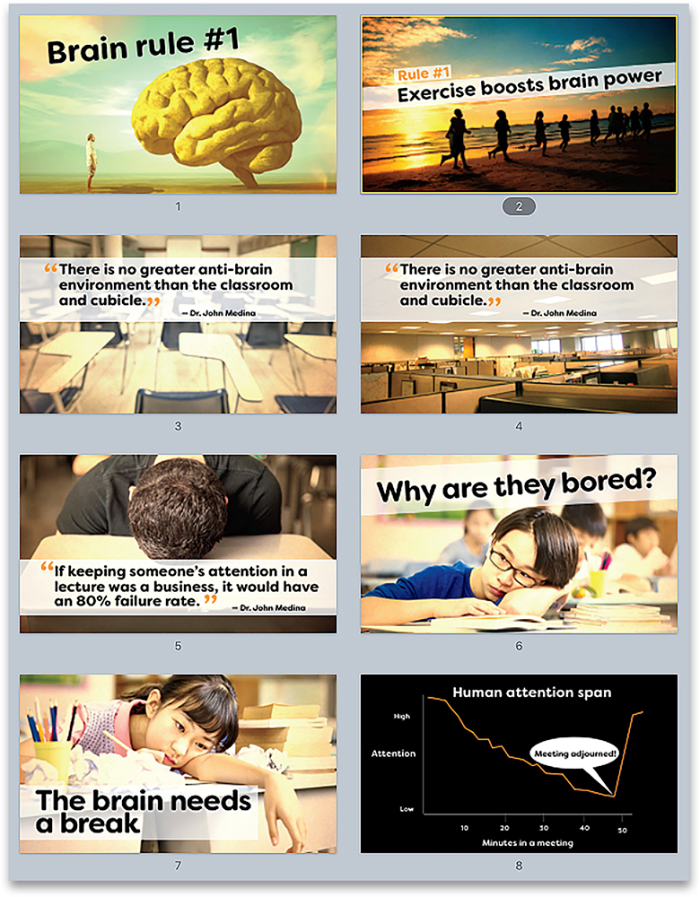

You can also use your ideas generated in step 3 to create rough sketches on printed blank slides from your slideware. In this example, key points of the narration behind each visual are written on the side. These sketches became the slides on the right.

Shown here are the title slide, the second slide which is the “hook,” followed by the three-part roadmap of the talk. The actual “hook” and background section of the obesity problem covered several slides before the presenter introduced the roadmap/outline. (Images used in these slides from Shutterstock.com.)
Step 5
Storyboarding on the computer. If you have a clear sense of your structure, you can skip steps 3 and 4 and start building the flow of your presentation directly in slideware (though I recommend going through those storyboarding and sketching steps if the stakes of the presentation are high). Create a blank slide using a template of your choosing (or the simplest version of your company’s template if you must use it). I usually choose a blank slide and then place a simple text box inside it with the size and font I’ll use most often. (You can create multiple master slides in PowerPoint and Keynote.) Then I duplicate several of these slides because they will contain the visual content of my presentation: short sentences or single words, images, quotes, charts and graphs, etc. The section slides—what presentation guru Jerry Weismann calls bumper slides—should be a different color with enough contrast that they stand out when you see them in the Slide Sorter view. You can have these slides hidden, so you see them only when planning in Slide Sorter view if you prefer; however, in my case, these slides will serve to give visual closure to one section and open the next section.
Now that I have a simple structure in the Slide Sorter view, I can add visuals that support my narrative. I have an introduction in which I introduce the issue or “the pain” and introduce the core message. I then use the next three sections to support my assertions or “solve the pain” in a way that is interesting and informative but that never loses sight of the simple core message.
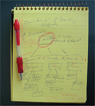
Rough outline from step 2 for a presentation I created on presentation delivery called “The Naked Presenter.” Here, I used a simple pad instead of Post-it notes. However, from the ideas on this pad, I sketched rough visuals and put down key words on Post-it notes (not shown here) to build the structure just as in step 4.

The start of the storyboarding process in step 5 for the same presentation. You can see the simple structure before slides were added to the appropriate sections. The total number of slides ended up being far more than pictured here.
Nancy Duarte

Principal at Duarte, Inc., the world’s leading presentation and story firm. Clients include the greatest brands and thought leaders in the world. Nancy is also the author of several best-selling books, including her latest, DataStory: Explain Data and Inspire Action Through Story.
Nancy Duarte talks about storyboards and the process of presentation design.
Much of our communication today exhibits the quality of intangibility. Services, software, causes, thought leadership, change management, company vision—they’re often more conceptual than concrete, more ephemeral than firm. And there’s nothing wrong with that. But we regularly struggle when communicating these types of ideas because they are essentially invisible. It’s difficult to share one’s vision when there’s nothing to see. Expressing these invisible ideas visually, so they feel tangible and actionable, is a bit of an art form, and the best place to start is not with the computer. A pencil and a sheet of paper will do nicely.
Why take this seemingly Luddite approach? Because presentation software was never intended to be a brainstorming or drawing tool. The applications are simply containers for ideas and assets, not the means to generate them. Too many of us have fallen into the trap of launching our presentation application to prepare our content. In reality, the best creative process requires stepping away from technology and relying on the same tools of expression we grew up with—pens and pencils. Quickly sketch lots of ideas. These can be words, diagrams, or scenes; they can be literal or metaphorical. The only requirement is that they express your underlying thoughts. The best thing about this process is that you don’t need to figure out how to use drawing tools or where to save the file. Everything you need you already have (and don’t say you can’t draw; you’re just out of practice). This means you can generate a large quantity of ideas in a relatively short amount of time.
For me, one idea per sticky note is preferable. And I use a Sharpie. The reason? If it takes more space than a Post-it and requires more detail than a Sharpie can provide, the idea is too complex. Simplicity is the essence of clear communication. Additionally, sticky notes make it easy to arrange and rearrange content until the structure and flow feels right. On the other hand, many people on my team use a more traditional storyboarding approach, preferring to linearly articulate detailed ideas. That’s fine, too. The point is not to prescribe exactly how to work but to encourage you to generate a lot of ideas.
Often ideas come immediately. That’s good, but avoid the potential pitfall of going with the first thing that comes to mind. Continue to sketch and force yourself to think through several more ideas. It takes discipline and tenacity—especially when it feels like you solved it on the first try. Explore words and word associations to generate several ideas. Use mind-mapping and word-storming techniques to create yet more ideas (digital natives might prefer mind-mapping software for this phase). Stronger solutions frequently appear after four or five ideas have percolated to the top. Continue generating ideas even if they seem to wander down unrelated paths; you never know what you might find, after all. Then, once you’ve generated an enormous amount of ideas, identify a handful that meet the objective of the vision or concept you’re trying to communicate. It matters less what form they take at this point than that they get your message across.
By the way, cheesy metaphors are a cop-out. If you feel tempted to use a picture of two hands shaking in front of a globe, put the pencil down, step away from the desk, and think about taking a vacation or investigating aromatherapy. Push yourself to generate out-of-the-box ideas. Take the time and spend the creative energy because the payoff will be a presentation people not only remember, but one they take action on.
Now, begin to sketch pictures from the ideas. These sketches become visual triggers that spark more ideas. The sketching process should be loose and quick—doodles really. Generate as many pictures as you can. In this way, sketching serves as proof-of-concept because ideas that are too complex, time consuming, or costly will present themselves as ripe for elimination. Don’t worry about throwing things away—that’s why you generated a lot of ideas in the first place. In fact, you’re ultimately going to have to throw all of them away except for one (designers recognize this as the destructive aspect of the creative process; it’s a good thing). Some of the ideas you generate may require multiple scenes built across a few slides versus a snapshot on a single slide. On the other hand, sometimes it’s as simple as using the perfect picture or diagram. Focus on whatever works best, not on the idea that’s easiest to execute.
Be prepared to enlist the help of a designer. (You did plan far enough ahead to make sure you’ve got one available, right?) There’s no shame in seeking professional help; what’s important is effective communication, regardless of whether or not you have the skill set to execute it.
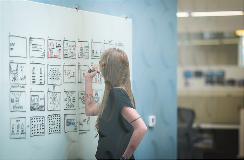
Haley Rich, a design lead at Duarte, Inc. sketches her storyboard on a whiteboard for quick ideation.

Digital Storyboards
During the ideation phase of any creative project, the goal is to generate as many ideas as possible. The fastest way to get ideas out of your brain and into the world is with your own two hands—whether that means drawing on a whiteboard or sketching in a notebook.
As technologies have changed over the past decade, however, a professional designer’s tablet and stylus have become their new paper and pen. Armed with these tools, professional designers can now capture their ideas in digital storyboards. Digital storyboards allow designers to add color, movement, and depth to sketches that can now be easily replicated and manipulated. This saves precious time and costly iterations as designers move forward into production.

Designers sometimes need to sketch out complex, three-dimensional concepts. While these would be time-consuming to achieve with the traditional tools of pen and paper, digital apps create movement and depth instantly. These sketches can help your client to clearly understand and sign off on a creative concept before producing it with expensive, 3D tools.
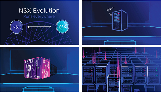
Traditional paper and pencil sketches usually start with a white surface. With digital storyboards, you can bring a client’s idea to life in full color. The richness of these visuals can help a client to envision (and get excited by!) their final slides–long before production even starts.
If you feel tempted to use a picture of two hands shaking in front of a globe, put the pencil down, step away from the desk, and think about taking a vacation or investigating aromatherapy.
—Nancy Duarte
Editing and Restraint
I am a big Star Wars fan. Over the years, as I’ve studied more about the incredible creativity and hard work behind Lucas’s films, I realized we mere mortals can learn much about presentations—which are essentially opportunities to tell our story—by listening to the advice of master storytellers, such as George Lucas.
As I researched the numerous interviews over the years of Lucas talking about the making of the Star Wars films, one key idea often discussed was the importance of editing like mad to get the story down to about two hours. To do this, they scrutinized every scene to make sure that it actually contributed to the story—no matter how cool it was. If, during the editing process, a scene was judged to be superfluous to the story in any way, it was cut (or trimmed if the length was the only problem). They were very keen on keeping to the two-hour format because this was in the best interest of the audience.
We have all seen scenes from movies that left us scratching our heads wondering how they contributed to the story. Perhaps the director felt the scene was so technically cool or difficult to make that he just couldn’t stand the thought of not including it in the film. But that would be a poor reason to include a scene. As far as presentations go, we have all seen people include data, facts, graphics, or a seemingly unrelated anecdote that just did not contribute to the speaker’s overall point (which we were probably at a loss to find anyway). Presenters often include superfluous items because they are proud of their work and want to show it off even when it does not help support the speaker’s point.
Moral of the story: Always keep the audience in mind by first keeping your talk as short as you can and still doing an effective job telling your story. Second, after you have prepared your presentation, go back and edit like crazy, eliminating parts that are not absolutely crucial to your overall point or purpose. You must be ruthless. When in doubt, cut it out.
It’s paramount that we be ruthless editors of our own material. We have to make tough choices, choosing even not to do something (because it is not meeting your standards, for example). The hardest thing can be deciding to cut and even abandon material altogether, but it must be done.
Many people are not good at editing their presentations because they are afraid. They figure nobody ever got fired for including too much information. Better safe than sorry, they say. But this leads to lots of material and wasted time. Covering your butt by including everything under the sun is not the right place to be coming from; it’s not the most appropriate motivation. It is, after all, only a presentation, and no matter how much you include, someone will say, “Hey, why didn’t you say _____!” Difficult people are out there, but don’t play to them, and do not let fear guide your decisions.
Designing a tight presentation that has the facts right but does so by giving simple, concrete anecdotes that touch people’s emotions is not easy work, but it’s worth it. Every successful presentation has elements of story to it. Your job is to identify the elements of your content that can be organized in a way that tells a memorable story.

Legendary filmmaker Akira Kurosawa commenting on the need to be ruthless with the editing of your story (from the book Something Like an Autobiography. Vintage, 1983).
In Sum
Make your ideas sticky by keeping things simple, using examples and stories, looking for the unexpected, and tapping into people’s emotions.
A presentation is never just about the facts.
Brainstorm your topic away from the computer, and chunk (group) the most important bits. Identify the underlying theme, and be true to that theme (core message) throughout the creation of the presentation.
Make a storyboard of your ideas on paper—and then use software to lay out a solid structure that you can see.
Show restraint at all times, and bring everything back to the core message.

