
An input component editor, provides rich text editing features. It contains a toolbar that can also be configured with custom controls to provide more functionality to the user.
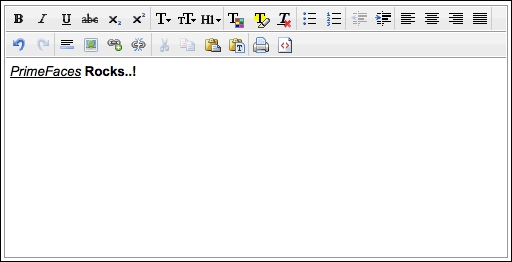
The basic component declaration for editor, which renders default controls such as indentation, and font and color selection, would be as follows:
<p:editor value="#{editorBean.text}" />The component will be rendered on the page with default controls as shown in the following screenshot:
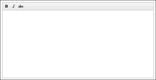
The editor component offers the controls attribute, which can be used to customize the toolbar of the editor. For instance, the following declaration will render only three controls, bold, italic, and strikethrough:
<p:editor value="#{editorBean.text}"
  controls="bold italic strikethrough" />
The component will be rendered as shown in the following screenshot:
The list of available controls is as follows:
alignleftalignrightboldbulletscentercolorcopycutfonthighlightimageindentitalicjustifylinknumberingoutdentpastepastetextprintredoremoveFormatrulesizesourcestrikethroughstylesubscriptsuperscriptunderlineundounlink
The editor component also provides a client-side JavaScript API for the execution of methods such as clearing the content of the editor. The editor component can be reached within JavaScript with the declaration of the widgetVar attribute:
<p:editor value="#{editorBean.text}" widgetVar="editor" />
<p:commandButton type="button" value="Clear"
onclick="PF('editorClear').clear()" icon="ui-icon-close" />We can also embed the editor component inside a dialog box to get input from the user in a more user-friendly manner:
<p:dialog widgetVar="editorDialog" modal="true">
  <p:editor />
</p:dialog>
<p:commandButton value="Show"
  onclick="PF('editorDialog').show()" />
By clicking on the commandButton, the dialog box that contains the editor component will be rendered on the page as a modal dialog.
The editor component is not integrated with ThemeRoller since there is only one icon set for the controls.
This recipe is available in the demo web application on GitHub (https://github.com/ova2/primefaces-cookbook/tree/second-edition). Clone the project if you have not done it yet, explore the project structure, and build and deploy the WAR file on every Servlet 3.x compatible application server, such as JBoss WildFly or Apache TomEE.
The showcase for the recipe is available under http://localhost:8080/pf-cookbook/views/chapter3/editor.jsf.