
A generic grouping component for JSF components, panel has features such as toggling, closing, a built-in pop-up menu, and AJAX event listeners. In this recipe, we will create panels that can be closed and toggled, with custom action menus and AJAX behaviors added.
A basic definition of the panel would be as follows:
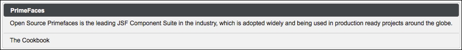
<p:panel id="simple" header="PrimeFaces" footer="The Cookbook">
  <h:outputText value="Open Source Primefaces is the leading JSF
    Component Suite in the industry, which is adopted widely and
    being used in production ready projects around the globe." />
</p:panel>
The preceding definition of the panel will be rendered as shown in the following image:
The header and footer attributes can be used to render text at the top of the panel as the header and at the bottom of the panel as the footer. The values defined for the attributes are escaped by default, so the HTML content can be easily provided. With the facets, header and footer, also offered by panel, you can define elements other than texts. The facet definitions override the attributes defined.
In order to enable closing and toggling of the panel, the closeable and toggleable attributes should be set to true. Once the panel gets closed, the page should be refreshed, or the panel should be re-rendered to see the panel back. The toggling speed can also be adjusted using the toggleSpeed attribute, which has the default value of 1000 milliseconds. The title values for the buttons can be localized with the closeTitle and toggleTitle attributes, if needed.
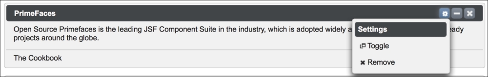
The options facet is present in panel to provide a built-in menu that would be given within the facet. The definition of a menu with two menu items would be as follows:
<p:panel id="panelWithMenu" header="PrimeFaces"
  footer="The Cookbook" widgetVar="panel" closable="true"
  toggleable="true">
  <h:outputText value="Open Source Primefaces is the leading
    JSF Component Suite in the industry, which is adopted widely
    and being used in production ready projects around the
    globe." />
  <f:facet name="options">
    <p:menu>
      <p:submenu label="Settings">
        <p:menuitem value="Toggle" url="#" icon="ui-icon-newwin"
          onclick="PF('panel').toggle()" />
        <p:menuitem value="Remove" url="#" icon="ui-icon-close"
          onclick="PF('panel').close()" />
      </p:submenu>
    </p:menu>
  </f:facet>
</p:panel>
The menu will render with the Settings icon as shown in the following image. The widget variable panel is being used by the menu item's onclick events to close and toggle the panel.
With the toggleOrientation attribute, it's possible to toggle the panels horizontally, from right-to-left, instead of the default vertical toggling. The value for the attribute could be either of the values vertical and horizontal.
The actions facet enables you to add custom actions to the title bar of the panel with specified icons. The definition here puts a help icon on the right-hand side of the title bar:
<p:panel id="customActions" header="PrimeFaces"
  footer="The Cookbook">
  <f:facet name="actions">
    <h:commandLink styleClass="ui-panel-titlebar-icon
      ui-corner-all ui-state-default"
      onclick="alert('action!')">
      <h:outputText styleClass="ui-icon ui-icon-help" />
    </h:commandLink>
  </f:facet>
  <h:outputText value="Open Source Primefaces is the leading JSF
    Component Suite in the industry, which is adopted widely and
    being used in production ready projects around the globe." />
</p:panel>
Tip
The ui-icon-help used in the preceding example is one of the elements of the jQuery UI. It provides an extensive set of icons that can be applied through CSS classes. The complete list can be found at http://api.jqueryui.com/theming/icons.
The panel component supports the close and toggle AJAX behavior events that will be fired when the panel is closed or toggled. The definition of the panel with AJAX behavior events will be as follows:
<p:panel id="ajaxPanel" header="PrimeFaces" footer="The Cookbook"
  closable="true" toggleable="true">
  <p:ajax event="close" listener="#{panelBean.handleClose}"
    update="growl" />
  <p:ajax event="toggle" listener="#{panelBean.handleToggle}"
    update="growl" />
  <h:outputText value="Open Source PrimeFaces is the leading
    JSF Component Suite in the industry, which is adopted widely
    and being used in production ready projects around the globe."/>
</p:panel>
The listener methods, handleClose and handleToggle, receive an instance of org.primefaces.event.CloseEvent and org.primefaces.event.ToggleEvent, respectively, as parameters:
public void handleClose(CloseEvent event) {
  MessageUtil.addInfoMessage("panel.closed",
    "Closed panel id:'" + event.getComponent().getId());
}

public void handleToggle(ToggleEvent event) {
  MessageUtil.addInfoMessage("panel.toggled",
    "Status:" + event.getVisibility().name());
}
To get the id parameter of the closed panel, event.getComponent().getId() is used, and to retrieve the status of toggling, the visibility enumeration can be retrieved using event.getVisibility().name(), which would be either VISIBLE or HIDDEN.
This recipe is available in the demo web application on GitHub (https://github.com/ova2/primefaces-cookbook/tree/second-edition). Clone the project if you have not done it yet, explore the project structure, and build and deploy the WAR file on application servers compatible with Servlet 3.x, such as JBoss WildFly and Apache TomEE.
The showcase for the recipe is available at http://localhost:8080/pf-cookbook/views/chapter4/panel.jsf.
For details about the MessageUtil class, see the Internationalization (i18n) and Localization (L10n) recipe in Chapter 1, Getting Started with PrimeFaces.