 Displaying overflowed content with scrollPanel
by Oleg Varaksin, Mert Çalışkan
PrimeFaces Cookbook - Second Edition
Displaying overflowed content with scrollPanel
by Oleg Varaksin, Mert Çalışkan
PrimeFaces Cookbook - Second Edition
- PrimeFaces Cookbook Second Edition
- Table of Contents
- PrimeFaces Cookbook Second Edition
- Credits
- Foreword
- Foreword
- About the Authors
- About the Reviewers
- www.PacktPub.com
- Preface
- 1. Getting Started with PrimeFaces
- 2. Theming Concepts
- 3. Enhanced Inputs and Selects
- Introduction
- Formatted input with inputMask
- Auto suggestion with autoComplete
- Usable features of inputTextArea
- Discovering selectBooleanCheckbox and selectManyCheckbox
- Choosing a single item with selectOneMenu
- Basic and advanced calendar scenarios
- Spinner – different ways to provide input
- Slider – different ways to provide input
- Rich text editing with the editor
- Advanced editing with an in-place editor
- Enhanced password input
- Star-based rating input
- 4. Grouping Content with Panels
- Introduction
- Grouping content with a standard panel
- PanelGrid with colspan and rowspan support
- Vertical stacked panels with accordion
- Displaying overflowed content with scrollPanel
- Working with a tabbed panel
- Grouping of buttons and more with toolbar
- The multipurpose output panel
- Simulating the portal environment with dashboard
- Creating complex layouts
- Responsive layout with Grid CSS
- 5. Data Iteration Components
- Introduction
- Selecting rows in dataTable
- Sorting and filtering data in dataTable
- In-cell editing with dataTable
- Resizing, reordering, and toggling columns in dataTable
- Making dataTable responsive
- Using subTable for grouping
- Handling tons of data – LazyDataModel
- Listing data with dataList
- Listing data with pickList
- Listing data with orderList
- Visualizing data with tree
- Visualizing data with treeTable
- Exporting data in various formats
- Managing events with schedule by leveraging lazy loading
- Visualizing data with dataScroller
- 6. Endless Menu Variations
- Introduction
- Statically and dynamically positioned menus
- Creating programmatic menus
- The context menu with nested items
- Integrating the context menu
- Breadcrumb – providing contextual information about page hierarchy
- SlideMenu – menu in the iPod style
- TieredMenu – submenus in nested overlays
- MegaMenu – the multicolumn menu
- PanelMenu – hybrid of accordion and tree
- MenuButton – multiple items in a popup
- Accessing commands via menubar
- Displaying checkboxes in selectCheckboxMenu
- 7. Working with Files, Images, and Multimedia
- Introduction
- Basic, automatic, drag and drop, and multiple file uploading
- Downloading files
- Cropping images
- Creating dynamic image streaming programmatically
- Displaying a collection of images with galleria
- Displaying a collection of images with imageSwitch
- Displaying a collection of images with contentFlow
- Embedding the multimedia content in JSF pages
- Capturing images with photoCam
- 8. Drag Me, Drop Me
- 9. Creating Charts and Maps
- Introduction
- Creating line, area, bar, and pie charts
- Creating combined charts
- Updating live data in charts with polling
- Interacting with charts via AJAX
- Basic mapping with GMaps
- Adding, selecting, and dragging markers in maps
- Creating rectangles, circles, polylines, and polygons in maps
- Enabling InfoWindow and streetView on maps
- 10. Client-side Validation
- 11. Miscellaneous Advanced Use Cases
- Introduction
- Programmatic updating and scrolling with RequestContext
- Two ways of triggering the JavaScript execution
- Adding AJAX callback parameters – validation within a dialog
- Opening external pages in dynamically generated dialogs
- Polling – sending periodical AJAX requests
- Blocking page pieces during long-running AJAX calls
- Controlling form submission using defaultCommand
- Clever focus management in forms
- Layout pitfalls of menus and dialogs
- Targetable messages with severity levels
- Conditional coloring in dataTable
- Sticking a component when scrolling
- Reducing page load time using content caching
- Possibilities for exception handling in PrimeFaces
- Index
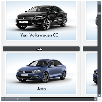
The scrollPanel component provides customizable scrollbars instead of the browser's scrolls. In this recipe, we will create panels with a fixed viewport and styled scroll bars applied to them.
A basic definition of a scroll panel with a width of 500 pixels and a height of 500 pixels would be as follows:
<p:scrollPanel style="width:500px;height:500px">
  <p:dataGrid var="car" value="#{scrollPanelBean.cars}"
    columns="2">
    <p:panel header="#{car.name}" style="text-align:center">
      <p:graphicImage value=
        "/resources/images/autocomplete/#{car.name}.png" />
    </p:panel>
  </p:dataGrid>
</p:scrollPanel>
This will render a list of car models within a data grid. The visual size of the grid will be limited to a 500 x 500 pixel view, and the content can be scrollable horizontally and vertically. By default, according to the selected UI theme, customized scrollbars will be rendered on the lines of the following image:
The mode attribute with the scrollbar value defines whether the component should render customized scroll bars according to a theme or use the browser's default ones with the native value.
This recipe is available in the demo web application on GitHub (https://github.com/ova2/primefaces-cookbook/tree/second-edition). Clone the project if you have not done it yet, explore the project structure, and build and deploy the WAR file on application servers compatible with Servlet 3.x, such as JBoss WildFly and Apache TomEE.
The showcase for the recipe is available at http://localhost:8080/pf-cookbook/views/chapter4/scrollPanel.jsf.
-
No Comment