
The layout component introduces a customizable border layout model that could easily be used to create complex layouts. In this recipe, we will create layouts with five distinct regions and a full-page layout that spans the whole page.
This customizable border layout model can be applied either to a full page or to a specific element. A basic definition of a full-page layout would be as follows:
<p:layout fullPage="true">
  <p:layoutUnit position="north" size="100" header=
    "Top" resizable="true" closable="true" collapsible="true">
    <h:outputText value="Layout content for North" />
  </p:layoutUnit>
  <p:layoutUnit position="south" size="100" header="Bottom"
    resizable="true" closable="true" collapsible="true">
    <h:outputText value="Layout content for South" />
  </p:layoutUnit>
  <p:layoutUnit position="west" size="200" header=
    "Left" resizable="true" closable="true" collapsible="true">
    <h:outputText value="Layout content for West" />
  </p:layoutUnit>
  <p:layoutUnit position="east" size="200" header=
    "Right" resizable="true" closable="true" collapsible="true">
    <h:outputText value="Layout content for Right" />
  </p:layoutUnit>
  <p:layoutUnit position="center">
    <h:outputText value="Layout content for Center" />
   </p:layoutUnit>
</p:layout>
This will render five panels in full-page size as shown in the following image:
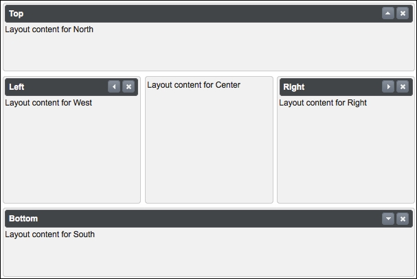
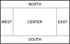
The fullPage attribute defines whether the layout should span the full page or a specific region. As layout is based on the border layout model, it contains five layout units: top, left, center, right, and bottom. Layout units get placed to the positions respectively, that is, top matches with north, left matches with west, bottom matches with south, right matches with east, and the center unit matches with center, as shown in the following image:
The layout component can contain the <p:layoutUnit> components for five different positions according to the border layout. The position attribute defines this positioning of the layout unit within the layout. The layoutUnit component can have the resizable, closable, and collapsible attributes for interaction.
In addition, the layout state can be preserved with the stateful attribute. When enabled by setting its value to true, the layout state is saved in a cookie with the name Layout. The header and footer attributes define the text that will be rendered for the layout unit.
When working with full-page layouts, using layout units within a form component is invalid. Instead of this, a layout unit must have a form owned by itself. Also, instead of updating the layout unit components directly, their content should be updated while doing a partial page rendering. An invalid definition of usage of the form component is as follows:
<p:layout fullPage="true">
  <h:form>
    <p:layoutUnit position="north">
      <h:outputText value="Layout content for North" />
    </p:layoutUnit>
    <p:layoutUnit position="center">
      <h:outputText value="Layout content for Center" />
    </p:layoutUnit>
  </h:form>
</p:layout>
The gutter attribute defines the size of the space that will be left between the adjacent units in pixels. The minSize and maxSize attributes define the minimum and maximum sizes of the layout units that will be set after resizing.
By setting the fullPage attribute to false, which is the default value, the layout can be used as a component within the page, as shown in the following image:
With element-based layouts, CSS should be used for styling the layout component as defined in the following code snippet:
<p:layout id="elementLayout" style="min-width:600px;min-
  height:400px;">
  ...
</p:layout>
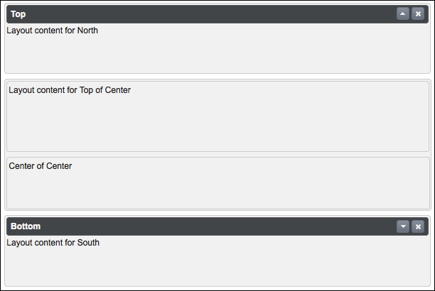
The layout unit components can also contain a layout component to provide nested layout abilities:
<p:layout id="elementLayout"
  style="min-width:600px;min-height:400px;">
  <p:layoutUnit position="north" size="100"
    header="Top" resizable="true" closable="true"
    collapsible="true">
    <h:outputText value="Layout content for North" />
  </p:layoutUnit>
  <p:layoutUnit position="south" size="100" header="Bottom"
    resizable="true" closable="true"
    collapsible="true">
    <h:outputText value="Layout content for South" />
  </p:layoutUnit>
  <p:layoutUnit position="center">
    <p:layout>
      <p:layoutUnit position="north" size="100"
        resizable="true" closable="true"
        collapsible="true">
      <h:outputText
        value="Layout content for Top of Center" />
      </p:layoutUnit>
      <p:layoutUnit position="center">
        <h:outputText value="Center of Center" />
      </p:layoutUnit>
    </p:layout>
  </p:layoutUnit>
</p:layout>
The visual output of the code will be as shown in the following image:
The layout component provides the toggle, close, and resize AJAX behavior events, which will be fired when the layout unit is toggled, closed, or resized. The definition of the event listeners for the layout component would be as follows:
<p:ajax event="toggle" listener="#{layoutBean.handleToggle}"
  update="growl" />
<p:ajax event="close" listener="#{layoutBean.handleClose}"
  update="growl" />
<p:ajax event="resize" listener="#{layoutBean.handleResize}"
  update="growl" />
The listener methods, handleToggle, handleClose, and handleResize, receive an instance of org. primefaces.event.ToggleEvent, org.primefaces.event.CloseEvent, and org.primefaces.event.ResizeEvent, respectively, as parameters:
public void handleClose(CloseEvent event) {
  MessageUtil.addInfoMessageWithoutKey("Unit Closed",
    "Position:'" + ((LayoutUnit)
    event.getComponent()).getPosition());
}

public void handleToggle(ToggleEvent event) {
  MessageUtil.addInfoMessageWithoutKey(((LayoutUnit)event.
    getComponent()).getPosition() + " toggled", "Status:" +
    event.getVisibility().name());
}

public void handleResize(ResizeEvent event) {
  MessageUtil.addInfoMessageWithoutKey(((LayoutUnit)event.
    getComponent()).getPosition() + " resized", "Status:" +
    event.getComponent().getId());
}
The visibility of the layout unit can be retrieved from event.getVisibility().name(), and the position of the layout unit can be retrieved by casting the component to the layout as ((LayoutUnit) event.getComponent()).getPosition().
This recipe is available in the demo web application on GitHub (https://github.com/ova2/primefaces-cookbook/tree/second-edition). Clone the project if you have not done it yet, explore the project structure, and build and deploy the WAR file on application servers compatible with Servlet 3.x, such as JBoss WildFly and Apache TomEE.
When the server is running, the showcase for the recipe is available at the following URLs:
http://localhost:8080/pf-cookbook/views/chapter4/fullPageLayout.jsfhttp://localhost:8080/pf-cookbook/views/chapter4/elementLayout.jsfhttp://localhost:8080/pf-cookbook/views/chapter4/nestedLayout.jsf
For details about the MessageUtil class, see the Internationalization (i18n) and Localization (L10n) recipe in Chapter 1, Getting Started with PrimeFaces.