
Menubar is a horizontal navigation component with drop-down menus that are displayed on mouseover or on clicking. Menubar features the same common behaviors as every PrimeFaces menu. It consists of (nested) submenus, menu items, and custom content that can be built declaratively or programmatically by modeling.
In this recipe, we will build a declarative menu bar with various commands as nested and direct menu items. The possibility of including any custom content, such as input, select, and button components, will be illustrated as well.
We will create a menu bar as shown in the following screenshot.
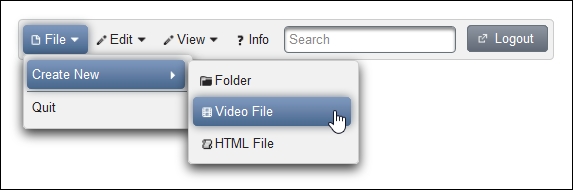
In the screenshot, the submenu Create New contains three menu items, Folder, Video File, and HTML File. The following complete code listing shows p:menubar with submenus p:submenu and menu items p:menuitem inside. An input component and a button component are included via f:facet with name="options" as well. The following code shows this:
<p:growl id="growl"/>
<p:menubar>
<p:submenu label="File" icon="ui-icon-document">
<p:submenu label="Create New">
<p:menuitem value="Folder"
actionListener="#{menubarBean.createFolder}"
icon="ui-icon-folder-collapsed" update="growl"/>
<p:menuitem value="Video File"
actionListener="#{menubarBean.createVideo}"
icon="ui-icon-video" update="growl"/>
<p:menuitem value="HTML File"
actionListener="#{menubarBean.createHTML}"
icon="ui-icon-script" update="growl"/>
</p:submenu>
<p:separator/>
<p:menuitem value="Quit" url="#"/>
</p:submenu>
<p:submenu label="Edit" icon="ui-icon-pencil">
<p:menuitem value="Cut" actionListener="#{menubarBean.cut}"
icon="ui-icon-scissors" update="growl"/>
<p:menuitem value="Copy" actionListener="#{menubarBean.copy}"
icon="ui-icon-copy" update="growl"/>
<p:menuitem value="Paste" actionListener="#{menubarBean.paste}"
icon="ui-icon-clipboard" update="growl"/>
</p:submenu>
<p:submenu label="View" icon="ui-icon-pencil">
<p:menuitem value="Zoom In"
actionListener="#{menubarBean.zoomIn}"
icon="ui-icon-zoomin" update="growl"/>
<p:menuitem value="Zoom Out"
actionListener="#{menubarBean.zoomOut}"
icon="ui-icon-zoomout" update="growl"/>
<p:submenu label="View Mode" icon="ui-icon-search">
<p:menuitem value="View Icons"
actionListener="#{menubarBean.viewIcons}"
update="growl"/>
<p:menuitem value="View Compact"
actionListener="#{menubarBean.viewCompact}"
update="growl"/>
<p:menuitem value="View Details"
actionListener="#{menubarBean.viewDetails}"
update="growl"/>
</p:submenu>
</p:submenu>
<p:menuitem value="Info" action="#{menubarBean.info}"
ajax="false" icon="ui-icon-help"/>
<f:facet name="options">
<p:inputText style="margin:0 10px 0 10px; vertical-align:middle;"
placeholder="Search"/>
<p:commandButton value="Logout" type="button"
icon="ui-icon-extlink"/>
</f:facet>
</p:menubar>
<p:dialog visible="#{flash.helpVisible}" header="Info Dialog">
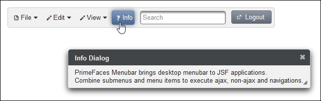
PrimeFaces Menubar brings desktop menubar to JSF applications.<br/>
Combine submenus and menu items to execute ajax, non-ajax and navigations.
</p:dialog>Menubar can also support menu items as root items. In the developed example, this is the Info menu item. A click on Info shows an information dialog. The following screenshot shows this:
Submenus and menu items as child components are required to compose a menu bar. A menu bar with a higher depth consists of nested submenus in parent submenus. Any custom content within a menubar should be placed in <f:facet name="options">.
The info dialog is only visible when the visible="#{flash.helpVisible}" EL expression returns true. The non-AJAX info action uses the JSF FlashScope variable to pass the value (true) of the helpVisible variable to the same page with a full-page request. The following code shows this:
public String info() {
  FacesContext.getCurrentInstance().getExternalContext().
    getFlash().put("helpVisible", true);

  return "/views/chapter6/menubar.xhtml";
}The autoDisplay attribute featured by p:menubar defines whether the first level of submenus will be displayed on mouseover or on click. When it is set to false (default), a click event is required to display the first level of submenus.
The toggleEvent attribute specifies the event to toggle the submenus. The valid values are hover (mouseover) and click. If it is not set, as in this example, the submenus are toggled on hover.
This recipe is available in the demo web application on GitHub (https://github.com/ova2/primefaces-cookbook/tree/second-edition). Clone the project if you have not done it yet, explore the project structure, and build and deploy the WAR file on application servers compatible with Servlet 3.x, such as JBoss WildFly and Apache TomEE.
The showcase for the recipe is available at http://localhost:8080/pf-cookbook/views/chapter6/menubar.jsf.