
C H A P T E R 31
Dependency Properties, Routed Events, and Templates
This chapter concludes your investigation of the WPF programming model by introducing you to the process of building customized control templates. While it is true that the content model and style mechanism do allow you to add unique bits to a standard WPF control, the process of building custom templates allows you to fully define how a control should render its output, respond to state transitions, and integrate into the WPF APIs.
This chapter begins by examining two topics that are important when creating a custom control, specifically dependency properties and routed events. Once you understand these topics, you will then learn about the role of a default template and how to view them programmatically at runtime. After this foundation has been laid, the remainder of this chapter will examine how to build custom control templates, and how to incorporate visual cues using the WPF trigger framework.
 Note Building production level templates will most certainly require the use of Expression Blend, due to the numerous built-in template tools. Here, you will build some simple templates which can be easily created in Visual Studio proper. Again, consult my book Pro Expression Blend (Apress, 2011) for details of the Blend IDE.
Understanding the Role of Dependency Properties
Like any .NET API, WPF makes use of each member of the .NET type system (classes, structures, interfaces, delegates, enumerations) and each type member (properties, methods, events, constant data, read-only fields, etc.) within its implementation. However, WPF also supports a unique programming concept termed a dependency property.
Like a “normal” .NET property (often termed a CLR property in the WPF literature), dependency properties can be set declaratively using XAML or programmatically within a code file. Furthermore, dependency properties (like CLR properties) ultimately exist to encapsulate data fields of a class and can be configured as read-only, write-only, or read-write.
To make matters more interesting, in almost every case you will be blissfully unaware that you have actually set (or accessed) a dependency property as opposed to a CLR property! For example, the Height and Width properties that WPF controls inherit from FrameworkElement, as well as the Content member inherited from ControlContent, are all, in fact, dependency properties.
<!-- Set three dependency properties! -->

<Button x:Name = "btnMyButton" Height = "50" Width = "100" Content = "OK"/>
Given all of these similarities, why does WPF define a new term for such a familiar concept? The answer lies in how a dependency property is implemented within the class. You’ll see a coding example in just a little bit; however, from a high level, all dependency properties are created in the following manner:
- First, the class that defined a dependency property must have
DependencyObjectin its inheritance chain.- A single dependency property is represented as a public, static, read-only field in the class of type
DependencyProperty. By convention, this field is named by suffixing the wordPropertyto the name of the CLR wrapper (see final bullet point).- The
DependencyPropertyvariable is registered via a static call toDependencyProperty.Register(), which typically occurs in a static constructor or inline when the variable is declared.- Finally, the class will define a XAML-friendly CLR property, which makes calls to methods provided by
DependencyObjectto get and set the value.
Once implemented, dependency properties provide a number of powerful features that are used by various WPF technologies including data binding, animation services, styles, templates and so forth. In a nutshell, the motivation of dependency properties is to provide a way to compute the value of a property based on the value of other inputs. Here is a list of some of these key benefits, which go well beyond those of the simple data encapsulation found with a CLR property:
- Dependency properties can inherit their values from a parent element’s XAML definition. For example, if you defined a value for the
FontSizeattribute in the opening tag of a<Window>, all controls in thatWindowwould have the same font size by default.- Dependency properties support the ability to have values set by elements contained within their XAML scope, such as a
Buttonsetting theDockproperty of aDockPanelparent. (Recall from Chapter 28 that attached properties do this very thing, as attached properties are a form of dependency properties.)- Dependency properties allow WPF to compute a value based on multiple external values, which can be very important for animation and data-binding services.
- Dependency properties provide infrastructure support for WPF triggers (also used quite often when working with animation and data binding).
Now remember, in many cases you will interact with an existing dependency property in a manner identical to a normal CLR property (thanks to the XAML wrapper). However, when I covered data binding in Chapter 28, you learned that if you need to establish a data binding in code, you must call the SetBinding() method on the object that is the destination of the operation and specify the dependency property it will operate on, like so:
private void SetBindings()

{

  Binding b = new Binding();

  b.Converter = new MyDoubleConverter();
  b.Source = this.mySB;

  b.Path = new PropertyPath("Value");


  // Specify the dependency property!

  this.labelSBThumb.SetBinding(Label.ContentProperty, b);

}
You also saw similar code when you examined how to start an animation in code, back in the previous chapter.
// Specify the dependency property!

rt.BeginAnimation(RotateTransform.AngleProperty, dblAnim);
The only time when you would need to build your own custom dependency property is when you are authoring a custom WPF control. For example, if you are building a UserControl that defines four custom properties and you want these properties to integrate well within the WPF API, you should author them using dependency property logic.
Specifically, if your properties need to be the target of a data-binding or animation operation, if the property must broadcast when it has changed, if it must be able to work as a Setter in a WPF style, or if it must be able to receive their values from a parent element, a normal CLR property will not be enough. If you were to use a normal CLR property, other programmers may indeed be able to get and set a value; however, if they attempt to use your properties within the context of a WPF service, things will not work as expected. Because you can never know how others might want to interact with the properties of your custom UserControl classes, you should get in the habit of always defining dependency properties when building custom controls.
Examining an Existing Dependency Property
Before you learn how to build a custom dependency property, let’s take a look at how the Height property of the FrameworkElement class has been implemented internally. The relevant code is shown here (with my included comments:
// FrameworkElement is-a DependencyObject.

public class FrameworkElement : UIElement, IFrameworkInputElement,

  IInputElement, ISupportInitialize, IHaveResources, IQueryAmbient

{

...

  // A static read-only field of type DependencyProperty.

  public static readonly DependencyProperty HeightProperty;


  // The DependencyProperty field is often registered

  // in the static constructor of the class.

  static FrameworkElement()

  {

    ...

    HeightProperty = DependencyProperty.Register(

      "Height",

      typeof(double),

      typeof(FrameworkElement),

      new FrameworkPropertyMetadata((double) 1.0 / (double) 0.0,

        FrameworkPropertyMetadataOptions.AffectsMeasure,

        new PropertyChangedCallback(FrameworkElement.OnTransformDirty)),

      new ValidateValueCallback(FrameworkElement.IsWidthHeightValid));
  }

  // The CLR wrapper, which is implemented using

  // the inherited GetValue()/SetValue() methods.

  public double Height

  {

    get { return (double) base.GetValue(HeightProperty); }

    set { base.SetValue(HeightProperty, value); }

  }

}
As you can see, dependency properties require quite a bit of additional code from a normal CLR property! And in reality, a dependency can be even more complex than what you see here (thankfully, many implementations are simpler than Height).
First and foremost, remember that if a class wants to define a dependency property, it must have DependencyObject in the inheritance chain, as this is the class that defines the GetValue() and SetValue() methods used in the CLR wrapper. Because FrameworkElement is-a DependencyObject, this requirement is satisfied.
Next, recall that the entity that will hold the actual value of the property (a double in the case of Height) is represented as a public, static, read-only field of type DependencyProperty. The name of this field should, by convention, always be named by suffixing the word Property to the name of the related CLR wrapper, like so:
public static readonly DependencyProperty HeightProperty;
Given that dependency properties are declared as static fields, they are typically created (and registered) within the static constructor of the class. The DependencyProperty object is created via a call to the static DependencyProperty.Register() method. This method has been overloaded many times; however, in the case of Height, DependencyProperty.Register() is invoked as follows:
HeightProperty = DependencyProperty.Register(

  "Height",

  typeof(double),

  typeof(FrameworkElement),

  new FrameworkPropertyMetadata((double)0.0,

    FrameworkPropertyMetadataOptions.AffectsMeasure,

    new PropertyChangedCallback(FrameworkElement.OnTransformDirty)),

  new ValidateValueCallback(FrameworkElement.IsWidthHeightValid));
The first argument to DependencyProperty.Register() is the name of the normal CLR property on the class (Height, in this case), while the second argument is the type information of the underlying data type it is encapsulating (a double). The third argument specifies the type information of the class that this property belongs to (FrameworkElement, in this case). While this might seem redundant (after all, the HeightProperty field is already defined within the FrameworkElement class), this is a very clever aspect of WPF in that it allows one class to register properties on another (even if the class definition has been sealed!).
The fourth argument passed to DependencyProperty.Register() in this example is what really gives dependency properties their own unique flavor. Here, a FrameworkPropertyMetadata object is passed that describes various details regarding how WPF should handle this property with respect to callback notifications (if the property needs to notify others when the value changes) and various options (represented by the FrameworkPropertyMetadataOptions enum) that control what is effected by the property in question (Does it work with data binding?, Can it be inherited?, etc.). In this case, the constructor arguments of FrameworkPropertyMetadata break down as so:
new FrameworkPropertyMetadata(

  // Default value of property.

  (double)0.0,


  // Metadata options.

  FrameworkPropertyMetadataOptions.AffectsMeasure,


  // Delegate pointing to method called when property changes.

  new PropertyChangedCallback(FrameworkElement.OnTransformDirty)

)
Because the final argument to the FrameworkPropertyMetadata constructor is a delegate, note that its constructor parameter is pointing to a static method on the FrameworkElement class named OnTransformDirty(). I won’t bother to show the code behind this method, but be aware that any time you are building a custom dependency property, you can specify a PropertyChangedCallback delegate to point to a method that will be called when your property value has been changed.
This brings me to the final parameter passed to the DependencyProperty.Register() method, a second delegate of type ValidateValueCallback, which points to a method on the FrameworkElement class that is called to ensure the value assigned to the property is valid.
new ValidateValueCallback(FrameworkElement.IsWidthHeightValid)
This method contains logic you might normally expect to find in the set block of a property (more information on this point in the next section).
private static bool IsWidthHeightValid(object value)

{

  double num = (double) value;

  return ((!DoubleUtil.IsNaN(num) && (num >= 0.0))

    && !double.IsPositiveInfinity(num));

}
After the DependencyProperty object has been registered, the final task is to wrap the field within a normal CLR property (Height, in this case). Notice, however, that the get and set scopes do not simply return or set a class-level double-member variable, but do so indirectly using the GetValue() and SetValue() methods from the System.Windows.DependencyObject base class, as follows:
public double Height

{

  get { return (double) base.GetValue(HeightProperty); }

  set { base.SetValue(HeightProperty, value); }

}
Important Notes Regarding CLR Property Wrappers
So, just to recap the story thus far, dependency properties look like a normal everyday property when you get or set their values in XAML or code, but behind the scenes they are implemented with much more elaborate coding techniques. Remember, the whole reason to go through this process is to build a custom control that has custom properties that need to integrate with WPF services that demand communication with a dependency property (e.g., animation, data binding, and styles).
Even though part of the implementation of a dependency property includes defining a CLR wrapper, you should never put validation logic in the set block. For that matter, the CLR wrapper of a dependency property should never do anything other than call GetValue() or SetValue().
The reason is that the WPF runtime has been constructed in such a way that when you write XAML that seems to set a property, such as
<Button x:Name="myButton" Height="100" .../>
the runtime will completely bypass the set block of the Height property and directly call SetValue()! The reason for this odd behavior has to do with a simple optimization technique. If the WPF runtime were to call the set block of the Height property, it would have to perform runtime reflection to figure out where the DependencyProperty field (specified by the first argument to SetValue()) is located, reference it in memory, and so forth. The same story holds true if you were to write XAML that retrieves the value of the Height property—GetValue() would be called directly.
Since this is the case, why do you need to build this CLR wrapper at all? Well, WPF XAML does not allow you to call functions in markup, so the following markup would be an error:
<!-- Nope! Can't call methods in WPF XAML! -->

<Button x:Name="myButton" this.SetValue("100") .../>
In effect, when you set or get a value in markup using the CLR wrapper, think of it as a way to tell the WPF runtime, “Hey! Go call GetValue()/SetValue() for me, since I can’t directly do it in markup!” Now, what if you call the CLR wrapper in code like so:
Button b = new Button();

b.Height = 10;
In this case, if the set block of the Height property contained code other than a call to SetValue(), it would execute, as the WPF XAML parser optimization is not involved.
The basic rule to remember is that when registering a dependency property, use a ValidateValueCallback delegate to point to a method that performs the data validation. This ensures that the correct behavior will occur, regardless of whether you use XAML or code to get/set a dependency property.
Building a Custom Dependency Property
If you have a slight headache at this point in the chapter, this is a perfectly normal response. Building dependency properties can take some time to get used to. However, for better or worse, it is part of the process of building many custom WPF controls, so let’s take a look at how to build a dependency property.
Begin by creating a new WPF Application named CustomDepPropApp. Now, using the Project menu, activate the Add User Control menu option, and create a control named ShowNumberControl.xaml (see Figure 31-1).
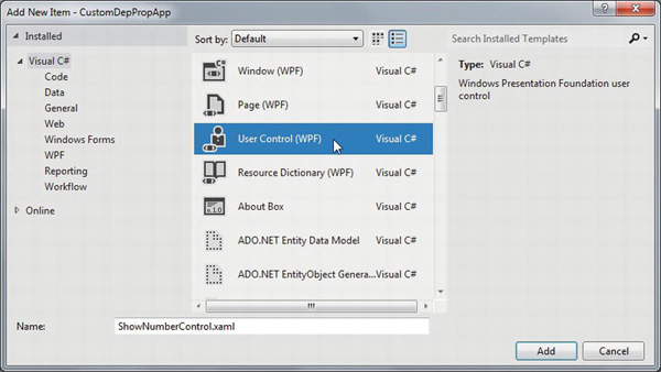
Figure 31-1. Inserting a new custom UserControl
Note You will learn more details about the WPF UserControl later in this chapter, so just follow along as shown for now.
Just like a window, WPF UserControl types have a XAML file and a related code file. Update the XAML of your user control to define a single Label control in the Grid, like so:
<UserControl x:Class="CustomDepPropApp.ShowNumberControl"

  xmlns="http://schemas.microsoft.com/winfx/2006/xaml/presentation"

  xmlns:x="http://schemas.microsoft.com/winfx/2006/xaml"

  xmlns:mc="http://schemas.openxmlformats.org/markup-compatibility/2006"

  xmlns:d="http://schemas.microsoft.com/expression/blend/2008"

  mc:Ignorable="d"

  d:DesignHeight="300" d:DesignWidth="300">

  <Grid>

    <Label x:Name="numberDisplay" Height="50" Width="200" Background="LightBlue"/>

  </Grid>

</UserControl>
In the code file of this custom control, create a normal, everyday .NET property that wraps an int and sets the Content property of the Label with the new value, as follows:
public partial class ShowNumberControl : UserControl

{

  public ShowNumberControl()

  {

    InitializeComponent();

  }


  // A normal, everyday .NET property.

  private int currNumber = 0;

  public int CurrentNumber

  {

    get { return currNumber; }

    set

    {

      currNumber = value;

      numberDisplay.Content = CurrentNumber.ToString();

    }

  }

}
Now, update the XAML definition of your window to declare an instance of your custom control within a StackPanel layout manger. Because your custom control is not part of the core WPF assembly stack, you will need to define a custom XML namespace that maps to your control (see Chapter 27). Here is the required markup:
<Window x:Class="CustomDepPropApp.MainWindow"

  xmlns="http://schemas.microsoft.com/winfx/2006/xaml/presentation"

  xmlns:x="http://schemas.microsoft.com/winfx/2006/xaml"

  xmlns:myCtrls="clr-namespace:CustomDepPropApp"

  Title="Simple Dependency Property App" Height="150" Width="250"

  WindowStartupLocation="CenterScreen">


  <StackPanel>

    <myCtrls:ShowNumberControl x:Name="myShowNumberCtrl" CurrentNumber="100"/>

  </StackPanel>

</Window>
As you can see, the Visual Studio designer appears to correctly display the value that you set in the CurrentNumber property (see Figure 31-2).
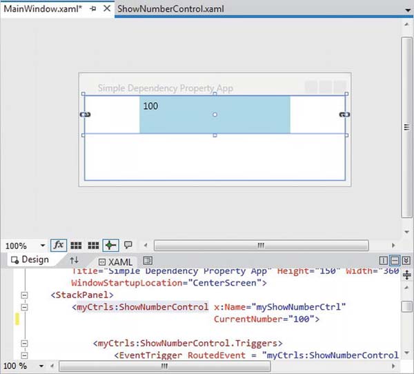
Figure 31-2. It appears your property works as expected
However, what if you want to apply an animation object to the CurrentNumber property so that the value changes from 100 to 200 over a period of 10 seconds? If you wanted to do so in markup, you might update your <myCtrls:ShowNumberControl> scope as so:
<myCtrls:ShowNumberControl x:Name="myShowNumberCtrl" CurrentNumber="100">

  <myCtrls:ShowNumberControl.Triggers>

    <EventTrigger RoutedEvent = "myCtrls:ShowNumberControl.Loaded">

      <EventTrigger.Actions>

        <BeginStoryboard>

          <Storyboard TargetProperty = "CurrentNumber">

            <Int32Animation From = "100" To = "200" Duration = "0:0:10"/>

          </Storyboard>

        </BeginStoryboard>

      </EventTrigger.Actions>

    </EventTrigger>

  </myCtrls:ShowNumberControl.Triggers>

</myCtrls:ShowNumberControl>
If you attempt to run your application, the animation object cannot find a proper target, so it is ignored. The reason is that the CurrentNumber property has not been registered as a dependency property! To fix matters, return to the code file of your custom control, and completely comment out the current property logic (including the private backing field). Now, position your mouse cursor within the scope of the class and type in the propdp code snippet (see Figure 31-3).
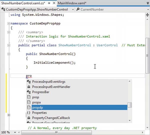
Figure 31-3. The propdp code snippet provides a starting point for building a dependency property
After you have typed propdp, press the Tab key twice. You will find the snippet expands to give you the basic skeleton of a dependency property (see Figure 31-4).
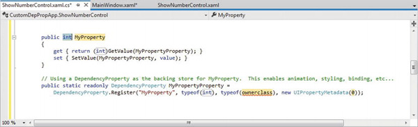
Figure 31-4. The expanded snippet
The simplest version of the CurrentNumber property will look like so:
public partial class ShowNumberControl : UserControl

{

  public int CurrentNumber

  {

    get { return (int)GetValue(CurrentNumberProperty); }

    set { SetValue(CurrentNumberProperty, value); }

  }


  public static readonly DependencyProperty CurrentNumberProperty =

     DependencyProperty.Register("CurrentNumber",

     typeof(int),

     typeof(ShowNumberControl),

     new UIPropertyMetadata(0));

   ...

}
This is similar to what you saw in the implementation of the Height property; however, the code snippet registers the property inline rather than within a static constructor (which is fine). Also notice that a UIPropertyMetadata object is used to define the default value of the integer (0) rather than the more complex FrameworkPropertyMetadata object.
Adding a Data Validation Routine
Although you now have a dependency property named CurrentNumber, you still won’t see your animation take hold. The next adjustment you might want to make is to specify a function to call to perform some data validation logic. For this example, assume that you need to ensure that the value of CurrentNumber is between 0 and 500.
To do so, add a final argument to the DependencyProperty.Register() method of type ValidateValueCallback, which points to a method named ValidateCurrentNumber.
ValidateValueCallback is a delegate that can only point to methods returning bool and take an object as the only argument. This object represents the new value that is being assigned. Implement ValidateCurrentNumber to return true or false, if the incoming value is within the expected range.
public static readonly DependencyProperty CurrentNumberProperty =

  DependencyProperty.Register("CurrentNumber", typeof(int), typeof(ShowNumberControl),

  new UIPropertyMetadata(100),

  new ValidateValueCallback(ValidateCurrentNumber));


public static bool ValidateCurrentNumber(object value)

{

  // Just a simple business rule. Value must be between 0 and 500.

  if (Convert.ToInt32(value) >= 0 && Convert.ToInt32(value) <= 500)

    return true;

  else

    return false;

}
Responding to the Property Change
Okay, so now you have a valid number, but still no animation. The final change you need to make is to specify a second argument to the constructor of UIPropertyMetadata, which is a PropertyChangedCallback object. This delegate can point to any method that takes a DependencyObject as the first parameter and a DependencyPropertyChangedEventArgs as the second. First, update your code as so:
// Note the second param of UIPropertyMetadata construtor.

public static readonly DependencyProperty CurrentNumberProperty =

  DependencyProperty.Register("CurrentNumber", typeof(int), typeof(ShowNumberControl),

  new UIPropertyMetadata(100,

                         new PropertyChangedCallback(CurrentNumberChanged)),

  new ValidateValueCallback(ValidateCurrentNumber));
Within the CurrentNumberChanged() method, your ultimate goal is to change the Content of the Label to the new value assigned by the CurrentNumber property. You have one big problem, however: the CurrentNumberChanged() method is static, as it must be to work with the static DependencyProperty object. So how are you supposed to gain access to the Label for the current instance of ShowNumberControl? That reference is contained in the first DependencyObject parameter. You can find the new value using the incoming event arguments. Here is the necessary code that will change the Content property of the Label:
private static void CurrentNumberChanged(DependencyObject depObj,

    DependencyPropertyChangedEventArgs args)

{

  // Cast the DependencyObject into ShowNumberControl.

  ShowNumberControl c = (ShowNumberControl)depObj;


  // Get the Label control in the ShowNumberControl.

  Label theLabel = c.numberDisplay;


  // Set the Label with the new value.

  theLabel.Content = args.NewValue.ToString();

}
Whew! That was a long way to go just to change the output of a label. The benefit is that your CurrentNumber dependency property can now be the target of a WPF style, an animation object, the target of a data-binding operation, and so forth. If you run your application once again, you should now see the value change during execution.
That wraps up your look at WPF dependency properties. While I hope you have a much better idea about what these constructs allow you to do and have a better idea of how to make your own, please be aware that there are many details I have not covered here.
If you find yourself in a position where you are building a number of custom controls that support custom properties, please look up the topic “Properties” under the “WPF Fundamentals” node of the .NET Framework 4.5 SDK documentation. Here, you will find many more examples of building dependency properties, attached properties, various ways to configure property metadata, and a slew of other details.
Source Code The CustomDepPropApp project is included under the Chapter 31 subdirectory.
Understanding Routed Events
Properties are not the only .NET programming construct to be given a facelift in order to work well within the WPF API. The standard CLR event model has also been refined just a bit to ensure that events can be processed in a manner that is fitting for XAML’s description of a tree of objects. Assume you have a new WPF Application project named WPFRoutedEvents. Now, update the XAML description of the initial window by adding the following <Button> control, which defines some complex content:
<Button Name="btnClickMe" Height="75" Width = "250"

        Click ="btnClickMe_Clicked">

  <StackPanel Orientation ="Horizontal">

    <Label Height="50" FontSize ="20">Fancy Button!</Label>

    <Canvas Height ="50" Width ="100" >

    <Ellipse Name = "outerEllipse" Fill ="Green" Height ="25"

             Width ="50" Cursor="Hand" Canvas.Left="25" Canvas.Top="12"/>

    <Ellipse Name = "innerEllipse" Fill ="Yellow" Height = "15" Width ="36"

             Canvas.Top="17" Canvas.Left="32"/>

    </Canvas>

  </StackPanel>

</Button>
Notice in the <Button>’s opening definition you have handled the Click event by specifying the name of a method to be called when the event is raised. The Click event works with the RoutedEventHandler delegate, which expects an event handler that takes an object as the first parameter and a System.Windows.RoutedEventArgs as the second. Implement this handler as so:
public void btnClickMe_Clicked(object sender, RoutedEventArgs e)

{

  // Do something when button is clicked.

  MessageBox.Show("Clicked the button");

}
If you run your application, you will see this message box display, regardless of which part of the button’s content you click on (the green Ellipse, the yellow Ellipse, the Label, or the Button’s surface). This is a good thing. Imagine how tedious WPF event handling would be if you were forced to handle a Click event for each and every one of these subelements. Not only would the creation of separate event handlers for each aspect of the Button be labor intensive, you would end up with some mighty nasty code to maintain down the road.
Thankfully, WPF routed events take care of ensuring that your single Click event handler will be called regardless of which part of the button is clicked automatically. Simply put, the routed events model automatically propagates an event up (or down) a tree of objects, looking for an appropriate handler.
Specifically speaking, a routed event can make use of three routing strategies. If an event is moving from the point of origin up to other defining scopes within the object tree, the event is said to be a bubbling event. Conversely, if an event is moving from the outermost element (e.g., a Window) down to the point of origin, the event is said to be a tunneling event. Finally, if an event is raised and handled only by the originating element (which is what could be described as a normal CLR event), it is said to be a direct event.
The Role of Routed Bubbling Events
In the current example, if the user clicks the inner yellow oval, the Click event bubbles out to the next level of scope (the Canvas), then to the StackPanel, and finally to the Button where the Click event handler is handled. In a similar way, if the user clicks the Label, the event is bubbled to the StackPanel and then finally to the Button element.
Given this bubbling routed event pattern, you have no need to worry about registering specific Click event handlers for all members of a composite control. However, if you wanted to perform custom clicking logic for multiple elements within the same object tree, you can do so.
By way of illustration, assume you need to handle the clicking of the outerEllipse control in a unique manner. First, handle the MouseDown event for this subelement (graphically rendered types such as the Ellipse do not support a Click event; however, they can monitor mouse button activity via ¬MouseDown, MouseUp, etc.).
<Button Name="btnClickMe" Height="75" Width = "250"

        Click ="btnClickMe_Clicked">

  <StackPanel Orientation ="Horizontal">

    <Label Height="50" FontSize ="20">Fancy Button!</Label>

    <Canvas Height ="50" Width ="100" >

    <Ellipse Name = "outerEllipse" Fill ="Green"

             Height ="25" MouseDown ="outerEllipse_MouseDown"

             Width ="50" Cursor="Hand" Canvas.Left="25" Canvas.Top="12"/>

    <Ellipse Name = "innerEllipse" Fill ="Yellow" Height = "15" Width ="36"

             Canvas.Top="17" Canvas.Left="32"/>

    </Canvas>

  </StackPanel>

</Button>
Then implement an appropriate event handler, which for illustrative purposes will simply change the Title property of the main window, like so:
public void outerEllipse_MouseDown(object sender, MouseButtonEventArgs e)

{

  // Change title of window.

  this.Title = "You clicked the outer ellipse!";

}
With this, you can now take different courses of action depending on where the end user has clicked (which boils down to the outer ellipse and everywhere else within the button’s scope).
Note Routed bubbling events always move from the point of origin to the next defining scope. Thus, in this example, if you were to click the innerEllipse object, the event would be bubbled to the Canvas, not to the outerEllipse, as they are both Ellipse types within the scope of Canvas.
Continuing or Halting Bubbling
Currently, if the user clicks the outerEllipse object, it will trigger the registered MouseDown event handler for this Ellipse object, at which point the event bubbles to the button’s Click event. If you want to inform WPF to stop bubbling up the tree of objects, you can set the Handled property of the EventArgs parameter to true, as follows:
public void outerEllipse_MouseDown(object sender, MouseButtonEventArgs e)

{

  // Change title of window.

  this.Title = "You clicked the outer ellipse!";


  // Stop bubbling!

  e.Handled = true;

}
In this case, you would find that the title of the window is changed, but you will not see the MessageBox displayed by the Click event handler of the Button. In a nutshell, routed bubbling events make it possible to allow a complex group of content to act either as a single logical element (e.g., a Button) or as discrete items (e.g., an Ellipse within the Button).
The Role of Routed Tunneling Events
Strictly speaking, routed events can be bubbling (as just described) or tunneling in nature. Tunneling events (which all begin with the Preview suffix—e.g., PreviewMouseDown) drill down from the topmost element into the inner scopes of the object tree. By and large, each bubbling event in the WPF base class libraries is paired with a related tunneling event that fires before the bubbling counterpart. For example, before the bubbling MouseDown event fires, the tunneling PreviewMouseDown event fires first.
Handling a tunneling event looks just like the processing of handling any other events; simply assign the event handler name in XAML (or, if needed, use the corresponding C# event-handling syntax in your code file) and implement the handler in the code file. Just to illustrate the interplay of tunneling and bubbling events, begin by handling the PreviewMouseDown event for the outerEllipse object, like so:
<Ellipse Name = "outerEllipse" Fill ="Green" Height ="25"

         MouseDown ="outerEllipse_MouseDown"

         PreviewMouseDown ="outerEllipse_PreviewMouseDown"

         Width ="50" Cursor="Hand" Canvas.Left="25" Canvas.Top="12"/>
Next, retrofit the current C# class definition by updating each event handler (for all objects) to append data about the current event into a string member variable named mouseActivity, using the incoming event args object. This will allow you to observe the flow of events firing in the background.
public partial class MainWindow : Window

{

  string mouseActivity = string.Empty;

  public MainWindow()

  {

    InitializeComponent();

  }


  public void btnClickMe_Clicked(object sender, RoutedEventArgs e)

  {

    AddEventInfo(sender, e);

    MessageBox.Show(mouseActivity, "Your Event Info");


    // Clear string for next round.

    mouseActivity = "";

  }


  private void AddEventInfo(object sender, RoutedEventArgs e)

  {

    mouseActivity += string.Format(

      "{0} sent a {1} event named {2}.
", sender,

      e.RoutedEvent.RoutingStrategy,

      e.RoutedEvent.Name);

  }


  private void outerEllipse_MouseDown(object sender, MouseButtonEventArgs e)

  {

    AddEventInfo(sender, e);

  }


  private void outerEllipse_PreviewMouseDown(object sender, MouseButtonEventArgs e)

  {

    AddEventInfo(sender, e);

  }

}
Notice that you are not halting the bubbling of an event for any event handler. If you run this application, you will see a unique message box display based on where you click the button. Figure 31-5 shows the result of clicking on the outer Ellipse object.
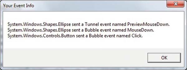
Figure 31-5. Tunneling first, bubbling second
So, why do WPF events typically tend to come in pairs (one tunneling and one bubbling)? The answer is that by previewing events, you have the power to ¬perform any special logic (data validation, disable bubbling action, etc.) before the bubbling counterpart fires. By way of an example, assume you have a TextBox that should contain only numerical data. You could handle the PreviewKeyDown event, and if you see the user has entered nonnumerical data, you could cancel the bubbling event by setting the Handled property to true.
As you would guess, when you are building a custom control that contains custom events, you could author the event in such a way that it can bubble (or tunnel) through a tree of XAML. For the purpose of this chapter, I will not be examining how to build custom routed events (however, the process is not that different from building a custom dependency property). If you are interested, check out the topic “Routed Events Overview” within the .NET Framework 4.5 SDK documentation. Here, you will find a number of tutorials that will help you on your way.
Source Code The WPFRoutedEvents project is included under the Chapter 31 subdirectory.
Logical Trees, Visual Trees, and Default Templates
There are a few more preparatory topics to investigate before you begin learning how to build custom controls. Specifically, you need to learn the distinction between a logical tree, a visual tree and a default template. When you are typing XAML into Visual Studio, or a tool such as kaxaml.exe, your markup is the logical view of the XAML document. As well, if you author C# code that adds new items to a StackPanel control, you are inserting new items into the logical tree. Essentially, a logical view represents how your content will be positioned within the various layout managers for a main Window (or another root element, such as Page or NavigationWindow).
However, behind every logical tree, there is a much more verbose representation termed a visual tree, which is used internally by WPF to correctly render out elements onto the screen. Within any visual tree, there will be full details of the templates and styles used to render out each object, including any necessary drawings, shapes, visuals, and animations.
It is useful to understand the distinction between logical and visual trees because when you are building a custom control template, you are essentially replacing all or part of the default visual tree of a control and inserting your own. Therefore, if you want a Button control to be rendered as a star shape, you could define a new star template and plug it into the Button’s visual tree. Logically, the Button is still of type Button, and it supports all of the properties, methods, and events as expected. But visually, it has taken on a whole new appearance. This fact alone makes WPF an extremely useful API, given that other toolkits would require you to build a brand-new class to make a star-shaped button. With WPF, you simply need to define new markup.
Note WPF controls are often described as lookless. This refers to the fact that the look and feel of a WPF control is completely independent (and customizable) from its behavior.
Programmatically Inspecting a Logical Tree
While analyzing a window’s logical tree at runtime is not a tremendously common WPF programming activity, it is worth mentioning that the System.Windows namespace defines a class named LogicalTreeHelper, which allows you to inspect the structure of a logical tree at runtime. To illustrate the connection between logical trees, visual trees, and control templates, create a new WPF Application named TreesAndTemplatesApp.
Update the markup for your window so that it contains two Button controls and a large read-only TextBox with scrollbars enabled. Make sure you use the IDE to handle the Click event of each button. The following XAML will do nicely:
<Window x:Class="TreesAndTemplatesApp.MainWindow"

  xmlns="http://schemas.microsoft.com/winfx/2006/xaml/presentation"

  xmlns:x="http://schemas.microsoft.com/winfx/2006/xaml"

  Title="Fun with Trees and Templates" Height="518"

  Width="836" WindowStartupLocation="CenterScreen">


  <DockPanel LastChildFill="True">

    <Border Height="50"  DockPanel.Dock="Top" BorderBrush="Blue">

      <StackPanel Orientation="Horizontal">

        <Button x:Name="btnShowLogicalTree" Content="Logical Tree of Window"

                Margin="4" BorderBrush="Blue" Height="40" Click="btnShowLogicalTree_Click"/>

        <Button x:Name="btnShowVisualTree" Content="Visual Tree of Window"

                BorderBrush="Blue" Height="40" Click="btnShowVisualTree_Click"/>

      </StackPanel>

    </Border>

    <TextBox x:Name="txtDisplayArea" Margin="10" Background="AliceBlue" IsReadOnly="True"

             BorderBrush="Red" VerticalScrollBarVisibility="Auto"

             HorizontalScrollBarVisibility="Auto" />

  </DockPanel>


</Window>
Within your C# code file, define a string member variable named dataToShow. Now, within the Click handler for the btnShowLogicalTree object, call a helper function that calls itself recursively in order to populate the string variable with the logical tree of the Window. To do so, you will call the static GetChildren() method of LogicalTreeHelper. Here is the code:
private void btnShowLogicalTree_Click(object sender, RoutedEventArgs e)

{

  dataToShow = "";

  BuildLogicalTree(0, this);

  this.txtDisplayArea.Text = dataToShow;

}


void BuildLogicalTree(int depth, object obj)

{

  // Add the type name to the dataToShow member variable.

  dataToShow += new string(' ', depth) + obj.GetType().Name + "
";


  // If an item is not a DependencyObject, skip it.

  if (!(obj is DependencyObject))

    return;


  // Make a recursive call for each logical child.

  foreach (object child in LogicalTreeHelper.GetChildren(

    obj as DependencyObject))

      BuildLogicalTree(depth + 5, child);

}
If you run your application and click this first button, you will see a tree print out in the text area, which is just about an exact replica of the original XAML (see Figure 31-6).
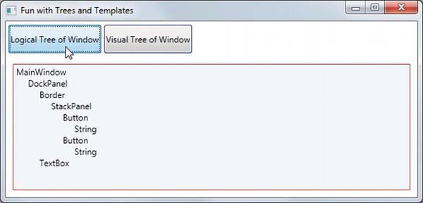
Figure 31-6. Viewing a logical tree at runtime
Programmatically Inspecting a Visual Tree
A Window’s visual tree can also be inspected at runtime using the VisualTreeHelper class of System.Windows.Media. Here is a Click implementation of the second Button control (btnShowVisualTree), which performs similar recursive logic to build a textual representation of the visual tree:
private void btnShowVisualTree_Click(object sender, RoutedEventArgs e)

{

  dataToShow = "";

  BuildVisualTree(0, this);

  this.txtDisplayArea.Text = dataToShow;

}


void BuildVisualTree(int depth, DependencyObject obj)

{

  // Add the type name to the dataToShow member variable.

  dataToShow += new string(' ', depth) + obj.GetType().Name + "
";

  // Make a recursive call for each visual child.

  for (int i = 0; i < VisualTreeHelper.GetChildrenCount(obj); i++)

    BuildVisualTree(depth + 1, VisualTreeHelper.GetChild(obj, i));

}
As you can see in Figure 31-7, the visual tree exposes a number of lower-level rendering agents such as ContentPresenter, AdornerDecorator, TextBoxLineDrawingVisual, and so forth.
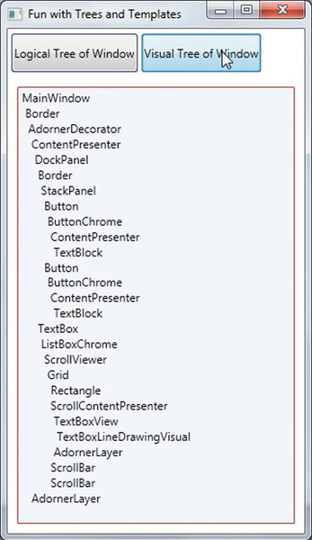
Figure 31-7. Viewing a visual tree at runtime
Programmatically Inspecting a Control’s Default Template
Recall that a visual tree is used by WPF to understand how to render a Window and all contained elements. Every WPF control stores its own set of rendering commands within its default template. Programmatically speaking, any template can be represented as an instance of the ControlTemplate class. As well, you can obtain a control’s default template by using the aptly named Template property, like so:
// Get the default template of the Button.

Button myBtn = new Button();

ControlTemplate template = myBtn.Template;
Likewise, you could create a new ControlTemplate object in code and plug it into a control’s Template property as follows:
// Plug in a new template for the button to use.

Button myBtn = new Button();

ControlTemplate customTemplate = new ControlTemplate();


// Assume this method adds all the code for a star template.

MakeStarTemplate(customTemplate);

myBtn.Template = customTemplate;
While you could build a new template in code, it is far more common to do so in XAML. However, before you start building your own templates, let’s finish the current example and add the ability to view the default template of a WPF control at runtime. This can be a really useful way to take a look at the overall composition of a template. First, update the markup of your window with a new StackPanel of controls docked to the left side of the master DockPanel, defined as so:
<Border DockPanel.Dock="Left" Margin="10" BorderBrush="DarkGreen"

        BorderThickness="4" Width="358">

  <StackPanel>

    <Label Content="Enter Full Name of WPF Control" Width="340" FontWeight="DemiBold" />

    <TextBox x:Name="txtFullName" Width="340" BorderBrush="Green"

             Background="BlanchedAlmond" Height="22"

             Text="System.Windows.Controls.Button" />

    <Button x:Name="btnTemplate" Content="See Template" BorderBrush="Green"

            Height="40" Width="100" Margin="5"

            Click="btnTemplate_Click" HorizontalAlignment="Left" />

    <Border BorderBrush="DarkGreen" BorderThickness="2" Height="260"

            Width="301" Margin="10" Background="LightGreen" >

      <StackPanel x:Name="stackTemplatePanel" />

    </Border>

  </StackPanel>

</Border>
Do take note of the empty StackPanel, stackTemplatePanel, as you will refer to it in code. Anyway, your window should now look something like Figure 31-8.
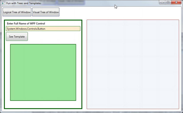
Figure 31-8. The updated UI of your window
The upper-left text area allows you to enter in the fully qualified name of a WPF control located in the PresentationFramework.dll assembly. Once the library is loaded, you will dynamically create an instance of the object and display it in the large square in the bottom left. Last but not least, the control’s default template will be displayed in the right-hand text area. First, add a new member variable to your C# class of type Control, like so:
private Control ctrlToExamine = null;
Here is the remaining code, which will require you to import the System.Reflection, System.Xml, and System.Windows.Markup namespaces:
private void btnTemplate_Click(object sender, RoutedEventArgs e)

{

  dataToShow = "";

  ShowTemplate();

  this.txtDisplayArea.Text = dataToShow;

}


private void ShowTemplate()

{

  // Remove the control that is currently in the preview area.

  if (ctrlToExamine != null)

    stackTemplatePanel.Children.Remove(ctrlToExamine);

  try
  {
    // Load PresentationFramework, and create an instance of the

    // specified control. Give it a size for display purposes, then add to the

    // empty StackPanel.

    Assembly asm = Assembly.Load("PresentationFramework, Version=4.0.0.0," +

       "Culture=neutral, PublicKeyToken=31bf3856ad364e35");

    ctrlToExamine = (Control)asm.CreateInstance(txtFullName.Text);

    ctrlToExamine.Height = 200;

    ctrlToExamine.Width = 200;

    ctrlToExamine.Margin = new Thickness(5);

    stackTemplatePanel.Children.Add(ctrlToExamine);


    // Define some XML settings to preserve indentation.

    XmlWriterSettings xmlSettings = new XmlWriterSettings();

    xmlSettings.Indent = true;


    // Create a StringBuilder to hold the XAML.

    StringBuilder strBuilder = new StringBuilder();


    // Create an XmlWriter based on our settings.

    XmlWriter xWriter = XmlWriter.Create(strBuilder, xmlSettings);


    // Now save the XAML into the XmlWriter object based on the ControlTemplate.

    XamlWriter.Save(ctrlToExamine.Template, xWriter);


    // Display XAML in the text box.

    dataToShow = strBuilder.ToString();

  }

  catch (Exception ex)

  {

    dataToShow = ex.Message;

  }

}
The bulk of the work is just tinkering with the compiled BAML resource to map it into a XAML string. Figure 31-9 shows your final application in action, displaying the default template of the System.Windows.Controls.DatePicker control.
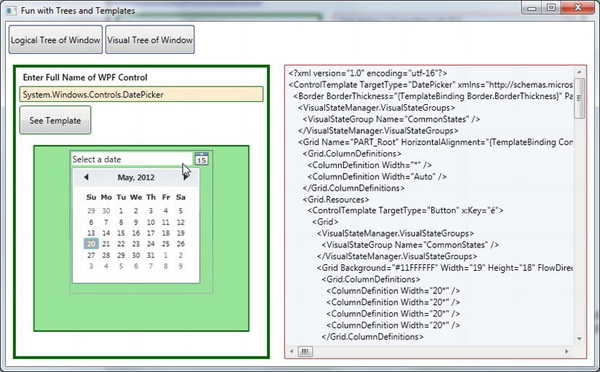
Figure 31-9. Investigating a ControlTemplate at runtime
Great! Hopefully you have a better idea about how logical trees, visual trees, and control default templates work together. Now you can spend the remainder of this chapter learning how to build custom templates and user controls.
Source Code The TreesAndTemplatesApp project is included under the Chapter 31 subdirectory.
Building a Control Template with the Trigger Framework
When you are building a custom template for a control, you could do so with nothing but C# code. Using this approach, you would be adding data to a ControlTemplate object and then assigning it to a control’s Template property. Most of the time, however, you will define the look and feel of a ControlTemplate using XAML and add bits of code (or possible quite a bit of code) to drive the runtime behavior.
For the remainder of this chapter you will examine how to build custom templates using Visual Studio. Along the way, you will come to learn about the WPF trigger framework, the Visual State Manager (VSM), and see how to use animations to incorporate visual cues for the end user. As you will see, using Visual Studio alone to build complex templates can entail a fair amount of typing and a bit of heavy lifting. To be sure, production-level templates will benefit from the use of Expression Blend. However, given that this edition of the text does not include coverage of Blend, it’s time to roll up our sleeves and pound out some markup.
To begin, create a brand-new WPF Application named ButtonTemplate. For this project, you are more interested in the mechanics of creating and using templates, so the markup for this main window is very simple.
<Window x:Class="ButtonTemplate.MainWindow"

  xmlns="http://schemas.microsoft.com/winfx/2006/xaml/presentation"

  xmlns:x="http://schemas.microsoft.com/winfx/2006/xaml"

  Title="Fun with Templates" Height="350" Width="525">

  <StackPanel>

    <Button x:Name="myButton" Width="100" Height="100"

            Click="myButton_Click"/>

  </StackPanel>

</Window>
In the Click event handler, simply display a message box (via MessageBox.Show()) that displays a message confirming the clicking of the control. Remember, when you build custom templates, the behavior of the control is constant but the look may vary.
Currently, this Button is rendered using the default template, which, as the last example illustrated, is a BAML resource within a given WPF assembly. When you want to define your own template, you are essentially replacing this default visual tree with your own creation. To begin, update the definition of the <Button> element to specify a new template using property element syntax. This template will give the control a round appearance.
<Button x:Name="myButton" Width="100" Height="100"

        Click="myButton_Click">

  <Button.Template>

    <ControlTemplate>

      <Grid x:Name="controlLayout">

        <Ellipse  x:Name="buttonSurface" Fill = "LightBlue"/>

        <Label x:Name="buttonCaption" VerticalAlignment = "Center"

               HorizontalAlignment = "Center"

               FontWeight = "Bold" FontSize = "20" Content = "OK!"/>

      </Grid>

    </ControlTemplate>

  </Button.Template>

</Button>
Here, you have defined a template that consists of a named Grid control containing a named Ellipse and a Label. Because your Grid has no defined rows or columns, each child stacks on top of the previous control, allowing you to have centering of content. Now, if you run your application, you will notice that the Click event will fire only when the mouse cursor is within the bounds of the Ellipse (i.e., not in the corners around the edges of the ellipse)! This is a great feature of the WPF template architecture: you do not need to recalculate hit-testing, bounds checking, or any other low-level detail. So, if your template used a Polygon object to render some oddball geometry, you can rest assured that the mouse hit-testing details are relative to the shape of the control, not the larger bounding rectangle.
Templates As Resources
Currently, your template is embedded to a specific Button control, which limits your reuse options. Ideally, you would place your template into a resource dictionary, so you can reuse your round button template between projects, or at minimum, move it into the application resource container for reuse within this project. Let’s move the local Button resource to the application level. First, locate the Template property for your Button in the Properties editor (you’ll find it under the Miscellaneous section). Now, click on the small white square icon and select “Convert to New Resource…” (see Figure 31-10).
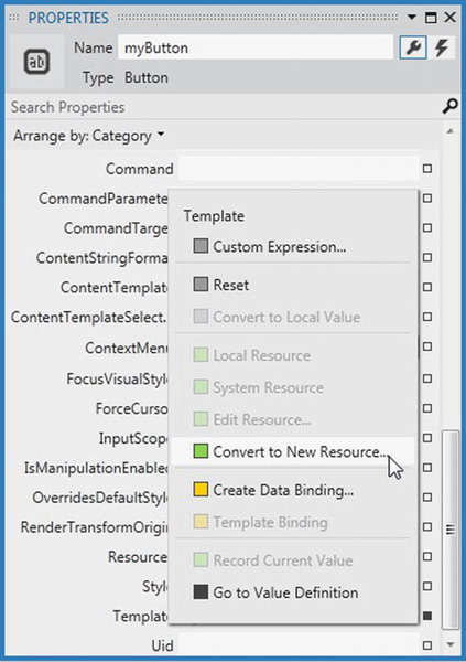
Figure 31-10. Extracting a local resource
From the resulting dialog box, define a new template named RoundButtonTemplate, which is stored at Application level (i.e., in App.xaml; see Figure 31-11).
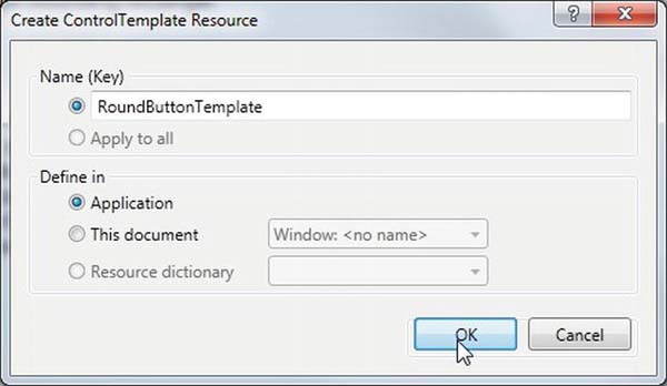
Figure 31-11. Placing your resource into App.xaml
At this point, you will find the following data in your Application object’s markup:
<Application x:Class="ButtonTemplate.App"

  xmlns="http://schemas.microsoft.com/winfx/2006/xaml/presentation"

  xmlns:x="http://schemas.microsoft.com/winfx/2006/xaml"

  StartupUri="MainWindow.xaml">

  <Application.Resources>

    <ControlTemplate x:Key="RoundButtonTemplate" TargetType="{x:Type Button}>

      <Grid x:Name="controlLayout">

        <Ellipse  x:Name="buttonSurface" Fill = "LightBlue"/>

        <Label x:Name="buttonCaption" VerticalAlignment = "Center"

               HorizontalAlignment = "Center"

               FontWeight = "Bold" FontSize = "20" Content = "OK!"/>

      </Grid>

    </ControlTemplate>

  </Application.Resources>

</Application>
Now, because this resource is available for the entire application, you can define any number of round buttons. Go ahead and create two additional Button controls that use this template for testing purposes (no need to handle the Click event for these new items).
<StackPanel>

  <Button x:Name="myButton" Width="100" Height="100"

          Click="myButton_Click"

          Template="{StaticResource RoundButtonTemplate}"></Button>

  <Button x:Name="myButton2" Width="100" Height="100"

          Template="{StaticResource RoundButtonTemplate}"></Button>

  <Button x:Name="myButton3" Width="100" Height="100"

          Template="{StaticResource RoundButtonTemplate}"></Button>

</StackPanel>
Incorporating Visual Cues Using Triggers
When you define a custom template, all of the visual cues of the default template are removed as well. For example, the default button template contains markup that informs the control how to look when certain UI events occur, such as when it receives focus, when it is clicked with the mouse, when it is enabled (or disabled), and so on. Users are quite accustomed to these sort of visual cues, as it gives the control somewhat of a tactile response. However, your RoundButtonTemplate does not define any such markup, so the look of the control is identical regardless of the mouse activity. Ideally, your control should look slightly different when clicked (maybe via a color change or drop shadow) to let the user know the visual state has changed.
When WPF was first released, the way to add in such visual cues was to add to the template any number of triggers that would typically change values of object properties or start a storyboard animation (or both) when the trigger condition was true. By way of example, update your RoundButtonTemplate with the following markup, which will change the color of the control to blue and the foreground color to yellow when the mouse is over the surface:
<ControlTemplate x:Key="RoundButtonTemplate" TargetType="Button" >

  <Grid x:Name="controlLayout">

    <Ellipse x:Name="buttonSurface" Fill="LightBlue" />

    <Label x:Name="buttonCaption" Content="OK!" FontSize="20" FontWeight="Bold"

           HorizontalAlignment="Center" VerticalAlignment="Center" />

  </Grid>

    <ControlTemplate.Triggers>

      <Trigger Property = "IsMouseOver" Value = "True">

        <Setter TargetName = "buttonSurface" Property = "Fill" Value = "Blue"/>

        <Setter TargetName = "buttonCaption" Property = "Foreground"

                Value = "Yellow"/>

      </Trigger>

    </ControlTemplate.Triggers>

  </ControlTemplate>
If you run the program yet again, you should find the color does toggle based on whether or not the mouse is within the Ellipse area. Here is another trigger, which will shrink the size of the Grid (and, therefore, all child elements) when the control is pressed via the mouse. Add this to your <ControlTemplate.Triggers> collection:
<Trigger Property = "IsPressed" Value="True">

  <Setter TargetName="controlLayout"

          Property="RenderTransformOrigin" Value="0.5,0.5"/>

  <Setter TargetName="controlLayout" Property="RenderTransform">

    <Setter.Value>

      <ScaleTransform ScaleX="0.8" ScaleY="0.8"/>

    </Setter.Value>

  </Setter>

</Trigger>
The Role of the {TemplateBinding} Markup Extension
Your template can only be applied to Button controls and, therefore, it would stand to reason that you could set properties on the <Button> elementthat will cause the template to render itself in a unique manner. For example, right now, the Fill property of the Ellipse is hard-coded to be blue and the Content of the Label is always set to the string value “OK”. Of course, you might want buttons of different colors and text values, so you might try to define the following buttons in your main window:
<StackPanel>

  <Button x:Name="myButton" Width="100" Height="100"

          Background="Red" Content="Howdy!"

          Click="myButton_Click"

          Template="{StaticResource RoundButtonTemplate}" />

  <Button x:Name="myButton2" Width="100" Height="100"

          Background="LightGreen" Content="Cancel!"

          Template="{StaticResource RoundButtonTemplate}" />

  <Button x:Name="myButton3" Width="100" Height="100"

          Background="Yellow" Content="Format"

          Template="{StaticResource RoundButtonTemplate}" />

</StackPanel>
However, regardless of the fact that each Button is setting a unique Background and Content value, you still end up with three blue buttons that contain the text “OK”. The problem is that the properties of the control using the template (Button) have properties that do not match identically with the items on the template (such as the Fill property of the Ellipse). As well, although the Label does have a Content property, the value defined in the <Button> scope is not automatically routed to the internal child of the template.
You can solve these issues by using the {TemplateBinding} markup extension when you build your template. This allows you to capture property settings defined by the control using your template and use them to set values in the template itself. Here is a reworked version of RoundButtonTemplate, which now uses this markup extension to map the Background property of the Button to the Fill property of the Ellipse; it also makes sure the Content of the Button is indeed passed to the Content property of the Label.
<ControlTemplate x:Key="RoundButtonTemplate" TargetType="Button">

  <Grid x:Name="controlLayout">

    <Ellipse x:Name="buttonSurface" Fill="{TemplateBinding Background}"/>

    <Label x:Name="buttonCaption" Content="{TemplateBinding Content}"

           FontSize="20" FontWeight="Bold"

           HorizontalAlignment="Center" VerticalAlignment="Center" />

  </Grid>

  <ControlTemplate.Triggers>

   ...

  </ControlTemplate.Triggers>

</ControlTemplate>
With this update, you can now create buttons of various colors and textual values (see Figure 31-12).
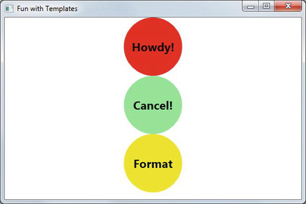
Figure 31-12. Template bindings allow values to pass through to the internal controls
The Role of ContentPresenter
When you designed your template, you used a Label to display the textual value of the control. Like the Button, the Label supports a Content property. Therefore, given your use of {TemplateBinding}, you could define a Button which contained complex content beyond that of a simple string. For example:
<Button x:Name="myButton4" Width="100" Height="100" Background="Yellow"

        Template="{StaticResource RoundButtonTemplate}">

  <Button.Content>

    <ListBox Height="50" Width="75">

      <ListBoxItem>Hello</ListBoxItem>

      <ListBoxItem>Hello</ListBoxItem>

      <ListBoxItem>Hello</ListBoxItem>

    </ListBox>

  </Button.Content>

</Button>
For this particular control, things work just as hoped. However, what if you need to pass in complex content to a template member that does not have a Content property? When you want to define a generalized content display area in a template, you can use the ContentPresenter class as opposed to a specific type of control (Label or TextBlock). You have no need to do so for this example; however, here is some simple markup that illustrates how you could build a custom template that uses ContentPresenter to show the value of the Content property of the control using the template:
<!-- This button template will display whatever is set

     to the Content of the hosting button. -->

<ControlTemplate x:Key="NewRoundButtonTemplate" TargetType="Button">

  <Grid>
    <Ellipse Fill="{TemplateBinding Background}"/>

    <ContentPresenter HorizontalAlignment="Center"

                      VerticalAlignment="Center"/>

  </Grid>

</ControlTemplate>
Incorporating Templates into Styles
Currently, your template simply defines a basic look and feel of the Button control. However, the process of establishing the basic properties of the control (content, font size, font weight, etc.) is the responsibility of the Button itself.
<!-- Currently the Button must set basic property values, not the template. -->

<Button x:Name ="myButton" Foreground ="Black" FontSize ="20" FontWeight ="Bold"

        Template ="{StaticResource RoundButtonTemplate}" Click ="myButton_Click"/>
If you want, you could establish these values in the template. By doing so, you can effectively create a default look and feel. As you might have already realized, this is a job for WPF styles. When you build a style (to account for basic property settings), you can define a template within the style! Here is your updated application resource in the application resources in App.xaml, which has been rekeyed as RoundButtonStyle:
<!-- A style containing a template. -->

<Style x:Key ="RoundButtonStyle" TargetType ="Button">

  <Setter Property ="Foreground" Value ="Black"/>

  <Setter Property ="FontSize" Value ="14"/>

  <Setter Property ="FontWeight" Value ="Bold"/>

  <Setter Property="Width" Value="100"/>

  <Setter Property="Height" Value="100"/>

  <!-- Here is the template! -->

  <Setter Property ="Template">

    <Setter.Value>

      <ControlTemplate TargetType ="Button">

        <Grid x:Name="controlLayout">

          <Ellipse x:Name="buttonSurface" Fill="{TemplateBinding Background}"/>

          <Label x:Name="buttonCaption" Content ="{TemplateBinding Content}"

                 HorizontalAlignment="Center" VerticalAlignment="Center" />

        </Grid>
        <ControlTemplate.Triggers>

          <Trigger Property = "IsMouseOver" Value = "True">

            <Setter TargetName = "buttonSurface" Property = "Fill" Value = "Blue"/>

            <Setter TargetName = "buttonCaption" Property = "Foreground" Value = "Yellow"/>

          </Trigger>

          <Trigger Property = "IsPressed" Value="True">

            <Setter TargetName="controlLayout"

                    Property="RenderTransformOrigin" Value="0.5,0.5"/>

            <Setter TargetName="controlLayout" Property="RenderTransform">

              <Setter.Value>

                <ScaleTransform ScaleX="0.8" ScaleY="0.8"/>

              </Setter.Value>

            </Setter>

          </Trigger>

        </ControlTemplate.Triggers>

      </ControlTemplate>

    </Setter.Value>

  </Setter>

</Style>
With this update, you can now create button controls by setting the Style property as so:
<Button x:Name="myButton" Background="Red" Content="Howdy!"

        Click="myButton_Click" Style="{StaticResource RoundButtonStyle}"/>
While the rendering and behavior of the button is identical, the benefit of nesting templates within styles is that you are able to provide a canned set of values for common properties. That wraps up your look at how to use Visual Studio and the trigger framework to build custom templates for a control. While there is still much more about the Windows Presentation Foundation API than has been examined here, you should be in a solid position for further study.
Source Code The ButtonTemplate project can be found under the Chapter 31 subdirectory.
Summary
This chapter examined a number of related WPF topics, all of which are focused on the construction of custom user controls. You started by investigating how WPF places a unique spin on traditional .NET programming primitives, specifically properties and events. As you have seen, a dependency property allows you to build a property that can integrate within the WPF set of services (animations, data bindings, styles, and so on). On a related note, routed events provide a way for an event to flow up or down a tree of markup.
You then examined the relationship between a logical tree and a visual tree. The logical tree is basically a one-to-one correspondence of the markup you would author to describe a WPF root element. Behind this logic tree is a much deeper visual tree that contains detailed rendering instructions.
The role of a default template was then examined. Remember, when you are building custom templates, you are essentially ripping out all (or part) of a control’s visual tree and replacing it with your own custom implementation.