
2.2. The Toolbox
One of the major advantages over many other IDEs that Microsoft has offered developers is true drag-and-drop placement of elements during the design of both web and Windows (and now WPF) forms. These elements are all available in what is known as the Toolbox (Ctrl+Alt+X), a tool window accessible via the View menu, as shown in Figure 2-9.
Figure 2.9. Figure 2-9
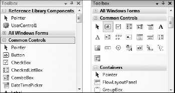
The Toolbox window contains all of the available components for the currently-active document being shown in the main workspace. These can be visual components, such as buttons and textboxes; invisible, service-oriented objects, such as timers and system event logs; or even designer elements, such as class and interface objects used in the Class Designer view.
Visual Studio 2008 presents the available components in groups rather than as one big mess of components. This default grouping enables you to more easily locate the controls you need — for example, data-related components are in their own Data group.
By default, groups are presented in list view (see the left side of Figure 2-9). Each component is represented by its own icon and the name of the component. This differs from the old way of displaying the available objects, in which the Toolbox was simply a stacked list of icons that left you guessing as to what some of the more obscure components were, as shown with the Common Controls group on the right side of Figure 2-9. You can change the view of each control group individually — right-click anywhere within the group area and deselect the "List View" option in the context menu.
Regardless of how the components are presented, the way they are used in a program is usually the same: click and drag the desired component onto the design surface of the active document, or double-click the component's entry for Visual Studio to automatically add an instance. Visual components, such as buttons and textboxes, will appear in the design area where they can be repositioned, resized, and otherwise adjusted via the property grid. Nonvisual components, such as the Timer control, will appear as icons, with associated labels, in a nonvisual area below the design area, as shown in Figure 2-10.
Figure 2.10. Figure 2-10

At the top left-hand side of Figure 2-9 is a group called Reference Library Components with a single component, UserControl1. "Reference Library" is actually the name of a class library that is defined in the same solution, and it contains the UserControl1 control. When you start to build your own components or controls, instead of your having to manually create a new tab and go through the process of adding each item, Visual Studio 2008 automatically interrogates all the projects in your solution. If any components (classes that inherit from System.ComponentModel.Component) or controls (classes that inherit from System.Windows.Forms.Control) are identified, a new tab will be created for that project and the appropriate items will be added with a default icon and class name (in this case UserControl1), as you can see on the left in Figure 2-9. For components, this is the same icon that will appear in the nonvisual part of the design area when you use the component.
Visual Studio 2008 interrogates all projects in your solution, both at startup and after build activities. This can take a significant amount of time if you have a large number of projects. If this is the case, you should consider disabling this feature by setting the AutoToolboxPopulate property to false under the Windows Forms Designer node of the Options dialog (Tools
Options).
To customize how your items appear in the Toolbox, you need to add a 16×16 pixel bitmap to the same project as your component or control. Next, select the newly inserted bitmap in the Solution Explorer and navigate to the Properties window. Make sure the Build property is set to Embedded Resource. All you now need to do is attribute your control with the ToolboxBitmap attribute.
<ToolboxBitmap(GetType(UserControl1), "MyControlIcon.bmp")> _
Public Class UserControl1
This attribute uses the type reference for UserControl1 to locate the appropriate assembly from which to extract the MyControlIcon.bmp embedded resource. There are other overloads of this attribute that can use a file path as the only argument. In this case you don't need even to add the bitmap to your project.
Unfortunately, it appears that you can't customize the way the automatically generated items appear in the Toolbox. However, if you manually add an item to the Toolbox and select your components, you will see your custom icon. Alternatively, if you have a component and you drag it onto a form, you will see your icon appear in the nonvisual space on the designer.
2.2.1. Arranging Components
Alphabetical order is a good default because it enables you to locate items that are unfamiliar. However, if you're only using a handful of components and are frustrated by having to continuously scroll up and down, you can create your own groups of controls and move existing object types around.
Repositioning an individual component is easy. Locate it in the Toolbox and click and drag it to the new location. When you're happy with where it is, release the mouse button and the component will move to the new spot in the list. You can move it to a different group in the same way — just keep dragging the component up or down the Toolbox until you've located the right group. These actions work in both List and Icon views.
If you want to copy the component from one group to another, rather than move it, hold down the Ctrl key as you drag, and the process will duplicate the control so that it appears in both groups.
Sometimes it's nice to have your own group to host the controls and components you use the most. To create a new group in the Toolbox, right-click anywhere in the Toolbox area and select the "Add Tab" command. A new blank tab will be added to the bottom of the Toolbox with a prompt for you to name it. Once you have named the tab, you can then add components to it by following the steps described in this section.
When you first start Visual Studio 2008, the items within each group are arranged alphabetically. However, after moving items around, you may find that they're in a bewildering state and decide that you simply need to start again. All you have to do is right-click anywhere within the group and choose the "Sort Items Alphabetically" command.
By default, controls are added to the Toolbox according to their base names. This means you end up with some names that are hard to understand, particularly if you add COM controls to your Toolbox. Visual Studio 2008 enables you to modify a component's name to something more understandable.
To change the name of a component, right-click the component's entry in the Toolbox and select the "Rename Item" command. An edit field will appear inline in place of the original caption, enabling you to name it however you like, even with special characters.
If you've become even more confused, with components in unusual groups, and you have lost sight of where everything is, you can choose "Reset Toolbox" from the same right-click context menu. This will restore all of the groups in the Toolbox to their original states, with components sorted alphabetically and in the groups in which they started.
Remember: Selecting "Reset Toolbox" will delete any of your own custom-made groups of commands, so be very sure you want to perform this function!
2.2.2. Adding Components
Sometimes you'll find that a particular component you need is not present in the lists displayed in the Toolbox. Most of the main .NET components are already present, but some are not. For example, the WebClient class component is not displayed in the Toolbox by default. Managed applications can also use COM components in their design. Once added to the Toolbox, COM objects can be used in much the same way as regular .NET components, and if coded correctly you can program against them in precisely the same way, using the Properties window and referring to their methods, properties, and events in code.
To add a component to your Toolbox layout, right-click anywhere within the group of components you wish to add it to and select "Choose Items". After a moment (this process can take a few seconds on a slower machine, as the machine needs to interrogate the .NET cache to determine all the possible components you can choose from), you will be presented with a list of .NET Framework components, as Figure 2-11 shows.
Figure 2.11. Figure 2-11

Scroll through the list to locate the item you wish to add to the Toolbox and check the corresponding checkbox. You can add multiple items at the same time by selecting each of them before clicking the OK button to apply your changes. At this time you can also remove items from the Toolbox by deselecting them from the list. Note that this will remove the items from any groups to which they belong, not just from the group you are currently editing.
If you're finding it hard to locate the item you need, you can use the Filter box, which will filter the list based on name, namespace, and assembly name. On rare occasions the item may not be listed at all. This can happen with nonstandard components, such as ones that you build yourself or that are not registered in the Global Assembly Cache. You can still add them by using the "Browse" button to locate the physical file on the computer. Once you've selected and deselected the items you need, click the "OK" button to save them to the Toolbox layout.
COM components, WPF components, and (workflow) activities can be added in the same manner. Simply switch over to the relevant tab in the dialog window to view the list of available, properly registered COM components to add. Again, you can use the "Browse" button to locate controls that may not appear in the list.