
32.4. Web Controls
When ASP.NET version 1.0 was first released, a whole new way of building web applications was enabled for Microsoft developers. Instead of using strictly server-based components in ASP or similar languages, and having to deal with the sequential way page code was processed, ASP.NET introduced the concept of feature-rich controls for web pages that acted in ways similar to their Windows counterparts.
Web controls such as button and textbox components have familiar properties such as Text, Left, and Width, along with just as recognizable methods and events such as Click and TextChanged. In addition to these, ASP.NET 1.0 provided a limited set of web-specific components, some dealing with data-based information, such as the DataGrid control, and others providing common web tasks, such as an ErrorProvider to give feedback to users about problems with information they entered into a web form.
ASP.NET version 2.0 introduced over 50 web server controls including new navigation components, user authentication, web parts, and improved data controls. The latest version of ASP.NET has introduced several new highly functional data components including the ListView, DataPager, and LinqDataSource controls.
Unfortunately, we don't have room in this book to explore all the server controls available to web applications in much detail. In fact, many of the components, such as TextBox, Button, and Checkbox, are simply the web equivalents of the basic user interface controls that you are no doubt very familiar with already. However, it will be useful to provide an overview of some of the more specialized and functional server controls that reside in the ASP.NET web developers' toolkit.
32.4.1. Navigation Components
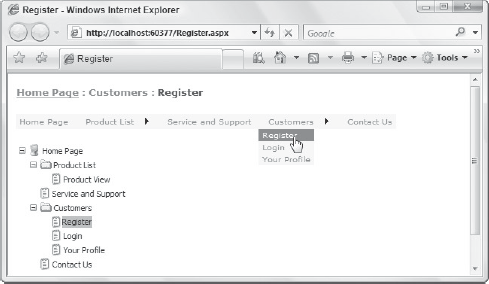
ASP.NET includes a simple way to add site-wide navigation to your web applications with the sitemap provider and associated controls. In order to implement sitemap functionality into your projects, you must manually create the site data, by default in a file called web.sitemap, and keep it up to date as you add or remove web pages from the site. Sitemap files can be used as a data source for a number of web controls, including SiteMapPath, which automatically keeps track of where you are in the site hierarchy, as well as the Menu and TreeView controls, which can present a custom subset of the sitemap information.
Once you have your site hierarchy defined in a web.sitemap file, the easiest way to use it is to drag and drop a SiteMapPath control onto your web page design surface (see Figure 32-25). This control automatically binds to the default sitemap provider, as specified in the Web.config file, to generate the nodes for display.
Figure 32.25. Figure 32-25

While the SiteMapPath control displays only the breadcrumb trail leading directly to the currently viewed page, at times you will want to display a list of pages in your site. The ASP.NET Menu control can be used to do this, and has modes for both horizontal and vertical viewing of the information. Likewise, the TreeView control can be bound to a sitemap and used to render a hierarchical menu of pages in a web site. Figure 32-26 shows a web page with a SiteMapPath, Menu, and TreeView that have each been formatted with one of the built-in styles.
Figure 32.26. Figure 32-26
32.4.2. User Authentication
Perhaps the most significant additions to the web components in ASP.NET version 2.0 were the new user authentication and login components. Using these components, you can quickly and easily create the user-based parts of your web application without having to worry about how to format them or what controls are necessary.
Every web application has a default data source added to its ASP.NET configuration when it is first created. The data source is a SQL Server Express database with a default name pointing to a local file system location. This data source is used as the default location for your user authentication processing, storing information about users and their current settings.
The benefit of having this automated data store generated for each web site is that Visual Studio can have an array of user-bound web components that can automatically save user information without your needing to write any code.
Before you can sign in as a user on a particular site, you first need to create a user account. Initially, you can do that in the administration and configuration of ASP.NET, which is discussed later in this chapter, but you may also want to allow visitors to the site to create their own user accounts. The CreateUserWizard component does just that. It consists of two wizard pages with information about creating an account, and indicates when account creation is successful.
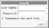
Once users have created their accounts they need to be able to log into the site, and the Login control fills this need. Adding the Login component to your page creates a small form containing User Name and Password fields, along with the option to remember the login credentials, and a "Log In" button (see Figure 32-27).
Figure 32.27. Figure 32-27
The trick to getting this to work straightaway is to edit your Web.config file and change the authentication to Forms. The default authentication type is Windows, and without the change the web site authenticates you as a Windows user because that's how you are currently logged in. Obviously, some web applications require Windows authentication, but for a simple web site that you plan to deploy on the Internet, this is the only change you need to make in order for the Login control to work properly.
You can also use several controls that will detect whether the user has logged on, and display different information to an authenticated user as opposed to an anonymous user. The LoginStatus control is a simple bi-state component that displays one set of content when the site detects that a user is currently logged in, and a different set of content when there is no logged-in user. The LoginName component is also simple, as it just returns the name of the logged-in user.
There are also controls that allow end users to manage their own passwords. The ChangePassword component works in conjunction with the other automatic user-based components to enable users to change their passwords. However, sometimes users forget their passwords, which is where the PasswordRecovery control comes into play. This component, shown in Figure 32-28, has three views: UserName, Question, and Success. The idea is that users first enter their usernames so the application can determine and display the security question, and then wait for an answer. If the answer is correct, then the component moves to the Success page and sends an e-mail to the registered e-mail address.
Figure 32.28. Figure 32-28

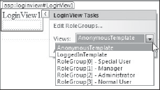
The last component in the Login group on the Toolbox is the LoginView object. LoginView enables you to create whole sections on your web page that are visible only under certain conditions related to who is (or isn't) logged in. By default, you have two views: the AnonymousTemplate, which is used when no user is logged in, and the LoggedInTemplate, used when any user is logged in. Both templates have an editable area that is initially completely empty.
However, because you can define specialized roles and assign users to these roles, you can also create templates for each role you have defined in your site (see Figure 32-29). The Edit RoleGroups command on the smart-tag Tasks list associated with LoginView displays the typical collection editor and enables you to build role groups that can contain one or multiple roles. When the site detects that the user logs in with a certain role, the display area of the LoginView component will be populated with that particular template's content.
Figure 32.29. Figure 32-29
See the "ASP.NET Web Site Administration" section later in this chapter for information on how to create and manage roles.
What's amazing about all of these controls is that with only a couple of manual property changes and a few extra entries in the Web.config file, you can build a complete user-authentication system into your web application. In fact, as you'll see in the "ASP.NET Web Site Administration" section later in this chapter, you can edit all these settings without needing to edit the Web.config file directly. Now that's efficient coding!
32.4.3. Data Components
Data controls were introduced to Microsoft web developers with the first version of Visual Studio .NET and have evolved to be even more powerful with each subsequent release of Visual Studio. Each data control has a smart-tag Tasks list associated with it that enables you to edit the individual templates for each part of the displayable area. For example, the DataList has seven templates in all, which can be individually customized (see Figure 32-30).
Figure 32.30. Figure 32-30

Visual Studio 2008 ships with three new data-related controls. These are LinqDataSource, ListView, and DataPager.
32.4.3.1. LinqDataSource
The data source control architecture in ASP.NET provides a really simple way for UI controls to bind to data. The data source controls that were released with ASP.NET 2.0 include SqlDataSource and AccessDataSource for binding to SQL Server or Access databases, ObjectDataSource for binding to a generic class, XmlDataSource for binding to XML files, and SiteMapDataSource for the site navigation tree for the web application.
Visual Studio 2008 ships with a new LinqDataSource control that enables you to directly bind UI controls to data sources using Language-Integrated Query (LINQ). This provides you with a designer-driven approach that automatically generates most of the code necessary for interacting with the data.
Before you can use LinqDataSource, you must already have a DataContext class created. The data context wraps a database connection in order to provide object lifecycle services. (Chapter 25 explains how to create a new DataContext class in your application.)
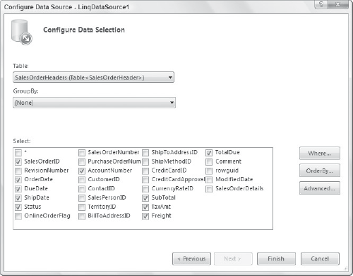
You can then create a LinqDataSource control instance by dragging it from the Toolbox onto the design surface. To configure the control, launch the Configure Data Source wizard under the smart tag for the control. Select the data context class, and then chose the data selection details you wish to use. Figure 32-31 shows the screen within the Configure Data Source wizard that enables you to choose the tables and columns to generate a LINQ to SQL query. It is then a simple matter to bind this data source to a UI server control, such as the ListView control, in order to provide read-only access to your data.
Figure 32.31. Figure 32-31
You can easily take advantage of more advanced data access functionality supported by LINQ, such as allowing inserts, updates, and deletes, by setting the EnableInsert, EnableUpdate, and EnableDelete properties on LinqDataSource to true. You can do this either programmatically in code or through the property grid.
More information on LINQ can be found in Chapters 23 through 25.
32.4.3.2. ListView and DataPager
A common complaint about the ASP.NET server controls is that developers have very little control over the HTML markups that they generate. This is especially true of the data access controls such as GridView, which always uses a HTML table to format the data it outputs, even though in some situations an ordered list would be more suitable.
The ListView control provides a good solution to the shortcomings of other data controls in this area. Instead of surrounding the rendered markup with superfluous <table> or <span> elements, it enables you to specify the exact HTML output that is rendered. The HTML markup is defined in the 11 templates that ListView supports:
AlternatingItemTemplate
ItemTemplate
The two most useful templates are LayoutTemplate and ItemTemplate. LayoutTemplate specifies the HTML markup that surrounds the output, while ItemTemplate specifies the HTML used to format each record that is bound to the ListView.
When you add a ListView control to the design surface, you can bind it to a data source and then open the Configure ListView dialog box shown in Figure 32-32, via smart-tag actions. This provides a code-generation tool that will automatically produce HTML code based on a small number of predefined layouts and styles.
Figure 32.32. Figure 32-32

Because you have total control over the HTML markup, the Configure ListView dialog box does not even attempt to parse any existing markup. Instead, if you reopen the window it will simply show the default layout settings.
In addition to supporting edit, insert, and delete operations, the ListView control supports sorting and paging. The paging functionality in ListView is provided by the new DataPager control.
The DataPager control is used to split the data that is displayed by a UI control into multiple pages — necessary when you're working with very large data sets. It natively supports paging via either a NumericPagerField object, which lets users select a page number, or a NextPreviousPagerField object, which lets users navigate to the next or previous page. As with the ListView control, you can also write your own custom HTML markup for paging by using the TemplatePagerField object.
32.4.4. Web Parts
Another excellent feature in ASP.NET is the ability to create Web Parts controls and pages. These allow certain pages on your site to be divided into chunks that either you or your users can move around, and show and hide, to create a unique viewing experience. Web Parts for ASP.NET are loosely based on custom web controls but owe their inclusion in ASP.NET to the huge popularity of Web Parts in SharePoint Portals.
With a Web Parts page, you first create a WebPartManager component that sits on the page to look after any areas of the page design that are defined as parts. You then use WebPartZone containers to set where you want customizable content on the page, and then finally place the actual content into the WebPartZone container.
While these two components are the core of Web Parts, you need only look at the WebParts group in the Toolbox to discover a whole array of additional components (see Figure 32-33). You use these additional components to enable your users to customize their experience of your web site.
Figure 32.33. Figure 32-33

Unfortunately, there is not enough space in this book to cover the ASP.NET web controls in any further detail. If you want to learn more, we recommend you check out the massive Professional ASP.NET 3.5: In C# and VB by Bill Evjen, Scott Hanselman, and Devin Rader.