
8.3. Adding and Positioning Controls
You can add two types of controls to your Windows Forms: graphical components that actually reside on the form itself, and components that do not have a specific visual interface displaying on the form.
You add graphical controls to your form in one of two ways. The first is to locate the control you want to add in the Toolbox and double-click its entry. Visual Studio 2008 will place it in a default location on the form — the first control will be placed against the top and left borders of the form, with subsequent controls tiled down and to the right.
The second method is to click the entry on the list and drag it onto the form. As you drag over available space on the form, the mouse cursor will change to show you where the control will be positioned. This enables you to directly position the control where you want it, rather than first add it to the form and then move it to the desired location. Either way, once the control is on the form, you can move it as many times as you like, so it doesn't really matter how you get the control onto the form's design surface.
There is actually one other method to add controls to a form — copy and paste a control or set of controls from another form. If you paste multiple controls at once, the relative positioning and layout of the controls to each other will be preserved. Any property settings will also be preserved, although the control names may be changed.
When you design your form layouts in SnapLines mode (see previous section), a variety of guidelines will be displayed as you move controls around in the form layout. These guidelines are recommended "best practice" positioning and sizing markers, so you can easily position controls in relation to each other and the edge of the form.
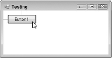
Figure 8-4 shows a Button control being moved toward the top left corner of the form. As it gets near the recommended position, the control will snap to the exact recommended distance from the top and left borders, and small blue guidelines will be displayed.
Figure 8.4. Figure 8-4
These guidelines work for both positioning and sizing a control, enabling you to snap to any of the four borders of the form — but they're just the tip of the SnapLines iceberg. When additional components are present on the form, many more guidelines will begin to appear as you move a control around.
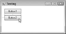
In Figure 8-5, you can see a second Button control being moved. The guideline on the left is the same as for the first button, indicating the ideal distance from the left border of the form. However, now three additional guidelines are displayed. A blue vertical line appears on either side of the control, confirming that the control is aligned with both the left and right sides of the other Button control already on the form (this is expected because the buttons are the same width). The other vertical line indicates the ideal gap between two buttons.
Figure 8.5. Figure 8-5
8.3.1. Vertically Aligning Text Controls
One problem with alignment of controls that, until recently, had persisted since the very early versions of Visual Basic was the vertical alignment of text within a control, such as a TextBox compared to a Label. The problem was that the text within each control was at a different vertical distance from the top border of the control, resulting in the text itself not aligning.
Many programmers went through the pain of calculating the appropriate number of pixels that one control or the other had to be shifted in order for the text portions to line up with each other (and more often than not it was a number of pixels that was smaller than the grid size, resulting in manual positioning via the Properties window or in code).
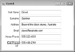
As shown in Figure 8-6, an additional guideline is now available for lining up controls that have text associated with them. In this example, the Cell Phone label is being lined up with the textbox containing the actual Cell Phone value. A line, colored magenta by default, appears and snaps the control in place. You can still align the label to the top or bottom border of the textbox by shifting it slightly and snapping it to its guideline, but this new guideline takes the often painful guesswork out of lining up text.
Note that the other guidelines show that the label is horizontally aligned with the Label controls above it, and that it is positioned the recommended distance from the textbox.
Figure 8.6. Figure 8-6
8.3.2. Automatic Positioning of Multiple Controls
Visual Studio 2008 gives you additional tools to automatically format the appearance of your controls once they are positioned approximately where you want them. The Format menu, shown in Figure 8-7, is normally accessible only when you're in the Design view of a form. From here you can have the IDE automatically align, resize, and position groups of controls, as well as set the order of the controls in the event that they overlap each other. These commands are also available via the design toolbar and keyboard shortcuts.
Figure 8.7. Figure 8-7
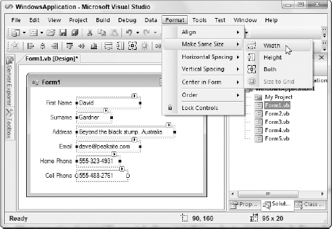
The form displayed in Figure 8-7 contains several TextBox controls, all with differing widths. This looks messy and we should clean it up by setting them all to the same width as the widest control. The Format menu enables you to automatically resize the controls to the same width, using the Make Same Size  Width command.
The commands in the Make Same Size menu use the first control selected as the template for the dimensions. You can first select the control to use as the template and then add to the selection by holding the Ctrl key down and clicking each of the other controls. Alternatively, once all controls are the same size, you can simply ensure they are still selected and resize the group at the same time with the mouse.
Automatic alignment of multiple controls can be performed in the same way. First, select the item whose border should be used as a base, and then select all the other elements that should be aligned with it. Next select Format  Align and choose which alignment should be performed. In this example the Label controls have all been positioned with their right edges aligned. We could have done this using the guidelines, but sometimes it's easier to use this mass alignment option.
Two other handy functions are the Horizontal Spacing and Vertical Spacing commands. These will automatically adjust the spacing between a set of controls according to the particular option you have selected.
8.3.3. Locking Control Design
Once you're happy with your form design you will want to start applying changes to the various controls and their properties. However, in the process of selecting controls on the form you may inadvertently move a control from its desired position, particularly if you're not using either of the snap layout methods or if you are trying to align many controls with each other.
Fortunately, Visual Studio 2008 provides a solution in the form of the Lock Controls command, available in the Format menu. When controls are locked you can select them to set their properties, but you cannot use the mouse to move or resize them, or the form itself. The location of the controls can still be changed via the Properties grid.
Figure 8-8 shows how small padlock icons are displayed on controls that are selected while the Lock Controls feature is active.
Figure 8.8. Figure 8-8

You can also lock controls individually by setting the Locked property of the control to True in the Properties window.
8.3.4. Setting Control Properties
You can set the properties on controls using the Properties window, just as you would a form's settings. In addition to simple text value properties, Visual Studio 2008 has a number of property editor types, which aid you in setting the values efficiently by restricting them to a particular subset appropriate to the type of property.
Many advanced properties have a set of subordinate properties that you can individually access by expanding the entry in the Properties window. Figure 8-9 (left) displays the Properties window for a label, with the Font property expanded to show the individual properties available.
Figure 8.9. Figure 8-9

Many properties also provide extended editors, as is the case for Font properties. In Figure 8-9 (right), an extended editor button in the Font property has been selected, causing the Choose Font dialog to appear.
Some of these extended editors invoke full-blown wizards, such as in the case of the Data Connection on some data-bound components, while others have custom-built inline property editors. An example of this is the Dock property, for which you can choose a visual representation of how you want the property docked to the containing component or form.
8.3.5. Service-Based Components
As mentioned earlier in this chapter, two kinds of components can be added to your Windows Forms — those with visual aspects and those without. Service-based components, such as timers and dialogs, and extender controls, such as tooltip and error-provider components, can all be used to enhance the application.
Rather than place these components on the form, when you double-click one in the Toolbox, or drag and drop it onto the design surface, Visual Studio 2008 will create a tray area below the Design view of the form and put the new instance of the component type there, as shown in Figure 8-10.
Figure 8.10. Figure 8-10

To edit the properties of one of these controls, locate its entry in the tray area and open the Properties window.
In the same way that you can create your own custom visual controls by inheriting from System.Windows.Forms.Control, you can create nonvisual service components by inheriting from System.ComponentModel.Component. In fact, System.ComponentModel.Component is the base class for System.Windows.Forms.Control.
8.3.6. Smart Tag Tasks
Smart tag technology was introduced in Microsoft Office. It provides inline shortcuts to a small selection of actions you can perform on a particular element. In Microsoft Word, this might be a word or phrase, while in Microsoft Excel it could be a spreadsheet cell. Visual Studio 2008 supports the concept of design-time smart tags for a number of the controls available to you as a developer.
Whenever a selected control has a smart tag available, a small right-pointing arrow will be displayed on the top right corner of the control itself. Clicking this smart tag indicator will open up a Tasks menu associated with that particular control.
Figure 8-11 shows the tasks for a newly added DataGridView control. The various actions that can be taken usually mirror properties available to you in the Properties window (such as the Multiline option for a TextBox control), but sometimes they provide quick access to more advanced settings for the component.
Figure 8.11. Figure 8-11
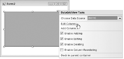
The Edit Columns and Add Column commands shown in Figure 8-11 are not listed in the DataGridView's Properties list, while the Choose Data Source and Enable settings directly correlate to individual properties (for example, Enable Adding is equivalent to the AllowUserToAddRows property).