
8.4. Container Controls
Several controls, known as container controls, are designed specifically to help you with your form's layout and appearance. Rather than have their own appearance, they hold other controls within their bounds. Once a container houses a set of controls, you no longer need to move the child controls individually, but can instead just move the container. Using a combination of Dock and Anchor values, you can have whole sections of your form's layout automatically redesign themselves at runtime in response to the resizing of the form and the container controls that hold them.
8.4.1. Panel and SplitContainer
The Panel control is used to group components that are associated with each other. When placed on a form, it can be sized and positioned anywhere within the form's design surface. Because it's a container control, clicking within its boundaries will select anything inside it. In order to move it, Visual Studio 2008 places a move icon at the top left corner of the control. Clicking and dragging this icon enables you to reposition the Panel.
The SplitContainer control (shown in Figure 8-12) automatically creates two Panel controls when added to a form (or another container control). It divides the space into two sections, each of which you can control individually. At runtime, users can resize the two spaces by dragging the splitter bar that divides them. SplitContainers can be either vertical (as in Figure 8-12) or horizontal, and they can be contained with other SplitContainer controls to form a complex layout that can then be easily customized by the end user without your needing to write any code.
Sometimes it's hard to select the actual container control when it contains other components, such as in the case of the SplitContainer housing the two Panel controls. To gain direct access to the SplitContainer control itself, you can either locate it in the drop-down list in the Properties window, or right-click one of the Panel controls and choose the Select command that corresponds to the SplitContainer. This context menu will contain a Select command for every container control in the hierarchy of containers, right up to the form itself.
Figure 8.12. Figure 8-12

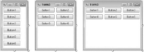
8.4.2. FlowLayoutPanel
The FlowLayoutPanel control enables you to create form designs with a behavior similar to that of web browsers. Rather than explicitly positioning each control within this particular container control, Visual Studio will simply set each component you add to the next available space. By default, the controls will flow from left to right, and then from top to bottom, but you can use the FlowDirection property to reverse this order in any configuration, depending on the requirements of your application.
Figure 8-13 displays the same form with six button controls housed within a FlowLayoutPanel container. The FlowLayoutPanel was set to fill the entire form's design surface, so that as the form is resized the container is also automatically resized. As the form gets wider and space becomes available, the controls begin to be realigned to flow left to right before descending down the form.
Figure 8.13. Figure 8-13
8.4.3. TableLayoutPanel
An alternative to the previously discussed container controls is the TableLayoutPanel container. It works much like a table in Microsoft Word or in a typical web browser, with each cell acting as an individual container for a single control.
Note that you cannot add multiple controls within a single cell directly. You can, however, place another container control such as a Panel within the cell, and then place the required components within that child container.
Placing a control directly into a cell will automatically position the control to the top left corner of the table cell. You can use the Dock property to override this behavior and position it as required. The Dock property is discussed further later in this chapter.
The TableLayoutPanel container enables you to easily create a structured, formal layout in your form with advanced features, such as the capability to automatically grow by adding more rows as additional child controls are added.
Figure 8-14 shows a form with a TableLayoutPanel added to the design surface. The smart tag tasks were then opened and the Edit Rows and Columns command executed. As a result, the Column and Row Styles dialog is displayed so you can adjust the individual formatting options for each column and row. The dialog displays several tips for designing table layouts in your forms, including spanning multiple rows and columns and how to align controls within a cell. You can change the way the cells are sized here, as well as add or remove additional columns and rows.
Figure 8.14. Figure 8-14
