
Chapter 8
jQuery UI Part I—Making Things Look Slick
WHAT’S IN THIS CHAPTER?
- Theming and Styling with jQuery
- Using ThemeRoller
- Using jQuery UI Widgets
jQuery UI is an associated user interface library for jQuery that contains widgets, effects, animations, and interactions. Widgets in this rich set are themeable, a process simplified by the ThemeRoller web app, and have an advanced look and feel to them. The framework also includes a very complete set of CSS classes useful for theming your application. While many of these features are replicated in other plugins, the unified codebase and API, overall quality, and flexibility of jQuery UI make it an indispensible asset when building complete web applications. This chapter covers jQuery UI theming, creating custom themes, widgets, and other ways to get effects that the jQuery core doesn’t provide.
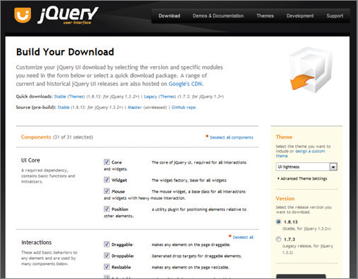
Getting started with jQuery UI is easy. You simply navigate over to jqueryui.com/download to obtain a copy. You can either download a preexisting theme or make your own. As Figure 8-1 shows, the download page also gives you the option of choosing which components to include in your download. It’s the rare project that makes full use of all the widgets and tools of jQuery UI, and in those cases, it’s better to download only the necessary components in order to reduce the download size footprint on your final product. But for exploring and experimenting, download the complete set of options.
If you want to edit your theme, inside of the file css/selected-theme-name/jquery-ui-xxx.css, there is a series of commented outlines (in my file, it’s around line 50) with an HTTP address. Use this address to re-create your altered theme in ThemeRoller, and continue modifying to your heart’s content.
The following folders are included in the jQuery UI download:
- index.html: A “gallery” of the widgets included with jQuery UI as well as the CSS classes
- js: A folder containing a copy of the latest, full version of jQuery UI, alongside a local copy of the core jQuery library
- css: A folder containing a default jQuery UI theme
- development-bundle: A folder containing full, unminified versions of all the jQuery UI files
jQuery UI contains a comprehensive CSS framework, which gives all of the widgets a consistent look and feel.
The CSS framework files are located in two places: the css folder at the top level and the development-bundle/themes folder. The .css file found at the top level contains all of the definitions in a single place, which reduces the amount of HTTP requests required to obtain CSS definitions. The files found under the development-bundle directory contain both the base theme and the selected custom theme.
jQuery UI is themeable (that’s the word the jQuery maintainers use) and customizable. You have a few different approaches for modifying themes:
- Make a theme from scratch
- Use a premade theme without making any changes
- Alter a theme manually
- Use ThemeRoller to modify a premade theme
Making a theme from scratch is anything but practical given the sheer number of CSS classes you’d have to create. Using the default themes is a great option, but the out-of-the-box defaults probably don’t match the colors of your application, so your best bet is to modify an existing theme. If you feel inclined, you can modify the CSS classes manually, but using ThemeRoller is much less of a hassle.
You can find ThemeRoller at http://jqueryui.com/themeroller. This page shows a preview of each of the widgets and the icon set before you download it. On the left side of the page is a panel displaying options for “Roll your own” themes, a gallery of premade themes, and a Help tab. Choose a theme that closely resembles what you’d like as a final product, and modify the options to suit your needs. When you’re finished, click the Download Theme button. It’s that simple.
In any event, your jQuery UI will always require the following boilerplate code, provided here for your convenience:
<!DOCTYPE html>
<html>
  <head>
    <link rel=”stylesheet”
          href=”development-bundle/themes/base/ui.theme.css”>
    <meta http-equiv=”Content-Type” content=”text/html; charset=utf-8”>
  </head>
  <body>
  </body>
</html>
Code snippet is from ui.css.txt
Generally, the JavaScript for creating any of the widgets is very simple and straightforward:
$(selector).widgetType();
Each widget type may require a specific markup structure; for example, the tab widget requires a list with anchors in order to render: Table 8-1 illustrates the code needed initialize each of the jQuery UI widgets.
Table 8.1: Code to Intialize jQuery UI Widgets
| WIDGET | METHOD CALL |
| button | $('#myButton').button(); |
| button set | $('input[type=radio]').buttonset(); |
| tabs | $('#tabs').tabs(); |
| accordion | $('#myAccordian').accordion(); |
| autocomplete | $('#myText').autocomplete(); |
| datepicker | $('#date').datepicker(); |
| dialog | $('#myDialog').dialog(); |
| progressbar slider | $('#itemLoader').progressbar(); $('#numberSlider').slider(); |
The widget sets also accept an object for configuring the many available options for fine controlling of the widgets.
Button
Browsers use the default OS native button for inputs. While this is certainly a functional choice, you’ll often want to create custom styles to match your site’s overall design. Figure 8-2 illustrates how the jQuery UI button class enhances the native version.

The $.button() style is applied to individual buttons whereas $.buttonset() is applied to button groups like radio inputs and checkboxes. Table 8-2 lists the available methods for both types of button widgets.
Table 8.2: Available $.button() and $.buttonset() Methods
| METHOD | DESCRIPTION |
| $(selector).button(); $(selector).buttonset(); |
Creates a default button widget |
| $(selector).button('disable'), $(selector).buttonset('disable'), |
Disables a previously created button widget. |
| $(selector).button('enable'), $(selector).buttonset('enable'), |
Enables a previously enabled button widget. |
| $(selector).button('destroy'), $(selector).buttonset('destroy'), |
Removes the button widget completely. This option rolls the selected element back to its initial state. |
| $(selector).button('option', optionName, value); $(selector).buttonset('option', optionName, value); |
Gets or sets any button option. If the third argument is omitted, acts as a getter. Otherwise, it sets the optionName with the provided value. |
| $(selector).button('widget'), $(selector).buttonset('widget'), |
Returns the .ui-button element. |
| $(selector).button('refresh'), $(selector).buttonset('refresh'), |
Refreshes the visual state of the button widget. |
Table 8-3 shows the options available for the button and buttonset.
Table 8.3: $.button() and $.buttonset() Options
| OPTION | ACCEPTS | DESCRIPTION |
| Disabled | Boolean | Disables the button widget. |
| Text | Boolean | Option dictating if text should be displayed or not. |
| Icons | Options | Icons displayed with button widget. Contains a primary and secondary icon. |
| Label | String | Button text. |
As you can tell from the options list, you can also include icons with the buttons. A button may contain both a primary icon (displayed on the left side) and a secondary icon (displayed on the right side). A valid icon name must be given. For example:
$(selector).button({
  text : true,
  icons : {
  primary : 'ui-icon-alert',
    secondary : 'ui-icon-lightbulb'
  }
});
Code snippet is from ui-button-icon.txt
Tabs
Tabs are a great way to pack a dense amount of information on a single page, and help to organize the content. To create a tab widget, you need a list, either ordered or unordered, with an anchor element in each list item. In addition, each list item must contain a reference to the associated tab content. A simple tab setup would look something like the following code sample. The href attribute of the anchors within our tab list reference their associated tab content element ids.
<div id=”tabs”>
  <ul>
    <li><a href=”#tab1”>Tab #1</a></li>
    <li><a href=”#tab2”>Tab #2</a></li>
  </ul>
  <div id=”tab1”>Tab Number 1</div>
  <div id=”tab2”>Tab Number 2</div>
</div>
Code snippet is from sample-tab-markup.txt
Table 8-4 lists the available $.tab() methods.
Table 8.4: Available $.tabs() Methods
| METHOD | DESCRIPTION |
| $(selector).tabs(); | Initializes the tab widget on the selected element. |
| $(selector).tabs(“destroy”); | Removes the tabs completely. This option rolls the selected element back to its initial state. |
| $(selector).tabs(“disable”); | Disables the tab widget. |
| $(selector).tabs(“enable”); | Enables the tab widget. |
| $(selector).tabs( “option” , optionName , [value] ); | Gets or sets any tabs option. If the third argument is omitted, acts as a getter. Otherwise, it sets the optionName with the provided value. |
| $(selector).tabs(“widget”); | Returns the .ui-tabs element. |
| $(selector).tabs( “add” , url , label , [index]); | Adds a new tab widget. The second url argument is either a fragment identifier for an in-page tab or a full URL for a remote (Ajax) tab. The label argument represents the text label for the new tab. The optional index argument is the zero-based position where to insert the new tab. |
| $(selector).tabs(“remove” , index); | Removes a tab widget. The second index argument indicates the tab to be removed. |
| $(selector).tabs(“enable” , index); | Enables a disabled tab widget. The second index argument indicates the tab to be enabled. |
| $(selector).tabs( “disable” , index ); | Disables a tab widget. As a note, the currently selected tab cannot be disabled. The second index argument indicates the tab to be disabled. |
| $(selector).tabs(“select”, index); | Selects a tab widget, as if it were clicked. The second index argument indicates the tab to be selected or the id selector of the associated panel. |
| $(selector).tabs(“load”, index); | Reloads the content of an Ajax tab. The second index argument indicates the tab to be reloaded. |
| $(selector).tabs(“url”, index, url); | Changes the url from which an Ajax tab will be loaded. The second index argument indicates the tab to be removed. The third argument is the url to load the new content from. |
| $(selector).tabs(“length”); | Retrieves the number of tabs of the first matched tab widget. |
| $(selector).tabs(“abort”); | Terminates all running ajax requests and animations. |
| $(selector).tabs( “rotate” , ms , [continuing] ); | Sets up an automatic rotation of tabs. The second ms argument indicates the time between rotations. The third argument, continuing, controls whether or not the rotation continues after a tab has been selected by a user. |
The following example demonstrates a tab set with the tabs displayed at the bottom that are also reorderable. The example initializes the tabs, uses $.find() to search for elements with the class ui-tabs-nav, and then applies the $.sortable() method to them.
$.sortable() is a jQuery UI Interaction method that allows elements to be sortable by dragging them with the mouse. You’ll learn about $.sortable() in Chapter 9.
The second line adjusts the CSS classes to allow the tabs to be positioned at the bottom of the content panel.
<!DOCTYPE html>
<html>
<head>
  <link href=”css/ui-lightness/jquery-ui-1.8.13.custom.css”
        rel=”stylesheet” />
  <script src=“http://code.jquery.com/jquery-1.7.1.js”></script>
  <script src=”js/jquery-ui-1.8.13.custom.min.js”></script>
  <script>
    $(function() {
      $(“#tabs”)
        .tabs()
        .find( “.ui-tabs-nav” )
        .sortable({ axis: “x” });
      $( “.tabs-bottom .ui-tabs-nav, .tabs-bottom .ui-tabs-nav > ∗” )
        .removeClass( “ui-corner-all ui-corner-top” )
        .addClass( “ui-corner-bottom” );
    });

  </script>
  <style type=”text/css”>
    #tabs {
      height: 200px;
    }
    .tabs-bottom {
      position: relative;
    }
    .tabs-bottom .ui-tabs-panel {
      height: 140px;
      overflow: auto;
    }
    .tabs-bottom .ui-tabs-nav {
       position: absolute !important;
       left: 0;
       bottom: 0;
       right:0;
       padding: 0 0.2em 0.2em 0;
    }
    .tabs-bottom .ui-tabs-nav li {
      margin-top: -2px !important;
      margin-bottom: 1px !important;
      border-top: none;
      border-bottom-width: 1px;
    }
    .ui-tabs-selected {
       margin-top: -3px !important;
    }
</style>

</head>
<body>
  <div id=”tabs” class=”tabs-bottom”>
    <ul>
      <li><a href=”#t1”>Tech Notes</a></li>
      <li><a href=”#t2”>Startup Ideas</a></li>
      <li><a href=”#t3”>JS Notes</a></li>
    </ul>
    <div id=”t1”>
      <p>Lorum Bacon</p>
    </div>
    <div id=”t2”>
      <p>Lorum Bacon</p>
    </div>
    <div id=”t3”>
      <p>Blah blah</p>
    </div>
  </div>

  </body>
</html>
Code snippet is from sortabletabs.txt
Table 8-5 lists some of the options available when working with $.tabs(). For the full list of options, see the documentation at http://jqueryui.com/demos/tabs/
Table 8.5: Tab Options
| OPTION | ACCEPTS | DESCRIPTION |
| disabled | Boolean | An array containing the position of the tabs that should be disabled when the widget is initialized. |
| event | String | The event used for selecting a tab. This commonly allows tabs to change on mouseover instead of a standard click. |
| fx | Options, Array | fx allows you to set animations for showing and hiding tab content. |
| panelTemplate | String | If you’re using Ajax tabs, then you can use panelTemplate to create default HTML from which the new tab panels will be generated. |
| selected | Number | This zero-based integer sets the position of the initially selected tab. |
| spinner | String | An HTML string used to display a “spinner” or some other indication that the tab panel is loading. Requires a span in the a tag of the title. |
| tabTemplate | String | The HTML template from which new tabs are generated. |
Accordion
Accordion widgets, similarly to tabs, are a great way to display and categorize a large amount of information. This widget is an expandable/collapsible box. It’s not meant to have all of its content expanded at the same time, but rather to display one “slice” of content at a time.
Table 8-6 illustrates the various accordion methods.
Table 8.6: Available $.accordion Methods
| METHOD | DESCRIPTION |
| $(selector).accordion(); | Initializes an accordion widget. |
| $(selector).accordion( “destroy” ); | Removes the accordion widget completely. This option rolls the selected element back to its initial state. |
| $(selector).accordion( “disable” ); | Disables the accordion widget. |
| $(selector).accordion( “enable” ); | Enables the accordion widget. |
| $(selector).accordion( “option” , optionName , [value] ); | Get or set any accordion option. If the third argument is omitted, acts as a getter. Otherwise, it sets the optionName with the provided value. |
| $(selector).accordion( “widget” ); | Returns the .ui-accordion element. |
| $(selector).accordion( “activate” , index ); | Activates a content part of the accordion widget. The index indicates the zero-indexed number matching the position of the header to close or a selector matching an element. |
| $(selector).accordion( “resize” ); | Recomputes the heights of the accordion widget contents. |
The required markup for an accordion is a div with nested headers, where each header contains a link. The content is placed in a nested div following the header, as the following example illustrates:
<!DOCTYPE html>
<html>
<head>
<link href=”css/ui-lightness/jquery-ui-1.8.13.custom.css” rel=”stylesheet” />
<script src=“http://code.jquery.com/jquery-1.7.1.js”></script>
<script src=”js/jquery-ui-1.8.13.custom.min.js”></script>
<script
$(function() {
  $( “#accordion” ).accordion();
});

</script>

</head>
<body>
  <div id=”accordion”>
    <h3><a href=”#”>First header</a></h3>
    <div>First content</div>
    <h3><a href=”#”>Second header</a></h3>
    <div>Second content</div>
   </div>
</body>
</html>
Code snippet is from accordion.txt
Table 8-7 lists some of the available options when initializing an accordion widget. For the full list of options, consult the documentation available at http://jqueryui.com/demos/accordion/.
Table 8.7: Accordion Options
| OPTION | ACCEPTS | DESCRIPTION |
| disabled | Boolean | Enables (false) or disables (true) the accordion widget. |
| animated | Boolean, String | Sets the preferred animation. A Boolean argument enables or disables animations altogether. |
| event | String | The type of event used to fire the accordion. This commonly allows tabs to change on mouseover instead of a standard click. |
Autocomplete
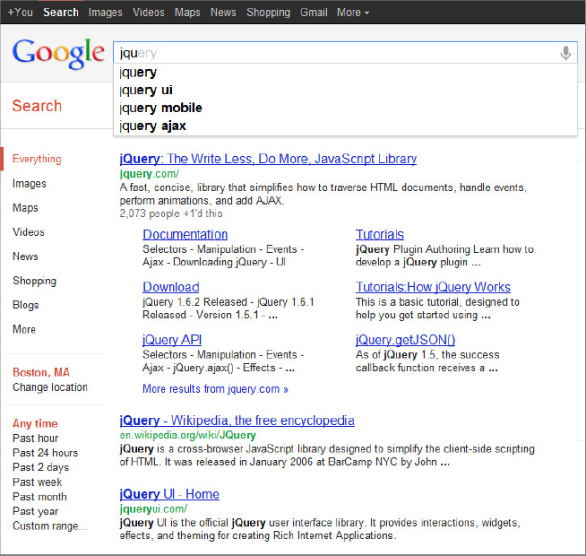
Given the large amount of data on the web, the quicker you can get to your results, the better. The autocomplete feature shows a pre-populated list of selectable options as the user types in characters. If you’ve ever used a search engine, you’ve experience autocomplete. Figure 8-3 shows a familiar implementation of autocomplete functionality in action on Google.com.
The following code sample shows a simple implementation of the autocomplete widget. It leverages the source option to reference a local datasource, in this case an array. Other than that, it’s nothing more than a simple call to $.autocomplete and this powerful feature is immediately available. There’s probably no better illustration of the power of jQuery UI. One line of code and you’ve significantly enhanced the usability of your site or application.
<!DOCTYPE html>
<html>
<head>
  <script src='http://code.jquery.com/jquery-1.7.1.js'></script>
  <link href=”css/ui-lightness/jquery-ui-1.8.13.custom.css” rel=”stylesheet” />
  <script src=”js/jquery-ui-1.8.13.custom.min.js”></script>
  <script >
  $(window).load(function(){
    $(function() {
      var stageWinners = [
        “Eddy Merckx”,”Bernard Hinault”,
        “André Leducq”,”Lance Armstrong”,
        “André Darrigade”,”Mark Cavendish”,
        “Nicolas Frantz”,”François Faber”,
        “Jean Alavoine”,”Jacques Anquetil”,
        “René Le Greves”,”Charles Pelissier”,
        “Freddy Maertens”,”Philippe Thys”,
        “Louis Trousselier”,”Gino Bartali”,
        “Mario Cipollini”,”Miguel Indurain”,
        “Robbie McEwen”,”Erik Zabel”,
        “Jean Aerts”,”Louison Bobet”,
        “Raffaele Di Paco”,”Maurice Archambaud”,
        “Charly Gaul”,”Walter Godefroot”,
        “Gerrie Knetemann”,”Antonin Magne”,
        “Henri Pelissier”,”Jan Raas”,
        “Joop Zoetemelk”,”Thor Hushovd”
      ];
      $( “#tdf” ).autocomplete({
        source: stageWinners
      });
    });
  </script>
</head>
<body>
  <div>
    <label for=”tags”>Tags: </label>
    <input id=”tdf”>
  </div>
</body>
</html>
Code snippet is from autocomplete.txt
Table 8-8 lists the full selection of $.autocomplete() methods.
Table 8.8: Available $.autocomplete Methods
| METHOD | DESCRIPTION |
| $(selector).autocomplete() | Initializes an autocomplete widget. |
| $(selector).autocomplete( “destroy” ) | Removes the autocomplete widget completely. This option rolls the selected element back to its initial state. |
| $(selector).autocomplete( “disable” ) | Disables the autocomplete widget. |
| $(selector).autocomplete( “enable” ) | Enables the autocomplete widget. |
| $(selector).autocomplete( “option” , optionName , [value] ) | Gets or sets any autocomplete option. If the third argument is omitted, acts as a getter. Otherwise, it sets the optionName with the provided value. |
| $(selector).autocomplete( “widget” ) | Returns the .ui-autocomplete element. |
| $(selector).autocomplete( “search” , [value] ) | Triggers a search event. If data is available, this will display the autocomplete suggestions. |
| $(selector).autocomplete( “close” ) | Closes the autocomplete widget menu. |
Table 8-9 lists the available autocomplete options.
Table 8.9: Autocomplete Options
| OPTION | ACCEPTS | DESCRIPTION |
| disabled | Boolean | Enables (false) or disables (true) the accordion widget. |
| appendTo | Selector | The element to append the menu to. |
| autofocus | Boolean | Indicates whether or not the first item should be automatically focused. |
| delay | Integer | The delay, in milliseconds, after a keystroke before the autcomplete opens. |
| minLength | Integer | The minimum number of characters a user has to type before the autocomplete fires. |
| position | Object | Indicates the position of the widget in relation to the associated input element. |
| source | String, Array, callback function | Indicates the preferred data source. This can be an array containing local data, a string specifying a URL, or a callback function |
Datepicker
The datepicker is one of the more versatile jQuery UI widgets. Chances are, if you’ve made a reservation online for a flight or hotel, you’ve used a JavaScript datepicker.
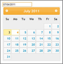
The “out of the box” version of the datepicker is incredibly useful, but there’s a mind-numbing amount of additional features and options that extends its capabilities. Besides the various ways of presenting the datepicker, it also includes a set of utility functions and keyboard shortcuts for navigation. You could call the default datepicker like so:
$(selector).datepicker();
and get a really nice widget like the one shown in Figure 8-4.
It looks cool, but you have so much more control over the datepicker outside of the default functionality. Table 8-10 gives the full list of $.datepicker methods.
Table 8.10: Available $.datepicker() Methods
| METHOD | DESCRIPTION |
| $(selector).datepicker(); | Initializes the datepicker widget. |
| $(selector).datepicker( “destroy” ); | Removes the datepicker widget completely. This option rolls the selected element back to its initial state. |
| $(selector).datepicker( “disable” ); | Disables the datepicker widget. |
| $(selector).datepicker( “enable” ); | Enables the datepicker widget. |
| $(selector).datepicker( “option” , optionName , [value] ); | Gets or sets any datepicker widget option. If the third argument is omitted, acts as a getter. Otherwise, it sets the optionName with the provided value. |
| $(selector).datepicker( “widget” ); | Returns the .ui-datepicker element. |
| $(selector).datepicker( “dialog” , date , [onSelect] , [settings] , [pos] ); | Opens a datepicker in a “dialog” box. This method accepts several arguments of its own. dateText: the initial date for the datepicker. onSelect: A callback function when a date is selected. settings: Settings for the datepicker. pos: The position of the top/left of the dialog as [x, y]. |
| $(selector).datepicker( “isDisabled” ); | Determines whether or not a datepicker widget has been disabled. |
| $(selector).datepicker( “hide” ); | Hides a datepicker widget. |
| $(selector).datepicker( “show” ); | Shows a hidden datepicker widget. |
| $(selector).datepicker( “refresh” ); | Refreshes the datepicker widget. |
| $(selector).datepicker( “getDate” ); | Returns the current selected date for the datepicker. Returns null if no date is selected. |
| $(selector).datepicker( “setDate” , date ); | Sets the current date for the datepicker. |
Table 8-11 lists all the available options for the datepicker widget.
Table 8.11: Datepicker Options
| OPTION | ACCEPTS | DESCRIPTION |
| disabled | Boolean | Enables/disables datepicker functionality. |
| altField | Selector, jQuery, element | An alternative field that will be updated in addition to the main field. Use a selector or jQuery wrapper object to specify the alternative field. Use in conjunction with the altFormat option. |
| altFormat | String | The date format used for the alternative field (altField) specified. Does not need to match the format of the principal text input field. For the full list of options for formatting dates, see the documentation for the $.datepicker.formatDate() method http://docs.jquery.com/UI/Datepicker/formatDate. |
| appendText | String | Text appended to the end of the date field, used to let the user know the date format. |
| autoSize | Boolean | Option specifying whether or not the date field should be resizable to fit the length of the date text of the current format. |
| buttonImage | String | A URL string for the pop-up button image. |
| buttonImageOnly | Boolean | When true, an image to trigger the calendar is placed after the input field. When false, the image is combined with a button element. |
| buttonText | String | The text shown on the trigger button. |
| calculateWeek | Function | A custom function for calculating the week for a particular date. |
| changeMonth | Boolean | Add a drop-down for selecting the month. |
| changeYear | String | Add a drop-down for selecting the year. |
| closeText | String | Text to be displayed on the close button on the display panel. The display panel must be set to true. |
| constrainInput | Boolean | Allow constraining of input to character set specified in dateFormat. |
| currentText | String | Text to display for “current day” button on the button panel. |
| dateFormat | String | The format of both the parsed and displayed date formats. |
| dayNames | Array | An array of the long name days. |
| dayNamesMin | Array | An array list of the minimized day names. |
| dayNamesShort | Array | An array of shortened day names. |
| defaultDate | Date, Number, String | Sets the default date to highlight when the datepicker is opened. Valid input options include a date object, an input string matching the dateFormat, number of days from the current day, a string of values, or null. |
| Duration | String, Number | Value indicating the speed at which the datepicker appears or disappears. |
| firstDay | Number | Option specifying the first day of the week, starting with Sunday at 0. |
| gotoCurrent | Boolean | When true, the current day button links to the currently selected day rather than today. |
| hideIfNoPrevNext | Boolean | Hides the next/previous buttons instead of disabling in circumstances where the next/previous buttons are not applicable. |
| isRTL | Boolean | True when the current language is read from right to left. This is a renationalization option. |
| maxDate | Date, Number, String | The maximum selectable date. |
| minDate | Date, Number, String | The minimum selectable date. |
| monthNames | Array | An array of the full month names, used by dateFormat. |
| monthNamesShort | Array | An array of shortened month names used on the header of the datepicker. When true, the $.datepicker.formatDate() function is applied to the prevText, nextText, and currentText values before being displayed. |
| navigationAsDate Format | Boolean | |
| nextText | String | The text for the next month link. |
| numberOfMonths | Number, Array | Option denoting the number of months to display; default is one. Accepts either an integer or an array for specifying number of rows by columns. |
| prevText | String | The text for the previous month link. |
| selectOtherMonths | Boolean | When true, allows the selection of dates in months other than the current month. Sets the cutoff year for determining the century for a date. |
| shortYearCutoff | String, Number | |
| showAnim | String | An option for setting the show/hide animation. |
| showButtonPanel | Boolean | Shows/hides the button panel. |
| showCurrentAtPos | Number | When more than one month is displayed, specifies in which month to select. Zero-based, starting at top left. |
| showMonthAfterYear | Boolean | Whether or not to show the year after the month in the datepicker header. |
| showOn | String | Valid options are focus, button, or both. Determines what action will trigger the appearance of the datepicker by focusing on the text input, clicking the mouse button, or both. |
| showOptions | Options | Additional options for showAnim if using jQuery UI effects for displaying the datepicker. |
| showOtherMonths | Boolean | Shows dates from the previous or next month, but not selectable. To make these days selectable, set selectOtherMonths to true. |
| showWeek | Boolean | Displays the week number. |
| stepMonths | Number | Number of months to skip over (step through) after clicking the previous/next links. |
| weekHeader | String | Used in conjunction with showWeek, the string shown for the week header. The default is Wk. |
| yearRange | String | The permissible range of years to display. |
| yearSuffix | String | Text displayed after the year. For example, BC or AD. |
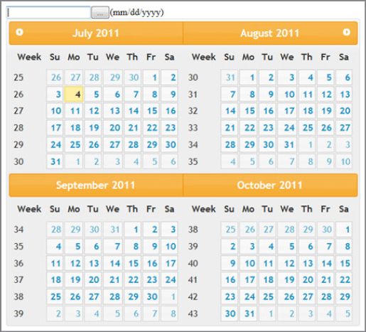
The following example shows how to create a 2 × 2 datepicker, with a button panel:
<!DOCTYPE html>
<html>
  <head>
    <meta http-equiv=”Content-Type” content=”text/html; charset=iso-8859-1” />
    <link href=”css/ui-lightness/jquery-ui-1.8.13.custom.css”
          rel=”stylesheet” />
    <script src=“http://code.jquery.com/jquery-1.7.1.js”></script>
    <script src=”js/jquery-ui-1.8.13.custom.min.js”>
    </script>
    <script>
      $(function(){
          $('input#mainField').datepicker({
             appendText : '(mm/dd/yyyy)',dateFormat : 'dd/mm/yy',
             closeText : 'X',
             showOn : 'button'
             currentText : 'Now',
             numberOfMonths : [2,2],
             selectOtherMonths : true,
             showOtherMonths : true,
             showWeek : true,
             weekHeader : 'Week'

          });
      });
    </script>
  </head>
  <body>
    <input type=”text” id=”mainField”>
  </body>
</html>
Code snippet is from datepicker.txt
You should see something similar to Figure 8-5.
Dialog
The jQuery UI dialog looks infinitely better than the default JavaScript alert box.
A nice replacement for the native JavaScript alert box might go something like this:
<!DOCTYPE html>
<html>
<head>
  <link href=”css/ui-lightness/jquery-ui-1.8.13.custom.css”
      rel=”stylesheet” />
  <script src=“http://code.jquery.com/jquery-1.7.1.js”></script>
  <script src=”js/jquery-ui-1.8.13.custom.min.js”>
  </script>
  <script>
    $(function() {
        $( “#dialog” ).dialog({
            modal: true,
            buttons: {
                Ok: function() {
                    $( this ).dialog( “close” );
                }
            }
        });
    });

</script>
</head>
  <body>
    <div id=”dialog” title=”A sample dialog”>
        Message Goes here
    </div>
  </body>
</html>
Code snippet is from dialog.txt
This displays a dialog box with a message and an OK button. The callback function simply closes the dialog. Of note is the modal property. In this case, it’s set to true, which indicates that the rest of the page will be inaccessible while the dialog is open.
The full list of $.dialog() options can be seen in Table 8-12.
Table 8.12: Available $.dialog() Methods
| METHOD | DESCRIPTION |
| $(selector).dialog() | Initializes the dialog widget. |
| $(selector).dialog( “destroy” ) | Removes the dialog widget completely. This option rolls the selected element back to its initial state. |
| $(selector).dialog( “disable” ) | Disables the dialog widget. |
| $(selector).dialog( “enable” ) | Enables the dialog widget. |
| $(selector).dialog( “option” , optionName , [value] ) | Gets or sets any dialog widget option. If the third argument is omitted, acts as a getter. Otherwise, it sets the optionName with the provided value. |
| $(selector).dialog( “widget” ) | Returns the .ui-dialog element. |
| $(selector).dialog( “close” ) | Closes the dialog widget. |
| $(selector).dialog( “isOpen” ) | Returns true if the dialog widget is currently open. |
| $(selector).dialog( “moveToTop” ) | In the case of multiple dialog widgets on a page, this method moves the selected dialog widget to the top of the dialog stack. |
| $(selector).dialog( “open” ) | Opens the selected dialog widget. |
Table 8-13 lists all the available dialog widget options.
Table 8.13: Dialog Options
| OPTION | BOOLEAN | DESCRIPTION |
| disabled | Boolean | Disables (true) or enables (false) the dialog widget. |
| autOpen | Boolean | Set to true, the dialog widget will open automatically. |
| buttons | Object, Array | Specifies which buttons should be displayed on the dialog widget. With a single object, the property of the object is a string indicating the type of button and the value is the callback methods to fire when the button is clicked. Alternatively, an array of button/callback pairs can be passed in to indicate a series of buttons to be presented in the dialog widget. |
| closeOnEscape | Boolean | Specifies whether or not the dialog widget should close when the user presses the escape key. |
| closeText | String | Specifies the text for the close button. |
| dialogClass | String | Specifies the CSS class to be added to the dialog. This allows for more detailed theming of dialog widgets. |
| draggable | Boolean | Indicates whether or not the dialog widget is draggable. |
| height | Number | The height, in pixels, of the dialog widget. |
| hide | String, Object | The effect to be used when the dialog widget is hidden. |
| maxHeight | Number | The maximum height, in pixels, of the dialog widget. |
| minHeight | Number | The minimum height, in pixels, of the dialog widget. |
| maxWidth | Number | The maximum width, in pixels, of the dialog widget. |
| minWidth | Number | The minimum width, in pixels, of the dialog widget. |
| modal | Boolean | Set to true, the dialog widget will display modal behavior: interaction with other elements on the page will be disabled. |
| position | String, Array | Specifies the position of the dialog. |
| resizable | Boolean | Indicates whether or not the dialog widget is going to be resizable. |
| show | String, Object | Shows the dialog widget. |
| stack | Boolean | Indicates whether or not the dialog widget will stack on top of other dialogs. |
| title | String | The title of the dialog widget. |
| width | Number | The width, in pixels, of the dialog widget. |
| zIndex | Number | The starting z-index of the dialog widget. |
Users want to be informed. They want to know whether a page is loading, an operation is being performed, or if it’s stuck. A progress bar is a classic tool for communicating this information to the end user. It’s important to keep in mind that the value of the progress bar displayed should be somewhat accurate, or you’ll still anger your users, at which point they may leave your page.
The progressbar widget is fairly simple in comparison with the other widgets studied so far, and only accepts two options, as summarized in Table 8-14.
Table 8.14: Progressbar Options
| OPTION | ACCEPTS | DESCRIPTION |
| Disabled | Boolean | Disables (true) or enables (false) the progressbar. |
| Value | Number | Indicates the initial value of the progressbar widget |
Expectedly, to change the “percent finished” of the progress bar, change the value option. The following example shows a progress bar that slowly increments to 100 percent after page load:
<!DOCTYPE html>
   <html>
<head>
  <link href=”css/ui-lightness/jquery-ui-1.8.13.custom.css” rel=”stylesheet” />
<script src=“http://code.jquery.com/jquery-1.7.1.js”></script>
  <script src=”js/jquery-ui-1.8.13.custom.min.js”></script>
  <script>
    $(function() {
      $( “#bar” ).progressbar({ value: 0 });
        setTimeout( updateProgress, 500 );
      });

    function updateProgress() {
      var progress;
      progress = $( “#bar” ).progressbar( “option”,”value” );
      if (progress < 100) {
        $(“#bar”).progressbar( “option”, “value”, progress + 1 );
        setTimeout( updateProgress, 500 );
      }
    }
  </script>
</head>
<body>
  <div id=”bar”>
  </div>
</body>
</html>
Code snippet is from progressbar.txt
Sliders are a more restricted way of inputting numeric values, as shown in Table 8-15. The old-fashioned method of using text fields with masks or validations has drawbacks. Using a slider is visually cleaner and intuitive. The sliders are either vertical or horizontal.
Table 8.15: Slider Options
| OPTION | ACCEPTS | DESCRIPTION |
| disabled | Boolean | Disables (true) or enables (false) the slider widget. |
| animate | Boolean, String, Number | Whether to slide the handle smoothly when the user clicks on the slider widget outside of the hit area represented by the handle. |
| min | Number | The minimum value of the slider widget. |
| max | Number | The maximum value of the slider widget. |
| orientation | String | The orientation of the slider widget. Widgets can be either horizontal or vertical. |
| range | Boolean, String | If true, the slider will detect if you have two handles and create a range element between these two handles. |
| step | Number | Determines the size of intervals between the min and max of the slider widget. |
| value | Number | Indicates the value of the slider. |
| values | Array | Used to define multiple handles. |
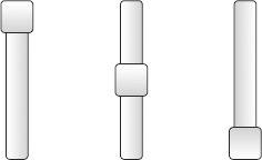
In the following example, three vertical sliders are created, and positioned side by side to give a visual “mixer” look:
<!DOCTYPE html>
<html>
<head>
  <link href=”css/ui-lightness/jquery-ui-1.8.13.custom.css” rel=”stylesheet” />
<script src=“http://code.jquery.com/jquery-1.7.1.js”></script>
  <script src=”js/jquery-ui-1.8.13.custom.min.js”></script>
  <style type=”text/css”>
    div {
      float : left;
      margin-left : 30px;
      margin-right : 30px;
    }
  </style>
  <script type=”text/javascript”>
    $(function(){
      $( '#slider1' ).slider({
        orientation : “vertical”
      });

      $( '#slider2' ).slider({
        orientation : “vertical”
      });

      $( '#slider3' ).slider({
        orientation : “vertical”
      });
    });
  </script>
</head>
<body>
  <div id=”slider1”></div>
  <div id=”slider2”></div>
  <div id=”slider3”></div>
</body>
</html>
Code snippet is from slider.txt
Your output should look something like Figure 8-6.
This intro to jQuery UI has given you a quick glance at the structure of a jQuery UI project, the themes, as well as the very complete CSS framework. Also, you’ve explored the sophisticated set of jQuery UI widgets that help normalize the look and feel of widgets across browsers while each widget presents a broad range of useful options. In the following chapter, you explore jQuery UI further with mouse interactions.
http://jqueryui.com/docs/Theming
http://jqueryui.com/docs/Theming/API
http://jquery-ui.googlecode.com/svn/trunk/tests/static/icons.html
http://www.petefreitag.com/cheatsheets/jqueryui-icons/
http://docs.jquery.com/UI/Datepicker/formatDate
http://www.ajaxlines.com/ajax/stuff/article/jquery_progressbar.php