
It’s a job that’s never started that takes the longest to finish.
The ListView control sums up the features of multiple view controls in a single one. For example, it can be used to create a tabular view of data nearly identical to the view you can obtain from a GridView or DataGrid control. At the same time, the ListView control can be employed to generate a multicolumn layout with the flexibility that only a general-purpose Repeater or, better yet, DataList control can offer.
The ListView control doesn’t only have similarities with other controls; it also has a number of unique features that, when evaluated from a wider perspective, make similarities shine under a different light. ListView uses similarities with other controls as the starting point for building more advanced and unique capabilities that warrant it having its own space in the toolbox of ASP.NET controls.
In this chapter, I’ll focus on exploring the programming interface of the ListView control and its usage in a variety of common scenarios.
The control is fully template based and allows you to control all aspects of the user interface via templates and properties. ListView operates in a way that closely resembles the behavior of existing data-bound controls, such as FormView or DataList. However, unlike these controls, the ListView control never creates any user-interface layout. Every markup tag that the control generates is entirely under the developer’s control, including header, footer, body, item, selected item, and so on.
The ListView control binds to any data source control and executes its set of data operations. It can page, update, insert, and delete data items in the underlying data source as long as the data source supports these operations. In most cases, no code is required to set up any of these operations. If code is required, you can also explicitly bind data to the control using the more traditional DataSource property and related DataBind method.
The rendering capabilities of the ListView control make it suitable for publishing scenarios where a read-only, but compelling, user interface is needed. The control also works great in editing scenarios even though it lacks some advanced features such as input validation or made-to-measure edit templates for particular types of data or foreign keys.
Data binding and template support are the principal characteristics of the ListView control that are most obvious when you examine the control’s programming model. From the programmer’s perspective, the key thing to be aware of is that you need to specify at least two template properties for the ListView control to compile and work. They are LayoutTemplate and ItemTemplate. In addition, the overall layout template must expose a connection point to the control so that bound records can be merged into the final markup.
The ListView layout supports several properties that fall into two main categories: behavior and templates. It also supports a few general ASP.NET control properties and binding properties. Table 11-1 lists the behavioral properties.
Table 11-1. ListView Behavior Properties
Property | Description |
|---|---|
ConvertEmptyStringToNull | Boolean value, indicates whether empty string values are automatically converted to null values when any contents edited in the control’s interface are saved back to the data source. |
EditIndex | Gets or sets the index of the item being edited. |
EditItem | Gets the item that is currently in edit mode within a ListView control. The type of the item is ListViewItem. |
GroupItemCount | Gets or sets the number of items to display per group. |
GroupPlaceholderID | Gets or sets the ID of the page element where the content for the ListView groups will be placed. The placeholder must be a server element flagged with the runat attribute. If a value for this property is not specified, a value of groupPlaceholder is assumed. |
InsertItem | Gets the item that is currently in insert mode within a ListView control. The type of the item is ListViewItem. |
InsertItemPosition | Gets or sets the location of the insert template. Feasible values are defined in the InsertItemPosition enumerated type: FirstItem, LastItem, or None. |
ItemPlaceholderID | Gets or sets the ID of the page element that will host data-bound items. The placeholder must be a server element flagged with the runat attribute. If this property is not specified, a value of ItemPlaceholder is assumed. |
Items | Gets the collection of bound items. |
SelectedDataKey | Gets the data-key array of values for the selected item. This value coincides with SelectedValue except when multiple key fields are used. |
SelectedIndex | Gets or sets the index of the currently selected item. |
SelectedValue | Gets the data-key value of the first key field of the selected item. |
SortDirection | Gets the sort direction of the field or fields being sorted. |
SortExpression | Gets the sort expression that is associated with the field or fields being sorted. |
Two properties in this list are somewhat new even to seasoned ASP.NET developers. They are ItemPlaceholderID and GroupPlaceholderID. When you are using groups to represent bound items, the group placeholder is the server-side ASP.NET control that, when added to the layout template, indicates where the group will be rendered. Similarly, the item placeholder indicates where bound items will be rendered. You add the item placeholder to the item template or to the group template if you are using groups.
The key thing about the ListView control is its full support for templates and the subsequent highly flexible rendering engine. Table 11-2 lists the templates the control supports.
Table 11-2. ListView Template Properties
Description | |
|---|---|
AlternatingItemTemplate | Indicates the template used to render every other bound item. If this property is not specified, all items are usually rendered using the item template. The alternating item template usually contains the same controls and content as the item, but with a different style to distinguish items. |
EditItemTemplate | Indicates the template to use for editing each bound item. The edit template usually contains input controls to update the values of the bound record. An edit template should also contain buttons to save and discard changes. |
EmptyDataTemplate | Indicates the template to render when the data source bound to the ListView control is empty. When this happens, the empty data template is rendered instead of the layout template. Note, though, that the InsertItemTemplate takes precedence if InsertItemPosition is not set to None. |
EmptyItemTemplate | Indicates the template to render when there are no more data items to display in the last group. |
GroupSeparatorTemplate | Indicates the template used to put custom content between each group in the ListView control. |
GroupTemplate | Indicates the template used to create a tiled layout for the contents of the ListView control. In a tiled layout, the items are repeated horizontally in a row according to the value of the GroupItemCount property. |
InsertItemTemplate | Indicates the template to use for inserting a new data item. The insert template contains input controls to gather data to initialize a new record. An insert template should also contain buttons to save and discard changes. |
ItemSeparatorTemplate | Indicates the template used to specify the content for the separator between the items of a ListView control. |
ItemTemplate | Indicates the template to use to render items bound to the control. |
LayoutTemplate | Indicates the template to render the root container of any contents displayed through the ListView control. This template is no longer required in ASP.NET 4. |
SelectedItemTemplate | Indicates the template used to render the currently selected data item. |
In addition to the properties listed in Table 11-1 and Table 11-2, the ListView control has a number of data-binding properties, including DataKeyNames, DataSource, DataSourceID, and DataMember.
The DataKeyNames property specifies the fields that represent the primary key of the data source. When you set this property declaratively, you use a comma-separated list of field names. The underlying type is an array of strings. Strictly related to DataKeyNames is DataKeys. This property contains an object that identifies the unique key for each item that is currently displayed in the ListView control. Through the DataKeys collection, you can access the individual values that form the primary key for each displayed record.
DataSource and DataSourceID provide two mutually exclusive ways of bringing data inside of the control. The DataSource property represents an enumerable collection of bindable records; the DataSourceID property points to a data source control in the page that does the entire job of retrieving and binding data. Starting with ASP.NET 2.0, all data controls can be bound to a data source control, but not all of them can fully leverage the capabilities of a data source control. Only view controls such as GridView and DetailsView can, for example, update the record in the data source or page and sort based on the capabilities of the underlying data source. Older data-bound controls, such as DataList, support only the read-only interface of data source controls. In this regard, the ListView control is a logical specialization of the DataList control that does provide full support for the capabilities of the underlying data source control. (In the OO meaning of the word, ListView and DataList have nothing in common.)
Finally, because the ListView control inherits from WebControl, it features a bunch of user-interface properties, including Style, CssClass, SkinID, Visible, and EnableTheming.
Note
The ListView control lacks the usual ton of style properties that characterize all other view controls in ASP.NET. The output of the ListView control can be styled at your leisure, but only by using cascading style sheets (CSS) directly, without even the mediation from ASP.NET themes.
This is intentional for a number of reasons. First, the control benefits from the momentum that CSS-based layouts are gaining in the industry. Second, Microsoft Visual Studio comes with a CSS editor through which editing and attaching styles to HTML elements is a breeze. Finally, the extreme flexibility of the markup generated by the ListView control would be hindered in several ways by ASP.NET themes. Themes work with entire ASP.NET controls, whereas the ListView control is an ASP.NET control that generates its output based on a template that is, when all is said and done, made of pure HTML you control at a fine-grained level.
The ListView control has no specific methods worth mentioning. Table 11-3 lists the events that the control fires during its life cycle.
Table 11-3. Events of the ListView Class
Description | |
|---|---|
ItemCanceling | Occurs when the user requests a cancel operation, but before the control cancels the ongoing insert or edit operation. |
ItemCommand | Occurs when the user clicks on any buttons found in the body of the control. |
ItemCreated | Occurs when a new item in the ListView control is being created. |
ItemDataBound | Occurs when an item is bound to its data. |
ItemDeleting, ItemDeleted | The two events occur before and after, respectively, the deletion of an item. The operation is requested by the interface of the ListView control. |
ItemEditing | Occurs when an edit operation is requested, but before the ListView switches to the edit template. |
ItemInserting, ItemInserted | The two events occur before and after, respectively, the insertion of an item. The operation is requested by the interface of the ListView control. |
ItemUpdating, ItemUpdated | The two events occur before and after, respectively, the update of an item. The operation is requested by the interface of the ListView control. |
LayoutCreated | Occurs when the layout template is created. |
PagePropertiesChanging, PagePropertiesChanged | The two events occur before and after, respectively, the properties of a page of data in the ListView control change. A page of data is the set of items that form a page in a paged ListView control. Page properties include page size and start row index. |
SelectedIndexChanging, SelectedIndexChanged | The two events occur before and after, respectively, the ListView control handles the selection of a displayed item and switches to the selected-item template. |
Sorting, Sorted | The two events occur before and after, respectively, the associated data source is sorted. |
As you can see, most of the events are related to the life cycle of individual data items. You can control when an item is created, deleted, inserted, or edited. Events fire before and after a given operation is accomplished. So you find doing/done pairs of events for each fundamental operation, such as ItemInserting/ItemInserted or ItemDeleting/ItemDeleted events. You can determine which item type is being created by using the ItemType property on the event data structure. Feasible values are DataItem, InsertItem, and EmptyItem. These values belong to the ListViewItemType enumerated type.
The ListView control also features typical events of ASP.NET controls such as Init, Load, PreRender, DataBinding, and Unload. You can handle these events the same way you handle them for other ASP.NET controls.
The view controls introduced with previous versions of ASP.NET solved many problems that developers were facing every day. Controls such as GridView and DetailsView make it a snap to create a list of records and even arrange a master/detail view. However, they offer limited control over the actual markup generated. Want an example? With a GridView control, placing a TBODY tag around the group of child rows is not a trivial task. And it is almost impossible to do with a DataGrid control, unless you resort to your most advanced skills and take on the tough task of deriving a custom grid control.
On the other hand, adapting the final markup to the actual needs would be quite a simple task if the view controls introduced with earlier versions of ASP.NET provided a bit more programmatic control over the rendering process and templating. This is just one of the key capabilities you gain with the ListView control. As you’ll see in a moment, the ListView control is flexible enough to render out in a tabular or tiled manner. It can be used to replace the GridView control, at least in relatively common situations, but also to create completely custom layouts.
This said, let’s briefly compare the ListView control to the other view controls available in ASP.NET to see exactly what each control can do and cannot do. Table 11-4 lists and briefly describes the view controls.
Table 11-4. Rich, Data-Bound View Controls in ASP.NET
So where does the ListView control fit in this puzzle of data-bound controls? Like all the controls listed in Table 11-4, the ListView control supports two-way data binding—that is, the ability of displaying and editing the contents of the bound data source. Unlike the others, though, the ListView control provides the greatest flexibility as far as the generation of the markup is concerned. It is not limited to a single record like FormView and DetailsView are, and it is not limited to a tabular layout like the GridView is. It is essentially a repeater with rich layout capabilities (like a DataList control) and the two-way data-binding capabilities of other view controls.
You use the ListView control to generate any user interface that needs to be built as you iterate a collection of records. You associate data with a ListView control using the DataSource property or, better yet, using the DataSourceID property. In the former case, you explicitly provide the data and control any aspect of the binding process. The DataSourceID property connects the control to a data source component. The binding process is mostly automatic, but it works both ways—it reads and saves data. The following data source control populates a ListView control with customers who reside in the United States:
<asp:ObjectDataSource ID="ObjectDataSource1" runat="server"
        TypeName="DAL.CustomerRepository"
        SelectMethod="LoadByCountry"
        OldValuesParameterFormatString="original_{0}">
    <SelectParameters>
        <asp:Parameter DefaultValue="USA" Name="country" />
    </SelectParameters>
</asp:ObjectDataSource>
The data source control invokes the LoadByCountry method on the specified business object and makes the response available to any bound control. Let’s use a ListView control:
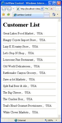
<asp:ListView ID="ListView1" runat="server" DataSourceID="ObjectDataSource1" ItemPlaceholderID="ListViewContent"> <LayoutTemplate> <div id="header"> <h1 id="logo">Customer List</h1> </div> <div runat="server" id="ListViewContent"> <%-- ListView contents display here --%> </div> </LayoutTemplate> <ItemTemplate> <asp:Label runat="server" ID="lblCompany" Text='<%# Eval("CompanyName") %>' /> , <asp:Label runat="server" ID="lblCountry" Text='<%# Eval("Country") %>' /> </ItemTemplate> <ItemSeparatorTemplate> <hr /> </ItemSeparatorTemplate> </asp:ListView>
In this example, the ListView control comprises three templates: layout, item, and item separator. Of the three, only the item separator template is optional. The layout template defines the overall structure of the output. The <div> element in the layout marked with the runat=server attribute represents the insertion point for a pair of item and item separator templates. The item template is finally filled with the actual data from the n.th record. The Eval method evaluates the specified property on the data item being currently bound. The Eval method works in reading; as we’ll see later, the Bind method works also in writing.
The item markup is made of a company name and country separated by a comma, and they are vertically separated from one another by a horizontal rule. Figure 11-1 shows the final results.
Most templated ASP.NET controls provide optional header and footer templates along with a repeated and data-bound item template. Header and footer templates are instantiated only once each, at the beginning and end, respectively, of the data binding loop. You can hide the header and footer, but most controls implicitly force you to think about the layout in terms of three components placed vertically: the header, body, and footer.
In this regard, the ListView control is different. It has no header or footer template, and it features just one template for the structure of the resulting markup: the layout template. If you need a header or a footer, you can easily place them in the layout. But if you need to develop the layout horizontally or in a tiled manner, the ListView approach makes it easier.
Up until ASP.NET 3.5, the layout template was mandatory in any ListView control. This is no longer the case, however, with ASP.NET 4. You can use the layout template as follows:
<LayoutTemplate>
    <div runat="server" ID="Body">
      ...
    </div>
</LayoutTemplate>
Instead of the <div> tag, you can use a <span> tag or provide appropriate CSS styling if you like the output flow with the rest of the page. The layout template must contain a server-side element that acts as the insertion point for data-bound item templates. This can be an HTML element decorated with the runat attribute or an ASP.NET server control. The ID of this placeholder element must be passed to the ListView’s ItemPlaceholderID property.
The LayoutTemplate property alone is not enough, though. At a minimum, you must also specify content for the ItemTemplate or GroupTemplate property. As mentioned, to bind to data, you use ASP.NET <%# … %> data-binding expressions and the Eval or Bind method.
Note
Like any other template properties in ASP.NET controls, the template properties of the ListView control can be set programmatically as well as declaratively. You can assign to a template property any managed object that implements the ITemplate interface. Such an object can be obtained from an ASCX user control by using the LoadTemplate method on the System.Web.UI.Page class.
Let’s put the graphical flexibility of the ListView control through its paces by examining how to render bound data using a number of layouts.
The ListView control is the perfect tool to build a table-based interface with more liberty than specialized controls such as DataGrid and GridView typically allow. By properly designing the layout template of a ListView control, you can create an outermost table and then arrange a completely custom output for the child rows. In this way, you gain control over the rows and can, for example, employ two rows per record and even give each row a different number of cells. This level of control is extremely hard to achieve with a GridView control, although it’s not impossible. To customize the GridView control to this level of detail, you need to override some of its protected virtual methods. Doing this requires the creation of a new derived control whose behavior touches on parts of the internal mechanics of the grid.
A ListView control lets you achieve the same results, but much more comfortably and with full support from Visual Studio 2008 designers.
To generate an HTML table, the ListView control needs to have a layout template defined as in the following code snippet:
<LayoutTemplate>
    <div>
        <h1 id="logo">Customer List</h1>
    </div>
    <div>
        <table>
            <thead>
                <tr>
                    <th>Company</th>
                    <th>Country</th>
                </tr>
                <tbody runat="server" id="ListViewContent">
                </tbody>
            </thead>
        </table>
    </div>
</LayoutTemplate>
The layout comprises two <div> elements, both of which are optional from a purely functional perspective. The <div> element, in fact, simplifies the process of styling the output, as you’ll see later in this chapter. Generally, the output is made of two HTML blocks—one for the header and one for the actual data.
The layout template defines the overall markup by defining the <table> tag and adding a child <thead> tag. Next, a <tbody> tag wraps the child rows, each of which will be bound to a data record. In this case, the <tbody> tag hosts the item templates. For this reason, it features the runat attribute and has its own ID set as the argument of the ItemPlaceholderID property of the ListView control:
<asp:ListView ID="ListView1" runat="server"
    DataSourceID="ObjectDataSource1"
    ItemPlaceholderID="ListViewContent">
    ...
</asp:ListView>
The actual body of the resulting table is determined by the item and alternating item templates.
In a tabular layout, created using an HTML table, the item template can’t be anything but a sequence of <tr> tags. Unlike with a pure grid control such as GridView, in a ListView layout you have no limitation on the number of rows per data item you can display. The following example uses two table rows per bound item:
<ItemTemplate>
    <tr>
        <td>
            <asp:Label runat="server" ID="lblCompany" Text='<%# Eval("CompanyName") %>' />
        </td>
        <td>
            <asp:Label runat="server" ID="lblCountry" Text='<%# Eval("Country") %>' />
        </td>
    </tr>
    <tr>
        <td colspan="2">
            <i>To contact this customer, please call <b><%# Eval("Phone") %></b></i>
        </td>
    </tr>
</ItemTemplate>
The first row contains two cells: one for the company name, and one for the country/region. The second row shows the phone number on a single-cell row. Both rows are rendered for each record bound to the ListView control. Figure 11-2 demonstrates the markup you obtain in this way.
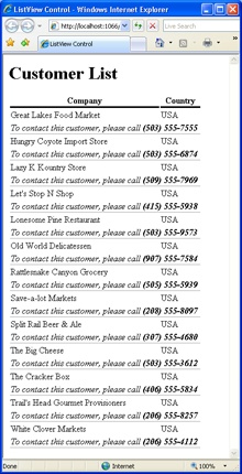
As you can see in the figure, some extremely simple styles have been applied to the table items. In particular, the <th> tags and the <td> tag of the second row have been styled to show a bottom border. Style properties can be applied using CSS styles or explicit inline style properties, as shown next. (Once again, although inline styles are supported in ASP.NET, they are considered a deprecated technique. You should always go with CSS classes.)
<th style="border-bottom:solid 3px black;">Company</th>
When comparing this sort of flexibility with the GridView control, the GridView control provides a number of free facilities, but it doesn’t offer as much flexibility in design, as seen in this example. To choose, you have to first evaluate your requirements and make a choice between flexibility of rendering and functions to implement.
ItemTemplate is mandatory in a ListView control and indicates the template to use for each bound item. The AlternatingItemTemplate property can be used to differentiate every other item, as shown in Figure 11-3.
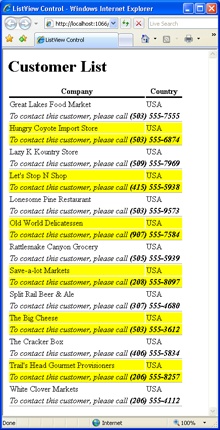
Most of the time, the alternating item template just features the same layout as regular items but styles it differently. However, changes to the template are allowed to any extent that can keep your users happy. The following code uses a small indentation for alternating rows:
<AlternatingItemTemplate>
<tr>
<td>
<asp:Label runat="server" ID="lblCompany" Text='<%# Eval("CompanyName") %>' />
</td>
<td>
<asp:Label runat="server" ID="lblCountry" Text='<%# Eval("Country") %>' />
</td>
</tr>
<tr>
<td>
<i>To contact this customer, please call <b><%# Eval("Phone") %></b></i>
</td>
</tr>
</AlternatingItemTemplate>Figure 11-4 shows the result.
HTML tables are an essential, but too often abused, piece of the Web jigsaw puzzle. HTML tables were designed for presenting tabular information. And they are still great at doing this. So any developer of a Web page that needs to incorporate a matrix of data is correct in using HTML tables. The problem with tables is that they are often used to define the page layout—a task they weren’t designed for.
To illustrate, a grid control that uses HTML tables to output its content is more than acceptable. A tree-view control that uses HTML tables to list its contents is less desirable. It’s not by mere chance that the ASP.NET team released the CSS adapter toolkit to allow you to change the rendering engine of some controls to make them inherently more CSS-friendly. And the TreeView is just one of the controls whose rendering style can be modified by using the toolkit.
Note
Using tables for creating multicolumn layouts—which is still common these days in most Web sites—has a number of significant drawbacks. Tables require a lot of code (or tags if you create tables declaratively) that has little to do with the data you intend to display through them. This code is tedious to write, verbose, and difficult to maintain. Worse yet, it makes for longer downloads and slower rendering in the browsers (a factor of growing importance for wireless devices). In addition, tables tend to mix up information and layout instead of forcing you to keep them neatly separated, and they result in less accessible content.
Visual Studio provides some facilities to work with ListView controls. Specifically, once you have bound the control to a data source, Visual Studio queries the data source and offers to generate some templates for you.
A flow layout is the simplest layout you can get. It requires only that you define a container—typically, a <div>—and then the markup for each record. The ListView control simply composes the resulting markup by concatenating the markup in a unique flow of HTML tags. Needless to say, the resulting markup can flow horizontally or vertically, depending on the tags you use (block or inline) and the CSS styles you apply.
If you’re looking for a block flow layout, your LayoutTemplate property will probably always look as simple as the one shown here:
<LayoutTemplate>
    <div ID="ListViewContent" runat="server">
       <!-- your markup -->
    </div>
</LayoutTemplate>
If you opt for a <span> tag, instead of getting a new block you get a piece of markup that flows inline with the rest of the ASP.NET page.
Note that in ASP.NET 4 the LayoutTemplate is optional. You can get the same results if you simply wrap the markup directly in an ItemTemplate element, as shown here:
<ItemTemplate>
    <!-- your markup -->
</ItemTemplate>
This approach simplifies the definition of a ListView without loss of programming power and generality.
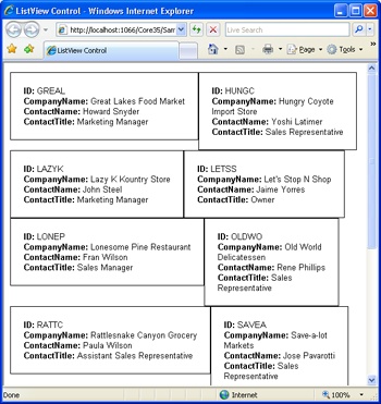
A good example of a flowing template is shown in Figure 11-1. Here’s another example:
<ItemTemplate>
    <div class="border" >
        <b>ID:</b>
        <asp:Label ID="IDLabel" runat="server" Text='<%# Eval("ID") %>' />
        <br />
        <b>CompanyName:</b>
        <asp:Label ID="CompanyNameLabel" runat="server"
            Text='<%# Eval("CompanyName") %>' />
        <br />
        <b>ContactName:</b>
        <asp:Label ID="ContactNameLabel" runat="server"
            Text='<%# Eval("ContactName") %>' />
        <br />
        <b>ContactTitle:</b>
        <asp:Label ID="ContactTitleLabel" runat="server"
            Text='<%# Eval("ContactTitle") %>' />
    </div>
</ItemTemplate>
The <div> tag normally creates a new block of markup and breaks the current flow of HTML. However, if you give it the float:left CSS style, it will float in the specified direction. As a result, the block of markup forms a horizontal sequence that wraps to the next line when the border of the browser’s window is met. Figure 11-5 offers a preview.
Note
In the previous chunk of HTML markup, I used <span> and <div> tags with styles applied and also mixed CSS styles with HTML tags used for controlling the appearance of the page, such as <b> and<br>. This approach is clearly arguable. The reason why I haven’t opted for a niftier, pure CSS-based code in the snippet is clarity. By reading which CSS styles are applied to which tag, you can more easily make sense of the output depicted in Figure 11-5.
Admittedly, the output of Figure 11-5 is not really attractive, even though it contains a few elements that, if improved a bit, might lead to more compelling results. The output of Figure 11-5 shows blocks of markup that flow horizontally and wrap to the next row. However, they share no common surrounding layout. In other words, those blocks are not tiled. To build a perfectly tiled output, you need to leverage group templates.
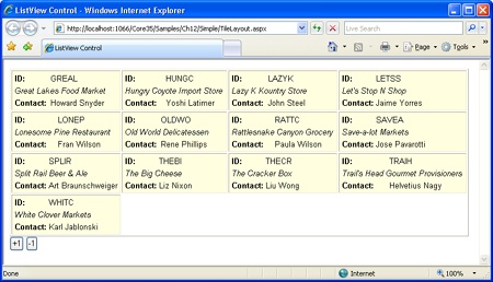
So far we’ve used the ListView control to repeat the item template for each bound record. The GroupTemplate property adds an intermediate (and optional) step in this rendering process. When you specify a group template, the total number of bound records is partitioned in groups and the item template is applied to the records in each group. When a group has been rendered, the control moves to the next one. Each group of records can have its own particular template—the group template—and a separator can be inserted between items and groups. How is the size of each determined? That has to be a fixed value that you set, either declaratively or programmatically, through the GroupItemCount property. Let’s consider the following layout and group templates:
<LayoutTemplate>
    <table border="1">
        <tr ID="groupPlaceholder" runat="server">
        </tr>
    </table>
</LayoutTemplate>
<GroupTemplate>
    <tr>
        <td ID="itemPlaceholder" runat="server">
        </td>
    </tr>
</GroupTemplate>
It indicates that the final output will be an HTML table where a new row is created for each group of items. Each table row contains as many cells as the value of GroupItemCount sets. The default value is 1. Note that in the preceding code snippet we’re using the default names for group and item containers—that is, groupPlaceholder and itemPlaceholder. When these names are used, there’s no need to set corresponding GroupPlaceholderID and ItemPlaceholderID properties on the ListView markup. Here’s the top-level markup for a tiled layout:
<asp:ListView ID="ListView1" runat="server"
     DataSourceID="ObjectDataSource1" GroupItemCount="4">
    ...
</asp:ListView>
As an example, if you set GroupItemCount to 4, you’ll have rows of 4 cells each until there are less than 4 records left. And after that? What if the number of bound records is not a perfect multiple of the group item count? That’s where the EmptyItemTemplate property fits in:
<EmptyItemTemplate>
      <td />
</EmptyItemTemplate>
This template is used to complete the group when no more data items are available. Figure 11-6 shows a typical tiled output you obtain by employing a ListView control.
Each group of items can be separated by a custom block of markup defined through the GroupSeparatorTemplate property. Here’s an example:
<GroupSeparatorTemplate>
<tr>
<td colspan='4'> </td>
</tr>
</GroupSeparatorTemplate>If you add this markup to the preceding example, you’ll display a blank row in between rows with data-bound cells. It’s a kind of vertical spacing.
The same can be done horizontally to separate data-bound cells within the same table row. To do so, you use the ItemSeparatorTemplate property instead. In both cases, the markup you put in must be consistent with the overall markup being created for the whole ListView control.
The GroupItemCount property is read-write, meaning that you can change the size of each group programmatically based on some user actions. The following code snippet shows a pair of event handlers associated with the Click event of two Button controls:
protected void Button1_Click(object sender, EventArgs e)
{
    // There's no upper limit to the value of the property
    ListView1.GroupItemCount += 1;
}

protected void Button2_Click(object sender, EventArgs e)
{
    // The property can't be 2 or less
    if (ListView1.GroupItemCount >2)
        ListView1.GroupItemCount -= 1;
}
The GroupItemCount property itself can’t take any value less than 1, but it has no upper limit. However, it should not accept any value larger than the actual number of data items currently bound.
As you assign a new value, the set modifier of the property resets the internal data-binding flag and orders a new binding operation. If you change the value of GroupItemCount over a postback, the ListView control automatically renders the updated markup back to the client. (See Figure 11-7.)

The ListView control doesn’t natively support more advanced capabilities—such as uneven groups of items where, for example, the association between an item and a group is based on a logical condition and not merely determined by an index. In this scenario, you could have a list where the first group contains customers whose name begins with A and the second group contains those beginning with B, and so on. You would have to provide the logic for this yourself. Let’s look at this next.
The support for groups built into the ListView control is not data driven. In other words, the layout (groups and items) is first created and it is then bound to data. When the binding step occurs, the group template is not directly involved and you won’t receive any event that tells you that a group has been either created or bound to its data.
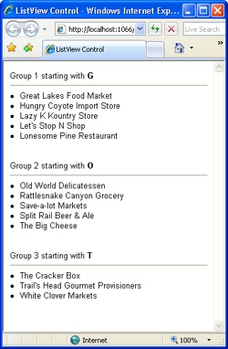
However, this doesn’t mean that your group templates must have a fixed layout and can’t be dynamically populated using data from its contained items. The ListView’s ItemDataBound event is the key to obtaining output such as that shown in Figure 11-8.
To start out, let’s take a look at the overall layout template of the ListView control:
<asp:ListView ID="ListView1" runat="server"
    DataSourceID="ObjectDataSource1"
    GroupItemCount="5"
    OnItemDataBound="ListView1_ItemDataBound">
    <ItemTemplate>
         <li><%# Eval("CompanyName") %></li>
    </ItemTemplate>
    <ItemSeparatorTemplate>
        <br />
    </ItemSeparatorTemplate>
    <LayoutTemplate>
        <div id="groupPlaceholder" runat="server">
        </div>
    </LayoutTemplate>
    <GroupTemplate>
        <asp:Label runat="server" ID="groupHeader" Text="Group" />
        <hr />
        <div id="itemPlaceholder" runat="server">
        </div>
        <br /><br /><br />
    </GroupTemplate>
</asp:ListView>
The group template is made of a Label control followed by an <hr> tag and the list of data items. Each bound item is expressed through an <li> tag. Let’s see how to change the Text property of the groupHeader control for each group being created. Here’s the structure of the ItemDataBound event handler:
private int lastGroup = -1;
protected void ListView1_ItemDataBound(object sender, ListViewItemEventArgs e)
{
    // To assign the group a data-bound title, retrieve the data item first
    if (e.Item.ItemType == ListViewItemType.DataItem)
    {
            var currentItem = (ListViewDataItem) e.Item;
            CustomizeGroupHeader((ListView) sender, currentItem);
    }
}
The ListViewItemEventArgs argument contains an Item property that refers to the item being bound to data. This item can be of a few types—InsertItem, EmptyItem, or DataItem. The list of feasible values is in the ListViewItemType enumerated type. In this case, we’re interested only in data items—that is, regular items showing some bound data.
To put your hands on the real data being bound to the item, you need to cast the ListView item to the ListViewDataItem type, from which you can access a number of data-related properties:
private void CustomizeGroupHeader(ListView root, ListViewDataItem currentItem)
{
    // The type of the data item depends on the data you bound--in this case,
    // a collection of Customer objects
    var cust = (DAL.Customer) currentItem.DataItem;

    // Get a ListViewContainer object--the container of the group template
    Control container = currentItem.NamingContainer;
    if (container == null)
        return;

    // Look up for a particular control in the group template--the Label
    Label groupHeader = (Label)container.FindControl("groupHeader");
    if (groupHeader == null)
        return;

    // Figure out the 0-based index of current group. Note that the display index
    // refers to the index of the item being bound, not the group
    int groupIndex = currentItem.DisplayIndex / root.GroupItemCount;
    if (groupIndex != lastGroup)
    {
        // This is a new group
        lastGroup = groupIndex;

        // Update the UI
        groupHeader.Text = String.Format("Group {0} starting with <b>{1}</b>",
            groupIndex + 1,
            cust.CompanyName.Substring(0, 1).ToUpper());
    }
}
You first get a reference to the naming container of the item. This container is the wrapper control for the group template. By using the FindControl method, you gain access to the Label control in the group template. The final step entails determining the value for the Text property of the Label control.
As mentioned, the ListView control doesn’t provide any readymade information about groups. So you don’t know about the index of the current group. The DisplayIndex property tells you only the index of the item being processed. Because the size of each group is fixed—and is based on the GroupItemCount property—you can easily obtain the 0-based index of the current group. You track the index of the current group in a global variable, and whenever a new group is found, you update the header.
Unlike other view controls, the ListView control doesn’t feature the usual long list of style properties such as HeaderStyle, ItemStyle, SelectedItemStyle, and so forth. After a few years of industry use, Microsoft downsized the importance of style properties and their role. Today, as evidenced by the ListView control, in ASP.NET, CSS styles are emerging as the most effective and efficient way to modify the appearance of the markup.
ASP.NET controls let you set style attributes in two nonexclusive ways—using the CssClass property and using style properties. The CssClass property takes the name of a CSS class and passes it on to the class attribute of the root HTML tag generated for the control. More often than not, though, ASP.NET controls produce a complex markup where multiple HTML tags are rendered together but yet need to be styled differently. Although this is far from being an impossible goal to achieve with CSS styles, for a few years Microsoft pushed style properties as the way to go.
Developers are probably more inclined to use style properties than CSS styles, which require some specific skills. Anyway, style properties let you specify CSS attributes to apply to particular regions of the markup being generated. For example, the ItemStyle property in a GridView control allows you to define the colors, font, and borders of each displayed item. In the end, the value of these properties are translated to CSS attributes and assigned to the HTML tags via the style attribute. The developers don’t have to build up any CSS skills and can leverage the Visual Studio editors and designers to get a preview.
Is there anything wrong with this approach?
The problem is that style attributes are defined as part of the page’s code, and there’s no clear separation between layout and style. ASP.NET themes are helpful and certainly mitigate the problem. All in all, for view controls with a relatively fixed layout, style properties—which are better if used through the intermediation of themes—are still a good option. The ListView control, though, is kind of an exception.
The ListView control provides an unprecedented level of flexibility when it comes to generating the markup for the browser. The item that for, say, a GridView control can be safely identified with a table row, can be virtually anything with a ListView control.
The CSS designer in Visual Studio allows you to style controls and save everything back to a CSS class. So, as a developer, you always work with properties and scalar values but have them saved back to the CSS class instead of the view state.
This is another important factor that leads developers to prefer cascading style sheets over style properties. The CSS is a separate file that is downloaded only once. Style properties, on the other hand, are saved to the view state and continually uploaded and downloaded with the page.
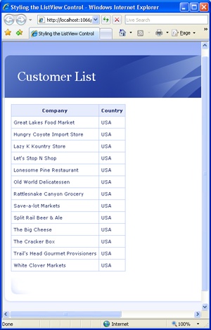
Cool cascading style sheets are usually developed by designers and assign a style to the vast majority of HTML tags. Often cascading style sheets incorporate layout information and influence the structure of the page they are applied to. A common trick used by cascading style sheets consists of assigning a particular ID to <div> tags and treating them in a special way. Let’s see how to radically improve the user interface of a previous ListView-based page with a cool CSS.
First, you explicitly link any relevant CSS file to the page (or the master page) by using the <link> tag. The HtmlHead control also allows you to load CSS files programmatically. Note that most realistic CSS files have an auxiliary folder of images that you have to set up on the production server too. The CSS file I’m using in the next example assigns a special role to <div> tags with the following IDs: header, footer, page, and content. The alternative is to explicitly assign a CSS class using the class attribute. Both ways are widely accepted. The class approach makes more obvious that something has been styled and what class it has been assigned to. But, in the end, it’s a matter of preference. If you opt for styling via IDs, you are totally free to choose any names you want. (Note, however, that IDs must be unique to allow them to be used with client scripts. This can be hard to achieve with multiple controls in one page, so, class names are really preferred.)
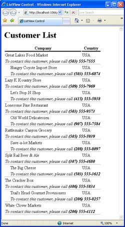
<asp:ListView ID="ListView1" runat="server"
    DataSourceID="ObjectDataSource1"
    ItemPlaceholderID="ListViewContent">
    <LayoutTemplate>
        <div id="header">
            <h1 id="logo">Customer List</h1>
        </div>
        <div id="page">
            <div id="content">
                <table>
                    <thead>
                        <tr>
                            <th>Company</th>
                            <th>Country</th>
                        </tr>
                        <tbody runat="server" id="ListViewContent">
                        </tbody>
                    </thead>
                </table>
            </div>
        </div>
        <div id="footer">
        </div>
    </LayoutTemplate>
    <ItemTemplate>
        <tr>
            <td><asp:Label runat="server" ID="lblName"
                     Text='<%# Eval("CompanyName") %>' /></td>
            <td><asp:Label runat="server" ID="lblCountry"
                     Text='<%# Eval("Country") %>' /></td>
        </tr>
    </ItemTemplate>
</asp:ListView>
The result is shown in Figure 11-9.
The ListView control makes it easy to handle common data-based operations, such as insert, update, delete, or sorting. All that you have to do is place buttons in the layout template and associate buttons with command names. Buttons can be global to the list (such as insert, sort, and page buttons) or specific to a particular item (such as update and delete buttons). Command names are just strings that are assigned to the CommandName property of the Button control.
So far, we have considered only scenarios with relatively static and noninteractive templates. It is definitely possible, though, to use the ListView control to create rich user interfaces that allow in-place editing, selection of items, paging, and updates back to the data source. Let’s start with in-place editing.
Unlike the GridView control, the ListView control doesn’t automatically generate an Edit button; nor does it automatically adapt the edit mode user interface from the item template.
This responsibility falls to the developer by design. The developer is required to define an edit template that will be used to edit the contents of the selected item, in keeping with the flexible nature of the control.
The edit template is any piece of markup you intend to display to your users when they click to edit a record. It can have any layout you like and can handle data access in a variety of ways.
If you’ve bound the ListView control to a data source control—for example, an ObjectDataSource control—you can take advantage of the ASP.NET built-in support for two-way data binding. Simply put, you use data binding <%# … %> expressions to bind to data, the Eval method for read-only operations, and the Bind method for full I/O operations.
The following markup defines a classic two-column table for editing some fields of a customer record:
<table>
    <tr>
        <td><b>ID</b></td>
        <td><asp:Label runat="server" ID="lblID" Text='<%# Eval("ID") %>' /></td>
    </tr>
    <tr>
        <td><b>Name</b></td>
        <td><asp:TextBox runat="server" ID="txtName"
            Text='<%# Bind("CompanyName") %>' /></td>
    </tr>
    <tr>
        <td><b>Country</b></td>
        <td><asp:TextBox runat="server" ID="txtCountry"
            Text='<%# Bind("Country") %>' /></td>
    </tr>
    <tr>
        <td><b>Street</b></td>
        <td><asp:TextBox runat="server" ID="txtStreet"
            Text='<%# Bind("Street") %>' /></td>
    </tr>
    <tr>
        <td><b>City</b></td>
        <td><asp:TextBox runat="server" ID="txtCity"
            Text='<%# Bind("City") %>' /></td>
    </tr>
</table>
Only one displayed item at a time can be in edit mode; the EditIndex property is used to get or set this 0-based index. If an item is being edited and the user clicks on a button to edit another one, the last-win policy applies. As a result, editing on the previous item is canceled and it’s enabled on the last-clicked item.
To turn the ListView user interface into edit mode, you need an ad hoc button control with a command name of Edit:
<asp:Button ID="Button1" runat="server" Text="Edit" CommandName="Edit" />
When this button is clicked, the ItemEditing event fires on the server. By handling this event, you can run your own checks to ensure that the operation is legitimate. If something comes up to invalidate the call, you set the Cancel property of the event data structure to cancel the operation, like so:
protected void ListView1_ItemEditing(object sender, ListViewEditEventArgs e)
{
    // Just deny the edit operation
    e.Cancel = true;
}An edit item template wouldn’t be very helpful without at least a couple of predefined buttons to save and cancel changes. You can define buttons using a variety of controls, including Button, LinkButton, ImageButton, and any kind of custom control that implements the IButtonControl interface.
Command names are plain strings that can be assigned to the CommandName property of button controls. The ListView (and other view controls) recognizes a number of predefined command names, as listed in Table 11-5.
Table 11-5. Supported Command Names
Command | Description |
|---|---|
Cancel | Cancels the current operation (edit, insert), and returns to the default view (item template) |
Delete | Deletes the current record from the data source |
Edit | Turns the ListView control into edit mode (edit item template) |
Insert | Inserts a new record into the data source |
Page | Moves to the next or previous page |
Select | Selects the clicked item, and switches to the selected item template |
Sort | Sorts the bound data source |
Update | Saves the current status of the record back to the data source |
The following code shows how to add a pair of Save/Cancel buttons:
<asp:Button ID="btnSave" runat="server" Text="Save" CommandName="Update" />
<asp:Button ID="btnCancel" runat="server" Text="Cancel" CommandName="Cancel" />
Any button clicking done within the context of a ListView control originates a server-side event—the ItemCommand event:
protected void ListView1_ItemCommand(object sender, ListViewCommandEventArgs e)
{
    // Use e.CommandName to check the command requested
}
Clicking buttons associated with predefined command buttons can result in subsequent, and more specific, events. For example, ItemUpdating and ItemUpdated are fired before and after, respectively, a record is updated. You can use the ItemUpdating event to make any last-minute check on the typed data before this data is sent to the database.
Note that before the update is made, ListView checks the validity of any data typed by calling the IsValid method on the Page class. If any validator is defined in the template, it is evaluated at this time.
In the edit mode user interface, you can have custom buttons too. A custom button differs from a regular Save or Cancel button only in terms of the command name. The command name of a custom button is any name not listed in Table 11-5. Here’s an example:
<asp:Button ID="btnMyCommand" runat="server" Text="Custom"
            CommandName="mycommand" />
To execute any code in response to the user’s clicking on this button, all you can do is add an ItemCommand event handler and check for the proper (custom) command name and react accordingly:
protected void ListView1_ItemCommand(object sender, ListViewCommandEventArgs e)
{
    // Check the command requested
    if (e.CommandName == "MyCommand")
    {
        ...
    }
}When the ListView control is used in two-way binding mode, any update operation is conducted through the connected data source control. You define select and save methods on the data source, configure their parameters (either declaratively or programmatically), and delegate to the ListView control all remaining chores.
For update and delete operations, though, you need to identify the record uniquely. This is where the DataKeyNames property gets into the game. You use this property to define a collection of fields that form the primary key on the data source:
<asp:ListView ID="ListView1" runat="server"
    ...
    DataSourceID="ObjectDataSource1"
    DataKeyNames="id">
   ...
</asp:ListView>
In this case, the DataKeyNames tells the underlying data source control that the ID field on the bound record has to be used as the key. Figure 11-10 shows a sample page in action that edits the contents of the currently displayed record.
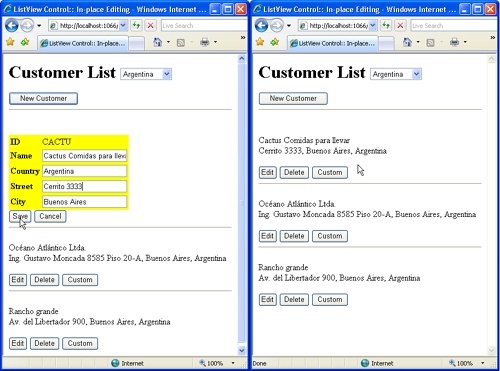
As you can see, Figure 11-10 also contains a Delete button side by side with the aforementioned Edit button. Here’s the full markup for ListView’s item template:
<ItemTemplate>
    <p>
        <%# Eval("CompanyName") %>
        <br />
        <%# Eval("Street") %>, <%# Eval("City") %>, <%# Eval("Country") %>
    </p>
    <asp:Button ID="btnEdit" runat="server" Text="Edit" CommandName="edit" />
    <asp:Button ID="btnDelete" runat="server" Text="Delete" CommandName="delete"
      OnClientClick="return confirm('Are you sure you want to delete this item?')," />
    <asp:Button ID="btnMyCommand" runat="server" Text="Custom" CommandName="mycommand" />
</ItemTemplate>
The Delete operation is even more crucial than an update. For this reason, you might want to be sure that deleting the record is exactly what the user wants. For example, you can pop up a client-side message box in which you ask the user to confirm the operation. It is a little piece of JavaScript code that you attach to the OnClientClick property of a Button control or to the onclick attribute of the corresponding HTML tag. It can save you a lot of trouble.
Wouldn’t it be nice if your application displays a message box upon the completion of an update operation? It doesn’t change the effect of the operation, but it would make users feel more comfortable. In a Web scenario, you can use only JavaScript for this purpose. The trick is that you register a piece of startup script code with the postback event where you execute the update operation. In this way, the script will be executed as soon as the page is served back to the browser. From the user’s perspective, this means right after the completion of the operation. Here’s what you need:
protected void ListView1_ItemUpdated(object sender, ListViewUpdatedEventArgs e)
{
    // Display a client message box at the end of the operation
    Page.ClientScript.RegisterStartupScript(
            this.GetType(),
            "update_Script",
            "alert('You successfully updated the system.'),",
            true);
}The ListView control allows you to define a made-to-measure interface for adding new records to the underlying data source. You do this through the InsertItemTemplate property. More often than not, the insert template is nearly identical to the edit item template, except for the fields that form the primary key of the data source. These fields are normally rendered as read-only text in the edit template. Clearly they have to be editable in an insert item scenario.
So let’s assume you have the following insert item template. As you can easily verify, it is the same edit item template we used in the previous example, except that a TextBox control is used for entering the ID of the new customer.
<InsertItemTemplate>
    <table>
        <tr>
            <td><b>ID</b></td>
            <td><asp:TextBox runat="server" ID="txtID"
                             MaxLength="5"
                             Text='<%# Bind("ID") %>' /></td>
        </tr>
        <tr>
            <td><b>Name</b></td>
            <td><asp:TextBox runat="server" ID="txtName"
                     Text='<%# Bind("CompanyName") %>' /></td>
        </tr>
        <tr>
            <td><b>Country</b></td>
            <td><asp:TextBox runat="server" ID="txtCountry"
                     Text='<%# Bind("Country") %>' /></td>
        </tr>
        <tr>
            <td><b>Street</b></td>
            <td><asp:TextBox runat="server" ID="txtStreet"
                     Text='<%# Bind("Street") %>' /></td>
        </tr>
        <tr>
            <td><b>City</b></td>
            <td><asp:TextBox runat="server" ID="txtCity"
                     Text='<%# Bind("City") %>' /></td>
        </tr>
    </table>
    <asp:Button ID="btnInsert" runat="server" Text="Add" CommandName="insert" />
    <asp:Button ID="btnCancel" runat="server" Text="Cancel" CommandName="cancel" />
</InsertItemTemplate>
How would you display this template? The edit item template shows up when the user clicks a button decorated with the Edit command name. Unfortunately, there’s no equivalent New command name to automatically bring up the insert item template. Instead, with the ListView the New command name is considered a custom command, handled by code you provide to activate the insert item template, unless it’s active by default. We’ll look at the details next.
The insert item template is displayed by position. The InsertItemPosition property determines where the template is displayed. There are three possibilities, as shown in Table 11-6.
Table 11-6. Feasible Positions for the Insert Item Template
If you leave the InsertItemPosition property set to its default value, no insert template is displayed, but you won’t have a predefined button to bring it up. If you use any of the other two values, the template is always visible and displayed at the beginning or the end of the list. This might not be desirable in most cases. Let’s see how to take programmatic control over the display of the insert template.
In the layout template, you add a custom button and capture any user’s click event. You can give the button any command name not listed in Table 11-5:
<asp:Button ID="btnNew" runat="server" Text="New Customer" CommandName="new" />
To handle the click on the button, you write an ItemCommand handler. In the event handler, you simply change the value of the InsertItemPosition property, as shown here:
protected void ListView1_ItemCommand(object sender, ListViewCommandEventArgs e)
{
     if (e.CommandName.Equals("New", StringComparison.OrdinalIgnoreCase))
     {
         ListView me = (ListView) sender;
         me.InsertItemPosition = InsertItemPosition.FirstItem;
     }
}
Changing the value of InsertItemPosition to anything but None brings up the insert item template, if any. In the insert template, you need to have a couple of predefined buttons with command names of Insert (to add) and Cancel (to abort).
It should be noted, though, that the insert item template is not automatically dismissed by the ListView control itself. As mentioned, this is because of the lack of built-in support for the New command name. In the end, this requires that you add a couple more handlers to dismiss the template when the user cancels or confirms the insertion.
The ItemCanceling event fires when the user hits a button associated with the Cancel command name. This can happen from either the edit or insert template. The event data object passed to the handler has the CancelMode property, which is designed to help you figure out what mode is active (insert or edit) and allow you to tailor your application’s response.
protected void ListView1_ItemCanceling(object sender, ListViewCancelEventArgs e)
{
    ListView me = (ListView) sender;

    // Dismissing the insert item template
    if (e.CancelMode == ListViewCancelMode.CancelingInsert)
        me.InsertItemPosition = InsertItemPosition.None;
}
To hide the insert item template after the new data item has been successfully appended to the data source, you use the ItemInserted event:
protected void ListView1_ItemInserted(object sender, ListViewInsertedEventArgs e)
{
    ListView me = (ListView) sender;
    me.InsertItemPosition = InsertItemPosition.None;
}
When you’re going to add a new record to an existing data source, a bit of validation—much more than is generally desirable—is mandatory. Being responsible for the insert template, you can add as many validators as necessary to the markup. The ListView control’s internal facilities then ensure that the operation is finalized only if no validator raised an error.
In particular, you might want to check whether the ID being inserted already exists in the data source. You can use a CustomValidator control attached to the text box:
<asp:TextBox runat="server" ID="txtID"
             MaxLength="5"
             Text='<%# Bind("ID") %>' />
<asp:CustomValidator runat="server" ID="CustomValidator1"
             ErrorMessage="Invalid ID"
             ControlToValidate="txtID"
             OnServerValidate="CustomValidator1_CheckID" />
The CustomValidator control fires a server-side event in which you can run code to validate the text in the input field. The server event is fired via a postback and has the following prototype:
protected void  CustomValidator1_CheckID(object source, ServerValidateEventArgs e)
{
    string proposedCustomerID = e.Value;
    e.IsValid = CheckIfUsed(proposedCustomerID);
}
private bool CheckIfUsed(string proposedCustomerID)
{
    var c = CustomerRepository.Load(proposedCustomerID);

    // The object is of type NoCustomer if no matching customer exists
    if (c is DAL.NoCustomer)
        return true;
    return false;
}
The Load method in the sample data access layer (DAL) used in this example supports the Special Case pattern. In other words, the method always returns a valid Customer object regardless of the value of the input proposedCustomerID parameter. If a customer with a matching ID can’t be found, the return object is an instance of the NoCustomer class. Of course, NoCustomer is a class that derives from Customer.
How is this different from returning a plain null value or perhaps an error code? In both cases, the caller can figure out whether a matching customer exists or not. However, returning a special-case Customer object is inherently more informative and doesn’t violate the consistency of the method—a class that inherits from Customer is always returned, whereas an error code is a number and null is a non-value.
The SelectedItemTemplate property allows you to assign a different template to the currently selected item in the ListView control. Note that only one displayed item at a time can be given the special selected template. But how do you select an item?
The selected item template is a special case of the item template. The two templates are similar and differ mostly in terms of visual settings—for example, a different background color. The switch between the regular and selected item template occurs when the user clicks on a button with the Select command name. If you intend to support the selection item feature, you place a Select button in the item template. When this button gets clicked, the ListView automatically applies the new template to the clicked item. Here are some sample item and selected item templates:
<ItemTemplate>
    <p>
        <asp:linkbutton runat="server" Text='<%# Eval("CompanyName") %>'
             CommandName="Select" />
        <br />
        <%# Eval("Street") %>, <%# Eval("City") %>, <%# Eval("Country") %>
    </p>
</ItemTemplate>

<SelectedItemTemplate>
    <h3>
        <%# Eval("CompanyName") %>
        <br />
        <%# Eval("Street") %>, <%# Eval("City") %>, <%# Eval("Country") %>
    </h3>

    <asp:Button ID="btnEdit" runat="server" Text="Edit" CommandName="Edit" />
    <asp:Button ID="btnDelete" runat="server" Text="Delete" CommandName="Delete"
        OnClientClick="return confirm('Are you sure you want to delete this item?')," />
    <asp:Button ID="btnUnselect" runat="server" Text="Unselect" CommandName="unselect" />
</SelectedItemTemplate>
In addition to changing some visual settings, the selected item template can contain buttons to trigger operations on the particular item.
In Figure 11-10 shown earlier, each item features its own set of operational buttons, such as Edit and Delete. This layout can be reworked to display buttons only on the selected item. To do so, you just move the buttons to the SelectedItemTemplate property.
In the item template, though, you need to insert a button control to trigger the selection process. You can use a push button or attach any significant text in the template to a link button:
<asp:linkbutton runat="server" Text='<%# Eval("CompanyName") %>' CommandName="Select" />Figure 11-11 shows the result.
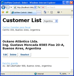
When you click the link button, the ListView switches the template and sets the SelectedIndex property accordingly. As soon as the user clicks on a different item, the selection is moved and the previously selected item regains the regular template. Is there a way to programmatically reset the selection? You bet.
All that you have to do is add a new custom button and handle its click event. In the event handler, you assign the –1 value to the SelectedIndex property. A value of –1 means that no items are selected. Here’s the related code snippet:
protected void ListView1_ItemCommand(object sender, ListViewCommandEventArgs e)
{
    ListView me = (ListView) sender;
    if (e.CommandName.Equals("Unselect", StringComparison.OrdinalIgnoreCase))
        me.SelectedIndex = -1;
}
Note that the index of the currently selected item and the index of the item being edited are saved to the view state and persisted across postbacks. This means that if the user changes the country/region selection (shown in Figure 11-11), both the edit and selection indexes are retained, which might not be desirable. For example, imagine that you selected (or are editing) the second customer from Argentina. Next, the user changes to Brazil while the selected (or edit) template is on. The result is that the second customer from Brazil is displayed in the selected (or edit) mode. If this behavior works for you, there’s nothing to modify in the code. Otherwise, you need to reset SelectedIndex and EditIndex in any postback event outside the ListView control. Here’s an example:
protected void DropDownList1_SelectedIndexChanged(object sender, EventArgs e)
{
    // The sender argument here indicates the DropDownList or any other
    // control responsible for the postback. You reference the ListView by
    // name or via a custom global member in the code-behind class of the page
    ListView1.SelectedIndex = -1;
    ListView1.EditIndex = -1;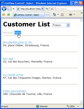
}In ASP.NET, grid controls support data paging natively. Purely iterative controls such as Repeater and DataList, though, leave the burden of pagination entirely on the developer’s capable shoulders. The ListView control falls somewhere in the middle of these two extreme positions. The ListView control doesn’t have built-in paging capabilities, but it knows how to work with a new control specifically designed to enable data paging on a variety of data-bound controls. This control is the DataPager.
The DataPager control is designed to add paging capabilities to a family of data-bound controls and not just the ListView. The support that the DataPager control offers to data-bound pageable controls such as the ListView is limited to the user interface of the pager.
You configure the DataPager to obtain the pager bar you like best, and then you instruct the DataPager control to fall back to the paged control to display the specified number of data items starting at the specified position. In no case does the DataPager expose itself to the data source or a data source control. All that it does is communicate to the paged control the next set of records to select and display. Table 11-7 lists the properties of the DataPager control.
Table 11-7. Properties of the DataPager Control
Only a few of these properties can be set declaratively. They are Fields, PagedControlID, PageSize, and QueryStringField. The other properties are read-only and owe their value to the paged control and the size of the bound data source.
The following code snippet shows the typical code you use to embed a data pager in an ASP.NET page that hosts a ListView control:
<asp:DataPager ID="DataPager1" runat="server"
     PagedControlID="ListView1" PageSize="4">
    <Fields>
        <asp:NextPreviousPagerField />
    </Fields>
</asp:DataPager>
The DataPager control heralds a new model for paging data-bound controls that is quite a bit different from the model employed by GridView controls. The user interface for paging is not part of the control, but it can be placed anywhere in the page and even driven through the query string.
The DataPager control is linked to the data-bound control being paged and lets this control know about the user selection. Subsequently, the paged control adjusts its row properties and passes the information back to the data pager. Figure 11-12 shows a data pager in action.
The user interface of the data pager control is largely customizable. You do that through the Fields property—a collection of DataPagerField objects. The property allows you to add multiple pagers of different styles. Table 11-8 lists the various options you have.
Table 11-8. Types of Data Pagers
All classes in Table 11-8 inherit from the same common class—DataPagerField. If you’re OK with the default user interface of the pagers, you don’t need to set any of the pager’s properties. The following markup, therefore, is perfectly functional:
<Fields>
   <asp:NumericPagerField />
</Fields>
Pager fields, though, have a number of visual properties to set the CSS style of buttons, the companion text, or perhaps the images to use instead of text.
As mentioned, the data pager control doesn’t handle data itself. Rather, the control is the manager of the paging user interface. For this reason, it needs to communicate with the paged control. Whenever a button in the pager is clicked to move to a given page, the pager control fires a message to the paged control and has it refresh the user interface properly.
Not all data-bound controls can be paged using a data pager. In ASP.NET, this privilege is limited to controls that implement the IPageableItemContainer interface. Currently, the sole control to support this interface is the ListView control. You can create your own custom controls to implement the interface, however. Here’s the definition of the interface:
public interface IPageableItemContainer
{
    // Events
    event EventHandler<PageEventArgs> TotalRowCountAvailable;

    // Methods
    void SetPageProperties(int startRowIndex, int maximumRows, bool databind);

    // Properties
    int MaximumRows { get; }
    int StartRowIndex { get; }
}
The PagedControlID property on the DataPager control defines the linked data-bound control. Whenever the pager is acted on, it invokes the SetPageProperties method on the paged control through the contracted interface. In doing so, it lets the ListView control (or the paged control) know about the new start row to display and the size of the page. Here’s the pseudocode used by the ListView control to support paging:
void SetPageProperties(int startRowIndex, int maximumRows, bool databind)
{
    if ((this._startRowIndex != startRowIndex) || (this._maximumRows != maximumRows))
    {
        PagePropertiesChangingEventArgs e;
        e = new PagePropertiesChangingEventArgs(startRowIndex, maximumRows);
        if (databind)
        {
            this.OnPagePropertiesChanging(e);
        }

        this._startRowIndex = e.StartRowIndex;
        this._maximumRows = e.MaximumRows;
        if (databind)
        {
            this.OnPagePropertiesChanged(EventArgs.Empty);
        }
    }
    if (databind)
    {
        base.RequiresDataBinding = true;
    }
}
PagePropertiesChanging and PagePropertiesChanged events are fired before and after, respectively, each paging operation.
The data pager control is normally placed outside the ListView’s layout. In this case, you use the PagedControlID property of the data pager to specify the paged control. However, if the PagedControlID property is not specified, the data pager assumes that its naming container is the paged control (as long as it implements the IPageableItemContainer interface). What does this mean to you? It means you can embed the data pager in the layout template of the ListView control and avoid setting the PagedControlID property on the pager explicitly.
The data bound to the ListView control can be sorted using a button in the layout template with the command name of Sort:
<LayoutTemplate>
   <asp:Button ID="btnSort" runat="server" Text="Sort"
               CommandName="Sort"
               CommandArgument="companyname" />
</LayoutTemplate>
You specify the sort expression and the initial sort direction using the CommandArgument property of the button. You use asc and desc to indicate the desired direction. Multiple sorting fields can be listed as well. The sorting automatically reverses from ascending to descending and vice versa as you click. The ListView’s SortExpression and SortDirection read-only properties tell you at any time about the current status of the sort.
The ListView control adds the benefits of ASP.NET view controls (such as the GridView or DetailsView control) to classic repeater data-bound controls such as DataList. The resulting control weds the extreme layout flexibility of a DataList or Repeater control with the power of two-way data binding of data source controls.
The ListView control can be used to implement virtually any reporting and publishing scenarios you can imagine. The distinct layout template gives you total control over the HTML being generated and the style it must have. Various item templates (regular, alternate, edit, selected, insert) let you decide about the markup to output for each possible state of the control.
Finally, the ListView control is a pageable control. Unlike other view controls, though, the ListView control binds to an external pager control—the new DataPager control. The connection between the two controls is all in the IPageableItemContainer interface. As a result, each data-bound control with this interface can be paged without incorporating the logic to page.