
So far, all the buttons and labels in examples have been rendered with a default look-and-feel that is standard for the underlying platform. With my machine’s color scheme, that usually means that they’re gray on Windows. Tkinter widgets can be made to look arbitrarily different, though, using a handful of widget and packer options.
Because I generally can’t resist the temptation to customize widgets in examples, I want to cover this topic early on the tour. Example 9-1 introduces some of the configuration options available in Tkinter.
Example 9-1. PP3EGuiTourconfig-label.py
from Tkinter import *
root = Tk( )
labelfont = ('times', 20, 'bold')                  # family, size, style
widget = Label(root, text='Hello config world')
widget.config(bg='black', fg='yellow')             # yellow text on black label
widget.config(font=labelfont)                      # use a larger font
widget.config(height=3, width=20)                  # initial size: lines,chars
widget.pack(expand=YES, fill=BOTH)
root.mainloop( )
Remember, we can call a widget’s config method to reset its options at any
time, instead of passing all of them to the object’s constructor.
Here, we use it to set options that produce the window in Figure 9-1.
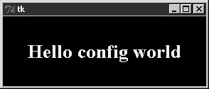
This may not be completely obvious unless you run this script on a real computer (alas, I can’t show it in color here), but the label’s text here shows up in yellow on a black background, and with a font that’s very different from what we’ve seen so far. In fact, this script customizes the label in a number of ways:
- Color
By setting the
bgoption of the label widget here, its background is displayed in black; thefgoption similarly changes the foreground (text) color of the widget to yellow. These color options work on most Tkinter widgets and accept either a simple color name (e.g.,'blue') or a hexadecimal string. Most of the color names you are familiar with are supported (unless you happen to work for Crayola). You can also pass a hexadecimal color identifier string to these options to be more specific; they start with a#and name a color by its red, green, and blue saturations, with an equal number of bits in the string for each. For instance,'#ff0000'specifies eight bits per color and defines pure red; “f” means four “1” bits in hexadecimal. We’ll come back to this hex form when we meet the color selection dialog later in this chapter.- Size
The label is given a preset size in lines high and characters wide by setting its
heightandwidthattributes. You can use this setting to make the widget larger than the Tkinter geometry manager would by default.- Font
This script specifies a custom font for the label’s text by setting the label’s
fontattribute to a three-item tuple giving the font family, size, and style (here: Times, 20-point, and bold). Font style can benormal,bold,roman,italic,underline,overstrike, or combinations of these (e.g., “bold italic”). Tkinter guarantees thatTimes,Courier, andHelveticafont family names exist on all platforms, but others may work too (e.g.,systemgives the system font on Windows). Font settings like this work on all widgets with text, such as labels, buttons, entry fields, listboxes, andText(the latter of which can display more than one font at once with “tags”). Thefontoption still accepts older X-style font indicators—long strings with dashes and stars—but the new tuple font indicator form is more platform independent.- Layout and expansion
Finally, the label is made generally expandable and stretched by setting the
pack expandandfilloptions we met in the last chapter; the label grows as the window does. If you maximize this window, its black background fills the whole screen and the yellow message is centered in the middle; try it.
In this script, the net effect of all these settings is that this label looks radically different from the ones we’ve been making so far. It no longer follows the Windows standard look-and-feel, but such conformance isn’t always important. Tkinter provides additional ways to customize appearance that are not used by this script:
- Border and relief
A
bd=Nwidget option can be used to set border width, and arelief=Soption can specify a border style;Scan beFLAT,SUNKEN,RAISED,GROOVE,SOLID, orRIDGE—all constants exported by the Tkinter module.- Cursor
A
cursoroption can be given to change the appearance of the mouse pointer when it moves over the widget. For instance,cursor='gumby'changes the pointer to a Gumby figure (the green kind). Other common cursor names used in this book includewatch,pencil,cross, andhand2.- State
Some widgets also support the notion of a state, which impacts their appearance. For example, a
state=DISABLEDoption will generally stipple (gray out) a widget on screen and make it unresponsive;NORMALdoes not. Some widgets support aREADONLYstate as well, which displays normally but is unresponsive to changes.- Padding
Extra space can be added around many widgets (e.g., buttons, labels, and text) with the
padx=Nandpady=Noptions. Interestingly, you can set these options both inpackcalls (where it adds empty space around the widget in general) and in a widget object itself (where it makes the widget larger).
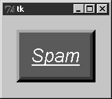
To illustrate some of these extra settings, Example 9-2 configures the custom button captured in Figure 9-2 and changes the mouse pointer when it is positioned above it.
Example 9-2. PP3EGuiTourconfig-button.py
from Tkinter import *
widget = Button(text='Spam', padx=10, pady=10)
widget.pack(padx=20, pady=20)
widget.config(cursor='gumby')
widget.config(bd=8, relief=RAISED)
widget.config(bg='dark green', fg='white')
widget.config(font=('helvetica', 20, 'underline italic'))
mainloop( )
To see the effects generated by these two scripts’ settings, try
out a few changes on your computer. Most widgets can be given a custom
appearance in the same way, and we’ll see such options used repeatedly
in this text. We’ll also meet operational configurations, such as
focus (for focusing input), and
others. In fact, widgets can have dozens of options; most have
reasonable defaults that produce a native look-and-feel on each
windowing platform, and this is one reason for Tkinter’s simplicity.
But Tkinter lets you build more custom displays when you want
to.