12
Reshaping Data with tidyr
One of the most common data wrangling challenges is adjusting how exactly row and columns are used to represent your data. Structuring (or restructuring) data frames to have the desired shape can be the most difficult part of creating a visualization, running a statistical model, or implementing a machine learning algorithm.
This chapter describes how you can use the tidyr (“tidy-er”) package to effectively transform your data into an appropriate shape for analysis and visualization.
12.1 What Is “Tidy” Data?
When wrangling data into a data frame for your analysis, you need to decide on the desired structure of that data frame. You need to determine what each row and column will represent, so that you can consistently and clearly manipulate that data (e.g., you know what you will be selecting and what you will be filtering). The tidyr package is used to structure and work with data fames that follow three principles of tidy data (as described by the package’s documentation1):
1tidyr: https://tidyr.tidyverse.org
Each variable is in a column.
Each observation is a row.
Each value is a cell.
Indeed, these principles lead to the data structuring described in Chapter 9: rows represent observations, and columns represent features of that data.
However, asking different questions of a data set may involve different interpretations of what constitutes an “observation.” For example, Section 11.6 described working with the flights data set from the nycflights13 package, in which each observation is a flight. However, the analysis made comparisons between airlines, airports, and months. Each question worked with a different unit of analysis, implying a different data structure (e.g., what should be represented by each row). While the example somewhat changed the nature of these rows by grouping and joining different data sets, having a more specific data structure where each row represented a specific unit of analysis (e.g., an airline or a month) may have made much of the wrangling and analysis more straightforward.
To use multiple different definitions of an “observation” when investigating your data, you will need to create multiple representations (i.e., data frames) of the same data set—each with its own configuration of rows and columns.
To demonstrate how you may need to adjust what each observation represents, consider the (fabricated) data set of music concert prices shown in Table 12.1. In this table, each observation (row) represents a city, with each city having features (columns) of the ticket price for a specific band.
Table 12.1 A “wide” data set of concert ticket price in different cities. Each observation (i.e., unit of analysis) is a city, and each feature is the concert ticket price for a given band.
city |
greensky_bluegrass |
trampled_by_turtles |
billy_strings |
fruition |
Seattle |
40 |
30 |
15 |
30 |
Portland |
40 |
20 |
25 |
50 |
Denver |
20 |
40 |
25 |
40 |
Minneapolis |
30 |
100 |
15 |
20 |
But consider if you wanted to analyze the ticket price across all concerts. You could not do this easily with the data in its current form, since the data is organized by city (not by concert)! You would prefer instead that all of the prices were listed in a single column, as a feature of a row representing a single concert (a city-and-band combination), as in Table 12.2.
Table 12.2 A “long” data set of concert ticket price by city and band. Each observation (i.e., unit of analysis) is a city–band combination, and each has a single feature that is the ticket price.
city |
band |
price |
Seattle |
greensky_bluegrass |
40 |
Portland |
greensky_bluegrass |
40 |
Denver |
greensky_bluegrass |
20 |
Minneapolis |
greensky_bluegrass |
30 |
Seattle |
trampled_by_turtles |
30 |
Portland |
trampled_by_turtles |
20 |
Denver |
trampled_by_turtles |
40 |
Minneapolis |
trampled_by_turtles |
100 |
Seattle |
billy_strings |
15 |
Portland |
billy_strings |
25 |
Denver |
billy_strings |
25 |
Minneapolis |
billy_strings |
15 |
Seattle |
fruition |
30 |
Portland |
fruition |
50 |
Denver |
fruition |
40 |
Minneapolis |
fruition |
20 |
Both Table 12.1 and Table 12.2 represent the same set of data—they both have prices for 16 different concerts. But by representing that data in terms of different observations, they may better support different analyses. These data tables are said to be in a different orientation: the price data in Table 12.1 is often referred to being in wide format (because it is spread wide across multiple columns), while the price data in Table 12.2 is in long format (because it is in one long column). Note that the long format table includes some duplicated data (the names of the cities and bands are repeated), which is part of why the data might instead be stored in wide format in the first place!
12.2 From Columns to Rows: gather()
Sometimes you may want to change the structure of your data—how your data is organized in terms of observations and features. To help you do so, the tidyr package provides elegant functions for transforming between orientations.
For example, to move from wide format (Table 12.1) to long format (Table 12.2), you need to gather all of the prices into a single column. You can do this using the gather() function, which collects data values stored across multiple columns into a single new feature (e.g., “price” in Table 12.2), along with an additional new column representing which feature that value was gathered from (e.g., “band” in Table 12.2). In effect, it creates two columns representing key–value pairs of the feature and its value from the original data frame.
# Reshape by gathering prices into a single feature
band_data_long <- gather(
band_data_wide,   # data frame to gather from
  key = band,     # name for new column listing the gathered features
  value = price,  # name for new column listing the gathered values
  -city           # columns to gather data from, as in dplyr's `select()`
)
The gather() function takes in a number of arguments, starting with the data frame to gather from. It then takes in a key argument giving a name for a column that will contain as values the column names the data was gathered from—for example, a new band column that will contains the values "greensky_bluegrass", "trampled_by_turtles", and so on. The third argument is a value, which is the name for the column that will contain the gathered values—for example, price to contain the price numbers. Finally, the function takes in arguments representing which columns to gather data from, using syntax similar to using dplyr to select() those columns (in the preceding example, -city indicates that it should gather from all columns except city). Again, any columns provided as this final set of arguments will have their names listed in the key column, and their values listed in the value column. This process is illustrated in Figure 12.1. The gather() function’s syntax can be hard to intuit and remember; try tracing where each value “moves” in the table and diagram.
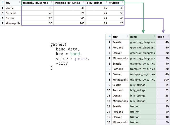
gather() function takes values from multiple columns (greensky_bluegrass, trampled_by_turtles, etc.) and gathers them into a (new) single column (price). In doing so, it also creates a new column (band) that stores the names of the columns that were gathered (i.e., the column name in which each value was stored prior to gathering).
Note that once data is in long format, you can continue to analyze an individual feature (e.g., a specific band) by filtering for that value. For example, filter(band_data_long, band == "greensky_bluegrass") would produce just the prices for a single band.
12.3 From Rows to Columns: spread()
It is also possible to transform a data table from long format into wide format—that is, to spread out the prices into multiple columns. Thus, while the gather() function collects multiple features into two columns, the spread() function creates multiple features from two existing columns. For example, you can take the long format data shown in Table 12.2 and spread it out so that each observation is a band, as in Table 12.3:
# Reshape long data (Table 12.2), spreading prices out among multiple features
price_by_band <- spread(
  band_data_long, # data frame to spread from
  key = city,     # column indicating where to get new feature names
  value = price   # column indicating where to get new feature values
)
Table 12.3 A “wide” data set of concert ticket prices for a set of bands. Each observation (i.e., unit of analysis) is a band, and each feature is the ticket price in a given city.
band |
Denver |
Minneapolis |
Portland |
Seattle |
billy_strings |
25 |
15 |
25 |
15 |
fruition |
40 |
20 |
50 |
30 |
greensky_bluegrass |
20 |
30 |
40 |
40 |
trampled_by_turtles |
40 |
100 |
20 |
30 |
The spread() function takes arguments similar to those passed to the gather() function, but applies them in the opposite direction. In this case, the key and value arguments are where to get the column names and values, respectively. The spread() function will create a new column for each unique value in the provided key column, with values taken from the value feature. In the preceding example, the new column names (e.g., "Denver", "Minneapolis") were taken from the city feature in the long format table, and the values for those columns were taken from the price feature. This process is illustrated in Figure 12.2.

spread() function spreads out a single column into multiple columns. It creates a new column for each unique value in the provided key column (city). The values in each new column will be populated with the provided value column (price).
By combining gather() and spread(), you can effectively change the “shape” of your data and what concept is represented by an observation.
Tip
Before spreading or gathering your data, you will often need to unite multiple columns into a single column, or to separate a single column into multiple columns. The tidyr functions unite()a and separate()b provide a specific syntax for these common data preparation tasks.
12.4 tidyr in Action: Exploring Educational Statistics
This section uses a real data set to demonstrate how reshaping your data with tidyr is an integral part of the data exploration process. The data in this example was downloaded from the World Bank Data Explorer,2 which is a data collection of hundreds of indicators (measures) of different economic and social development factors. In particular, this example considers educational indicators3 that capture a relevant signal of a country’s level of (or investment in) education—for example, government expenditure on education, literacy rates, school enrollment rates, and dozens of other measures of educational attainment. The imperfections of this data set (unnecessary rows at the top of the .csv file, a substantial amount of missing data, long column names with special characters) are representative of the challenges involved in working with real data sets. All graphics in this section were built using the ggplot2 package, which is described in Chapter 16. The complete code for this analysis is also available online in the book’s code repository.4
2World Bank Data Explorer: https://data.worldbank.org
3World Bank education: http://datatopics.worldbank.org/education
4tidyr in Action: https://github.com/programming-for-data-science/in-action/tree/master/tidyr
After having downloaded the data, you will need to load it into your R environment:
# Load data, skipping the unnecessary first 4 rows
wb_data <- read.csv(
  "data/world_bank_data.csv",
  stringsAsFactors = F,
  skip = 4
)
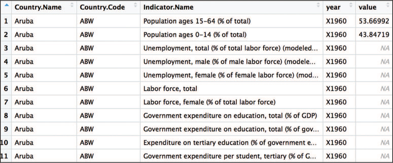
When you first load the data, each observation (row) represents an indicator for a country, with features (columns) that are the values of that indicator in a given year (see Figure 12.3). Notice that many values, particularly for earlier years, are missing (NA). Also, because R does not allow column names to be numbers, the read.csv() function has prepended an X to each column name (which is just a number in the raw .csv file).

While in terms of the indicator this data is in long format, in terms of the indicator and year the data is in wide format—a single column contains all the values for a single year. This structure allows you to make comparisons between years for the indicators by filtering for the indicator of interest. For example, you could compare each country’s educational expenditure in 1990 to its expenditure in 2014 as follows:
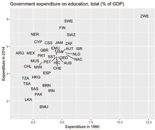
# Visually compare expenditures for 1990 and 2014

# Begin by filtering the rows for the indicator of interest
indicator <- "Government expenditure on education, total (% of GDP)"
expenditure_plot_data <- wb_data %>%
  filter(Indicator.Name == indicator)

# Plot the expenditure in 1990 against 2014 using the `ggplot2` package
# See Chapter 16 for details
expenditure_chart <- ggplot(data = expenditure_plot_data) +
  geom_text_repel(
    mapping = aes(x = X1990 / 100, y = X2014 / 100, label = Country.Code)
  ) +
  scale_x_continuous(labels = percent) +
  scale_y_continuous(labels = percent) +
  labs(title = indicator, x = "Expenditure 1990", y = "Expenditure 2014")
Figure 12.4 shows that the expenditure (relative to gross domestic product) is fairly correlated between the two time points: countries that spent more in 1990 also spent more in 2014 (specifically, the correlation—calculated in R using the cor() function—is .64).
However, if you want to extend your analysis to visually compare how the expenditure across all years varies for a given country, you would need to reshape the data. Instead of having each observation be an indicator for a country, you want each observation to be an indicator for a country for a year—thereby having all of the values for all of the years in a single column and making the data long(er) format.
To do this, you can gather() the year columns together:
# Reshape the data to create a new column for the `year`
long_year_data <- wb_data %>%
  gather(
    key = year, # `year` will be the new key column
    value = value, # `value` will be the new value column
    X1960:X # all columns between `X1960` and `X` will be gathered
  )
As shown in Figure 12.5, this gather() statement creates a year column, so each observation (row) represents the value of an indicator in a particular country in a given year. The expenditure for each year is stored in the value column created (coincidentally, this column is given the name "value").
year). This structure allows you to more easily create visualizations across multiple years.This structure will now allow you to compare fluctuations in an indicator’s value over time (across all years):
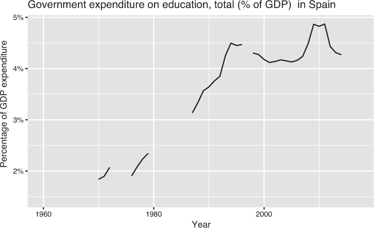
# Filter the rows for the indicator and country of interest
indicator <- "Government expenditure on education, total (% of GDP)"
spain_plot_data <- long_year_data %>%
  filter(
    Indicator.Name == indicator,
    Country.Code == "ESP" # Spain
  ) %>%
  mutate(year = as.numeric(substr(year, 2, 5))) # remove "X" before each year

# Show the educational expenditure over time
chart_title <- paste(indicator, " in Spain")
spain_chart <- ggplot(data = spain_plot_data) +
  geom_line(mapping = aes(x = year, y = value / 100)) +
  scale_y_continuous(labels = percent) +
  labs(title = chart_title, x = "Year", y = "Percent of GDP Expenditure")
The resulting chart, shown in Figure 12.6, uses the available data to show a timeline of the fluctuations in government expenditures on education in Spain. This produces a more complete picture of the history of educational investment, and draws attention to major changes as well as the absence of data in particular years.
You may also want to compare two indicators to each other. For example, you may want to assess the relationship between each country’s literacy rate (a first indicator) and its unemployment rate (a second indicator). To do this, you would need to reshape the data again so that each observation is a particular country and each column is an indicator. Since indicators are currently in one column, you need to spread them out using the spread() function:
# Reshape the data to create columns for each indicator
wide_data <- long_year_data %>%
  select(-Indicator.Code) %>% # do not include the `Indicator.Code` column
  spread(
    key = Indicator.Name, # new column names are `Indicator.Name` values
    value = value # populate new columns with values from `value`
  )
This wide format data shape allows for comparisons between two different indicators. For example, you can explore the relationship between female unemployment and female literacy rates, as shown in Figure 12.7.
# Prepare data and filter for year of interest
x_var <- "Literacy rate, adult female (% of females ages 15 and above)"
y_var <- "Unemployment, female (% of female labor force) (modeled
  ILO estimate)"

lit_plot_data <- wide_data %>%
  mutate(
    lit_percent_2014 = wide_data[, x_var] / 100,
    employ_percent_2014 = wide_data[, y_var] / 100
  ) %>%
  filter(year == "X2014")

# Show the literacy vs. employment rates
lit_chart <- ggplot(data = lit_plot_data) +
  geom_point(mapping = aes(x = lit_percent_2014, y = employ_percent_2014)) +
  scale_x_continuous(labels = percent) +
  scale_y_continuous(labels = percent) +
  labs(
    x = x_var,
    y = "Unemployment, female (% of female labor force)",
    title = "Female Literacy Rate versus Female Unemployment Rate"
  )

Each comparison in this analysis—between two time points, over a full time-series, and between indicators—required a different representation of the data set. Mastering use of the tidyr functions will allow you to quickly transform the shape of your data set, allowing for rapid and effective data analysis. For practice reshaping data with the tidyr package, see the set of accompanying book exercises.5
5tidyr exercises: https://github.com/programming-for-data-science/chapter-12-exercises