
Sometimes it’s really nice to have a visual representation of your data. In this recipe, we are going to look at using the plot.ly python API to generate a nice graph.
In this recipe, we will be using the plot.ly API to generate our graph. If you don’t already have one, you’ll need to sign up for an account at https://plot.ly.
Once you have an account, you will need to prepare your environment for using plot.ly.
The easiest way is to use pip to install it, so simply run the command:
$ pip install plotly
Then, you will need to run the following command (substituting the {username}, {apikey}, and {streamids} with your own, which are viewable under your account subscriptions on the plot.ly site):
python -c “import plotly; plotly.tools.set_credentials_file(username=’{username}’, api_key=’{apikey}’, stream_ids=[{streamids}])”
If you are following along with this example, I used the pcap file that is available online here for testing: http://www.snaketrap.co.uk/pcaps/hbot.pcap.
We will be enumerating all the FTP packets from the pcap file and plotting them against time.
To parse the pcap file, we will be using the dpkt module. Like Scapy, which has been used in earlier recipes, dpkt can be use to parse and manipulate packets.
The easiest way is to use pip to install it. Simply run the following command:
$ pip install dpkt
This recipe will read a pcap file and extract the dates and times of any FTP packets before plotting this data to a graph:
import time, dpkt
import plotly.plotly as py
from plotly.graph_objs import *
from datetime import datetime

filename = ‘hbot.pcap’

full_datetime_list = []
dates = []

for ts, pkt in dpkt.pcap.Reader(open(filename,’rb’)):
    eth=dpkt.ethernet.Ethernet(pkt)
    if eth.type!=dpkt.ethernet.ETH_TYPE_IP:
        continue

    ip = eth.data
    tcp=ip.data

    if ip.p not in (dpkt.ip.IP_PROTO_TCP, dpkt.ip.IP_PROTO_UDP):
        continue

    if tcp.dport == 21 or tcp.sport == 21:
        full_datetime_list.append((ts, str(time.ctime(ts))))

for t,d in full_datetime_list:
    if d not in dates:
        dates.append(d)

dates.sort(key=lambda date: datetime.strptime(date, “%a %b %d %H:%M:%S %Y”))

datecount = []

for d in dates:
    counter = 0
    for d1 in full_datetime_list:
        if d1[1] == d:
            counter += 1

    datecount.append(counter)

data = Data([
    Scatter(
        x=dates,
        y=datecount
    )
])
plot_url = py.plot(data, filename=’FTP Requests’)We first import the necessary modules and assign the filename of our pcap file to a variable:
import time, dpkt
import plotly.plotly as py
from plotly.graph_objs import *
from datetime import datetime

filename = ‘hbot.pcap’
Next, we set up our lists that we will populate when we iterate over our pcap file. The Full_datetime_list variable will hold all the FTP packets dates while dates we will use to hold unique datetime from the full list:
full_datetime_list = []
dates = []
We then open up the pcap file for reading and iterate over it in a for loop. This section checks that the packet is an FTP packet and if it is, it then appends the time to our array:
for ts, pkt in dpkt.pcap.Reader(open(filename,’rb’)):
    eth=dpkt.ethernet.Ethernet(pkt)
    if eth.type!=dpkt.ethernet.ETH_TYPE_IP:
        continue

    ip = eth.data
    tcp=ip.data

    if ip.p not in (dpkt.ip.IP_PROTO_TCP, dpkt.ip.IP_PROTO_UDP):
        continue

    if tcp.dport == 21 or tcp.sport == 21:
        full_datetime_list.append((ts, str(time.ctime(ts))))
Now that we have our list of datetime function for the FTP traffic, we can get the unique datetime function out of it and populate our dates array:
for t,d in full_datetime_list:
    if d not in dates:
        dates.append(d)
We then sort the dates, so that they are in order on our graph:
dates.sort(key=lambda date: datetime.strptime(date, “%a %b %d H:%M:%S %Y”))
Then, we simply iterate over the unique dates and count all the packets sent/received during that time from our larger array and populate our counter array:
datecount = []

for d in dates:
    counter = 0
    for d1 in full_datetime_list:
        if d1[1] == d:
            counter += 1

    datecount.append(counter)
All that is left to do is make an API call to plot.ly, using our date array and count the array as the data points:
data = Data([
    Scatter(
        x=dates,
        y=datecount
    )
])
plot_url = py.plot(data, filename=’FTP Requests’)
When you run the script, it should pop open the browser to your newly created plot.ly graph, as shown here:
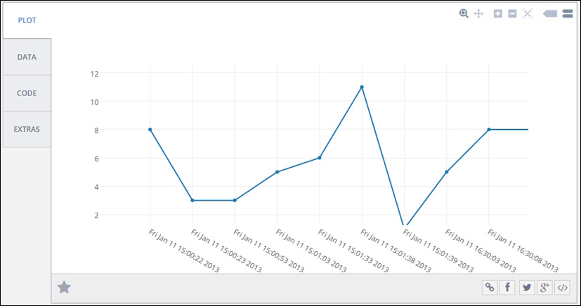
And that’s all there is to it. plot.ly has a lot of different methods to visualize your data and it is well worth having a play around with it. Think of how impressed your boss will be when they see all the pretty graphs that you start sending them.