
Chapter 8
Standardized usability questionnaires
Abstract
Standardized usability questionnaires are questionnaires designed for the assessment of perceived usability, typically with a specific set of questions presented in a specified order using a specified format with specific rules for producing scores based on the answers of respondents. For usability testing, standardized questionnaires are available for assessment of a product at the end of a study (post-study—e.g., QUIS, SUMI, PSSUQ, and SUS) and after each task in a study (post-task—e.g., ASQ, Expectation Ratings, SEQ, SMEQ, and Usability Magnitude Estimation). Standardized questionnaires are also available for the assessment of website usability (e.g., WAMMI and SUPR-Q) and for a variety of related constructs. Almost all of these questionnaires have undergone some type of psychometric qualification, including assessment of reliability, validity, and sensitivity, making them valuable tools for usability practitioners.
Keywords
standardized usability questionnaire
reliability
coefficient alpha
validity
sensitivity
factor analysis
mixed tone
acquiescence bias
Introduction
What is a standardized questionnaire?
A questionnaire is a form designed to obtain information from respondents. The items in a questionnaire can be open-ended questions, but are more typically multiple choice, with respondents selecting from a set of alternatives (“Please select the type of the car that you usually drive.”) or points on a rating scale (“On a scale of 1–5, how satisfied were you with your recent stay at our hotel?”). This chapter does not provide comprehensive coverage of the techniques for designing ad hoc or special-purpose questionnaires. For information about those techniques, see references such as Parasuraman (1986), Kuniavsky (2003), Courage and Baxter (2005), Brace (2008), Tullis and Albert (2008), or Azzara (2010).
The primary focus of this chapter is to describe current standardized questionnaires designed to assess participants’ satisfaction with the perceived usability of products or systems during or immediately after usability testing. A standardized questionnaire is a questionnaire designed for repeated use, typically with a specific set of questions presented in a specified order using a specified format, with specific rules for producing metrics based on the answers of respondents. As part of the development of standardized questionnaires, it is customary for the designer to report measurements of its reliability, validity, and sensitivity— in other words, for the questionnaire to have undergone psychometric qualification (Nunnally, 1978).
Advantages of standardized usability questionnaires
Standardized measures offer many advantages to practitioners (Nunnally, 1978), specifically:
• Objectivity: A standardized measurement supports objectivity because it allows usability practitioners to independently verify the measurement statements of other practitioners.
• Replicability: It is easier to replicate the studies of others, or even one’s own studies, when using standardized methods. For example, research on usability measurement has consistently shown that standardized usability questionnaires are more reliable than nonstandardized (ad hoc, homegrown) usability questionnaires (Hornbæk, 2006; Hornbæk and Law, 2007; Sauro and Lewis, 2009).
• Quantification: Standardized measurements allow practitioners to report results in finer detail than they could using only personal judgment. Standardization also permits practitioners to use powerful methods of mathematics and statistics to better understand their results (Nunnally, 1978). Although the application of statistical methods such as t-tests to multipoint scale data has a history of controversy (for details, see Chapter 9), our research and practice indicates that these methods work well with multipoint scale data.
• Economy: Developing standardized measures requires a substantial amount of work. However, once developed, they are very economical to reuse.
• Communication: It is easier for practitioners to communicate effectively when standardized measures are available. Inadequate efficiency and fidelity of communication in any field impedes progress.
• Scientific generalization: Scientific generalization is at the heart of scientific work. Standardization is essential for assessing the generalization of results.
What standardized usability questionnaires are available?
The earliest standardized questionnaires in this area focused on the measurement of computer satisfaction (e.g., the Gallagher Value of MIS Reports Scale and the Hatcher and Diebert Computer Acceptance Scale), but were not designed for the assessment of usability following participation in scenario-based usability tests. For a review of computer satisfaction questionnaires published between 1974 and 1988, see LaLomia and Sidowski (1990). The first standardized usability questionnaires appropriate for usability testing appeared in the late 1980s (Chin et al., 1988; Kirakowski and Dillon, 1988; Lewis, 1990a,b). Some standardized usability questionnaires are for administration at the end of a study. Others are for a quick, more contextual assessment at the end of each task or scenario.
Currently, the most widely used standardized usability questionnaires for assessment of the perception of usability at the end of a study (after completing a set of test scenarios) and those cited in national and international standards (ANSI, 2001; ISO, 1998) are:
• The Questionnaire for User Interaction Satisfaction (QUIS) (Chin et al., 1988)
• The Software Usability Measurement Inventory (SUMI) (Kirakowski and Corbett, 1993; McSweeney, 1992)
• The System Usability Scale (SUS) (Brooke, 1996)
Questionnaires intended for administration immediately following the completion of a usability task or test scenario that is part of a larger overall study include:
• Expectation Ratings (ER) (Albert and Dixon, 2003)
• The Subjective Mental Effort Question (SMEQ) (Sauro and Dumas, 2009)
Assessing the quality of standardized questionnaires: reliability, validity, and sensitivity
The primary measures of standardized questionnaire quality are reliability (consistency of measurement) and validity (measurement of the intended attribute) (Nunnally, 1978). There are several ways to assess reliability, including test–retest and split-half reliability. The most common method for the assessment of reliability is coefficient alpha (also known as Cronbach’s alpha), a measurement of internal consistency (Cortina, 1993; Nunnally, 1978). Coefficient alpha can range from 0 (no reliability) to 1 (perfect reliability). Measures that can affect a person’s future, such as IQ tests or college entrance exams, should have a minimum reliability of 0.90 (Nunnally, 1978). For other research or evaluation, measurement reliability in the range of 0.70–0.80 is acceptable (Landauer, 1997).
A questionnaire’s validity is the extent to which it measures what it claims to measure. There are several distinct approaches to establishing validity.
Content validity depends on a rational (rather than empirical) assessment of where the items came from. Typically, content validity is assumed if the items were created by domain experts or selected from a literature review of existing questionnaires in the target or related domains.
Criterion-related validity refers to the relationship between the measure of interest and a different concurrent or predictive measure, typically assessed with the Pearson correlation coefficient (see Chapter 10 for information about correlations). These correlations do not have to be large to provide evidence of validity. For example, personnel selection instruments with validities as low as 0.30 or 0.40 can be large enough to justify their use (Nunnally, 1978).
Construct validity refers to the extent to which the items selected for a questionnaire align with the underlying constructs that the questionnaire was designed to assess. Questionnaire developers use statistical procedures (primarily factor analysis) to discover or confirm clusters of related items. When items cluster together in a reasonable (or expected) way, this is not only evidence of construct validity, but also is the basis for forming reasonable subscales. High correlations between measurements believed to tap into the same construct are evidence of convergent validity. Low correlations between variables that are not expected to measure the same construct are evidence of divergent validity (sometimes referred to as “discriminant validity”).
If a questionnaire is reliable and valid, then it should also be sensitive to experimental manipulation. For example, responses from participants who experience difficulties working with Product A but find Product B easy to use should reflect Product B’s relatively better usability through statistically significant differences. There is no direct measurement of sensitivity similar to those for reliability and validity. An indirect measure of sensitivity is the minimum sample size needed to achieve statistical significance when comparing products. Keeping everything else equal (i.e., the “true” difference in usability between Product A and Product B), the more sensitive a questionnaire, the smaller is the minimum required sample size.
Other item characteristics
Number of scale steps
The question of the “right” number of scale steps often comes up when discussing questionnaire design. In general, more scale steps are better than fewer scale steps in standardized questionnaires, but with rapidly diminishing returns. For mathematical reasons (and confirmed by empirical studies), the reliability of individual items increases as a function of the number of steps (Nunnally, 1978). As the number of scale steps increases from 2 to 20, the increase in reliability is very rapid at first, tends to level off at about 7, and after 11 steps there is little gain in reliability from increasing the number. The number of steps in an item is very important for measurements based on a single item (thus our recommendation to use a 7-step version of the SEQ) but is less important when computing measurements over a number of items (as in the computation of an overall or subscale score from a multi-item questionnaire).
Availability of a neutral response
A question related to the number of scale steps is whether to provide a neutral response option. Neutral response options are a natural consequence of items with an odd number of steps—the neutral response is the option in the middle. Another way to allow a neutral response is with a Not Applicable (NA) choice on or off the scale. A neutral point allows respondents who honestly have no definite attitude with regard to the content of the item to indicate this. An even number of steps forces respondents to express a positive or negative attitude (although they always have the choice to refuse to respond to the item).
For questionnaire design in general, there is no simple recommendation for providing or withholding a neutral response option. Presser and Schuman (1980) found that offering a middle position increases the size of that category but “tends not to otherwise affect univariate distributions” (p. 70). As Parasuraman (1986, p. 399) puts it, “the choice between a forced or nonforced format must be made after carefully considering the characteristics unique to the situation.”
The designers of most standardized usability questionnaires with items containing a relatively small number of steps have chosen an odd number of steps, implicitly indicating a belief that it is possible, perhaps even common, for respondents to have a neutral attitude when completing a usability questionnaire. An exception is earlier versions of the QUIS, which had ten steps ranging from 0 to 9. The current Version 7 has nine steps ranging from 1 to 9, with an NA choice (see http://lap.umd.edu/quis/).
Agreement versus bipolar scales
The two most common formats for standardized questionnaires designed to assess sentiments (such as satisfaction or perceived usability) are Likert-type agreement items and bipolar items. For a Likert-type agreement item, respondents indicate the extent to which they agree or disagree with a statement such as “I thought the system was easy to use” (e.g., Fig. 8.5). An analogous bipolar item would have respondents choose a number between opposing endpoints, for example, “Difficult to use” at one end and “Easy to use” on the other (e.g., Fig. 8.1). Both formats are in wide use, and both produce measurements that are amenable to similar psychometric analysis (e.g., factor analysis).

Figure 8.1 Sample QUIS item
Norms
By itself a score, individual or average, anchored or unanchored, has no truly established meaning with regard to whether it is poor or good. Some sort of comparison is required. One way to provide meaning is through comparison using a statistical test, either with one set of data against a benchmark or comparison of two sets of data from, for example, different products or different user groups. Another is comparison with norms. The basis for norms is data collected from a representative group that has a sufficiently large sample size to establish percentiles. For a metric in which a low score is poorer than a high score, an observed score that is at the 5th percentile can be interpreted as markedly poorer than one that is at the 95th percentile. Thus, standardized questionnaires for which there is normative data are of greater value to practitioners than questionnaires that lack them. On the other hand, even when a questionnaire has norms, there is always a risk that the new sample doesn’t match the normative sample, so it is important to understand where a questionnaire’s norms came from. As Anastasi (1976, p. 89) stated, “Test norms are in no sense absolute, universal, or permanent.”
Post-study questionnaires
This section of the chapter contains information about a number of published post-study questionnaires, including the four “classic” standardized usability questionnaires (QUIS, SUMI, PSSUQ, and SUS) and two new short questionnaires (UMUX and UMUX-LITE).
QUIS (Questionnaire for User Interaction Satisfaction)
Description of the QUIS
The QUIS was the first published of these four post-study questionnaires (Chin et al., 1988). According to the QUIS website (http://lap.umd.edu/QUIS/), a multidisciplinary team of researchers in the Human-Computer Interaction Lab (HCIL) at the University of Maryland at College Park created the QUIS to assess users’ subjective satisfaction with specific aspects of the human–computer interface.
The current version of the QUIS (7.0) contains “a demographic questionnaire, a measure of overall system satisfaction along six scales, and hierarchically organized measures of nine specific interface factors (screen factors, terminology and system feedback, learning factors, system capabilities, technical manuals, online tutorials, multimedia, teleconferencing, and software installation)” (http://lap.umd.edu/QUIS/about.html, downloaded March 17, 2011). QUIS 7.0 is available in five languages (English, German, Italian, Brazilian Portuguese, and Spanish) and two lengths, short (41 items) and long (122 items), using 9-point bipolar scales for each item (Fig. 8.1). According to the QUIS website, most people use the short version, and only the sections that are applicable to the system or product.
To use the QUIS, it’s necessary to license it from the University of Maryland’s Office of Technology Commercialization. At the time of this writing, the fees are $50 for a student license, $200 for an academic or other nonprofit license, and $750 for a commercial license.
Psychometric evaluation of the QUIS
The primary source for information on the psychometric evaluation of the QUIS is Chin et al. (1988), which reported research on the QUIS Versions 3 through 5. The first long version of the QUIS had 90 items with:
• Bipolar scales numbered from 0 to 9
• All scales aligned with the negative response on the left
• An off-scale NA response option
• Five items for overall reaction to the system
• 85 component-related questions organized into 20 groups
The psychometric evaluation reported by Chin et al. (1988) was for a short form of Version 5 with 27 items covering overall reactions to the software, screen, terminology and system information, learning, and system capabilities. Data from 127 participants indicated an overall reliability of 0.94 (no information provided for the subscales). The participants completed four QUIS questionnaires each (one for a liked system, one for disliked, one for an MS-DOS command-line application, and one for any of several contemporary menu-driven applications). A factor analysis (n = 96) of the correlations among the items was, for the most part, consistent with expectation (an indication of construct validity), but with some notable exceptions—for example, the items hypothesized to be in a screen factor did not group as expected. Comparison of ratings for liked and disliked systems showed means for liked systems were higher (better) than those for disliked systems, providing some evidence of sensitivity.
Slaughter et al. (1994) compared responses from paper and online formats of the QUIS Version 5.5. Twenty participants used a word processor and then completed both questionnaires with one week between completions. Half of the participants completed the paper version first. Consistent with the findings of most research comparing paper and online questionnaire formats, there was no significant difference in user ratings.
SUMI (Software Usability Measurement Inventory)
Description of the SUMI
The SUMI is a product of the Human Factors Research Group (HFRG) at University College Cork in Ireland, led by Jurek Kirakowski. Their first standardized questionnaire was the Computer Usability Satisfaction Inventory (CUSI—Kirakowski and Dillon, 1988). The CUSI was a 22-item questionnaire (overall reliability: 0.94) with two subscales, one for Affect (reliability of 0.91) and the other for Competence (reliability of 0.89).
In the early 1990s, the HFRG replaced the CUSI with the SUMI (Kirakowski, 1996). The SUMI is a 50-item questionnaire with a Global scale based on 25 of the items and five subscales for Efficiency, Affect, Helpfulness, Control, and Learnability (10 items each). As shown in the example in Fig. 8.2 (the first item of the SUMI), the items have three scale steps (Agree, Undecided, Disagree). The SUMI contains a mixture of positive and negative statements (e.g., “The instructions and prompts are helpful”; “I sometimes don’t know what to do next with this system”). To view the entire SUMI, see http://sumi.ucc.ie/en/.

Figure 8.2 Sample SUMI item
The SUMI is currently available in 14 languages (Dutch, English, Finnish, French, German, Greek, Italian, Norwegian, Polish, Portuguese, Slovenian, Spanish, Swedish, and Turkish). The use of the SUMI requires a license from the HFRG. At the time of writing this chapter, the HFRG offers three services with differing fees: offline (€1300), online (€650), and online student (no charge). For descriptions of the services and their requirements, see http://sumi.ucc.ie/pricing.html.
Psychometric evaluation of the SUMI
During its development, the SUMI underwent a considerable amount of psychometric development and evaluation (Kirakowski, 1996). The initial pool of SUMI items was 150. After content analysis by a group of ten HCI experts and software engineers, the remaining pool contained 75 items. A factor analysis of responses to these 75 items by 139 end users plus detailed item analysis led to the final 50 items and a decision to use a three-step agreement scale for the items. Factor analysis of an independent sample of 143 users who completed the 50-item version of the SUMI revealed five subscales:
• Efficiency: The degree to which the software helps users complete their work
• Affect: The general emotional reaction to the software
• Helpfulness: The degree to which the software is self-explanatory, plus the adequacy of help facilities and documentation
• Control: The extent to which the user feels in control of the software
• Learnability: The speed and facility with which users feel they mastered the system or learned to use new features
In addition to these subscales, there is a Global scale based on the 25 items that loaded most strongly on a general usability factor. After making a few minor changes to get to the final version of the SUMI, the researchers at HFRG collected over 1000 completed questionnaires from 150 systems, confirmed the preliminary factor structure, and used coefficient alpha to calculate the reliability of the SUMI scales. This large sample was also the start of one of the most powerful features of the SUMI—a normative database with which practitioners can compare their results to those of similar products and tasks, keeping in mind that variation in products and tasks can weaken the generalizability of norms (Cavallin et al., 2007). Table 8.1 shows the scales and their reliabilities.
Table 8.1
Reliabilities of the SUMI Scales
| SUMI Scale | Reliability | SUMI Scale | Reliability |
| Global | 0.92 | Helpfulness | 0.83 |
| Efficiency | 0.81 | Control | 0.71 |
| Affect | 0.85 | Learnability | 0.82 |

Other psychometric features of the SUMI are scale standardization and sufficient data for item-level analysis. When analyzing raw SUMI scores (obtained by adding the responses for each item), HFRG uses proprietary formulas to convert raw scores to standard scores with a mean of 50 and standard deviation of 10. From the properties of the normal distribution, this means that about 68% of SUMI standard scores will fall between 40 and 60 and, by definition, those below 40 are below average and those above 60 are above average. Item-level analysis uses the standardization database to identify items that fall far away from the expected distribution of Agree, Undecided, and Disagree responses, which can sometimes provide more precise diagnostic information to use when interpreting the results.
The factor analyses conducted during the development and evaluation of the SUMI provide evidence of construct validity. There appear to be no published data on predictive or concurrent validity. A number of evaluations have demonstrated the sensitivity of the SUMI. For example, analysis of SUMI scores obtained from 94 users of word-processing systems showed significant differences in SUMI scale scores as a function of the system participants were using. There was also a significant interaction between the systems used and the different SUMI scale scores, which indicates that the various scales measured different aspects of user satisfaction with their systems (Kirakowski, 1996).
PSSUQ (Post-Study System Usability Questionnaire)
Description of the PSSUQ
The PSSUQ is a questionnaire designed to assess users’ perceived satisfaction with computer systems or applications. The origin of the PSSUQ was an internal IBM project called SUMS (System Usability MetricS), headed by Suzanne Henry. The SUMS researchers created a large pool of items based on the contextual usability work of Whiteside et al. (1988). After content analysis by that group of human factors engineers and usability specialists, 18 items remained for the first version of the PSSUQ (Lewis, 1990a, 1992).
An independent IBM investigation into customer perception of usability of several different user groups indicated a common set of five usability characteristics (Doug Antonelli, personal communication, January 5, 1991). The 18-item version of the PSSUQ addressed four of those characteristics (quick completion of work, ease of learning, high-quality documentation and online information, and functional adequacy), but did not cover the fifth (rapid acquisition of productivity). The inclusion of an item to address this characteristic led to the second version of the PSSUQ, containing 19 items (Lewis, 1995). After several years’ use of the PSSUQ Version 2, item analysis indicated that three questions in that version (3, 5, and 13) contributed relatively little to the reliability of the PSSUQ, resulting in a third version with 16 items (Lewis, 2002, 2012) after removing them (Fig. 8.3).

Figure 8.3 The PSSUQ, Version 3
The instructions provided to participants in moderated usability tests before completing the PSSUQ are:
This questionnaire gives you an opportunity to tell us your reactions to the system you used. Your responses will help us understand what aspects of the system you are particularly concerned about and the aspects that satisfy you. To as great an extent as possible, think about all the tasks that you have done with the system while you answer these questions. Please read each statement and indicate how strongly you agree or disagree with the statement. If a statement does not apply to you, select NA. Please write comments to elaborate on your answers. After you have completed this questionnaire, I’ll go over your answers with you to make sure I understand all of your responses.
Thank you! (Lewis, 1995, p. 77)
The PSSUQ items produce four scores—one overall and three subscales. The rules for computing them are:
• Overall: Average the responses for Items 1 through 16 (all the items)
• System Quality (SysQual): Average Items 1 through 6
• Information Quality (InfoQual): Average Items 7 through 12
• Interface Quality (IntQual): Average Items 13 through 15
The resulting scores can take values between 1 and 7, with lower scores indicating a higher degree of satisfaction. Note that some practitioners prefer higher scores to indicate higher satisfaction, and switch the labels for “Strongly Agree” and “Strongly Disagree” (e.g., see Tullis and Albert, 2008, p. 140). From a strict interpretation of standardization, it’s best to avoid this type of manipulation unless there is evidence that it does not affect the factor structure of the items. On the other hand, the various psychometric evaluations of the PSSUQ since its initial publication suggests that it should be robust against these types of minor manipulations (Lewis, 2002). If comparing across published studies, however, it is critical to know which item format was in use and, if necessary, to adjust one of the sets of scores. To reverse a 7-point PSSUQ score, subtract it from 7 and add 1. For example, that would change a 1 to a 7, a 7 to a 1, and would leave a 4 unchanged.
The PSSUQ does not require any license fee (Lewis, 2012—see p. 1303). Researchers who use it should cite their source (if using Version 3, please cite this book), and should make clear in their method sections which item format they used. Our experience has been that practitioners can add items to the questionnaires if there is a need, or, to a limited extent, can remove items that do not make sense in a specific context. Using the PSSUQ as the foundation for a special-purpose questionnaire, however, ensures that practitioners can score the overall PSSUQ scale and subscales, maintaining the advantages of standardized measurement.
Psychometric evaluation of the PSSUQ
The earliest versions of the PSSUQ showed very high scale and subscale reliability. For Version 3 (Lewis, 2002, 2012), the reliabilities are:
• Overall: 0.94
• SysQual: 0.90
• InfoQual: 0.91
• IntQual: 0.83
All of the reliabilities exceed 0.80, indicating sufficient reliability to be useful as standardized usability measurements (Anastasi, 1976; Landauer, 1997; Nunnally, 1978).
Factor analyses have been consistent across the various versions of the PSSUQ, indicating substantial construct validity (Lewis 1990a, 1992, 1995, 2002). In addition to construct validity, the PSSUQ has shown evidence of concurrent validity. For a sample of 22 participants who completed all PSSUQ (Version 1) and ASQ items in a usability study (Lewis et al., 1990), the overall PSSUQ score correlated highly with the sum of the ASQ ratings that participants gave after completing each scenario (r(20) = 0.80, p = 0.0001). The overall PSSUQ score correlated significantly with the percentage of successful scenario completions (r(29) = −0.40, p = 0.026). SysUse (r(36) = −0.40, p = 0.006) and IntQual (r(35) = −0.29, p = 0.08) also correlated with the percentage of successful scenario completions.
The PSSUQ has also proved to be sensitive to manipulation of variables that should affect it, and insensitive to other variables (Lewis, 1995, 2002). In the office applications study described by Lewis et al. (1990), three different user groups (secretaries without mouse experience, business professionals without mouse experience, and business professionals with mouse experience) completed a set of tasks with three different office systems in a between-subjects design. The overall scale and all three subscales indicated significant differences among the user groups, and InfoQual showed a significant system effect.
Analyses of variance conducted to investigate the sensitivity of PSSUQ measures using data collected from usability studies over five years (Lewis, 2002) indicated that the following variables significantly affected PSSUQ scores (as indicated by a main effect, an interaction with PSSUQ subscales, or both):
• Study (21 levels—the study during which the participant completed the PSSUQ)
• Developer (four levels—the company that developed the product under evaluation)
• Stage of development (two levels—product under development or available for purchase)
• Type of product (five levels—discrete dictation, continuous dictation, game, personal communicator, or pen product)
• Type of evaluation (two levels—speech dictation study or standard usability evaluation)
The following variables did not significantly affect PSSUQ scores:
• Gender (two levels—male or female)
• Completeness of responses to questionnaire (two levels—complete or incomplete)
For gender, neither the main effect nor the interaction was significant. The difference between the female and male questionnaire means for each of the PSSUQ scales was only 0.1. Although evidence of gender differences would not affect the usefulness of the PSSUQ, it’s notable that the instrument does not appear to have an inherent gender bias.
Analysis of the distribution of incomplete questionnaires in the Lewis (2002) database showed that of 210 total questionnaires, 124 (59%) were complete and 86 (41%) were incomplete. Across the incomplete questionnaires, the completion rate for SysUse and IntQual items were, respectively, 95% and 97%; but the average completion rate for InfoQual items was only 60%. Thus, it appears that the primary cause of incomplete questionnaires was the failure to answer one or more InfoQual items. In most cases (78%), these incomplete questionnaires came from studies of speech dictation, which did not typically include documentation, or standard usability studies conducted on prototypes without documentation.
Unlike most attitude questionnaires with scales produced by summing the item scores, an early decision in the design of the PSSUQ was to average rather than sum item scores (Lewis, 1990a, 1992). The results of the analysis of completeness support this decision. As shown in Fig. 8.4, the completeness of responses to the questionnaire had neither a significant main effect nor a significant interaction. The difference between the complete and incomplete questionnaire means for each of the PSSUQ scales was only 0.1, and the changes cancelled out for the Overall score (means of 2.7 for both complete and incomplete questionnaires). This finding is important because it supports the practice of including rather than discarding partially completed PSSUQ questionnaires when averaging items to compute scale scores. The data do not provide information concerning how many items a participant might ignore and still produce reliable scores, but they do suggest that in practice participants typically complete enough items.

Figure 8.4 The PSSUQ completeness by factor interaction
PSSUQ norms and interpretation of normative patterns
PSSUQ item and scale norms correlate highly across versions. Table 8.2 shows the best available norms for Version 3 (means and 99% confidence intervals), using the original alignment such that lower scores are better than higher scores. Note that the means of all items and scales fall below the scale midpoint of 4 and, with the exception of Item 7 (“The system gave error messages that clearly told me how to fix problems”), the upper limits of the 99% confidence intervals are also below the scale midpoint. This demonstrates why for the PSSUQ (and probably for all similar questionnaires), practitioners should not use the scale midpoint exclusively as a reference from which to judge participants’ perceptions of usability. The best reference is one’s own data from similar evaluations with similar products, tasks, and users. If such data are not available, then the next best reference is the PSSUQ norms.
Table 8.2
PSSUQ Version 3 Norms (Means and 99% Confidence Intervals)
| Item | Item Text | Lower Limit | Mean | Upper Limit |
| 1 | Overall, I am satisfied with how easy it is to use this system. | 2.60 | 2.85 | 3.09 |
| 2 | It was simple to use this system. | 2.45 | 2.69 | 2.93 |
| 3 | I was able to complete the tasks and scenarios quickly using this system. | 2.86 | 3.16 | 3.45 |
| 4 | I felt comfortable using this system. | 2.40 | 2.66 | 2.91 |
| 5 | It was easy to learn to use this system. | 2.07 | 2.27 | 2.48 |
| 6 | I believe I could become productive quickly using this system. | 2.54 | 2.86 | 3.17 |
| 7 | The system gave error messages that clearly told me how to fix problems. | 3.36 | 3.70 | 4.05 |
| 8 | Whenever I made a mistake using the system, I could recover easily and quickly. | 2.93 | 3.21 | 3.49 |
| 9 | The information (such as online help, on-screen messages, and other documentation) provided with this system was clear. | 2.65 | 2.96 | 3.27 |
| 10 | It was easy to find the information I needed. | 2.79 | 3.09 | 3.38 |
| 11 | The information was effective in helping me complete the tasks and scenarios. | 2.46 | 2.74 | 3.01 |
| 12 | The organization of information on the system screens was clear. | 2.41 | 2.66 | 2.92 |
| 13 | The interface of this system was pleasant. | 2.06 | 2.28 | 2.49 |
| 14 | I liked using the interface of this system. | 2.18 | 2.42 | 2.66 |
| 15 | This system has all the functions and capabilities I expect it to have. | 2.51 | 2.79 | 3.07 |
| 16 | Overall, I am satisfied with this system. | 2.55 | 2.82 | 3.09 |
| Scale | Scale Scoring Rule | |||
| SysUse | Average Items 1–6. | 2.57 | 2.80 | 3.02 |
| InfoQual | Average Items 7–12. | 2.79 | 3.02 | 3.24 |
| IntQual | Average Items 13–15. | 2.28 | 2.49 | 2.71 |
| Overall | Average Items 1–16. | 2.62 | 2.82 | 3.02 |

These data are from 21 studies and 210 participants, analyzed at the participant level.
There are probably very few cases in which you could use these norms for direct assessment of a product under evaluation. These data came from a variety of sources that included different types of products at different stages of development and the performance of different types of tasks using systems that were available from the mid-1990s through the early 2000s. Despite this, there are some interesting and potentially useful patterns in the data, which have been consistent across the different versions of the questionnaire.
Ever since the introduction of the PSSUQ, the item that has received the poorest rating— averaging from 0.45 to 0.49 scale steps poorer than the next poorest rating—is Item 7 (“The system gave error messages that clearly told me how to fix problems”). Also, the mean ratings of InfoQual tend to be poorer than mean ratings of IntQual, with differences for the various versions ranging from 0.5 to 1.1.
The consistently poor ratings for Item 7 suggest:
• If this happens in your data, it shouldn’t surprise you.
• It really is difficult to provide usable error messages throughout a product.
• It will probably be worth the effort to focus on providing usable error messages.
• If you find the mean for this item to be equal to or less than the mean of the other items in InfoQual, you have probably achieved better-than-average error messages.
The consistent pattern of poor ratings for InfoQual relative to IntQual indicates that if you find this pattern in your data, you shouldn’t conclude that you have terrible documentation or a great interface. If, however, this pattern appeared in the data for a first iteration of a usability study and the redesign focused on improving the quality of information, then any significant decline in the difference between InfoQual and IntQual would be suggestive of a successful intervention.
SUS (System Usability Scale)
Description of the SUS
Despite being a self-described “quick and dirty” usability scale, the SUS (Brooke, 1996), developed in the mid-1980s, has become a popular questionnaire for end-of-test subjective assessments of usability (Brooke, 2013; Lewis, 2012; Zviran et al., 2006). The SUS accounted for 43% of post-test questionnaire usage in a recent study of a collection of unpublished usability studies (Sauro and Lewis, 2009). Research conducted on the SUS (described later) has shown that although it is fairly quick, it is probably not all that dirty. The SUS (shown in Fig. 8.5) is a questionnaire with ten items, each with five scale steps. The odd-numbered items have a positive tone; the tone of the even-numbered items is negative.

Figure 8.5 The standard version of the SUS
Item 8 shown with “awkward” in place of the original “cumbersome.”
Item 8 shown with “awkward” in place of the original “cumbersome.”
According to Brooke (1996), participants should complete the SUS after having used the system under evaluation but before any debriefing or other discussion. Instructions to the participants should include asking them to record their immediate response to each item rather than thinking too much about them. The SUS scoring method requires participants to provide a response to all ten items. If for some reason participants can’t respond to an item, they should select the center point of the scale.
The first step in scoring a SUS is to determine each item’s score contribution, which will range from 0 to 4. For positively worded items (odd numbers), the score contribution is the scale position minus 1 (xi – 1). For negatively worded items (even numbers), the score contribution is 5 minus the scale position (5 – xi). To get the overall SUS score, multiply the sum of the item score contributions by 2.5. Thus, overall SUS scores range from 0 to 100 in 2.5 point increments. A free spreadsheet for computing SUS scores is available at http://www.measuringux.com/SUS_Calculation.xls. A more comprehensive spreadsheet that scores the SUS, identifies unusual responses, and provides a normalized score and “grade” is available at www.measuringu.com/products/SUSpack.
The SUS does not require any license fee. “The only prerequisite for its use is that any published report should acknowledge the source of the measure” (Brooke, 1996, p. 194). See the References section of this chapter for the information needed to acknowledge Brooke (1996) as the source of the SUS.
Since its initial publication, some researchers have proposed minor changes to the wording of the items. For example, Finstad (2006) and Bangor et al. (2008) recommend replacing “cumbersome” with “awkward” in Item 8. The original SUS items refer to “system,” but substituting the word “website” or “product,” or using the actual website or product name seems to have no effect on the resulting scores (Lewis and Sauro, 2009). Of course, any of these types of minor substitutions should be consistent across the items.
Although there have been a number of translations of the SUS (Dutch, Finnish, French, Italian, German, Slovene, Spanish, Swedish), most have been ad hoc (Brooke, 2013), with only a few translations having undergone any psychometric evaluation. Sauro (2011a) described a Dutch translation that had internal reliability similar to the standard English version. Blažica and Lewis (2015) published a Slovene translation that had acceptable reliability, evidence of concurrent validity with likelihood-to-recommend ratings, and sensitivity to frequency of use.
Psychometric evaluation of the SUS
The ten SUS items were selected from a pool of 50 potential items, based on the responses of 20 people who used the full set of items to rate two software systems, one of which was relatively easy to use, and the other relatively difficult. The items selected for the SUS were those that provided the strongest discrimination between the systems. In the original paper by Brooke (1996), he reported strong correlations among the selected items (absolute values of r ranging from 0.7 to 0.9), but he did not report any measures of reliability or validity, referring to the SUS as a quick and dirty usability scale. For these reasons, he cautioned against assuming that the SUS was any more than a unidimensional measure of usability (p. 193): “SUS yields a single number representing a composite measure of the overall usability of the system being studied. Note that scores for individual items are not meaningful on their own.” Given data from only 20 participants, this caution was appropriate at that time.
An early assessment of the SUS indicated a reliability of 0.85 (Lucey, 1991). More recent estimates using larger samples have consistently found its reliability to be at or just over 0.90 (Bangor et al., 2008; Lewis et al., 2015a,b; Lewis and Sauro, 2009).
A variety of studies have provided evidence of the validity and sensitivity of the SUS, including:
• Bangor et al. (2008) found the SUS to be sensitive to differences among types of interfaces and changes made to a product. They also found significant concurrent validity with a single 7-point rating of user friendliness (r = 0.806).
• Lewis and Sauro (2009) reported that the SUS was sensitive to the differences in a set of 19 usability tests.
• Kortum and Sorber (2015) found differences in the SUS ratings of mobile device operating systems (iOS and Android) and types of devices (phones and tablets).
• SUS scores are sensitive to successful task completion, with those completing tasks successfully providing higher scores (Kortum and Peres, 2014; Lewis et al., 2015a; Peres et al., 2013).
• Bangor et al. (2013) found a significant relationship between SUS scores and a composite metric based on business indicators of success in the marketplace.
• There is also evidence from multiple sources that the SUS is generally sensitive to differences in the magnitude of users’ experience with a product such that users with more product experience tend to provide more favorable ratings (Borsci et al., 2015; Kortum and Johnson, 2013; Lewis et al., 2015b; McLellan et al., 2012).
In an ambitious investigation of the psychometric properties of the SUS, Bangor et al. (2008) conducted a factor analysis of 2324 SUS questionnaires and concluded there was only one significant factor, consistent with prevailing practitioner belief and practice. The method applied by Bangor et al., however, did not exclude the possibility of additional structure. Lewis and Sauro (2009) reanalyzed the data from Bangor et al. and an independent set of SUS cases from Sauro and Lewis (2009), and concluded that the factor structures of the two datasets converged at a two-factor solution. Later in the same year, Borsci et al. (2009), using a different measurement model and an independent set of data (196 Italian cases), arrived at the same conclusion—a two-factor solution with Items 1, 2, 3, 5, 6, 7, 8, and 9 on one factor and Items 4 and 10 on the other.
Based on the content of the items, Lewis and Sauro (2009) named the 8-item subscale “Usable” and the 2-item subscale “Learnable.” Using the data from Sauro and Lewis, the subscale reliabilities (coefficient alpha) were 0.91 for Usable and 0.70 for Learnable. An analysis of variance on the data showed a significant study by scale interaction—evidence of scale sensitivity. To make the Usable and Learnable scores comparable with the Overall SUS score so they also range from 0 to 100, just multiply their summed score contributions by 3.125 for Usable and 12.5 for Learnable.
Analyses conducted since 2009 (Lewis et al., 2013; 2015b; Sauro and Lewis, 2011; and a number of unpublished analyses) have typically resulted in a two-factor structure but have not replicated the item-factor alignment that seemed apparent in 2009. The more recent analyses have been somewhat consistent with a general alignment of positive- and negative-tone items on separate factors—the type of unintentional structure that can occur with sets of mixed-tone items (Barnette, 2000; Blažica and Lewis, 2015; Cheung and Rensvold, 2000; Davis, 1989; Grimm and Church, 1999; Ibrahim, 2001; Kortum and Sorber, 2015; Nunnally, 1978; Quilty et al., 2006; van de Vijver and Leung, 2001).
Borsci et al. (2015) found that the structure of the SUS was unidimensional when administered to people who had less experience with an e-learning tool, but was bidimensional (with Usable and Learnable factors) when administered to users with more experience. Given the contradictory findings since 2009, we advise practitioners to be cautious when considering the use of the Usable and Learnable subscales, especially if the users in the study do not have significant experience using the product. There is a clear need for more research on the conditions under which the extraction of Usable and Learnable subscales would be reasonable.
Where did the 3.125 and 12.5 multipliers come from?
Getting SUS subscales to range from 0 to 100
The standard SUS raw score contributions can range from 0 to 40 (ten items with five scale steps ranging from 0 to 4). To get the multiplier needed to increase the apparent range of the summed scale to 100, divide 100 by the maximum sum of 40, which equals 2.5 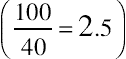 . Because the Usable subscale has eight items, its range for summed score contributions is 0–32, so its multiplier is
  . Following the same process for the Learnable subscale, you get a multiplier of 12.5
  .
.
. Because the Usable subscale has eight items, its range for summed score contributions is 0–32, so its multiplier is . Following the same process for the Learnable subscale, you get a multiplier of 12.5 .SUS norms
The recent research on the psychometric properties of the SUS has also provided some normative data. For example, Table 8.3 shows some basic statistical information about the SUS from the data reported by Bangor et al. (2008) and Lewis and Sauro (2009).
Table 8.3
SUS Statistics from Bangor et al. (2008) and Lewis and Sauro (2009)
| Bangor et al. | Lewis and Sauro | |||
| Statistic | Overall | Overall | Usable | Learnable |
| N | 2324 | 324 | 324 | 324 |
| Minimum | 0 | 7.5 | 0 | 0 |
| Maximum | 100 | 100 | 100 | 100 |
| Mean | 70.14 | 62.10 | 59.44 | 72.72 |
| Variance | 471.32 | 494.38 | 531.54 | 674.47 |
| Standard Deviation | 21.71 | 22.24 | 23.06 | 25.97 |
| Standard error of the mean | 0.45 | 1.24 | 1.28 | 1.44 |
| Skewness | NA | −0.43 | −0.38 | −0.80 |
| Kurtosis | NA | −0.61 | −0.60 | −0.17 |
| First quartile | 55.00 | 45.00 | 40.63 | 50.00 |
| Median | 75.00 | 65.00 | 62.50 | 75.00 |
| Third quartile | 87.50 | 75.00 | 78.13 | 100.00 |
| Interquartile range | 32.50 | 30.00 | 37.50 | 50.00 |
| Critical z (99.9%) | 3.09 | 3.09 | 3.09 | 3.09 |
| Critical d (99.9%) | 1.39 | 3.82 | 3.96 | 4.46 |
| 99.9% confidence interval upper limit | 71.53 | 65.92 | 63.40 | 77.18 |
| 99.9% confidence interval lower limit | 68.75 | 58.28 | 55.48 | 68.27 |

Note: Add and subtract critical d (computed by multiplying the critical z and the standard error) from the mean to get the upper and lower bounds of the 99.9% confidence interval.
Of particular interest is that the central tendencies of the Bangor et al. (2008) and the Lewis and Sauro (2009) Overall SUS distributions were not identical, with a mean difference of 8.0. The mean of the Bangor et al. distribution of Overall SUS scores was 70.1, with a 99.9% confidence interval ranging from 68.7 to 71.5. The mean of our Overall SUS data was 62.1, with a 99.9% confidence interval ranging from 58.3 to 65.9. Because the confidence intervals did not overlap, this difference in central tendency as measured by the mean was statistically significant (p < 0.001). There were similar differences (with the Bangor et al. scores consistently higher) for the first quartile (10 points), median (10 points), and third quartile (12.5 points). The distributions’ measures of dispersion (variance, standard deviation, and interquartile range) were close in value. The difference in central tendency between the datasets is most likely due to the different types of users, products, and tasks included in the datasets.
Sauro (2011a) analyzed data from 3187 completed SUS questionnaires. Fig. 8.6 shows the distribution of the scores.

Figure 8.6 Distribution of 3187 SUS scores
The individual responses have a clear negative skew. There are also peaks in scores at 50, around 75, 90, and at 100. There are two important things to keep in mind when looking at this frequency distribution. First, although there are a finite number of possible responses, the combination of average SUS scores for a study is virtually infinite. For example, the frequency distribution in Fig. 8.6 has data from 112 different studies. Of these, only five pairs of studies, 10 in total (9%), have the same average SUS score. Note that due to the discrete nature of multipoint scale measures, the median is restricted to about 80 values—which is one of the key reasons to assess the central tendency of multipoint scale scores with the mean rather than the median (Lewis, 1993).
Second, the skew doesn’t hurt the accuracy of statistical calculations or the computation of the mean. As discussed in previous chapters, even though the distribution of individual responses is skewed and not normally distributed, we typically base our statistical calculations on the distribution of the study means, not the individual scores. Normality does become an issue when we want to convert raw SUS scores into percentile ranks, but fortunately, a transformation procedure is available which adjusts SUS scores to a normal distribution (see the sidebar).
Getting normal
Converting SUS scores to percentile ranks—from the files of Jeff Sauro
Using data from 446 studies and over 5000 individual SUS responses, I’ve found the overall mean score of the SUS is 68 with a standard deviation of 12.5. To get a better sense of how to use that information to interpret a raw SUS score, you can use Table 8.4 to convert the raw score into a percentile rank. In essence, this percentile rank tells you how usable your application is relative to the other products in the total database. The distribution of SUS data is slightly negatively skewed, so the table entries were transformed prior to conversion (specifically, a logarithmic transformation on reflected scores—see Sauro, 2011a for details). To use the table, start in the “Raw SUS Score” column and find the score closest to the one for your study, then examine the percentile rank column to find the percentage of products that fall below your score. For example, a SUS score of 66 has a percentile rank of 44%. This means that a score of 66 is considered more usable than 44% of the products in the Sauro (2011a) database (and less usable than 56%). Anything with a percentile below 50% is, by definition, below average, and anything above 50% is above average.
Table 8.4
Percentile Ranks for Raw SUS Scores
| Raw SUS Score | Percentile Rank (%) | Raw SUS Score | Percentile Rank (%) |
| 5 | 0.3 | 69 | 53 |
| 10 | 0.4 | 70 | 56 |
| 15 | 0.7 | 71 | 60 |
| 20 | 1.0 | 72 | 63 |
| 25 | 1.5 | 73 | 67 |
| 30 | 2 | 74 | 70 |
| 35 | 4 | 75 | 73 |
| 40 | 6 | 76 | 77 |
| 45 | 8 | 77 | 80 |
| 50 | 13 | 78 | 83 |
| 55 | 19 | 79 | 86 |
| 60 | 29 | 80 | 88 |
| 65 | 41 | 85 | 97 |
| 66 | 44 | 90 | 99.80 |
| 67 | 47 | 95 | 99.9999 |
| 68 | 50 | 100 | 100 |

With the advent of large-sample datasets of SUS scores, there have been a few attempts to provide a “grading scale” for their interpretation. For example, Bangor et al. (2009) added a 7-point scale user-friendliness item as an 11th question to nearly a thousand SUS questionnaires (“Overall, I would rate the user-friendliness of this product as:” (from left to right) “Worst Imaginable; Awful; Poor; OK; Good; Excellent; Best Imaginable”). They developed a grading scale in which SUS scores below 60 were an “F,” between 60 and 69 were a “D,” between 70 and 79 were a “C,” between 80 and 89 were a “B,” and 90 and above were an “A.”
In the spirit of the relative (as opposed to an absolute) measurement of usability, we prefer to grade on a curve in which a SUS score of 68 is at the center of the range for a “C”—after all, from the data we have, that’s the exact average, but in the Bangor et al. (2009) grading scheme, it’s a “D.” It’s also virtually impossible to get an “A” following the grade assignment suggested by Bangor et al., reminding us of those feared college professors who never gave an “A.” Although it does happen that individual participants give SUS scores of 100, in a review of 241 studies (Sauro, 2011a), only two—less than 1%—had mean SUS scores above 90. To provide a fairer grading assignment, we used percentiles like those calculated for Table 8.4 to develop the curved grading scale shown in Table 8.5 for mean SUS scores computed from a set of individual SUS scores for a study (keeping in mind the importance of computing confidence intervals to establish the range of likely mean SUS scores for any given sample of individual SUS scores—such a confidence interval might indicate a grade range rather than a single grade).
Table 8.5
Curved Grading Scale Interpretation of SUS Scores
| SUS Score Range | Grade | Percentile Range |
| 84.1–100 | A+ | 96–100 |
| 80.8–84.0 | A | 90–95 |
| 78.9–80.7 | A− | 85–89 |
| 77.2–78.8 | B+ | 80–84 |
| 74.1–77.1 | B | 70–79 |
| 72.6–74.0 | B− | 65–69 |
| 71.1–72.5 | C+ | 60–64 |
| 65.0 –71.0 | C | 41–59 |
| 62.7–64.9 | C− | 35–40 |
| 51.7–62.6 | D | 15–34 |
| 0.0–51.6 | F | 0–14 |
To get to a finer grain of analysis, Sauro (2011a) organized SUS data by the type of interface. To generate a global benchmark for SUS, he combined the Bangor et al. (2008), Sauro (2011a), and Tullis and Albert (2008) datasets. The Tullis data included 129 SUS surveys from the companion website for Tullis and Albert (2008), www.MeasuringUserExperience.com (which in turn was obtained from reviewing studies in the ACM portal and other publications for SUS). The means by interface type for the Bangor et al. data were provided by Philip Kortum (personal communication, 1/12/2011).
In total, this analysis included data from 446 surveys/usability studies. A survey/study has multiple respondents (most have been between 10 and 30 respondents and some have more than 300). Table 8.6 is a summary table of benchmarks by interface type created by weighting the means and standard deviations based on the sample size. As shown in the row labeled “Global,” the weighted mean from all three sources was an average of 68 with a standard deviation of 12.5.
Table 8.6
SUS Benchmarks by Interface Type
| 99% Confidence Interval | ||||||
| Category | Description | Mean | SD | N | Lower Limit | Upper Limit |
| Global | Data from the entire set of 446 surveys/studies | 68.0 | 12.5 | 446 | 66.5 | 69.5 |
| B2B | Enterprise software application such as accounting, HR, CRM, and order-management systems | 67.6 | 9.2 | 30 | 63.0 | 72.2 |
| B2C | Public facing mass-market consumer software such as office applications, graphics applications, and personal finance software | 74.0 | 7.1 | 19 | 69.3 | 78.7 |
| Web | Public facing large scale websites (airlines, rental cars, retailers, financial service) and intranets | 67.0 | 13.4 | 174 | 64.4 | 69.6 |
| Cell | Cell phone equipment | 64.7 | 9.8 | 20 | 58.4 | 71.0 |
| HW | Hardware such as phones, modems, and Ethernet-cards | 71.3 | 11.1 | 26 | 65.2 | 77.4 |
| Internal SW | Internal productivity software such as customer service and network operations applications | 76.7 | 8.8 | 21 | 71.2 | 82.2 |
| IVR | Interactive voice response (IVR) systems, both phone and speech based | 79.9 | 7.6 | 22 | 75.3 | 84.5 |
| Web/IVR | A combination of web-based and interactive voice response systems | 59.2 | 5.5 | 4 | 43.1 | 75.3 |

Kortum and Bangor (2013) published SUS ratings for a set of 14 everyday products from a survey of more than 1000 users. Respondents were asked to assess usability based not on a particular task, but on their overall integrated experience with the products (Grier et al., 2013) for the products with which they had some familiarity. The products included in the survey were either top products in their categories (e.g., Google search) or class-based categories (e.g., microwave ovens). Table 8.7 shows the mean SUS for each product along with 99% confidence intervals and associated grade ranges from our curved grading scale (Table 8.5). These data can be of value to practitioners who are working with these or similar products and need to set custom benchmarks rather than using the more general values provided in Table 8.5.
Table 8.7
SUS Ratings for Everyday Products
| Product | 99% CI Lower Limit | Mean | 99% CI Upper Limit | Sauro–Lewis Grade | Std Dev | n |
| Excel | 55.3 | 56.5 | 57.7 | D | 18.6 | 866 |
| GPS | 68.5 | 70.8 | 73.1 | B− to C | 18.3 | 252 |
| DVR | 71.9 | 74.0 | 76.1 | B+ to C+ | 17.8 | 276 |
| PPT | 73.5 | 74.6 | 75.7 | B− to B | 16.6 | 867 |
| Word | 75.3 | 76.2 | 77.1 | B | 15.0 | 968 |
| Wii | 75.2 | 76.9 | 78.6 | B to B+ | 17.0 | 391 |
| iPhone | 76.4 | 78.5 | 80.6 | B to A− | 18.3 | 292 |
| Amazon | 80.8 | 81.8 | 82.8 | A | 14.8 | 801 |
| ATM | 81.1 | 82.3 | 83.5 | A | 16.1 | 731 |
| Gmail | 82.2 | 83.5 | 84.8 | A to A+ | 15.9 | 605 |
| Microwaves | 86.0 | 86.9 | 87.8 | A+ | 13.9 | 943 |
| Landline | 86.6 | 87.7 | 88.8 | A+ | 12.4 | 529 |
| Browser | 87.3 | 88.1 | 88.9 | A+ | 12.2 | 980 |
| Google search | 92.7 | 93.4 | 94.1 | A+ | 10.5 | 948 |

Does it hurt to be positive? evidence from an alternate form of the SUS
Consider the following statement (Travis, 2008):
There are many issues to consider when designing a good questionnaire, and few usability questionnaires are up to scratch. For example, we’ve known for over 60 years that you need to avoid the “acquiescence bias”: the fact that people are more likely to agree with a statement than disagree with it (Cronbach, 1946). This means that you need to balance positively-phrased statements (such as “I found this interface easy to use”) with negative ones (such as “I found this interface difficult to navigate”). So it’s surprising that two commonly used questionnaires in the field of usability—the Usefulness, Satisfaction, and Ease-of-Use (USE) questionnaire and the Computer System Usability Questionnaire (CSUQ)—suffer from just this problem: every question in both of these questionnaires is positively phrased, which means the results from them are biased towards positive responding.
Travis (2008) isn’t alone in his criticism of usability questionnaires that have items with consistent positive tone—in other words, questionnaires that have all items express a positive thought with which respondents are to agree or disagree. However, the decision to vary or not to vary item tone is not simple. There are factors other than response biases that developers of standardized usability questionnaires must take into account.
On one hand, there are potential advantages to alternating the tone of questionnaire items. The major impetus for alternating item tone is to control response biases such as acquiescence (the tendency of respondents to agree with items) and extreme responses (the rare tendency of some respondents to provide the maximum or minimum response for all items). On the other hand, there are three major potential disadvantages of this practice (the three “Ms”):
1. Misinterpret: Users may respond differently to negatively worded items such that reversing responses from negative to positive doesn’t account for the difference. For example, problems with misinterpreting negative items can include the creation of artificial two-factor structures and lowering internal reliability, especially in cross-cultural contexts (Barnette, 2000; Cheung and Rensvold, 2000; Davis, 1989; Grimm and Church, 1999; Ibrahim, 2001; Nunnally, 1978; Quilty et al., 2006; van de Vijver and Leung, 2001).
2. Mistake: Users might not intend to respond differently, but may forget to reverse their score, accidently agreeing with a negative statement when they meant to disagree. We have been with participants who acknowledged either forgetting to reverse their score or commenting that they had to correct some scores because they realized they had responded in the opposite of their intention.
3. Miscode: Researchers might forget to reverse the scales when scoring, and would consequently report incorrect data. Despite there being software to easily record user input, researchers still have to remember to reverse the scales. Forgetting to reverse the scales is not an obvious error. The improperly scaled scores are still acceptable values, especially when the system being tested is of moderate usability (in which case many responses will be neutral or close to neutral).
Regarding the prevalence of miscoding, there are two sources of data available. First, in 2009, eight of 15 teams used the SUS as part of the Comparative Usability Evaluation-8 (CUE-8) workshop at the Usability Professionals Association annual conference (Molich et al., 2009). Of the eight teams, one team improperly coded their SUS results. Second, as part of an earlier analysis of SUS, Sauro and Lewis (2009) examined 19 contributed SUS datasets; two were improperly coded and needed to be recoded prior to inclusion in the larger-scale analysis. Thus, three out of 27 SUS datasets (11.1%) had negative items that practitioners had failed to reverse, leading to incorrect SUS scores. Assuming this to be a reasonably representative selection of the larger population of SUS questionnaires, the associated 95% confidence interval suggests that miscoding affects somewhere between 3% and 28% of SUS datasets (most likely closer to 10%).
Despite published concerns about acquiescence bias, there is little evidence that the practice of including both positively and negatively worded items solves the problem. To our knowledge there is no research documenting the magnitude of acquiescence bias in general, or whether it specifically affects the measurement of attitudes toward usability. For that reason, in Sauro and Lewis (2011), we explored three questions:
1. Is there an acquiescence bias in responses to the SUS, and if so, how large is it?
2. Does the alternating wording of the SUS provide protection against acquiescence and extreme response biases?
3. Further, does its alternating item wording outweigh the negatives of misinterpreting, mistaking, and miscoding?
To explore those questions, we created an all-positive version of the SUS. As shown in Fig. 8.7, the even-numbered items, originally written in negative tone, maintain a similar content but are positive in this version. The odd-numbered items are the same as in the standard version. Given the planned tasks, both versions had the minor substitution of “website” for “system.” Note that to get overall scores from 0 to 100, it is still necessary to recode responses, but the recoding rule is the same for all items—subtract 1 from the raw item score to get the recoded score, sum them, then multiply by 2.5.

Figure 8.7 The positive version of the SUS
In Aug and Sep of 2010, 213 users (recruited using Amazon’s Mechanical Turk micro-tasking service, all from the United States) performed two representative tasks on one of seven websites (third party automotive or primary financial services websites: Cars.com, Autotrader.com, Edmunds.com, KBB.com, Vanguard.com, Fidelity.com, or TDAmeritrade.com). At the end of the study users completed either the standard or the positive version of the SUS. The assignment of questionnaires to participants was random. Between 15 and 17 users completed each version for each website.
Coefficient alpha was high for both versions, with 0.92 for the standard version and 0.96 for the positive version. There was no significant difference between the questionnaires for overall SUS score (t(206) = 0.85, p > 0.39), the average of the even items (t(210) = 1.09, p > 0.27), or the average of the odd items (t(206) = 0.60, p > 0.54). There was a difference in the means of the odd- and even-numbered items (Standard: t(210) = 3.09, p <0.01; positive: t(209) = 2.32, p < 0.03), but that difference was consistent across the versions of the questionnaire, as indicated by the nonsignificant interaction (F(1, 211) = 0.77, p > 0.38), shown in Fig. 8.8.

Figure 8.8 Nonsignificant interaction between odd and even items of standard and positive versions of the SUS
In other words, carefully rewording the negative items to a positive tone appeared to have no significant effect on the resulting scores. Note that the means for the even- and odd-numbered items are the means after appropriate recoding for the items to shift the item scores from their raw form to a scale that runs from 0 to 4 for each item, where a 0 is a poor rating and 4 is the most favorable. Thus, the recoding rule for the even items in the positive version is different from the rule for even items in the standard version due to their difference in tone.
The measure of acquiescence bias was the number of agreement responses (4 or 5) to the odd-numbered (consistently positively worded) items in both questionnaires. The mean number of agreement responses was 1.64 per questionnaire for the standard SUS (SD = 1.86, n = 107) and 1.66 for the positive version (SD = 1.87, n = 106)—no significant difference (t(210) = −0.06, p > 0.95).
The measure of extreme response bias was the number of times respondents provided either the highest or lowest response option (1 or 5) for both questionnaire types for all items. The mean number of extreme responses was 1.68 for the standard SUS (SD = 2.37, n = 107) and 1.36 for the positive version (SD = 2.23, n = 106) – again, no significant difference (t(210) = 1.03, p > 0.30).
There were two potential indicators of mistakes, both based on consistency of response. One indicator was if there were at least three responses indicating agreement to positively and negatively worded items or three responses with disagreement to positively and negatively worded items. The second approach was to examine responses to the most highly correlated negative and positive item which, according to the large dataset of Bangor et al. (2008), were items 2 and 3 (r = .593). Examination of the responses to the standard SUS questionnaire found that 18 of the 107 original SUS questionnaires contained at least three internal inconsistencies (16.8%, 95% confidence interval ranged from 10.8% to 25.1%) and 53 questionnaires had inconsistent responses for items 2 and 3 (49.5%, 95% confidence interval ranged from 40.2% to 58.9%).
The final comparison was to use factor analysis to compare the two-factor structures of the data for the standard and positive versions of the SUS with the large-sample structure reported in Lewis and Sauro (2009). In that prior factor analytic work, the SUS items clustered into two factors, with one factor (Usable) containing items 1, 2, 3, 5, 6, 7, 8, and 9, and the other factor (Learnable) containing items 4 and 10. Neither of the resulting alignments of items with factors exactly duplicated the findings with the large samples of the SUS, and neither were they exactly consistent with each other, with discrepancies occurring on items 6, 8, and 9. Both the original and positive versions were consistent with the large-sample finding of including items 4 and 10 in the second factor. The original deviated slightly more than the positive from the large-sample factor structure (original items 6 and 8 aligned with the second rather than the first factor; positive item 9 aligned with the second rather than the first factor). The difference in the structure observed for this sample of standard SUS responses and the structure reported by Lewis and Sauro (2009) (and replicated by Borsci et al., 2009) could be due to its relatively small sample size. There is a need for further research to see if this pattern remains stable.
The major conclusions drawn from this study were:
• There is little evidence that the purported advantages of including negative and positive items in usability questionnaires outweigh the disadvantages.
• Researchers interested in designing new questionnaires for use in usability evaluations should avoid the inclusion of negative items.
• Researchers who use the standard SUS have no need to change to the all positive version provided that they verify the proper coding of scores. In moderated testing, researchers should include procedural steps (e.g., during debriefing) to ensure error-free completion.
• In unmoderated testing, it is more difficult to correct the mistakes respondents make, although these data suggest that the effect is unlikely to have a major impact on overall SUS scores.
• Researchers who do not have a current investment in the standard SUS can use the all positive version with confidence because respondents are less likely to make mistakes when responding, researchers are less likely to make coding errors, and the scores will be similar to the standard SUS.
UMUX (Usability Metric for User Experience)
Description of the UMUX
The UMUX (Finstad, 2010b; 2013; Lewis, 2013b) is a relatively new addition to the set of standardized usability questionnaires. The primary goal of the UMUX was to get a measurement of perceived usability consistent with the SUS but using fewer items that more closely conformed to the ISO definition of usability (effective, efficient, satisfying). Although one might question the time savings of four versus 10 items in a standard usability evaluation, there are situations in which a shorter questionnaire might be useful. For example, “real estate” can be an issue when putting together a survey in which perceived usability is only one of many planned metrics.
UMUX items vary in tone and have seven scale steps from 1 (Strongly disagree) to 7 (Strongly agree). Starting with an initial pool of 12 items, the final UMUX had four items that included a general question similar to the SEQ (“[This system] is easy to use”) and the best candidate item from each of the item sets associated with efficiency, effectiveness, and satisfaction, where “best” means the item with the highest correlation to concurrently collected SUS scores ( Fig. 8.9). No license is required for its use.

Figure 8.9 The Usability Metric for User Experience (UMUX)
Psychometric evaluation of the UMUX
To validate the UMUX, Finstad (2010b) had users of two systems, one with a reputation for poor usability (System 1, n = 273) and the other perceived as having good usability (System 2, n = 285), complete the UMUX and the SUS. Using a scheme similar to the SUS (recoding raw item scores to a 0–6 scale where 0 is poor and 6 is good, then multiplying the sum of the items by 100/24), UMUX scores can range from 0 to 100. As expected, the reliability of the SUS was high, with a coefficient alpha of 0.97. The reliability of the UMUX was also high, with coefficient alpha equaling 0.94. Finstad found a high correlation between the SUS and UMUX scores (r = 0.96, p < 0.001), providing evidence of concurrent validity. The UMUX was sensitive in the expected direction to the differences in usability for the two systems (t(533) = 39.04, p < 0.01). Finstad reported that the UMUX items aligned on a single factor, making it a unidimensional measurement.
Lewis et al. (2013) included the UMUX in two surveys (n1 = 402, n2 = 389), using the standard version of the SUS in one survey and the positive version in the other. The UMUX reliability estimates were 0.87 and 0.81, and the correlations with the SUS were 0.90 (standard) and 0.79 (positive). These estimates of reliability and concurrent validity were substantially lower than those in Finstad (2010b), but were still impressive. For both datasets there was no significant difference between the mean SUS and mean UMUX scores (extensive overlap of 99% confidence intervals). As predicted by Lewis (2013b), the factor structure of the UMUX had a clear bidimensional pattern with positive-tone items aligning with one factor and negative-tone items aligning with the other. Note that factor structure due to varying item tone is of little practical interest given the scale’s reliability, validity, and sensitivity.
Borsci et al. (2015) conducted a study in which they used Italian translations of the SUS and UMUX (and UMUX-LITE—discussed in the next section) to obtain measurements of perceived usability from users who had relatively little experience with the website under study and users who had considerably more experience. Consistent with Lewis et al. (2013), estimates of UMUX reliability were between 0.80 and 0.90. As in Lewis et al. (2013), the correlations between the SUS and UMUX (Study 1: r = 0.55; Study 2: r = 0.72) were statistically significant, but lower than the correlations reported in Finstad (2010b). Unlike previous research, there were considerable differences between the means of the SUS and UMUX for the various studies and conditions in Borsci et al. (2015), with the UMUX scores consistently and significantly higher than the concurrently collected SUS scores.
In summary, the UMUX appears to be a reliable, valid, and sensitive questionnaire for the assessment of perceived usability. The jury is still out regarding the extent to which its scores closely correspond to those of concurrently collected SUS scores. The correspondence was close in Finstad (2010b) and Lewis et al. (2013), but was not close in Borsci et al. (2015). This might be due to differences in the English and Italian versions of the questionnaires, but it’s too early yet to do anything other than speculate. Practitioners who would like to use the UMUX as a substitute for the SUS should start by using them concurrently to check for differences and, ideally, should publish their results.
UMUX-LITE
Description of the UMUX-LITE
Based on item analysis of the UMUX and after considering different candidate two-item versions, Lewis et al. (2013) derived the UMUX-LITE. As shown in Fig. 8.10, it consists of the two positive-tone items from the UMUX. This resulted in a parsimonious questionnaire that has a connection through the content of its items to the Technology Acceptance Model (Davis, 1989), a questionnaire from the market research literature that assesses the usefulness (Item 1) and ease-of-use (Item 2) of systems, and has an established relationship to likelihood of future use. No license is required for its use.
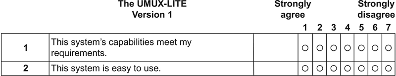
Figure 8.10 The UMUX-LITE
Psychometric evaluation of the UMUX-LITE
Lewis et al. (2013) computed UMUX-LITE scores from two surveys (n = 402, 389), using the standard version of the SUS in one survey and the positive version in the other. The UMUX-LITE reliability estimates were 0.83 and 0.82 (comparable to those found for the full UMUX in that study), and the correlations with the SUS were 0.81 (standard) and 0.85 (positive). It also correlated significantly (r = 0.73) with concurrently collected ratings of likelihood-to-use.
Applying a SUS-like scoring method for the UMUX-LITE entails converting each item score to a 0–6 point scale by subtracting one from the raw item score, summing the two resulting scores, then multiplying that sum by 100/12. Lewis et al. (2013) found a small but statistically significant difference between the overall SUS scores and UMUX-LITE scores computed in this way. To compensate for that difference, they used linear regression to achieve a closer correspondence between the SUS and UMUX-LITE scores, as shown in the following equation:
Note that in this formula, you should use the raw item scores from the 1–7 point scale as shown in Fig. 8.10. Note also that when using this formula, the range of the metric is no longer 0–100, but is constrained to 22.9–87.9 (which still corresponds to a range from F to A+ on our curved grading scale for the SUS).
Lewis et al. (2015b) concurrently collected UMUX-LITE and SUS scores in a series of surveys of user evaluations of enterprise software (n = 397). The reliability of the UMUX-LITE was 0.86, and its correlations with the SUS, a rating of overall experience, and likelihood to recommend were all significant (respectively r = 0.83, 0.72, and 0.72). The overall mean difference between the SUS and the regression-adjusted UMUX-LITE was 1.1 (about 1% of the range of possible SUS scores). Strictly speaking, the difference was statistically significant (t(396) = 2.2, p = 0.03), but for any practical use (such as comparison to SUS norms like the curved grading scale in Table 8.5), it is essentially no difference. “When sample sizes are large, it is important not to confuse statistically significant differences with meaningful differences” (Lewis et al., 2015b, p. 501).
Using Italian versions of the questionnaires, Borsci et al. (2015) also found the regression-adjusted UMUX-LITE to have reasonably close correspondence to concurrently collected SUS scores. For their first study (n = 186), in which participants had relatively little experience with the website they were using, the mean difference was about three points, with 95% confidence intervals just failing to overlap. In their second study (n = 93), with more experienced participants, the mean difference was just 1.2 points—similar to the difference reported by Lewis et al. (2015b), with substantial overlap of the corresponding 95% confidence intervals. In addition to this second evaluation of the accuracy of the regression-adjusted UMUX-LITE metric, Borsci et al. also reported somewhat lower but still significant correlations between the UMUX-LITE and the SUS (Study 1: r = 0.45; Study 2: r = 0.66).
Thus, the UMUX-LITE appears to be an ultrashort reliable, valid, and sensitive metric that, after applying the regression adjustment, tracks closely with concurrently collected SUS scores. If using the UMUX-LITE, be sure to document its computation and, if using the regression-adjusted version, be sure to double check the scores and verify they fall in a range between 22.9 and 87.9. Finally, as Lewis et al. (2015b, p. 503) stated:
Despite these encouraging results, it is important to note some limitations to generalizability. To date, the data we have used for psychometric evaluation of the UMUX-LITE have come from surveys. Indeed, this is the primary intended use of the UMUX-LITE when there is limited survey real estate available for the assessment of perceived usability. It would, however, be interesting to see if data collected in traditional usability studies would show a similar correspondence between the SUS and the UMUX-LITE. Until researchers have validated the UMUX-LITE across a wider variety of systems and research methods, we do not generally recommend its use independent of the SUS.
Experimental comparison of post-study usability questionnaires
There are few direct comparisons of the various standardized usability questionnaires (making this a promising area of research for motivated graduate students). In addition to the traditional psychometric measures of reliability and validity, usability practitioners have a practical need for questionnaires that are sensitive to changes in usability. Going beyond the simple definition of sensitivity as the capability of a standardized usability questionnaire to indicate significant differences between systems, Tullis and Stetson (2004) examined differences in the sensitivity of five methods used to assess satisfaction with usability.
The five methods investigated by Tullis and Stetson (2004) were:
• SUS: The standard version of the SUS, as described earlier in this chapter.
• QUIS: A variant of the 27-item version of the QUIS described earlier in this chapter that used 10-point scales, with three items dropped that were not appropriate for assessing websites (e.g., “Remembering names and use of commands”), the term “system” replaced by “website,” and the term “screen” generally replaced by “web page.”
• CSUQ: As described later in this chapter, the CSUQ is a variant of the PSSUQ (previously described) with very similar psychometric properties—this study used the 19-item Version 2 (Lewis, 1995), replacing the term “system” with “website” and for consistency with the other methods, labeling the lower end of the scale with “Disagree” and the upper end with “Agree” so larger values indicate more satisfaction with usability.
• Words: Tullis and Stetson (2004) based this method on the 118 words used in Microsoft’s Product Reaction Cards (Benedek and Miner, 2002)—participants chose the words that best described their interaction with the website, and were free to choose as many or as few words as they wished—satisfaction scores were the ratio of positive to total words selected.
• Fidelity questionnaire: Used at Fidelity for several years in usability tests of websites, composed of nine statements (e.g., “This website is visually appealing”) to which users respond on a 7-point scale from “Strongly Disagree” to “Strongly Agree” with scale steps numbered −3, −2, −1, 0, 1, 2, 3 (obvious neutral point at 0).
A total of 123 Fidelity employees participated in the study, randomly assigned to one of the methods, which they used to evaluate their satisfaction after completing two tasks at two financial websites. The tasks were (a) find the highest price in the past year for a share of a specified company and (b) find the mutual fund with the highest three-year return. The order in which participants visited the sites was random.
Analysis of the overall results for all methods showed a significant preference for Site 1 over Site 2. In the more interesting analysis, Tullis and Stetson (2004) randomly selected subsamples of the data at sample sizes of 6, 8, 10, 12, and 14 for each method. They then investigated which methods most quickly converged on the “correct” conclusion regarding the usability of two websites as a function of sample size (a variable of practical importance to usability practitioners), where correct meant a significant t-test consistent with the decision reached using the total sample size—that Site 1 was more usable than Site 2.
As shown in Fig. 8.11, of the five methods assessed by Tullis and Stetson (2004), the SUS was the fastest to converge on the final (correct) conclusion, reaching 75% agreement at a sample size of 8 and 100% agreement when n = 12. The CSUQ (a variant of the PSSUQ, discussed later in this chapter) was the second fastest, reaching 75% agreement at a sample size of 10 and 90% agreement when n = 12. In contrast, even when n = 14, the other methods were in the low- to mid-70% of agreement with the correct decision. This is compelling evidence that practitioners should prefer the SUS as a method of assessing satisfaction with usability, especially when facing limited resources for sample size and having no need for multidimensional measurement. For studies that would benefit from multidimensional assessment of usability, practitioners should consider the CSUQ (or PSSUQ).

Figure 8.11 Relative sensitivities of five methods for assessing satisfaction with usability
Table 8.8 lists key characteristics of the post-study questionnaires discussed in this chapter.
Table 8.8
Key Characteristics of the Post-Study Questionnaires
| Questionnaire | Requires License Fee | Number of Items | Number of Subscales | Global Reliability | Validity Notes |
| QUIS | Yes ($50–750) | 27 | 5 | 0.94 | Construct validity; evidence of sensitivity |
| SUMI | Yes (€0–1000) | 50 | 5 | 0.92 | Construct validity; evidence of sensitivity; availability of norms |
| PSSUQ | No | 16 | 3 | 0.94 | Construct validity; concurrent validity; evidence of sensitivity; some normative information |
| SUS | No | 10 | 2 | > 0.89 | Construct validity; evidence of sensitivity; emerging normative information |
| UMUX | No | 4 | 1 | > 0.80 | Construct validity; concurrent validity; evidence of sensitivity |
| UMUX-LITE | No | 2 | 1 | > 0.82 | Construct validity; concurrent validity; evidence of sensitivity; potential to apply SUS norms |

Post-task questionnaires
Post-study questionnaires are important instruments in the usability practitioner’s toolbox, but they assess satisfaction at a relatively high level. This can be a strength when comparing general satisfaction with competitors or different versions of a product, but is a weakness when seeking more detailed diagnoses of problem areas in a user interface. To address this weakness, many practitioners perform a quick assessment of perceived usability immediately after participants complete each task or scenario in a usability study. Research indicates a substantial and significant correlation between post-study and post-task assessments of perceived usability (Sauro and Lewis, 2009), with r = 0.64 (p < 0.0001; R2 = 41%), showing that they tap into a common underlying construct, but do not perfectly align. In other words, they are similar but not identical, so it makes sense to take both types of measurements when conducting studies. This section of the chapter describes a variety of commonly used post-task questionnaires.
ASQ (After-Scenario Questionnaire)
Description of the ASQ
The development of the ASQ (Fig. 8.12) took place at the same time as the PSSUQ, described earlier in this chapter. It is a three-item questionnaire that uses the same format as the PSSUQ, probing overall ease of task completion, satisfaction with completion time, and satisfaction with support information. The overall ASQ score is the average of the responses to these items. Like the PSSUQ, the ASQ is available for free use by practitioners and researchers, but anyone using it should cite the source (e.g., Lewis, 1995; Lewis, 2012; or this book).

Figure 8.12 The ASQ
Psychometric evaluation of the ASQ
Measurements of ASQ reliability have ranged from 0.90 to 0.96 (Lewis, 1990b, 1991, 1995). Use of the ASQ in Lewis et al. (1990, analysis reported in Lewis, 1995) showed a significant correlation between ASQ scores and successful scenario completion (r(46) = −0.40, p < 0.01)—evidence of concurrent validity. A factor analysis of the ASQ scores from the eight tasks investigated in Lewis et al. (1990) showed a clear association of ASQ factors with associated tasks, with the eight factors explaining almost all (94%) of the total variance (Lewis, 1991). Of the 48 participants in Lewis et al. (1990), (27) completed all items on all ASQs. An analysis of variance on that data indicated a significant main effect of Scenario (F(7,126) = 8.92, p < 0.0001) and a significant Scenario by System interaction (F(14,126) = 1.75, p = 0.05), providing evidence of the sensitivity of the ASQ.
SEQ (Single Ease Question)
Description of the SEQ
As shown in Fig. 8.13, the SEQ simply asks participants to assess the overall ease of completing a task, similar to the ASQ Item 1. Some practitioners use a 5-point version of this scale. Given research on the relative reliability of and user preference for 5- and 7-point scales (Finstad, 2010a; Lewis, 1993; Nunnally, 1978; Preston and Colman, 2000), we recommend using the 7-point version.

Figure 8.13 The SEQ
Psychometric evaluation of the SEQ
Two studies have shown evidence of concurrent validity for the SEQ. Tedesco and Tullis (2006), using a 5-point version of the SEQ, reported a significant correlation with a metric of performance efficiency that combined task completion rates and times. Sauro and Dumas (2009) reported significant correlations of the SEQ (7-point version anchored on the left with “Very easy” and on the right with “Very difficult”) with the SMEQ and the UME (r > 0.94) and with the SUS (r = −0.6, p < 0.01). (Note that as shown in Fig. 8.13, a higher number on the standard SEQ corresponds to an easier task—the scale was reversed for the Sauro and Dumas study to make it consistent with the direction of the SMEQ and UME metrics.) They also reported significant correlations with completion times (r = −0.9) and number of errors (r = 0.84).
SMEQ (Subjective Mental Effort Question)
Description of the SMEQ
Zijlstra and van Doorn (1985) developed the SMEQ (also known as the Rating Scale for Mental Effort, or RSME). The SMEQ (Fig. 8.14) is a single item questionnaire with a rating scale from 0 to 150 with nine verbal labels ranging from “Not at all hard to do” (just above 0) to “Tremendously hard to do” (just above 110).

Figure 8.14 The SMEQ
In the paper version of the SMEQ, participants draw a line through the scale (which is 150 mm in length) to indicate the perceived mental effort of completing a task, with the SMEQ score the number of millimeters the participant marked above the baseline of 0. In the online version developed by Sauro and Dumas (2009), participants use a slider control to indicate their ratings. The originators of the SMEQ claimed that it is reliable, easy to use, and that they placed the verbal labels (originally in Dutch) by calibrating them psychometrically against tasks (Sauro and Dumas, 2009).
Psychometric evaluation of the SMEQ
In Sauro and Dumas (2009), the SMEQ correlated significantly with the SEQ (r = 0.94, p < 0.01) and UME (r = 0.845, p < 0.01). Like the SEQ, the SMEQ had a significant correlation with SUS scores (r = −0.6, p < 0.01) as well as with completion time (r = −0.82), completion rates (r = 0.88), and errors (r = −0.72) collected during the experiment—all evidence of concurrent validity.
ER (Expectation Ratings)
Description of expectation ratings
Albert and Dixon (2003) described the use of ERs in usability testing. Basically, ERs address the relationship between how easy or difficult a participant found a task to be after performing it relative to how they perceived it before beginning the task. The ER procedure uses a variation of the SEQ, getting participants to rate the expected difficulty of all of the tasks planned for a usability study before doing any of the tasks (the ERs), then collecting the post-task rating in the usual way after the completion of each task (the experience rating). For example, Tedesco and Tullis (2006) used the following two questions:
• Before doing all tasks (ER): “How difficult or easy do you expect this task to be?“
• After doing each task (experience rating): “How difficult or easy did you find this task to be?”
In the original study (Albert and Dixon, 2003), the rating scales for the two questions included seven steps with endpoints of “Very Easy” (1) and “Very Difficult” (7). Tedesco and Tullis (2006) used 5-point scales. As noted previously, given research on the relative reliability of and user preference for 5- and 7-point scales (Finstad, 2010a; Lewis, 1993; Nunnally, 1978; Preston and Colman, 2000), we recommend using seven points.
One advantage of having the before and after ratings is that practitioners can graph a scatterplot of the results and map them onto four quadrants (Tullis and Albert, 2008):
• Upper left (“Promote it”): These are tasks that participants thought would be difficult but turned out to be easier than expected, so they are features that an enterprise might reasonably promote.
• Lower left (“Big opportunity”): Participants perceived these tasks as difficult before and after performing them. There were no surprises, but these tasks represent potential opportunities for improvement, which would move them up to the “Promote it” category.
• Upper right (“Don’t touch it”): This quadrant contains the tasks perceived as easy before and after task performance, so it’s reasonable to just leave them alone.
• Lower right (“Fix it fast”): These are the tasks that participants thought would be easy but turned out to be difficult—a potential source of user dissatisfaction—making this the quadrant of primary focus for improvement.
Psychometric evaluation of expectation ratings
Tedesco and Tullis (2006) reported evidence of concurrent validity for the “after” question of an ER. Specifically, they found a significant correlation (r = 0.46, n = 227, p < 0.0001) between a combined measure of completion rates and times (performance efficiency) and the “after” rating for a set of six tasks.
How well can users predict task-level usability?
As it turns out, pretty well—from the files of Jeff Sauro
When you ask a user to attempt a task, it seems reasonable that they quickly interpret what they’re asked to do and have some idea about how difficult it will be. For example, if I were to ask you to compute your adjusted gross income after accounting for deductions using some IRS forms and tax tables, you’d probably expect that to be more difficult than finding the hours of a local department store online. I wondered how much of the actual difficulty is revealed in the description of the task scenario. How accurate would ratings be if I just asked users how difficult they think a task is without actually testing them?
To find out, I had one group of users rate how difficult they’d think a set of tasks would be. I then had another set of users actually attempt the tasks then rate how difficult they thought they were. Using separate groups eliminates the possibility that users might have a bias to keep their before and after ratings consistent. I picked a mix of eight tasks with a range of difficulty and used some well-known websites (Craigslist.com, Apple.com, Amazon.com, eBay.com, and CrateandBarrel.com). I had between 30 and 40 people rate how difficult they thought each task would be, then I had separate groups of users (between 11 and 16 per task) attempt the tasks on the website. For example, one task expected to be fairly easy was to find out if a Crate and Barrel store in Denver (zip code 80210) is open on Sunday; a relatively difficult task was to estimate how much it would cost in commissions and fees to sell your iPhone 3GS on eBay.
In general users tended (on seven out of eight tasks) to overpredict how difficult tasks would be. The one task that was more difficult than expected was the “eBay Seller fees” task. While I think most people expect to pay fees to sell something on eBay, I think they expected the fee structure to be more straightforward. Part of the difficulty in the task is because there are multiple variables (such as total sale price, shipping costs, and the type of merchandise). The most notable miss was where users overpredicted the difficulty of the “Craigslist Find apt” task by 50%. For some reason people thought this would be rather difficult. I wondered if it had to do with people being less familiar with the SF rental market. In looking at the data, people outside of California did rate the task as more difficult, but even California residents thought finding an apartment on Craigslist would be more difficult than it was.
To understand how much the predicted score could explain the actual score I conducted a simple linear regression at the task level. Half of the variation in task difficulty can be explained by how a different set of users think the task will be (adjusted R2 = 50.8%). The scatterplot in Fig. 8.15 shows this strong association, with the Craigslist “find apartment” and eBay “fees” tasks highlighted to show their departure from the trendline (for more information on this study, see www.measuringu.com/predicted-usability.php).

Figure 8.15 Relationship between predicted task-ease and actual task ease
UME (Usability Magnitude Estimation)
Description of UME
Magnitude estimation has a rich history in psychophysics, the branch of psychology that attempts to develop mathematical relationships between the physical dimensions of a stimulus and its perception. Psychophysics had its start in the early- to mid-19th century with the work of Weber (on just noticeable differences) and Fechner (sensory thresholds), culminating in Fechner’s Law (Massaro, 1975): S = k(log10I)—that there is a logarithmic relationship between the intensity of a physical stimulus (I) and its perceived sensation (S), replaced in most psychophysics work about 100 years later by Stevens’ Power Law: S = kIn, which provided a better fit for most relationships (Mussen et al., 1977). In his work, Fechner developed a variety of experimental methods, one of which was magnitude estimation. In magnitude estimation, participants judge the intensity of a stimulus against a baseline stimulus (e.g., how bright a stimulus light is as a ratio of the perceived brightness of a reference light—five times as bright, half as bright, etc.).
In a usability testing context, the goal of UME is to get a measurement of usability that enables ratio measurement, so a task (or product) with a perceived difficulty of 100 is perceived as twice as difficult as a task (or product) with a perceived difficulty of 50. There have been a few published attempts to apply magnitude estimation methods to the study of the perception of usability. Cordes (1984a,b) had participants draw lines to represent the relative ease of completing tasks in a usability study. About 20 years later, McGee (2003, 2004) published favorable papers describing his applications of UME to the measurement of usability.
It is customary to train participants in the magnitude estimation process before attempting to apply it to the evaluation of tasks in a usability study. The training stimuli are usually simple stimuli, such as judging the length of lines or the areas of circles against reference objects (McGee, 2003). One common approach to UME is to have participants experience and evaluate a baseline task, usually one that is very easy, before tackling the target tasks (Cordes, 1984a,b), although it is also possible to get estimates from an additional baseline, typically, a task that is relatively difficult, as in McGee (2004). After collecting all the data from a participant, the first step in analysis is to use log transformation to convert the data to a consistent ratio scale (based on geometric averages) for comparison purposes (McGee, 2003).
For example, in Sauro and Dumas (2009), the participants’ baseline task was to select the Search icon from a set of five clearly labeled icons (assigned a baseline difficulty of 10). After completing each target task of the usability study, participants answered an open-ended question about relative difficulty of use that referenced the baseline (Fig. 8.16).

Figure 8.16 Sample UME item
Researchers who promote UME believe it overcomes serious deficiencies of other measurements of perceived usability. For example, the format of a multipoint scale item has fixed endpoints that might overly restrict responses (ceiling or floor effects), and multipoint scales do not typically produce proven interval-level measurement. The UME process, in contrast, places no restrictions on the ratings that participants provide.
There are, however, some thorny practical problems with applying UME in usability testing. The claimed advantage of UME over other types of measurement of perceived usability is mired in a controversy that has gone on since the late 1940s. We won’t cover it in this chapter, but you’ll find a discussion of the controversy regarding levels of measurement (such as nominal, ordinal, interval, and ratio) and their interpretation in the next chapter.
Another problem with UME is that both practitioners and participants often find it difficult to do, especially in unmoderated testing. Tedesco and Tullis (2006) had planned to include it in their comparison of post-task subjective ratings, but:
This condition was originally based on Usability Magnitude Estimation but was significantly modified through iterations in the study planning. In pilot testing using a more traditional version of Usability Magnitude Estimation, they found that participants had a very difficult time understanding the concepts and using the technique appropriately. As a result, they modified it to this simpler technique [using a 100-point bipolar scale]. This may mean that Usability Magnitude Estimation is better suited to use in a lab setting, or at least a moderated usability study, than in an online, unmoderated usability study.
(Tullis and Albert, 2008, pp. 133–134)
In Sauro and Dumas (2009), participant training in UME was also an issue. “We found that users had some difficulty, especially early in the sessions, in grasping the ratio judgments” (p. 1601). “Concepts such as ‘twice as difficult’ and ‘one half as difficult’ take training and feedback to understand” (p. 1602). Given these issues in the usability of UME, it is likely to play a relatively minor role in the practical toolbox of most usability practitioners.
Psychometric evaluation of UME
There is no question regarding the effectiveness of magnitude scaling in psychophysics (Mussen et al., 1977). A variety of studies have provided evidence of the validity and sensitivity of UME. Cordes (1984a) reported significant improvements in his UME measurements across an iteration in the development of a complex software product in which developers fixed numerous usability problems between the two evaluations. He also fitted the relationship between perceived difficulty and task-completion time with a power function whose exponent (0.5) indicated that for every 100-fold increase in task-completion time there was a 10-fold increase in perceived difficulty.
McGee (2003) found significant correlation between UME and task completion time (r = −0.244, p < 0.001), number of clicks (r = −0.387, p < 0.0001), errors (r = −0.195, p < 0.011), and assists (r = −0.193, p < 0.012). Sauro and Dumas (2009) had 26 participants complete five travel expense reporting tasks with two products. UME had strong correlations with task completion time (r = −0.91, p < 0.01), the SMEQ (r = 0.845, p < 0.01), the average of the first two items of the ASQ (r = 0.955, p < 0.01), and also correlated significantly with overall SUS scores (r = 0.316, p < 0.01).
Experimental comparisons of post-task questionnaires
The psychometric data support the use of all five post-task questionnaires: ASQ, SEQ, SMEQ, ER, and UME. Even though they all have acceptable psychometric properties, it would be useful for practitioners to know which tends to be the most sensitive—specifically, the one that most rapidly converges on large sample results when samples are small. Within the past 10 years, there have been two attempts to investigate this.
Tedesco and Tullis (2006) collected a set of data for five methods for eliciting post-task subjective ratings in usability testing, with 1131 Fidelity employees completing six tasks using an internal website. The methods tested were:
• SEQ-V1 (n = 210): A 5-point item from 1 (Very Difficult) to 5 (Very Easy), with the wording “Overall, this task was:”
• SEQ-V2 (n = 230): A 5-point item from 1 (Very Difficult) to 5 (Very Easy), with the wording “Please rate the usability of the site for this task:”
• ASQ (n = 244): The average of the first two items of the ASQ, using 5- rather than 7-point scales
• ER (n = 227): These were 5-point versions of the ER questions of Albert and Dixon (2003)—most analyses used only the second item, making it essentially another variant of the SEQ (“How difficult or easy did you find this task to be?”)
• SEQ-V3 (n = 221): This was a 100-point scale from 1 (Not at all supportive and completely unusable) to 100 (Perfect, requiring absolutely no improvement), with the wording “Please assign a number between 1 and 100 to represent how well the Website supported you for this task.”—the original intention was to do UME for this condition, but in the end, the item was more similar to a version of the SEQ with additional instructions to try to get participants to do ratio-level rating
Using a strategy similar to that of Tullis and Stetson (2004), Tedesco and Tullis (2006) conducted a subsampling analysis, taking 1000 random samples from the full data set with subsample sizes ranging from 3 to 29 in increments of 2, then computing the correlation between the average ratings for the six tasks at that sample size and the average ratings found with the full dataset. They found that all five methods worked well at the larger sample sizes, with all correlations exceeding 0.95 when n ≥ 23. Even when n = 3 the correlations were reasonably high, ranging from about 0.72 for the ASQ to about 0.83 for the SEQ-V1. Across all the sample sizes from 3 to 29, the SEQ-V1 was consistently more sensitive, with its greatest advantage at the smaller sample sizes.
Sauro and Dumas (2009) compared the sensitivity of three post-task questionnaires:
• SEQ: The standard SEQ, as shown in Fig. 8.13, similar to the SEQ-V1 of Tedesco and Tullis (2006), but using a 7- rather than a 5-point scale
• SMEQ: An online version of the SMEQ, similar to that shown in Fig. 8.14, with a slider control for setting its value that started slightly above the top of the scale
In the study, 26 participants completed five travel expense reporting tasks using two released versions of a similar application. Half of the participants started with each application, and the assignment of rating types across tasks and products was also counterbalanced. To the extent that time allowed, participants attempted each task up to three times, for a maximum of up to 30 tasks per participant. In addition to completing the tasks and post-task ratings, participants also completed the standard SUS for both products.
The SUS scores for the two products indicated a significant difference in perceived usability, with no overlap between the products’ 95% confidence intervals (one with a mean of just over 50, the other with a mean exceeding 75). Analyses at the task level indicated similar outcomes for SEQ and SMEQ, both of which picked up significant differences for four out of five tasks. In contrast, UME indicated significant differences between the products for only two of the five tasks. The results of a resampling exercise were consistent with these task-level results. Fig. 8.17 shows, for 1000 samples with replacement at sample sizes of 3, 5, 8, 10, 12, 15, 17, 19, and 20, the percentage of significant t-tests (p < 0.05) consistent with the findings from the entire sample.

Figure 8.17 Sensitivity by sample size for SEQ, SMEQ, and UME
At very small samples sizes, there was little difference between the methods, all of which were insensitive (about 16% significant t-tests when n = 3; about 36% when n = 5). When n = 8 the methods began to diverge, with UME falling behind SEQ and SMEQ. As the sample size increased, UME continued to fall behind, never achieving higher than about 65% significant t-tests. For all sample sizes greater than 5, SMEQ had a higher percentage of significant t-tests than SEQ, but not significantly greater.
In both comparative studies (Sauro and Dumas, 2009; Tedesco and Tullis, 2006), UME fared poorly in comparison to the other post-task methods. Overall, the results support the use of the standard SEQ (as shown in Fig. 8.13) or, for online data collection, the SMEQ (Fig. 8.14) for practical post-task assessment of perceived task difficulty.
Questionnaires for assessing perceived usability of websites
The initial development of the major standardized usability questionnaires took place in the mid- to late-1980s, with publication in the early- to mid-1990s—before the widespread adoption of the Web. In fact, in 1988, during the studies that provided the initial data for the PSSUQ (Lewis et al., 1990), it was necessary to train many of the novice participants in how to use a mouse before they could start the key tasks of the studies. After the Web began to achieve its popularity as a means for conveying information and conducting commerce, questionnaires designed more specifically for the assessment of the perceived usability of websites appeared.
WAMMI (Website Analysis and Measurement Inventory)
Description of the WAMMI
One of the first research groups to recognize the need for an instrument specialized for the assessment of websites was the HFRG at University College Cork in Ireland (Kirakowski and Cierlik, 1998). In association with Nomos Management AB of Stockholm, they created the WAMMI. The source for its items were statements of opinion collected from a large number of designers, users, and Web masters about positive and negative experiences associated with websites. After content and factor analysis, the resulting questionnaire had the same factor structure as the SUMI, with 12 items for each of the factors (a total of 60 items). The current version of the WAMMI has a set of 20 5-point items, still covering five subscales (Attractiveness, Controllability, Efficiency, Helpfulness, and Learnability) and a global measure (www.wammi.com). Fig. 8.18 shows a sample WAMMI item. The entire questionnaire is available for review at www.wammi.com/samples/index.html (Fig. 6.17 of Tullis and Albert, 2008, p. 152).

Figure 8.18 Sample WAMMI item
Like the SUMI, standardized global WAMMI scores have a mean of 50 and a standard deviation of 10. Also like the SUMI, the instrument is available free of charge for educational use after receiving a letter of permission. There is a cost for commercial use, but the WAMMI website lists contact information rather than specific fees. The WAMMI is available in Danish, Dutch, English, Finnish, French, German, Italian, Norwegian, Polish, Portuguese (European), Spanish, and Swedish. Again using the SUMI strategy, one of the strengths of the WAMMI is the possibility of comparing a given set of results against a proprietary database of WAMMI scores: “The uniqueness of WAMMI is that visitor-satisfaction for the site being evaluated is compared with values from our reference database, which now contains data from over 300 surveys” (www.wammi.com/whatis.html, visited April 3, 2011).
Psychometric evaluation of the WAMMI
Kirakowski and Cierlik (1998) reported the first version of the WAMMI to be reliable, valid, and sensitive. Coefficient alpha ranged from 0.70 to 0.90 for the subscales, and was 0.96 overall. A comparison of two websites showed correspondence between WAMMI scores and task-level measurements of SMEQ and RUE (relative user efficiency—the time on task of a test user divided by the time on task of an expert user), unfortunately, there were no data provided of statistical tests of validity or sensitivity.
In changing from 60 items in the original WAMMI to 20 items in the current version, you’d expect some decline in reliability. According to the WAMMI website (www.wammi.com/reliability.html), the current reliabilities (coefficient alpha) for the WAMMI global measurement and subscales are:
• Attractiveness: 0.64
• Controllability: 0.69
• Efficiency: 0.63
• Helpfulness: 0.70
• Learnability: 0.74
• Global: 0.90
With about four items per subscale, these values are a bit on the low side, but still indicative of a reasonable level of reliability, especially for large-sample studies. The WAMMI developers may well have decided to trade off some reliability to dramatically reduce the length of the questionnaire and the time required to complete it.
SUPR-Q (Standardized User Experience Percentile Rank Questionnaire)
Description of the SUPR-Q
The SUPR-Q (Sauro, 2011b, 2015) is a rating scale designed to measure perceptions of usability, credibility/trust, appearance, and loyalty for websites, now in its second version. Like the WAMMI, the SUPR-Q provides relative rankings expressed as percentages, so a SUPR-Q percentile score of 50 is average (roughly half the websites evaluated in the past with the SUPR-Q have received better scores and half received worse). In addition to this global comparison, the SUPR-Q normative database (with data from over 70 websites and over 2500 users across 18 industries) allows comparison of scores with a subset of up to 10 other websites or with an industry. At the time of this writing, the SUPR-Q prices were:
• $1999 for a commercial license with access to the normative database
• $499 for a standard individual license
• Discounted academic and student pricing are also available
As shown in Fig. 8.19, the second version of the SUPR-Q has eight items (derived from an initial pool of 33 items), with seven 5-point items (1 = “Strongly disagree”; 5 = “Strongly agree”) and one 11-point item Likelihood to Recommend item (identical to the item used in the Net Promoter Score, described later in this chapter).

Figure 8.19 The SUPR-Q
To score the SUPR-Q, add the responses for the first seven questions plus half the score for the eighth item (likelihood to recommend). These raw SUPR-Q scores can range from a low of 7 to a high of 45. Comparison of raw SUPR-Q scores with the SUPR-Q database allows conversion to percentile ranks for the global score, four subscales (Usability, Trust, Loyalty, Appearance), and each of the individual questions. For example, a global SUPR-Q score of 75% means the global score for the tested website was higher than 75% of all websites in the SUPR-Q database.
Psychometric evaluation of the SUPR-Q
Based on surveys collected from website users (Sauro, 2015, n = 3891), the reliability of SUPR-Q global and subscale scores was:
• Usability (Items 1, 2): 0.88
• Trust (Items 3, 4): 0.85
• Loyalty (Items 5, 8): 0.64
• Appearance (Items 6, 7): 0.78
• Global (All items): 0.86
All the SUPR-Q scale reliabilities exceeded 0.70 except for Loyalty, which was 0.64. The global SUPR-Q scores correlated significantly with concurrently collected SUS scores (r = 0.75), as did all four subscales (Usability: 0.73; Trust: 0.39; Loyalty: 0.61; Appearance: 0.64). In a study of 40 websites (n = 2513), the global SUPR-Q and its subscales discriminated well between the poorest and highest quality websites, with about equal discriminating power as the SUS. The means and standard deviations from this study (which can provide the basis for interpreting SUPR-Q scores) were:
• SUPR-Q: M = 3.93, SD = 0.29
• Usability: M = 4.06, SD = 0.29
• Trust: M = 3.80; SD = 0.52
• Loyalty: M = 3.91; SD = 0.46
• Appearance: M = 3.88; SD = 0.25
The SUPR-Q exhibits generally acceptable levels of reliability, with the exception of the Loyalty subscale. Sauro (2015) suggested adding an item to that subscale in the future to improve its reliability. Across its development, item alignment with factors provided evidence of construct validity, and its correlations with concurrently collected SUS scores were evidence of convergent validity. Sauro (2015) provided means and standard deviations for the SUPR-Q and its subscales that provide initial normative information for the interpretation of relatively good and poor scores.
Other questionnaires for assessing websites
Since the beginning of the 21st century, there have been a number of other publications of questionnaires designed for the assessment of websites. The focus of this research has ranged from assessment of perceived quality and satisfaction to perceived usability. None of these questionnaires are as well known in the user research community as the WAMMI and SUPR-Q, but may be of interest to practitioners specializing in the assessment of websites.
Aladwani and Palvia (2002) developed a questionnaire to capture key characteristics of Web quality from the user’s perspective. Starting with a pool of 102 representative items, their 25-item questionnaire (7-point items from 1 = “Strongly disagree” to 7 = “Strongly agree,” all positive tone) measured four dimensions of Web quality, all of which had coefficient alphas exceeding 0.85: specific content (0.94), content quality (0.88), appearance (0.88), and technical adequacy (0.92). The reliability of the overall scale was 0.91. A multitrait–multimethod matrix indicated significant convergent and divergent validity, and concurrent evaluation with a 3-point rating of overall Web quality resulted in significant correlations with their overall scale (r = 0.73, p < 0.01) and the subscales (r ranging from 0.30 to 0.73, all p < 0.01). For the 25-item user-perceived Web quality instrument, see their Table 5 (Aladwani and Palvia, 2002, p. 474).
The WEBQUAL questionnaire was developed by Loiacono et al. (2002) to capture key characteristics of Web quality from a user perspective. Starting with an initial pool of 142 representative items for 13 key constructs, the current version has 36 7-point Likert-type items (one negative tone)—three for each of the 12 remaining constructs. The questionnaire broadly covers Usefulness, Ease-of-Use, Entertainment, and Complimentary Relationship. The reliabilities of the subscales ranged from 0.72 to 0.90 (but note that there is considerable similarity among the items in some constructs, which tends to inflate coefficient alpha). Loiacono et al. reported significant convergent and discriminant validity and significant concurrent validities with overall Web quality (r = 0.72), intention to purchase (r = 0.56), and intention to revisit the website (r = 0.53).
Wang and Senecal (2007) sought to develop a short, reliable, and valid questionnaire for the assessment of perceived usability of a website for comparative benchmarking purposes. Based on their literature review, they conceptualized website usability as having three factors: ease of navigation, speed, and interactivity. From an initial pool of 12 items drawn from previous questionnaires, their final questionnaire contained eight items (three for navigation, three for speed, and two for interactivity—with coefficient alphas of 0.85, 0.91, and 0.77, respectively). A confirmatory factor analysis indicated an excellent fit of the data to their three-factor model. An assessment of concurrent validity showed a significant correlation between their overall usability scores and a measurement of user attitude toward the tested website (r = 0.73, p < 0.001).
Lascu and Clow (2008, 2013) developed and validated a questionnaire for the assessment of website interaction satisfaction, drawing on the market research literature on satisfaction and service quality and the information systems literature on user information satisfaction. From an initial pool of 132 items, the final questionnaire contained 15 items identified as important characteristics of excellent websites (see their Table 3, Lascu and Clow, 2008, p. 373). Each item had a positive tone, with five scale steps starting with 5 (strongly agree with the statement) on the left and ending with 1 (strongly disagree with the statement). Factor analysis indicated support for four subscales, all with coefficient alpha exceeding 0.6: customer centeredness (0.92), transaction reliability (0.80), problem-solving ability (0.77), and ease of navigation (0.6). Coefficient alpha for the overall scale was 0.898. The results of a confirmatory factor analysis and evaluation of discriminant validity supported the four-factor model.
The Intranet Satisfaction Questionnaire (ISQ) (Bargas-Avila et al., 2009; Lewis, 2013a; Orsini et al., 2013) is a questionnaire developed to measure user satisfaction with company intranets. After the initial evaluation of items, 18 items made the cut into the first large-sample evaluation of the intranet of an insurance company (n = 881). Item analysis from the initial dataset led to the deletion of five items, leaving 13 6-point items (all positive tone, 1 = “I strongly disagree,” 6 = “I strongly agree”) in the second version of the questionnaire (see their Table 6, p. 1247). The results of a second large-sample evaluation (n = 1350) revealed a mean ISQ score (averaging over items) of 4.5 (SD = 0.78). The overall coefficient alpha (based on items 1–12) was 0.89. Subscale reliabilities were 0.82 for Content Quality and 0.84 for Intranet Usability. Subscale correlations with the 13th item (“Overall, I am satisfied with the Intranet”) were both significant (Content Quality: r = 0.51; Intranet Usability: r = 0.68), providing evidence of concurrent validity). An exploratory factor analysis indicated two factors: Content Quality and Intranet Usability, which explained about 57% of the variability in ISQ scores. The analyses used the original German version of the ISQ, which is also available in English, Chinese, French, Italian, Japanese, Portuguese, Russian, Spanish, and Slovenian. “In November 2006, the ISQ was offered via www.Intranetsatisfaction.com in various languages for free on the Internet. Since then, over 500 companies from around the world have downloaded the tool and dozens have already made use of it” (Bargas-Avila et al., 2009, p. 1250).
The most recent addition to the set of Internet questionnaires is Joyce and Kirakowski’s (2015) General Internet Attitude Scale (GAIS). Unlike questionnaires designed to elicit information about a user’s state (e.g., satisfaction or other sentiment) as a consequence of interacting with a website, the goal of the GAIS was “to explore the underlying components of the attitudes of individuals to the Internet, and to measure individuals on those attitude components” (Joyce and Kirakowski, 2015, p. 506). The method of initial item selection of 97 statements from existing questionnaires for the measurement of Internet attitudes supports the content validity of the GAIS. The theoretical basis for the structure of the questionnaire was a three-component psychological model of attitude (affect, behavior, and cognition). After several rounds of refinement, the final version of the GAIS contained 21 items with an overall reliability of 0.85. Factor analysis provided evidence for four subscales: Internet Affect (nine items, reliability of 0.87), Internet Exhilaration (three items, reliability of 0.76), Social Benefit of the Internet (six items, reliability of 0.79), and Internet Detriment (three items, reliability of 0.67). Although the factor structure of the GAIS did not explicitly replicate the three-component model of attitudes, those components tended to group together in the four factors that did emerge. Similar to the finding reported by Lewis (2002), males and females seemed to have similar attitudes toward the Internet. There were, however, statistically significant differences in attitude as a function of age group, with a steady decline in attitude scores observed as age increased beyond the 25–34 years age group. There was also a significant positive correlation between overall GAIS scores and a measure of Internet self-efficacy (r (839) = 0.43, p < 0.001).
Other questionnaires of interest
CSUQ (Computer System Usability Questionnaire)
The CSUQ is a variant of the PSSUQ (Lewis, 1995), developed to permit the collection of a large number of completed questionnaires and to see if the factor structure found for the PSSUQ in a usability testing setting would stay the same in a mailed survey. The emergence of the same factors would demonstrate the potential usefulness of the questionnaire across different user groups and research settings. The CSUQ is identical to the PSSUQ, with slight changes to the wording due to the change to nonlab research. For example, Item 3 of the PSSUQ Version 3 states, “I was able to complete the tasks and scenarios quickly using this system,” but Item 3 of the CSUQ Version 3 states, “I am able to complete my work quickly using this system.” The computation of CSUQ scores is the same as that for PSSUQ scores (discussed earlier in this chapter). Fig. 8.20 shows the current version of the CSUQ (with items removed to match the current Version 3 of the PSSUQ).

Figure 8.20 The CSUQ
Out of 825 randomly selected IBM employees in the early 1990s, 325 returned the questionnaire (CSUQ Version 2, which had 19 items). A maximum likelihood confirmatory factor analysis indicated that the factor structure of the CSUQ was virtually identical to that of Version 1 of the PSSUQ (which had 18 items—see Lewis, 1992, 1995), with a coefficient alpha of 0.95 for the Overall score, 0.93 for SysUse, 0.91 for InfoQual, and 0.89 for IntQual. The values of coefficient alpha for the CSUQ scales were within 0.03 of those for the earlier evaluation of PSSUQ scales (Lewis, 1992). The CSUQ was sensitive to differences in a number of variables, including:
• Number of years of experience with the computer system (Overall: F(4,294) = 3.12, p = 0.02; InfoQual: F(4,311) = 2.59, p = 0.04; IntQual: F(4,322) = 2.47, p = 0.04)
• Type of computer used (InfoQual: F(5,311) = 2.14, p = 0.06)
• Range of experience with different computers (Overall: F(3,322) = 2.77, p = 0.04; InfoQual: F(3,311) = 2.60, p = 0.05)
These results demonstrated that the factor structure of the PSSUQ held in a nonusability lab setting, so the CSUQ scales are comparable to their corresponding PSSUQ scales. The results also show (as noted for the SUS in Sauro and Lewis, 2011) that minor changes in the wording of items for these standardized usability questionnaires do not appear to dramatically change the factor structure. The CSUQ is also available in a Turkish version (Erdinç and Lewis, 2013).
USE (Usefulness, Satisfaction, and Ease-of-Use)
Lund (1998, 2001) published a preliminary report on the USE, a 30-item questionnaire designed to capture information about Usefulness, Ease-of-Use, Ease of Learning, and Satisfaction. The USE is available at Gary Perlman’s website (http://hcibib.org/perlman/question.cgi?form=USE, or see http://usesurvey.com/ExampleQuestionnaire.html). All items have a positive tone, with scale steps that go from 1 (strongly disagree) to 7 (strongly agree). Lund used standard psychometric methods in the development of the USE (large initial item pool, factor analysis, computation of coefficient alpha, iterative development), but to date the psychometric details have not been published.
HQ (Hedonic Quality)
To support research into nontask-related aspects of user experience, Hassenzahl et al. (2000) developed a questionnaire for assessing hedonic quality (HQ). The HQ has seven 7-point bipolar items. Originally in German, translated into English (Hassenzahl, 2001; Hassenzahl et al., 2000), the HQ bipolar scale anchors are:
• HQ1: interesting–boring
• HQ2: costly–cheap
• HQ3: exciting–dull
• HQ4: exclusive–standard
• HQ5: impressive–nondescript
• HQ6: original–ordinary
• HQ7: innovative–conservative
The initial study by Hassenzahl et al. (2000) included questionnaires for assessing ergonomic quality (EQ—attributes of standard definitions of usability, such as simple/complex and clear/confusing) and judgment of a product’s appeal (APPEAL—attributes such as pleasant/unpleasant and desirable/undesirable). Twenty participants used seven software prototypes of varying designs to complete a task (switching off a pump in a hypothetical industrial plant). Factor analysis of the resulting data showed distinct groupings for the hypothesized HQ and EQ items into separate factors. Regression analysis showed about equal contribution of HQ and EQ to the prediction of APPEAL.
In a replication and elaboration of the previous study, Hassenzahl (2001) had 15 users rate their experience using three different types of displays (CRT, LCD, and VS—a virtual screen projected on the user’s desk) using HQ, EQ, APPEAL, and the SMEQ (a measure of mental effort, described earlier in this chapter). The factor structure discriminating HQ and EQ was reasonably stable and again, regression analysis showed about equal impact of HQ and EQ on the prediction of APPEAL. As evidence of discriminant validity, EQ correlated significantly with SMEQ (r = −0.61, p < 0.01), but did not correlate with HQ (r = 0.01).
Hassenzahl (2004) developed related instruments exploring the measurement of hedonics, including the following:
• Stimulation hedonics (novelty, challenge)
• Identification hedonics (self-expression)
• Evocation hedonics (memory provoking)
He has also differentiated between EQ and pragmatic quality (PQ) as different aspects of standard usability (efficiency and effectiveness). The reliabilities of these various questionnaires tend to be high, usually exceeding coefficient alpha of 0.85, with reasonable patterns of relationship among them and assessments of perceived beauty and goodness.
Further application of this research has led to the development and use of the AttrakDiff questionnaire (see attrakdiff.de/index-en.html) and has influenced the development of the User Experience Questionnaire (UEQ, Rauschenberger et al., 2013). These questionnaires differ from more traditional assessments of perceived usability by virtue of their more direct focus on the perceived user experience (e.g., hedonic plus ergonomic/pragmatic quality). For example, Hassenzahl et al. (2015) recently used a version of AttrakDiff to explore aspects of experience-oriented and product-oriented evaluation.
EMO (Emotional Metric Outcomes)
The EMO (Lewis and Mayes, 2014) is a standardized questionnaire designed to assess the emotional outcomes of interaction, especially the interaction of customers with service-provider personnel or software. It is a concise multifactor instrument that provides an assessment of transaction-driven personal and relationship emotional outcomes, both positive and negative. A primary goal of the EMO is to move beyond traditional assessment of satisfaction to more effectively measure customers’ emotional responses to products and processes. The EMO development took place over several stages, starting with a survey that included 52 items drawing upon a variety of sources from psychology, human–computer interaction, machine learning, and market research (supporting content validity). The full version of the EMO (EMO16, shown in Fig. 8.21) has 16 items that support the computation of four subscales: Positive Relationship Affect (PRA04: Items 1–4), Negative Relationship Affect (NRA04: Items 5–8), Positive Personal Affect (PPA04: Items 9–12), and Negative Personal Affect (NPA04: Items 13–16). It is also possible to use a short (8-item) version of the EMO (EMO08) which has two rather than four items per subscale (PRA02: Items 1–2; NRA02: Items 5–6; PPA02: Items 9–10; NPA02: Items 13–14). To compute EMO scores, it is necessary to first reverse the scoring of the negative-tone items (NRA and NPA) using the formula 10 − xi, where xi is the item score. The score for each subscale is the average of its items, and the overall EMO is the average of the four subscales. Because the EMO items use 11-point scales from 0–10, all subscale and overall means can range from 0 to 10.

Figure 8.21 The EMO questionnaire
Data from three surveys (n = 3029, 1041, and 1943—see Lewis and Mayes, 2014, for details) and from a large-sample unmoderated usability study (n = 471—see Lewis et al., 2015a, for details) provided substantial evidence for the psychometric quality of the EMO. Factor analysis and regression analysis generally support the designed four-factor structure, with the strongest evidence for construct validity appearing in the data from the usability study. Overall reliability estimates were high (around 0.94), with subscale reliabilities (including the two-item scales) ranging from 0.76 to 0.94. Evidence of concurrent validity comes from significant correlations with ratings of likelihood-to-recommend (ranging from 0.41 for NRA02 to 0.79 for PRA04) and overall experience (ranging from 0.44 for NRA02 to 0.83 for EMO16). The EMO has been shown to be sensitive to industry differences (insurance vs. banking), auto insurance website experience, and successful vs. unsuccessful task completion.
ACSI (American Customer Satisfaction Index)
Claes Fornell of the Stephen M. Ross Business School at the University of Michigan developed the ACSI. Based on annual national satisfaction surveys, ACSI uses a 0–100 scale for its indexes for 10 economic sectors, 45 industries, over 225 companies, and over 200 federal or local government services (www.theasci.org). The ACSI model includes perceived quality, perceived value, and customer expectations driving customer satisfaction, which in turn affects customer loyalty and complaints. The ACSI is particularly popular for its assessments of US government and commercial websites (Tullis and Albert, 2008). Their questionnaire for websites (see Tullis and Albert, 2008, Fig. 6.19, p. 154) has a core set of 14–20 questions using 10-point scales and covering attributes such as the quality of information, freshness of information, clarity of site organization, overall satisfaction, and loyalty (likelihood to return and/or recommend to others). We do not know of any published data on the psychometric properties of the ACSI, but it is a commonly used industrial metric for tracking changes in customer satisfaction.
NPS (Net Promoter Score)
Introduced in 2003 by Fred Reichheld, the NPS has become a popular metric of customer loyalty in industry (Reichheld, 2003, 2006—see www.netpromoter.com). The NPS uses a single Likelihood to Recommend (LTR) question (“How likely is it that you would recommend our company to a friend or colleague?”) with 11 scale steps from 0 (Not at all likely) to 10 (Extremely likely) (Fig. 8.19, Item 13). In NPS terminology, respondents who select a 9 or 10 are “Promoters,” those selecting 0 through 6 are “Detractors,” and all others are “Passives.” The NPS from a survey is the percentage of Promoters minus the percentage of Detractors, making the NPS a type of top-box-minus-bottom-box metric (actually, top two minus bottom seven boxes)—thus, the “net” in Net Promoter. The developers of the NPS hold that this metric is easy for managers to understand and to use to track improvements over time, and improvements in NPS have a strong relationship to company growth.
Since its introduction, the NPS has generated controversy. For example, Keiningham et al. (2007) challenged the claim of a strong relationship between NPS and company growth. In general, top-box and top-box-minus-bottom-box metrics lose information during the process of collapsing measurements from a multipoint scale to percentages of a smaller number of categories (Sauro, 2010d), and thus lose sensitivity (although increasing sample sizes can make up for lack of sensitivity in a metric).
Also, there is no well-defined method for computing confidence intervals around the NPS. When you have access to the raw LTR ratings, you can convert the LTR data to −1 for Detractors, 0 for Passives, and +1 for Promoters. The mean of this converted data will be the NPS expressed as a proportion, and you can compute a confidence interval using the methods presented in Chapter 3 for rating scales. As far as we know, there has been no systematic research on the accuracy of this approach, but at least it provides some indication of the plausible range of a given NPS.
Relationship between the SUS and NPS
Perceived usability significantly affects customer loyalty—from the files of Jeff Sauro
Even practitioners and researchers who promote the use of the NPS point out that the metric, by itself, is of limited value. You also need to understand why respondents provide the rating they do. We all want higher customer loyalty, so knowing what “levers” move the loyalty needle is important. If you can make changes that will increase loyalty, then increased revenue should follow. So, do improvements in usability increase customer loyalty?
To find out, we performed regression analyses of SUS against Net Promoter Scores (Lewis, 2012a; Sauro, 2010a)—more specifically, against responses to the NPS LTR question. In total, we examined LTR data from 2201 users from over 80 products such as rental car companies, financial applications, and websites like Amazon.com. The data came from both lab-based usability tests and surveys of recent product purchases where the same users answered both the SUS and the LTR questions. Responses to the LTR and SUS had a strong positive correlation of 0.623, meaning SUS scores explained about 39% of the variability in responses to the LTR question. A simplified yet effective regression equation for predicting LTR from SUS scores is LTR = SUS/10, so a SUS score of 70 predicts an approximate response to the LTR question of about 7. A slightly more accurate (but harder to remember) regression equation is LTR = 1.33 + 0.08(SUS).
Another way to look at the data is to see what the SUS scores are for Promoters and Detractors. As shown in Fig. 8.22, Promoters have an average SUS score of 81 whereas Detractors have an average score of 52.5. If you’re looking for a benchmark SUS score based on these data, it looks like anything above an 80 will usually put you in the Promoter range.

Figure 8.22 Mean and 99.9% confidence intervals for SUS scores for NPS Detractors and Promoters
CxPi (Forrester Customer Experience Index)
Forrester (www.forrester.com) is a market research company with considerable focus on customer experience. Since 2007 they have produced an annual Customer Experience Index report. For their 2011 report (using data collected in 4Q 2010), they asked over 7000 US consumers about their interactions with airlines, banks, credit card providers, health insurance plans, hotels, insurance providers, ISPs, investment firms, parcel shipping firms, PC manufacturers, retailers, TV service providers, and wireless service providers.
For each of these industries and companies within industries, they provide a Customer Experience (CxPi) score. The CxPi uses responses to three questions designed to address perceived usefulness, usability, and enjoyability (“Thinking of your interactions with these firms over the past 90 days: (1) how well did they meet your needs?, (2) how easy were they to do business with?, (3) how enjoyable were they to do business with?”). For each question, respondents make choices along a 5-point scale (1 = a very negative experience; 5 = a very positive experience). Similar to the NPS, the score for each of the three indexes is a top-box-minus-bottom-box net percentage score (actually, top-two minus bottom-two). The CxPi is the average of the three index scores. We do not know of any published data on the psychometric properties of the CxPi, but it is a commonly used industrial metric for tracking annual changes in customer experience.
TAM (Technology Acceptance Model)
At roughly the same time that usability researchers were producing the first standardized usability questionnaires, market researchers were tackling similar issues. Of these, one of the most influential has been the Technology Acceptance Model, or TAM (Davis, 1989). According to the TAM, the primary factors that affect a user’s intention to use a technology are its perceived usefulness and perceived ease of use. Actual use of technologies is affected by the intention to use, which is itself affected by the perceived usefulness and usability of the technology. In the TAM, perceived usefulness is the extent to which a person believes a technology will enhance job performance, and perceived ease of use is the extent to which a person believes that using the technology will be effortless. A number of studies support the validity of the TAM and its satisfactory explanation of end-user system usage (Wu et al., 2007).
There are two six-item questionnaires used in the TAM, one for Perceived Usefulness and one for Perceived Ease-of-Use (starting from initial pools of 14 items for each construct—mixed positive and negative tone). As shown in Fig. 8.23, the items for these questionnaires have seven steps from “likely” to “unlikely,” each with a verbal rather than numeric label.

Figure 8.23 Sample item from TAM questionnaires
An initial study with 112 participants provided the data needed to refine the scales (Davis, 1989). The results of this initial study indicated that mixing the tone of the items was causing problems in the factor structure for the intended constructs. “These ‘reversed’ items tended to correlate more with the same item used to measure a different trait than they did with other items of the same trait, suggesting the presence of common method variance. This is ironic, since reversed scales are typically used in an effort to reduce common method variance” (Davis, 1989, p. 327). Consequently, Davis eliminated the items with negative tone, converting a few of them to positive tone to ensure enough items in the scales for high reliability, and ending with six items per construct. The final versions of the Perceived Usefulness and Perceived Ease-of-Use items appear in Table 8.9.
Table 8.9
The TAM Perceived Usefulness and Perceived Ease-of-Use Items
| Perceived Usefulness | Perceived Ease-of-Use |
| Using [this product] in my job would enable me to accomplish tasks more quickly. | Learning to operate [this product] would be easy for me. |
| Using [this product] would improve my job performance. | I would find it easy to get [this product] to do what I want it to do. |
| Using [this product] in my job would increase my productivity. | My interaction with [this product] would be clear and understandable. |
| Using [this product] would enhance my effectiveness on the job. | I would find [this product] to be flexible to interact with. |
| Using [this product] would make it easier to do my job. | It would be easy for me to become skillful at using [this product]. |
| I would find [this product] useful in my job. | I would find [this product] easy to use. |
Davis (1989) conducted a lab study in which 40 participants evaluated (in counterbalanced order) two graphics applications with different user interfaces. Coefficient alpha was 0.98 for Perceived Usefulness and 0.94 for Perceived Ease-of-Use, and multitrait–multimethod analyses indicated appropriate convergent and divergent validity. A factor analysis of the data had the expected pattern of association of items with factors. Both Perceived Usefulness and Perceived Ease-of-Use (pooled data) correlated significantly with self-predictions of likelihood of use if the product were available at the participants’ place of work (respectively, r = 0.85 and 0.59, both p < 0.001). Since its original publication, there have been some attempts to add perceived enjoyment to the model (e.g., Sun and Zhang, 2011; Teo and Noyes, 2011).
..................Content has been hidden....................
You can't read the all page of ebook, please click here login for view all page.