
Chapter 10
An introduction to correlation, regression, and ANOVA
Abstract
The previous chapters have covered the fundamentals (information and analytical methods) that practitioners need to conduct usability testing and other user research. There is a world of more advanced statistical methods that can inform user research. This chapter provides an introduction to correlation, regression, and ANOVA.
Keywords
general linear model
GLM
correlation
rho
phi
regression
analysis of variance
ANOVA
multiple comparisons
interaction
Introduction
The previous chapters have covered the fundamentals that practitioners need to conduct usability testing and other user research. There is a world of more advanced statistical methods that can inform user research. In this chapter we provide an introduction to three related methods: correlation, regression, and analysis of variance (ANOVA)—methods that allow user researchers to answer some common questions such as:
• Correlation: Are two measurements associated or independent? For example, is there a significant correlation between perceived usability and likelihood-to-recommend?
• Regression: Can I use one variable to predict the other with reasonable accuracy? For example, if I know the perceived usability as measured with the System Usability Scale (SUS), can I accurately predict likelihood-to-recommend? (For the answer, see Chapter 8, “Relationship between the SUS and NPS”?)
• ANOVA: Are the mean SUS scores for five websites all the same, or is at least one of them different?
These methods were primarily developed in the late 18th and early 19th centuries (Cowles, 1989). Francis Galton, Charles Darwin’s cousin, sought to establish a mathematical basis for the covariations observed in heredity. In 1896 Karl Pearson, a student of Galton, developed his product–moment correlation coefficient, a single unitless numerical index for assessing the extent to which two variables have a linear relationship. Galton himself had graphed linear relationships between correlated variables using the method now known as linear regression (e.g., Fig. 10.4). In 1929 Sir Ronald Fisher used intraclass correlation to develop ANOVA.
Decades later statisticians worked out the mathematics that showed that all three analytical methods were variations of the general linear model (GLM; Rutherford, 2011). You might recall from high school math that the equation for a straight line is y = mx + b, where y is the dependent variable, x is the independent variable, m is the slope of the line, and b is the y intercept (the point where the line crosses the y axis). This equation describes the relationship between x and y. When your data do not all fall precisely on a straight line, it is possible to use linear regression to estimate the slope and intercept of the best-fitting line. Once you start estimating, you introduce error into the process, which is why this involves inferential statistics.
The GLM method insures that the estimated values provide the best possible linear fit to the data, minimizing the error with the method of least squares. The Pearson correlation coefficient (r) is a measure of how well the regression line fits the data when both x and y are continuous variables. When independent variables are dichotomous (binary 0/1) instead of continuous, the GLM becomes equivalent to ANOVA. The GLM can also be extended from the simple case of one dependent variable and one independent variable to matrices of variables and errors—topics that we will only touch on in this chapter. For more information on these complex multivariate methods, consult a textbook such as Tabachnick and Fidell (2012).
The irony of the mathematical equivalence among these methods is that personality conflicts between Pearson and Fisher led to a division among statisticians (and psychologists adopting their methods) who either focused on correlational analysis of uncontrolled data or ANOVA of data from controlled experiments. “Had they been collaborators and friends, rather than adversaries and enemies, statistics might have had a quite different history” (Cowles, 1989, p. 5).
Correlation
Correlation addresses the fundamental question of whether two variables are related or independent. Correlations can range from −1 to +1, where −1 means a perfect negative correlation (as one variable goes up the other goes down), 0 means no correlation (the variables are independent with no pattern of relationship), and +1 means a perfect (error-free) positive correlation between two variables (both go up and down at the same time)—Fig. 10.1.

Figure 10.1 Scatterplots of various relationships between variables
From left to right: perfect positive correlation, no correlation, and perfect negative correlation.
From left to right: perfect positive correlation, no correlation, and perfect negative correlation.
How to compute a correlation
To compute a correlation, you have to have two variables, usually referred to as x and y, where each x–y pair came from the same source. In user research, that source will usually (but not necessarily) be a person. The formula for the Pearson correlation is:

where:
So, the correlation coefficient is the ratio of the sum of the crossproducts of x and y (the signal) and the square root after multiplying their sums of squares (the noise), illustrated in Table 10.1. The pairs of UMUX-LITE and SUS data in the table are a portion of the data adapted from a larger-sample survey conducted to explore the relationship between these two questionnaires which were designed to assess perceived usability (from Lewis et al., 2013—for details about the questionnaires, see their descriptions in Chapter 8).
Table 10.1
Example of Computing r
| Participant | UMUX-LITE (x) | SUS (y) |
|
|
|
|
|
| 1 | 55.4 | 72.5 | −2.3 | 11.8 | 5.39 | 138.90 | −27.36 |
| 2 | 87.9 | 82.5 | 30.2 | 21.8 | 910.75 | 474.62 | 657.46 |
| 3 | 66.2 | 50.0 | 8.5 | −10.7 | 72.45 | 114.80 | −91.20 |
| 4 | 82.5 | 82.5 | 24.8 | 21.8 | 613.15 | 474.62 | 539.46 |
| 5 | 22.9 | 10.0 | −34.8 | −50.7 | 1212.53 | 2571.94 | 1765.94 |
| 6 | 44.6 | 65.0 | −13.2 | 4.3 | 173.05 | 18.37 | −56.38 |
| 7 | 44.6 | 62.5 | −13.2 | 1.8 | 173.05 | 3.19 | −23.49 |
| Mean | 57.7 | 60.7 | |||||
| St Dev | 23.0 | 25.2 | Sum | 3160.37 | 3796.43 | 2764.43 | |
| r | 0.80 |

For these data, the value of r is 0.80. In Excel, you can use the =CORREL function to compute a correlation, so you don’t need to set up a table like this each time you want to find out how two variables correlate. However, examining a table like this can help you understand how the correlation coefficient works.
For example, note that the denominator of the ratio will always be positive because SSxx and SSyy are sums of squares (and squares are always positive). The numerator, however, can be positive or negative depending on whether there is a tendency for the deviations of x and y from their means to be in the same or opposite directions. If there is no general tendency for the deviations of x and y from their means to be in the same (positive correlation) or opposite (negative correlation) directions, then they will tend to cancel out and indicate no correlation. As shown in Fig. 10.2, the values of x and y in Table 10.1 have a strong tendency to increase and decrease together.

Always check for nonlinearity
Most, but not all, paired data will have a linear component
A fundamental assumption of correlation and regression is that the relationship between the variables is linear (straight line). It is always a good idea to graph your data as a scatterplot when considering correlation or regression analysis to look for a linear relationship. Even though the four graphs in Fig. 10.3 are all nonlinear, it would be possible to approximate the first two (a and b) with straight lines (although prediction would be better using the appropriate nonlinear equation or data transformation—topics that are outside the scope of this book). The second two (c and d), however, have linear correlations of 0 because there is no linearity at all in their patterns. Graphing the data before you start computing linear correlations and regressions could prevent you from concluding there are no relationships among the data when there really are—it’s just that they’re nonlinear rather than linear.

Figure 10.3 Graphs of nonlinear patterns
Statistical significance of r
As we’ve seen throughout this book, whenever we select a sample of users we need to take into account sampling error. Like completion rates and task times, correlations computed from a sample will fluctuate and what we may think is a solid relationship between two variables may change if we sample more users. To declare a correlation as statistically significant, we are saying the correlation is different from 0 (similar to comparing differences to 0 as was done in Chapters 4 and 5). Table 10.2 shows the smallest correlations you can detect as statistically significant based on various sample sizes and significance levels. Note that when reporting a correlation, its degrees of freedom are the sample size minus two (n − 2).
Table 10.2
Some Critical Values of |r|
| df | p < 0.10 | p < 0.05 | p < 0.02 | p < 0.01 |
| 1 | 0.988 | 0.997 | 0.9995 | 0.9999 |
| 2 | 0.900 | 0.950 | 0.980 | 0.990 |
| 3 | 0.805 | 0.878 | 0.934 | 0.959 |
| 4 | 0.729 | 0.811 | 0.882 | 0.917 |
| 5 | 0.669 | 0.754 | 0.833 | 0.874 |
| 10 | 0.497 | 0.576 | 0.658 | 0.708 |
| 15 | 0.412 | 0.482 | 0.558 | 0.606 |
| 20 | 0.360 | 0.423 | 0.492 | 0.537 |
| 25 | 0.323 | 0.381 | 0.445 | 0.487 |
| 50 | 0.231 | 0.273 | 0.322 | 0.354 |
| 100 | 0.164 | 0.195 | 0.230 | 0.254 |

df = n − 2
For example, if you have a correlation of 0.80 with a sample size of 7, you would report the result as r(5) = 0.80, p < 0.05. For values not in the table, you can convert r to t, then use the Excel function =TDIST to get the significance level (p).

Continuing with the example:
As expected, p < 0.05, meaning a correlation of 0.80 from a sample size of 7 is statistically significant. If you did the same calculation with r = 0.754, you’d find p = 0.05, as shown in Table 10.2.
One important take-away from the table is that you need a reasonably large sample size to detect modest, but potentially important relationships between variables. That is, if you’re hoping to confidently detect a correlation of r = 0.3 or less, you should plan on a sample size of around 50. If you’re limited to using only a small sample size (e.g., 10) you can still look for correlations in your data, you’ll just be limited to finding stronger associations (above r = 0.575).
Confidence intervals for r
Throughout this book we’ve emphasized the importance of supplementing tests of significance with confidence intervals. Essentially, a test of significance of r tells you whether the confidence interval (range of plausibility) contains 0—in other words, whether 0 (no correlation at all) is or is not a plausible value for r given the data. To compute the confidence interval, you first need to transform r into z′. This is necessary because the distribution of r is skewed and this procedure normalizes the distribution.
This establishes the center of the confidence interval. The margin of error (d) is:

The confidence interval around z′ is z′ ± d.
After you compute the endpoints of the interval, you need to convert them back to r.

Applying these formulas to the previous example (and showing the Excel method for computing them using the ln and exp functions—see Chapter 3), you get a 95% confidence interval that ranges from 0.12 to 0.97:
Given such a small sample size, the 95% confidence interval is very wide (from 0.12 to 0.97), but you now know that not only is 0 implausible given the data, 0.10 is also implausible (but 0.15 is plausible). It is important to note that the resulting confidence interval will not be symmetrical around the value of r unless the observed correlation is equal to 0.
Interpreting the magnitude of r
Although the interpretation of correlations can depend on the context, it can help to have some guidance on how to interpret their magnitudes. Like statistical confidence, what’s considered a “strong” relationship depends on how much error you can tolerate and the consequences of being wrong. Cohen (1988) examined correlations in the behavioral sciences and provided the following interpretative guidelines based on how commonly the correlations appeared in the peer-reviewed literature:
• r = 0.10 small
• r = 0.30 medium
• r = 0.50 large
Although the correlation of 0.80 in the previous example is very large, the 95% confidence interval shows that the plausible range could go from small to almost perfect (0.12–0.97). If all we need to know is whether the correlation is statistically significant, we’re done. But if we need a more precise estimate of the correlation, then we clearly need more data.
Keep in mind that “small” does not necessarily mean “unimportant.” Small significant correlations can have large impacts. For example, on ecommerce websites that receive millions of visitors a month, paying attention to a “small” correlation between attitudes toward a new design and number of sales could increase sales by millions of dollars. Always consider the context when interpreting the strength of a correlation.
Sample size estimation for r
There are a number of approaches to estimating sample sizes for the correlation coefficient. Moinester and Gottfried (2014) recently surveyed the methods based on prespecification of the desired width of the resulting confidence interval. The formula they recommended is:

To use the formula, you need to decide the level of confidence (for 95% confidence z = 1.96), the size of the critical difference (also known as the margin of error, d in the equation), and the expected value of r. If you have no idea what value of r to expect, set it to 0 to maximize the estimated sample size. As described in Chapter 6 (“Basic Principles of Summative Sample Size Estimation”), if you’re not sure what value to use for d, try the “what if” approach, exploring a range of values to either (1) settle on a feasible sample size that meets your needs or (2) determine that it is not possible to address the question at hand with the resources available.
As you may recall, in the example from the previous section n = 7 and the resulting 95% confidence interval was very wide, ranging from 0.12 to 0.97. Keeping the level of confidence at 95%, assuming that the true correlation is close to the observed correlation (r = 0.80), and setting d to 0.20, the estimated sample size is:

Recalculating the confidence interval while keeping everything the same but setting n to 18 results in a 95% confidence interval ranging from 0.52 to 0.92. The slight increase in the sample size had little effect on the upper bound, but a dramatic effect on the lower bound. Given the data, a correlation of 0.90 is still plausible, but a correlation of 0.50 is no longer plausible. The width of the interval of 0.40 (0.92−0.52) is equal to two times the value of d used in the sample size formula. The observed value of r is not in the center of the interval. As mentioned previously, r will be in the center of the interval only when it is equal to 0.
Coefficient of determination (R2)
Multiplying r by itself (squaring it) produces a metric known as the coefficient of determination. It’s represented as R2—usually expressed as a percentage—and provides another way of interpreting the strength of a relationship. For the correlation of 0.80 between the SUS and the UMUX-LITE in our running example, R2 is 64%: the SUS explains 64% of the variation in the UMUX-LITE, and the UMUX-LITE explains 64% of the variation in the SUS. Even a strong correlation such as r = 0.5 only explains a minority (25%) of the variation between variables.
It is important to be careful with the word “explains” in this context, which should not be taken to imply causation (see the sidebar, “Correlation Is Not Causation”). Height, for example, explains around 64% of the variation in weight. Knowing people’s heights explains most, but not all, of why they are a certain weight. Other factors—perhaps exercise, diet, and genetics—may account for the other 36% of the variation.
Correlation with binary data
When working with binary data (such as task-completion rates) the association is based on the same principle of correlation used between continuous variables, but the computations are different.
To start, arrange your data in rows and columns. The example shown in Table 10.3 covers 15 customer transactions involving any of four books (Books A, B, C, and D). For example, Customer 1 purchased Book A and Book B, and not Book C or Book D. Customer 2 purchased Book B and none of the others. These could just as easily be software products, groceries, songs in a playlist, TV shows, or any other products or services.
Table 10.3
Purchases Per Customer (1 = Purchased; 0 = Did Not Purchase)
| Customer | Book A | Book B | Book C | Book D |
| 1 | 1 | 1 | 0 | 0 |
| 2 | 0 | 1 | 0 | 0 |
| 3 | 1 | 1 | 0 | 0 |
| 4 | 1 | 0 | 0 | 1 |
| 5 | 0 | 0 | 0 | 0 |
| 6 | 1 | 1 | 0 | 0 |
| 7 | 1 | 0 | 1 | 0 |
| 8 | 0 | 0 | 1 | 0 |
| 9 | 1 | 1 | 0 | 0 |
| 10 | 1 | 1 | 0 | 0 |
| 11 | 0 | 1 | 0 | 0 |
| 12 | 0 | 1 | 0 | 0 |
| 13 | 1 | 1 | 0 | 0 |
| 14 | 0 | 0 | 0 | 0 |
| 15 | 0 | 0 | 0 | 0 |

One way to use these data would be to guide recommendations for future purchases. When building the list of recommendations, it would be reasonable to arrange the list based on the strength of association, highest first. Keep in mind that in this matrix, all 15 customers were exposed to all four books, so a 0 means that the customer made a deliberate decision not to purchase. Considering a book and not purchasing it is different from not ever seeing the book.
Computing the phi correlation
An association between binary variables is called a phi correlation, represented with the Greek symbol ϕ. You can compute phi by hand or by using the Excel function =CORREL().
To calculate phi by hand:
1. Arrange your data into a contingency table as shown in Table 10.4 for each pair of books. Each cell is labeled from a to d. Six customers purchased both Book A and Book B, two purchased Book A but not Book B, and so forth.
2. Compute the phi correlation using the following formula:

3. Inserting the data for Book A and B into the formula shows that their phi correlation is 0.327.

Table 10.4
Contingency Table for Purchases of Books A and B
| Book B | ||
| Book A | Y | N |
| Y | 6 (a) | 2 (b) |
| N | 3 (c) | 4 (d) |

The phi correlations of all the pairs of books purchased are shown in Table 10.5 (rounded to two decimal places). For example, the phi correlation between Book A and Book B is 0.33; the correlation between Book A and Book D is 0.25. You don’t need to correlate a book with itself (so cells A:A, B:B, C:C, and D:D are blank) and the top-half of the matrix is blank because it’s a duplication of the data on the bottom.
Table 10.5
Phi Correlation Matrix of Each Book Combination
| Phi Correlations | ||||
| A | B | C | D | |
| A | ||||
| B | 0.33 | |||
| C | −0.03 | −0.48 | ||
| D | 0.25 | −0.33 | −0.10 | |

You can interpret the strength of phi similarly to the way we interpret the Pearson correlation r, so the correlation between Book A and Book B (0.33) is of medium strength. In our scenario, if a customer were viewing Book A, it would make sense to recommend (and possibly offer that customer an incentive to also purchase) Book B and Book D because Book A has a positive correlation with both those books. Note that phi correlations can be artificially restricted based on the proportions, in which case they underestimate the actual association. That is, unlike the correlation of continuous variables that can range between −1 and 1, under certain circumstances phi correlations can have maximum values less than 0.20 (see Bobko, 2001 for further explanation).
To assess the significance of phi, you can convert it to a chi-squared value (with one degree of freedom) using χ2 = nϕ2 (Cohen et al., 2011). For 0.33, χ2(1) = 15(0.332) = 1.63 (p = 0.20). You can assess the probability of chi-squared using the =CHIDIST() function in Excel which, for this example, is =CHIDIST(1.63,1).
With a sample size of 15, a phi of 0.33 isn’t large enough to provide convincing evidence of a relationship. Using the formula for the confidence interval of r, the estimated 95% confidence interval for a phi of 0.33 ranges from −0.22 to 0.72. Applying the formula for sample size estimation of r to find the smallest sample size for which a phi of 0.33 would be significant (lower limit greater than 0) results in an estimate of 36. The revised confidence interval with n = 36 ranges from 0.002 to 0.594 (just excluding 0). This suggests that user researchers can, with caution, use the confidence interval and sample size estimation formulas for r when working with phi.
Regression
To predict one variable from another requires the use of an extension of linear correlation called linear regression. Regression analysis is a “workhorse” in applied statistics. The math isn’t too complicated and most software packages support regression analysis. Linear regression extends the idea of the scatterplot used in correlation and adds a line that best “fits” the data. Because it is an extension of linear correlation, linear regression models the linear component of the relationship between variables. If the relationship has no linear component, then the correlation will be close to 0 and the linear regression will have little to no predictive accuracy.
Although there are many ways to draw lines through the data, least-squares analysis is a mathematical approach that minimizes the squared distance between the line and each dot in the scatterplot. This analysis can be done by hand or using software such as Minitab, SPSS, SAS, R, or Excel (e.g., see the Excel calculator documented in Lewis and Sauro, 2016, available at measuringu.com/products/expandedStats). Fig. 10.4 adds the least-squares regression line to the scatterplot of SUS and UMUX-LITE scores from Fig. 10.2. In addition to showing the line, the figure also shows the regression equation and value of R2.

Figure 10.4 A least-squares regression line
The regression equation takes the general form of:
•  (pronounced y-hat): Represents the predicted value of the dependent variable (in this example, the predicted value of the SUS score).
• b0: Called the y-intercept, this is where the line would cross (or intercept) the y-axis (in other words, this is the predicted value of y when x = 0).
• b1: The slope of the predicted line (how steep it is).
• x: Represents a particular value of the independent variable (in this example, the UMUX-LITE score).
• e: Represents the inevitable error the prediction will contain.
So in this example the regression equation indicates the predicted SUS score is 10.22 (the y-intercept) plus 0.874 (the slope) multiplied by the UMUX-LITE score (x).
Estimating slopes and intercepts
The formula for computing the slope of the best-fitting line is:

where r is the correlation between x and y sx and sy are the standard deviations of the x- and y-values.
The formula for the intercept is:
where  and
and  are the means of the x- and y-values and b1 is the slope.
For example, using the data from Table 10.1, the slope of the best fitting line is 0.80(23.0/25.2) ≈ 0.874 and the intercept is 60.7−0.874(57.7) ≈ 10.22, matching the equation shown in Fig. 10.4 (the values are only approximately equal due to round off error).
Confidence intervals for slopes and predicted values
Any time you estimate, there will be error and uncertainty. In linear regression you estimate slopes, intercepts, and predicted values. To establish the plausible values for your estimates, compute confidence intervals. Note that computing the confidence interval of the intercept is a special case of computing the confidence interval for a predicted value (ŷ) when x = 0.
Confidence interval for the slope
First, compute the standard error (SE) using the following equation:

where yi is the value of the dependent variable for observation i,
ŷi is the estimated value of the dependent variable for observation i,
xi is the observed value of the independent variable for observation i,
n is the sample size.
Next, determine the value of t for your desired level of confidence, using n − 2 degrees of freedom.
Then compute the margin of error by multiplying SE by t.
Finally, add and subtract the margin of error from the slope.
For example, Table 10.6 shows the SUS/UMUX-LITE data we’ve been using throughout the chapter with these new calculations.
Substituting the values from the table into the equation for the standard error, you get:

Table 10.6
Example of Computing the Standard Error of the Slope
| Participant | UMUX-LITE (x) | SUS (y) | xi–x | ŷ | y–ŷ | (xi–x)2 | (y–ŷ)2 |
| 1 | 55.4 | 72.5 | −2.3 | 58.6 | 13.9 | 5.39 | 192.11 |
| 2 | 87.9 | 82.5 | 30.2 | 87.0 | −4.5 | 910.75 | 20.65 |
| 3 | 66.2 | 50.0 | 8.5 | 68.1 | −18.1 | 72.45 | 327.90 |
| 4 | 82.5 | 82.5 | 24.8 | 82.3 | 0.2 | 613.15 | 0.04 |
| 5 | 22.9 | 10.0 | −34.8 | 30.2 | −20.2 | 1212.53 | 409.44 |
| 6 | 44.6 | 65.0 | −13.2 | 49.2 | 15.8 | 173.05 | 250.55 |
| 7 | 44.6 | 62.5 | −13.2 | 49.2 | 13.3 | 173.05 | 177.66 |
| Mean | 57.7 | 60.7 | |||||
| Std Dev | 23.0 | 25.2 | Sum | 3160.37 | 1378.34 | ||
| df | 5 | SE | 0.2953 |

The standard error is 0.2953. With n = 7, there are 5 degrees of freedom for this procedure. The corresponding value of t for a 95% confidence interval is 2.57, so the margin of error is 0.2953(2.57) = 0.76. Thus, the 95% confidence interval for the slope of 0.874 ranges from 0.12 to 1.63.
Confidence interval for predicted values (including the intercept)
The process for computing the confidence interval around a predicted value is similar, using the following equation for the standard error:

Note that the intercept is the special case where x = 0, so in that case,  becomes
  .
.
Continuing with the sample data in Table 10.6, suppose we have set UMUX-LITE to 68 and predicted the corresponding value of SUS (69.65). To compute the confidence interval around that prediction, start with the standard error:

The standard error is 6.97. With n = 7, there are 5 degrees of freedom for this procedure. The corresponding value of t for a 95% confidence interval is 2.57, so the margin of error is 6.97(2.57) = 17.92. Thus, the 95% confidence interval for the predicted value of 69.65 ranges from 51.73 to 87.57. That’s a pretty wide interval, but keep in mind that the sample size in this example is very small. For practical regression, you’ll usually be dealing with much larger sample sizes, and the statistics program that you use (e.g., SPSS) will likely provide the standard errors that you’ll need to compute your confidence intervals. However, in general, there is much more uncertainty around predicting a data point compared to predicting the slope of a regression line.
Finally, let’s look at the special case of the intercept. For this example, compute the standard error using:

The standard error is 18.17. With n = 7, there are 5 degrees of freedom for this procedure. The corresponding value of t for a 95% confidence interval is 2.57, so the margin of error is 18.17(2.57) = 46.7. The 95% confidence interval for the estimated intercept of 10.22 ranges from −36.48 to 56.92. That interval is even wider than the one for the estimated value of 69.65. It is a property of linear regression models that predictions are more accurate when x is closer to because when they are equal  , so the standard error is the smallest it can be.
Extrapolate with caution
It’s much riskier than interpolation
When using linear regression, interpolation (estimating values that are between observed data points) is much less risky than extrapolation (estimating beyond the ends of the observed values). As shown in the formula for the standard error of an estimated value, the further x is from the mean of the x′s the less precise the estimate will be. Even more importantly, there’s no guarantee that the regression line will continue to be linear as it extends before and after the observed data points. For a practical, real-world example, Fig. 10.5 shows the population of Japan after WWII from 1945 till 1990.

Figure 10.5 Population of Japan from 1945 through 1990
The simple linear-regression equation fits the data well (R2 = 97%). The regression equation is Population = −2,120,000,000 + 1,126,540 (Year). Using the regression equation, we can then predict what the population of Japan would be in the future (beyond the 1990 dataset). Fig. 10.6 shows the predicted population (squares) against the actual population (triangles) from 1995 to 2014.

Figure 10.6 Predicted population of Japan (squares) and actual population (triangles)
Despite the good fit of a line to the earlier data, going beyond the bounds of the dataset to predict values is risky. In this case, using simple linear regression to predict the future population of Japan during the 1990s overpredicted the actual population substantially. In fact, Japan’s population has actually begun to shrink and is over 20 million less than we predicted! Although you’re unlikely to be predicting future populations of countries, you may find yourself predicting page views or purchases—both of which often increase linearly with positive customer attitudes, but not indefinitely!
What if there are two or more independent variables?
Then you need to use multiple regression—from the files of Jeff Sauro
With multiple regression, you build the regression equation with two or more independent variables. With another independent variable, the regression formula becomes:
The computational methods of multiple regression are similar to those of simple linear regression, but if you need to evaluate more than one independent variable, we recommend using a statistical program designed for these types of analyses (e.g., SPSS, SAS, R, Minitab).
I once had 2584 customers rate their likelihood to recommend (LTR) a university’s learning management system (LTR is a common measure of customer loyalty). They also rated the stability of the system (whether it crashed) and its usability (using a four-item questionnaire). I then used regression to evaluate the extent to which these variables predicted LTR. For the independent variable of Stability, the regression equation was LTR = 1.950 + 1.423(Stability), with a correlation of 0.49 and corresponding R2 of 24%. Adding usability to the model, the resulting equation was LTR = −0.937 + 0.541(Stability) + 0.419(Usability), with an R2 of 56%. Alone, Stability accounted for 24% of the variability in LTR, but after adding Usability the regression model explained 56%.
Multiple regression also provides a way to compare the importance of the different independent variables (predictors) by examining their standardized coefficients. The standardization process converts each raw coefficient into a standard score, making their values comparable. In this model, Stability had a standardized weight of 0.188 and the standardized weight for Usability was 0.641. In other words, Usability appeared to be more than three times as important as Stability in predicting customer loyalty.
Sample size estimation for linear regression
The first step in determining a sample size for linear regression is to decide which aspect is of primary interest. The correlation is the best metric of overall quality, but depending on the situation, you might be more focused on the slope or the intercept. Earlier in this chapter we provided a sample size formula for correlation. Following are formulas for estimating sample sizes when focused on estimating the slope or the intercept.
Slope
To simplify the formula, instead of working with the sums of squares (as shown in Table 10.6), we’re going to work with the formula for population variances—the sums of squares divided by the sample size n (rather than dividing by n − 1). Starting with the equation of the standard error of the slope, substituting the population variabilities of x and e for their sums of squares (their denominators of n cancel out), using the fact that d = t(SE), and solving for n, you get:

For the detailed derivation of this formula, see the Appendix. To estimate n you need:
• An estimate of the population variability of x 
• An estimate of the population variability of e 
• The desired level of confidence (used to determine the value of t)
• The smallest difference between the obtained and true value that you want to be able to detect (d)
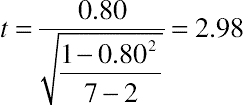
For the example we’ve been using in this chapter, the 95% confidence interval for the slope of 0.874 ranges from 0.12 to 1.63 (±0.76). Suppose there was a need to have an estimate that controlled the accuracy to ±0.25 (so d2 = 0.0625). From the data in Table 10.6, we have estimates of  and
and  which are, respectively, 451.48 (3160.37/7) and 196.91 (1378.34/7). As discussed in Chapter 6, use the value of z in place of t for an initial sample size estimate (with df = n − 2), then iterate until the sample size doesn’t change. For 95% confidence, z = 1.96 (so z2 = 3.84). Table 10.7 shows the iterations, which result in a sample size estimate of 32.
Table 10.7
Example Sample Size Estimation for Regression Slope
| Iteration | d | d 2 | t | df | t 2 |
|
|
n | Round up |
| 1 | 0.25 | 0.0625 | 1.96 | na | 3.84 | 451.48 | 196.91 | 28.81 | 29 |
| 2 | 0.25 | 0.0625 | 2.05 | 27 | 4.21 | 451.48 | 196.91 | 31.38 | 32 |
| 3 | 0.25 | 0.0625 | 2.04 | 30 | 4.17 | 451.48 | 196.91 | 31.10 | 32 |
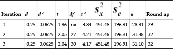
Let’s see if increasing n from 7 to 32 has the desired effect, keeping everything else equal.

The new standard error is 0.12, the value of t given 95% confidence and 30 degrees of freedom is 2.04, so the critical difference (d, aka, margin of error) is 0.12(2.04) = 0.25—exactly the desired value.
Intercept
The formula for the intercept also uses the population variance for e and x. Starting with the equation of the standard error of the intercept, using the fact that d = t(SE), and solving for n, you get:

For the detailed derivation of this formula, see the Appendix. To estimate n you need:
• An estimate of the population variability of x —the sum of the squared deviations of x from the mean of x, with that sum divided by n
• An estimate of the population variability of e —the sum of the squared deviations of each y from its estimated value, with that sum divided by n
• The desired level of confidence (used to determine the value of t)
• The smallest difference between the obtained and true value that you want to be able to detect (d)
• An estimate of the mean value of x  .
.
Continuing with the chapter example, the 95% confidence interval of the intercept of 10.22 ranged from −36.48 to 56.92. Because the accuracy of our estimate of the intercept has a large effect on the accuracy of our predictions, suppose we’ve decided that we need a more precise estimate and have determined that constraining it within a range of ±5 will be accurate enough for our purposes (so d2 = 25). From the data in Table 10.6, we have estimates of  and
and  which are, respectively, 451.48 (3160.37/7) and 196.91 (1378.34/7). Again, we use the value of z in place of t for an initial sample size estimate (with df = n−2), then iterate until the sample size doesn’t change. For 95% confidence, z = 1.96 (so z2 = 3.84). Table 10.8 shows the iterations for a sample size estimate of 258.
Table 10.8
Example Sample Size Estimation for Regression Intercept
| Iteration | d | d 2 | t | df | t 2 |
|
|
|
|
n | Round up |
| 1 | 5 | 25 | 1.96 | na | 3.84 | 57.7 | 3331.76 | 451.48 | 196.91 | 255.55 | 256 |
| 2 | 5 | 25 | 1.97 | 254 | 3.88 | 57.7 | 3331.76 | 451.48 | 196.91 | 257.97 | 258 |
| 3 | 5 | 25 | 1.97 | 256 | 3.88 | 57.7 | 3331.76 | 451.48 | 196.91 | 257.95 | 258 |

Keeping everything else the same, the new estimate of the standard error is:

The new standard error is 2.54, the value of t given 95% confidence and 256 degrees of freedom is 1.97, so the critical difference (d, aka, margin of error) is the desired value of 5 (2.54(1.97) = 5.00).
To estimate a specific value of x other than the y-intercept, replace  with
with  . When
  the equation simplifies to:

Analysis of variance
The ANOVA has its roots in agriculture, just a little less than a century ago. In 1919, Ronald Fisher began working at the Rothamsted Experimental Station to reanalyze agricultural data collected since 1843 and to improve their methods for future agricultural research (Cowles, 1989). It was in this latter effort that he began working out the methods of ANOVA and modern methods of experimental design, of which random assignment to treatment conditions is the hallmark. From this seed (pun intended), ANOVA became ubiquitous in the 20th century, supporting the analysis of experimental designs of varying complexities. The F-test—the test used to assess the statistical significance of ANOVA results—was named in honor of Fisher (Cowles, 1989).
It can take years of graduate classes and training to become proficient in the use of ANOVA. In this chapter, we’re going to focus on two of its simpler (and very common) applications. One is the extension of the t-test to the comparison of more than two means—in other words, when there are more than two levels of an independent variable. The other is the assessment of factorial designs, which involve the manipulation of multiple independent variables and permit the assessment of main effects (the significance of each of the independent variables) and their interaction (the extent to which the effects of one variable are dependent on the levels of the other variables in the experiment). Also, these applications of ANOVA in this chapter are only for between-subjects experiments. The underlying models become more complicated for within-subjects (repeated measures) experiments.
Comparing more than two means
In Chapter 5 we introduced the two-sample t-test for use when comparing a continuous dependent variable and a categorical variable with two levels (e.g., Design A and Design B). When there are more than two levels of a variable, however, you can use ANOVA.
How the omnibus test works
The technical term for an ANOVA with one independent variable is “one-way ANOVA” (think “one-variable ANOVA”). The null hypothesis for this test is that all means are equal. The alternative hypothesis is that at least one of the means is different from at least one of the others. The primary assumptions of this test are essentially the same as those for the two-sample t-test discussed in Chapter 5.
• Representativeness: The samples are representative of the populations to which the researcher intends to generalize the results.
• Independence: Data collected from each participant should not affect the scores of other participants.
• Homogeneity of Variance: Each group should have roughly equal standard deviations.
• Normality: The sampling distributions of the means for each group should be normal.
As with the t-test, the ANOVA is considered generally robust to violations of normality and homogeneity of variance. If you have very unequal sample sizes and vastly different variances, you may have to investigate nonparametric alternatives to ANOVA, data transformations, adjustments to the degrees of freedom used for the F-tests (such as the Welch–Satterthwaite procedure described in Chapter 5), or consult with a professional statistician. As with the t-test, the assumptions of representativeness and independence are the most important—you should be sure one participant’s metrics don’t affect other participants’ metrics in some way and that participants are representative of the populations of interest, ideally by the structure of the study (the experimental design).
Recall that a t-test is essentially an assessment of a signal-to-noise ratio, with the difference between means in the numerator (the signal) and a standard error in the denominator (the noise). The test of a one-way ANOVA is similar, but when there are more than two means it gets more complicated to compute the estimates of signal and noise. One way to approach this conceptually is through the partitioning of sums of squares (SS), then comparing the mean squares (sums of squares divided by the appropriate degrees of freedom) for variability between groups (signal, denoted MSBetween) divided by variability within groups (noise, denoted MSWithin). When you see mean squares, think of these as variances. The ANOVA is telling you if the variance between groups is sufficiently greater than the variance within groups. A large enough ratio indicates a statistical difference involving at least one of the group means.
To compute the ratio by hand, start by calculating the total sums of squares:

Then compute SSBetween:

where the subscript i refers to the groups, k is the number of groups, and n without a subscript is the total sample size. Finally:
You assess the significance of the ANOVA with an F-test. An F-test is similar to a t-test, but because you’re dealing with more than two means, the numerator and denominator both have degrees of freedom. The df for the numerator (also referred to as df1) is k−1, and for the denominator (also referred to as df2) is n−k. To calculate the mean squares divide SSBetween by df1 to get MSBetween and SSWithin by df2 to get MSWithin. Then compute F by calculating the ratio of MSBetween/MSWithin.
Table 10.9 shows some critical values of F for α = 0.05 and various df with denominator df listed in the first column and numerator df listed as the remaining row headers. More extensive tables are available in statistics books or online, or you can use the Excel functions FDIST (which produces a p-value to evaluate the results of an F-test) and FINV (which provides critical values of F). If the observed value of F for a given α, df1, and df2 is greater than the critical value, this only indicates that at least one of the means is significantly different from at least one of the others. When reporting the results of F-tests, provide both df—numerator first, then denominator (error) df using the standard format, for example: F(2, 5) = 6.5, p < 0.05.
Table 10.9
Some Critical Values of F for α = 0.05
| Numerator df | ||||||||||
| Denominator df | 1 | 2 | 3 | 4 | 5 | 6 | 7 | 8 | 9 | 10 |
| 1 | 161.4 | 199.5 | 215.7 | 224.6 | 230.2 | 234.0 | 236.8 | 238.9 | 240.5 | 241.9 |
| 2 | 18.51 | 19.00 | 19.16 | 19.25 | 19.30 | 19.33 | 19.35 | 19.37 | 19.38 | 19.40 |
| 3 | 10.13 | 9.552 | 9.277 | 9.117 | 9.013 | 8.941 | 8.887 | 8.845 | 8.812 | 8.786 |
| 4 | 7.709 | 6.944 | 6.591 | 6.388 | 6.256 | 6.163 | 6.094 | 6.041 | 5.999 | 5.964 |
| 5 | 6.608 | 5.786 | 5.409 | 5.192 | 5.050 | 4.950 | 4.876 | 4.818 | 4.772 | 4.735 |
| 10 | 4.965 | 4.103 | 3.708 | 3.478 | 3.326 | 3.217 | 3.135 | 3.072 | 3.020 | 2.978 |
| 20 | 4.351 | 3.493 | 3.098 | 2.866 | 2.711 | 2.599 | 2.514 | 2.447 | 2.393 | 2.348 |
| 30 | 4.171 | 3.316 | 2.922 | 2.690 | 2.534 | 2.421 | 2.334 | 2.266 | 2.211 | 2.165 |
| 40 | 4.085 | 3.232 | 2.839 | 2.606 | 2.449 | 2.336 | 2.249 | 2.180 | 2.124 | 2.077 |
| 50 | 4.034 | 3.183 | 2.790 | 2.557 | 2.400 | 2.286 | 2.199 | 2.130 | 2.073 | 2.026 |
| 100 | 3.936 | 3.087 | 2.696 | 2.463 | 2.305 | 2.191 | 2.103 | 2.032 | 1.975 | 1.927 |

Consider the findings shown in Table 10.10, from an unpublished study in which four groups of participants rated the quality of four artificial voices using the revised version of the Mean Opinion Scale (MOS-R; Polkosky and Lewis, 2003). The MOS-R is a standardized questionnaire with 10 bipolar items (7-point scales). The overall MOS-R score is the average of responses to those 10 items and can range from 1 to 7, with 7 being the best possible score. Table 10.10 shows the calculations needed to compute an omnibus F-test to assess the overall significance of participants’ reaction to the artificial voices.
Table 10.10
MOS-R Ratings of Four Artificial Voices
| Voice A | Voice B | Voice C | Voice D | ||
| 4.2 | 3.9 | 3.4 | 4.9 | ||
| 5.7 | 2.1 | 4.0 | 5.9 | ||
| 5.3 | 4.3 | 2.6 | 6.0 | ||
| 5.7 | 3.3 | 3.8 | 6.8 | ||
| Computed | Combined | ||||
| Mean | 4.49 | 5.23 | 3.40 | 3.45 | 5.90 |
| Sum(x) | 71.9 | 20.9 | 13.6 | 13.8 | 23.6 |
| (Sum(x))2 | 5169.6 | 436.8 | 185.0 | 190.4 | 557.0 |
| ((Sum(x))2)/n | 323.10 | 109.20 | 46.24 | 47.61 | 139.24 |
| Sum(x2) | 349.5 | 110.7 | 49.0 | 48.8 | 141.1 |
| n | 16 | 4 | 4 | 4 | 4 |

Using the values from Table 10.10 (note that there are some small discrepancies due to round off error):
• SSTotal = 349.5 − 5169.6/16 = 26.43
• SSBetween = 109.20 + 46.24 + 47.61 + 139.24 − 323.10 = 19.19
• SSWithin = 26.43 − 19.19 = 7.24
• MSBetween = 19.19/3 = 6.40
• MSWithin = 7.24/12 = 0.60
• F = 6.40/0.60 = 10.6
Table 10.11 shows the ANOVA results presented in a traditional summary table. Note that the Total SS (strictly speaking, the adjusted total) equals the sum of Between SS and Within SS, and the df for Total SS equals the sum of the df for Between SS and Within SS. The results indicate that at least one of the means is significantly different from at least one of the others (F(3, 12) = 10.6, p = 0.001).
Table 10.11
ANOVA Summary Table for Study of Four Artificial Voices
| Source | SS | df | MS | F | Sig |
| Total | 26.43 | 15 | |||
| Between | 19.19 | 3 | 6.40 | 10.6 | 0.001 |
| Within | 7.24 | 12 | 0.60 |

Multiple comparisons
Now we’re pretty sure at least one pair of means is different, but which one(s)? Voice D got the best mean rating, Voice A the second best, then Voice C, and finally, Voice B. It is beyond the scope of this chapter to provide a comprehensive review of the multitude of post hoc multiple comparison procedures. One way in which multiple comparison procedures differ is with regard to which they are conservative or liberal. Now would be a good time to review “What if You Need to Run More than One Test?” in Chapter 9, especially the sidebar on Abelson’s styles of rhetoric.
Running an omnibus test in the first place indicates a conservative style, so maintaining that style for this section, we’ll start with the Bonferroni correction, which is a conservative method. Despite being conservative (fewer differences identified as statistically significant but fewer false positives), it remains popular because it’s easy to understand and easy to compute by hand. With four means to compare, there are six possible pairs of means. The basis of the Bonferroni correction is to divide α by the number of comparisons, which for this example would be 0.05/6 = 0.008. The results of the six t-tests are:
• Voice A versus Voice B: t(6) = 3.06, p = 0.022
• Voice A versus Voice C: t(6) = 3.77, p = 0.009
• Voice A versus Voice D: t(6) = −1.28, p = 0.25
• Voice B versus Voice C: t(6) = −0.09, p = 0.93
• Voice B versus Voice D: t(6) = −4.05, p = 0.007
• Voice C versus Voice D: t(6) = −4.93, p = 0.003
Using the conservative Bonferroni adjustment to guide the interpretation of the results, only two comparisons (B vs. D and C vs. D) were significant. If instead we took the most liberal approach (simply running multiple t-tests at α = 0.05 for each test), we would deem four of the comparisons to be significant (A vs. B, A vs. C, B vs. D, and C vs. D).
A relatively new approach to balancing the conservative and liberal styles is the control of the false discovery rate (FDR—see Chapter 9) using the Benjamini–Hochberg method (Benjamini and Hochberg, 1995). To use the Benjamini–Hochberg method, take the p-values from all the comparisons and rank them from lowest to highest. Then create a new threshold for statistical significance for each comparison by dividing the rank by the number of comparisons and then multiplying this by the initial significance threshold (alpha). For six comparisons, the lowest p-value, with a rank of 1, is compared against a new threshold of (1/6)*0.05 = 0.008, the second is compared against (2/6)*0.05 = 0.017, and so on, with the last one being (6/6)*0.05 = 0.05. If the observed p-value is less than or equal to the new threshold, it’s considered statistically significant. Table 10.12 shows the p-values in order and the new significance thresholds obtained from the Benjamini–Hochberg method. In this case, the Benjamini–Hochberg method designates the same paired comparisons to be significant as the multiple t-tests without adjustment. This will not always happen (see the sidebar, “A Large-Sample Real-World Example of Multiple Pairwise Comparisons”).
Table 10.12
Benjamini–Hochberg Comparisons of Four Artificial Voices
| Comparison | p | Rank | New Threshold | Outcome |
| Voice C versus Voice D | 0.003 | 1 | 0.008 | Sig. |
| Voice B versus Voice D | 0.007 | 2 | 0.017 | Sig. |
| Voice A versus Voice C | 0.009 | 3 | 0.025 | Sig. |
| Voice A versus Voice B | 0.022 | 4 | 0.033 | Sig. |
| Voice A versus Voice D | 0.25 | 5 | 0.042 | |
| Voice A versus Voice C | 0.93 | 6 | 0.050 |

As shown in Table 10.12, the Benjamini–Hochberg method positions itself between unadjusted testing and the Bonferroni method by adopting a sliding scale for the threshold of statistical significance. The first threshold will always be the same as the Bonferroni threshold, and the last threshold will always be the same as the unadjusted value of α. The thresholds in between the first and last comparisons rise in equal steps from the Bonferroni to the unadjusted threshold. Note that the approach we described in Chapter 9 (“What if You Need to Run More than One Test?)” has a similar goal—focusing on the rate of false discovery rather than minimizing the Type I error. When there are a larger-than-expected number of significant comparisons, the Benjamini–Hochberg method provides additional guidance to researchers.
It may sometimes happen that the omnibus F-test is statistically significant, but using even a liberal approach, none of the paired comparisons are significant. This is unusual, but can happen because the omnibus F-test and multiple pairwise comparisons do not address exactly the same null hypotheses (Rutherford, 2011). Don’t panic. Just accept the ambiguity of the outcome, draw the best conclusions you can, and move on.
A large-sample real-world example of multiple pairwise comparisons
Investigating the user experience of popular retail websites—from the files of Jeff Sauro
In 2013, I measured the quality of the user experience with ten popular US-based retail websites using the SUPR-Q (Sauro, 2013). SUPR-Q scores are derived by taking the average of the eight items in the questionnaire, with higher scores indicating better perceived experiences (for details, see the section on SUPR-Q in Chapter 8). Fig. 10.7 shows the mean scores along with 90% confidence intervals (I used α = 0.10 for this research).

Figure 10.7 Mean SUPR-Q scores of popular retail websites
Amazon had the highest SUPR-Q score and Walgreens the lowest, but which websites were statistically different from each other? With 10 websites, there are 45 total paired comparisons and plenty of opportunity to falsely identify a difference. All pairwise comparisons were made and the p-values were ranked from lowest to highest as shown in Table 10.13. Without any adjustments, 22 of the 45 comparisons were statistically significant at p < 0.10 (the column labeled “Unadjusted Result” in the table). Using the Benjamini–Hochberg method, 17 were statistically significant (the column labeled “BH Result”). The threshold for the Bonferroni method was  (0.10/45), which flagged just nine comparisons as statistically significant (the column labeled “Bonferroni Result”). This illustrates how the Benjamini–Hochberg method strikes a good balance between the more liberal unadjusted p-values and the more conservative Bonferroni method.
Table 10.13
Results of Benjamini–Hochberg and Bonferroni Multiple Comparisons of Popular Retail Websites
| Pair | Site 1 | Site 2 | p-value | Rank | BH Threshold | Unadjusted Result | BH Result | Bonferroni Result |
| 1 | Walmart | Amazon | 0.000 | 1 | 0.002 | Sig. | Sig. | Sig. |
| 2 | BestBuy | Amazon | 0.000 | 2 | 0.004 | Sig. | Sig. | Sig. |
| 3 | Amazon | Target | 0.000 | 3 | 0.007 | Sig. | Sig. | Sig. |
| 4 | Amazon | BedBath | 0.000 | 4 | 0.009 | Sig. | Sig. | Sig. |
| 5 | Amazon | Overstock | 0.000 | 5 | 0.011 | Sig. | Sig. | Sig. |
| 6 | Amazon | Staples | 0.000 | 6 | 0.013 | Sig. | Sig. | Sig. |
| 7 | Amazon | Walgreens | 0.000 | 7 | 0.016 | Sig. | Sig. | Sig. |
| 8 | Etsy | Walgreens | 0.001 | 8 | 0.018 | Sig. | Sig. | Sig. |
| 9 | Nordstrom | Walgreens | 0.001 | 9 | 0.020 | Sig. | Sig. | Sig. |
| 10 | BestBuy | Walgreens | 0.009 | 10 | 0.022 | Sig. | Sig. | |
| 11 | Amazon | Etsy | 0.009 | 11 | 0.024 | Sig. | Sig. | |
| 12 | BedBath | Walgreens | 0.013 | 12 | 0.027 | Sig. | Sig. | |
| 13 | Nordstrom | Staples | 0.018 | 13 | 0.029 | Sig. | Sig. | |
| 14 | Etsy | Staples | 0.020 | 14 | 0.031 | Sig. | Sig. | |
| 15 | Walmart | Walgreens | 0.023 | 15 | 0.033 | Sig. | Sig. | |
| 16 | Target | Walgreens | 0.024 | 16 | 0.036 | Sig. | Sig. | |
| 17 | Amazon | Nordstrom | 0.037 | 17 | 0.038 | Sig. | Sig. | |
| 18 | Overstock | Walgreens | 0.051 | 18 | 0.040 | Sig. | ||
| 19 | Walmart | Nordstrom | 0.054 | 19 | 0.042 | Sig. | ||
| 20 | Walmart | Etsy | 0.060 | 20 | 0.044 | Sig. | ||
| 21 | Target | Nordstrom | 0.090 | 21 | 0.047 | Sig. | ||
| 22 | Nordstrom | Overstock | 0.095 | 22 | 0.049 | Sig. | ||
| 23 | Target | Etsy | 0.105 | 23 | 0.051 | |||
| 24 | BedBath | Nordstrom | 0.108 | 24 | 0.053 | |||
| 25 | Etsy | Overstock | 0.114 | 25 | 0.056 | |||
| 26 | BestBuy | Nordstrom | 0.117 | 26 | 0.058 | |||
| 27 | BedBath | Etsy | 0.127 | 27 | 0.060 | |||
| 28 | BestBuy | Etsy | 0.138 | 28 | 0.062 | |||
| 29 | Staples | Walgreens | 0.200 | 29 | 0.064 | |||
| 30 | BestBuy | Staples | 0.207 | 30 | 0.067 | |||
| 31 | BedBath | Staples | 0.255 | 31 | 0.069 | |||
| 32 | Target | Staples | 0.345 | 32 | 0.071 | |||
| 33 | Walmart | Staples | 0.381 | 33 | 0.073 | |||
| 34 | Overstock | Staples | 0.471 | 34 | 0.076 | |||
| 35 | Walmart | BestBuy | 0.616 | 35 | 0.078 | |||
| 36 | BestBuy | Overstock | 0.682 | 36 | 0.080 | |||
| 37 | Walmart | BedBath | 0.716 | 37 | 0.082 | |||
| 38 | BedBath | Overstock | 0.757 | 38 | 0.084 | |||
| 39 | BestBuy | Target | 0.768 | 39 | 0.087 | |||
| 40 | Etsy | Nordstrom | 0.836 | 40 | 0.089 | |||
| 41 | Target | BedBath | 0.857 | 41 | 0.091 | |||
| 42 | Walmart | Target | 0.877 | 42 | 0.093 | |||
| 43 | Target | Overstock | 0.884 | 43 | 0.096 | |||
| 44 | BestBuy | BedBath | 0.909 | 44 | 0.098 | |||
| 45 | Walmart | Overstock | 0.982 | 45 | 0.100 |


Assessing interactions
For certain kinds of experimental designs it is possible to partition the SSBetween into independent effects. For example, factorial designs allow the independent estimation of the effects of two or more independent variables and their interactions. A significant interaction occurs when the result for an independent variable varies sufficiently depending on the level of a different independent variable. The simplest factorial design is one in which there are two independent variables, each with two levels (known as a 2 × 2 factorial design).
For example, consider an unpublished study in which male and female participants used the MOS-R to rate the quality of two artificial voices, one male and one female. Nass and Brave (2005) had suggested that the social psychological principle of “similarity attraction” might apply to user reactions to artificial voices such that males would prefer a male voice and females a female voice. If the similarity attraction hypothesis held, the expectation was that there would be a significant interaction between the gender of the artificial voice (Voice) and the gender of the person rating the voice (Rater).
Fig. 10.8 illustrates some of the patterns of results that can occur given this type of factorial study. If there were a main effect of Voice but no main effect of Rater or any interaction, the pattern would look something like (a). If there were a main effect of Voice but not one of Rater and no interaction, it would be something like (b). The pattern in (c) results from significant main effects for both independent variables and their interaction. The pattern in (d) is a special case known as a crossed interaction—there is no main effect for either independent variable but there is a significant interaction. For this study, if similarity attraction has a strong effect on how listeners perceive artificial voices, we would expect a crossed interaction (Fig. 10.8d).

Figure 10.8 Some possible outcomes for a 2 × 2 factorial design
For factorial designs, the formulas for computing SSTotal, SSBetween, and SSWithin are the same as those from the previous section of this chapter. The general formulas for computing the SS for the independent (main) effects and their interaction are:


The df for the main effects are the number of levels of the independent variable minus 1. To compute the df for the interaction, multiply the df for each of the independent variables involved in the interaction.
Table 10.14 shows the results of the study and Table 10.15 shows the summary table. From the summary table, note that SSBetween had three degrees of freedom. There were two levels of Voice (Voice M and Voice F), so this effect had one degree of freedom. The same was true of Rater—just two levels (Male and Female), so it also had one degree of freedom. To get the degrees of freedom for the interaction, you multiply the degrees of freedom for the associated main effects, which was 1 × 1 = 1. When df = 1, the MS is equal to the SS. If you work with more advanced forms of ANOVA, you’ll find yourself carefully tracking the degrees of freedom to make sure they add up correctly.
Table 10.14
Results of the Factorial Experiment of Voice and Rater
| Voice M (Males) | Voice M (Females) | Voice F (Males) | Voice F (Females) | ||
| 3.6 | 6.0 | 4.2 | 4.4 | ||
| 6.1 | 3.4 | 3.4 | 4.2 | ||
| 5.7 | 5.7 | 3.2 | 4.6 | ||
| 4.2 | 5.7 | 3.7 | 2.7 | ||
| Computed | Combined | ||||
| Mean | 4.43 | 4.90 | 5.20 | 3.63 | 3.98 |
| Sum(x) | 70.8 | 19.6 | 20.8 | 14.5 | 15.9 |
| (Sum(x))2 | 5012.6 | 384.2 | 432.6 | 210.3 | 252.8 |
| ((Sum(x))2)/n | 313.29 | 96.04 | 108.16 | 52.56 | 63.20 |
| Sum(x2) | 331.4 | 100.3 | 112.5 | 53.1 | 65.5 |
| n | 16 | 4 | 4 | 4 | 4 |

Table 10.15
Summary Table for ANOVA of the Factorial Study of Voice and Rater
| Source | SS | df | MS | F | Sig |
| Total | 18.13 | 15 | 1.21 | ||
| Between | 6.68 | 3 | 2.23 | ||
| Voice | 6.25 | 1 | 6.25 | 6.55 | 0.025 |
| Rater | 0.42 | 1 | 0.42 | 0.44 | 0.52 |
| Interaction | 0.003 | 1 | 0.003 | 0.003 | 0.96 |
| Within | 11.46 | 12 | 0.95 |

The steps for computing the values for SS, df, and MS in the summary table (ignoring some small discrepancies due to round off error) are:
• SSTotal = 331.4 − 5012.6/16 = 18.13
• SSBetween = 96.04 +108.16 + 52.56 + 63.2 − 313.29 = 6.68
• SSVoice = (19.6 + 20.8)2/8 + (14.5 + 15.9)2/8 − 313.29 = 6.25
• SSRater = (19.6 + 14.5)2/8 + (20.8 + 15.9)2/8 − 313.29 = 0.42
• SSInteraction = 6.68 − 6.25 − 0.42 = 0.003
• SSWithin = 18.13 − 6.68 = 11.46
• dfTotal = 16 − 1 = 15
• dfBetween = 4 − 1 = 3
• dfVoice = 2 − 1 = 1
• dfRater = 2 − 1 = 1
• dfInteraction = 1(1) = 1
• dfWithin = 15 − 3 = 12 (these are the error/denominator df)
• MSTotal = 18.3/15 = 1.21
• MSBetween = 6.68/3 = 2.23
• MSVoice = 6/25/1 = 6.25
• MSRater = 0.42/1 = 0.42
• MSInteraction = 0.003/1 = 0.003
• MSWithin = 11.46/12 = 0.95 (error MS for this ANOVA model)
• The values for the F-tests are the mean squares of the effect divided by MSWithin
Fig. 10.9 shows a graph of the main effects and the interaction from this study. As shown in the ANOVA summary table, only the main effect of Voice was statistically significant. Interpreting a significant interaction is more important than interpreting the associated main effects (captured in the informal rule, “interactions trump main effects”), but in this case the interaction was not significant (for an example of a significant interaction, see the sidebar “Large-Sample Real-World Example of an Interaction Effect”). The patterns of ratings of male and female participants were about the same for each artificial voice, with both genders preferring the male voice (Voice M) over the female voice (Voice F). Note that these results do not necessarily disprove the similarity attraction hypothesis, but do suggest that if it exists, it is weaker than the difference in the quality of these artificial voices (Lewis, 2011).

Figure 10.9 Graph of results from the factorial study of Voice and Rater
Prior to the work that Fisher did at the Rothamsted Experimental Station, the most common approach to conducting experiments was to manipulate one variable at a time while trying to hold all other variables constant. One of Fisher’s greatest contributions to research was demonstrating the efficiency of factorial designs relative to one-variable-at-a-time designs. As demonstrated in this section, with a properly designed factorial experiment you can study all of the variables of interest in one experiment and, in addition to assessing their individual effects, you can also assess their interactions.
Large-sample real-world example of an interaction effect
Is there an interaction between pre- and post-brand affection and pre-existing brand affection?—From the files of Jeff Sauro
Prior attitudes with a brand, product, or website are often a powerful predictor of attitudinal metrics collected in a usability study and should be collected and analyzed when drawing conclusions. For example, we were working to understand how a new checkout experience influenced the brand affection of participants. We asked participants their overall affection toward the brand prior to checking out and then after the checkout experience. Brand affection was measured using an average from 10 items using 7-point response options (Thomson et al., 2005).
We knew that many customers had a strongly favorable attitude whereas others had a strongly negative attitude toward the brand already, so we wanted to see if the checkout experience affected these customers differently.
We found that overall, brand affection for participants in the study increased after checking out. However, the story was more nuanced once we included prior brand affection. Fig. 10.10 shows a significant interaction effect between pre- and post-brand affection. We saw that participants who had high brand affection actually slightly decreased their affection (by about 4%) after checking-out. In contrast, participants with low pre-existing brand affection actually increased their affection toward the brand substantially (18%).

Figure 10.10 Interaction between pre-existing and post-checkout brand affection
Confidence intervals and sample size estimation for ANOVA
Confidence intervals
We expect that most researchers who use ANOVA will do their analyses with a statistical computer application such as SAS or SPSS. For the various effects of interest, these programs provide estimates of the standard error. Recall that the fundamental formula for computing a confidence interval is to multiply the standard error by the appropriate value of z or t (depending on the denominator degrees of freedom for the effect) to get the margin of error, then add and subtract that margin of error from the point estimate (the mean).
Sample size estimation
The appropriate sample size estimate for an ANOVA depends on the details of the design in addition to other assumptions (e.g., magnitude of variance, equal or unequal variances for the various groups, etc.). A free resource for ANOVA sample size estimation is the G*Power application (see “Dealing with More Complex Sample Size Estimation” in Chapter 6).
..................Content has been hidden....................
You can't read the all page of ebook, please click here login for view all page.