
Appendix
A crash course in fundamental statistical concepts
Introduction
Throughout the book we’ve attempted to provide as much statistical background as possible without letting it get too overwhelming. In this appendix we review some fundamental statistical concepts and provide pointers to chapters where the concepts are covered in greater detail. If you’ve never had an introductory statistics class or don’t remember basic concepts such as measuring central tendency and variability, then you can use this appendix for a quick review.
Types of data
The first step in using statistics to make better decisions is obtaining measurements. There are two major types of measurements: quantitative and categorical. Task time, number of usability problems, and rating scale data are quantitative. Things like gender, operating system, and usability problem type are categorical variables.
Quantitative data fall on a spectrum from continuous to discrete-binary, as shown in Fig. A.1. Note that the extreme discrete end of this spectrum includes binary categorical measurements such as pass/fail and yes/no. The more discrete the data, the larger the required sample size for the same level of precision as a continuous measure. Also, you’ll usually use different statistical tests for continuous versus discrete data (Chapters 3–6).
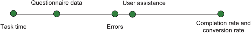
Figure A.1 Spectrum of quantitative data
Discrete data have finite values, or buckets. You can count them. Continuous data technically have an infinite number of steps, which form a continuum. The number of usability problems would be discrete—there are a finite and countable number of observed usability problems. Time to complete a task is continuous since it could take any value from 0 to infinity, for example, 178.8977687 s.
You can tell the difference between discrete and continuous data because discrete can usually be preceded by the phrase “number of...,” for example, number of errors or number of calls to the help desk.
You can convert categorical data into discrete quantitative data. For example, task passes and failures can be converted to 0 for fail and 1 for pass. Discrete data don’t lend themselves well to subdividing (you can’t have half an error) but we’re often able to analyze them more like continuous data because they can potentially range from 0 to infinity. Questionnaire data that use closed-ended rating scales (e.g., values from 1 to 7) do have discrete values, but because the mean rating can take an infinite number of values we can analyze it like continuous data.
There are other ways of classifying measurements, such as the famous and controversial hierarchy of Nominal, Ordinal, Interval, and Ratio data discussed in Chapter 9. For most applied user research, the major useful distinctions are between categorical and quantitative data and, within quantitative data, between continuous and discrete.
Populations and samples
We rarely have access to the entire population of users. Instead we rely on a subset of the population to use as a proxy for the population. When we ask a sample of users to attempt tasks and we measure the average task time, we’re using this sample to estimate the average task time for the entire user population. Means, standard deviations, medians, and other summary values from samples are called statistics. Sample statistics estimate unknown population parameters. Population parameters (like the mean task time and standard deviation) are denoted with Greek symbols (μ for mean and σ for standard deviation) and sample statistics are denoted with Latin characters ( for mean and s for standard deviation).
Sampling
The most important thing in drawing conclusions from data, whether in user research, psychology, or medicine, is that the sample of users you measure represents the population about which you intend to make statements. No amount of statistical manipulation can correct for making inferences about one population if you observe a sample from a different population.
Ideally, you should select your sample randomly from the parent population. In practice, this can be very difficult due to (1) issues in establishing a truly random selection scheme or (2) problems getting the selected users to participate. It’s always important to understand the potential biases in your data and how that limits your conclusions. In applied research we are constrained by budgets and the availability of users but products still must ship, so we make the best decisions we can given the data we have. Where possible seek to minimize systematic bias in your sample but remember that representativeness is more important than randomness. In other words, you’ll make better decisions if you have a less-than-perfectly random sample from the right population than if you have a perfectly random sample from the wrong population. See Chapter 2 for more discussion on Randomness and Representativeness.
Measuring central tendency
Mean
One of the first and easiest things to do with a set of data is to find the average. The average is a measure of central tendency, meaning it is a way of summarizing the middle value (where the center of the data tends to be). For a set of data that is roughly symmetrical, the arithmetic mean provides a good center value. To calculate the mean, add up each value and divide by the total number in the group. For example, here are ten SUS scores from a recent usability test (see Chapter 8 for more on SUS).
The mean SUS score is 60.55. You can use the Excel function =AVERAGE() to find the arithmetic mean.
Median
When the data you’re analyzing aren’t symmetrical, like task times, the mean can be heavily influenced by a few extreme data points and thus becomes a poor measure of the middle value. In such cases the median provides a better idea of the most typical value. For odd samples, the median is the central value; for even samples, it’s the average of the two central values. Here is an example of task-times data from a usability test, arranged from fastest to slowest:
For these data, the median is 116.5 (the mean of 111 and 122). In Excel, you can find the median with the function =MEDIAN().
Geometric mean
The median is by definition the center value. In a small sample of data (less than 25 or so), the sample median tends to do a poor job of estimating the population median. For task-time data we’ve found that another average called the geometric mean tends to provide a better estimate of the population’s middle value than the sample median (see Chapter 3 for more discussion on using the geometric mean with task times). To find the geometric mean, transform the raw times to log-times (using the Excel function =LN()), find the arithmetic mean of these log-times, then convert this mean of the logs back into the original scale (using the Excel function =EXP()). The geometric mean for the task times shown previously is 133.8 s. You can also use the Excel function =GEOMEAN() on the raw task times. Fig. A.2 shows the various “average” times for this example.

Figure A.2 Difference in “average” point estimates
Standard deviation and variance
In addition to describing the center or most typical value in a set of data, we also need a measure of the spread of the data around the average. The most common way to do this is using a metric called the standard deviation. The standard deviation provides an estimate of the average difference of each value from the mean.
If, however, you just subtract each value from the mean and take an average, you’ll always get 0 because the differences cancel out. To avoid this problem, after subtracting each value from the mean, square the values then take the average of the squared values. This gets you the average squared difference from the mean, a statistic called the variance. It is used a lot in statistical methods, but it’s hard to think in terms of squared differences. The solution is to take the square root of the variance to get the standard deviation—an intuitive (and the most common) way to describe the spread of data. A narrated visualization of the standard deviation is available online at http://www.usablestats.com/tutorials/StandardDeviation.
The normal distribution
Many measures when graphed tend to look like a bell-shaped curve. For example heights, weights, and IQ scores are some of the more famous bell-shaped distributions. Fig. A.3 shows a graph of 500 North American men’s heights in inches. The average height is 5 ft. 10 in. (178 cm) with a standard deviation of 3 in. (7.6 cm).

Figure A.3 Distribution of North American men’s heights in inches
Over the past century, researchers have found that the bulk of the values in a population cluster around the “head” of the bell curve. In general, they’ve found that 68% of values fall within one standard deviation of the mean, 95% fall within two standard deviations, and 99.7% fall within three standard deviations. In other words, for a population that follows a normal distribution, almost all the values will fall within three standard deviations above and below the mean—a property known as the Empirical Rule (Fig. A.4).

Figure A.4 Illustration of the Empirical Rule
As you can see in Fig. A.4, the bulk of the heights fall close to the mean with only a few further than two standard deviations from the mean.
As another example, Fig. A.5 shows the weights of 2000 Euro coins which have an average weight of 7.53 g and a standard deviation of 0.035 g.

Figure A.5 Weights of 2000 Euro coins
Almost all coins fall within three standard deviations of the mean weight.
If we can establish that our population follows a normal distribution and we have a good idea about the mean and standard deviation, then we have some idea about how unusual values are—whether they are heights, weights, average satisfaction scores, or average task times.
z-scores
For example, if you had a friend who had a height of 6 ft. 10 in., intuitively you’d think he was tall. In fact, you probably haven’t met many people who are as tall as or taller than him. If we think of this person as one point in the population of adult men, we can get an idea about how unusual this height is. All we need to know is the mean and standard deviation of the population.
Using the mean and standard deviation from the North American population (5 ft. 10 in. and 3 in., respectively), someone who is 6 ft. 10 in. is 12 in. higher than the mean. By dividing this difference by the standard deviation of 3, we get 4, which tells us how many standard deviations this point is from the mean. The number of standard deviations is a unitless measure that has the same meaning regardless of the dataset. In this case, our friend is four standard deviations above the mean. When used this way, the number of standard deviations also goes by the name z-score or normal score.
Based on the Empirical Rule, we know that most data points in a normal distribution fall within three standard deviations of the mean, so a person who is four standard deviations above the mean is very tall indeed (taller than at least 99% of the population). If we know that a toddler’s height is four standard deviations above the mean, knowing nothing else, you know that he is very tall for his age. If a student’s IQ score is four standard deviations above the mean you know that her score is well above average. If you know a company’s loyalty ratings are four standard deviations above the mean, this is compelling evidence that their scores are among the highest (and they have a very loyal following).
We can use the properties of the normal curve to be more precise about just how tall, smart, or loyal someone is. Just like the Empirical Rule gave us the percent of values within one, two, and three standard deviations, we can use the same principle to find the percent we’d expect to fall between any two points and how extreme a point is.
We already have the number of standard deviations (that’s what the z-score tells us), so all we have to do is find the area under the normal curve for the given z-score(s).
Area under the normal curve
If the normal curve was a rectangle it would be easy to find the area by multiplying the length times the width—but it’s not, or it would be called the normal rectangle. The area of curved shapes is essentially found by adding up small rectangles that approximate the curves, with this process smoothed through the use of calculus. Fortunately, we can use software or tabled values to spare us all the tedious calculus.
One of the most important things to remember about using the normal curve as a reference distribution is that the total area under the curve adds up to 1 or 100% (Fig. A.6).

Figure A.6 Like a pie chart, the area under the normal curve adds up to 100%
You can think of it like a big pie-chart—you can have as many slices as you want but they all need to add up to 100%. The same principle applies to the normal curve. Unlike a pie chart though, the normal curve theoretically goes on to both positive and negative infinity, but the area gets infinitesimally small as you go beyond four standard deviations from the mean.
If you have access to Excel, you can find the percent of area up to a point in the normal curve by using the function =NORMSDIST(z), where z is the number of standard deviations (the z-score). For example, a z-score of 1.28 provides the area from negative infinity to 1.28 standard deviations above the mean and accounts for about 90% of the area. The shaded region in Fig. A.7 shows you 90% of the area from negative infinity to 1.28 standard deviations above the mean. We can use the area under the curve as a percentile rank to describe how typical or unusual a value is.

Figure A.7 Illustration of an area under the normal curve
A person who is four standard deviations above the mean would be in the =NORMSDIST(4) 99.997th percentile in height (very unusual!). Most statistics books include a table of normal values. To find the percentile rank from the table, you find the z-score that’s closest to yours and find the area. For example, Table A.1 is a section from a normal table. There isn’t an entry for 1.28 but we can see it falls somewhere between 88.49% and 90.32% (closer to 90.32%).
Table A.1
Partial z-Scores to Percentile Rank Table
| z-Score | Percentile |
| 1.0 | 84.13 |
| 1.1 | 86.43 |
| 1.2 | 88.49 |
| 1.3 | 90.32 |
| 1.4 | 91.92 |
| 1.5 | 93.32 |
| 1.6 | 94.52 |
| 1.7 | 95.54 |
Because the total area must add up to 100% under the curve, we can express a z-score of 1.28 as being higher than 90% of values or less than 10% of values (100% minus 90%).
Applying the normal curve to user research data
The examples so far have been mostly about height, weight, and IQ scores—metrics that nicely follow a normal distribution. In our experience, user researchers rarely use these metrics, more typically using measurements such as averages from rating scales and completion rates. Graphs of the distributions of these types of data are usually far from normal. For example, Fig. A.8 shows 15 SUS scores from a usability test of the Budget.com website. It is hardly bell-shaped or even symmetrical.

Figure A.8 Graph of 15 SUS scores
The average SUS score from this sample of 15 users is 80 with a standard deviation of 24. It’s understandable to be a bit concerned about how much faith to put into this mean as a measure of central tendency because the data aren’t symmetric. It is certainly even more of a concern about how we can use the normal curve to make inferences about this sort of data.
It turns out this sample of 15 comes from a larger sample of 311 users, with all the values shown in Fig. A.9. The mean SUS score of these data is 78.

Figure A.9 Graph of 311 SUS scores
Again, the shape of this distribution makes you wonder if the normal curve is even relevant. However, if we take 1000 random samples of 15 users from this large population of 311, then plot the 1000 means, you get the graph shown in Fig. A.10. Although the large sample of 311 SUS scores is not normal, the distribution of the random means shown in Fig. A.10 does follow a normal distribution. The same principle applies if the population we draw randomly from is 311 or 311 million.

Figure A.10 Graph of 1000 means of random samples of 15 SUS scores
Central Limit Theorem
Fig. A.10 illustrates one of the most fundamental and important statistical concepts—the Central Limit Theorem. In short, this theorem states that as the sample size approaches infinity, the distribution of sample means will follow a normal distribution regardless of what the parent population looks like. Even for some very nonnormal populations, at a sample size of around 30 or higher, the distribution of the sample means becomes normal. The mean of this distribution of sample means will also be equal to the mean of the parent population.
For many other populations, like rating scale data, the distribution becomes normal at much smaller sample sizes (we used 15 in Fig. A.10). To illustrate this point with binary data, which has a drastically nonnormal distribution, Fig. A.11 shows 1000 random samples taken from a large sample of completion rate data with a population completion rate of 57%. The data are discrete-binary because the only possible values are fail (0) and pass (1).

Figure A.11 Illustration of distribution of binary means approaching normality
The black dots show each of the 1000 sample completion rates at a sample size of 50. Again we can see the bell-shaped normal distribution take shape. The mean of the sampling distribution of completion rates is 57%, the same as the population from which it was drawn. For reasonably large sample sizes, we can use the normal distribution to approximate the shape of the distribution of average completion rates. The best approaches for working with this type of data are discussed in Chapters 3 through 6.
Standard error of the mean
We will use the properties of the normal curve to describe how unusual a sample mean is for things like rating scale data and task times. When we speak in terms of the standard deviation of the distribution of sample means, this special standard deviation goes by the name “standard error” to remind us that that each sample mean we obtain differs by some amount from the true unknown population mean. Because it describes the mean of multiple members of a population, the standard error is always smaller than the standard deviation. The larger our sample size is, the smaller we would expect the standard error to be and the less we’d expect our sample mean to differ from the population mean. Our standard error needs to take into account the sample size. In fact, based on the sample size, there is a direct relationship between the standard deviation and the standard error. We use the sample standard deviation and the square root of the sample size to estimate the standard error—how much sample means fluctuate from the population mean.
From our initial sample of 15 users we had a mean of 80 and a standard deviation of 24. This generates a standard error (technically the estimate of the standard error) of 6.2.

Margin of error
We can use this standard error just like we use the standard deviation to describe how unusual values are from certain points. Using the Empirical Rule and the standard error of 6.2 from this sample, we’d expect around 95% of sample means to fall within two standard errors or about 12.4 points on either side of the mean population score. This 12.4-point spread is called the margin of error. If we add and subtract the margin of error to the sample mean of 80, we have a 95% confidence interval that ranges from 67.6 to 92.4 (see Chapter 3 for more detail on generating confidence intervals). However, we don’t know the population mean or standard deviation. Instead, we’re estimating it from our sample of 15 so there is some additional error we need to account for. Our solution, interestingly enough, comes from beer.
t-distribution
Using the Empirical Rule and z-scores to find the percent of area only works when we know the population mean and standard deviation. We rarely do in applied research. Fortunately, a solution was provided over 100 years ago by an applied researcher named William Gossett who faced the same problem at Guinness Brewing (for more information, see Chapter 9).
He compensated for flawed estimates of the population mean and standard deviation by accounting for the sample size to modify the z-distribution into the t-distribution. Essentially, at smaller sample sizes, sample means fluctuate more around the population mean, creating a bell curve that is a bit fatter in the tails than the normal distribution. Instead of 95% of values falling with 1.96 standard deviations of the mean, at a sample size of 15, they fall within 2.14 standard deviations.
For most small-sample research, we use these t-scores instead of z-scores to account for how much we expect the sample mean to fluctuate. Statistics textbooks include t-tables or, if you have access to Excel, you can use the formula =TINV(0.05,14) to find how many standard deviations account for 95% of the area (called a critical value). The two parameters in the formula are alpha (1 minus the level of confidence (1−0.95 = 0.05)) and the degrees of freedom (sample size minus 1 for a one-sample t), for which t = 2.14.
Therefore a more accurate confidence interval would be 2.14 standard errors (6.2*2.14) which generates the slightly wider margin of error of 13.3. This would provide us with a 95% confidence interval ranging from 66.7 to 93.3. Confidence intervals based on t-scores will always be larger than those based on z-scores (reflecting the slightly higher variability associated with small sample estimates), but will be more likely to contain the population mean at the specified level of confidence. Chapter 3 provides more detail on computing confidence intervals for a variety of data.
Significance testing and p-values
The concept of the number of standard errors that sample means differ from population means applies to both confidence intervals and significance tests. If we want to know if a new design actually improves task-completion times but can’t measure everyone, we need to estimate the difference from sample data. Sampling error then plays a role in our decision. For example, Fig. A.12 shows the times from 14 users who attempted to add a contact in a CRM application. The average sample completion time is 33 s with a standard deviation of 22 s.

Figure A.12 Task completion times from 14 users
A new version of the data entry screen was developed and a different set of 13 users attempted the same task (Fig. A.13). This time the mean completion time was 18 s with a standard deviation of 10 s.

Figure A.13 Task completion times from 13 other users
So, our best estimate is that the new version is 15 s faster than the older version. A natural question to ask is whether the difference is statistically significant. That is, it could be that there is really no difference in task-completion times between versions. It could be that our sampling error from our relatively modest sample sizes is just leading us to believe there is a difference. We could just be taking two random samples from the same population with a mean of 26 s. How can we be sure and convince others that at this sample size we can be confident the difference isn’t due to chance alone?
How much do sample means fluctuate?
Fig. A.14 shows the graph of a large dataset of completion times with a mean of 26 s and a standard deviation of 13 s.

Figure A.14 Large dataset of completion times
Imagine you randomly selected two samples—one containing 14 task times and the other 13 times, found the mean for each group, computed the difference between the two means, and graphed it. Fig. A.15 shows what the distribution of the difference between the sample means would look like after 1000 samples. Again we see the shape of the normal curve.

Figure A.15 Result of 1000 random comparisons
We can see in Fig. A.15 that a difference of 15 s is possible if the samples came from the same population (because there are dots that appear at and above 15 s and −15 s). This value does, however, fall in the upper tail of the distribution of 1000 mean differences—the vast majority cluster around 0. Just how likely is it to get a 15 s difference between these sample means if there really is no difference? To find out, we again count the number of standard errors that the observed mean difference is from the expected population mean of 0 if there really is no difference. As a reminder, this simulation is showing us that when there is no difference between means (we took two samples from the same dataset) we will still see differences just by chance.
For this two-sample t-test, there is a slight modification to the standard error portion of the formula because we have two estimates of the standard error—one from each sample. As shown in the following formula for the two-sample t, we combine these estimates using a weighted average of the variances (see Chapter 5 for more detail):

where  and
and  are the means from sample 1 (33 s) and sample 2 (18 s),
s1 and s2 are the standard deviations from sample 1 (22 s) and sample 2 (10 s),n1 and n2 are the sample sizes from sample 1 (14) and sample 2 (13), and
t is the test statistic (look up using the t-distribution based on the sample size for two-sided area).
Filling in the values, we get a standard error of 6.5 s, and find that a difference of 15 s is 2.3 standard errors from the mean.
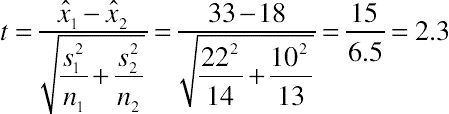
To find out how likely this difference is if there were really no difference, we look up 2.3 in a t-table to find out what percent of the area falls above and below 2.3 standard deviations from the mean. The only other ingredient we need to use in the t-table is the degrees of freedom, which is approximately two less than the smaller of the two sample sizes (13-2 = 11) (for a more specific way to compute the degrees of freedom for this type of test, see Chapter 5). Using the Excel function = TDIST(2.3,11,2) we get 0.04, which is called the p-value. A p-value is just a percentile rank or point in the t-distribution. It’s the same concept as the percent of area under the normal curve used with z-score. A p-value of 0.04 means that only 4% of differences would be greater than 15 s if there really was no difference. Put another way, 2.3 standard errors account for 96% of the area under the t-distribution (1 − 0.04). In other words, we expect to see a difference this large by chance only around 4 in 100 times. It’s certainly possible that there is no difference in the populations from which the two samples came (that the true mean difference is 0), but it is more likely that the difference between means is something more like 5, 10, or 15 s. By convention, when the p-value falls below 0.05 there is sufficient evidence to conclude the difference isn’t due to chance. In other words, we would conclude that the difference between the two versions of the CRM application indicates a real difference (see Chapter 9 for more discussion on using the p-value cutoff of 0.05).
Keep in mind that although the statistical decision is that one design is faster, we have not absolutely proven that it is faster. We’re just saying that it’s unlikely enough that the observed mean differences come from populations with a mean difference of 0 (with the observed difference of 15 s due to chance). As we saw with the resampling exercise, we occasionally obtained a difference of 15 s even though we were taking random samples from the same population. Statistics is not about ensuring 100% accuracy – instead it’s more about risk management. Using these methods we’ll be right most of the time, but at a 95% level of confidence, in the long run we will incorrectly conclude 5 out of 100 times (1 out of 20) that a difference is statistically significant when there is really no difference. Note that this error rate only applies to situations in which there is really no difference.
The logic of hypothesis testing
The p-value we obtain after testing two means tells us the probability the difference between means is really 0. The hypothesis of no difference is referred to as the null hypothesis. The p-value speaks to the credibility of the null hypothesis. A low p-value means the null hypothesis is less credible and unlikely to be true. If the null hypothesis is unlikely to be true then it suggests our research hypothesis is true—specifically, there is a difference. In the two CRM designs, the difference between mean task times was 15 s. We’ve estimated that a difference this large would only happen by chance around 4% of the time, so the probability the null hypothesis is true is 4%. It seems much more likely that the alternate hypothesis, namely, that our designs really did make a difference, is true.
Rejecting the opposite of what we’re interested in seems like a lot of hoops to jump through. Why not just test the hypothesis that there is a difference between versions? The reason for this approach is at the heart of the scientific process of falsification.
It’s very difficult to prove something scientifically. For example, the statement, “Every software program has usability problems,” would be very difficult to prove or disprove. You would need to examine every program ever made and to-be made for usability problems. However, another statement, “Software programs never have usability problems,” would be much easier to disprove. All it takes is one software program to have usability problems and the statement has been falsified.
With null hypothesis testing, all it takes is sufficient evidence (instead of definitive proof) that a 0 difference between means isn’t likely and you can operate as if at least some difference is true. The size of the difference, of course, also matters. For any significance test, you should also generate the confidence interval around the difference to provide an idea of practical significance. The mechanics of computing a confidence interval around the difference between means appears in Chapter 5. In this case, the 95% confidence interval is 1.3–28.7 s. In other words, we can be 95% confident the difference is at least 1.3 s, which is to say the reduction in task time is probably somewhere between a modest 4% reduction (1.3/33) or a more noticeable 87% reduction (28.7/33).
As a pragmatic matter, it’s more common to test the hypothesis of 0 difference than some other hypothetical difference. It is, in fact, so common that we often leave off the difference in the test statistic. In the formula used to test for a difference, the difference between means is placed in the numerator. When the difference we’re testing is 0, it’s left out of the equation because it makes no difference.

In the CRM example, we could have asked the question, is there at least a 10-s difference between versions? We would update the formula for testing a 10-s difference between means and would have obtained a test statistic of 0.769 (as shown in the following formula).

Looking this up using the Excel function =TDIST(0.769,11,2) we get a p-value of 0.458.
A p-value of 0.458 would tell us there’s about a 46% chance of obtaining a difference of 15 s if the difference was really exactly 10 s. We could then update our formula and test for a 5 s difference and get a p-value of 0.152. As you can see, the more efficient approach is to test for a 0 difference and if the p-value is sufficiently small (by convention less than 0.05, but see Chapter 9) then we can conclude there is at least some difference and look to the confidence interval to show us the range of plausible differences.
Errors in statistics
Because we can never be 100% sure of anything in statistics, there is always a chance we’re wrong—there’s a “probably” in probability, not “certainty.” There are two types of errors we can make. We can say there is a difference when one doesn’t really exist—called a Type I error – or we can conclude no difference exists when one in fact does exist—a Type II error. Fig. A.16 provides a visualization of the ways we can be wrong and right in hypothesis testing, using α = 0.05 as the criterion for rejecting the null hypothesis.
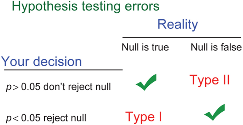
Figure A.16 Statistical decision making: two ways to be right; two ways to be wrong
The p-value tells us the probability we’re making a Type I error. When we see a p-value of 0.05, we interpret this to mean that the probability of obtaining a difference this large or larger if the difference is really 0 is about 5%. So over the long run of our statistical careers, if we only conclude designs are different if the p-value is less than 0.05, we can expect to be wrong no more than about 5% of the time, and that’s only if the null hypothesis is always true when we test.
Not reported in the p-value is our chance of failing to say there is a difference when one exists. So for all those times when we get p-values of, say, 0.15 and we conclude there is no difference in designs, we can also be making an error. A difference could exist, but because our sample size was too small or the difference was too modest, we didn’t observe a statistically significant difference in our test. Chapters 6 and 7 contain a thorough discussion of power and computing sample sizes to control Type II errors. A discussion about the importance of balancing Type I and Type II errors for applied research appears in Chapter 9.
If you need more background and exposure to statistics, we’ve put together interactive lessons with many visualizations and examples on the measuringu.com website.
Key points
• Pay attention to the type of data you’re collecting. This can affect the statistical procedures you use and your interpretation of the results.
• You almost never know the characteristics of the populations of interesting data, so you must infer the population characteristics from the statistics you calculate from a sample of data.
• Two of the most important types of statistics are measures of central tendency (e.g., the mean, median, and geometric mean) and variation (e.g., the variance, standard deviation, and standard error).
• Many metrics tend to be normally distributed. Normal distributions follow the Empirical Rule—that 68% of values fall within one standard deviation, 95% within two, and 99.7% within three.
• As predicted by the Central Limit Theorem, even for distributions that are not normally distributed, the sampling distribution of the mean approaches normality as the sample size increases.
• To compute the number of standard deviations that a specific score is from the mean, divide the difference between that specific score and the mean by the standard deviation to convert it to a standard score, also known as a z-score.
• To compute the number of standard deviations that a sample mean is from a hypothesized mean, divide the difference between the sample mean and the hypothesized mean by the standard error of the mean (which is the standard deviation divided by the square root of the sample size), which is also interpreted as a z-score.
• Use the area under the normal curve to estimate the probability of a z-score. For example, the probability of getting a z-score of 1.28 or higher by chance is 10%. The probability of getting a z-score of 1.96 or higher by chance is 2.5%.
• For small samples of continuous data, use t-scores rather than z-scores, making sure to use the correct degrees of freedom (based on the sample size).
• You can use t-scores to compute confidence intervals or to conduct tests of significance—the best strategy is to do both. The significance test provides an estimate of the likelihood of an observed result if there is really no effect of interest. The confidence interval provides an estimate of the size of the effect, combining statistical with practical significance.
• In significance testing, keep in mind that there are two ways to be wrong and two ways to be right. If you conclude that there is a real difference when there isn’t, you’ve made a Type I error. If you conclude that you have insufficient evidence to claim a difference exists when it really does, you’ve made a Type II error. In practical user research (as opposed to scientific publication), it is important to seek the appropriate balance between the two types of error—a topic covered from several perspectives in Chapter 9.
..................Content has been hidden....................
You can't read the all page of ebook, please click here login for view all page.