In This Chapter
Working out if charts are just a load of mumbo-jumbo or an essential investing tool
Understanding patterns and the psychology behind them
Introducing charts for even the biggest sceptics
If you're the sceptical type, you may prefer to skip this chapter and spare your blood pressure. At the risk of annoying a lot of very experienced and successful investors who insist that using charts is a load of superstitious nonsense, this chapter talks about the theory suggesting you can learn useful things from the shapes that price trends make when you draw them on a piece of paper – or, more probably, on your computer screen.
Fans of the charting approach have a special name for their hobby that helps to ward off the cynics. They call it technical analysis – a term suggesting some sort of scientific basis for what they do. Personally, I prefer to call this approach market psychology. I don't claim to know much about the workings of the human brain, but I can tell you that when a group of people are all in the same situation, they have a definite tendency to think in the same way. And that's where charting can help to figure out what's coming next. Sometimes, anyway.
The last time I cricked a bone in my back, I went to my doctor for advice. She said I could fix it the official or unofficial way. The official way, she said, was to rest my back for a couple of weeks, take a lot of painkillers, and let nature take its own time to heal me. The unofficial way was to get myself down to a chiropractor, for her to massage my poor aching bones, apply a bit of electroconvulsive therapy, feel the muscles around my spine, and manipulate the affected joints until they realigned.
He wasn't officially recommending the chiropractor, he said, because he wasn't allowed to do that under the medical profession's rules. Chiropractic is an alternative medicine. Practitioners train for a much shorter time than the seven-plus years required to be a doctor, and often have only a working knowledge of the body they're treating. But the discipline also has a habit of getting the treatment right, thanks to years of physical observation of patients. And that's exactly how things worked out with my chiropractor. She had me back up and about after forty minutes of pummelling, and within a week I was completely fixed.
I want you to view technical analysts (TAs) in the same way as chiropractors. They don't always know why the things they do work out as well as they do. And yes, they do come unstuck every so often and get their analysis completely wrong. But they're right often enough to acquire a lot of followers in the investing world. That's why chartists/technical analysts really do have a place in this book. Charts of one sort or another belong in every investor's armoury.
How does mass psychology work in the financial markets? Two basic emotions drive the markets: greed and fear. The balance between those two is what keeps the markets on a stable course, because people usually veer about somewhere in the middle. (You can exclude the other great emotion, love, as most people don't have an emotional attachment to their shares. At least, they shouldn't, because that really does get in the way of rational decision making.)
Looking at the way markets invariably over-react to almost any stimulus best proves this greed/fear dichotomy. Once somebody's spotted a bargain and started running in one direction, you can bet your life the greedy herd isn't far behind. Closely followed, of course, by all the fearful ones who follow the greedy people simply because they don't dare to be left out. That situation's all fine and dandy until the day somebody realises that the herd has now run too far in one direction, and prices are getting much too high to be sensible. So a 'correction' occurs, in which the herd retreats and prices swing back towards a sort of equilibrium.
At this point, some of the latecomers probably start to realise that they've lost money on the correction, and they may very well attempt to persuade other investors to launch a renewed push for the 'summit' price so that they can recover their positions. A price recovery may then happen. And the rally may even succeed, if enough genuine reasons exist for the market to think it can squeeze a bit more growth out of this investment. Sometimes you can transform even the most exhausted marathon runners by shouting encouragement at them.
Nevertheless, as often as not, the rally quickly falters and fades. Maybe it goes into a sulk while everybody waits to see what happens next. But more probably, it pitches steeply back downwards. People start saying things like: 'Well, I've had a good run out of this share, and yes, it was very nice when that last-minute rally came along to save it from a decline. But if even the late rally didn't hold the share up for long, that tells me this share really hasn't got enough support from other investors. I'm out of here before it falls any further.'
At that point fear comes surging back into the equation and everybody else joins the rush for the exit door.
Does that story have a ring of truth? And surely a behaviour pattern like that does create certain unmistakable patterns on a share price chart? If so, perhaps people shouldn't be quite so dismissive of technical analysts' belief that they can identify these trends from looking at a chart.
Observing behaviour patterns isn't necessarily proof that you can use charts in a predictive way. Knowing what's happened in the past (and why) doesn't give you a cast-iron guarantee that you can figure out what may happen next. But if a chart can teach you something about the mass psychology of the mob, that's useful information.
Lots of extraneous reasons also account for why a rally, for example, fails to stick. Maybe the whole economy's gone into shock and everybody's selling shares, full stop. Or maybe something really exciting's going on somewhere else, and people are pulling their money out of one stock to buy another. A chart can't tell you that. So, on the clear understanding that a chart's a bit of a blunt instrument, the next section describes how to recognise a range of patterns and, more importantly, how to interpret them.
Tip
Stockcharts (www.stockcharts.com) is probably the most useful technical analysis forum on the web. You can find a very comprehensive rundown on the theoretical basics at the so-called Chart School on this site, and a useful comparison between the principles of technical analysis and its arch enemy, fundamental analysis.(That's where you value a share the 'rational way', according to how its market position, its share price and its financial performance stack up.)
The range of patterns that technical analysts look for is almost limitless. Some hardliners think that their science is pure and eternal, and that therefore it has no need to consider the effects of outside influences like changeable economic conditions. Others, perhaps more sensibly, prefer to regard the charts, and the underlying psychology they represent, as just one of the factors to examine when you look at a share. As you can probably guess, I'm one of the latter group.
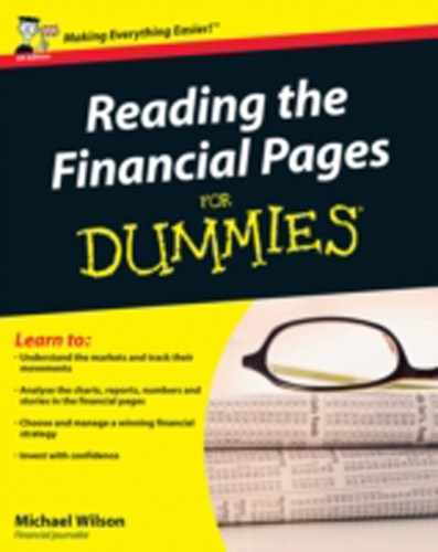
A double top is what you get when a share reaches a peak and falls back by 10–20 per cent, and then does exactly the same again some time later: hitting exactly the same top price the second time round and falling away at the same rate. In effect, the chart describes an inverted W, as shown in Figure 10-1.
What a double top says to an investor is that this stock probably doesn't have very much growth potential left and the time's come to sell. The market's made two attempts to beat a particular price level, but somehow just not enough people are willing to give it their backing. The share has hit a ceiling – that is, a 'resistance level', described in 'Rising floors, support levels, and resistance levels', later in this chapter.
The decline that follows this second peak may be very sharp indeed, but a few small rallies probably occur along the way, during which cannier investors may manage to offload some of their holdings.
I hardly need to tell you that almost nobody's thinking about the company itself – only about the curve! That's how technical analysis works, at least in its purest form. You may say it isn't very analytical at all. And it drives 'fundamentals' investors to distraction. I've seen quite a few serious altercations on Internet discussion forums between TA fans and 'fundies', and as a rule the TA fans end up retreating into their own little corners where they all speak the same language. I think this is rather a shame, because the best results by far are obtained by comparing and then synthesising the strengths of the two approaches. Your views might vary, of course.
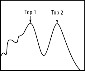
A head and shoulders pattern is what you get when a share rises, dips, rises to a peak, then falls back and has another go at reaching the peak – but fails. What you're left with is a pattern that looks, well, like a head and shoulders. And this is the surest sign you're likely to get that the share's reached its sell-by date. See Figure 10-2.
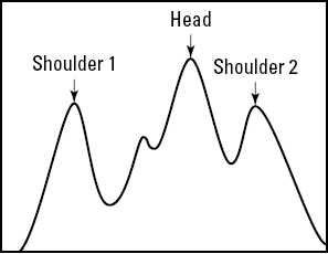
But what's interesting is that head and shoulders patterns come in an inverse formation too. In this example, a share's fallen, recovered, fallen to an even deeper depth, and then started a bigger recovery that takes it pretty much back to its starting level. But as soon as it dips for a third time, a body of investors think 'hang on, this share isn't as bad as the pessimists have been making out'. A renewed buying push starts, and eventually you get to something called a breakout.
A breakout is what every TA investor dreams of spotting. That's when all the previous assumptions about what the market can and can't bear go out of the window, and some pent-up trend gets unleashed as the magic spell of the resistance level gets broken. (I cover resistance levels in the section 'Rising floors, support levels, and resistance levels' later in this chapter.) You're more than welcome to tell me that the whole idea of having floors and ceilings to a share price is strictly for the fairies in the first place. But wearing my TA hat just for now, a sizeable number of people think that a breakout's a development on the general scale of Jupiter and Mars aligning with each other. A breakout is a big event.
Being a bit less sceptical, just for once, you can reason that a breakout signifies that something has indeed changed in the psychology of the market. People have suddenly abandoned whatever was holding them back. And if you're quick enough, you can profit from the emerging change in the conditions. Figure 10-3 illustrates a breakout.
In the same way, a double bottom (no, really), looks like a normal W. In a double bottom, the share price has tried twice to plunge below a certain level, but the market isn't playing ball and the price has rebounded strongly. Once the price has recovered for the second time to the level that prevailed at the start of the W, a TA investor feels pretty sure that another breakout has happened, and the likelihood is that the share is now free to rise much more quickly.
Look at a typical TA chart and you're likely to notice that it's covered with straight diagonal lines that run roughly in parallel with the main trends over a given period. One soars above the curve and one's below it, so that the actual share price line is sandwiched between the two.
Why? TAs believe that at any one time the market includes a fairly fixed level of tolerance that dictates just how high a share's price can reasonably be allowed to go, and another level of tolerance for how low it can go. In other words, if a share goes outside those limits, a fair number of investors say no thanks. The share has hit an invisible wall.
You're probably thinking that this is close to mumbo-jumbo. Why on earth should the 'collective psychology' of the market decide, all at once, that an absolute ceiling applies to a share's price beyond which it can't go? And an absolute floor (the 'support level') below which nobody's tempted to sell it?
These are good questions, and I honestly can't answer them. But sheer experience dictates that a great many shares seem to run into these frustrating barriers, so maybe they do exist after all.
I can suggest rational reasons for some of these phenomena, but not all. If a share has been floated on the stock market at 200p but then drops alarmingly back to 100p, a lot of investors may say, 'Yes, I made a mistake, but I'm jolly well not going to sell that share until it reaches the price I bought it at – and then I'm out of here.' So the price hits an invisible wall at 200p.
Other investors may leave instructions with their broker to sell if ever the dividend yield goes lower than the bank rate, or if the price/earnings ratio (see Chapter 2 for more on these) gets to be more than 50 per cent above the sector average. You can't ever really know, which is why the mumbo-jumbo accusations don't stop coming.
What you can say, though, is that if (big if) these ceilings and support levels are genuine, their very consistency suggests that the market's a bit more logical than some people suppose. Not every day does a fundie accuse a TA devotee of being excessively logical, but these things do happen.
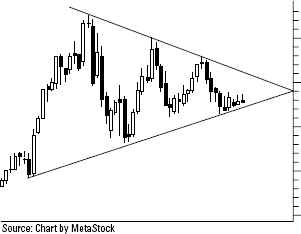
The apotheosis of the support and resistance line theory (see the preceding section) comes when an investor reckons that these two lines are converging. As a general rule they tend to hover around in parallel to each other like the outer layers of a sandwich. But when you get a chart like Figure 10-4, a TA specialist says, 'Whoa, this market is getting surer about exactly what it wants.'
And indeed it is. The chart shows a share that's got hardly any more room for manoeuvre. The market's ideas about its top and bottom price are converging so progressively that all the doubt is being squeezed out as the weeks go by. Perhaps the company's in the final stages of a takeover bid, and everyone's pretty sure what the final price may be?
More types of triangles exist than I have the patience or the room to describe in this chapter. You can get soft bottoms, triple bottoms, flags, pennants, wedges, and cups and handles. If you've got the time and the inclination, you can find plenty of information about these TA trends (try the Stockcharts website, www.stockcharts.com). Whether you choose to believe in them or not is entirely up to you. But at least now you understand what people are yakking on about in the discussion forums. That's good enough for me, because by bringing them to your attention I've primed you for the day you meet these peculiar terms in the flesh.
Forget about watching tiny share price movements over short spaces of time, and turn your gaze to the heavens instead for the bigger picture. The giant of TA theories is the Elliott Wave.
The Elliott Wave is half-philosophy, half-superstition. It dictates that nearly all really important stock market developments come in predictable waves. And that something mystically called Fibonacci numbers determine these waves.
Bull markets (long-term trends of stock market growth) are characterised by five major waves, according to Elliott Wave theorists: a first wave, followed by a small relapse, then a third wave and another fallback, and then the fifth really big wave where all the action really happens. You may hear TA enthusiasts arguing for months on end as to whether the fifth wave has really started, or whether the third wave has merely had a fit of indigestion and thrown a minor wobble that makes you think the first wave has started. Chapter 4 covers bull markets.
But bear markets (longish periods of stock market decline) give you less warning. They have only three waves, according to Elliott Wave followers: a first falling wave, then a small recovery, then the big drop! See Chapter 4 on bear markets.
I'm oversimplifying this theory quite horribly, and I apologise to all genuine Elliott Wave people for my unforgivable heresy. If you want the real lowdown, the information section on the Stockcharts website (www.stockcharts.com) gives you plenty to think about.
I don't ever buy a share, or a tracker, or a commodity, without taking a good look at the historical charts – maybe going back three years, or maybe even five or ten years. Until I've seen with my very own eyes how the share's behaved in the past, I don't feel I have a proper understanding of it.
Knowing that a company has recently announced a bright new trading statement isn't much consolation to me if the stock market turns out to have marked its share price down as soon as the news became public. Either that optimistic announcement wasn't quite as straightforward as it appeared (that is, the market flatly refused to believe it), or else the market was expecting the news to be even better, so the price fall signifies its disappointment. These things really do happen, and a chart gives me a picture in a split second that can be more useful than the proverbial thousand words.
Conversely, I may be very impressed by the news that a share has put on a lot of money in the last year. And rather less impressed by the discovery that it used to be four times as high.
Increasingly, a new kind of interactive share chart is appearing that allows you to grab a 'time slice' from the chart with your mouse and then home in on the fine detail. If commodities like oil or metals are your thing, you can get excellent free charts from the likes of Kitco (www.kitco.com) or TFC (www.tfc-charts.com). I like the currency charts from X-Rates (www.x-rates.com) and HiFX (www.hifx.co.uk), but you've plenty of choice, so do take the time to find the ones that suit you best.
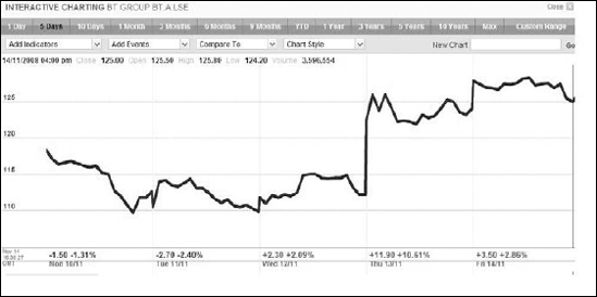
Figure 10-5 shows an example, a five-day chart for British Telecom that looks rather tasty. Goodness, the share price is up by 14 per cent in three days. Talk of a major cost-cutting exercise is in the papers, and the management's making positive noises about turning the company round after a disastrous run of bad publicity caused by some frankly unforgivable management failings. So far, so good. This is looking promising.
But oh dear, Figure 10-6 shows what the same chart looks like if you take the five-year view. The share has lost nearly two-thirds of its value in the space of 12 months, and you suddenly start to see that 14 per cent share price rally in a completely different context. So is the share still such a bargain?
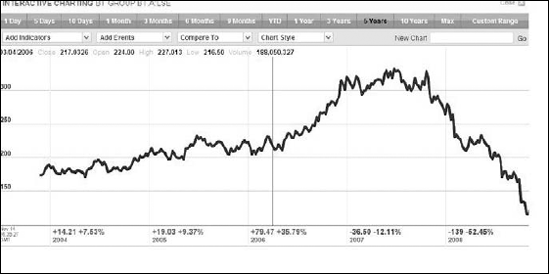
Don't get me wrong here. Like a lot of long-term investors, I don't mind if a share's fallen by quite a bit in the last few years, just as long as I understand why. After all, the time to buy a share is when it's cheap. But I do like to see a share that's starting to stage a bit of a comeback before I lay down my money. And a rally that's so badly counter to the trend is a bad enough omen to make me very suspicious.
Armed with this information, I now go in hard with some thorough research that tells me whether I can really believe in this company. Maybe this research convinces me, and maybe it doesn't. But can you think of any other way to assemble so much information in such a short space of time?
Tip
Whatever you happen to think about the strengths and weaknesses of using charts for predicting the market's psychology, they do come up trumps for spotting trends and generally looking out for candidates – and for weeding out the duds, too.