The Web has the potential to more fully integrate people with seeing, hearing, physical, learning, and other disabilities into society. By limiting the interaction necessary to communicate, as well as enabling delayed communications so that participants can move at their own pace, the Web has transformed our relationships with one another. Properly designed web pages neither know nor care whether you’re reading them with a CRT or a screen reader. Properly designed forms neither know nor care whether you’re inputting data with a keyboard, a mouse, or voice recognition software.
However, accessibility does not come automatically. Many pages are locked into one modality of use, most commonly visual. Many pages are designed with the assumption that the user will view the page in the same way the designer does. Such pages can lock out people with different levels of eyesight, attention, motor skills, and a dozen other characteristics.
Accessibility is not just about supporting people with extreme physical impairments such as blindness either. Ability and accessibility are both continuums. People don’t merely see or not see. They see better or worse. Most of us see worse with age. By age 40, we’ve either discovered the Ctrl-+ keyboard shortcut for increasing the font size of our browser or we’ve begun to curse 20-something web designers as we surf (or both). The changes you make to improve accessibility don’t just help people who meet the legal definition of disabled. They help everyone whose seeing, hearing, or motor skills are less than perfect. At least some of the time, that’s all of us. If it isn’t today, it will be tomorrow. As we age, eyesight and motor skills decline, and accessibility becomes more important. When I started on the web, college students represented a majority of the population on the Net. Today they’re probably less than 10%, and they are vastly outnumbered by senior citizens.
Accessibility also improves your site for people accessing it with nontraditional devices. A 28-year-old Wall Street trader may prefer to view your news through the small screen of her BlackBerry. Even an airline pilot with 20/20 vision may as well be blind when listening to your page on his cell phone while jogging.
Of course, accessibility isn’t just about supporting people with physical or device impairments. Wheelchair ramps are far more commonly used by parents with strollers, students with bicycles, and delivery people with hand trucks than they are by people in wheelchairs. When properly done, increasing accessibility for the disabled increases accessibility for everyone. That’s as true on the World Wide Web as it is in the physical world.
In many jurisdictions, accessibility is not just a good idea. It’s the law. In the United States, the Americans with Disabilities Act requires that all web sites built or procured by the federal government be accessible to users without regard for physical handicap. In the United Kingdom, the Disability Discrimination Act imposes similar requirements, and many other nations either already or soon will have equivalent laws.
If all that isn’t enough to convince you that it’s important to invest time and resources in making your pages accessible, consider this. The most profoundly disabled user of your page is going to be a search engine robot. Robots can’t see, hear, touch, or think. They are unbelievably stupid. Although a person can eventually make sense out of a strange layout or text encoded in an image, a robot never will. Almost everything you do to make your pages more accessible to and usable by people will be paid back tenfold in search engine optimization.
Simply making documents valid XHTML makes documents a lot more accessible than they otherwise would be. Making them strict XHTML rather than transitional goes even further. Removing presentational elements such as b and replacing them with semantic elements such as strong helps a little. Separating the content from the presentation using CSS stylesheets helps a lot.
However, that’s the beginning of accessibility, not the end. If you aren’t careful, you can create completely valid but almost totally inaccessible pages. Validation is an automatic and unthinking process. It focuses purely on the syntax. It can’t tell whether you’ve chosen green or red text that will be impenetrable to many color-blind visitors. It doesn’t know that the first 20 KB of your page are advertising and navigation that blind users have to slog through before getting to the actual content. It can’t distinguish between a well-designed data table containing monthly financials and a layout table that rearranges the linear flow of text into unintelligible gibberish.
Making web sites accessible requires applying human intelligence to recognize and then fix problems such as these. As usual, tools are available that can help. The W3C HTML validator discussed in Chapter 2 notes many accessibility problems as well as pure well-formedness and validity errors. Other tools are available that check more deeply for accessibility. The W3C maintains a list of many such tools at www.w3c.org/WAI/ER/tools/complete/. These tools are helpful, but they are relatively stupid. They may find problems a validator won’t, such as green text on a red background, and they may suspect that certain tables are likely being used for layout. However, they don’t know this, and there are many problems they will never find. You must spend some time looking at the site with accessibility in mind.
Accessibility is ultimately about people, not about following a fixed set of rules. If your site is open and accessible to all users, you’ve done your job, even if you’ve violated a rule here or there. If your site is confusing and hard to use, you haven’t, even if it validates and passes all the automated checks. To really tell how well you’ve succeeded, you have to do user testing. Observe real people navigating your site. Watching even a single user will reveal problems you didn’t know you had. Time and budget permitting, you should observe many people, and include users with different skill sets and abilities. Watching a senior citizen navigate your site will tell you very different things than watching a teenager. Watching a blind user navigate with a screen reader will reveal issues you won’t encounter with a sighted user. Try to test as many different classes of users as you can. Even if your budget does not permit formal user testing, do some informal testing by recruiting your friends, family, and coworkers for simple tests.
Sometimes even seeing the difficulties other users experience isn’t enough. We have to experience them for ourselves. If you do not have easy access to blind users, you can simulate their experience. First, try to surf your site through the text mode browser Lynx. Second, try using a voice browser. Turn off your monitor and surf your own site. If you use a Mac, VoiceOver is built in (though it does take some time to get used to). However, most blind users prefer the more powerful payware Windows program, JAWS. Either one will give you a decent approximation of how a blind user views your site. Next, turn the monitor back on, disconnect the mouse and the keyboard, and try to navigate with voice recognition. This will help to teach you how some physically disabled people will approach the site and where their pain points are likely to be.
Web-site accessibility is still quite poor, and in 2008 there’s no excuse for that. Most users are inconvenienced, some critically so. However, there are some simple changes and improvements you can make to the design of your sites to improve matters.
Replace any images that contain text with the text they contain, along with the markup and CSS rules that mimic the styling.
<img src="logo.gif" width="200" height="200" alt="Welcome to TIC!" /><h1 style="font-family: Verdana; font-size: 18pt; font-weight: bold">Welcome to TIC!</h1>
Visually impaired users can’t see images, but they can hear text with a screen reader or feel it with a Braille printer. An alt attribute helps, but it is not a substitute for real, marked-up text.
Converting images to text dramatically improves search engine optimization. Search engines pay a lot of attention to text and relatively little to images. They pay special attention to text that appears early in the document and in headings. Thus, it’s particularly important to make sure that headings are real text, not images or word art.
Replacing images with text also improves web-site performance, especially over slow or overloaded connections. It will save you bandwidth costs and save your readers time.
The text will likely not look exactly like it was mocked up in Photoshop, even after you’ve styled it with CSS. Furthermore, its appearance is likely to change slightly from one person to the next depending on their operating system, fonts installed, default fonts chosen, and browser. Readers almost never care about this, but sometimes designers do.
This may also bother the company lawyers in the very specific case of trademarked logos. If the lawyers cannot be reasoned with, keep the logos as img elements (with appropriate alt attributes), but change all other text images to real text.
Begin by looking at your pages to see where text is hidden inside images. Start at the home page and work your way through the site. If you’re uncertain whether something is or isn’t text, try to select the individual letters. If you can, it’s text. If you can’t, it’s an image. Alternatively, right-click on the suspect text and see whether you have an option to View Image, Save Picture As, or some such thing. If you can do this, it’s a picture, not text.
Once you’ve ascertained that you’re dealing with an image rather than text, you need to replace the image with text, while retaining as much of the formatting as possible. Fortunately, CSS gives you a lot of power. CSS can easily change the colors of the foreground and background of the text. Indeed, with a CSS background image you may be able to use the same background picture the text has. You’ll also be able to adjust font styles and weights: Make the text bold or italic, and so forth. CSS can specify the same font that was used in the image, though not all browsers may have that font installed, and many readers may have to substitute a slightly different font.
For example, on the Addison-Wesley home page, I found the logo shown in Figure 6.1.

We can actually reproduce this fairly well using HTML+CSS, as shown in Listing 6.1.
Example 6.1. Addison-Wesley Logo in HTML and CSS
<div style="width: 84px; height: 64px;">
<div style="background-color: #3D468B;
            color: white;
            font-family: Helvetica, sans-serif;
            font-size: 10pt;
            text-align: center;
            padding-top: 4px;
            padding-bottom: 3px;
            border-bottom-style: solid;
            border-bottom-width: medium;
            border-bottom-color: #FBE537;
            letter-spacing: 0.08em">
PEARSON
</div>
<div style="background-color: #327BBF;
            color: white;
            padding-left: 0.5em;
            padding-top: 6px;
            font-family: Times, serif;
            font-size: 12pt;">
<div>
Addison
</div>
<div style="text-indent: 1.5em;
            padding-bottom: 5px;">
Wesley
</div>
</div>
</div>
Figure 6.2 shows the rendered result.

We can do even better if we allow ourselves to use background images, as shown in Listing 6.2 and Figure 6.3. Now we get the swoosh and everything.
Example 6.2. Addison-Wesley Logo in HTML and CSS with Background Image
<div style="width: 84px; height: 64px;
            background-image: url('background-logo.gif')">
<div style="color: white;
            font-family: Helvetica, sans-serif;
            font-size: 10pt;
            text-align: center;
            padding-top: 4px;
            padding-bottom: 3px;
            letter-spacing: 0.08em">
PEARSON
</div>
<div style="color: white;
            padding-left: 0.5em;
            padding-top: 6px;
            font-family: Times, serif;
            font-size: 12pt;">
<div>
Addison
</div>
<div style="text-indent: 1.5em;
            padding-bottom: 5px;">
Wesley
</div>
</div>
</div>
Unlike the original img tag, the background image is purely presentational. Although I’ve included the style rules inline here for illustration, they should be moved into an external CSS stylesheet. The HTML document would then have pure content, no decoration. Nonetheless, the result shown in Figure 6.3 is equally attractive. You’d really have to compare the two side by side to notice any difference at all.
Fancier tricks, such as running the text along a curve or making the type jump around like ransom notes, may not succeed. To be honest, though, I’m not sure I’d want that. Simpler is often better.
Machines cannot reliably read printed text, especially the heavily stylized text you find in images on many web sites. Thus, there’s no way to fully and reliably automate this process. However, you easily can search through the site for the filename to find the pages where you’ll need to replace an image with text. For example, on the Addison-Wesley home page, I noticed the image is in the file aw-logo.gif. Therefore, I would search for aw-logo.gif to find other HTML files where I need to make the same change.
Make sure each nonhidden input, textarea, select, or other form element has an associated label.
Red-necked Grebe <input name="rng" type="checkbox"/>
Visually impaired users with screen readers cannot always use the two-dimensional layout of a page to determine which labels go with which fields. It is important to explicitly tag each nonhidden field with a label so that it is properly identified by screen readers.
There are more visually impaired users than you might think. This includes not only physically blind users, but also people using cell phone browsers while driving, and others who may not be able to immediately look at the screen but can listen to it. This class of user is set to grow significantly over the next few years.
Adding explicit label elements, possibly with id and class attributes, will also make it easier to style the labels with CSS or provide additional hints with JavaScript or smarter browsers. For example, a browser might highlight the associated label when the user tabs or clicks into an input field.
None. This should not affect your existing layout for most users and will improve it for some.
Because you’re introducing new elements and changing the parents of some elements, a few programs that access the DOM or use XPath may need to be updated. However, such programs are uncommon.
For every form input, select, or textarea element, there must be at least one label element. (I tend to think there should be exactly one, but multiple labels are allowed.) The label element can either enclose the input element or have a for attribute that contains the ID of the element it refers to.
Consider a typical login form:
<form action="login.php" method="post">
<p>Username:
  <input type="text" name="log" id="log" size="18" />
</p>
<p>Password:
  <input type="password" name="pwd" id="pwd" size="18" />
</p>
<p>
  <input name="stayloggedin" type="checkbox"
         id="stayloggedin" value="remember" />
  Remember me on this computer
</p>
<p class="submit">
  <input type="submit" name="submit" id="submit"
         value="Login" />
  <input type="hidden" name="redirect" value="admin.php" />
</p>
</form>
Some of the labels appear on the left, and some appear on the right. This is a very simple form with just four visible elements, so chances are a blind user could figure out which text labels go with which input fields. However, the more complex the form gets, the harder it becomes to match the text to the right elements. Indeed, if the form begins to depend too heavily on the layout of one particular browser at one screen size, it may become challenging even for fully sighted users. All too often, I’ve seen forms where the labels get pushed away from the fields they describe because my font size or window size isn’t quite what the designers expected.
Fixing this is not hard. The simplest approach is merely to enclose each input field and its associated description in a label element, like so:
<form action="login.php" method="post">
<p><label>Username:
  <input type="text" name="log" id="log" size="18" />
</label></p>
<p><label>Password:
  <input type="password" name="pwd" id="pwd" size="18" />
</label></p>
<p><label>
  <input name="stayloggedin" type="checkbox"
         id="stayloggedin" value="remember" />
  Remember me on this computer</label>
</p>
<p class="submit">
  <input type="submit" name="submit" value="Login" />
</p>
</form>
You do not need to label hidden fields with predefined values, because these are not meant to be seen by anybody. However, you can if you wish.
Sometimes the descriptive text is not immediately next to the form field. In these cases, it’s most important to label the field description. Each form field should have an id attribute by which it is uniquely identified. The label element can be placed in any convenient location in the document. Its for attribute points to the id of the associated field. For example, this form puts the labels in separate paragraphs so that they appear above their fields rather than adjacent to them:
<form action="login.php" method="post">
<p><label for="log">Username: </label></p>
<p><input type="text" name="log" id="log" size="18" /></p>
<p><label for="pwd">Password: </label></p>
<p><input type="password" name="pw" id="pw" size="8" /></p>
<p><label for="stayloggedin ">
Remember me on this computer</label></p>
<p><input name="stayloggedin" type="checkbox"
         id="stayloggedin" value="remember" /></p>
<p class="submit">
  <input type="submit" name="submit"
       id="submit" value="Login" />
</p>
</form>
Of course, you can do both—include the input field directly inside the label element and use a for attribute:
<form action="login.php" method="post">
<p><label for="log">Username:
  <input type="text" name="log" id="log" size="18" />
</label></p>
<p><label for="pwd">Password:
  <input type="password" name="pwd" id="pwd" size="18" />
</label></p>
<p><label for="stayloggedin ">
  <input name="stayloggedin" type="checkbox"
         id="stayloggedin" value="remember" />
  Remember me on this computer</label>
</p>
<p class="submit">
  <input type="submit" name="submit" id="submit" value="Login" />
</p>
</form>
I’m not sure this is really necessary, but it doesn’t hurt, and it might help some tool somewhere.
Rewrite your forms and form processing scripts to use conventional names for conventional things such as e-mail addresses, credit card numbers, phone numbers, and so forth.
<form action="/register" method="post"> <p>Salutation: <label><input type="radio" name="n1" value="m" /> Mr.</label> <label><input type="radio" name="n2" value="f" /> Ms.</label> </p> <p><label>First Name: <input type="text" name="n3" /> </label></p> <p><label>Last Name: <input type="text" name="n4" /> </label></p> <p><label>E-Mail Address: <input type="text" name="e1" /> </label></p> <p><label>Password: <input type="password" name="p1" /> </label></p> <p><label>Address Line 1: <input type="text" name="a1" /> </label></p> <p><label>Address Line 2: <input type="text" name="a2" /> </label></p> <p><label>City: <input type="text" name="a3" /> </label></p> <p><label>State/Province: <input type="text" name="a4" /> </label></p> <p><label>ZIP/Postal Code: <input type="text" name="a5" /></label></p> <p><label>Voice: <input type="text" name="t1" /> </label></p> <p><label>Fax: <input type="text" name="t2" /> </label></p> <input type="submit" title="Register" /> </form>
A browser can autofill much information, even on a form it’s never encountered before, if the form uses standard names for input fields. This helps all of us who hate to waste time retyping repetitive content. However, it’s especially helpful to physically impaired users (including the very young and very old) who have much greater difficulty typing than average.
You’re also more likely to collect accurate and correct information if the browser automatically fills in the values than if the user types them. Not only is the browser less likely to make random typos, but many users actively fake the information they input into many web forms.
You’ll probably have to rewrite some back-end code to support this.
You may also need to introduce an additional level of indirection if the database or program that receives data from the form uses the field names in its own code. This is probably a net positive, though, because it will increase the flexibility of the back-end code.
Search your forms for common input. In particular, look for the following:
All of these can use standard field names that browsers can recognize and that are defined in RFC 3106. For example, the first line of the street address should be named Ecom_ShipTo_Postal_Street_Line1. The city for the billing address should be named Ecom_BillTo_Postal_City. These field names are defined by RFC 3106 and are summarized in Table 6.1. Yes, the names are a little unwieldy, but users won’t see them. It’s worth imposing a small extra burden on the site’s developers to assist users in this way.
Table 6.1. Standard Field Names
Name | Meaning | Minimum Length |
|---|---|---|
Ecom_ShipTo_Postal_Name_Prefix | Ship to title | 4 |
Ecom_ShipTo_Postal_Name_First | Ship to first name | 15 |
Ecom_ShipTo_Postal_Name_Middle | Ship to middle name | 15 |
Ecom_ShipTo_Postal_Name_Last | Ship to last name | 15 |
Ecom_ShipTo_Postal_Name_Suffix | Ship to name suffix | 4 |
Ecom_ShipTo_Postal_Company | Ship to company name | 20 |
Ecom_ShipTo_Postal_Street_Line1 | Ship to street line1 | 20 |
Ecom_ShipTo_Postal_Street_Line2 | Ship to street line2 | 20 |
Ecom_ShipTo_Postal_Street_Line3 | Ship to street line3 | 20 |
Ecom_ShipTo_Postal_City | Ship to city | 22 |
Ecom_ShipTo_Postal_StateProv | Ship to state/province | 2 |
Ecom_ShipTo_Postal_PostalCode | Ship to ZIP/postal code | 14 |
Ecom_ShipTo_Postal_CountryCode | Ship to country | 2 |
Ecom_ShipTo_Telecom_Phone_Number | Ship to phone | 10 |
Ecom_ShipTo_Online_Email | Ship to e-mail | 40 |
Ecom_BillTo_Postal_Name_Prefix | Bill to title | 4 |
Ecom_BillTo_Postal_Name_First | Bill to first name | 15 |
Ecom_BillTo_Postal_Name_Middle | Bill to middle name | 15 |
Ecom_BillTo_Postal_Name_Last | Bill to last name | 15 |
Ecom_BillTo_Postal_Name_Suffix | Bill to name suffix | 4 |
Ecom_BillTo_Postal_Company | Bill to company name | 20 |
Ecom_BillTo_Postal_Street_Line1 | Bill to street line1 | 20 |
Ecom_BillTo_Postal_Street_Line2 | Bill to street line2 | 20 |
Ecom_BillTo_Postal_Street_Line3 | Bill to street line3 | 20 |
Ecom_BillTo_Postal_City | Bill to city | 22 |
Ecom_BillTo_Postal_StateProv | Bill to state/province | 2 |
Ecom_BillTo_Postal_PostalCode | Bill to ZIP/postal code | 14 |
Ecom_BillTo_Postal_CountryCode | Bill to country | 2 |
Ecom_BillTo_Telecom_Phone_Number | Bill to phone | 10 |
Ecom_BillTo_Online_Email | Bill to e-mail | 40 |
Ecom_ReceiptTo_Postal_Name_Prefix | Receipt to title | 4 |
Ecom_ReceiptTo_Postal_Name_First | Receipt to first name | 15 |
Ecom_ReceiptTo_Postal_Name_Middle | Receipt to middle name | 15 |
Ecom_ReceiptTo_Postal_Name_Last | Receipt to last name | 15 |
Ecom_ReceiptTo_Postal_Name_Suffix | Receipt to name suffix | 4 |
Ecom_ReceiptTo_Postal_Company | Receipt to company name | 20 |
Ecom_ReceiptTo_Postal_Street_Line1 | Receipt to street line1 | 20 |
Ecom_ReceiptTo_Postal_Street_Line2 | Receipt to street line2 | 20 |
Ecom_ReceiptTo_Postal_Street_Line3 | Receipt to street line3 | 20 |
Ecom_ReceiptTo_Postal_City | Receipt to city | 22 |
Ecom_ReceiptTo_Postal_StateProv | Receipt to state/province | 2 |
Ecom_ReceiptTo_Postal_PostalCode | Receipt to ZIP/postal code | 14 |
Ecom_ReceiptTo_Postal_CountryCode | Receipt to country | 2 |
Ecom_ReceiptTo_Telecom_Phone_Number | Receipt to phone | 10 |
Ecom_ReceiptTo_Online_Email | Receipt to e-mail | 40 |
Ecom_Payment_Card_Name | Name on card | 30 |
Ecom_Payment_Card_Type | Card type | 4 |
Ecom_Payment_Card_Number | Card number | 19 |
Ecom_Payment_Card_Verification | Card verification value | 4 |
Ecom_Payment_Card_ExpDate_Day | Card expire date day | 2 |
Ecom_Payment_Card_ExpDate_Month | Card expire date month | 2 |
Ecom_Payment_Card_ExpDate_Year | Card expire date year | 4 |
Ecom_Payment_Card_Protocol | Card protocols | 20 |
Ecom_ConsumerOrderID | Consumer order ID | 20 |
Ecom_User_ID | User ID | 40 |
Ecom_User_Password | User password | 20 |
Ecom_SchemaVersion | Schema version | 30 |
Ecom_WalletID | Wallet ID | 40 |
Ecom_TransactionComplete | End transaction flag | |
Ecom_Merchant | Merchant home domain | 128 |
Ecom_Processor | Processor home domain | 128 |
Ecom_Transaction_ID | Transaction identifier | 128 |
Ecom_Transaction_Inquiry | Transaction URL inquiry | 500 |
Ecom_Transaction_Amount | Transaction amount | 128 |
Ecom_Transaction_CurrencyCode | Transaction currency | 3 |
Ecom_Transaction_Date | Transaction date | 80 |
Ecom_Transaction_Type | Transaction type | 40 |
Ecom_Transaction_Signature | Transaction signature | 160 |
Ecom_TransactionComplete | End transaction flag |
Most of these fields have a certain minimum length that’s allowed. Some have other constraints. For example, the currency field should be ready to accept an ISO currency code such as USD or GBP.
Not all fields fit into this scheme. For instance, there’s no standard name for a fax number. That’s fine. Most forms collect some unique and original information. Not everything needs to have a standard name. However, you should enable the browser to autofill as much as possible.
You’ll need to make any changes to field names in at least two places: the form itself and the server-side program that receives input from the form. If the form is a heavy user of JavaScript, as many forms are, you’ll need to update the scripts as well to use the new names.
Many autofill tools can also recognize standard labels, as well as field names. In many cases, the name and the label will be the same, perhaps modulo a small case change. However, because the label is user-visible, you’ll often want to customize or translate it, rather than using the standard field names. By contrast, the field name is invisible and irrelevant to the end-user.
If these names are too much to stomach, most autofill tools will recognize reasonable variations of them. For instance, you may be able to use PostalCode instead of Ecom_ReceiptTo_Postal_PostalCode. You might even discover that zip or zip_code works for some users. However, support will vary among autofill tools and even among users, depending on which other forms they’ve already filled in. It’s best to use the names in Table 6.1 if at all possible. Even if it’s not, stay away from meaningless names such as field4 and q17a.
Remove autocomplete="off" attributes where appropriate.
<form action="/login" method="post" autocomplete="off"> <p><label>E-Mail Address: <input type="text" name="e1" autocomplete="off"/> </label></p> <p><label>Password: <input type="password" name="p1" /> </label></p> <input type="submit" title="Login" autocomplete="off"/> </form>
Autocompletion helps users avoid wasting time retyping repetitive content. It’s especially helpful to physically impaired users (including the very young and very old) who have much greater difficulty typing than average.
Autocompletion also improves security in login forms by avoiding the need for users to write down passwords or to reuse the same password from site to site. Login forms that prevent users from using autocomplete are far more likely to be compromised by out-of-band mechanisms such as shoulder surfing.
Many webmasters believe that autocompleting logins is a security risk. Indeed, it may be so on a shared computer, such as one in a public library. However, only the end-user can determine whether their computer is shared. Users are always free not to remember a username or password or to tell the browser to forget stored information, if they use a shared computer. That being said, I do recommend that lab managers configure their computers to forget all stored information (not just forms, but also cookies, bookmarks, history, and other potentially private data) between browser restarts.
Search your HTML pages for autocomplete="off". This can appear on the form element or on individual input elements. When you find it, consider whether this is really appropriate.
Some forms really do expect different input each time. For instance, the main query field in a search engine likely doesn’t see a lot of repeated content from the same user, or at least not enough to make autocomplete helpful. Most users search for something different every time they visit. These forms may legitimately use autocomplete="off". Therefore, you should not perform a blanket search and replace that removes all autocomplete="off" attributes.
However, in the vast majority of cases, autocomplete="off" merely inconveniences users for little or no good reason. If you’re in doubt, remove it. The user never has to use autocompletion, but should not be prevented from doing so by the server’s whim.
Add a tabindex attribute to every editable, nonhidden form control.
<form action="login.php" method="post"> <p><label>Username: <input type="text" name="log" size="18" /> </label></p> <p><label>Password: <input type="password" name="pwd" size="8" /> </label></p> <p><label> <input name="stayloggedin" type="checkbox" id="stayloggedin" value="remember" /> Remember me on this computer</label> </p> <p class="submit"> <input type="submit" value="Login" /> </p> </form>
Keyboard navigation is greatly simplified if the user can tab from one control to the next. This is especially important on forms that will be used frequently—for example, by a data entry clerk. It is also important for users with lesser manual dexterity who aren’t able to reliably or easily target fields with a mouse. However, even dexterous, one-time users expect to be able to tab between fields and will attempt to do so. Make sure that when they press the Tab key, the focus advances to the next logical field.
The proper tab order is not always obvious, and it may vary from one user to the next, especially in forms where input fields advance both horizontally across the screen and vertically down the screen. Nonetheless, any carefully considered and assigned tab order is likely to be better than the default order the browser guesses when no tab order is specified by a form.
Seven elements support the tabindex attribute:
aareabuttoninputobjectselecttextarea
Unifying these is the fact that they are all some form of user input. Thus, each can have an explicit tabindex attribute.
The value of the tabindex attribute is an integer between 0 and 32,767. (If you have more than 32,768 of these elements, split the page. It’s too large.) Tabbing begins with 1 (or the lowest positive value) and continues in order to the highest value.
On a page whose main purpose for existing is to get the user to fill out a form, it’s reasonable to guess that the tabs should hit the form fields first. Give each form input element a tabindex attribute, ordered from start to finish, and make the submit button the last tabindex. I either don’t assign tabindexes to links on such a page or I assign higher tabindexes to them than to the form fields so that they’ll be tabbed through after the form.
In many forms, you need to consider not only the logical order of the fields, but also which fields are likely to be filled out. This is sometimes a hard call to make, but if a field is used only infrequently and is positioned off to the side, I sometimes leave it out of the tab order to enable the user to more quickly advance through the common fields.
The tabindex attribute has page scope. Consequently, you need to consider the logical order of the forms, links, and other controls on the page, not merely the order of controls within any one form. It may seem as though 32,767 is more indexes than you’ll need, but it does allow you to do things such as assign numbers from 1 to 500 to the first form; 501 to 1,000 to the second; and so forth.
If your site does not currently use tabindex attributes, you can simply search for all input fields to find the fields you need to augment. If tabindex attributes are already in use on your site, you can use this regular expression pattern to find nonhidden input fields that don’t yet have a tabindex:
<input/s+((id|class|title|style|dir|lang|value|type|src|size
|name|maxlength|checked|alt|align|accept|accesskey|onfocus
|onblur|onselect|onchange|onclick|ondblclick|onmousedown
|onmouseup|onmouseover|onmousemove|onmouseout|onkeypress
|onkeydown|onkeyup)s*=s*("[^"]+"|'[^']+')s*)*>
You will need to consider each page individually to determine an appropriate tab order. There are no automated tools to help.
Several other elements also support the tabindex attribute, most notably object and a. I don’t usually place tabindex attributes on a elements because the default beginning-to-end order is normally sufficient for links, especially on simple, linear pages. However, if you’re faced with a page where less important links precede more important ones—for instance, links in a left sidebar precede links in the main content—you can add tabindex attributes to a elements as well.
It is especially important to assign explicit tabindexes on pages that mix links with form fields. Often, links are used to provide help or explanatory text about the form or its fields, and that’s good. However, the tab order should always jump from one field to the next and should never hit any link in between them. If you use the default tab order, the user can easily tab into what they expect the next field to be, but will end up on a link instead. At best, this will be annoying when they begin to type and realize their text isn’t showing up. At worst, a user will fail to submit crucial data because they typed it into a link instead of a field.
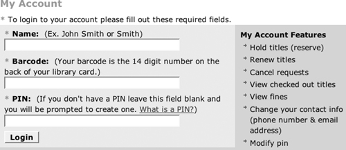
For example, consider the Brooklyn Public Library login form in Figure 6.4. A user will typically click the mouse in the Name field, press Tab, fill out the barcode from a library card, press Tab, and then type in the PIN. Only the last tab doesn’t actually place the cursor in the PIN field. Instead, the focus is on the “What is a PIN?” link, so the text is lost. The tab order should be explicitly specified so that the user advances directly from the Barcode field to the PIN field.
Place an “invisible” link at the beginning of each page that jumps straight to the main content on the page.
<body> <div id="header">Blah blah blah</div> <div id="leftnav">Blah blah blah</div> <div id="main">Blah blah blah</div> <div id="footer">Blah blah blah</div> </body>
Reading a site with a screen reader is hard enough without being forced to slog through a long sidebar or header on every page. Blind users really appreciate being able to jump straight to the unique content of each page.
The first step is to identify the pages where skip links are likely to be helpful. On some sites with common sidebars and headers, this is pretty much every page. On other sites, it is only certain pages. The usual pattern is that a header or left sidebar, or both, precede the actual content of the page when viewed in HTML:
<div id="header">Blah blah blah</div>
<div id="leftnav">Blah blah blah</div>
<div id="main">Blah blah blah</div>
The visual layout of what comes first does not matter as much, though how much it matters can vary from one screen-reading program to another. (Some screen readers just follow the raw HTML. Others try to scrape the text off the screen after the browser has laid it out and rendered it.)
Regardless, a skip link right at the beginning is helpful. You can place this just inside or immediately preceding the first div on the page:
<div id="header">
  <a href="#main">Skip to main content</a> Blah blah blah
</div>

<a href="#main">Skip to main content</a>
<div id="header">Blah blah blah</div>
Whichever approach is more convenient for you is fine.
Some sites aren’t bothered by the extra link at the top and just choose to show it to everyone. However, it’s not hard to hide if you don’t like it. The simplest approach is to set the CSS display property to none:
<a href="#main" style="display: none">Skip to content</a>
Like most things CSS, this is inconsistently supported across browsers, but it’s not a big deal if a browser shows it anyway. More seriously, some screen readers may omit it, too.
The second approach is the perennial white-on-white trick (or whatever your background color happens to be). This trick is normally used for black-hat search engine optimization, but here we use it for a good cause. For example:
<a href="#main" style="color: white">Skip to content</a>
Again, this is not a perfect solution, but it’s good enough most of the time.
My favorite variation is to make the link content a small image that matches the background color. Then place the text, such as “Skip to main content,” in the alt attribute. This way, only screen readers will see it.
<a href="#main"><img src="blank.png"
                     alt="Skip to main content"
                     width="1" height="1"/></a>
Whether you display the link or not, the key is to make sure the page has one so that blind readers can skip to the main content. It’s hard enough to listen to a page without being forced to listen to three minutes of navigation links from a sidebar.
Place h1–h6 elements at reasonable breaks throughout long pages.
<div class="title">The Ungrammatical Times</div> <div class="headline">Mill Employees Refuse to Work After Death</div> <div class="headline">First time offenders cut in half</div>
Assistive software enables both visually and physically impaired readers to jump to the next headline on a page with a single keystroke. However, this works only when those headings are identified with proper HTML markup.
You may need to rewrite the stylesheets for the page to restore the original look and feel. However, this shouldn’t be hard.
There’s no easy way to find mislabeled headings. They can be p elements, div elements, even span or dt elements. On most sites, though, the problems tend to be consistent from page to page. Once you’ve identified how a site is formatting headings, you can devise a search and replace to find and fix them. For instance, if a site has identified each heading as a headline class, it’s simple to search for class="headline".
One thing you may wish to consider is adding subheads to medium-to-long pages that don’t already have them. Users of all abilities tend to scan pages rather than reading them from beginning to end. They zero in on only the sections they’re most interested in. Descriptive subheads on the page make the scanning process easier.
Place the most important, most distinct content first in each heading and link.
<h1>Cheney Alleges Canada has Weapons of Mass Destruction</h1> <ul> <li>Dick Cheney says Tuva Has Weapons of Mass Destruction</li> <li>Dick Cheney says Mexico Has Weapons of Mass Destruction</li> </ul> <a href="finance.html">SuperPortal: Finance</a> <a href="sports.html">SuperPortal: Sports</a> <a href="news.html">SuperPortal: News</a>
Readers listening to a page with a screen reader scan by jumping from link, list item, or heading to the next item without listening to the entire item. Do not make readers listen to more than they have to in order to determine whether the link or headline is relevant to them.
On occasion, the language can become a little stilted, especially when complete sentences are involved.
Visually impaired users often scan pages by listening to the first two or three words of each successive link or heading. Those words have to count.
You can inspect easy link, heading, and table title to see whether it needs to be reordered. It’s easy enough to write an XPath expression that will find all of these in any given document. For example:
//html:a | //html:h1 | // html:h2 | //html:h3 | //html:h4
| //html:h5 | //html:h6
A regular expression is not much harder:
<as+.*>.*</a> | <h([1-6])s+.*>.*</h1>
Fixing them, however, requires real human intelligence. Given the state of the art, this cannot be automated.
For each item, ask yourself whether the most important content comes first. For example, the heading “Johns Hopkins scientists find cure for cancer” should be rewritten as “Cancer cure found by Johns Hopkins scientists.” The most important information is that a cure for cancer was found, not who found it. A sighted user may in fact pick up on that in the first form because the word cancer is likely to jump out at him even before he has read the sentence (especially if it’s been emphasized with em or strong tags). However, a blind reader may hear the words “Johns Hopkins scientists” and jump to the next heading on the page because she’s not all that interested in scientists or Johns Hopkins.
This inverted style of writing can, of course, be more than a little stilted and distracting when it occurs in the middle of body text. I don’t customarily use it in links inside paragraphs and narrative text. However, it’s very important for lists of links, such as tables of contents and the like. In these, the auditory user is going to scan down the page very, very quickly, listening to just two or three words of each item.
Consequently, one thing you should avoid at all costs is lists in which each item starts with the same two or three words. For example:
<ul>
  <li>Clothing: Shoes</li>
  <li>Clothing: Shirts</li>
  <li>Clothing: Pants</li>
  <li>Clothing: Belts</li>
  <li>Clothing: Accessories</li>
</ul>
The more words of text in common at the start of each link, heading, or list item, the more annoying this is. Rewrite all such lists as soon as possible, and then improve other links and headings as time permits.
Make sure all your forms have enough space for the user to comfortably type in the requested values.
<label>Subject: <input name="subject" id="subject" size="25" maxlength="240" type="text" /></label> <label>Describe the problem: <textarea name="message" id="message" cols="40" rows="8"> </textarea></label>
There’s nothing quite as frustrating as trying to write an essay in a 40-column by 20-row box. Make sure all text areas have enough space to allow the users to enter what they need to enter. It’s better to have too large a box than too small.
Expanding a form’s width may require some adjustment of the surrounding layout to provide more space for the form, especially on three-column pages, or pages with a sidebar on the right. However, it should have no effect on the back-end processing. Small text areas do not prevent users from entering large quantities of text. They just make it inconvenient for them to do so.
You can find many pages you need to check just by searching for <textarea. More often than not, the cols and rows fields that determine the size of the box are on the same line, and you can do quick visual inspection for the smallest ones. These are the ones you’ll probably want to fix first.
The proper width and height may vary, depending on what you’re asking the user to enter. A customer filling in a mailing address may only need six rows or fewer. A journalist filing an article may need hundreds. For width, I’m suspicious of anything less than 60 columns wide; 80 is probably a better choice. For text areas, the width is typically set by the cols attribute. The height is set by the rows attribute. For single-line input fields, the width is set by the size attribute. For text and password input, this size is measured in characters. For other types of input, the size is measured in pixels.
If an input field or a text area is by itself on a line (very common for text areas, not uncommon for input fields) or at least has no content to the right of it, it’s often appropriate to allow it to expand horizontally. You can do this with CSS by specifying a percentage width that will override the default width. Usually somewhere between 80% and 100% is reasonable; 90% is often a good median value. This gives the user as much space as the browser has to give, and the browser window can be maximized if more space is required.
textarea { width: 90%; }Height depends heavily on what information the form is requesting. However, 6 lines is usually the minimum I’d allow, and 12 are probably better for small amounts of text such as mailing addresses and brief messages. For serious writing, such as for web mail and blog comments, go taller: 20, 24, 36, or even 40 rows high. I don’t suggest going so tall that the text area fills the page. It will scroll if it has to, and there’s likely to be other content on the page that the user will want to see at the same time. However, it’s simply easier to write when you have a larger window on your text rather than squinting at it through a four-line peephole. For example:
<textarea name="problems" id="problems"
          cols="80" rows="36" ></textarea>
If in doubt, err on the side of too much room rather than too little. It’s no big deal if the user has some blank space in the form, but it’s much more troublesome if they can’t fit the text. Always allow for extra room. Many users will have different, larger fonts than you do, whether because of different platforms, different preferences, worse eyesight, or other reasons.
Add a caption element and/or a summary attribute to each table. Add a th element for each row or column label.
<table> <tr> <td>Species</td> <td>Spring</td> <td>Summer</td> <td>Fall</td> <td>Winter</td> </tr> <tr> <td>Pied-Billed Grebe</td> <td>Uncommon</td> <td>Very rare</td> <td>Uncommon</td> <td>Fairly Common</td> </tr> <tr> <td>Mourning Dove</td> <td>Common</td> <td>Common</td> <td>Common</td> <td>Common</td> </tr> <tr> <td>Worm-eating Warbler</td> <td>Uncommon</td> <td>Rare</td> <td>Very rare</td> <td>Not Present</td> </tr> </table>
Although tables are an excellent means of presenting certain kinds of data to sighted readers, they challenge blind readers who must access a page linearly. Consider the code immediately preceding this paragraph. Presented linearly in HTML, does it really make a lot of sense? This is how a blind user is likely to see it. Presented two-dimensionally as in Table 6.2, it’s a lot easier to read.
Many sight-impaired users prefer to just get a quick summary of a table rather than trying to read the entire thing. When they do need to drill down into a table, it’s very helpful to have marked-up headers for rows and columns that help them determine where they are.
Captions are shown to sighted users as well as users with screen readers. If you really don’t want a caption, this can be a problem. In this case, you might choose to provide a title attribute instead.
However, even fully sighted users often prefer to be told what a table means rather than carefully inspecting the data for themselves. Indeed, often the table is really a reference for readers who want to know more, rather than something intended for everybody to read. A caption is usually a good addition for everyone, not just users listening to the page with a screen reader.
Neither the caption element nor the summary attribute is required by the XHTML strict DTD. You can search for <table to find all table elements and then quickly inspect them manually to see whether they need captions or summaries or both.
Some accessibility tools do notice if these are missing. Tidy will warn you about missing summaries and headers with this message:
The table summary attribute should be used to describe the table structure. It is very helpful for people using nonvisual browsers. The scope and headers attributes for table cells are useful for specifying which headers apply to each table cell, enabling nonvisual browsers to provide a meaningful context for each cell.
However, human intelligence and effort are required to fill in the values for each additional summary and caption. There’s no easy way around that.
The caption element contains marked-up text more fully describing the table. It can contain inline elements such as strong or a, but not block elements such as p or div.
The summary attribute contains plain text describing the table. However, the real difference between the two is that everyone sees the caption text, whereas usually only screen readers will notice the summary attribute. Because only users with screen readers are likely to read the summary attribute, it’s usually the best place to put the most detailed prose description of the table’s contents. The caption typically includes a less descriptive (though more marked-up) title that describes what’s in the table without attempting to repeat the actual data.
If you don’t include a caption in the table, you should add a title attribute to the table that serves as a caption for nonsighted readers. This is in addition to the summary. For example:
<table title="Species Frequency in Prospect Park"
  summary="The Pied-billed grebe spends the winter.
  The Worm-eating Warbler passes through on migration,
  while the Mourning Dove is a year-round resident.">
Of course, some sighted and nonsighted users alike are going to want to drill down into the table, at least some of the time. To assist with this, you should mark up each header in a th element rather than in a td element. This element can be used for both row and column headers and may appear anywhere a td element can appear. Browsers often style the header differently than a regular cell, and if they don’t, CSS can. Furthermore, screen readers can repeat table headers as necessary to keep a listening user from getting lost in the table.
The th element is used for both row and column headers. To indicate which it is, each such element should have a scope="row" or scope="col" attribute. You can also set scope to rowgroup or colgroup to cover the group to which the header belongs. Visual browsers don’t make much use of the scope attribute, but screen readers do.
In more complicated tables, it may not be possible to cleanly associate each th header with exactly one row or column. In this case, individual table cells (td elements) may each have a headers attribute that contains a whitespace-separated list of the IDs of the headers (th elements) that apply to that cell. A screen reader can read the names of the headers before reading the content of each cell.
Because screen readers do repeat table headers from time to time, each multiword header should have a shorter abbr attribute (not the same thing as an abbr element) that screen readers can use in preference to the full heading. The longer the heading is, the more important this becomes.
Finally, simplify your tables to the extent possible. Do not nest tables, and try to avoid columns and rows that span more than one cell. Even when a table is truly a data table and not a layout table, it still poses a challenge for screen readers and sight-impaired users. Complicated nested table markup can move difficult but possible-to-read content over the line into unintelligible.
Wrap abbr and acronym tags around abbreviations and acronyms.
<label>Subject: Gleaning Resource Descriptions from Dialects of Languages (GRRDL) defines Extensible Stylesheet Language Transformations (XSLT) stylesheets that can transform Hypertext Markup Language (HTML) documents into Resource Description Framework (RDF) triples.
Screen readers need to know when they should try to pronounce an entire word and when they should just spell it out.
Not all your readers necessarily know all the acronyms that you use. Many browsers will show a tool tip to tell the reader what the acronym means if you mark it up appropriately in the source document. This avoids the need to explain everything for the larger portion of your audience who does know what the acronym means.
Some browsers put some really ugly dotted lines under marked-up acronyms and abbreviations. This also throws off the line spacing. However, you can counter this with CSS.
For purposes of HTML, an abbreviation is made up of the first letters of the words in a phrase. It is pronounced by spelling out the words. For example:
<abbr>BBC</abbr>
<abbr>GNP</abbr>
<abbr>IBM</abbr>
By contrast, an acronym is normally pronounced like a word, rather than by spelling it out. Examples include:
<acronym>NAFTA</acronym>
<acronym>GATT</acronym>
<acronym>Inc.</acronym>
These aren’t quite the dictionary definitions of abbreviation and acronym—in fact, an acronym is really a type of abbreviation—but they do reflect how speech synthesizers decide to pronounce each unfamiliar abbreviation.
Each abbr or acronym element should have a title attribute that expands the abbreviation. For example:
<abbr title="British Broadcasting Corporation">BBC</abbr>
<abbr title="Gross National Product">GNP</abbr>
<abbr title="International Business Machines">IBM</abbr>
<acronym title
  ="North American Free Trade Agreement">NAFTA</acronym>
<acronym title="General Agreement on Tariffs and Trade">GATT</acronym>
<acronym title="Incorporated">Inc.</acronym>
Some browsers will show a small tool tip with the title if the user mouses over the element. One big benefit is that this avoids the need to explicitly define an acronym or abbreviation that 99% of people understand the first time you use it.
Add lang and xml:lang attributes to each root element identifying the primary language of the document. Add superseding lang and xml:lang attributes to any element in that document that is written in a different language.
<html xmlns="http://www.w3.org/1999/xhtml"> <body> <p>Pierre shouted, "Vive la France!"</p> </body> </html>
Proper language identification is important for pronunciation by screen readers.
Language identification also assists search engines. Your French pages are more likely to be picked up by google.fr and your German pages by google.de if the content is properly tagged.
Finally, language identification assists you when authoring pages, especially when working in something other than a system’s primary language. It enables editors to choose the proper dictionary for spell checking.
If you know none of your documents already contains a lang or xml:lang attribute, and that they’re all written in the same language, it’s easy to search for <html and replace it with <html lang='en' xml:lang='en'.
If you aren’t certain whether there are any such attributes already, try searching for langs*=s*['"a-zA-z]. If nothing turns up, it’s highly likely that there aren’t any.
If you do find that some of your documents have such attributes already and some don’t, the following regular expression should find most documents that do not have a lang or xml:lang attribute on their root html element:
<htmls+((id|class|dir|xmlns)s*=s*("[^"]+"|'[^']+')s*)*>This will find most cases you need to deal with.
The language codes themselves are standardized in the IANA Language Subtag Registry. Where possible, you should use the standard two-letter codes as shown in Table 6.3. This is an abbreviated list. You can find the full list at www.iana.org/assignments/language-subtag-registry.
Although there are many more codes than I’ve shown in Table 6.3, there are even more languages on the planet (about 6,000) than there are two-letter codes. Less common languages now use three-letter codes. For instance, Coptic has the code cop. There are also dialect subcodes you can use. For example, en-US is English as spoken in the United States, whereas en-GB is English as spoken in Great Britain. This might matter a little to search engines or spell checkers. However, getting this right is not nearly as important as identifying the primary language.
Although they are redundant, you should include both lang and xml:lang attributes, at least for now. Older browsers only recognize lang, and some generic XML tools only recognize xml:lang. Going forward, lang will be eliminated in XHTML 1.1 and xml:lang will be the only option. However, that is still a few years in the future, at least.