
7. Designing for Breakpoints
“Don’t wait for the muse to inspire you, to put you in the mood. That comes only with doing. So do.”
—DANNY GREGORY, THE CREATIVE LICENSE
So far, this book has been about a workflow that supports your creative process. It’s a support system. While it can give you some guidance and the proper space in which to be creative, it does not in and of itself provide that creativity.
This means that when it comes down to it, if you’re a visual designer, now’s the time to get down to business. This step in the process is where you do the things you’re used to doing: sketching, fiddling around in Photoshop, cutting out pieces of paper and rearranging them on the table, drawing on whiteboards (or other available surfaces), and iterating until you have a visual design that pleases you, your boss, and your client.
You’ll be experimenting with applying your design language at various breakpoints, thinking all the while about what your design will be doing between the breakpoints, as Jeremy Keith notes.1
1 Jeremy Keith, “Fanfare for the common breakpoint.” http://adactio.com/journal/5425/
If you’ve been following along, you’ll have done some sketching while working on your linear design. Perhaps you’ve roughed out what you might want to do at larger screen sizes. Great! If you worked only on your linear or small-screen design and waited until now to sketch for different breakpoints, that’s fine too. Personally, I take the latter approach, as it eases me into the visual design process.
Let’s get started!
First, a bit about sketching
Sketching, in my opinion, is the single most important skill in a visual designer’s repertoire. It’s the trick up the magician’s sleeve. It’s often said that the generation of good ideas is a numbers game: the more sketches you make, the greater the chance that you’ll find a high-quality solution. This is true in my own experience: every project I’ve done well was born out of a serious amount of sketching. Projects that were, shall we say, less well done (read: projects that sucked really, really badly) were the ones for which I sketched less.
In your first sketches, this has very little to do with time; you can do a hundred thumbnails in less than 15 minutes. They won’t all be great, but that’s not the point of sketching.
The point is this: sketching is thinking on a surface. It’s liberating and wonderful, especially if you remind yourself that no one has to see your sketches at all, ever. You can always choose the ones you show later on. The more I sketch, the more creative I feel. And I never do it enough. Think about the most creative people you know. Chances are, they sketch.
How to sketch
When it comes to sketching, there are no set rules. Coming from advertising design during the time before Photoshop was widely used, I’ve known plenty of people who sketched with professional-quality colored markers. I’ve known designers who sketch everything in storyboard form or comic book style. Some use watercolor paints. Some jump straight into Photoshop. Some use a mouse. Some use a tablet.
Note
If enough time goes by and my sketches are really rough, it’s like I’m looking at an alien language and I have no idea what I meant. Have you ever had that experience? Rough is good, but try to sketch clearly enough that your drawing doesn’t lose meaning over time.
It doesn’t matter. What matters is that you sketch in a form and with tools that let you express your ideas sufficiently, such that the person who needs to work from those sketches can do so effectively. If that person is you, then as long as you know what you meant by whatever you drew, you’re doing just fine.
That said, there are some practices I find helpful in my own work that you might find useful as well. My favorite method of sketching parallels the workflow described in this book: it builds from abstract to concrete. If you’re a designer, you’ll be familiar with this popular method:
1. Start with many small, non-detailed thumbnail sketches.
2. Select the sketches that represent ideas you’d like to further explore.
3. Make more detailed and larger but still rough sketches of the selected ideas.
4. Create realistic comps of the winning rough sketches.
Thumbnail Sketches: Quantity Matters
Thumbnail sketches, so named because they’re usually quite small, are meant to start exploring many ideas quickly (Figure 7.1). No, they don’t need to be the size of an actual human thumbnail. But make them small enough that it’s impossible to add too much detail. Thumbnails should be done as quickly as possible. They’re the lone sketcher’s equivalent of a brainstorming session; it’s a numbers game, remember? Quantity matters, as does speed. It’s often said that the quality of your resulting design ideas will increase as the number of ideas you generate increases. Assuming this is true, it’s most certainly due to the fact that with a large amount of thumbnail sketches, you’ve considered more options, moved past the clichés (the first ideas that pop into your head are probably similar to the first ideas others have had), and have a larger selection of ideas to choose from. This is all good for your design.
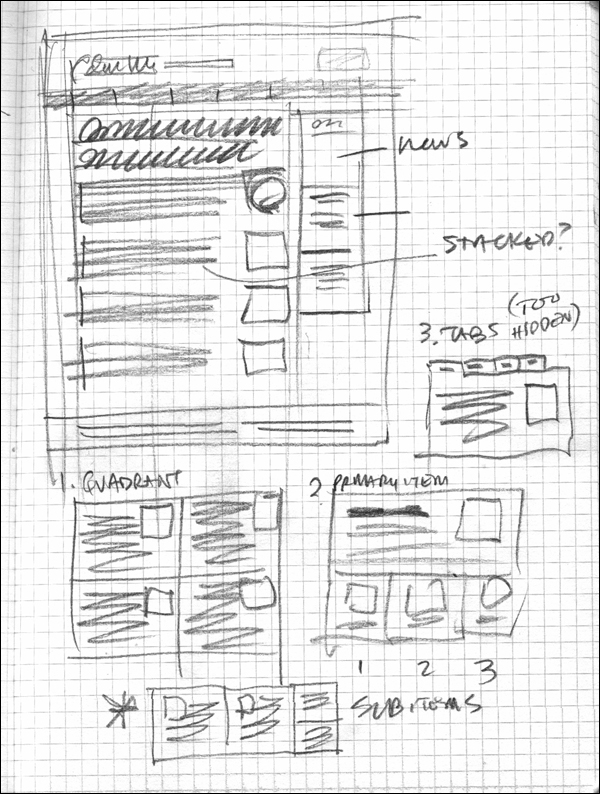
Figure 7.1. Thumbnail sketches are the perfect way to explore lots of ideas very quickly. (Image courtesy of Mike Rohde)
Contrary to conventional wisdom, brainstorming by yourself is more effective than brainstorming with others.2 You needn’t be afraid of coming up with ideas that aren’t good enough. Thumbnail sketches are a design tool, not a deliverable. They don’t have to be pretty. Most of mine look like something you’d find in the trash. In fact, most of them end up there at the end of the day. As you’re working, remember that you don’t have to show them to anyone else. They’re just a means of getting your first ideas on paper, so there’s no need to censor yourself. Think like a fashion photographer: make a ton of shots, because most of them will suck. The more you have, the higher the likelihood that you’ll find a non-sucky one in there somewhere.
2 Richard Wiseman, 59 Seconds: Think a little, change a lot (Knopf, 2009).
Remember that anything goes—crazy or unrealistic ideas are OK, since they might lead to more exciting and creative design choices later on. But you’ll need to find a balance with speed. I usually challenge myself to get 20 thumbnails done in one minute. That’s only three seconds per sketch, so I never make it. But it does get me working at a high tempo. If that seems too much for you, aim for 20 sketches in five minutes. Include just enough information in each sketch so you’ll remember your idea when you review the sketches later. Don’t stop at 20 sketches, either. Keep going until you feel like there are no ideas left in your brain. Like there’s no brain left in your head. Like there’s—all right, you get the idea.
What should you sketch? Basically, anything that comes to mind. That said, I do recommend sketching in sets, with each set focusing on the same design components. If you’re thinking about layout, do a set of thumbnails that explore layout so that you exhaust your layout ideas. The same goes for the general concept, color, font, or anything worth sketching. You can combine these components in your sketches, but don’t just do one set of twenty thumbnails with five layouts, five colors, five fonts, and five images. That’s cheating badly. Shame.
Spend no more than, say, 15 minutes on thumbnails, and get as many done as quickly as you can within that amount of time. Like push-ups, the last couple of ideas will hurt the most and be the hardest to do, but they’ll have the greatest effect.
Ballpoint pen, fine liner, computer stylus, brush, pencil, paper, napkin, canvas, whiteboard, tablet—it doesn’t matter what you use, really, as long as it works for you, not against you, in getting your ideas recorded. Don’t focus on tools here; focus on the ideas.
Feel free to annotate your sketches, but keep the notes to a minimum and do them quickly.
Make a Selection
When you’ve finished sketching, it’s time to make a selection. I like to choose three thumbnails that represent the best ideas from my set of thumbnails. Why three? One or two choices might not allow for enough variety or exploration, and more than three simply take more time to flesh out. Three is a good number to start out with. If none of the three ideas are approved, you can always go back to the thumbnails and pick the three next best ideas to further explore.
Once you choose your winning thumbnails, consider each one for a moment. Are there additional annotations you’d like to make? Any notes to yourself about some aspect of the design to serve as reminders once you get into the design in more detail? Jot these down on or near each sketch.
Rough Sketches: Still a Rough Impression, but Quality Matters
Next, redraw each of the winning thumbnail ideas in the form of a rough sketch (Figure 7.2). For some, any sketch is a rough sketch, even thumbnails. But these roughs are bigger, with more detail. I tend to use a whole sheet of A4 paper for a rough sketch, leaving enough margin space for annotations. Don’t be afraid to annotate; write notes to yourself about everything you’d like to explore further, as well as things you don’t want to forget.
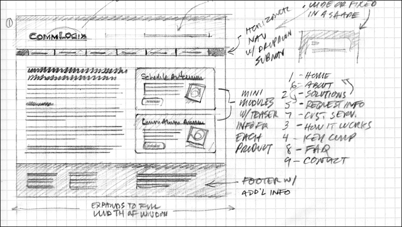
Figure 7.2. Rough sketches go a step further than thumbnails, with ideas explored more thoroughly. (Image courtesy of Mike Rohde)
You don’t need to draw text, although you may want to actually read top-level headings and navigation, if they’re important to you. Rough sketches usually show more detail and make more use of shading to indicate color differences, backgrounds, and other things that might create contrast. The quality of rough sketches, as far as detail is concerned, is more important than with thumbnails: it’s likely that you’ll want to use these as discussion pieces within your team so that you can come to an agreement about which design you’ll choose for your final mockup.
Again, everyone’s sketching style is different, and the easier it is for people to interpret your sketches, the less it matters how they look in other respects. The important thing is that your sketches communicate the essential information about your concept to the person viewing them.
Create Comps Based on the Best Rough Sketches
Years ago, I learned to make comps by combining printed and drawn type with printed and drawn images. The process was akin to making a collage, though much more precise. Now, comps are usually created on the computer. Comps are arguably the graphic designer’s equivalent of the architect’s scale model or the sculptor’s maquette. They present a realistic depiction of a finished product but cost less in terms of time, effort, and money than a finished product.
We’ll discuss how to create the responsive designer’s equivalent to traditional comps—the web-based mockup—in the next chapter.
Sketching on devices
Since we’re talking about responsive design, I recommend doing some of your rough sketching on actual devices (Figure 7.3). There are plenty of apps (including free ones) that will turn your tablet or smartphone into a blank canvas, ready for you to sketch your UI ideas and export them as images that you can then import into the image editor of your choice (or straight into a web mockup) as a guide for creating more detailed comps. Sketching on devices lets you explore the size of elements (is that button too small?), as well as color and general layout. More importantly, it allows you to do this very quickly.
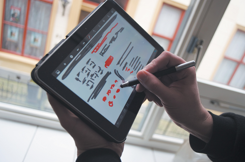
Figure 7.3. Sketching on device screens encourages extra consideration of the size and spacing of on-screen elements. (Photo courtesy of Travis Holmes)
For quite a while I drew with my finger on various devices. Then Stephanie Rieger recommended that I use a touchscreen stylus, so I could actually draw on the screen like I would draw on paper. Boy, did I feel stupid for not thinking of that one. Luckily, the advantages of using a stylus quickly made up for my feelings of inadequacy and I’m no longer in therapy. Buy a touchscreen stylus if you don’t have one.
The great thing about these sketches is that you can export them and use them as a background in whatever application you use for fleshing out your designs (Figure 7.4). I like to set a sketch as a background image to a web page with CSS, which gives me a starting point for setting up a layout grid and considering potential changes in that grid depending on screen size. If you’ve paid attention to the size of the elements in your sketches (such as the size of buttons), setting a background image in this way helps to ensure that what you create in your mockup HTML/CSS will be similar to your original sketches.
Sketching as a habit
Proponents of sketching often advocate turning sketching into a habit. For some, like Mike Rohde, author of The Sketchnote Handbook, it’s become a way of life (Figure 7.5).3 Rohde gives us an answer to the why of sketching in Sketching: The Visual Thinking Power Tool, an article he wrote for A List Apart:4
3 Mike Rohde, The Sketchnote Handbook (Peachpit Press, 2012).
4 Mike Rohde, “Sketching: the Visual Thinking Power Tool.” A List Apart. http://www.alistapart.com/articles/sketching-the-visual-thinking-power-tool/.
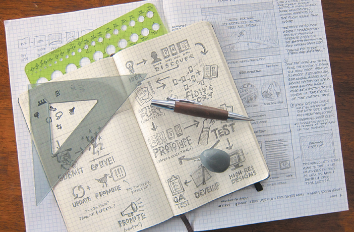
Figure 7.5. Sketching advocates like Mike Rohde encourage sketching as an aid to thinking. (Image courtesy of Mike Rohde)
“Adding sketching to the design process is a great way to amplify software and hardware tools. Sketching provides a unique space that can help you think differently, generate a variety of ideas quickly, explore alternatives with less risk, and encourage constructive discussions with colleagues and clients.”
—MIKE ROHDE
He also stresses the importance of the sketch as a thinking tool as opposed to a work of art. “Ugly gets the job done just fine,” he says.
While Rohde and other sketch artists like Danny Gregory use sketching as others might use a diary, that’s not necessarily the way you have to do it. Even Gregory fell out of the sketching habit for a while after becoming a father and author. But you can turn sketching into a habit for your web design work, a way to help you think about various possibilities and explore design ideas before jumping on the computer.
Try it out!
Only sweat the major breakpoints (for now)
As mentioned earlier, Jeremy Keith notes that what happens between the breakpoints is just as important as the breakpoints themselves—perhaps even more so. While I agree with this, we do have to start somewhere. In a way, this part of the process reminds me of storyboarding, or creating animation keyframes, with the in-between frames being developed later. We’re going to do that here.
Let’s say you’ve chosen three basic design directions from your thumbnails. Think about what your major breakpoints will look like (Figure 7.6). And here’s the key: try to come up with as few major breakpoints as possible. That might sound crazy, since we’re talking about responsive design. After all, we have media queries, so let’s use about 12 of them, right? No! If a linear layout works for every screen and is appropriate for your particular concept, then there’s no need for different layouts. In that case, simply describe what will happen when the screen gets larger. Will everything generally stay the same, with changes only to font size, line height and margins? If so, sketch those. For these variations, make thumbnails first, explore some options, and then move on to larger, more detailed sketches. Use your breakpoint graph as a guide at first and make sketches according to the breakpoints you’ve estimated on your graph.
Major breakpoints are conditions that, when met, trigger major changes in your design. A major breakpoint might be, for example, where your entire layout must change from two columns to four.
When thinking about major breakpoints, remember to think about device classes. If you’re thinking about smartphones, tablets, laptops/desktops, TVs, and game consoles, for example, you’re heading in the right direction. If you’re thinking in terms of brand names and specific operating systems, you’re on the wrong track. The idea is to think in terms of general device classifications and, sometimes, device capabilities. Capabilities are more important when designing web applications, since you should be thinking about what screens will look like both with and without any particular capability.
Rough sketches of major breakpoints can help you determine:
Rough sketches are more detailed than thumbnails, but they shouldn’t take a long time to create. In a short period, you should have a sketch of each major breakpoint for each of your chosen designs. This should be enough to decide on one of the designs.
• Whether or not more major breakpoints are needed
• Which design choice will be the most labor intensive; you might opt for a design that will better fit within time and budget constraints
• Whether or not a particular device class has been neglected or needs further consideration
• What technologies you’ll need to develop the design responsively
So where and when will you sketch minor breakpoints? In the browser, when you do your web-based mockup. You’ll find out why and how in the next chapter. In the meantime, simply focus on making sketches of the state of your web pages or app screens at the major breakpoints of each design.
Minor breakpoints are conditions that, when met, trigger small changes in your design. An example would be moving form labels from above text fields to the left of those fields, while the rest of the design remains the same.
At this point, don’t worry too much if you notice that the initial breakpoints on your breakpoint graph simply won’t do. Those were just a starting point, and you’re free to revise your estimate based on your sketches. You might even decide that you need an extra breakpoint for a given design and record that in sketch form; you can add that breakpoint to your graph. This is a cycle of discovery, learning, and revision.
Think about your content while sketching
While sketching, you’ll certainly be thinking about the way things should look. My experience is that much UI sketching of this type revolves around the layout of elements on the screen. I’ve found it useful to keep thinking about the content while sketching, and to consider what will happen to the content in various situations. When designing responsively, it can be useful to consider how you’ll handle the following content in particular:
• Text
• Navigation
• Tables
Oh, sure, there are many more things to consider, and you’ll end up creating your own list of “things to do some extra thinking about” as the project progresses. For now, let’s take a look at the items listed above.
Text
Before you say, “Hey, wait a minute, didn’t you just tell me that I didn’t have to draw text while sketching?” hear me out. While sketching, there are a couple of text-related issues you’ll need to tackle: column width and text size, both of which are relevant in proportion to the screen and the other elements on the page.
Column width is fairly obvious, but it can be difficult to estimate how wide a column will be with actual text. In this case, sketching on a device might give you a better idea of the actual space you have to work with. Another method I’ve used is just to make a simple HTML page that contains only text, and load that into a device’s browser (or even an emulator, which while not optimal still gives a more realistic impression than lines on paper). When the text seems too large or too small, you can adjust the font size accordingly. Once it seems right, you’ll be able to make your sketches a bit more realistic.
Note
Distinguish between touchability and clickability. Many designers, myself included, have made the mistake of refining links for people who click on them using a mouse, or even via the keyboard, without considering how touchable these links are for people on touch devices.
Think about the size of links—not only the text size, but also the amount of space around them. Both of these factors play a role in the touchability or clickability of links (and buttons): large links and buttons are easier targets, but slightly smaller links with plenty of space around them can work just as well. That said, there’s a decent chance that no matter what you choose to sketch, you’ll end up making changes again when you create your mockups.
This is the great thing about sketching that I can’t repeat often enough: you’re going to refine your design in the browser anyway, so the speed with which you can try things out when sketching means you won’t have to do detail work more than once (unless your client has changes, but we all know that never happens).
Navigation
Navigation is another poster child for sketching on actual devices. The size issues are the same as with links, but there’s a lot more thinking to do in terms of the design of navigation for various devices, which means navigation might change significantly at each major breakpoint.
Think back to Bryan Rieger’s practice of designing in text first, and ponder what you would do before the very first breakpoint if you had only plain HTML and CSS at your disposal—in other words, if you had no JavaScript. That means no, you can’t have your menu collapsed at the top of the screen and have it drop down when someone touches it. If you have your menu at the top, it’s in its expanded form and takes up all the vertical space it normally would.
This is a controversial enough subject, with even accessibility gurus in disagreement: JavaScript, after all, is currently considered an “accessibility supported” technology. But this isn’t necessarily about accessibility. It’s about thinking about what happens when a browser lacks JavaScript support, or if the JavaScript available on the device is different than what you’d expect. Your content will be presented in a certain way before JavaScript does its thing with it, no matter what the browser. So why not think about what that initial state will be?
In the chapter on wireframes, I talked about my preferred pattern for navigation on the smallest screens: keep it near the bottom of the screen and place a link to that navigation near the top of the screen. JavaScript, when available and working as expected, can move that navigation up to the top and create the drop-down menu on the fly.
But a pattern is not design law, so how you choose to handle the smallest screens will depend on your project. If I had only a few links in my navigation, I might very well put the menu at the top from the very start, and there it would stay at every breakpoint.
Remember that JavaScript and CSS let you do a lot of rearranging of stuff on the screen. That knowledge should empower you to safely design a great page with plain HTML and use JavaScript and CSS to spice it up any way you like. This is the essence of progressive enhancement.
Tables
Tables! Oh, the bane of the responsive designer (or wait, is that images? Or video? Or layout? Ahem). Tables are tough to deal with on small screens. I’d love to tell you I have all the answers, but instead I have more questions. Hopefully, these will lead you to a solution. It’s good to think about these while you’re sketching.
First of all, what types of tables will you be dealing with? Narrow? Wide? Numerical? Textual? Your content inventory should give you enough information to answer these simple questions. Once you’ve considered those, try to categorize the types of tables you have into something like the following classes (Figure 7.7):
• Small-screen-friendly tables, which you’ll probably leave as they are, because they’re small enough and will work fine on most small screens.
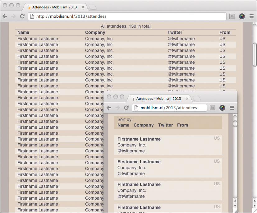
• Blockable tables, which you can alter with CSS so that each row in the table functions visually as a block item in a list (Figure 7.8).
• Chartable tables, which contain numerical data that can be transformed into a chart, graph, or other visualization that will take up less space on a small screen.
• Difficult tables, which are hard enough to deal with that you’ll need to come up with a different plan for them, sometimes even on a case-by-case basis. These are our enemies, but unfortunately, are the friends of our clients, who all love Microsoft Excel. Oh well.
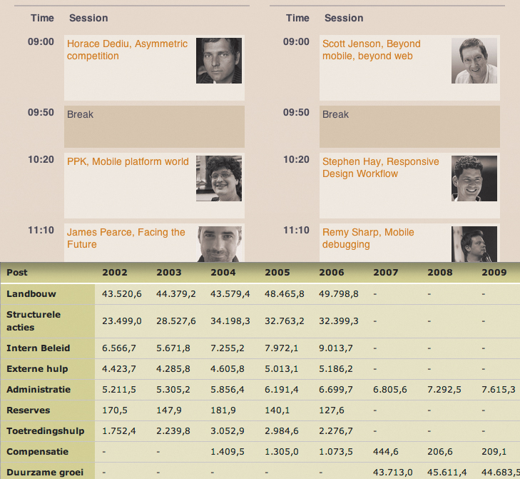
Figure 7.7. There are several different types of tables, and different ways of dealing with them on small screens. (Sources: mobilism. nl and eu-verantwoording.nl)
Thinking again in terms of progressive enhancement, the base design should probably just include the whole table, which means that the user will have to scroll horizontally to see the whole thing in many cases. On top of this, we can employ CSS and JavaScript, when they’re available, to do some magic for us. Blockable and chartable tables can be blocked with CSS and charted with JavaScript. Plenty of designers and developers have experimented with many different options for tables, from simply making the table itself scrollable to exchanging columns and rows.
The fun part is that what you do on small screens isn’t necessarily what you’ll do on larger screens. That’s why now—when all you have to do is sketch and it won’t take much time—is the time to think about the changes you’ll be making at each breakpoint.
What to do if you get stuck
Every designer gets stuck at some point. It’s no big deal unless you treat it like one. There are countless ways to deal with it, from asking yourself what if questions (“What if it weren’t a table, but a list?” is what I asked myself before “blockifying” the attendees table for the Mobilism site) to the cliché taking a shower, which you hopefully do on a regular basis anyway. The reason this chapter focuses so much on sketching is because the act of drawing itself can actually stimulate your brain to come up with more ideas, provided you push it hard enough by sketching past your comfort zone of first-come ideas.
If your problem is that you’re stuck creatively, there are many inspiring books and resources to get your creative engine started during the bitter cold of designer’s block. Although there are plenty of resources on design and creativity itself (try such classics as Edward de Bono’s Lateral Thinking), the greatest inspiration can come from sources outside the realm of design.5 Trying to combine things that normally aren’t combined can lead to surprising results. It’s a simple little trick, but I’ve often used Brian Eno and Peter Schmidt’s Oblique Strategies to force me to take a different approach.6 Worst case, it’s a lot of fun. Best case, you’ve got a great idea!
5 Edward de Bono, Lateral Thinking (Viking, 2009).
6 http://en.wikipedia.org/wiki/Oblique_Strategies
If your problem is that you’re not sure how to handle something in the context of responsive design, there’s no harm in researching how others have solved problems like yours. Just be sure to use your creativity and tailor any ideas you might find to your own situation; after all, you’re a designer. At the time of this writing I find Brad Frost’s This Is Responsive to be one of the most exhaustive collections of responsive design patterns and resources available.7 You can spend hours going through there and you’ll certainly come across something that will get you unstuck.
7 http://bradfrost.github.com/this-is-responsive/
So anyway, are you done sketching your design? Great! Relax, that was the hard part. Um, oh wait. (Just kidding, relax. In the next chapter, you get to do some coding.)