
1. In Splendid Variety These Changes Come
“Not everything is design. But design is about everything. So do yourself a favor: be ready for anything.”
—MICHAEL BIERUT
The web is a place of constant change, innovation, and well, wonder. The things we can do on, with, and because of the web are absolutely amazing, particularly when you remember what the early days of the commercial web were like. Thinking about the early days, the way we built websites in 1995 and what design possibilities were available to us then—it all seems laughable now.
In some ways, the web design process is completely different today, but in others, it’s exactly the same.
Designers have scrambled since the beginning of the commercial web to translate the ideas in their heads to the browser. The first popular web designers were those clever enough to devise hacks that helped to achieve this goal. From spacer GIFs and layout tables to sliding doors, faux columns, and image replacement, to frameworks, CSS preprocessors, and JavaScript polyfills, we’ve traveled through a whole spectrum of creative ways to get our designs onto the web, even if that meant breaking the semantic web in the process, by combining our content with meaningless presentational elements.
And yet, while people, devices, browsers, and the entire web have changed, design processes have remained largely the way they’ve been since the very beginning of the web—even before the web, actually.
The birth of static hi-fi mockups
I used to work in print design. I graduated a few months before moving from the United States to the Netherlands. It took me weeks of calling every creative agency in the phone book in my area before one called me back and—after an interview—offered me the chance to be an intern. This was 1992, three years before most of the general public in the Netherlands was offered commercial internet access. The small agency had one desktop computer; I believe it was an Apple Macintosh LC. It was not for design. It was for things like writing letters and creating invoices. Design proposals were drawings, done by hand with very expensive colored markers.
That’s how we designed things. We drew them, just as I’d been taught in college: create thumbnail sketches (the more the better), then make a selection. From that selection, make some rough sketches. From the best of those, choose between one and three—usually it was three because ad agencies loved to do tons of work in hopes of reeling in the account—and work that out in the best visualization possible. At the time, marker renderings were still top dog. Prepress work was outsourced in whole or in part to specialized agencies. Having worked with computers quite a bit as a student, I was surprised that they weren’t utilized as much in the industry. But that changed quickly.
I was hired six months later. My pet love for typography led me to find ways to use QuarkXPress on the company’s Macintosh Quadra 700 (bought quite soon after my internship started) to set type, print it out, and draw on top of it, incorporating real type into marker renderings. This made things much more realistic for our clients and gave them a more accurate impression of what they were getting. Other designers I knew did the same thing. We started incorporating color-printed images into our design impressions instead of drawing them. It wasn’t long before I started using a combination of Photoshop and QuarkXPress to create complete mockups on the screen. I did a lot of packaging design, and I felt pretty smart doing everything on the computer, printing it out and then drawing shadows and such on top of the print with markers, until I started doing all of it in Photoshop because it all looked so real. Clients loved that type of rendering, and the more experienced marker renderers we used to outsource to stopped getting work from us altogether.
I felt fantastic about what I was doing, but failed to notice that it was taking me longer and longer to do what I used to do with markers in a fraction of the time. I was creating a product instead of visualizing an idea. However, after all the work involved, if we did get an account, some of what I’d done actually saved me production time. Lots of copy was typeset, and layout was essentially finished. Besides, this way of working was becoming the norm. When I first started doing Photoshop comps, it was pretty normal to pitch against agencies that still did everything by hand. And we won almost every time, because clients had the feeling they knew what they were getting. Eventually, everyone did it this way.
Interesting discussions ensued. Were we as designers less creative because we used new tools? The impression was that markers on paper were somehow an extension of our creativity, while computers stifled or stole that creativity to some extent. Did the computer as a visualization tool in fact make us less creative? Or did we simply have a more effective way of visualizing our already creative ideas? What about the time investment, especially in an industry that took—and still takes—spec work for granted? Was it really necessary to visualize in so much detail in the presale phase?
Like it or not, that’s the way things went. Clients had come to expect high-quality, high-fidelity prints of design ideas. We still pasted these on presentation board, which was really the only way to say, “Hey, this is just a proposal, an impression.” But we couldn’t knock it, because for print, visuals from a computer are closer to reality than marker drawings.
The static mockup comfort zone
After we’d been making hi-fi static mockups for print work for a couple of years, a funny thing happened. The web was born. One might expect this collection of world-changing technologies to catalyze changes in process similar to the way design had moved from manual rendering to computer-aided rendering. But everything stayed the same. We stuck with Photoshop comps. We made pretty pictures of what we were going to make later. And clients accepted it. And we’ve worked that way for years.
Think about this for a minute: the changes in design that came about with the rise of desktop publishing were geared toward making designs more realistic. They were showing—more accurately than ever before—what the end product would look like. Why didn’t that same shift happen when the web came along?
I have my pet theories, one of which is that some things just weren’t as nice on the web. In the early days, type was not anti-aliased. Photoshop type was, and thus looked better. And if it looks better, it sells better.
This tendency to want to make pretty pictures of websites started causing problems; eventually I tired of explaining to clients after a site was built that they had been presented an impression and that the web was just plain uglier than the mockups we made for them. I turned off anti-aliasing and asked my employees to do the same. I didn’t want clients to be unpleasantly surprised. For years, we had tried to be as realistic as we could in image editors like Illustrator and Photoshop. We paired this with the gifts of a) talking a lot and b) being able to explain vividly and accurately how things on the web would really look. Those tactics saved our butts on many projects. But those times are over.
The responsive web is the web as it was intended. It’s not the desktop web. It’s not the newest Safari browser web or the mobile web or the iOS web. It’s not the tablet web. It’s the universal web of information that should be universally accessible to everyone regardless of device or physical limitation.
Designing for the web is even more challenging now that we have what developer Jake Archibald calls do stuff sites in addition to get stuff sites. When designing do stuff sites (web applications), we need to think not only about form and content, but also about interaction. It is challenging to express this visually.
The specialist invasion
Long ago, many firms had just one person who did most of their web design. I don’t mean things like project management and back-end programming. I mean visual design, interaction design, and often front-end development.
Front-end development around 1998 consisted mainly of HTML. There was also a lot of Flash going on. My first employees had no idea what CSS was; I had to explain it to them. There was still a lot we couldn’t do with CSS. JavaScript—well, let’s not even go there.
It certainly was possible for one person to design a website, mock up some pages in Photoshop, “slice” those Photoshop images up, and put them back together in HTML, allowing for the replacement of Photoshop-rendered text with the real thing, whether for small static brochure websites or as templates for a CMS.
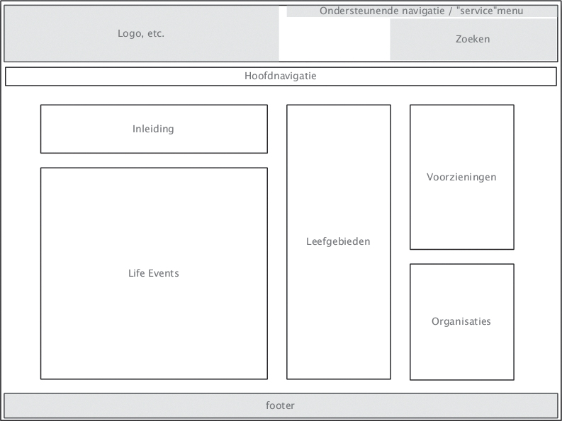
We used very simple drawings, then often called wireframes or schematics, to depict websites’ underlying visual structure as we started thinking about them systematically and modularly (Figure 1.1). Even get stuff websites had do stuff aspects to them, and these things needed to be communicated during the design process.
We began to see a shift, in my experience around 2002, when projects were large enough and web work had become complex enough that we could start specializing in one or two specific aspects of the front-end experience. Many designers still wrote HTML, while site diagrams and wireframes were often the realm of the information architect. Tools like Jesse James Garrett’s visual vocabulary gave us an abstracted way of communicating site structure and basic interaction simultaneously (Figure 1.2).1 As interactions expanded from client-server interactions to smaller and more subtle interactions on the client side, specialists used increasingly detailed wireframes to demonstrate them. Wireframes began to look more and more like working web pages, only without color and imagery. Sometimes they were connected to one another to create prototypes with working links for clients to click through.
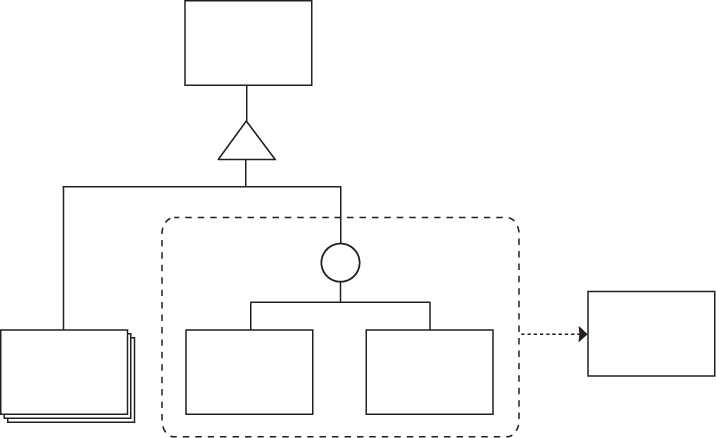
Figure 1.2. Many designers and information architects still use Jesse James Garrett’s visual vocabulary to describe site structure and interaction.
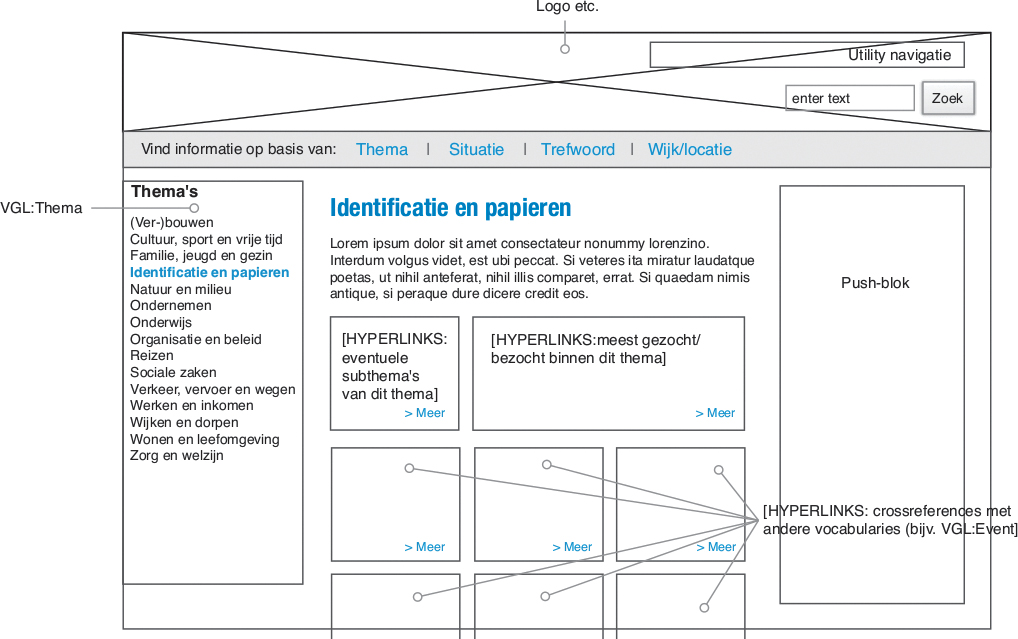
Before we knew it, something had happened: it became inefficient, though not impossible, to remain a generalist web designer. “Web design” had given birth to the specialist fields of information architecture, interaction design, visual design, and front-end development, happily followed years later by such fields as the desperately needed content strategy and the often ambiguous user-experience design. Wireframes, at this point one of the important deliverables of interaction designers, had become detailed enough that the role of the graphic/visual designer had changed slightly. In many web design and development firms, even at the time of this writing, visual design follows interaction design as part of the traditional waterfall process. This often means that designers are handed intricate wireframes that have been seen and approved by the client (Figure 1.3). As the client has seen and signed off on something that is quite detailed even in terms of page layout, it’s often difficult or impossible for the visual designer to deviate from the basic design of the wireframes, effectively reducing the work of the visual designer to a color-by-numbers exercise. Visual designers are often required to base their work on these wireframes, changing typography and positioning things to an invisible grid, adding color and imagery, basically pouring decoration sauce onto the wireframe dish.
In the waterfall model of website development, each step is done in isolation and the results of each step form the input for each subsequent step, similar to the way an assembly line works.
In this scenario, the real design work is done by interaction designers. They’re the ones solving problems, while the visual designers are left to color within the lines. This hardly seems fair, as designers who don’t solve problems are merely decorators. And decoration is not design.
We’re all interaction designers
Archibald’s distinction between get stuff sites and do stuff sites isn’t always clear-cut; sometimes even get stuff sites involve quite a bit of doing stuff. Searching or filtering information, logging in or requesting documents, filling out forms, even clicking through sections of the site are interactions that users do without thinking.
I’m of the opinion that the interaction designer and the visual designer should be the same person. In fact, I would assert that if you work on the design or development of the front-end web at all, you are in some way an interaction designer. There are aspects of what you do that can affect the experience (and thus the interaction) users have with your site or application. A developer who’s concerned with optimizing performance is actively trying to improve user experience and interaction. A designer’s purposeful use of color, space, size, and composition on a form is an attempt to make that interaction quick and easy for the user. The content strategist concerning herself with the importance of one type of content as opposed to another is thinking about improving the experience for the user.
This is not to say that “pure” interaction designers don’t have their place. What I am saying is that graphic designers have been solving interaction, readability, usability, and aesthetic problems for centuries. There’s no need to reduce them to decorators on the web. At the very least, interaction design, visual design, and content strategy (and perhaps other fields) should overlap much more than they often do today. This can be achieved by transforming each step in the design and development process from one that involves disciplines working in isolation to one that encourages collaboration during each step.
Jump from the waterfall
I propose leaving the waterfall method of web design workflow behind in favor of a multidisciplinary, iterative approach to design work for the web that allows clients to experience the evolution of a design from the very beginning with no opportunities for unpleasant surprises. I propose overlapping and combining disciplines, eliminating silos within the design process.
I support an evolutionary, iterative design process in which features and elements are added on an as-needed basis. This process is based on the principle of progressive enhancement: starting with nothing more than universally accessible structured content and working from that point forward to the desired complexity. This process starts small and grows. It’s messy. No finishing wireframes first and handing them over to the designer. The wireframe is simple. The wireframe becomes the design. It evolves into it—in the browser.
The web affords us a wonderful opportunity: to be able to design and test a design in the actual medium for which we’re designing. It’s time to stop designing pictures of websites and start designing all aspects of the user experience simultaneously and in a practical way.
This book presents my attempt at creating such a process.
The straw that broke...
The thought process behind this book started about four years ago when I was working on a client project, creating my design in “Photoshop templates” as we called them: Photoshop documents representing web pages and the elements they contain. We needed depictions of quite a few pages to visualize the necessary elements. This was the normal way of doing things. However, in this case the company doing the front-end development required that every single element be exactly depicted in the Photoshop documents. If links were to be blue, this needed to be consistent across all of the Photoshop documents. We couldn’t simply note the fact that links were such-and-such blue. The Photoshop documents were the documentation. Again, this was pretty much the norm at the time, but it didn’t make me any happier when the client came back with feedback that some metadata needed to be placed between each paragraph and heading sizes needed to be changed. What followed was about two days of opening Photoshop documents, increasing their vertical size to accommodate the necessary changes, making changes that involved moving each bit by hand, and finally doing this across many Photoshop documents.
What in the name of all that is holy would have happened if that project was a “responsive” design project? After doing the same types of edits in about 100 different Photoshop documents (hypothetically 20 pages at five screen sizes), I would be curled in a fetal position in a corner of some dark place, that’s what.
When I realized that two days of work could have been done with two lines of CSS, I decided at that moment that I would never make Photoshop “templates” again and I set out to create a new workflow that would save time and my sanity.
When I became an independent consultant in 2010, I had the opportunity to experiment with this workflow; clients had to accept my way of working as simply “how I work.” I found that it worked well, not only for me but also for my clients. It wasn’t without its problems (and still isn’t). But compared to the waterfall method, it’s quicker, easier, and more fun, and clients tend to like seeing the evolution of the design from structured content to finished design. They also seem to appreciate how much work goes into creating a web design. I don’t have to tell them this; they infer it from the process.
The elephant in the room
One of the most important reasons to consider a new workflow is responsive web design. In its most stripped-down form, responsive web design makes a single, static representation of a screen or page absolutely meaningless. An image created in an image editor is not a depiction of a page in any browser, let alone in a variety of browsers within the context of an even larger variety of viewports on a variety of platforms (Figure 1.4). As far as I’m concerned, responsive web design has rendered these static representations obsolete.
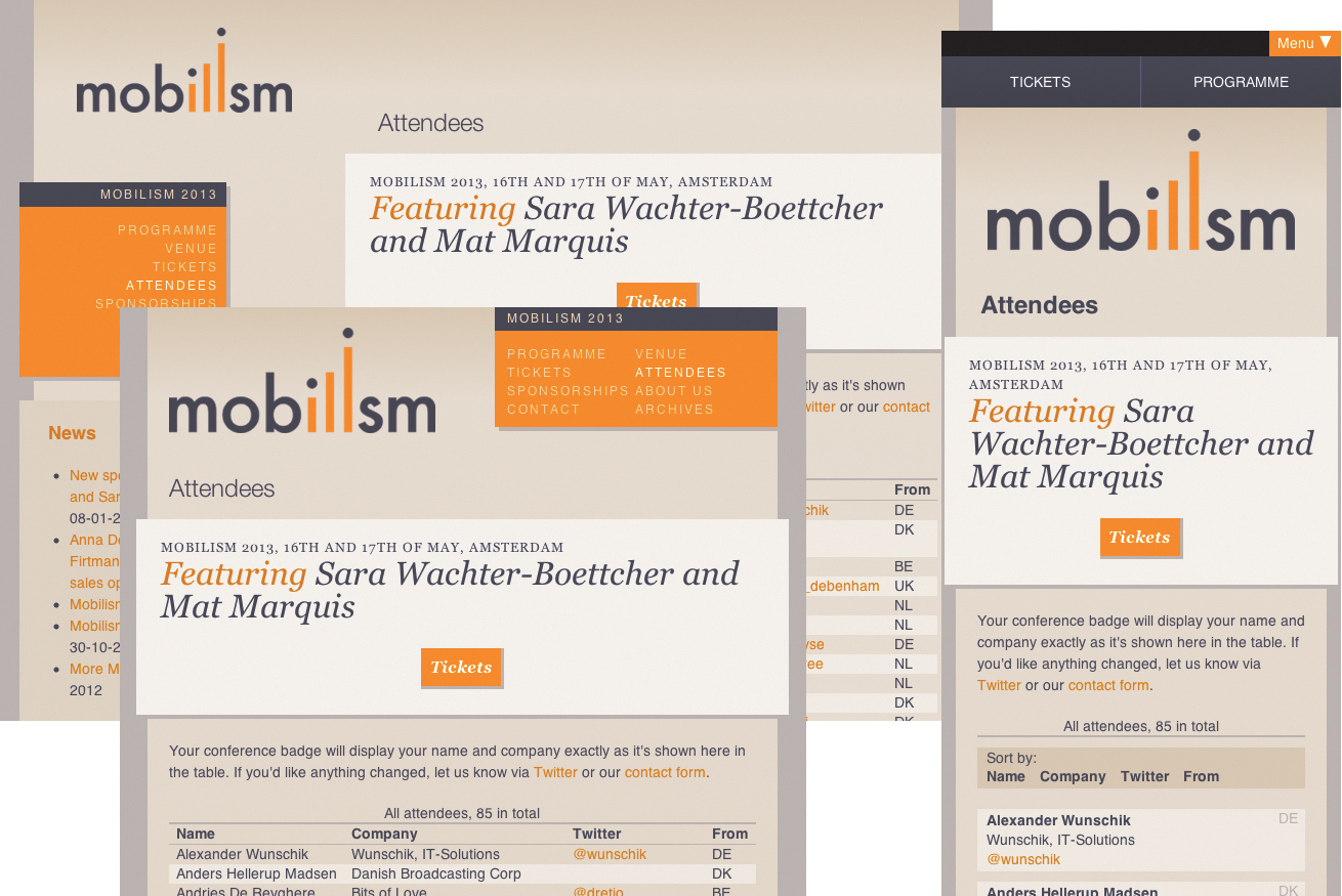
Figure 1.4. For layouts that change at different screen widths, static representations are time-consuming.
Image editors remain a valuable tool—for image editing (surprise!), creating image assets, and creating exploratory images in the vein of mood boards or variations of them such as Samantha Warren’s Style Tiles.2 Photoshop and other image editors have become visual playgrounds for some. But as far as I’m concerned, the use of image editors for the creation of static mockups is officially old school, and I would encourage designers to put some of that creative energy to use exploring the medium for which they design.
This is not gospel
This is my process as it is today. It’s messy in places. It’s not a complete, A to Z procedure for designing and developing websites. It’s visual design as I think it should be, with heavy overlap with content strategy, interaction design, usability, and reality.
The design workflow presented in this book has been used in real-life projects. It cannot be dismissed with a hand wave and a comment like, “That might work for freelancers, but not for our huge, real web projects.” Indeed, this workflow has been used for large projects as well as small.
The ideas in this book are eclectic. Some are old, some are new, many are mash-ups of different ideas. You may find that your way of thinking aligns with some ideas better than others. The workflow set forth in this book is not right or wrong; it just might challenge some deep-seated thoughts and habits.
This is a challenge
This book will push you to think differently about how you design and what tools you use to do so. It will challenge you to learn some HTML and CSS if you don’t know them already, as well as some commands in the dreaded command line interface. It will encourage you to look outside your own discipline for tools and thinking; you’ll learn how some tools used by developers can free you up for more creative thinking instead of pixel-pushing, how to work more quickly and efficiently. You’ll learn to actually enjoy it when clients make changes to your design. Well, to a degree.
This book documents almost two years of experimentation, observation, reading, thinking, and doing. This process works for me, but that doesn’t mean it will work for you as it’s described here. I invite you to find what works for you, your clients, and your team. My hope is that at least some of the thoughts in these pages will change the way you design for the web and the way you think about it.
Have fun, and keep learning.