Chapter 11
Refine Your Design for Great Looks
In This Chapter
![]() Considering design factors in digital resumes
Considering design factors in digital resumes
![]() Recognizing that small things mean a lot
Recognizing that small things mean a lot
![]() Giving your qualifications room to breathe
Giving your qualifications room to breathe
![]() Choosing an overall look for your resume
Choosing an overall look for your resume
Good design is about more than simply looking good. Good resume design means making your document appealing and accessible for prospective employers. Making it relevant for the job you seek. Making it appropriate for someone in your shoes.
There’s no reason why handsome physical design cannot be — and every reason why it should be — applied to the resume information so important to your journey ahead.
As I explain in Chapter 7, the full-design resume can be a blue-ribbon winner at any resume show, conveying a visual message along with information expressed in typographic text. The graphic elements of a full-design resume — such as bullets, columns, graphs, and a generous use of white space — make human reading easier and more inviting.
Modern recruiting software usually can handle fully formatted resumes in a word-processing attachment (typically MS Word). All the design tips I describe in this chapter work on paper and attached online resumes.
By contrast, the plain-text resume is constructed without formatting and reads like a one-paragraph page in a book. But, because online resume databases usually accept only documents submitted in plain text, you’re often stuck with the style.
The hyperlinked resume refers to a plain-text resume sent online that includes a link to a full-design resume stored on a Web site, whether it’s a resume-hosting site, or your own personal site. A resume synopsis (or resume brief) is a couple of summary paragraphs that include a hyperlink to a full-design resume.
Crafting Resumes That Resonate
Although the job market has moved to digital resumes — and away from paper resumes — tree-and-ink products will be around for the foreseeable future. Paper resumes are the medium of choice in the following situations:
![]() When you’re making the rounds of booths at career fairs, hand out your paper resumes. (Yes, some employers, for legal reasons, won’t accept paper resumes at fairs, but they’re in the minority.)
When you’re making the rounds of booths at career fairs, hand out your paper resumes. (Yes, some employers, for legal reasons, won’t accept paper resumes at fairs, but they’re in the minority.)
![]() When you’re calling on your personal network to assist your job search, circulate paper resumes. People are more likely to remember you and your search with a piece of paper to remind them than they are to recall that your resume is hanging out somewhere on the Internet.
When you’re calling on your personal network to assist your job search, circulate paper resumes. People are more likely to remember you and your search with a piece of paper to remind them than they are to recall that your resume is hanging out somewhere on the Internet.
![]() When you meet an employer or recruiter in a job interview, bring along several copies of your paper resume. An attractive resume makes a good impression and can jump-start questions that you want to answer.
When you meet an employer or recruiter in a job interview, bring along several copies of your paper resume. An attractive resume makes a good impression and can jump-start questions that you want to answer.
Here are suggestions on how to make the first cut in the employment screening process.
Paper selection
In a digital era, how good should your paper be? Although you’re using paper only for hand-to-hand delivery, the standards haven’t changed. For professional, technical, managerial, and executive jobs, the stock for a paper resume should be quality paper that contains rag content of perhaps 25 percent, as well as a watermark (a faint image ingrained in the paper). For lower-level positions, any decent-looking paper will do.
What color should you choose? Stick to white or off-white, eggshell, or the palest of gray. Print on only one side of the sheet.
What about theme papers — musical notes for musicians, tree leaves for environmental jobs, and the like? Although the use of theme paper for resumes has grown over the past decade, my preference is for plain stock unless you’re in a highly creative field. Most employers still prefer the no-frills look in paper.
Consistency, consistency, consistency
Make reading easy on employers by deciding on a style and sticking to it. You detract from your words — and your image — when you
![]() Mix differently spaced tabs and indentations.
Mix differently spaced tabs and indentations.
![]() Make a habit of mixing bullet styles without thought. You can mix bullets and checkmarks if the result is tasteful and doesn’t look cluttered.
Make a habit of mixing bullet styles without thought. You can mix bullets and checkmarks if the result is tasteful and doesn’t look cluttered.
![]() Use different spacing between lines. Keep your line spaces the same between headings and the body text for each data point. You’re going for a finished look, which means no careless placement of content.
Use different spacing between lines. Keep your line spaces the same between headings and the body text for each data point. You’re going for a finished look, which means no careless placement of content.
When three’s not a crowd
Certain groupings are just more pleasing to the eye, so many resume pros use the rule of threes: three skills groups, three accomplishments, three sentences on a topic, and so forth. A grouping of five is also attractive.
But avoiding even numbers is not a hard-and-fast rule — groups of two and four are equally acceptable. Look for examples of odd-number groupings in the sample resumes in Part IV. Ask a friend with artistic good taste to look at your final draft and give you an honest opinion of your design technique.
Come on, break it up!
How often have you tried to read a solid block of text and given up because it makes you want to run for the eye drops? Employers and recruiters reading resume after resume also space out on dense text, especially in small type. The answer is to break it up, to segment your data points in related groups.
Too blocky and dense
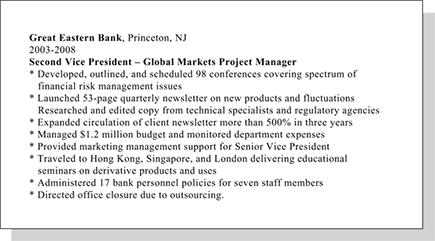
Just right

Open spaces
White space is the master graphic attention-getter; it makes recruiters want to read a resume. Too often, job seekers hearing that they must not exceed one page (Untrue!) try to cram too much information in too little space.
Although some resume pros advise that you right-justify the text (align it down the right side of the page), you’re not hurting your chances if you use a ragged right-hand margin. Right justification creates wasted white spaces that add nothing to an impression of a document’s openness.
In addition to margins and white space between parts of a resume, consider the vital issue of line spacing — the space between lines in a paragraph and the space between paragraphs. Thoughtful line spacing is very important because it impacts a document’s overall look.
Whatever you choose, be clear that an overcrowded page almost guarantees your resume won’t be read by younger recruiters and hiring managers who grew up in an age of television and quick-reading stories in newspapers, magazines, and Web content. And older eyes won’t take the wear and tear of too many words jammed into a small space.
When you’re concerned that your resume is overstuffed, it probably is too hard to read. A ratio of one-quarter white space to text is about right.
Typefaces and fonts
A typeface is a family of characters — letters, numbers, and symbols. A font is a specific size of a typeface. For example, Helvetica is a typeface; Helvetica 10-point, Helvetica 12-point, and Helvetica 14-point are three different fonts.
If you want to mix two typefaces, I like Helvetica for headings and Times New Roman for text and lesser headings. Printing your name in small capital letters can be pleasing. Use italics sparingly; italicized words lose readability in blocks of text.
Professional resume writers use many tricks of the trade to put more information in a resume without making it seem packed to the rafters. They condense type, use a smaller-size font, and manipulate vertical spacing. Most amateur resume writers don’t want to get into this depth of detail. Doing so is a time-consuming learning experience and risks readability, something you can’t afford to lose.
A few more tips on appearance
![]() Your name and contact information can be flush left, centered, or flush right.
Your name and contact information can be flush left, centered, or flush right.
![]() Important information jumps in the recruiter’s face when set off by bullets, asterisks, and dashes.
Important information jumps in the recruiter’s face when set off by bullets, asterisks, and dashes.
![]() Typos and spelling errors are attention killers. They come across as carelessness or lack of professionalism. Even when your resume is a customized point-by-point match for the available job, a spelling mistake or poor grammar blemishes its overall impression and may sink your chances.
Typos and spelling errors are attention killers. They come across as carelessness or lack of professionalism. Even when your resume is a customized point-by-point match for the available job, a spelling mistake or poor grammar blemishes its overall impression and may sink your chances.
Use your computer’s spell-check feature, read your finished resume carefully, and ask a friend who is a good proofreader to read it.
![]() Don’t staple together a two- or three-page resume or put it in a folder or plastic insert. The resume may be photocopied and distributed, or it may be — gasp, shades of ancient technology! — scanned into a database.
Don’t staple together a two- or three-page resume or put it in a folder or plastic insert. The resume may be photocopied and distributed, or it may be — gasp, shades of ancient technology! — scanned into a database.
To minimize the risk of a page becoming an orphan, put a simple heading or footer atop each page after the first with your name and page number. In a multiple-page resume, you may want to indicate the total number of pages (for example, Page 1 of 2).
Checking out a resume makeover
Using an easily read layout is fundamental. Take a look at what I mean: Figure 11-1 shows you the before version of the resume of Bruce Begovic, who holds a new master’s degree in biology. It’s nothing but a “design dump” in which Bruce’s data is merely unloaded onto a single page without giving thought to layout refinements. Pass the eyewash! Figure 11-2 shows the spruced-up version.
Which version would you rather read — the dense, eye-crossing one-pager, or the roomier, eye-pleasing two-pager?
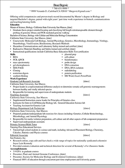
Figure 11-1: Bruce’s initial thrown-together resume looks like he wrote it in 10 minutes on the fly. It’s a snooze.
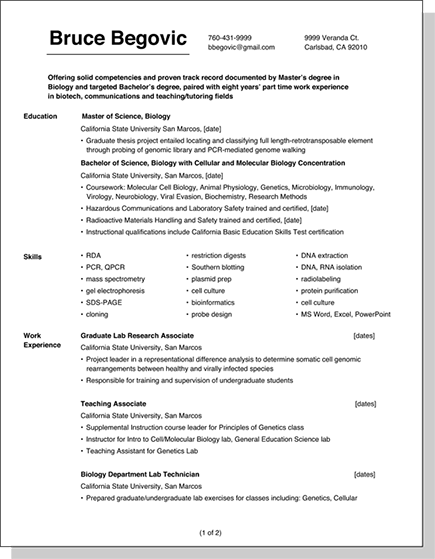
Figure 11-2: Bruce’s revised resume dramatically improves his resume’s appearance and projects an image that reinforces his value.

Boost Visibility with Resume Architecture
Unless you’re the sort of person who enjoys reading the fine print on credit card agreements, you’ll agree with me that white space is one of the two most powerful design elements in today’s search sweepstakes.
But there’s a second potent design element to think about — a resume’s overall look and feel.
Until recent years, the look and feel was pretty much plain vanilla. Now career marketing documents are evolving into a more distinctive look and feel. In today’s marketplace you find forward-leaning job seekers stepping out with crisp, more dramatic resume architecture.
The following four template shells (Figures 11-3 through 11-6) illustrate the concept of vibrant architecture. I named the examples template shells because I present only the design structure here; you fill in the text, and perhaps alter the headings, with your unique information.
Template shell with modern appeal
This shell can work for most career fields but is especially cool for technical resumes. You can use the architecture in Figure 11-3 for resumes of one, two, or more pages.
In longer resumes, the headings in the left column vary. For example, an information technology resume can include such headings as Programming Languages, Development Environments, Web Environments, Platforms & Mobile, and other discrete areas of abilities and accomplishments.
Template shell for intern career fair
Peppy and preppy, the high-impact design in Figure 11-4 is a generic natural for college students dropping off resumes at campus career fairs where writing customized resumes for an anticipated company recruiter isn’t feasible. (Companies can jump in or drop out of these fairs at the last minute.)
With a change of headings, the stylized architecture can also work for adult career fairs and, in fact, be a good choice in any environment where eye-catching attention is a necessity.
Template shell for dash without flash
A job seeker in virtually any career field can use the classy design that Figure 11-5 shows. It’s a good choice for professional and managerial job seekers who lean toward the traditional presentation style but want to look up-to-date.
You can add any headings you like, such as achievements, honors and awards, skills, and competencies.
Template shell showing “it’s a match!”
The “personal traits” in the heading should apply specifically to you, showing four different traits or branding terms (See Chapter 2). Examples for professional jobs: Analytical Thinker, Problem Solver, Strategic Leader, Proven Planner. Examples for non-professional jobs: Dedicated Worker, Reliable Researcher, Skillful Organizer, Budget Manager.
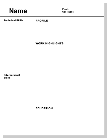
Figure 11-3: This design presents an up-to-date image and is appropriate for most job seekers.

Figure 11-4: Be careful not to choose a screen color so dark that headings are difficult to read.
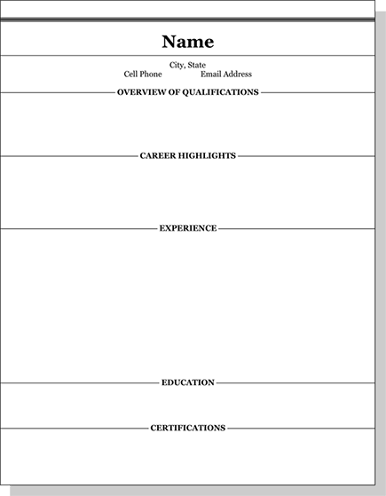
Figure 11-5: This design features a prominent display of certification(s) for your occupation, which may be critical in today’s market.
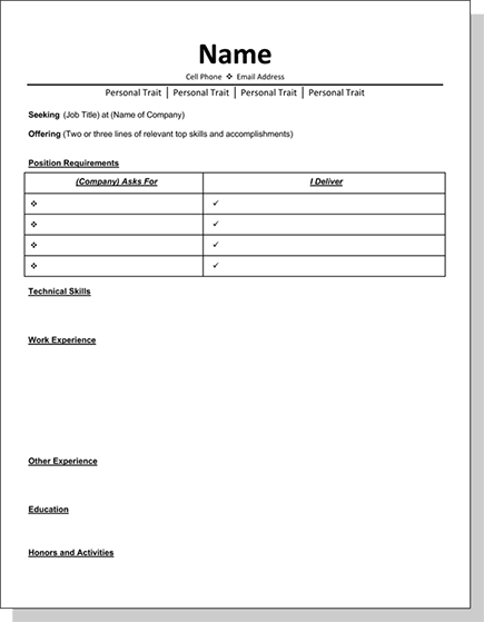
Figure 11-6: This design highlights a “benefits bringer,” rather than a “skills slinger.“ It is very effective.
Design That Showcases Your Words
This chapter’s takeaway: Pay plenty of attention to your resume’s appearance in presenting your targeted content. Well-chosen resume architecture and design are like a guided tour — an employer’s eyes are directed to the factual tip-offs that answer these three essential questions:
![]() Why are you contacting me?
Why are you contacting me?
![]() What can you do for me?
What can you do for me?
![]() How do I know you can do this?
How do I know you can do this?
