
3 Monte Carlo Simulation and other random thoughts
Many seasoned estimating practitioners will tell you that a Range Estimate is always better than a single-point deterministic estimate. (We have a better chance of being right, or less chance of being wrong, if we are one of those ‘glass is half-empty’ people!)
If we create a Range Estimate (or 3-Point Estimate) using Monte Carlo Simulation we are in effect estimating with random numbers (… and I’ve lost count of the number of Project Managers who have said, ‘Isn’t that how you estimators usually do it?’).
A word (or two) from the wise?
'The generation of random numbers is too important to be left to chance.'
Robert R. Coveyou
American Research
Mathematician
Oak Ridge National Laboratory
1915-1996
There is, of course, a theory and structure to support the use of Monte Carlo Simulation; after all, as Robert Coveyou is reported to have commented (Peterson, 1997), we wouldn’t want its output to be a completely chance encounter, would we?
3.1 Monte Carlo Simulation: Who, what, why, where, when and how
3.1.1 Origins of Monte Carlo Simulation: Myth and mirth
Based purely on its name, it is often assumed that the technique was invented by, or for use in, the gambling industry in Monte Carlo in order to minimise the odds of the ‘house’ losing, except on an occasional chance basis … after all someone’s good luck is their good public relations publicity. However, there is a link, albeit a somewhat more tenuous one, between Monte Carlo Simulation and gambling.
It was ‘invented’ as a viable numerical technique as part of the Manhattan Project which was an international research programme tasked with the development of nuclear weapons by the USA, UK and Canada (Metropolis & Ulam, 1949). (So why, wasn’t it called ‘Manhattan Simulation’ or the ‘Big Bang Theory Simulation’? You may well ask ... but it just wasn’t.) The phrase ‘Monte Carlo Simulation’ was coined as a codename by Nicholas Metropolis in recognition that the uncle of its inventor, colleague Stanislaw Ulam, used to frequent the casinos in Monaco hoping to chance his luck. (The name ‘Metropolis’ always conjures up images of Superman for me, but maybe that’s just the comic in me wanting to come out? In this context we could regard Stanislaw Ulam as a super hero.)
The Manhattan Project needed a repeatable mathematical model to solve complex differential equations that could not be solved by conventional deterministic mathematical techniques. Monte Carlo Simulation gave them a viable probabilistic technique. The rest is probably history.
The fundamental principle behind Monte Carlo Simulation is that if we can describe each input variable to a system or scenario by a probability distribution (i.e. the probability that the variable takes a particular value in a specified range) then we can model the likely outcome of several independent or dependent variables acting together.
3.1.2 Relevance to estimators and planners
Let me count the ways 1, 2, 3, 4 .... Err, 12, 13, 14, 15… dah! I’ve lost count, but I think I got up to ‘umpteen’.
It has been used extensively in the preparation of this book to demonstrate likely outcomes of certain worked examples and empirical results.
We can use it to model:
- The range of possible outcomes, and their probabilities, of particular events or combination of events where the mathematics could be computed by someone that way inclined, … and not all estimators have or indeed need that skill or knowledge
- The range of possible outcomes, and their probabilities, of particular events or combination of events, where the mathematics are either nigh on impossible to compute, or are just totally impractical from a time perspective, even for an estimator endowed with those advanced mathematical skills. (Why swim the English Channel when you can catch a ferry or a train? It may not feel as rewarding but it’s a lot quicker and probably less risky too.) The original use in the Manhattan Project is the prime example of this
- We can use it to model assumptions to test out how likely or realistic certain technical or programmatic assumptions might be, or how sensitive their impact may be for cost or schedule, for example
- … and, of course, to model risk, opportunity and uncertainty in cost and/or schedule to generate 3-Point Estimates of Cost Outturn and Forecast Completion Dates, which definitely falls into the second group above
Over the next few sub-sections, we’ll take a look at a few examples to demonstrate its potential use before we delve deeper into cost and schedule variability in the rest of the chapter.
Note: Whilst we can build and run a Monte Carlo Model in Microsoft Excel, it is often only suitable for relatively simple models with a limited number of independent input variables. Even then, we will find that with 10,000 iterations, such models are memory-hungry, creating huge files and slower refresh times. There are a number of dedicated software applications that will do all the hard work for us; some of these are directly compatible and interactive or even integrated with Microsoft Excel; some are not.
3.1.3 Key principle: Input variables with an uncertain future
All variables inherently have uncertain future values, otherwise we would call them Constants. We can describe the range of potential values by means of an appropriate probability distribution, of which there are scores, if not hundreds of different ones. We discussed a few of these in Volume II Chapter 4. We could (and we will) refer to this range of potential values as ‘Uncertainty’. As is often the case, there is no universal source of truth about the use of the term ‘Uncertainty’ so let’s define what we mean by it in this context.
Definition 3.1 Uncertainty
Uncertainty is an expression of the lack of sureness around a variable’s eventual value, and is frequently quantified in terms of a range of potential values with an optimistic or lower end bound and a pessimistic or upper end bound
Here we have avoided using the definitive expressions of ‘minimum’ and ‘maximum’ in expressing a practical and reasonable range of uncertainty. In other words, we can often describe situations which are possible but which also fall outside the realm of reasonableness. However, for more pragmatic reasons when we input these uncertainty ranges into a Monte Carlo Simulation tool, we may often use statistical distributions which have absolute minima and maxima.
There is often a view expressed of either the ‘Most Likely’ (Mode) value or the ‘Expected’ value (Arithmetic Mean) within that range, although in the case of a Uniform Distribution a ‘Most Likely’ value is something of an oxymoron as all values are equally likely (or unlikely if we have lots of them, and whether we are a glass half-full or half-empty personality).
Each variable will have either a fixed number of discrete values it can take depending on circumstances, or an infinite number of values from a continuous range. If we were to pick an infinite number of values at random from a single distribution, we would get a representation of the distribution to which they belong. However, choosing an infinite number of things at random is not practical, so we’ll have to stick with just having a large number of them instead!
For instance, if we tossed a coin a thousand times, or a thousand coins once each, then we would expect that around 500 would be ‘Heads’ and similarly around 500 would be ‘Tails’. (We’ll discount the unlikely chance of the odd one or two balancing on its edge.) This would reflect a 1 in 2 chance of getting either.
If we rolled a conventional die 6,000 times, we would expect approximately 1,000 of each of the faces numbered 1 to 6 to turn uppermost. This represents a discrete Uniform Distribution of the integers from 1 to 6.
If we divided the adult population of a major city into genders and ethnic groups we would expect that the heights of the people in each group to be approximately Normally Distributed.
So how can we exploit this property of large random numbers being representative of the whole? The answer is through Monte Carlo Simulation.
Let’s consider a simple example of two conventional dice. Let’s say we roll the two dice and add their values. In this case we can very simply compute the probability distribution for the range of potential values. Figure 3.1 summarises them. We have only one possible way of scoring 2 (1+1), and one way of scoring 12 (6+6), but we have six different ways of scoring 7:
1+6, 2+5, 3+4, 4+3, 5+2, 6+1
So, let’s see what happens when we roll two dice at random 36 times. In a perfect world each combination would occur once and once only giving us the distribution above, but we just know that that is not going to happen, don’t we? In fact we have tried this twice, with completely different results as shown in Figure 3.2. (Not what we would call very convincing, is it?) The line depicts the theoretical or true distribution derived in Figure 3.1; the histogram depicts our 36 random samples. The random selections look exactly that – random!

Figure 3.1 Probability Distribution for the Sum of the Values of Two Dice
If we did it a third time and added all the random samples together so that we had 108 samples, we might get a slightly better result as we have in the left hand graph of Figure 3.3, but it’s still not totally convincing. If we carried on and got 1,080 sample rolls of two dice, we would get something more akin to the right hand graph of Figure 3.3, which whilst it is not perfect fit, it is much more believable as evidence supporting the hypothesis that by taking a large number of random samples we will get a distribution that is more representative of the true distribution. So, let’s continue that theme of increasing the number of iterations tenfold, and then repeat it all again just to make sure it was not a fluke result. We show both sets of results in Figure 3.4.

Figure 3.2 Sum of the Values of Two Dice Based on 36 Random Rolls (Twice)

Figure 3.3 Sum of the Values of Two Dice Based on 108 and 1,080 Random Rolls
The two results are slightly different (for instance, look at the Summed Value of 6; in the left hand graph, the number of occurrence is slightly under 1,500 whereas it is slightly over that in the right hand graph.) However, we would probably agree that the two graphs are consistent with each other, and that they are both reasonably good representations of the true distribution, which is depicted by the line graph. In the grand scheme of estimating this difference is insignificant; it’s another case of Accuracy being more important than Precision (Volume I Chapter 4). For completeness, we have shown the results of our two simulation runs of 10,800 random double dice rolls in Table 3.1, from which we can determine the cumulative probability or percentage frequency of occurrence. If we plot these in Figure 3.5, we can barely see the difference between the three lines. (We might do if we have a magnifying glass handy.)
What we have demonstrated here is the basic principles and procedure that underpin Monte Carlo Simulation:

Figure 3.4 Sum of the Values of Two Dice Based on 10,800 Random Rolls

Table 3.1 Sum of the Values of Two Dice Based on 10,800 Random Rolls (Twice)

Figure 3.5 Cumulative Frequency of the Sum of Two Dice Being less than or Equal to the Value Shown
- Define the probability distribution of each variable in a model
- Select a value at random from each variable
- Compute the model value using these random choices
- Repeat the procedure multiple times
- Count the number of times each particular output total occurs, and convert it to a percentage of the total
- Stability in random sampling comes with an increased number of samples
Monte Carlo Simulation will model the likely output distribution for us.
3.1.4 Common pitfalls to avoid
One common mistake made by estimators and other number jugglers new to Monte Carlo Simulation is that they tend to use too small a sample size, i.e. too few iterations. In this case ‘size does matter – bigger is better!’ In any small sample size, it is always possible that we could get a freak or fluke result, the probability of which is very, very small (like winning the lottery that for some reason, has always eluded me!). Someone has to win it, but it is even more unlikely that someone will win the jackpot twice (although not impossible).
The stability that comes with large sample sizes was demonstrated in the last example where we had stability of the output when we used 10,800 iterations. (We used that number because it was a multiple of 36; there is no other hidden significance.)
Another common mistake people make is that they think that Monte Carlo Simulation is summing up complex probability distributions. This is quite understandable as the procedure is often described as taking a random number from a distribution AND another random number from another distribution AND … etc. Furthermore, the word ‘AND’ is normally associated mathematically with the additive operator PLUS. In the sense of Monte Carlo Simulations we should really say that AND should be interpreted as AND IN COMBINATION WITH, or DEPENDENT ON, the results of other things happening. In that sense we should describe it as the product of complex probability distributions, or perhaps liken it to Microsoft Excel’s SUMPRODUCT function.
The net result is that Monte Carlo Simulation will always bunch higher probability values together around the Arithmetic Mean, narrowing the range of potential output values (recall our Measures of Central Tendency in Volume II Chapter 2), and ‘dropping off’ the very unlikely results of two or more extremely rare events occurring together.
Let’s consider this in relation to 5 dice rolled together. The sum of the values could be as low as 5 or as high as 30, but these have only a 0.01286% chance each of occurring (1/6 x 1/6 x 1/6 x 1/6 x 1/6). In other words, on average we would only expect to get 5 1s or 5 6s, once in 10,000 tries. So, it’s not actually impossible … just very improbable.
Without computing the probability of every possible sum of values between 5 and 30, Monte Carlo will show us that we can reasonably expect a value between 11 and 24 with
For the Formula-phobes: Monte Carlo Simulation narrows in on more likely values
It is a not uncommon mistake that people take the range of possible outcomes as being between the sum of the ‘best case’ values and the sum of the worst-case values. In an absolute sense, this is true, but the probability of getting either value at the bounds of the range is highly unlikely.
For instance, the chance of throwing a 6 on a die is 1 in 6; the chance of getting a double 6 is 1 in 36, or 1 in 6 multiplied by 1 in 6.
As we saw in Figure 3.1 each combination of the two dice have that same probability of 1/36 of happening together, but there are six ways that we can score 7 meaning that the probability of scoring 7 is 6/36 or 1/6. So, we have to multiply the probabilities of each random event occurring and sum the number of instances that we get the same net result. The chance of two or more rare events occurring together is very small, we are more likely to get a mixture of events: some good, some bad. If we increase the number of dice, the number of physical combinations increases, and the chances of getting all very low or very high values in total get more unlikely, and gets more challenging to compute manually. However, we can simulate this with Monte Carlo without the need for all the mathematical or statistical number juggling. Remember …
Not all the good things in life happen together, and neither do all the bad things … it might just feel that way sometimes.
90% Confidence. Here we have set up a simple model that generates a random integer between 1 and 6 (inclusive) using Microsoft Excel’s RANDBETWEEN(bottom, top) function. We can then sum the 5 values to simulate the random roll of 5 dice. We can run this as many times as we like using a new row in Excel for every ‘roll of the dice’. Using the function COUNTIF(range, criteria) we can then count the number of times we get every possible value between 5 and 30. We show an example in Figure 3.6 based on 10,000 simulation iterations.
For the Formula-phobes: 90% Confidence Interval
It might not be obvious from Figure 3.6 why the 90% Confidence Interval is between values 11 and 24. Unless we specify otherwise, the 90% Confidence Interval is taken to be the symmetrical interval between the 5% and 95% Confidence Levels. In our example:
- There are 283 values recorded with a score of 11 which accounts for a Confidence Level > 3.1% and ≤ 5.9%, implying that the 5% level must be 11
- There are 248 values recorded with a score of 24 which accounts for Confidence Level > 94.4% and ≤ 96.9%, implying that the 95% level must be 24
In fact, in this example the range 11 to 24 accounts for some 93.8% of all potential outcomes.
3.1.5 Is our Monte Carlo output normal?
If we look at the Probability Density Function for the range of possible outcomes, we will notice that it is very ‘Normalesque’ i.e. Bell-shaped (Figure 3.7) whereas when we were looking at only two dice (Figure 3.1), the output was distinctly triangular in shape.
This is no fluke; it is an early indication of phenomena described by the Central Limit Theorem and the Weak and Strong Laws of Large Numbers for independent identically distributed random samples. (Don’t worry, I’m not going to drag you through those particular proofs; there’s plenty of serious textbooks and internet sources that will take you through those particular delights.)
However, although this tendency towards a Normal Distribution is quite normal, it is not always the result!

Figure 3.6 Cumulative Distribution of the Sum of the Values of Five dice Based on 10,000 Random Rolls

Figure 3.7 Probability Mass Function for a 5 Dice Score cf. Normal Distribution
Caveat augur
Whilst modelling uncertainty in a system of multiple variables can often appear to be Normally Distributed, do not make the mistake of assuming that it always will be. It depends on what we are modelling.
For instance, let’s look at a case where the output is not Normal. Consider a continuous variable such as the height of school children. Now we know that the heights of adult males are Normally Distributed, as are the heights of adult females. The same can be inferred also for children of any given age. To all intents and purposes, we can identify three variables:
- Gender – which for reasons of simplicity we will assume to be a discrete uniform distribution, i.e. 50:50 chance of being male or female (rather than a slightly less imprecise split of 49:51)
- Age – which we will also assume to be a discrete uniform distribution. In reality this would be a continuous variable but again for pragmatic reasons of example simplicity we will round these to whole years (albeit children of a younger age are more likely to be precise and say they are or whatever). We are assuming that class sizes are approximately the same within a school
- Height for a given Gender and Age – we will assume to be Normally Distributed as per the above
Now let’s visit a virtual primary school and sample the heights of all its virtual pupils. No, let’s visit all the virtual primary schools in our virtual city and see what distribution we should assume for the height of a school child selected at random.
The child selected could be a Girl or a Boy, and be any age between 5 years and 11 (assuming the normal convention of rounding ages down to the last birthday).
Many people’s first intuitive reaction is that it would be a Normal Distribution, which is quite understandable, but unfortunately it is also quite wrong. (If you were one of those take heart in the fact that you are part of a significant majority.)
When they think about it they usually realise that at the lower age range their heights will be Normally Distributed; same too at the upper age range, and … everywhere between the two. Maybe it’s a flat-topped distribution with Queen Anne Legs at the leading and trailing edges (i.e. slightly S-Curved)?
However, although that is a lot closer to reality, it is still not quite right. Figure 3.8 illustrates an actual result from such random sampling … the table top is rounded and sloping up from left to right, more like a tortoise. For the cynics amongst us (and what estimator isn’t endowed with that virtue?) who think perhaps that we have a biased sample of ages, Figure 3.9 shows that the selection by age is Uniformly Distributed and as such is consistent with being randomly selected.

Figure 3.8 Height Distribution of Randomly Selected School Children Aged 5–11

Figure 3.9 Age Distribution of Randomly Selected School Children Aged 5–11
Let’s analyse what is happening here. There is little significant difference between the heights of girls and boys at primary school age. Furthermore, the standard deviation of their height distributions at each nominal age of 5 through to 11 is also fairly consistent at around 5.5% to 5.6%. (Standard Deviation based on the spread of heights between the Mean Nominal Age and the 2nd Percentile six months younger and the 98th Percentile six months older). These give us the percentile height growth charts shown in Figure 3.10, based on those published by Royal College of Paediatrics and Child Health (RCPCHa,b, 2012). (It is noted that there are gender differences but these are relatively insignificant for this age range … perhaps that’s a hint of where this discussion is going.)
We have calculated the theoretical distribution line in Figure 3.8 using the sum of a Normal Distribution for each nominal age group for girls and boys using the 50th Percentile (50% Confidence Level) from Figure 3.10. The 96% Confidence Interval between 2% and 98% has been assumed to be 4 Standard Deviations (offset by 6 months on either side). Figure 3.11 shows the individual Normal Distributions which then summate to the overall theoretical distribution (assuming the same number of boys and girls in each and every age group). We will have noticed that the age distributions get wider and shorter … but their areas remain the same; this is due to the standard deviation increasing in an absolute sense as it is a relatively constant percentage of the mean. The net result is that there is an increased probability of children of any given height, and the characteristic, albeit slight sloping table top.

Figure 3.10 Percentile Height School Children Ages 5–11 Source: Copyright © 2009 Royal College of Paediatrics and Child Health

Figure 3.11 Height Distribution of Randomly Selected School Children Aged 5–11
Now let’s extend the analysis to the end of secondary school and 6th form college, nominally aged 18. Let’s look at all girls first in the age range from 5 to 18 (Figure 3.12). Following on from the primary years we get a short plateauing on the number of schoolgirls over an increasing height, before it rises dramatically to a peak around 163.5 cm.

Figure 3.12 Height Distribution of Randomly Selected Schoolgirls Aged 5–18
Figure 3.13 explains why this happens. After age 13, girls’ growth rate slows down and effectively reaches a peak between the ages 16 and 18. This gives us more girls at the taller height range. Figure 3.14 shows the primary and secondary age groups separately just for clarity. Whereas primary school aged children were more of a rounded mound with a slight slope, the secondary school aged girls are ‘more normal’ with a small negative skew.
Now let’s turn our attention to the boys through primary and secondary school including 6th form college (aged 5–18). It’s time for an honesty session now… how many of us expected it to be the Bactrian Camel Distribution shown in Figure 3.15?
No, the dip is nothing to do with teenage boys having a tendency to slouch. Figure 3.16 provides us with the answer; it is in the anomalous growth of boys through puberty, where we see a slowdown in growth after age 11 (in comparison to girls – right hand graph) before a surge in growth in the middle teen years, finally achieving full height maturity at 18 or later.
As a consequence of this growth pattern we get:
- Less boys in the 140–160 cm height range as they accelerate through this range
- The slowdown immediately prior to this growth surge causes an increased number of boys in the height range 135–140 cm in comparison to girls.
- After age 16, boys’ growth rate slows again, giving a more Normal Distribution around 175 cm as they reach full expected growth potential
- For completeness, we have shown primary and secondary school aged boys separately in Figure 3.17

Figure 3.13 Percentile Growth Charts for UK Girls Aged 5–18 Source: Copyright © 2009 Royal College of Paediatrics and Child Health
Overall across all schoolchildren aged 5.18, we get the distribution in Figure 3.18. Collectively from this we might conclude the following:
- Overall randomly selected children’s height is not Normally Distributed
- Teenage boys are Statistical Anomalies, but the parents amongst us will know that already and be nodding wisely
- Collectively, girls become Normal before boys! (My wife would concur with that, but I detect an element of bias in her thinking)
More importantly …

Figure 3.14 Height Distribution of Randomly Selected Schoolgirls Aged 5–18

Figure 3.15 Height Distribution of Randomly Selected Schoolboys Aged 5–18

Figure 3.16 Percentile Growth Charts for UK Boys Aged 5–18 Source: Copyright © 2009 Royal College of Paediatrics and Child Health

Figure 3.17 Height Distribution of Randomly Selected Schoolboys Aged 5–18

Figure 3.18 Height Distribution of Randomly Selected Schoolchildren Aged 5–18
- Monte Carlo Simulation is a very useful tool to understand the nature of the impact of multiple variables, and that the output is not necessarily Normally Distributed, or even one that we might intuitively expect
- Don’t guess the output; it’s surprising how wrong we can be
3.1.6 Monte Carlo Simulation: A model of accurate imprecision
When we are building a Monte Carlo Simulation Model, there is no need to specify input parameters to a high degree of precision, other than where it provides that all-important TRACEability link to the Basis of Estimate.
Input variables can be in any measurement scale or currency, but at some point, there has to be a conversion in the model to allow an output to be expressed in a single currency. In this scenario, the term currency is not restricted to financial or monetary values, but could be physical or time-based values:
- These conversion factors could be fixed scale factors (such as Imperial to metric dimensions) in which case there is no variability to consider
- The conversion factors could themselves be variables with associated probability distributions such as Currency Exchange Rates or Escalation Rates
Don’t waste time and energy or spend sleepless nights on unnecessary imprecision. Take account of the range of the input variables’ scales in relation to the whole model.
In terms of input parameters for the input variable distributions, such as the Minimum (or Optimistic), Maximum (or Pessimistic) or Mode (Most Likely) values, we do not need to use precise values; accurate rounded values are good enough.
For example, the cumulative probability of getting a value that is less than or equal to £ 1,234.56789 k in a sample distribution cannot be distinguished from a statistical significance point of view from getting the value £ 1,235 k.
Using the rounded value as an input will not change the validity of the output.
However, resist the temptation to opt for the easy life of a plus or minus a fixed percentage of the Most Likely (see the next section) unless there are compelling reasons that can be captured and justified in the Basis of Estimate; remember the principles of TRACEability (Transparent, Repeatable, Appropriate, Credible and Experientially-based). Remember that input data often has a natural skew.
For an example of this ‘accurate imprecision’ let’s turn our attention to one of the most common, perhaps popular, uses of Monte Carlo Simulation in the world of estimating and scheduling ... modelling uncertainty across a range of input values. In Table 3.2 we have shown ten cost variables each with its own defined distribution. For reference, we have summated the Minimum and Maximum values across the variables, along with the sum of their modes and means.
If we run the model with 10,000 iterations, we will get an output very similar to that shown in Figures 3.19 and 3.20. Every time we run the model, even with this number of iterations, we will get precisely different but very consistent results. In other words, Monte Carlo Simulation is a technique to use to get accurate results with acceptable levels of imprecision. For instance, if we were to re-run the model, the basic shape of the Probability Density Function (PDF) graph in Figure 3.19 will remain the same, but all the individual mini-spikes will change (as shown in the upper half of Figure 3.21). In contrast, the Cumulative Distribution Function (CDF) S-Curve of the probability of the true outcome being less than or equal to the value depicted will hardly change at all if we re-run the model, as illustrated in the lower half of Figure 3.21. (We’re talking of ‘thickness of a line’ differences only here.)
Table 3.3 emphasises the consistency by comparing some of the key output statistics from these two simulations using common input data.
From the common input data in our earlier Table 3.2, the output results in Table 3.3 and either result in Figure 3.21 we can observe the following:

Table 3.2 Example Monte Carlo Simulation of Ten Independently Distributed Cost Variables

Figure 3.19 Sample Monte Carlo Simulation PDF Output Based on 10,000 Iterations

Figure 3.20 Sample Monte Carlo Simulation CDF Output Based on 10,000 Iterations

Figure 3.21 Comparison of Two Monte Carlo Simulations of the Same Cost Model

Table 3.3 Comparison of Summary Output Statistics Between Two Corresponding Simulations
- With the exception of the two variables with Uniform Distributions, all the other input variables have positively skewed distributions (i.e. the Mode is closer to the Minimum than the Maximum (Table 3.2)
- The output distribution of potential cost outcomes is almost symmetrical as suggested by the relatively low absolute values of the Skewness statistic (Table 3.3)
- The output distribution is significantly narrower than that we would get by simply summing the minima and the maxima of the input distributions (Figure 3.21)
- Consistent with a symmetrical distribution, the rounded Mean and Median of the Output are the same and are equal to the sum of the input Means (Tables 3.2 and 3.3)
- The precise ‘local output Mode’ is closer to the Mean and Median than the sum of the input Modes, further suggesting a symmetrical distribution (Table 3.3). Note: on a different simulation run of 10,000 iterations, the local mode will always drift slightly in value due to changes in chance occurrences
- The Mean +/- thr ee times the Standard Deviation gives a Confidence Interval of 99.84% which is not incompatible with that of a Normal Distribution at 99.73% (Table 3.3)
- If we measured the Confidence Interval at +/- one Standard Deviation or +/two Standard Deviations around the Mean we would get 67.59% and 95.77% respectively. This also compares favourably with the Normal Distribution intervals of 68.27% and 95.45%
- The Excess K urtosis being reasonably close to zero is also consistent with that of an approximately Normal Distribution
However, if only life was as simple as this …
Caveat augur
This model assumes that all the input variable costs are independent of each other, and whilst this may seem a reasonable assumption, it is often not true in the absolute sense. For example, overrunning design activities may cause manufacturing activities to overrun also, but manufacturing as a function is quite capable of overrunning without any help from design!
Within any system of variables there is likely to be a degree of loose dependence between ostensibly independent variables. They share common system objectives and drivers.
We will return to the topic of partially correlated input variables in Section 3.2.
3.1.7 What if we don't know what the true Input Distribution Functions are?
At some stage we will have to make a decision about the choice of input distribution. This is where Monte Carlo Simulation can be forgiving to some extent. The tendency of models to converge towards the central range of values will happen regardless of the distributions used so long as we get the basic shape correct, i.e. we don’t want to use negatively skewed distributions when they should be positively skewed, but even then, Monte Carlo has the ‘magnanimity’ to be somewhat forgiving.
However, as a Rule of Thumb, distributions of independent variables of cost or time are more likely to be positively rather than negatively skewed. We cannot rule out symmetrical distributions if the input is at a sufficiently high level in terms of systems integration.
If we were to model the basic activities that result in the higher level integrated system then, as we have already seen, they would naturally converge to a symmetrical distribution that can be approximated to a Normal Distribution. Neither can we rule out negatively skewed distributions of other variables that might be constituent elements of a cost or schedule calculation such as the performance we might expect to achieve against some standard, norm or benchmark, but for basic cost and schedule, we should expect these to be positively skewed.

For the Formula-phobes: Why are cost and time likely to be positively skewed?
Suppose we have to cross the precinct in town to get to the Bank, a distance of some 100m.
We might assume that at a reasonable average walking pace of around four miles per hour, it will take us around a minute. Let’s call that our Most Likely Time.
The best we could expect to achieve if we were world class athletes, would be around ten seconds, giving us what we might consider to be an absolute minimum. (So, that's not going to happen in my case, before anyone else says it.)
The worst time we could reasonably expect, could be considerably more than our Most Likely Time. The town centre may be very busy and we may have to weave our way around other people, and we’re in no rush, we can take as long as we like, do a bit of window shopping on route … and then there’s the age factor for some of us, and … in these shoes?!
The net result is that our capacity to take longer is greater than our capacity to do it more quickly. We have an absolute bound at the lower end (it must be greater than zero), but it’s relatively unbounded at the top end (life expectancy permitting!).
Caveat augur
The natural tendency for positive skewness in input variables of time and cost is a valid consideration at the lowest detail level. If we are using higher level system cost or time summaries, these are more likely to be Normally Distributed … as we are about to discover.
If we were to include these remote, more extreme values in our Monte Carlo analysis, they are unlikely to occur by random selection, and if one did, it would be a bit of a ‘one-off’ that we would ignore in relation to the range of realistic values we could reasonably expect. That though may lead us to wonder whether it really matters what distributions we input to our Monte Carlo Model. Let’s consider now what might those same basic distribution shapes be that we might ‘get away with’ substituting (summarised in Table 3.4), and see how they perform. Note that we can mirror the positively skewed distributions in this table to give us their negatively skewed equivalents should the eventuality arise.
Note: If we do know the likely distribution because we have actual data that has been calibrated to a particular situation, then we should use it; why go for the rough and ready option? Remember the spirit of TRACEability (Transparent, Repeatable, Appropriate, Credible and Evidence-based).

Table 3.4 Example Distributions that Might be Substituted by Other Distributions of a Similar Shape
More often though, we won’t have the luxury of a calibrated distribution and we will have to rely on informed judgement, and that might mean having to take a sanity check. For instance, if we are considering using a Beta Distribution but we don’t know the precise parameter values (i.e. it has not been calibrated to actual data) then we might like to consider plotting our distribution first using our ‘best guess’ at the parameter values (i.e. alpha, beta, AND the Start and End points.) If the realistic range of the distribution does not match our intentions or expectations then we can modify our input parameters, or use a more simplistic Triangular Distribution.
If you are concerned that we may be missing valid but extreme values by using a Triangular Distribution, then we can always consider modelling these as Risks (see Section 3.3.1) but as we will see it may not be the best use of our time.
Before we look at the effects on making substitutions, let’s examine the thought processes and see what adjustments we might need to make in our thinking.
- If the only things of which we are confident are the lower and upper bounds, i.e. that the Optimistic and Pessimistic values cover the range of values that are likely to occur in reality, then we should use a Uniform Distribution because we are saying in effect that no single value has a higher chance of arising than any other … to the best of our knowledge.
- If we are comfortable with our Optimistic value and that the Pessimistic value covers what might be reasonably expected, but excludes the extreme values or doomsday scenarios covered by the long trailing leg of a Beta Distribution, then provided that we are also confident that one value is more likely than any other, then we can be reasonably safe in using a Triangular Distribution
- If we are reasonably confident in our Optimistic and Most Likely values but are also sure that our Pessimistic value is really an extreme or true ‘worst case’ scenario, then we should either use a Beta Distribution … or truncate the trailing leg and use a Triangular Distribution with a more reasonable pessimistic upper bound. Table 3.5 illustrate how close we can approximate a range of positively and negatively skewed Beta Distributions by Triangular Distributions
From a practical point of view, if we know the Beta Distribution shape, (and therefore its parameters) then why would we not use them anyway? There is no need to approximate them just for the sake of it (who needs extra work?). However, suppose we believe that we have a reasonable view of the realistic lower and upper bounds but that we want to make sure that we have included the more extreme values in either the leading or trailing legs of a wider Beta Distribution, how can we use our Triangular approximation to get the equivalent Beta Distribution?
However, whilst we can create Triangular Distributions which have the same key properties as Beta Distributions such that the Modes and Means match, the relationship is too intertwined and complex to be of any practical use, as illustrated by the Formula-phile call-out. We could of course find the best fit solution using Microsoft Excel’s Solver and performing a Least Squares algorithm but that again begs the question of why we are looking at an approximation if we already know what we think the true distribution is? We are far better in many instances asking ourselves what the reasonable lower and upper bounds of a distribution are and using those with a Triangular Distribution.

Table 3.5 Beta and Triangular Distributions with Similar Shapes
For the Formula-philes: Substituting the Beta Distribution with a Triangular Distribution
Consider a Triangular Distribution with a start point B and an end point E and a mode,. Consider also a Beta Distribution with parameters α and β, a start point S and finish point F such that its mode, M̂, coincides with that of the Triangular Distribution. Let the two distributions have a common mean, M̄ also.


… which expresses the range of the ‘equivalent’ Beta Distribution in relation to a Triangular Distribution with the same Mean and Mode. We just need to know the sum of the two Beta Distribution parameters, and to have an idea of the Beta Distribution Start Point if it is Positively Skewed.
… not really the snappiest or most practical of conversion formulae, is it?
I can see that some of us are not convinced. Let’s see what happens when we start switching distributions. Using the data from our previous Table 3.2 and plotting the five Beta Distributions, we might accept that the Triangular Distribution in Figure 3.22 are not unreasonable approximations.
Now let’s see what happens if we make these Triangular substitutions from Figure 3.22 in our Model Carlo Model. Figure 3.23 illustrates the result on the right hand side in comparison with the original data from Figure 3.19 reproduced on the left. Now let’s play a game of ‘Spot the Difference’ between the left and right hand graphs. Apart from the exact positions of the individual ‘stalagmites’ in the upper graph, it is hard to tell any real difference in the lower cumulative graph.
Table 3.6 summarises and compares some of the key statistics. Note that in this instance we are using the same set of random numbers to generate the Monte Carlo Simulations as we did in the original simulation; they’re just ‘driving’ different distributions. (Just in case you thought it might make a difference by fluke chance.)
Now let’s try something inappropriate (no, not in that way, behave); let’s forget about making the adjustment to truncate the Beta Distribution Maximum and simply replace it with a Triangular Distribution; we’ve done just that in Figure 3.24 and Table 3.7. This time there is a marked difference with the central and right areas of the output

Figure 3.22 Approximation of 5 Beta Distributions by 5 Triangular Distributions

Figure 3.23 Comparison of Two Monte Carlo Simulations with Appropriate Substituted Distributions

Table 3.6 Comparison of Two Monte Carlo Simulations with Appropriate Substituted Distributions

Figure 3.24 Comparison of Two Monte Carlo Simulations with Inappropriate Substituted Distributions (1)
distribution moving more to the right; the left hand ‘start’ area is largely unchanged. Overall, however, the basic output shape is still largely ‘Normalesque’ with its symmetrical bell-shape, leading us to re-affirm perhaps that system level costs are likely to be Normally Distributed rather than positively skewed.
However, if we had simply replaced all the distributions with Uniform Distributions on the grounds that we weren’t confident in the Most Likely value, we would have widened the entire output distribution even more, but on both sides, but yet it would have still remained basically Normalesque in shape, as illustrated in Figure 3.25 and Table 3.8.

Table 3.7 Comparison of Two Monte Carlo Simulations with Inappropriate Substituted Distributions (1)

Figure 3.25 Comparison of Two Monte Carlo Simulations with Inappropriate Substituted Distributions (2)
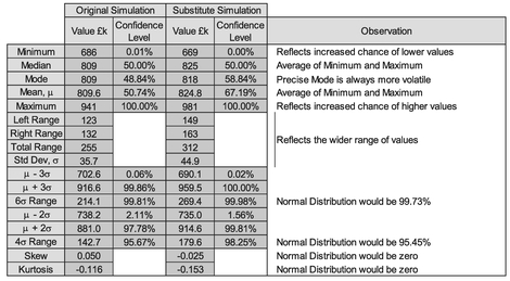
Table 3.8 Comparison of Two Monte Carlo Simulations with Inappropriate Substituted Distributions (2)
We can conclude from this that there is no way of telling from the output distribution whether we have chosen the right input variable’s distributions of uncertainty as it will always be generally Normalesque, i.e. bell-shaped and symmetrical, where we are aggregating costs or time. (This may not be the case when we use Monte Carlo in other ways, for instance when we consider risk and opportunity ... we’ll be coming to those soon.)
In order to make an appropriate choice of distribution where we don’t know the true distribution then we should try to keep it simple, and ask ourselves the checklist questions in Table 3.9. For those of us who prefer diagrams, these are shown in Figures 3.26 and 3.27 for basic input levels, and system level input variables.
In terms of our ‘best guess’ at Beta Distribution shape parameters (alpha and beta), we can choose them based on the ratio of the Mode’s relative position in the range between the Optimistic and Pessimistic values. (The alpha and beta parameters will always be greater than one.) Typical values are shown in Table 3.10, but as Figure 3.28 illustrates, several Beta Distributions can be fit to pass through the same Start, Mode and Finish points. However, the peakier the distribution is (i.e. greater values of parameters alpha and beta combined), then the more likely it is that the minimum and maximum values will be extreme values and therefore may not be representative of the Optimistic and Pessimistic values intended.
Table 3.9 Making an Appropriate Informed Choice of Distribution for Monte Carlo Simulation

Caveat augur
These checklists decision and flow diagrams are aimed at modelling cost and schedule estimates and should not be construed as being applicable to all estimating and modelling scenarios, where other specific distributions may be more appropriate.

Figure 3.26 Making an appropriate informed choice of Distribution for Monte Carlo Simulation (1)

Figure 3.27 Making an Appropriate Informed Choice of Distribution for Monte Carlo Simulation (2)

Figure 3.28 Three Example Beta Distributions with Common start, Mode and Finish Points

Table 3.10 Choosing Beta Distribution Parameters for Monte Carlo Simulation Based on the Mode
For the Formula-philes: Selecting Beta Distribution parameters based on the Mode
Consider a Beta Distribution with parameters α and β, a start point S and finish point F and a mode, M̂.

… which expresses the Mode as a proportion of the Range of a Beta Distribution as the ratio of the alpha parameter less one in relation to the sum of the two parameters less one each.
In conclusion, if we don’t know what an actual input distribution is, but we have a reasonable idea of the Optimistic, Most Likely and Pessimistic values, then Monte Carlo Simulation will be quite forgiving if we opt for a rather simplistic triangular distribution instead of a Normal or Beta Distribution. It will not, however, be quite so accommodating to our fallibilities if we were to substitute a uniform distribution by a triangular distribution, or use a uniform distribution where the true distribution has a distinct Most Likely value.
3.2 Monte Carlo Simulation and correlation
3.2.1 Independent random uncertain events – How real is that?
If only using Monte Carlo Simulation for modelling cost or schedule was always that simple, i.e. that all the variables were independent of each other. We should really ask ourselves whether our supposedly independent events are in fact truly and wholly independent of each other.
For instance, let’s consider a Design and Manufacture project:
- If the Engineering Department comes up with a design that is difficult to make, then there will be a knock-on cost to Manufacturing
- If Engineering is late in completing their design, or makes late changes at the customer’s request, there is likely to be a knock-on effect to Manufacturing’s cost or schedule
- If Engineering produces a design on time that is easy to make, with no late customer changes, then that doesn’t mean that Manufacturing’s costs will be guaranteed Manufacturing is just as capable as Engineering of making their own mistakes and incurring additional costs
- Changes to the design of systems to incorporate customer changes, or in response to test results, may have an impact on other parts of the engineered design, previously frozen
- Programme Management in the meantime is monitoring all the above and their costs may increase if they have to intervene in order to recover performance issues
In essence there is a ‘soft link’ between various parts of an organisation working together to produce a common output. We can express the degree to which the performance of different parts of the organisation, or the ripple effect of design changes through the product’s work breakdown structure are interlinked by partial correlation. We may recall covering this in Volume II Chapter 5 with the aid of the Correlation Chicken, Punch and Judy and the rather more sophisticated Copulas.
To see what difference this makes let’s consider our previous example from Section 3.1.6 and impose 100% correlation between the ten cost elements in Table 3.2.
Of course, this is an extreme example and it is an unlikely and unreasonable assumption that all the input cost variables are perfectly positively correlated with one another, i.e. all the minima align and all the maxima align, as do all the corresponding confidence levels in-between. However, it serves us at present to illustrate the power of correlation, giving us the result on the right hand side of Figure 3.29; the left hand side represents the independent events view which we generated previously in Figure 3.19. Table 3.11 summarises and compares the key statistics from the two simulations.
The difference in the results is quite staggering (apart from looking like hedgehog roadkill! Note: No real hedgehogs were harmed in the making of this analogy, and I hope you weren’t eating), but when we analyse what we have told our Monte Carlo Model to do, it is quite rational. When we define tasks within a model to be perfectly (i.e. 100%) correlated, we are forcing values to match and team up in the order of their values. This is referred to as Rank Order Correlation, which as we know from Volume II Chapter 5 is not the same generally as Linear Correlation.
This gives us three notable features:

Figure 3.29 Monte Carlo Simulation–Comparison Between Independent and 100% Correlated Tasks

Table 3.11 Comparison of Monte Carlo Simulations with 100% and 0% (Independent) Correlated Events
- It reduces the frequency of central values and increase occurrences of values in the leading and trailing edges … data is squashed down in the middle and displaced out to the lower and upper extremes, i.e. all the low level values are forced to happen together, and the same for all the high level values
- The Monte Carlo Output will be less ‘Normalesque’ in shape and instead will take on the underlying skewness of the input data
- The Monte Carlo minimum and maximum values now coincide with the sum of the input minima and the sum of the input maxima respectively
From a pragmatic perspective the likelihood of our getting a situation where all (or some might say ‘any’) input variables are 100% correlated is rather slim, perhaps even more improbable than a situation in which we have full independence across multiple input variables. In reality, it is more likely that we will get a situation where there is a more of an ‘elastic’ link between the input variables; in other words, the input variables may be partially correlated. Based on the two extremes of our original model (which assumed completely independent events or tasks), and our last example in which we assumed that all the tasks were 100% Correlated, then intuitively we might expect that if all tasks are 50% Correlation with each other, then the range of potential outcomes will be somewhere between these two extremes
For the Formula-phobes: Impact of correlating inputs
The impact of correlating distribution values together is to move them down and out towards the edges. Let’s consider just two input variables. If they are independent, there is a reduced chance of both Optimistic values occurring together, or both Pessimistic values occurring together. As a consequence, we are more likely to get middle range values.

If we set the two variables to be 100% correlated with each other, then all the low-end values will occur together, as will all the high-end values.
There will be no mixing of low and high values which reduces the number of times values occur in the middle range.
of 0% and 100% correlation. Whether it is ‘halfway’ or not remains to be seen, but to some extent it depends on how we construct the model and apply the correlation relationship.
3.2.2 Modelling semi-independent uncertain events (bees and hedgehogs)
Does it really matter if we ignore any slight tendency for interaction between variable values? According to the considered opinion and research of the renowned cost estimating expert Stephen Book (1997), the answer would be a definite ‘Yes’. Whilst he acknowledges that establishing the true correlation between variables is very difficult, he advises that any ‘reasonable’ non-zero correlation would be better (i.e. closer to reality) than ignoring correlation, and by default, assuming it was zero.
As we have already demonstrated, if we have a sufficient (not necessarily large) number of independent cost variables, then the output uncertainty range can be approximated by a Normal Distribution, and that we can measure the variance or standard deviation of that output distribution. Book (1997, 1999) demonstrated that if we were to take a 30-variable model and assume a relatively low level of correlation of 20% across the board, then we are likely to underestimate the standard deviation by about 60% in comparison with a model that assumes total independence between variables. As a consequence, the range of potential outcomes will be understated by a similar amount. Book also showed that the degree of underestimation of the output range increases rapidly with small levels of correlation, but that rate of underestimation growth slows for larger levels of correlation (the curve would arch up and over to the right if we were to draw a graph of correlation on the horizontal access and percentage underestimation on the vertical scale).
Based on this work by Book, Smart (2009) postulated that a background correlation of 20%, or possibly 30%, is a better estimate of the underlying correlation between variables than 0% or 100%, and that the level of background correlation increases as we roll-up the Work Breakdown Structure from Hardware-to-Hardware level (at 20%), Hardware-to-Systems (at 40%) and finally Systems-to-Systems Level integration (at 100%).
Let’s explore some of the options we have to model this partial correlation.
However, in order to demonstrate what is happening in the background with partially correlated distributions, a more simplistic logic using a relatively small number of variables may be sufficient to illustrate some key messages on what to do, and what not do, with our Commercial Off-the-Shelf toolset.
Caveat augur
Whilst it is possible to create a Monte Carlo Simulation Engine in Microsoft Excel with partially correlated variables, it is not recommended that we do this without the aid of a dedicated Monte Carlo Add-in, or instead that we use a discrete application that will interact seamlessly with Microsoft Excel. Doing it exclusively in Microsoft Excel creates very large files, and the logic is more likely to be imperfect and over-simplified.
Unless we skipped over Volume II Chapter 5 as a load of mumbo-jumbo mathematics, we might recall that we defined Correlation as a measure of linearity or linear dependence between paired values, whereas Rank Correlation links the order of values together. From a probability distribution perspective, the latter is far more intuitive than the former in terms of how we link and describe the relationship between two variables with wildly different distributions. This is illustrated in Figure 3.30, in which the left hand graph shows two independent Beta Distributions. By forcing a 1:1 horizontal mapping of the Confidence Levels between the two, we can force a 100% Rank Correlation, but as shown in the right hand graph, this is clearly not a Linear Correlation.
Notes:
- If we took more mapping points between the two distributions then the Linear Correlation would increase as there would be proportionately more points in the central area than in the two extreme tails, giving us a closer approximation to a straight line … but we’ll never get a perfect 100% Linear Correlation.
- The degree of curvature is accentuated in this example as we have chosen oppositely skewed distributions. If the two distributions had had the same positive or negative direction of skew, then the degree of Linear Correlation would increase also.
- For these reasons, we can feel more relaxed about enforcing degrees of correlation between two distributions based on their Rank Correlation rather than Linear Correlation.

Figure 3.30 Enforcing a 100% Rank Correlation Between Two Beta Distributions
Mapping the distribution Confidence levels together in this way seems like a really good idea until we start to think how should we do it when the distributions are only partially correlated? What we want to get is a loose tying together that allows both variables to vary independently of each other but also apply some restrictions so that if we were to produce a scatter diagram of points selected at random between two distributions it would look like our Correlation Chicken example from Volume II Chapter 5. We have already seen in that chapter that the Controlling Partner Technique works well to ‘push’ a level of correlation between an independent and dependent variable, but it doesn’t work with semi-independent variables without distorting the underlying input distributions
Iman and Conover (1982) showed that it is possible to impose a partial rank correlation between two variables which maintains the marginal input distributions. Book (1999) and Vose (2008, pp.356–358) inform us that most commercially available Monte Carlo Simulation toolsets use Rank Order Correlation based on the seminal work of Iman and Conover ... but not all; some Monte Carlo toolsets available in the market can provide a range of more sophisticated options using mathematical Copulas to enable partial correlation of two or more variables (Vose, 2008, p.367). Here, in order to keep the explanations and examples relatively simple, we will only be considering the relatively simple Normal Copula as we discussed and illustrated in Volume II Chapter 5.
In Monte Carlo Analysis, when we pick a random number in the range [0,1] we are in essence choosing a Confidence Level for the Distribution in question. The Cumulative Distribution Function of a Standard Continuous Uniform Distribution is a linear function between 0 and 1 on both scales. In Volume II Chapter 5 we discussed ways in which we can enforce a level of linear correlation between two variables that are linearly dependent on each other. However, when we start to consider multiple variables, we must start to consider the interaction between other variables and their consequential knock-on effects. Let’s look at two basic models of applying 50% correlation (as an example) to a number of variables:
- We could define that each variable is 50% correlated with the previous variable (in a pre-defined sequence). We will call this ‘Chain-Linking’
- We could identify a ‘master’ or ‘hub’ variable with which all other variables are correlated at the 50% level. Let’s call this ‘Hub-Linking’
A Standard Continuous Uniform Distribution is one that can take any value between a minimum of 0 and a maximum of 1with equal probability
Conceptually, these are not the same as we can see from Figure 3.31, and neither of them are perfect in a logical sense, but they serve to illustrate the issues generated. In both we are defining a ‘master variable’ to which all others can be related in terms of their degree of correlation. In practice, we may prefer a more democratic approach where all semi-independent variables are considered equal, but we may also argue that some variables may be more important as say cost drivers than others (which brings to mind thoughts of Orwell’s Animal Farm (1945) in which, to paraphrase the pigs, it was declared that there was a distinct hierarchy amongst animals when it came to interpreting what was meant by equality!).

Figure 3.31 Conceptual Models for Correlating Multiple Variables
3.2.3 Chain-Linked Correlation models
Let’s begin by examining the Chain-Linked model applied to the ten element cost data example we have been using in this chapter. If we specify that each Cost Item in our Monte Carlo Model is 50% correlated to the previous Cost Item using a Normal Copula, then we get the result in Figure 3.32, which shows a widening and flattening of the output in the right hand graph in comparison with the independent events output in the left hand graph. Reassuringly, the widening and flattening is less than that for the 100% Correlated example we showed earlier in Figure 3.29.
In Figure 3.33 we show the first link in the chain, in which we have allowed Cost Item 1 to be considered as the free-ranging chicken, and Cost Item 2 to be the correlated chicken (or chick) whose movements are linked by its correlation to the free-ranging chicken. The left-hand graph depicts the Correlated Random Number generated by the Copula (notice the characteristic clustering or ‘pinch-points’ in the lower left and upper right where the values of similar rank order have congregated … although not exclusively as we can see by the thinly spread values in the top left and bottom right corners). This pattern then maps directly onto the two variables’ distribution functions, giving us the range of potential paired values shown in the right hand graph of Figure 3.33, which looks more like the Correlated Chicken analogy from Volume II Chapter 5.
Figure 3.34 highlights that despite the imposition of a 50% correlation between the two variables, the input distributions have not been compromised (in this case Uniform and PERT-Beta for Cost Items 1 and 2 respectively). As Cost Item 1 is the Lead Variable, the values selected at random are identical to the case of independent events, whereas for Cost Item 2, the randomly selected values differ in detail but not in their basic distribution, which remains a PERT-Beta Distribution.
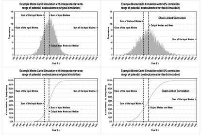
Figure 3.32 Example of 50% Chain-Linked Correlation Using a Normal Copula

Figure 3.33 Chain-Linked Output Correlation for Cost Items 1 and 2
The net effect on the sum of the two variables is to increase the likelihood of two lower values or two higher values occurring together, and therefore decrease the chances of a middle range value to compensate, as shown in Figure 3.35.
This pattern continues through each successive pairing of Chain-Linked variables.

Figure 3.34 Impact of Chain-Linked Correlation on ‘Controlled’ Variable Value
In Table 3.12 we have extracted the Correlation Matrix which shows that indeed each pair in the chain (just to the right or left of the diagonal, is around the 50% correlation we specified as an input (which must be re-assuring that we have done it right). Normally, the diagonal would say 100% correlated for every variable with itself. For improved clarity, we have suppressed these here.) Perhaps what is more interesting is that if we step one more place away from the diagonal to read the Correlation between alternate links in the chain (e.g. first and third or second and fourth) we get a value around 25%. Some of us may be thinking that this is half the value of the chain, but it is actually the product of the adjacent pairs, in this case 50% of 50%.
As we look further away from the diagonal the level of ‘consequential’ correlation diminishes with no obvious pattern due to the random variations. However, there is a pattern, albeit a little convoluted; it’s the Geometric Mean of the products of the preceding correlation pairs (above and to the right if we are below the diagonal, (or below and to the left if we are above the diagonal) as illustrated in Figure 3.36, for a chain of five variables in four decreasing correlation pairs (60%, 50%, 40%, 30%).
Commercially available Monte Carlo Simulation applications are likely to create an error message in these circumstances.
It would also seem to be perfectly reasonable to expect that if we were to reverse the chain sequence then we would get the same Monte Carlo Output. However, in our

Figure 3.35 Impact of Chain-Linked Correlation on Sum of Variable Values

Table 3.12 Monte Carlo Output Correlation with 50% Chain-Linked Input Correlation

Figure 3.36 Generation of a Chain-Linked Correlation Matrix
Resist the temptation to close the chain and create a circular correlation loop. This is akin to creating a circular reference in Microsoft Excel, in which one calculation is ultimately dependent on itself.
Commercially available Monte Carlo Simulation applications are likely to create an error message in these circumstances.
example if we were to reverse the linking and use Variable 10 as the lead variable, we would get the results in Figure 3.37 and Table 3.13, which is very consistent with but not identical to that which we had in Figure 3.32. This is due to the fact that we are allowing a different variable to be the lead and the difference is within the variation we can expect between any two Monte Carlo Simulation iterations. The reason for this difference is that we are holding a different set of random values fixed for the purposes of the comparison.

Figure 3.37 Example of 50% Chain-Linked Correlation Where the Chain Sequence has been Reversed
There may be a natural sequence of events that would suggest which should be our lead variable. However, as we will have spotted from this example, chain-linking correlated variables in this way does not give us that background correlation that Smart (2009) recommended as a starting point for cost modelling. Perhaps we will get better luck with a Hub-Linked Model?

Table 3.13 Output Correlation Matrix where the Chain-Link Sequence has been Reversed
3.2.4 Hub-Linked Correlation models
Now let’s consider Hub-Linking all the Cost Items to Cost Item 1 (the Hub or Lead Variable). As we can see from the hedgehog plot on the right in comparison with the Mohican haircut on the left of Figure 3.38, Hub-Linked Correlation also widens the range of potential output values in comparison with independent events. A quick look back at Figure 3.32 tells us that this appears to create a wider range of potential outcomes than the Chain-Linked model example.

Figure 3.38 Example of 50% Hub-Linked Correlation
Table 3.14 reproduces the Cross-Variable Correlation Matrix (again with the diagonal 100% values suppressed for clarity). Here we can see that each variable is close to being 50% correlated with Hub Variable 1, but the consequence is that all other variable pairings are around 25% correlated (i.e. the square of the Hub’s Correlation; we might like to consider this to be the ‘background correlation’).
Notes:
- 1) We instructed the model to use a 50% Rank Correlation. Whilst the corresponding Linear Correlation will be very similar in value it will be slightly different. If we want the Output Linear Correlation to be closer to the 50% Level we may have to alter the Rank Correlation by small degree, say 51%.
- 2) If we were to use an input Rank Correlation of 40%, the background correlation would be in the region of 16%
Let’s just dig a little deeper to get an insight into what is happening here by looking at the interaction between individual pairs of values. Cost Items 1 and 2 behave in exactly the same way as they did for Chain-Linking where Cost Item 1 was taken as the Lead Variable in the Chain (see previous Figures 3.33, 3.34 and 3.35). We would get a similar set of pictures if we look at what is happening between each successive value and the Hub Variable. If we compare the consequential interaction of Cost Items 2 and 3, we will get the ‘swarm of bees’ in Figure 3.39. We would get a similar position if we compared other combinations of variable values as they are all just one step away from a Hub-Correlated pair … very similar to being two steps removed from the Chain-Link diagonal.
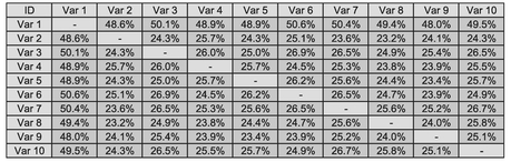
Table 3.14 Monte Carlo Output Correlation with 50% Hub-Linked Input Correlation
However, you may be disappointed, but probably not surprised, that if we change the Hub Variable we will get a different result, as illustrated in Figure 3.40 in comparison with previous Figure 3.38. (In this latter case, we used Cost Item 10.) On the brighter side, there is still a broader range of potential model outcomes than we would get with independent events. However, it does mean that we would need to be careful in picking our Hub variable. In the spirit of TRACEability (Transparent, Repeatable, Appropriate, Credible and Experientially-based), we should have a sound logical reason, or better still evidence, of why we have chosen that particular variable as the driver for all the others.

Figure 3.39 Consequential Hub-Linked Correlation for Cost Items 2 and 3

Figure 3.40 Example of 50% Hub-Linked Correlation Using a Different Hub Variable
Again, using a simple Normal bi-variate Copula as we have here to drive correlation through our model using a specified Lead or Hub-variable, does not give us a constant or Background Isometric correlation across all variables … but it does get us a lot closer than the Chain-Linked model.
3.2.5 Using a Hub-Linked model to drive a background isometric correlation
Suppose that we find that our chosen Monte Carlo application works as it does for a Hub-Linked model, and we want to get a background Correlation of a particular value, here’s a little cheat that can work. Again, for comparison we’ll look at achieving a background correlation of around 50%. We’ll reverse engineer the fact that the Hub-Linked model above created a consequential correlation equal to the square of the Hub-based Correlation.
- Let’s create a dummy variable with a uniform distribution but a zero value (or next to nothing, so that its inclusion is irrelevant from an accuracy perspective)
- Use this dummy variable as the Hub variable to which all others are correlated … but at a Correlation level equal to the square root of the background correlation we want. In this case we will use 70.71% as the square root of 50%
When we run our simulation, we get an output similar to Figure 3.41 with a Correlation Matrix as Table 3.15.
Just to wrap this up, let’s have a look in Figure 3.42 at what our background Isometric Correlation of 25% looks like using this little cheat:
- 25% is midway in the starting correlation of 20% to 30% as recommended by Smart (2009), which in turn was based on the on observations made by Book (1997, 1999)
- The Square Root of 25% is 50%, which is what we will use as the correlation level for our Dummy Hub variable
3.2.6 Which way should we go?
The answer is ‘Do not build it ourselves in Microsoft Excel.’ The files are likely to be large, unwieldly and limited in potential functionality. We are much better finding a Commercial Off-The-Shelf (COTS) Monte Carlo Simulation tool which meets our needs. There are a number in the market that are or operate as Microsoft Excel Add-Ins, working seamlessly in supplementing Excel without the need for worrying whether our calculations are correct. There are other COTS Monte Carlo Simulation tools that are not integrated with Microsoft Excel but which can still be used by cutting and pasting data between them.
How these various toolsets ‘push’ correlation through the model is usually hidden under that rather vague term ‘proprietary information’ but in the views of Book (1999) and Vose (2008) many of them use the algorithms published by Iman and Conover (1982). We should run a few tests to see if we get the outputs we expect:

Figure 3.41 Using Hub-Linked Correlation with a Dummy Variable to Derive Isometric Correlation

Table 3.15 Monte Carlo Output Correlation with 50% Isometric Hub-Linked Input Correlation
- Some toolsets allow us to view the Output Correlation Matrix. Does it give us what we expect?
- If a Correlation Matrix is not a standard output, can we generate the correlation between any pairs of variables generated within the model, and plot them on a scatter diagram?

Figure 3.42 Using Hub-Linked Correlation with a Dummy Variable to Derive 25% Isometric Correlation
- Try to replicate the models in this book to see whether we get outputs that are compatible with the Chain-Linked, Hub-Linked or Background Isometric Models.
- Check what happens if we reverse a Chain-Linked model. Does it maintain a consistent output?
Let’s compare our three models of Correlation and draw out the differences (Table 3.16). Based on the three Correlation Matrices we have created we would expect that there was a progressive movement of each model away from total independence to total correlation … and not to be disappointed, we have that. (Don’t tell me you were all thinking that I was going to disappoint you?) The range and standard deviation of the potential outcomes all increase relative to the model to the left. The Mean and the Median remain relatively unfazed by all the correlation going on around them. The 4σ range of a Normal Distribution would yield a Confidence Interval of 95.45%. Our models get less and less ‘Nor-malesque’ as we move from left to right, becoming slightly more positively skewed (Skew > 0) and less peaky or more platykurtic (Excess Kurtosis < 0) than a Normal Distribution.
Of one thing we can be sure, whatever model of correlation we choose it will only ever be an approximation to reality, as a result we should choose a model that we can support rationally under the spirit of TRACEability. With this in mind we may want to consider defining the level of Correlation as an Uncertainty Variable itself and model it accordingly. (We could do this, but are we then not at risk of failing to make an informed judgement and passing the probability buck to a ‘black box’?)

Table 3.16 Comparison of Chain-Linked, Hub-Linked and Background Isometric Correlation Models
3.2.7 A word of warning about negative correlation in Monte Carlo Simulation
Until now we have only been considering positive correlation in relation to distributions, i.e. situations where they have a tendency to pull each other in the same direction (low with low, high with high.) We can also in theory use negative correlation in which the distributions push each other in opposite directions (low with high, high with low.)
As a general rule, ‘Don’t try this at home’, unless you have a compelling reason!
It is true that negative correlation will have the opposite effect to positive correlation where we have only two variables, forcing a Monte Carlo Simulation inwards and upwards, but it causes major logical dilemmas where we have multiple variables as we inevitably will have in the majority of cases.
Caveat augur
Think very carefully before using negative correlation, and if used, use them sparingly.
Chain-Correlation between pairs of variables push consequential correlation onto adjacent pairs of variables based on the product of the parent variables’ correlations. This may create unexpected results when using negative correlation.
We can illustrate the issues it causes with an extreme example, if we revisit our Chain-Linked Model but impose a 50% Negative Correlation between consecutive overlapping pairs, (Var 1 with Var 2, Var 2 with Var 3 etc.), giving us an alternating pattern of positive and negative correlated pairs, similar to Table 3.17.

Table 3.17 Monte Carlo Output Correlation with 50% Negative Chain-Linked Input Correlation
3.3 Modelling and analysis of Risk, Opportunity and Uncertainty
In Section 3.1.3 we defined ‘Uncertainty’ to be an expression of the lack of sureness around a variable’s value that is frequently quantified as a distribution or range of potential values with an optimistic or lower end bound and a pessimistic or upper end bound.
In principle all tasks and activities will have an uncertainty range around their cost and/or the duration or timescale. Some of the cause of the uncertainty can be due to a lack of complete definition of the task or activity to be performed, but it also includes allowance for a lack of sure knowledge in terms of the level of performance applied to complete the task or activity.
Some tasks or activities may have zero uncertainty, for example a fixed price quotation from a supplier. This doesn’t mean that there is no uncertainty, just that the uncertainty is being managed by the supplier and a level of uncertainty has been baked into the quotation.
There will be some tasks or activities that may or may not have to be addressed, over and above the baseline project assumptions; these are Risk and Opportunities. In some circles Risk is sometimes defined as the continuum stretching between a negative ‘Threat’ and a positive ‘Opportunity’, but if we were to consult authoritative sources such as the Oxford English Dictionary (Stevenson & Waite, 2011), the more usual interpretation has a negative rather than a positive connotation. As we can surmise, this is another of those annoying cases where there is no universally accepted definition in industry. For our purposes in the context of this discussion, we shall define three terms as follows:
Definition 3.2 Risk
A Risk is an event or set of circumstances that may or may not occur, but if it does occur a Risk will have a detrimental effect on our plans, impacting negatively on the cost, quality, schedule, scope compliance and/or reputation of our project or organisation.
Definition 3.3 Opportunity
An Opportunity is an event or set of circumstances that may or may not occur, but if it does occur, an Opportunity will have a beneficial effect on our plans, impacting positively on the cost, quality, schedule, scope compliance and/or reputation of our project or organisation.
Definition 3.4 Probability of Occurrence
A Probability of Occurrence is a quantification of the likelihood that an associated Risk or Opportunity will occur with its consequential effects.T
Within a single organisation it would be hoped that there would be a consistent definition in use, but when dealing with external organisations (or people new to our organisation) it is worth checking that there is this common understanding.
Using the terms as they are defined here, if a Risk or an Opportunity does occur then it will generally have an associated range of Uncertainty around its potential impact. The thing that differentiates the inherent uncertainties around Risks and Opportunities that may arise, and those around the Baseline Tasks, is that the former has an associated Probability of Occurrence that is less than 100%; Baseline Tasks have to be done.
Each Baseline task or activity has a Probability of Occurrence of 100%, i.e. it will happen but we cannot be sure what the eventual value will be.
In the same way, if the Risk or Opportunity does happen, then we are unlikely to know its exact impact, hence the uncertainty range.
If the Risk or Opportunity does not occur, then there is no uncertainty; the associated value is zero.
Performing an analysis of the Risks, Opportunities and Uncertainties on a project, or programme of projects, is an important element of risk management, but it is often also wider than risk management in that risk management processes in many organisations tend to concentrate on Risks and their counterparts (Opportunities), and the Uncertainties around those, but unfortunately, they often ignore the Uncertainties in the Baseline task. Such Uncertainty still needs to be managed; in fact we can go a step further and say that from a probabilistic perspective Risks and Opportunities should be modelled in conjunction with the Uncertainty around the Baseline task as a single model as they are all part of the same interactive system of activities and tasks within a project. (Here, we will not be addressing risk management techniques per se, but will be looking at the use of Monte Carlo Simulation to review the total picture of Risks, Opportunities and Uncertainties.)
That said, there will be occasions where we want to model Risk and/or Opportunities in isolation from the general Uncertainties in the Baseline assumption set. If we are doing this as part of a wider risk management activity to understand our exposure, then this is quite understandable and acceptable. However, in order that we understand the true impact on cost or schedule or both, then we must look at the whole system of Risks, Opportunities, Baseline tasks and all the associated Uncertainties ‘in the round’ to get a statistically supportable position.
We will return to this point in Section 3.3.2.
3.3.1 Sorting the wheat from the chaff
Our Definitions of Risk, Opportunity and Uncertainty may seem very ‘black or white’ but in reality, when we come to apply them we will find that there are areas that can be described only as ‘shades of grey’.
Let’s consider the simple task of the daily commute to work through rush-hour traffic. Suppose this tortuous journey has the following characteristics:
- 1) We usually travel by the same mode of road transport (car, bus, bicycle, motor-bike etc.)
- 2) We usually set off at around the same time in the morning
- 3) The shortest route is 15 miles and we normally take around 40 minutes to do the journey depending on traffic and weather. (Why are you groaning? Think yourself lucky; some people’s journeys are much worse!)
- 4) There are ten sets of traffic lights, but no bus lanes or dual occupancy lanes (whoopee, if you’re in a car! Boo, if you are in a bus, taxi or on a bicycle)
- 5) There are limited opportunities for overtaking stationary or slow-moving traffic, and then that depends on whether there is oncoming traffic travelling in the opposite direction
- 6) If we get delayed, then we start to encounter higher volumes of traffic due to the school run. (Lots of big 4x4 vehicles looking for somewhere safe to park or stop – I couldn’t possibly comment!)
- 7) On occasions, we might encounter a road accident or a burst water pipe in the road
Does that sound familiar? Let’s analyse some of the statements here, and whether we should treat them as Baseline Uncertainty, Risk or Opportunity:
- The use of the words ‘usually’ and ‘normally’ in (2) and (3) implies that there is uncertainty, or a lack of exactness
- Traffic lights in (4) could be interpreted as ‘may or may not’ be stopped, which we could interpret as a Risk because a red (or amber) light may or may not occur. However, the same could be said of a green light in that it may or may not occur. In this instance as it must be either one of two outcomes (stop or continue), so we are better treating this as uncertainty around the Baseline task of passing through the lights. This is one of those ‘shades of grey’ to which we referred
- In (5), the word ‘Opportunity’ is casually thrown in as it can easily be misinterpreted and used in a wider sense than is intended by our Definition 3.3. For instance, we may have an Opportunity to use a motorbike instead of a car, allowing us to overtake more easily. However, in that context, there is no real ‘may or may not’ chance probability here, it is more likely to be a digital decision: we decide from the outset whether to use a motorbike or a car … unless we find that the car is difficult to start, in which case, we have our ‘may or may not’ element that would constitute an opportunity of using a motorbike. However, here in the context of ‘opportunities’ in (5) and driving a car, we are better interpreting this as being an integral part of the Optimistic range of values
- Similarly, in (6), the use of ‘if’ suggests that there is an element of ‘may or may not’ occur. It seems to be hinting at potential positive correlation between events, but in most practical circumstances we can allow this just to be covered by an extended range of pessimistic values
- The clue in (7) that these are risks are the words ‘on occasions we might’. There is a definitive ‘may or may not’ aspect to these, which if they occur, will create delays in excess of our normal range of travel time Uncertainty
Most of us will have spotted that there is no clear Opportunity in our list as we have defined it. This is because they are often harder to identify than Risks. A possible Opportunity here could be:
We know that there is an alternative shorter route we can take to work which passes the site of a major employer in the area. The route is normally very busy, so we avoid it. We may hear on the local radio that traffic is lighter than usual on this route as the threatened industrial action at the plant is going ahead as last-minute talks had failed to reach a compromise. There is a definitive ‘may or may not’ here (or in this case ‘hear’) that creates the opportunity for reducing our travel time. We may or may not hear the local Traffic News on the radio before we reach the point where the two routes divide.
Let’s look at an example of the ‘shades of grey’ we were talking about:
We have already highlighted that the traffic lights (4) fall into this category. In (3) we mention that the journey time can vary depending on the weather. There will always be weather of some description, but extreme weather conditions (in the UK at least) are quite rare. For instance, blizzards and hurricane force winds affecting major towns and cities are quite rare from a probabilistic perspective and are likely only to affect travel at certain times of the year. Even if it were to affect us only once or twice a year, this would be less than a 1% probability. We could model this as a positively-skewed peaky Beta Distribution. Alternatively, we could model it as a Triangular Distribution with a truncated but realistic pessimistic journey time based on typical poor weather for the area and consider the extreme weather conditions as something that may or may not occur – in other words, as a Risk.
Consistency is the key in these situations, and we need to ensure when we ‘sentence’ our assumptions and variables appropriately and that the decisions we make are recorded accordingly in the Basis of Estimate (BoE). It might help if we think of this as the ECUADOR technique
Exclusions, Constants, Uncertainties, Assumptions, Dependencies, Opportunities and Risks
An Assumption is something that we take to be true (at least for the purpose of the estimate) which has either an associated value that is taken as a Constant or has a value that is Uncertain.
Something that may or may not happen is a Risk or an Opportunity. Some Risks can be avoided or mitigated by Excluding them or placing a Dependency on an external third party. Similarly, some Opportunities can be promoted by placing a Dependency on an external third party.
Assumptions lead us to specify Constants and Uncertainties.
Risks and Opportunities may be mitigated by Dependencies or Exclusions, which in turn revises our list of Assumptions.
3.3.2 Modelling Risk Opportunity and Uncertainty in a single model
In order to model Risks and Opportunities in our Monte Carlo Simulation we need to add an input variable for each Probability of Occurrence. (For fairly obvious reasons we won’t be abbreviating this to PoO!) To this variable we will invariably assign a Bernoulli Distribution – or a Binary ‘On/Off’ Switch (see Volume II Chapter 4). With this distribution we can select values at random so that for a specified percentage of the time, we can expect the distribution to return 100% or ‘On’ value, and the remainder of the time it will return 0% or ‘Off’ value.
Rather than think that we need to have an additional variable for Risks and Opportunities it is more practical to use the same Probability of Occurrence variable for modelling Baseline Uncertainty too. In this case, the Probability of Occurrence will always take the value 100%, i.e. be in a state of ‘Always On’.
Let’s illustrate this in Table 3.18 by looking back to our simple cost model example from Table 3.2 in Section 3.1.6 to which we have added a single high impact risk (just so that we can see what happens to our Monte Carlo Plot when we add something that may or may not happen). For now we will assume the background Isometric Correlation of 25% as we had in Figure 3.42 and add a single Risk with 50% Probability of Occurrence and a Most Likely impact of £ 350 k, an optimistic impact of £ 330 k and a pessimistic value of £ 400 k (in other words a BIG Risk). We will assume a Triangular Distribution for the Risk.
Such is the nature of Monte Carlo Simulation and the slight variances we get with different iterations or runs, the less meaningful it is to talk about precise output values. From now on we will show the Monte Carlo Out as more rounded values (in this case to the nearest £ 10 k rather that £ 1 k. So … no more hedgehogs! (Sorry if some of us found that statement upsetting; I meant it from a plot analogy point of view, not from an extinction perspective.)
Running our model with this Risk produces the somewhat startling result in Figure 3.43, which shows that our fairly Normalesque Output plot from Figure 3.42 has suddenly turned into a Bactrian Camel. (Yes, you got it, I’m a man of limited analogy.)
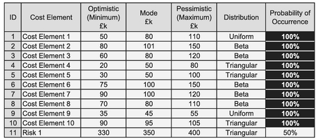
Table 3.18 Monte Carlo Input Data with a Single Risk at 50% Probability of Occurrence

Figure 3.43 25% Isometric Correlation Across Baseline Activities Plus One 50% High Impact Risk
However, if we think of it rationally, it is quite easy to understand what is going on here – it’s all a question of Shape Shifting!
- Half the time the Risk does not occur, which gives us the same output shape and values as we had in Figure 3.42 … but with only half the frequency (left hand hump).
- The other half of the time we get that same shape repeated but with an additional cost value of between £ 330 k and £ 400 k when the Risk occurs … the shape shifts to the right.
- The knock-on effect to the cumulative Confidence Levels gives us a double S-Curve. As this does not actually go flat at the 50% Level it confirms that two humps do in fact overlap slightly in the middle.
We still have the contraction or narrowing of the potential range but for emphasis we have shown the sum of the Input Minima without the Risk but included the Risk in the sum of the Input Maxima.
If our Risk had only had a probability of occurrence of some 25%, then we would still have the same degree of Shape Shifting, but the first hump would be three times as large as the second. In other words, 75% of the time in our random simulations the Risk does not occur and 25% of the time it does. Figure 3.44 illustrates this; the lower

Figure 3.44 25% Isometric Correlation Across Baseline Activities Plus One 25% High Impact Risk
Caveat augur
Note that we have elected not to correlate the Uncertainty around the Risk variable here with any other variable.
If we were to decide to do this (and we have that option) then we should ensure that we are correlating the input distributions prior to the application of the Probability of Occurrence rather than afterwards.
If we have a 10% Risk or Opportunity, then 90% of the time the final output value will be zero.
graph confirms that the first hump accounts for 75% of the random occurrences and the remainder are accounted for by the second hump when the Risk occurs.
It would be a very rare situation that we only had a single Risk to worry about. In fact, it would be bordering on the naïve. Let’s see what happens when we add a second Risk at 50% Probability. This time we will define a PERT-Beta Distribution with a range from £ 240 k to £ 270 k around a Most Likely of £ 250 k. Again, we have deliberately exaggerated these values in relation to the Baseline Task to highlight what is happening in the background, as we show in Figure 3.45. (It resembles something of a rugged mountain terrain.)

Figure 3.45 25% Isometric Correlation Across Baseline Activities Plus Two 50% High Impact Risks
The upper graph shows the standard Monte Carlo Output; the lower graph attempts to explain what is happening within it. It divides into four quarters from an output frequency perspective:
- 25% of the time neither risk occurs
- 25% of the time Risk 1 occurs but Risk 2 does not
- 25% of the time Risk 2 occurs but Risk 1 does not
- 25% of the time both risks occur
Each Risk has its own spread of Uncertainty which occurs at random to the Uncertainty ranges around the Baseline tasks but we can verify the approximate position of the second Mode quite simply. (For correctness, we really should be considering the effects of the distribution Means and not the Modes, but Modes are often more accessible for quick validation.):
- Baseline Task Central Value occurs around £ 800 k
- We would expect the Nominal Mode for Risk 1 to occur £ 350 k to the right of the Baseline Task Central Value, i.e. £ 800 k + £ 350 k = £ 1,150 k
- Similarly, we can expect the Nominal Mode for Risk 2 to occur in the region of £ 250 k to the right of the Baseline Task Central Value, i.e. £ 800 k + £ 250 k = £ 1,050 k
- When both risks occur, we can expect the peak to occur some £ 600 k (sum of the two Risk Modes) to the right of the Baseline Central Value, i.e. £ 800 k + £ 600 k = £ 1,400 k. The ultimate peak occurring some £ 300 k to the right of the Baseline Task Central Value can be rationalised as the offset based on the weighted average of the two Risks occurring independently. In this case the weighted average is the simple average of £ 350 k and £ 250 k)
If we had Opportunities instead of Risks, then the principle would be the same only mirrored with the offset being to the left of the baseline condition. Don’t forget that we need to enter opportunities as negative costs!
Just think how complicated it gets with several Risks and Opportunities all switching in and out in differing random combinations. (The good news is that Monte Carlo can cope with it even if we just shake our heads and shiver.)
Let’s look at an example, using our same simple cost model to which we have added four Risks and one Opportunity, as shown in Table 3.19. This gives us the output in Figure 3.46. (We’re sticking with the 25% Isometric Correlation.)
As we can see all the risk effects appear to have blurred together in this case (no obvious ‘camelling’ this time), and gives an apparent shift to the right in relation to the output for the Baseline activities alone, shown as a dotted line. (Another case of shape shifting, although there is also a good degree of squashing and stretching going on as well.)
We said earlier that Risks, Opportunities and Baseline task Uncertainties are all part of a single holistic system and should be modelled together … but sometimes modelling

Table 3.19 Monte Carlo Input Data with Four Risks and One Opportunity
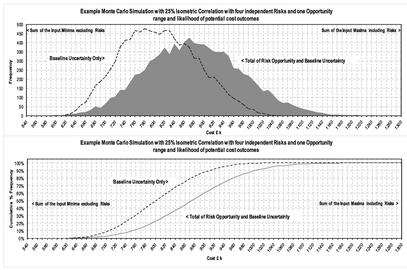
Figure 3.46 25% Isometric Correlation Across Baseline Activities with Four Risks and One Opportunity

Figure 3.47 Monte Carlo Output for Four Independent Risks and One Opportunity (not Baseline Tasks)
Risks and Opportunities separately from Baseline uncertainties can help us to understand what the ‘Background Risk’ is, and which risks we simply cannot ignore as background noise – the so-called low probability, high impact risks that we will discuss in Section 3.3.5 on ‘Dealing with high probability Risks’. We may indeed choose to ignore them as a conscious deliberate act, but it shouldn’t be left as a by-product of, or as ‘collateral damage’ from a full statistical analysis.
Figure 3.47 illustrates that by modelling all the Risks and Opportunities in isolation from the Baseline tasks we can begin to understand the key interactions by looking at the combinations of Most Likely Values of the Risks and Opportunities. We have highlighted some of the possible combinations as an example. Assuming that we are working in a risk-sharing environment between customers and contractors then, as it stands with this model, we would probably want to cover the main ‘humps’ in the profile. From a risk protection perspective, if we are the producer or contractor, we may want to choose a Risk Contingency of some £ 140 k depicting the 90% Confidence Level. However, this may make us uncompetitive, and from a customer perspective it may be unaffordable or unpalatable; the customer may wish to see a 50:50 Risk Share of some £ 64 k. Incidentally, the overall average simulated value of the four Risks and one Opportunity is £ 71.8 k (as indicated on the graph), whereas the Mode or Most Likely value is zero.
Note that the probability of all four Risks occurring simultaneously is very small … the last hump is barely perceptible. (It’s in the ‘thickness of a line’ territory.)
We’ll get back to choosing an appropriate confidence level in Section 3.5 after we have discussed a few more issues that we may need to consider.
3.3.3 Mitigating Risks, realising Opportunities and contingency planning
It is not uncommon in some areas to refer to the product of the Most Likely Value of a Risk and its Probability of Occurrence as the Risk Exposure:
Risk Exposure = Most Likely Risk Impact x Probability of Occurrence
We should point out that this can be assumed to include the equivalent negative values for Opportunities. This is not always the case.
It may be more useful, however, if we were to compare each individual Risk Exposure with the total of the absolute values (ignoring the signs) of all such Risk and Opportunity Exposures, giving us a Risk & Opportunity Ranking Factor for each Risk:
Our argument to support this differentiation is that if the Risk occurs, we are exposed to its full range of values. If it doesn’t occur, there will be no impact, no exposure. It is really just a question of semantics, but regrettably this factoring of the Most Likely Risk Impact by the Risk’s Probability of Occurrence is sometimes used as the basis for calculating a contribution to a Risk Contingency, as we will discuss in Chapters 4 and 5. (As you can probably tell, I’m not a fan of this technique.) However, the Risk & Opportunity Ranking Factor can be a useful measure in helping us to prioritise our Risk Mitigation and Opportunity Promotion efforts. (Note that the word ‘can’ implies that this is not always the case!)
The need to be competitive and to be affordable prompts us to look at ways we can ensure that some of our Risks are mitigated or that our Opportunities are promoted or realised. This usually requires us to expend time, effort and resources (and therefore cost) in order to increase or reduce their impact or increase or reduce the likelihood of their arising, depending on whether we are thinking of opportunities or risks. We have to invest to make a potential saving.
To help us make the appropriate decision on where we might be better concentrating our thoughts and efforts, we might want to consider the following using Table 3.20.
- By digitally de-selecting one Risk or Opportunity at a time, we can perhaps see where we should prioritise our efforts.
- We can begin with the Risk or Opportunity which has the highest absolute Risk and Opportunity Ranking Factor (i.e. ignoring negative signs created by Opportunities) and assess the overall impact on the Risk Profile if we can mitigate that ‘largest’ risk or promote the largest opportunity.
- Figure 3.48 gives an example of Mitigating Risk 1 which had an assumed Probability of Occurrence of some 67%. What it doesn’t show is the cost of mitigation, i.e. the investment which will have to be included in a revised list of Baseline tasks when we run our new overall Monte Carlo Simulation of Risk Opportunity and Uncertainty combined.
Here, if we were to mitigate Risk 1, the resulting Risk Profile would suggest that there was now a 47% chance that we would not be exposed to further risk impact. That sounds like a good decision, but potentially, this could give us a real problem if we are in an environment in which it is custom and practice to have a 50:50 Risk Share with a customer or client, based blindly on Monte Carlo Simulation Confidence Levels, then:
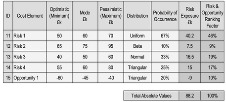
Table 3.20 Risk Exposure and Risk and Opportunity Ranking Factor

Figure 3.48 Monte Carlo Output Post Mitigation of Risk 1
- A revised 50% Confidence Level of around £ 10 k, which would be woefully inadequate to deal with any of the remaining risks unless we can use it to mitigate them fully or promote the realisation of the opportunity.
- It could lead to inappropriate behaviours such as not mitigating the Risk to ensure a better 50:50 contingency arrangement with a customer!
However, suppose in that situation, prior to any mitigation activity we had a discussion (that’s a euphemism for negotiation) with the customer/client, and that we were offered a Risk Contingency of some £ 64 k, being approximately the 50% Confidence Level for the Risks and Opportunities shown in Figure 3.48. Furthermore, let’s assume that this Contingency is there also to fund any Risk Mitigation activities on the basis that any Risk Mitigation and Opportunity Promotion should be self-funding in terms of what they are trying to avoid or realise.
We can show (Figure 3.49) from our Monte Carlo Model that there is an almost 60% chance that a maximum of only one Risk, i.e. including the probability that no Risks occur. (We have not included the opportunity here.)
Armed with this knowledge, should any one of our Risks occur (and assuming that none of the budget has been spent on mitigation or promotion) then what can we say about a level of contingency set at £ 64 k?

Figure 3.49 Monte Carlo Simulation of Number of Risks Likely to Occur
- It adequately covers the pessimistic range of Risk 1, which has the greatest probability of occurring, with a little left over for other risk mitigation or opportunity promotion. We might conclude that this supports a 50:50 Risk Sharing culture
- £ 64 k is woefully inadequate for Risk 2 … even for the optimistic outcome. Perhaps this is where we would be better investing our time and resource into mitigation activities. (It’s going to hurt if it happens, exceeding our 50:50 Risk Share budget and suggesting that a 50:50 Risk Share based purely on Monte Carlo Confidence Levels alone can be somewhat delusional)
- It should cover Risk 3 comfortably as it did for Risk 1 but not if Risk 1 also occurs. Risk 3 is the second most probable to occur and is ranked second using the Risk & Opportunity Ranking Factor
- In terms of Risk 4, the contingency just about covers the range of values less than the Median, given that the Median is between the Mode at £ 60 k and the Mean at £ 65 k
- The Opportunity can boost our Risk Contingency. Let’s hope it occurs to allow us to increase our Contingency to cover Risk 2
Using this analytical thought process and the profile in Figure 3.47, we may conclude that a Contingency of around £ 87 k would be more appropriate in order to cover Risk 2 should that be the ‘one’ to arise, or perhaps around £ 65 k plus the cost of mitigating Risk 2.
Some organisations choose to allocate a Risk Contingency Budget to individual Risks. In this case we would probably allocate it all to Risk 1 (and keep our fingers crossed that none of the others occur). There is a misconception by some, however, that Monte Carlo Simulation will enable us to identify a Contingency for each risk, implying an Expected Value Technique that we will discuss in Section 3.6, which as we can see is somewhat less meaningful when used blindly in the context of Contingency planning.
3.3.4 Getting our Risks, Opportunities and Uncertainties in a tangle
Suppose we were to treat a Baseline Uncertainty as one Risk and one Opportunity rather than as a continuous single variable. Does it matter?
Let’s return to our example of a daily commute to work. Let’s suppose that we are not on flexible working times and are expected to begin our shift by a certain time. We might say:
- There is a Risk that we will be late caused by our setting off later than we would consider to be ideal
- … but, there is an Opportunity that we will be early for work as a result of our setting off earlier than we normally need
For the Formula-phobes: Splitting Baseline Uncertainty into a Risk and Opportunity pair
Consider a Triangular Distri-bution. Let’s split the triangle into two right-angled triangles by dropping a line from the Apex to the Base. The left hand triangle has an area of L% and the right hand triangle has an area of R%. The sum of the two areas must equal the original 100%.

We can consider the left hand triangle as an Opportunity to outturn at less than the Most Likely value with a probability of occurrence of L%. Conversely, the right hand triangle can be thought of as a Risk of being greater than the Most Likely value with a probability of occurrence of R%. However, the two cannot both occur at the same time so any model would have to reflect that condition, i.e. the probability of being less than the Most Likely is the probability of not being greater than the Most Likely (R% = 1 – L%).
For the Formula-philes: Splitting Baseline Uncertainty into a Risk and Opportunity pair
Consider a Triangular Distribution with a range of a to b and a mode at m̂. Consider also two right-angled triangular distributions with a common Apex and mode at m̂ such that the range of one is between a and m̂, and the range of the other is between m̂ and b.

… which expresses the area of the two right-angled triangles in relation to the proportion of their respective bases to the whole.

Table 3.21 Swapping an Uncertainty Range with a Paired Opportunity and Risk Around a Fixed Value

Figure 3.50 Swapping an Uncertainty Range with an Opportunity and a Risk Around a Fixed Value
Equally we could just define our start time as a Baseline variable with an Uncertainty range that spans the range of setting off early through to setting off late, with our Most Likely value being our Normal Setting-off Time.
Let’s apply this in our Cost Model example and see what happens. Suppose we replace our Uncertainty range around Cost Element 5 with two right-angled Opportunity 2 and Risk 5 Triangular Distributions as shown in Table 3.21. Cost Element 5 is now assumed to have a fixed value of £ 50 k.
Now let’s play a game of ‘Spot the Difference’ in Figure 3.50.
To be honest it isn’t much of a game as there are only two differences:
- Our perception of the range of Baseline Uncertainty is narrower and peakier in the lower graph (i.e. where we have taken Cost Element 5 to be a fixed value, and treated its Uncertainty Range as an Opportunity and a Risk)
- The title of the lower graph has been changed
The more important overall view of Risk Opportunity and Uncertainty is exactly the same in the two graphs, which should give us a nice warm feeling that Monte Carlo Simulation can be somewhat flexible or ‘forgiving’ if we don’t differentiate between Risks and Baseline Uncertainties ‘cleanly’ … so long as we don’t forget to consider whether there is a corresponding Opportunity for each Risk.
This leads nicely to the next section …
3.3.5 Dealing with High Probability Risks
The natural consequence of being able to substitute a Baseline Uncertainty by a corresponding Risk and Opportunity pairing allows us to deal with High Probability Risks or Opportunities differently. For instance, with a High Probability, High Impact Risk, it may be better to assume that the implied effect will occur and therefore include it within the Baseline tasks, and to look at the small complementary probability that it doesn’t happen, as an Opportunity (i.e. Complementary Probability = 100% – Probability.)
The only thing that will change in the output from our Monte Carlo Modelling will be our perception of the Baseline Activity. For example, consider a Risk such as the following:
- Optimistic, Most Likely, Pessimistic range of £ 80 k, £ 100 k, £ 150 k
- 80% Probability of Occurrence
This can be substituted by a Baseline Activity with the same range of Uncertainty plus an Opportunity:
- Optimistic, Most Likely, Pessimistic range of -£ 150 k, -£ 100 k, -£ 80 k. (Remember that Opportunities must be considered as negative Risks from a value perspective, acting to reduce cost or schedule duration)
- 20% Probability of Occurrence (i.e. the complementary probability of 80%)
Note that as well as the Probability of Occurrence of the Opportunity being the complement of that for the Risk, the sequence and skew of the Opportunity is the reverse of that of the Risk!
Caveat augur
It is very important that we interpret the output from any Monte Carlo Simulation rather than proceed with blind faith in its prophecy. It will perform the mathematics correctly, but when it comes to Risk and Opportunities … things that may or may not happen … then care must be taken to ensure that we are not setting ourselves up for a fall. This is true in a general sense but it is especially so where we have Low Probability High Impact Risks, …. or as we will term them here, ‘Extreme Risks’. Just because something is unlikely to occur, it doesn’t mean that it won’t.
Beware of the False Prophet from Monte Carlo. Interpret its prophecy wisely.

Table 3.22 Residual Risk Exposure
Similarly, if we were to identify an Opportunity with a high Probability of Occurrence, we can also assume that it will occur but that there will also be a Risk that we will fail to realise the benefit.
3.3.6 Beware of False Prophets: Dealing with Low Probability High Impact Risks
Let’s return to the question of using Risk Exposures as we discussed in Section 3.3.3. Let’s extend the thinking to cover the Residual Risk Exposure and define that to be the Risk Exposure that is not covered by a Factored Most Likely Impact Value:
Residual Risk Exposure = Most Likely Impact x (100% — Probability of Occurrence)
We can use this then to identify Extreme Risks and allows us then to consider our strategy in dealing with them as illustrated in Table 3.22.
The natural extension to the previous situation of a High Probability High Impact Risk is to consider how we might deal with a Low Probability High Impact Risk, i.e. where we would have a Very High Residual Risk Exposure if we were to rely on a Factored Contingency Contribution. The clue to this answer is in Section 3.3.3.
The issue that these types of Risk create can be summarised as follows:
- The low probability, high impact values in Monte Carlo Simulations are character-ised by a long trailing leg in the Monte Carlo Output with little elevation in relation to the ‘bulk’ of the output
- If we ignore these Risks by accident (and this is easy to do if we are not looking for them) then the consequence of their coming to fruition can be catastrophic
- If w e ignore these Risks consciously (on the misguided basis that they will be covered by a general Risk Contingency) then the consequence of their coming to fruition can be catastrophic as any Contingency is very likely to be inadequate (High Residual Risk Exposure)
- If we assume that the Risk will occur then we will be fundamentally changing our perception of the Baseline task. This may make us unaffordable or uncompetitive. We should also include a complementary Opportunity at 95% Probability that the activity will not be required
- If we choose to exclude the Risk from our Estimate (like the Ostrich burying its proverbial head in the sand), then it does not make the Risk go away. If it is formally excluded from a contractual perspective, then it just passes the Risk on to the Customer or Client; again, it doesn’t go away. This then needs to be followed up with a joined up adult conversation with the customer as this may be the best option for them, the argument being that:
- If we were to include the Risk then we would have to do so on the basis of (iv), and the customer will be paying for it whether or not it occurs
- If we were to exclude it and the customer carries the Risk, then the customer would only pay for it if the Risk were to occur
- The only additional cost to the customer w ould be if we were to be able to identify an appropriate Mitigation Plan or Strategy in the future, which by implication may need some level of investment
Let’s look at the issues using our Cost Model Example. This time we add an extra Risk with a High Impact and Low Probability:
- Optimistic, Most Likely, Pessimistic Range of £ 200 k, £ 220 k, £ 270 k with a Triangular Distribution
- 5% Probability of Occurrence
- The Residual Risk Exposure (based on Most Likely value) is £ 209 k which is some 25%+ of the Baseline Mean of £ 809 k
In Figure 3.51 the upper graph is a copy of Figure 3.47 but with an extended bottom axis to take account of the Extreme Risk. At first glance we might be fooled into thinking that there is no difference, but on closer inspection we can just detect that the peak of the mole hill in the lower graph with the Extreme Risk is slightly less than that in the upper graph which excluded the Extreme Risk. There is a slight extension to the trailing edge, but this is very difficult to see.
The Skew and Excess Kurtosis statistics do not really help us either. We may recall from Volume II Chapter 3 (unless we passed on that particular statistical delight) that Skewness is a measure of the degree to which a distribution has a leading or trailing edge relative to its Arithmetic Mean, and Excess Kurtosis measures the degree of ‘Peakedness’ relative to the overall range of values. We might expect that an Extreme Risk increases the positive skewness and the Excess Kurtosis (as the range increases). Well that does happen here, but not to the extent that it would start alarm bells ringing for us as both values including the Extreme Risk are fairly low, i.e. less than one.

Figure 3.51 Extreme Risks are Difficult to Spot and Easily Overlooked
Pearson-Fisher Skewness Coefficient measures the difference in left and right hand ranges relative to the Arithmetic Mean. Some definitions of Skewness are more conveniently expressed in relation to the Median (see Volume II Chapter 3).
However, if we temporarily set aside the dominant Baseline tasks and just look at the Risks and Opportunities, before and after we add the Extreme Risk, then we can see the effects of the Extreme Risk a little more clearly in the lower graph of Figure 3.52 (if we squint a little), almost like distant headland further down the coast. (That’s almost poetic; let’s hope we don’t get all misty eyed; some of us have got that glazed look again already!) Even now the impact of the Extreme Risk could be easily overlooked as ‘noise’.
However, whilst the change in the degree of Skewness is not insignificant, the impact on the Excess Kurtosis is an order of magnitude different. An Excess Kurtosis greater than 1 should prompt us to look at our Risk Profile more closely. We may then see that distant headland on the coast even if we had missed it on our first visual inspection. The smaller the Probability of Occurrence and the greater the impact, then the greater the Excess Kurtosis will be.

Figure 3.52 Extreme Risks are Easier to Spot in the Context of Risks and Opportunities Only
Just to emphasise how easy it is to overlook or dismiss the Extreme Risk, Figure 3.53 compares the Output Confidence Levels of four variations of our cost model. Reading from left to right:
- Baseline tasks only (no Risks or Opportunities)
- Baseline tasks plus Risks and Opportunities EXCLUDING the Extreme Risk
- Baseline tasks plus Risks and Opportunities INCLUDING the Extreme Risk
- Baseline tasks plus Risks and Opportunities PLUS the Extreme Risk included as a Baseline task (i.e. assuming that we can neither mitigate it nor negotiate its exclusion from the contract, so we assume that it will occur?)
If we are honest with ourselves, at first glance we would probably make a very similar recommendation on an estimate value based on the middle two profiles. We wouldn’t feel comfortable reading simply from the left hand line. No-one in their right minds would take the right hand line … at least not until we had explored all the options to mitigate it, which includes that difficult adult conversation with the customer/client.
We could say that the principles outlined here apply equally to Extreme Values of Opportunity. Theoretically this is true, but pragmatically it is much less evident due to the natural positive Skewness of cost and elapsed time as we discussed in Section 3.1.7.

Figure 3.53 Impact of Extreme Risks on Cost Model Confidence Levels
3.3.7 Using Risk or Opportunity to model extreme values of Uncertainty
Based on our discussion in Section 3.3.4, we can choose to segregate extreme values of Baseline Uncertainty from the values that are more pragmatic considerations from an estimating or scheduling perspective. However, from our deliberations in Section 3.3.6, we may conclude ‘What’s the point … they are not going to show up anyway in any materially significant way!’ The point is that it allows us to remove the extremes from our consideration … or better still identify them so that they can be mitigated in some way, without us having to place restrictions on the more general range of values (some might say that is just being realistic, but ‘being pragmatic’ is nearer the truth). We may then choose to insure ourselves from some of the extremes and their consequential detrimental effects. It also enables us to avoid some endless (and to some degree pointless) arguments about whether something is a Risk or just a Baseline Uncertainty.
Talking of ‘whether or not’, let’s consider the example of the weather. (Was that you groaning, or just your stomach rumbling?) We will always have weather, so that implies that it should be treated as a Baseline Uncertainty, but different extremes of weather could be considered depending on the time of year as Risks or Opportunities. For instance:
A word (or two) from the wise?
'Augustine's Law of Amplification of Agony: One should expect that the expected can be prevented, but the unexpected should have been expected'
Norman R Augustine
Law No XLV
1997
- What is the chance of snow in summer in the south of England?
- Very, very small, we would probably agree; yet it snowed in London on 2nd June 1975 (I was there! I thought I was delusional, that my Maths Exams had finally got to me! Check it out with your favourite Internet Search Engine, if you don’t believe me. )
- How many construction projects at the time had it included as a Risk with potentially disruptive effects? (It’s a rhetorical question, to which I don’t know the answer but I assume it to be a round number … 0 .)
By considering, and excluding these extremes of Uncertainty we will not be creating a model with any greater degree of statistical relevance, but we can use these thought processes to place practical limits on what is and is not included. It highlights some things that we need to mitigate that otherwise we don’t expect to happen. Augustine’s Law of Amplification of Agony (1997, p.301) warns us against that particular folly.
3.3.8 Modelling Probabilities of Occurrence
In the majority of cases, the Probability of Occurrence used is a subjective estimate; one of those created using an Ethereal Approach, often (although not always) using a Trusted Source Method to ‘come up with’ a Most Likely value of the Probability of Occurrence. In other words, it is largely guesswork, and at best, a considered opinion. It may cross our minds that we should really model it as a variable with an Uncertainty Range somewhere between zero and 100%.
Let’s see what happens if we were to assume that the Probability of Occurrence should be modelled as a PERT-Beta Distribution between 0% and 100%, with a Mean Value based on the Single-point Deterministic value which we would choose using the Ethereal Approach and Trusted Source Method as the ‘typical’ practice. The results are shown in Figures 3.54 and 3.55.
Figure 3.54 looks at the impact on the Overall Risk and Opportunities, and we would probably conclude that it makes very little difference to the outcome. Figure 3.55 confirms our suspicions from a cumulative confidence level perspective. Our conclusion therefore must be ‘Why bother with the extra work?’ Needless to say ( but I’ll write it anyway ), the impact on the Confidence Levels of the overall Risk, Opportunity and Uncertainty Model will similarly be negligible. From this we might take three messages:
- Modelling Probabilities of Occurrence with an Uncertainty Range rather than a Single-point Deterministic value, will give us the ‘same result’ as the modelling with discrete single-point values, provided that …

Figure 3.54 Impact of Modelling Probabilities of Occurrence with Uncertainty Distributions (1)
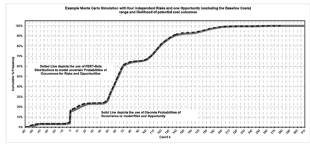
Figure 3.55 Impact of Modelling Probabilities of Occurrence with Uncertainty Distributions (2)
- 2. The Probability of Occurrence for any Risk or Opportunity reflects the Mean Probability for each and not the Most Likely. See Volume II Chapter 4 on the relationships between Mean and Mode for a range of commonly used Distributions.
- 3. If we truly believe that our discrete Probability of Occurrence is the Most Likely probability, then we should adjust it for modelling purposes to reflect the 5M’s as for modelling purposes it will either be under or overstated.
If we choose to model the Probabilities of Occurrence for Risks and Opportunities, then we must ensure that the Distribution parameters assume that the equivalent Single-point Deterministic values that are typically used represent the Mean values, and not the Most Likely values, which may be our more intuitive starting point.
The net result will be that the effective Probabilities of Occurrence used in the model will be greater than the Most Likely if it is less than 50%, or less than the Most Likely if it is greater than 50%. In other words, modelling returns the effective mean probability, and therefore a single-point deterministic estimate of the Probability of Occurrence should likewise reflect the Mean probability and not the Most Likely.
For the Formula-phobes: Mean in relation to the Mode and Median
Recall the 5M Rule of Thumb from Volume II Chapter 2, the sequence of Mode, Median, Mean changes depending on the direction of skew in our data.


As a consequence, any assumption of the Probability of Occurrence we use should be the Mean value and not the Most Likely. The average of the Random Samples from a Distribution will be approximately equal to the Mean of the Distribution (if the sample size is large enough).
Some organisations’ response to this is to limit the range of Probabilities used to a discrete set of values which are aligned with a qualitative assessment/judgement of the Likely Occurrence, as illustrated in the example in Table 3.23. Each organisation will assign the values pertinent to them, and may have a different number of categories.
Table 3.23 Example Probabilities Aligned with Qualitative Assessments of Risk/Opportunity Likelihood
| Qualitative Assessment of Likelihood | Probability of Occurrence Used | Implied Range |
|---|---|---|
| Very Low | 5% | < 10% |
| Low | 20% | 10% to 30% |
| Medium | 40% | 30% to 50% |
| High (more likely to occur than not) | 65% | 50% to 80% |
| Very High (consider moving to Baseline) | 90% | > 80% |
3.3.9 Other random techniques for evaluating Risk, Opportunity and Uncertainty
There are other random sampling techniques that can be used to create views of potential outcomes for Risks, Opportunities and Uncertainties such as Latin Hypercube Sampling (LHS) and Bootstrap Sampling techniques.
Don’t panic! We’re not going through any of these in detail … you’ve suffered enough already as it is!
These techniques are usually only appropriate where we have access to specialist software to support us. Here we will just give an outline of how they differ from Monte Carlo Simulation (just in case the name crops up and you think ‘Mmm, what’s that?’).
Latin Hypercube Sampling (LHS)
LHS is sometimes packaged with Monte Carlo Simulation software applications and therefore becomes an accessible option. It puts greater emphasis on the ‘tails’ of the model than we would get through the more commonly used Monte Carlo Simulation. It does this by dividing each variable’s range of potential values into intervals of equal probability, e.g. 10 10% or 20 5% intervals. (It assumes the same number of intervals for each variable.)
To help us understand how LHS works, let’s first consider the simple model of a Latin Square which has only two variables. A Latin Square is an arrangement of symbols such that each symbol appears once, and only once, in each row and column. For instance, if each variable’s values are divided into tertile confidence intervals of nominally 0%–33%, 33%–67%, 67%–100%, we can draw 12 Latin Squares, as illustrated in Figure 3.56. For the two variables, each Latin Square allows us to draw three unique samples, although it can be argued that from a sampling perspective if we were to interchange B and C we would duplicate half the combinations. (Note that the left hand six sets of three samples are equivalent to the right hand six sets if we do this.) In this way we can select 18 unique Latin Square samples for two variables with three tertile confidence intervals.
A Latin Hypercube extends this concept into multiple dimensions. As the number of variables and quantile confidence intervals we choose for each variable increases, so too does the number of unique sample combinations available to us. The Latin Hypercube then forces samples to be taken in the extreme lower and upper ranges of each variable that may otherwise be missed by pure random sampling.
Bootstrap Sampling
Any organisation only has access to a limited amount of data in any real detail, typically its own data based on its experiences and performance. Typically it does not have access to all the detail history of relevant data performed by other organisations in the wider population. There are Software Applications that can be purchased or licensed that come packaged with databases, but these are often limited in the level of detail that can be accessed by the user.

Figure 3.56 3x3 Latin Square Sampling Combinations for Three Confidence Intervals
Typically used in conjunction with rather than a replacement for Monte Carlo Simulation, Bootstrap Sampling allows us to choose random samples from an empirical distribution rather than a known or assumed (and theoretically perfect) distribution. As the number of data points available to us is often limited, the Bootstrap Technique requires us to select sample points at random, record them and then throw them back in the pot to be picked again. Statisticians refer to this as ‘Sampling with Replacement’.
To some of us this may sound like a slightly dubious practice, picking data from what may be quite a limited sample. To others amongst us it may make absolute sense to limit our choice to the evidence we have rather than assume or imply a theoretical distribution which may or may not in reality be true, as it is only testing assumptions about what the sample distribution is.
Let’s see how it works, and what the implications might be.
Take an example of rolling a conventional six-sided die. Let’s suppose that after 25 rolls, we’ve had enough (not the most stimulating exercise we’ve had, was it?) and our results of our endeavours are shown in the left hand graph of Figure 3.57. There appears to be a bias to the lower three numbers (60%) compared with the upper set of three. We would have expected a more even or uniform distribution but either:
- We haven’t rolled the die enough – our sample size is too small
- The die is loaded – it is biased towards the lower numbers
We don’t know which is true, but we will use the Bootstrap Sampling technique to get a sample distribution for the sum of adding together the faces of two such dice. If we were to use Monte Carlo Simulation to generate a sample size of 1,080 based on this empirical distribution for one die, we would get the distribution shown in the middle graph of Figure 3.57. For reference, we have superimposed the theoretical Geometric Distribution on the graph also as a dotted line, and in the right hand graph we have shown the more widely used Random Sampling for the Theoretical Distribution.
Whilst the results are not as convincing as we might wish them to be, it does appear to be making some compensation for the imperfect empirical distribution sample, and as such it is better than a ‘guess’ and at least supports our TRACEability objective.

Figure 3.57 Example of Bootstrap Sampling with a Small Empirical Distribution
Expert Judgement
Now the cynics amongst us will probably be saying that the Expert Judgement Technique should fall into this category of ‘other random techniques’ as it requires guesswork by the Expert. To an extent this is true but it is not entirely random. If the person providing that input is truly an expert, then that person’s experience and knowledge will narrow the range of potential values into something that is credible … let’s call that ‘educated guesswork’.
If we are truly uneasy with using that technique, then we can always ask that expert to provide a lower and upper bound on the Most Likely value provided. Alternatively, we can always ask other Experts for their valued opinions as well. We can always use a pseudo-Delphi Technique to refine their thoughts:
- Ask them to provide their views independently at first (using the same brief)
- Sit them round the table and ask them to explain their thinking and/or opinion to the other experts to see if they can influence each other to their way of thinking
- When they have finished their discussion, use the output as the basis for a range estimate
We can build on this to create an improved profile of how the underlying probability distribution might look, by layering the ranges from each Subject Matter Expert (SME) to create a crude histogram as illustrated in Figure 3.58.
3.4 ROU Analysis: Choosing appropriate values with confidence
There a number of ways in which we can choose a value from the range of potential values we can create from a Risk Opportunity and Uncertainty Analysis:
- We could take a structured, reasoned approach to selecting a value based on the scenario in question using all available information
- We could take the average of all the values in our Monte Carlo Model
- We could ask our granny to pick a number from 1 to 100, and use that to denote the Confidence Level we are going to use from our Monte Carlo Model Output
Well, perhaps not the last one, it’s not repeatable unless we know that granny always picks her favourite lucky number, in which case we should have known before we asked. As for the second option, it would appear to follow the spirit of TRACEability but it presupposes that Monte Carlo Simulation is always right and dismisses any other approach. (We’ll get back to that point very shortly.)
Let’s take the first option and look at all the information we have to hand, not least of which is that we should not be overly precise with the value we choose as our ‘answer’ or recommendation. We’ll be using the same Cost Model that we used in Section 3.3 as our example.

Figure 3.58 Layering Delphi Technique Expert Range Estimates
The intuitive reaction from many of us may be to dismiss the Top-down Approach out of hand as too simplistic, too pessimistic etc. After all, the Bottom-up Approach is more considered, and more detailed, and as the saying goes, ‘The devil is in the detail!’ … well, actually, in this case the devil is NOT in the detail because …
3.4.1 Monte Carlo Risk and Opportunity Analysis is fundamentally flawed!
That got you attention, didn’t it? However, it wasn’t just a shock tactic, it is in fact true when it comes to a Risk and Opportunity Analysis of cost and schedule.
Monte Carlo Simulation is a beautiful elegant statistical technique (OK, I’ll seek therapy) but it is fundamentally flawed in that it is almost always incomplete. We can illustrate this quite simply by considering the 2x2 ‘Known-Unknown Matrix’ shown in Table 3.24.
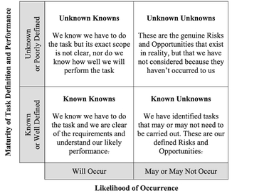
Table 3.24 The Known Unknown Matrix
The ‘Unknown Unknowns’ are those Risks (or potentially Opportunities) that we haven’t considered. Our failure to identify them doesn’t make them any less real, or less likely to occur, but it does imply that our view of Risks and Opportunities is incomplete. In other words, a 50% Confidence Level in Monte Carlo Simulation is only the 50% Level based on what we have included in our model and not the 50% Level of the true total. As we have already discussed, due to the natural Skewness in our cost or time data, the Unknown Unknown Risks will quite naturally outweigh any Unknown Unknown Opportunities. The same is true for any other Bottom-up Technique. Donald Rumsfeld’s 2002 perspective on this is an often-cited quotation.
A word (or two) from the wise?
'There are known knowns. These are things we know that we know. There are known unknowns. That is to say, there are things that we now know we don't know. But there are also unknown unknowns. These are things we do not know we don't know.'
Donald Rumsfeld
United States Secretary of Defense
DoD news briefing
12 February 2002
As a consequence, any Monte Carlo Simulation of Cost or Schedule that purports to consider Risks and Opportunities, is inherently optimistically biased, and therefore is fundamentally flawed, not in terms of what it includes but the fact that it is inherently incomplete; it provides a ‘rose-tinted glasses’ perspective on life.
Note: We are not talking about Risks or Opportunities that we have consciously excluded and documented as such, just the ones that we haven’t considered, or perhaps have dismissed out of hand and not bothered to record.
We can always revisit our list of Risks and Opportunities using a Checklist (as we will discuss for the Top-down Approach in Section 4.1.3) to see whether there are any that we have overlooked … but it will always be prone to being imperfect. Table 3.25 summarises how the Known-Unknown Matrix relates to Monte Carlo Simulation Models in respect of Baseline Tasks, Risks, Opportunities, and the associated ranges of Uncertainties.
Armed with this awareness we have a choice.
A word (or two) from the wise?
'To know that we know what we know, and that we do not know what we do not know, that is true knowledge,'
Confucius
Chinese Philosopher
551-479 BC
- Dismiss Monte Carlo Simulation as a mere Confidence Trick (Surely you saw that one coming?)
- Make appropriate adjustment or allowance to how we interpret its output for the Unknown Unknowns
The second option is the more useful … but how do we make that adjustment, and to what extent?
The simplest way is to read a higher Confidence Level from our Monte Carlo Output to compensate for the understatement, but by how much? Having done all the detail analysis, we shouldn’t just leave this final decision down to guesswork. It would be better to make an informed judgement based on an alternative Approach, Method or Technique. (Enter Stage Left – the ‘Slipping and Sliding Technique’ as one such way of making an informed, auditable and repeatable decision. We will be discussing this in Chapter 4.)

Table 3.25 The Known Unknown Matrix–Monte Carlo View
Despite this fundamental drawback, Monte Carlo Simulation is still worth doing. However, we should note that it is essential that we have a robust Risk and Opportunity Register on which to base it. Consequently, early in a project, when the Risk and Opportunity Register is somewhat less mature, we should always look to other techniques to validate our conclusions.
3.5 Chapter review
Well, hasn’t this chapter been fun? (It was a rhetorical question!) We began with a very brief history of Monte Carlo Simulation and where it might be useful to the estimator. It can be used to model a whole variety of different situations where we have a number of variables with a range of potential values that could occur in different combinations. Monte Carlo Simulation is simply a structured technique of using multiple random numbers to generate a not-so-random but stable and consistent profile of the range of potential outcomes. This range is narrower than we would get by simply summating the Optimistic and Pessimistic values, which is down to the probabilistic scenario that not all the good things in life will happen together, nor will all the bad things; it’s more of a mixture of the good and the bad together, giving us a result somewhere in the middle. We confirmed that for cost and schedule variables, despite the input variable distributions being skewed (usually positively), the output distribution can usually be approximated by a Normal distribution. However, in other situations the output will not necessarily be ‘Normalesque’ (remember the example of the anomalous heights of school children!). One of the most common uses for Monte Carlo Simulation in estimating is to assess the impact of Risk, Opportunity and Uncertainty.
We demonstrated that we don’t have to get the input distributions precisely correct to get a valid Output Distribution; Monte Carlo Simulation is very forgiving … so long as we get the basic distribution shapes correct, and we don’t need to be too precise either; Monte Carlo is a model of accurate imprecision!
However, we also learnt that in many cases when we are considering cost or schedule, we cannot assume that all the input variables are totally independent of each other. Research has shown that a background correlation in the region of 20% to 30% is a more reasonable assumption than total independence. This has the effect of widening the output distribution, pushing down in the middle and outwards to both sides. We then went on to explore different options we can assume in ‘pushing’ correlation into a model across all its variables such as Chain-Linking and Hub-Linking.
Monte Carlo Simulation is often used to model Risks, Opportunities and Uncertainties. These are consequences that may or may not arise, but if they do, they are either detrimental or beneficial respectively. In order to model Risks and Opportunities we need to add a variable for the Probability of Occurrence for each Risk or Opportunity. The effects of this will tend to create models that are less Normalesque, and could indeed be quite markedly positively skewed due to the effects of Risks and Opportunities ‘switching on and off’ in the modelling process. Whilst we can model Risk and Opportunities independently of the Baseline tasks to understand the interaction of these, it is essential that the final Monte Carlo Simulation includes all Risks, Opportunities and Baseline task Uncertainties as a single model as they exist together in a single interactive system.
One of the dangers of Monte Carlo Simulation is that we put too much blind faith in the numbers that it generates without thinking about what it is telling us, or is not telling us. It’s not that the way that it does the mathematics, is in any way suspect, but those same calculations do tend to mask the impact of Low Probability, High Impact Risks. Unless we select the very high end of the Confidence Range, then this class of Risks will not be covered by a more competitive output value from the model; there will be a high residual Risk exposure in the event (albeit unlikely by definition) of the Risk occurring. We have to make a conscious decision on whether:
- We can (and therefore should) mitigate the Risk
- Pass the Risk back to the customer/client (i.e. exclude it), who only pays if it occurs
- Assume that the Risk will occur, and include it in the price the customer/client pays regardless (and Risk being unaffordable or uncompetitive)
- Run with the Risk and carry the can if we get unlucky
The major disadvantage in Monte Carlo Simulation for modelling Risk is that we forget that it is fundamentally flawed, and is inherently optimistically biased as it only models the Risks and Opportunities that we have thought about; it does not take account of Risks that we have not considered … the Unknown Unknowns!
Now was that chapter as exciting and inspiring for you as it was for me? A case of real Monte Carlo Stimulation! (You didn’t think I’d let that one go unsaid, did you?)
References
Augustine, NR (1997) Augustine’s Laws (6th Edition), Reston, American Institute of Aeronautics and Astronautics, Inc.
Book, SA (1997) ‘Cost Risk Analysis: A tutorial’, Risk Management Symposium sponsored by USAF Space and Missile Systems Center and The Aerospace Institute, Manhattan Beach, 2 June.
Book, SA (1999) ‘Problems of correlation in the Probabilistic Approach to cost analysis’, Proceedings of the Fifth Annual U.S. Army Conference on Applied Statistics, 19–21 October.
Iman, RL & Conover, WJ (1982) ‘A distribution-free approach to inducing rank order correlation among input variables’, Communications in Statistics – Simulation and Computation, Number 11, Volume 3: pp.311–334.
Metropolis, N & Ulam, S (1949) ‘The Monte Carlo Method’, Journal of the American Statistical Association, Volume 44, Number 247: pp.335–341.
Orwell, G (1945) Animal Farm, London, Secker and Warburg.
Peterson, I (1997) The Jungles of Randomness: A Mathematical Safari, New York, John Wiley & Sons, p.178.
RCPCH (2012a) BOYS UK Growth Chart 2–18 Years, London, Royal College of Paediatrics and Child Health.
RCPCH (2012b) GIRLS UK Growth Chart 2–18 Years, London, Royal College of Paediatrics and Child Health.
Rumsfeld, D (2002) News Transcript: DoD News Briefing – February 12th, Washington, US Department of Defense [online] Available from: http://archive.defense.gov/Transcripts/Transcript.aspx?TranscriptID=2636 [Accessed 13/01/2017].
Smart, C (2009) ‘Correlating work breakdown structure elements’, National Estimator, Society of Cost Estimating and Analysis, Spring, pp.8–10.
Stevenson, A & Waite, M (Eds) (2011) Concise Oxford English Dictionary (12th Edition), Oxford, Oxford University Press.
Vose, D (2008) Risk Analysis: A Quantitative Guide (3rd Edition), Chichester, Wiley.