
In This Chapter
Displaying histograms and area graphs
Making use of pie charts and three kinds of boxplots
Using dual-axis charts to combine variables with different ranges
SPSS has a number of ways to present data graphically; depending on the characteristics of your data, some graphs are more appropriate than others. Chapter 10 provides an overview of some more common graph types; this chapter discusses some lesser-known ones. Every example in these two chapters is as simple as possible to present a general idea of the types of charts you can choose. To use one with your data, you start by choosing a basic form and then continue by setting options to extend the form so it displays the information in the way that works best for your purposes. The Element Properties window, which appears automatically every time you generate a new chart, provides every possible option that applies to the chart you're building.
Tip
When you use Chart Builder, it's completely safe to drag and drop any variables you want to see in your graph; if the variable won't make sense there, the drop will fail. SPSS does you the kindness of figuring out what will and won't work. Also, no matter what you try to do while building a graph, your data will never be hurt.
A histogram represents the number of items that appear within a range of values (or within a bin, statistically speaking — see Chapter 7). You can use a histogram to look at a graphic representation of the frequency distribution of the values of a variable. Histograms are useful for demonstrating the patterns in your data when you want to display information to others rather than discover data patterns for yourself.
You can use the following steps to create a simple histogram that displays the number of automobiles (in the survey used in the example) that have particular gas mileage capabilities for each of several years:
Choose File
Open Data and open the
Cars.savfile, which is in the SPSS installation directory.Choose Graphs
Chart Builder.The Chart Builder dialog box appears.
In the Choose From list, select Histogram.
Drag the first graph diagram (the one with Simple Histogram tooltip) to the panel at the top of the window.
In the Variables list, do the following:
Select the Model Year variable and drag it to the X-Axis rectangle in the panel.
Select Miles Per Gallon and drag it to the Count rectangle on the left side of the panel.
Click the OK button.
The histogram shown in Figure 11-1 appears.
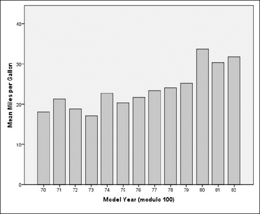
Figure 11.1. A histogram displaying the number of cars with various gas mileage values in each year.
The graph in Figure 11-1 looks like a bar chart, but it isn't. The height of each bar does not represent the mean or an average — the height is determined by the largest value.
Tip
The meaning of a graph of this sort is not intuitive; you may want to add a note explaining what it means.
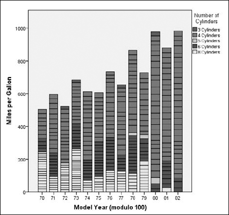
You can create a histogram that is more like a bar chart. In a stacked histogram, the overall extent of the bars represents the sum of the values in each category, and different categories of a third variable are indicated by displaying portions of the bars in different colors.
In this type of histogram, the scale on the left can be used to gauge the relative sizes of each of the colored segments of a bar. The overall height of each bar is the sum of the miles per gallon in each model year (as it would be in a bar chart). Here each bar is a stack of rectangles, each one representing a portion of the total number of cars — in this case, cars with a certain number of cylinders. The following steps produce a stacked histogram displaying the same information as shown in the preceding simple histogram, but this one displays sums instead of means:
Choose File
Choose Graphs
Chart Builder.In the Choose From list, select Histogram.
Drag the second graph diagram (the one with the Stacked Histogram tooltip) to the panel at the top of the window.
In the Variables list, do the following:
Select the Model Year variable and drag it to the X-Axis rectangle.
Select Miles Per Gallon and drag it to the Count rectangle on the left side of the panel.
Select Number of Cylinders and drag it to the Stack Set Color rectangle, at the upper right.
Click the OK button.
The histogram shown in Figure 11-2 appears.
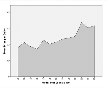
A frequency polygon is a histogram that looks like an area graph (described in the next section) — but it is a histogram, so it works differently. It represents the number of items that appear within a range. The following steps guide you through a procedure that produces a frequency polygon histogram:
Choose File
OpenData and open theCars.savfile.Choose Graphs
Chart Builder.In the Choose From list, select Histogram.
Drag the third graph diagram (the one with the Frequency Polygon tooltip) to the panel at the top of the window.
In the Variables list, do the following:
Select the Model Year variable and drag it to the X-Axis rectangle in the panel.
Select Miles Per Gallon and drag it to the Mean rectangle.
This is the rectangle that was originally called the Y-Axis.
Click the OK button.
The histogram shown in Figure 11-3 appears.
A population pyramid provides an immediate comparison of the number of items that fall into categories. It is called a pyramid because it often takes a triangular shape — wide at the bottom and tapering to a point at the top. The following steps can be followed to build an example pyramid histogram chart:
Choose File
OpenData and open theEmployee data.savfile, which is in the SPSS installation directory.Use the tab to switch to Variable View.
Select the Type column of the
bdatevariable.Click the button that appears near the variable type name, which is
Date.In the list of date formats, choose
mmm yyand then click the OK button.This is a matter of personal preference. The chart is produced no matter which format is used to display the dates, but I think this format looks better than most of the others.
Choose Graphs
Chart Builder.In the Choose From list, select Histogram.
Drag the fourth graph diagram (the one with the Population Pyramid tooltip) to the panel at the top of the window.
In the Variables list, do the following:
Click the OK button.
The chart shown in Figure 11-4 appears.
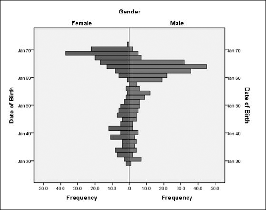
You can create pyramid histograms based on categorical variables with three, four, or more values. The plot produced will consist of as many pairs as needed (and even a single-sided pyramid for one category, if necessary) to display bars that show the relative number of occurrences of different values in the categories.
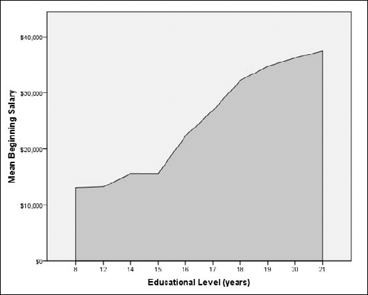
An area graph is really a line graph, or a collection of line graphs, with the areas below the lines filled in to represent the mean of one or more values at the various points.
A simple area graph displays the area below a single line. The following steps produce a simple area graph:
Choose File
OpenData and open theEmployee data.savfile, which is in the SPSS installation directory.Choose Graphs
Chart Builder.In the Choose From list, select Area.
Drag the first graph diagram (the one with the Simple Area tooltip) to the panel at the top of the window.
In the Variables list, do the following:
Select the Educational Level variable and drag it to the X-Axis rectangle.
Select Beginning Salary and drag it to the Count rectangle.
This is the rectangle that was labeled Y-Axis until the X-Axis became defined.
Click the OK button.
The area chart shown in Figure 11-5 appears.
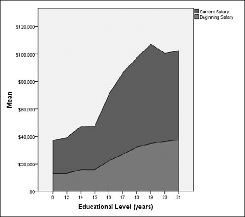
A stacked area chart is a chart with more than one variable being displayed along the X-axis. The values are stacked in such a way that the ups and downs of the lower value in the chart affect the upper values in the chart. That is, the chart is not a group of independent lines; instead, it represents a cumulative total — to which each variable displayed adds a value.
Step 5c of the following procedure can be repeated for the inclusion of two or more variables. They all appear in the legend at the upper right, and each variable provides the value for one layer of the stack.
If you include more than one variable, make sure that the variables you select for stacking have similar ranges of values so the scale on the left side will make sense for all of them. If, for example, one variable ranges into the thousands and the other doesn't go over a hundred, the smaller one will compress itself visually — and come out in the final graph as a line.
Note
When you select multiple variables for stacking, be sure to select them in the order you want them stacked; the first one you select will remain on top. The second one you select will be placed under it, and so on.
Tip
The two types of area charts, simple and stacked, act the same when you construct them. You can select the stacked chart and produce a single-area chart, or you can start with the simple area chart and stack your variables.
Follow these steps to produce a stacked area chart with two stacked variables:
Choose File
Choose Graphs
Chart Builder.In the Choose From list, select Area.
Drag the second graph diagram (the one with the Stacked Area tooltip) to the panel at the top of the window.
In the Variables list, do the following:
Select the Educational Level variable and drag it to the X-Axis rectangle.
Select Current Salary and drag it to the Count rectangle.
This is the rectangle that was originally called the Y-Axis.
Select Beginning Salary and drag it to the plus sign in the Current Salary rectangle.
Be sure to drag it to the plus sign and not simply to the rectangle in general. (The plus sign appears at the top of the rectangle when you drag the new variable's name across it.)
Click the OK button.
The area chart shown in Figure 11-6 appears.
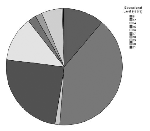
Pie charts are the easiest kind to spot — they are the only charts that show up as circles. The purpose of a pie chart is simply to show how something (the "whole") is divided into pieces — whether two, ten, or any other number. Each slice in the pie chart represents its percentage of the whole. For example, if a slice takes up 40 percent of the total pie, that slice represents 40 percent of the total number. A pie chart is also called a polar chart, so SPSS calls this option Pie/Polar.
In the following steps, you construct a simple pie chart:
Choose File
OpenData and open theEmployee data.savfile, which is in the SPSS installation directory.Choose Graphs
Chart Builder.In the Choose From list, select Pie/Polar.
Drag the pie diagram to the panel at the top of the window.
In the Variables list, drag Educational Level to the Slice By rectangle at the bottom of the panel.
Click the OK button.
The pie chart shown in Figure 11-7 appears.
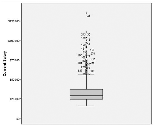
A boxplot uses graphic elements to display five statistics at one time within each categorical value. The statistics are the minimum value, first quartile, median value, third quartile, and maximum value. A boxplot is particularly good for helping you spot values lying well outside the range of normal values.
A simple boxplot displays the range of values of a single scale variable for all values of a categorical variable. The following steps guide you through the creation of a simple boxplot:
Choose File
OpenData and open theEmployee data.savfile, which is in the SPSS installation directory.Choose Graphs
Chart Builder.In the Choose From list, select Boxplot.
Drag the first graph diagram (the one with the Simple Boxplot tooltip) to the panel at the top of the window.
In the Variables list, do the following:
Select the Educational Level variable and drag it to the X-Axis rectangle.
Select the Current Salary variable and drag it to the Y-Axis rectangle.
Click the OK button.
The boxplot shown in Figure 11-8 appears.
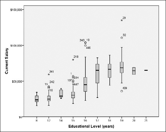
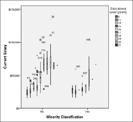
In Figure 11-8, each vertical column of graphics represents all the values for a category. Values beyond the extents of the first and third quartiles are marked with circles or stars; those marked with stars represent extremes. You can look at a boxplot of this type to find where your data may be out of whack.
A clustered boxplot displays the values of three variables in one graph. A boxplot displays a lot of information — and if it's displaying three variables, it can get very busy visually. Fortunately, it's easier to read on-screen in color than it is here on this page in shades of gray. The legend in the upper-right corner assigns colors to the categorical values; those colors appear in the boxes to show you which is which. You're also shown the ID numbers of cases with extreme values. Use the following steps to construct a clustered boxplot:
Choose File
OpenData and open theEmployee data.savfile.Choose Graphs
Chart Builder.In the Choose From list, select Boxplot.
Drag the second graph diagram (the one with the Clustered Boxplot tooltip) to the panel at the top of the window.
In the Variables list, do the following:
Click the OK button.
The boxplot shown in Figure 11-9 appears.
A one-dimensional boxplot displays one variable in such a way that you can easily see the range of values and spot out-of-range values. The following steps construct an example of a one-dimensional boxplot:
Choose File
OpenData and open theEmployee data.savfile.Choose Graphs
Chart Builder.In the Choose From list, select Boxplot.
Drag the third graph diagram (the one with the 1-D Boxplot tooltip) to the panel at the top of the window.
Click the Groups/Point ID tab and select the Point To ID Label option.
A rectangle labeled Point Label Variable appears in the upper-right corner of the preview panel at the top.
In the Variables list, do the following:
Drag the Employee Code variable to the Point Label rectangle in the upper-right of the panel.
Drag the Current Salary variable to the X-Axis rectangle, on the left side of the panel.
Click the OK button.
The boxplot shown in Figure 11-10 appears.
The boxplot in Figure 11-10 graphically displays values out of the normal range. Each value is tagged with the ID number of its case. The number displayed as the ID is the variable previously chosen as the point ID. If no point ID variable had been chosen, the annotation would show the normal SPSS case numbers.
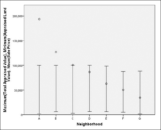
A high-low chart displays the range of values between specified high and low values. Its purpose is to compare two or three variables.
The high-low-close graph shows how a variable appears when plotted between a high value and a low value. The graph displays the relationships among three sets of values. This example and the one that follows (the simple-range bar graph) display the same information, but with a different look to the graphics. This graph displays the range as a vertical line, and the other graph shows it as a bar.
Follow these steps to create a high-low-close graph:
Choose File
OpenData and open the file namedHome sales [by neighborhood].sav, which is in the SPSS installation directory.Choose Graphs
Chart Builder.In the Choose From list, select High-Low.
Drag the first graph diagram (the one with the High-Low-Close tooltip) to the panel at the top of the window.
In the Variables list, do the following:
Drag the Total Appraised Value variable to the High Variable rectangle at the top on the left.
Drag the Appraised Land Value variable to the Low Variable rectangle at the center left.
Drag the Sale Price variable to the Close Variable rectangle at the bottom on the left.
Drag the Neighborhood variable to the X-Axis rectangle.
Click the OK button.
The high-low graph shown in Figure 11-11 appears.
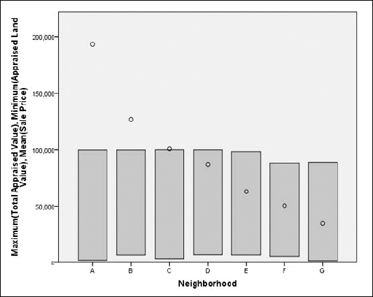
The simple range bar graph shows how a variable appears when plotted between high and low values. That is, it displays the relationships among three sets of values. This example and the one before it display the same information, but with a different appearance to the graphics. This graph displays the upper and lower range as a vertical bar.
Do the following to build a simple range bar graph:
Choose File
OpenData and open the file namedHome sales [by neighborhood].sav, which is in the SPSS installation directory.Choose Graphs
Chart Builder.In the Choose From list, select High-Low.
Drag the second graph diagram (the one with the Simple Range Bar tooltip) to the panel at the top of the window.
In the Variables list, do the following:
Drag the Total Appraised Value variable to the High Variable rectangle at the top on the left.
Drag the Appraised Land Value variable to the Low Variable rectangle at the center left.
Drag the Sale Price variable to the Close Variable rectangle at the bottom on the left.
Drag the Neighborhood variable to the X-Axis rectangle.
Click the OK button.
The high-low range bar graph shown in Figure 11-12 appears.
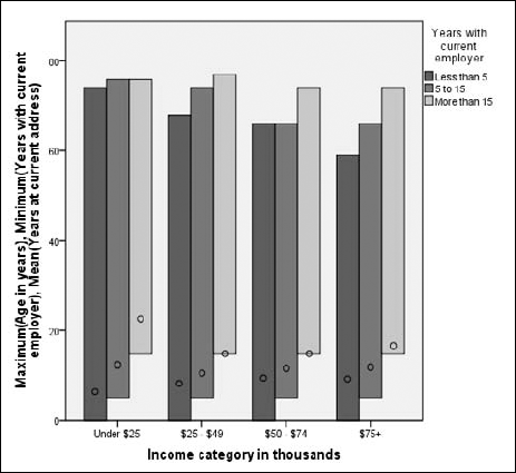
The clustered range bar graph displays the relationship among five variables. No other chart can be used to so clearly display so many variables. This example demonstrates the relationships among five employee variables: years of employment, income ranges, years with employer, ages, and the years they've lived at their current addresses.
Do the following to build a clustered range bar graph:
Choose File
OpenData and open the file nameddemo.sav, which is in the SPSS installation directory.Choose Graphs
Chart Builder.In the Choose From list, select High-Low.
Drag the third graph diagram (the one with the Clustered Range Bar tooltip) to the panel at the top of the window.
In the Variables list, do the following:
Drag the category Years With Current Employer[empcat] variable to the Cluster on X rectangle in the upper-right corner.
Drag the Income Category variable to the X-Axis rectangle at bottom.
Drag the Age In Years variable to the High Variable rectangle at top left.
Drag the measure Years With Current Employer[employ] variable to the Low Variable rectangle at center left.
Drag the Years At Current Address variable to the Close Variable rectangle at bottom left.
Click the OK button.
The high-low graph shown in Figure 11-13 appears.
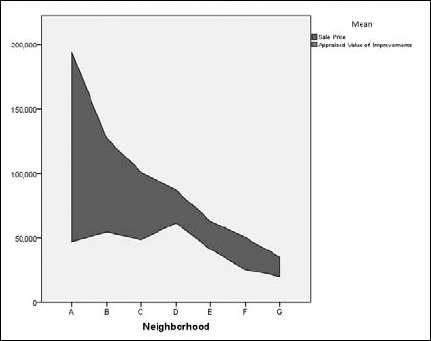
A differenced area graph provides a pair of line graphs that emphasize the difference between two variables filling the area between them with a solid color. The two graphs are plotted against the points of a categorical variable. The following steps produce a differenced area graph:
Choose File
OpenData and open theHome sales [by neighborhood].savfile, which is in the SPSS installation directory.Choose Graphs
Chart Builder.In the Choose From list, select High-Low.
Drag the fourth graph diagram (the one with the Differenced Area tooltip) to the panel at the top of the window.
In the Variables list, do the following:
Drag the Neighborhood variable to the X-Axis rectangle.
Drag the Sale Price variable to either of the Y-Axis rectangles.
Drag the Appraised Value of Improvements variable to the other Y-Axis rectangle.
Click the OK button.
The differenced area chart shown in Figure 11-14 appears.
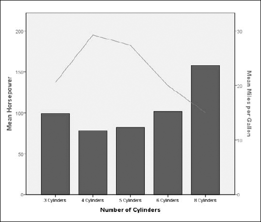
Many of the graphic forms allow you to plot two or more variables on the same chart, but they must always be plotted against the same scale. In the dual-axis graph, two variables are plotted — and two different scales are used to plot them. As a result, the values don't require the same ranges (as they do in the other plots); the curves and trends of the two variables can be easily compared, even though they're on different scales.
Two variables with different ranges that vary across the same set of categories can be plotted together, as shown in the following example:
Choose File
OpenData and open theCars.savfile, which is in the SPSS installation directory.Choose Graphs
Chart Builder.In the Choose From list, select Dual Axes.
Drag the first diagram (the one with the Dual Y Axes With Categorical X Axis tooltip) to the panel at the top of the window.
In the Variables list, do the following:
Drag the Horsepower variable to the Y-Axis rectangle on the left.
Drag the Miles Per Gallon variable to the Y-Axis rectangle on the right, which is now named Count.
Drag the Number of Cylinders variable to the X-Axis rectangle.
Click the OK button.
The dual-axis graph shown in Figure 11-15 appears.
If you don't mind a little complexity, two variables with different ranges that vary according to changes in another value laid out along a third scale can be plotted together, as shown in the following example:
Choose File
Choose Graphs
Chart Builder.In the Choose From list, select Dual Axes.
Drag the second graph diagram (the one with the Dual Y Axes With Scale X Axis) to the panel at the top of the window.
In the Variables list, do the following:
Drag the Miles Per Gallon variable to the Y-Axis rectangle on the left.
Drag the Engine Displacement variable to the Y-Axis rectangle on the right.
Drag the Time to Accelerate 0 to 60 variable to the X-Axis rectangle.
Click the OK button.
The dual-axis chart shown in Figure 11-16 appears.
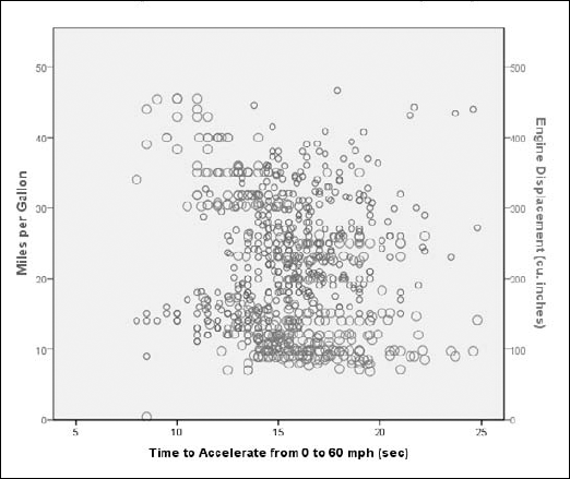
Figure 11.16. A dual-axis graph displaying two variables with different ranges against a scale variable.
The graph displayed in Figure 11-16 is a combination of two dot-plot formats, with the dots in different colors. Even on a color screen, the two sets of values — each set plotted on a different Y-axis scale — can be confusing. With this type of plot, you must take care that your data makes sense being displayed this way.