In This Chapter
Comparing means
Finding out how things match up with correlations
Making predictions with regression testing
This chapter describes how to instruct SPSS to dig into your data, execute an analysis, and reach a conclusion. In SPSS, executing an analysis consists of taking in your raw data, performing calculations, and presenting the results in a table or a chart.
This chapter provides examples of the most fundamental types of analysis that SPSS offers. Any menu choices or options that I don't demonstrate here are more advanced forms of the same types of analysis. The more advanced forms often require that you set more options, and sometimes they require the selection of more variables from the dataset, but the process is always fundamentally the same as the examples described in this chapter. The advanced forms employ the same basic algorithms. In general, understanding how the analysis examples in this chapter operate will give you the understanding you need for the more advanced forms.
In the descriptions in this chapter, I assume you're familiar with the fundamental procedures required for constructing tables, which I describe in Chapter 12.
The tests for comparing the mean of one variable to the mean of another are more varied and flexible than you might think. The analysis methods in this section fall into the category of means tests, but they are actually more than that. You'll find that they can produce up to twelve statistics, of which the mean is only one.
You can generate a simple comparison table by loading the Employee data.sav file and choosing Analyze
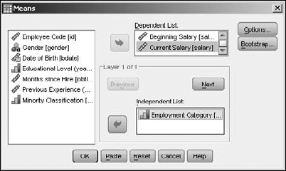
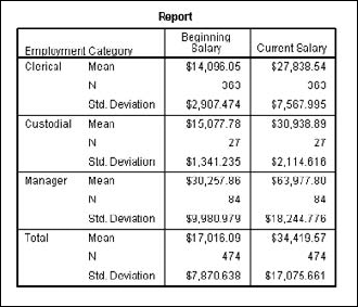
The table produced from this dialog box is shown in Figure 13-2. By default, it includes the means, a count of the number of cases, and the standard deviation. But you are not limited to only these. By clicking the Options button on the dialog box shown in Figure 13-1, you can choose any combination of 21 statistics.
Note
When you run an analysis that produces a table as output, a second table is also produced: the Case Processing Summary table. It provides a quick summary of the number of cases included and omitted. Cases with a missing value for a chosen variable are omitted.
That's not the end of the possible variations. You can include other independent variables in two ways:
The table in Figure 13-2 is single-layered, but by clicking the Next button in the dialog box in Figure 13-1, you can add new layers for independent variables.
You can add independent variables to the same top layer (or any other layer) and make a larger table to include them.
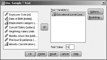
The one-sample T test compares an expected value with a mean derived from the values of a single variable. To run such a test, you choose the variable you want to average and the value you expect. The report shows you the accuracy of your expectations.
For an example of the T test, open the Employee data.sav file. Choose Analyze
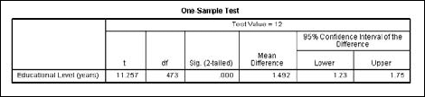
The resulting table is shown in Figure 13-4. At the top of the table is the value that's the basis of all comparisons — the average number of years of education of all employees was compared to 12. The first column, labeled with the letter t, is the mean value derived from the data. The second column, the one labeled df, is the degrees of freedom. The Mean Difference column is the average of the magnitude of the differences between the values and the expected value. The Confidence Interval values show how wide the range is around the value of 12 to include 95 percent of all values.
The independent-samples T test compares the means of two sets of values from one variable. To run an example of the test, load the Employee data.sav file. Choose Analyze
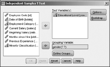
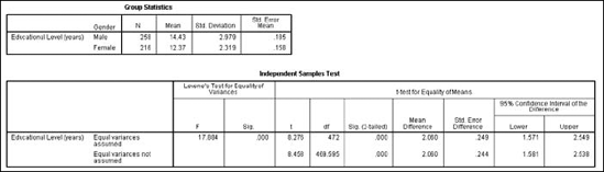
Move the Educational Level variable to the Test Variable(s) panel. This variable supplies the values for the means you want to test. Move the Gender variable to the Grouping Variable panel; this variable is used to select the two groups. The variable could have multiple values defined for it, but you need to choose only two. Click the Define Groups button to specify the two values — in this example, the only values available are m and f. Entering these two values causes them to appear in place of the question marks following the name of the variable. Click the OK button, and SPSS produces the pair of tables shown in Figure 13-6.
The Independent Samples Test table displays the two means, the standard deviation and standard error for the two means. The table provides further information about the mean in two rows of numbers, but you need to know some things about reading the table. The table has one row for equal variances and one for unequal variances. You decide which to use this way:
If the significance of the Levene test — the number in the second column — is high (greater than 0.05 or so), the values in the first row are applicable.
If the significance of the Levene test is low, the numbers in the second row are more applicable.
If the significance of the T test — that is, the two-tailed significance — is low, it indicates a significant difference in the two means.
If none of the numbers of the 95 percent confidence interval are 0, it indicates that the difference between the means is significant.
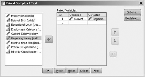
The paired-samples T test is a comparison test specially designed to compare values from the same group at different times. The values could be gathered before and after an event, or simply before and after a passage of time.
To run the test, choose Analyze
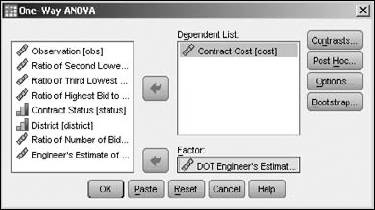
ANOVA is an acronym for ANalysis Of VAriance. A one-way ANOVA is the analysis of the variance of values (of a dependent variable) by comparing them against another set of values (the independent variable). It is a test of the hypothesis that the mean of the tested variable is equal to that of the factor.
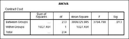
The output table from running this test is a small one. To see an example of its output, load the Road construction bids.sav file. Then choose Analyze
Many statistical values result from comparing actual results against expected results — or, in statistics-speak, the comparison of dependent variables against independent variables. Straight lines are easier to compare than curves and often produce a result that's easier to understand. This section is about curveless analysis.
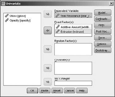
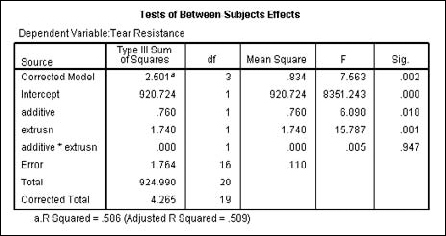
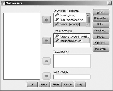
You can compare one dependent variable against more than one independent variable. For example, suppose a plastic manufacturer wants to increase the resistance to tearing of his product, so he varies the extrusion rate and additives to do so. To see how the results of the study can be calculated, open the Plastic.sav file. Then choose Analyze
Select the Tear Resistance variable to be the one dependent variable, and the Additive Amount and Extrusion variables to be the fixed variables, as shown in Figure 13-10.
The table in Figure 13-11 is produced, displaying the resulting values of Tear Resistance, depending on Extrusion and Additive Amount, both individually and together.
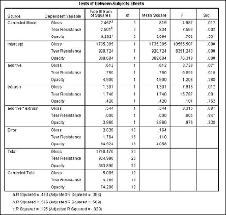
It is also possible to measure more than one dependent variable against more than one independent variable. Using the same data as in the single-value test of the preceding section, choose Analyze
Click the OK button, and the table in Figure 13-13 is produced. You may notice that this table is the same basic form as the single-value table in the preceding section, except the Dependent Variable column now has three entries for each entry in the Source column.
The group of tests in this section determines the similarity or difference in the way two variables change in value from one case (row) to another through the data.
To run a simple bivariate (two-variable) correlation, load data that has two variables to be compared and choose Analyze
You can choose up to three kinds of correlations. The most common form is the Pearson correlation, which is the default. If you want, you can click the Options button and decide what is to be done about missing values and to tell SPSS whether you want to calculate the standard deviations. The result of the selections in Figure 13-14 is shown in Figure 13-15.
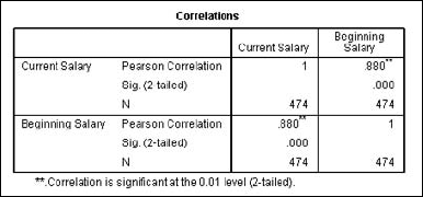
Correlation figures vary from −1 to +1, and the larger the value, the stronger the correlation. In Figure 13-15, you can see that the variables have a correlation of 1 with themselves and .880 with one another, which is a significant correlation.
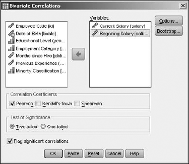
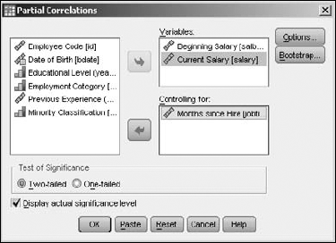
Outside factors can affect a correlation. You can include such factors in the calculations by using a procedure known as a partial correlation. For example, in the previous example, I found that the current salary of each employee correlated with the starting salary, but I did not take into account the length of employment. In this example, I will. Begin by choosing Analyze
Select the Current Salary and Beginning Salary as the Variables, along with the Months Since Hire as the Controlling factor that should have an effect on the correlation. The resulting dialog box should look like the one in Figure 13-16.
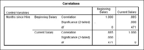
The result is an even higher level of correlation than in the previous example, as shown in Figure 13-17.
Regression analysis is about predicting the future (the unknown) based on data collected from the past (the known). Such an analysis determines a mathematical equation that can be used to figure out what will happen, within a certain range of probability:
The analysis is performed based on a single dependent variable.
The process takes into consideration the effect one or more dependent variables have on the dependent variable.
It takes into account which independent variables have more effect than others.
Note
Performing regression analysis is the process of looking for predictors and determining how well they predict a future outcome.
When only one independent variable is taken into account, the procedure is called a simple regression. If you use more than one independent variable, it's called a multiple regression. All dialog boxes in SPSS provide for multiple regression.
Linear regression is used when the projections are expected to be in a straight line with actual values. The following is an example of a linear multiple regression:
Choose File
Open Data and open the
demo.savfile.The file is in the SPSS installation directory.
Choose Analyze
RegressionLinear.The Linear Regression dialog box appears.
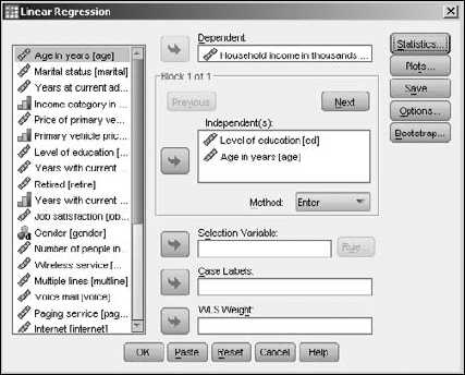
Select Household Income In Thousands and move it to the Dependent panel.
This is the variable for which we want to set up a prediction equation.
Select Level of Education and move it to the Independent(s) panel. And select Age in Years and move it to the Independent(s) panel.
The screen should look like Figure 13-18. Here the assumption is that two variables have a linear effect on Household Income in Thousands.
Click OK.
The table in Figure 13-19 is produced.
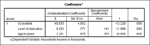
You will also find other tables included as part of the output, but they all have to do with how the values of this table are produced. This table defines the equation for you in its first column. Assuming that the assumption of the linear relationship is correct, income can be predicted with the following:
Household Income = (9.252)(Level of Education) + (2.261)(Age in Years) - 49.553
This is non-linear regression. If you have a collection of data points, it's possible to create a curve that passes through (or very near) those points. The equation of the curve can then be used to estimate the values of points you don't have yet. This can be done by interpolation (drawing a curve that connects the existing points) or extrapolation (extending the curve beyond the existing points). The graphic presentation of values isn't as numerically accurate as a table of numbers, but it has some advantages — not the least of which is that you can quickly spot patterns and trends. Predictions are only estimations, no matter how sophisticated — so presenting a prediction as a graph is as good as doing so with numbers, given the inherent inexactness of graphic representation of values.
In the following, I fit a curve to a group of data points for the purpose of demonstrating the probable horsepower of an engine, depending on its cubic inches of displacement:
Choose File
The file is in the SPSS installation directory.
Choose Analyze
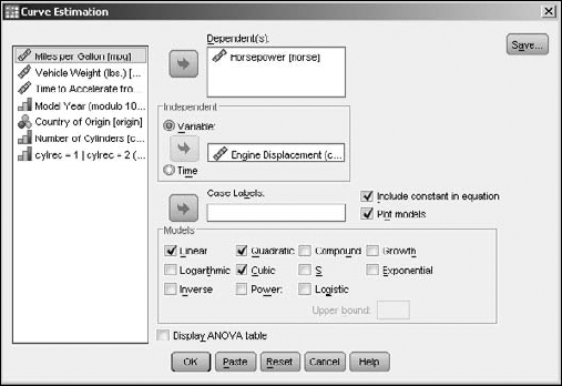
RegressionCurve Estimation.The Curve Estimation dialog box appears.
Select Horsepower as the variable to have its value predicted by moving it to the Dependent(s) panel.
Tip
You could choose more than one dependent variable — in which case, the output would appear as more than one chart. Each dependent variable has its own graph.
Select Engine Displacement and move it to the Independent panel.
Select Linear, Quadratic, and Cubic as the types of curves to be generated.
The screen should look like Figure 13-20.
Click OK.
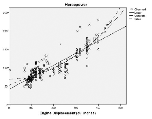
SPSS generates some tables to describe the processing used to reach its conclusion. The graph shown in Figure 13-21 contains the three requested curves.
In Figure 13-21, each dot represents the relationship of actual engine displacement to measured horsepower. The predicted values of horsepower according to displacement are represented in three ways:
None of the curves fit the data points exactly, but they do give you the best possible prediction of the results.
Log linear is based on the assumption that a linear relationship exists between the independent variables and the logarithm of the dependent variable.
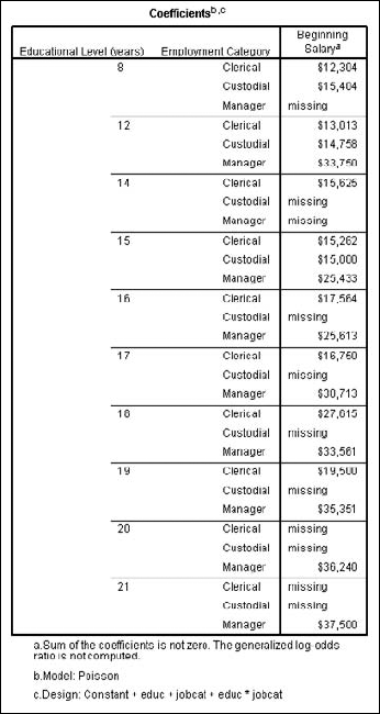
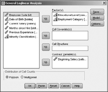
The example in this section summarizes the starting salaries of employees, organizing their educational level and employment category. To generate this table, open the Employee data.sav file. Then choose Analyze
Move the Educational Level and Employment Category variables to the Factor(s) panel, making them the two variables used to divvy up the results. Move the Beginning Salary variable to the Contrast Variable(s) panel, making it the variable containing the data to be divvied up. Your screen should look like Figure 13-22.
Click the OK button and the table shown in Figure 13-23 appears. You can see that the salaries increase with the number of years of education.
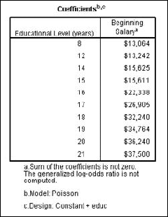
Executing the same analysis — but leaving out the variable for the Employment Category — we get a table that organizes salaries only by the level of education, as shown in Figure 13-24.