
The strengths of WebKit as a development platform are evident when you begin to explore the capabilities you have with advanced graphics, animation, and other special effects. You can utilize some of the more advanced capabilities of JavaScript, HTML5, and CSS to create cool effects in your Web apps.
I began looking at graphics programming in Chapter 8, "Programming the Canvas." I continue the discussion as I explore how to work with effects and animation.
A gradient is a coloring effect you can add to your Web page in which one color gradually changes to another color over the surface of a canvas or other element. Linear gradients are applied to a rectangular block surface, whereas radial gradients are displayed as circles. You can specify the start and end colors as well as color values in between (known as color stops). You can create gradients in both CSS and JavaScript. I'll show you how.
You can use the WebKit-supported function -webkit-gradient() to create a "virtual" gradient image and define it as an image URL parameter. Here's the syntax for a linear gradient:
-webkit-gradient(linear, startPoint, endPoint, from(color), color-stop(percent,color), to(color))
The linear parameter defines the type of gradient. The startPoint and endPoint parameters define the start- and endpoints of the gradient and are typically represented by constants: left top, left bottom, right top, and right bottom.
The from() and to() functions indicate the starting and ending colors, whereas the color-stop() function defines a color at a particular point on the gradient.
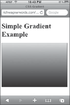
For example, the following style can be added to a div or other block element to create a gradient that starts with light green at the top left and ends with black on the lower left. A color stop of dark green is added to occur at the 50 percent mark. Here's the style:
.simpleLinear
{
width:100px;
height:100px;
border:1px solid black;
background: -webkit-gradient( linear, left top, left bottom, from(#a1f436),
color-stop(0.5, #668241), to(rgb(0, 0, 0)));
}
As you can see, the color can be defined using a hex value or using the rgb() function.
The results are shown in Figure 9-1.
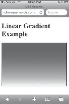
You can add multiple color-stop() functions to a gradient to give more complex effect. The following style begins with maroon and ends with white, but it also has green and blue color stops defined at the 30 percent and 80 percent points along the gradient:
.complexLinear
{
 width:100px;
 height:100px;
 border:1px solid black;
 background: -webkit-gradient(linear, left top, left bottom, from(#a21c47),
 to(#f9f9f9), color-stop(0.3, #564fb5),color-stop(0.8, #66cc00));
}
Figure 9-2 shows the result.
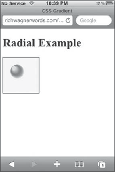
To create a radial gradient, you use the following syntax:
-webkit-gradient(radial,innerCenter, innerRadius, outerCenter, outerRadius, from(color), color-stop(percent, color), to(color));
The innerCenter defines the x, y coordinate of the center of the inner circle that starts the gradient. The innerRadius defines the width of the radius for the inner circle. The outerCenter and outerRadius define the same thing for the outer circle that ends the gradient. The from(), to(), and color-stop() functions work the same way as the linear gradient.
The following style example defines a small gradient 10-radial circle starting at (30,30) and ending with a 30-radial circle at (50,50). It has one color stop, midway through the gradient:
.radial
{
 width:100px;
 height:100px;
 border:1px solid black;
 background: -webkit-gradient(radial, 30 30, 10, 50 50, 30, from(#a1f436),
 to(rgba(1,0,0,0)), color-stop(50%, #668241));
}
Figure 9-3 displays the result.
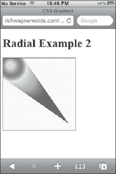
You can also combine multiple gradients onto a single surface by listing one after the other. The following style example defines two radial gradients for a 200 • 200 div:
.radial2
 {
  width:200px;
  height:200px;
  border:1px solid black;
  background: -webkit-gradient(radial, 20 20, 10, 25 25, 40, from(#a1f436),
  to(rgba(1,0,0,0)), color-stop(50%, #668241)),
       -webkit-gradient(radial, 100 100, 20, 20 20, 40, from(#a21c47),
       to(#f9f9f9), color-stop(50%, #66cc00));
}
The two orbs are shown in Figure 9-4.
If you prefer scripting, you can also create both linear and radial gradients by using the following methods of the context object:
createLinearGradient(x1,y1,x2,y2)creates a gradient from the starting point (x1,y1) to the endpoint (x2,y2).createRadialGradient(x1,y1,r1,x2,y2,r2)creates a gradient circle. The first circle is based on the x1, y1, and r1 values, and the second circle is based on the x2, y2, and r2 values.
See Chapter 8 for more details on the canvas and context objects.
Both of these methods return a canvasGradient object that can have colors assigned to it with the addColorStop(position, color) method. The position argument is a float number between 0.0 and 1.0 that indicates the position of the color in the gradient. The color argument is any CSS color.
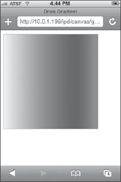
In the following example, a linear gradient is added to a square box on the canvas. The gradient starts on the left side, transitions to blue, and ends on the right in red. Here is the code for the entire HTML page:
<!DOCTYPE html PUBLIC "-//W3C//DTD XHTML 1.0 Strict//EN"
     "http://www.w3.org/TR/xhtml1/DTD/xhtml1-strict.dtd">
<html xmlns="http://www.w3.org/1999/xhtml">
<head>
<title>Draw Gradient</title>
<meta name="viewport" content="width=320; initial-scale=1.0; maximum-scale=1.0;
user-scalable=0;">
<script language="javascript" type="text/javascript">
function drawGradient()
{
var canvas = document.getElementById('myCanvas'),
var context = canvas.getContext('2d'),
var lg = context.createLinearGradient(0,125,250,125);
context.globalAlpha="0.8";
lg.addColorStop(0,'white'),
lg.addColorStop(0.75,'blue'),
lg.addColorStop(1,'red'),
context.fillStyle = lg;
context.strokeStyle="#666666";
context.lineWidth=".5";
context.fillRect(10,10,250,250);
context.strokeRect(10,10,250,250);
}
</script>
</head>
<body onload="drawGradient()">
<canvas id="myCanvas" width="300" height="300" style="position:absolute;
left:0px; top:0px; z-index:1"/>
</body>
</html>The first color stop is set to white, the second to blue, and the third to red. Once you assign these using the addColorStop() method, the lg linearGradient object is assigned as the fillStyle for the context. The fillRect() method is then called to paint the block. A gray border is added using the strokeRect() method. Figure 9-5 shows the results.
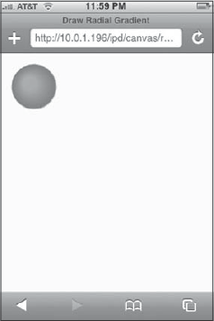
A radial gradient is created by using the createRadialGradient() method and then adding color stops at the appropriate position. For example:
function drawRadialGradient()
{
 var canvas = document.getElementById('myCanvas'),
 var context = canvas.getContext('2d'),
 var rg = context.createRadialGradient(45, 45, 10, 52, 50, 35);
 rg.addColorStop(0, '#95b800'),
 rg.addColorStop(0.9, '#428800'),
 rg.addColorStop(1, 'rgba(220,246,196,0)'),
 context.fillStyle = rg;
 context.fillRect(0, 0, 250, 250);
}
The createRadialGradient() method defines two circles: one with a 10px radius and the second with a 35px radius. Three color stops are added using addColorStop(), and then the rg radialGradient object is assigned to the fillStyle property. See Figure 9-6.
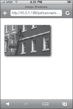
Shadow effects are a common visual technique to enhance the look of your page element. Using JavaScript, the context object provides four properties that you can use for defining shadows on the canvas. These are as follows:
Let me show you how to use them. The following code uses these properties to define a blurred shadow for an image:
function drawImg(){
 var canvas = document.getElementById('myCanvas'),
 var context = canvas.getContext('2d'),
 context.shadowColor = "black";
 context.shadowBlur = "10";
 context.shadowOffsetX = "5";
 context.shadowOffsetY = "5";
  var img3 = new Image();
  img3.src = 'images/nola.jpg';
  img3.onload = function()
  {
   context.drawImage(img3, 20, 30);
  }
}
The four highlighted lines of code defined a blurred black shadow that is offset 5px from the canvas. Figure 9-7 shows the result.
If you have used the Cover Flow view in the iTunes app, you have noticed the use of reflections. In fact, image reflections are an increasingly popular effect added to images. Using CSS techniques, you can add reflections to your images or block elements.
To create a reflection, use the -webkit-box-reflect property:
-webkit-box-reflect :direction offsetmaskImage|-webkit-gradient;
The direction parameter specifies the direction of the reflection relative to the object: above, below, left, or right. The offset parameter defines the offset distance (in pixels or as a percentage) that the reflection should be offset from the block. The maskImage parameter specifies a mask image. Or, as shown, you can use a -webkit-gradient() function instead. For example, if you wanted to add a bottom reflection to an image using a gradient, you could use the following style rule:
<style>

 .reflectedImage
 {
  border:1px solid black;
  -webkit-box-reflect:below 3px -webkit-gradient(linear, left top, left bottom,
  from(transparent), color-stop(0.5, transparent), to(white));
 }


</style>
</head>
<body>

<img src="images/nola.jpg" class="reflectedImage"/>

</body>
Notice that the -webkit-gradient() function defines a linear gradient as the reflection. It begins fully transparent and ends fully white to blend into the background. Figure 9-8 shows the result.
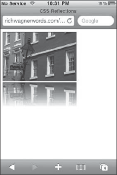
Reflections on a black background can be especially compelling visually on the iPhone viewport. The following example shows a reflection on black (see Figure 9-9):
<!DOCTYPE html PUBLIC "-//W3C//DTD XHTML 1.0 Strict//EN"
     "http://www.w3.org/TR/xhtml1/DTD/xhtml1-strict.dtd">

<html xmlns="http://www.w3.org/1999/xhtml">
<head>
<title>CSS Reflections</title>
<meta name="viewport" content="width=320; initial-scale=1.0; maximum-scale=1.0;
user-scalable=0;">

<style>

 .reflectedImage
 {
  -webkit-box-reflect:below 3px -webkit-gradient(linear, left top, left bottom,
  from(transparent), color-stop(0.5, transparent), to(black));
 }

 body
 {
  background-color:#000000;
 }

</style>
</head>
<body>

<img src="images/nola.jpg" class="reflectedImage"/>

</body>
</html>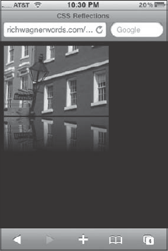
If you want to add reflections using JavaScript, I recommend checking out several open source libraries that use canvas programming to create sophisticated charts and image effects, such as reflections. Two particularly noteworthy libraries are the PlotKit and Reflection.js. The PlotKit is a JavaScript Chart Plotting library (available at www.liquidx.net/plotkit), and Reflection.js enables you to add reflections to your images (available at cow.neondragon.net/stuff/reflection). The Reflection.js library uses canvas to render the reflection but allows you to use it simply by adding a reflect class to an image.
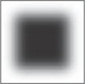
Masks is a common designer technique used to hide parts of an image. Typically you use a mask to create a blurred border around an image. You can use the CSS property -webkit-mask-image to add masks to images. Its syntax is shown here:
-webkit-mask-box-image: uri top right bottom left xRepeat yRepeat;The uri specifies the mask image, such as the one shown in Figure 9-10. The top, right, bottom, and left parameters define the distance the mask is from the edge of the image. The repeat parameters specify x, y repeat styles. You can also use the constants: repeat (tiled), stretch, or round (which stretches all parts of the image slightly so that there are no partial tiles at any end).
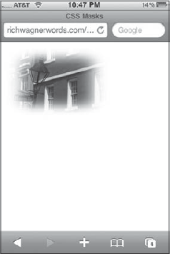
For example, to create a vignette mask around an image that uses the mask image shown in Figure 9-10, you can use the following style definition:
.vignetteMask
{
 -webkit-mask-box-image: url(images/mask.png) 25 stretch;
}
The 25 parameter specifies a 25-pixel distance around the full image, and stretch stretches the mask (which is smaller than the image it is applied to) to equal the size of the image it is applied to. Figure 9-11 shows the results.
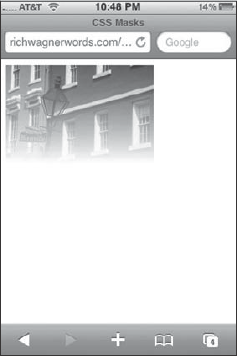
You are not limited to using a masked image, however. You can also use a -webkit-gradient() function to achieve a faded mask effect. For example, consider this style:
.fadeToWhite
 {
  -webkit-mask-image:-webkit-gradient(linear, left top, left bottom,
  from(rgba(0,0,0,1)), to(rgba(0,0,0,0)));
 }
A linear gradient provides a masking effect for the image that uses this style. Notice how the bottom of the image in Figure 9-12 fades into the background.
Or, to achieve a rounded masking effect, you can combine the use of the -webkit-border-radius declaration with a -webkit-mask-image property. Consider the following:
.roundedImage
{
 -webkit-border-radius: 12px;
 -webkit-mask-image:-webkit-gradient(linear, left top, left bottom,
 from(rgba(0,0,0,1)), to(rgba(0,0,0,0)));
}
The mask is applied to an image with rounded corners.
Back in Chapter 8, I explored how to draw on the canvas using the context object. However, I wanted to point out three more methods of the context object you can use for transforming the state of a canvas. They are:
translate(x, y)changes the origin coordinates (0, 0) of the canvas.rotate(angle)rotates the canvas around the current origin by a specified number of radians.scale(x, y)adjusts the scale of the canvas. The x parameter is a positive number that scales horizontally, whereas the y parameter scales vertically.
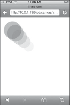
The following example uses translate() and scale() as it draws a circle successive times onto the canvas. Each time these methods are called, their parameters are adjusted:
function transform()
{
 var canvas = document.getElementById('myCanvas'),
 var context = canvas.getContext('2d'),
 var s = 1;
 for (var i = 1; i < 6; i++)
 {
  var t = i * 8;
  context.translate(t, t);
  context.scale(s, s);
context.fillStyle = "rgba(" + t * 4 + ","+ t * 6 + "," + t * 8 + ", 0.3)";
context.beginPath();
context.arc(50, 50, 40, 0, 2 * pi, false);
context.fill();
s -= 0.05;
}
}The t variable is 8 times the current iteration of the for loop, and then it is used as the parameter for translate(). The scale() method uses the s variable, which is decremented by 0.05 after each pass. The fillStyle() method also uses the t variable to adjust the rgb color values for each circle drawn. Figure 9-13 shows the result of the transformation.
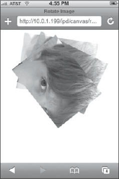
The rotate() method rotates the canvas based on the specified angle. For example, in the following code, an image is drawn on the canvas three times, and each time the translate() and rotate() parameter values and the globalAlpha property are changed:
function rotateImg(){
 var canvas = document.getElementById('myCanvas'),
 var context = canvas.getContext('2d'),
 context.globalAlpha = "0.5";
   var r = 1;
 var img = new Image();
 img.src = 'images/jared.jpg';
 img.onload = function() {
  for (var i = 1; i < 4;i++) {
   context.translate(50, −15);
   context.rotate(.15 * r);
   context.globalAlpha = i * .33;
context.drawImage(img, 20, 20); r += 1; } } }
Figure 9-14 shows the layered result. Note the difference in transparency of the bottom most image to the topmost.
Note that as you begin to work with more advanced drawings on the canvas, you will need to manage the drawing state. A drawing state includes the current path, the values of the major context properties (such as fillStyle and globalAlpha), and any transformations (such as rotating) that have been applied. To this end, you can use the save() and restore() methods. The save() method saves a snapshot of the canvas, which can be retrieved later using the restore() method. The save() and restore() methods enable you to return to a default drawing state with minimal additional code and without needing to painstakingly re-create every setting.
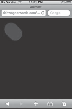
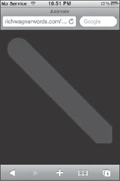
You can use the context drawing capabilities discussed earlier in combination with JavaScript timer routines to create animations on the canvas. On first take, the potential for creating canvas-based animation sounds like a perfect lightweight substitute for Flash for iPhone and iPod touch. For some purposes, it can be ideal. However, any such excitement needs to be kept in reasonable check. Perhaps the chief shortcoming of the canvas drawing in JavaScript is that you need to repaint the entire canvas for each frame of your animation. As a result, complex animations risk becoming jerky on the mobile device. That being said, canvas animation can be a powerful tool to add to your development toolbox.
Like a motion picture or video clip, an animation is a series of frames that, when viewed one after the other, gives the appearance of movement. Therefore, when you code, your job is to show a drawing, clear it, draw the next frame in the series, clear it, and so on until your animation is completed or it loops back to the start. If you are changing any context settings and need to reset them for each new frame, you need to use the save() and restore() methods.
The following HTML page shows a simple animation program in which a circle moves diagonally from the top-left to the bottom-right part of the canvas:
<!DOCTYPE html PUBLIC "-//W3C//DTD XHTML 1.0 Strict//EN"
     "http://www.w3.org/TR/xhtml1/DTD/xhtml1-strict.dtd">

<html xmlns="http://www.w3.org/1999/xhtml">
<head>
<title>Animate</title>
<meta name="viewport" content="width=320; initial-scale=1.0; maximum-scale=1.0;
user-scalable=0;">
<script language="javascript" type="text/javascript">

function init() {
 setInterval( animate, 1 );
}

var p = 0;

function animate(){
 var canvas = document.getElementById('myCanvas'),
 var context = canvas.getContext('2d'),
 context.globalCompositeOperation = "copy";
 context.fillStyle = "rgba(0,0,255, 0.3)";
 context.beginPath();
 context.arc(50 + p, 50 + p, 30, 0, 360, false);
 context.fill();
 p += 1;
}
</script>
</head>
<body bgcolor="black" onload="init()">
<canvas id="myCanvas" width="300" height="300" style="position:absolute;
left:0px; top:0px"/>
</body>
</html>
The init() function is called when the document is loaded, which sets off a timer to call animate() every 100 milliseconds. The animate() function clears the canvas, moves the orientation point, and draws a filled circle. The p variable is then incremented by 1 before repeating.
Figures 9-15 and 9-16 show the start and finish of the animation effect.
This chapter focused on adding special effects and working with advanced graphic techniques in your iPhone Web apps. You can use both CSS and JavaScript to add gradients. A gradient is a coloring effect in which a one color gradually morphs into another color over the surface of a canvas or other HTML element. There are two types of gradients: linear gradients, which are applied to a rectangular blocks, and radial gradients, which are rendered as circles. To define in CSS, use the -webkit-gradient() function to create a "virtual" gradient image and define it as an image URL parameter. To define in JavaScript, use the context object's createLinearGradient() or createRadialGradient() function.
There are other effects available as well. Shadows can be created with the shadowColor, shadowBlur, shadowOffsetX, and shadowOffsetY CSS properties. Reflections are defined using the -webkit-box-reflect property. Masks, which hide parts of an image, are defined with the webkit-mask-image property.
You can use the canvas drawing in combination with a JavaScript timer to create animations. To do so, you create a drawing, clear it, draw the next frame in the series, clear it, and so on until your animation is completed or it loops back to the start.