In this chapter, you’ll create a logo, a business card, a letterhead, and a standard #10 envelope for a fictitious company, REACH. This company provides goal-setting workshops and tutoring for children and teens, encouraging them to achieve their dreams through focused effort. There are many other tutoring companies out there, and REACH has hired you to give it an identity that will set it apart from others and that will clearly define its niche in the market. In an effort to communicate its vision, REACH has decided to use the tag line “Learn. Grow. Succeed.”
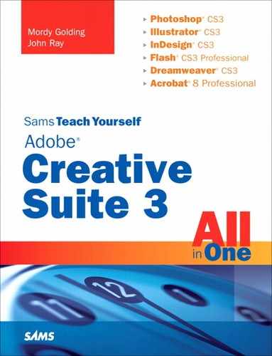
Start by creating a new Version Cue project. Launch Bridge and choose Tools, Version Cue, New Project (see Figure 12.1). Name your project reach, add a description in the Project Info field, and check the Share This Project with Others option before clicking the OK button.
The first step is to create a logo for REACH. It’s best to create logos in Illustrator because vector art is scalable to any size. It’s also easier to repurpose the art for print or Web use, as well as to easily apply spot colors, if necessary.
The logo you’re going to create for REACH will consist of a type treatment and an illustration. Launch Adobe Illustrator CS3 and create a basic CMYK document.
Choosing a typeface is obviously one of the most important parts of designing a logo. Although it might be fun trying to find a totally unique font to use, remember that a logo has to be clear and readable. It’s not just by coincidence that so many logos are set in fonts such as Helvetica or Garamond. You can always add little tweaks to the type afterward to give it a unique look, if necessary.
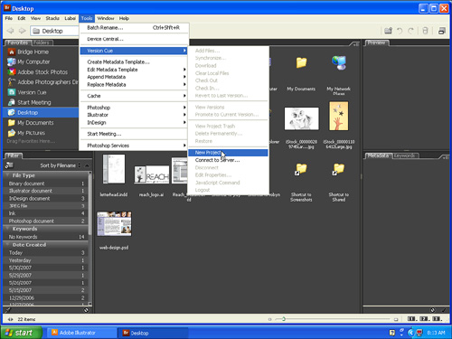
Press T to select the Type tool and type REACH. Try applying different fonts to the type to get the look you want (see Figure 12.2). I chose Gill Sans Light because I think it gives a clean, confident look. (If Gill Sans Light isn’t available on your system, Myriad Pro Regular is another good choice.)

In the Character panel, change the type size to 72 point. Set the tracking amount to –18 to pull the letters toward each other and turn on Optical Kerning (see Figure 12.3); letters aligned in this way will work well with the illustration you’re going to be adding.
Next, start a new line of text and type the tag line learn. grow. succeed. Change the tag line to a font size of 24 point, with tracking of 50 and leading of 25 point. Also, turn off Optical Kerning for the tag line text. This treatment makes the tag line a nice counterpoint to the larger, uppercase company name text.
Now you’ll want to convert the text to outlines. This is usually a good idea with a logo, making it easier to send the logo to others without worrying about fonts. The last thing you would want is to have your logo look completely different just because the person who opened it on another computer didn’t have your exact font. To convert the text to outlines, select the Type object and choose Type, Create Outlines. The typography part of the logo is now complete.
To add a graphic element to the logo, you can create an illustration that can quickly help identify what REACH does or represents. Because the company represents reaching for your dreams, here you’ll create the image of a hand reaching for the stars. Rather than attempt to actually draw a hand and stars, you’ll employ Illustrator’s Live Trace feature to help create a realistic illustration that will surely draw attention. Remember that because you’re creating this in Illustrator, it will be easy to repurpose this design element for other needs.
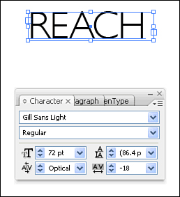
To create a hand and three stars to echo the three words in REACH’s tag line, you first place an image into Illustrator with which to work. Choose File, Place, and navigate to the folder of images and locate the file iStock_000001106412Large.jpg, which is a photograph that matches our concept (see Figure 12.4). The image, as it appears in your document, is too big for your needs here. With the image still selected, double-click the Scale tool, enter a value of 15% in the Uniform field, and click OK (see Figure 12.5). Position the scaled image to the left of the text.

Using raster images in a logo is usually not a great idea because if the logo needs to be scaled up in size, you will lose resolution and detail. The Live Trace feature in Illustrator enables you to convert this pixel-based image into a vector-based image and also enables you to customize the look of the image. Select the image, click the Tracing Presets and Options icon in the Control panel, and choose Comic Art.
The result of the Live Trace (see Figure 12.6) is a more stylized image because of the posterization that occurs as a result of a reduction to fewer colors.
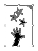
This is a very good trace of the hand, and lowest of the three stars, but there is some clean up to do to remove the smudge at the upper right and fix the other two stars. To do this, you’ll need to expand the paths so you can work with sections of the trace individually. Click Expand in the Control panel and watch the selection switch to paths with points (see Figure 12.7).
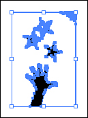
To remove unwanted points, choose the Direct Selection tool, select the mess of points at the upper right, and press Delete on your keyboard. Do the same for the top two stars. Don’t worry—you’ll replace them with copies of the bottom star. Also delete the corner points at the upper left, lower left, and lower right.
As long as you’re cleaning up, now is a good time to point out that Live Trace makes both shaded and white shapes, which can be confusing when you start moving and changing the tracings. To remove them, switch to the Selection tool, select the traced objects, and choose Object, Ungroup. Select the shaded shapes and nudge them of the way, and then click areas where there might be white shapes and delete them.
Now that you have a clean area to work in, select the remaining star and double-click the Selection tool, which brings up the Move dialog box. Click the Copy button (see Figure 12.8). Using the Direct Selection tool, position the new star approximately where one of the originals was. Then press (Cmd-D) [Ctrl+D] to duplicate the last transformation, which gives you a total of three stars. Position the final star roughly where you want it.

Let’s vary the angle of the stars, as they were in the original image. Select the top star and choose Object, Transform, Rotate from the menu and set the Angle property to 340. Select the other new star and set its angle to 15.
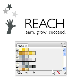
You will now change the appearance of the traced object by using different shades of gray instead of black. Choose Swatch Library from the Swatches panel (see Figure 12.9), and open the Metal library. Now that the library is open in your document, you can use these colors for your traced objects.

Select the star at the top and click a deep gray in the Swatches library. Set the star just below it to a medium gray and the bottom star to a light gray. For the reaching hand, echo the dark gray of the top star to bring visual coherence (see Figure 12.10).
Now, you’ll create a border by clicking once on the artboard with the Rectangle tool. Specify a width of 1.5 inches and a height of 2 inches, and press the D key to fill it white with a black stroke. Change the width of the stroke to 4 points and change the fill to a very soft gray. Send it to the back of the stacking order and position it behind the hand and stars (see Figure 12.11).

The hand is overlapping the box more than we’d like, so we’ll need a clipping mask to hide the part we don’t want. Fortunately, our rectangle is exactly what we need. Duplicate it and carefully position it on top of the original rectangle with the extra area of the hand shape sticking out; notice that the new rectangle is at the top of the stack. Then, hold down the Shift key and select both the new rectangle and the hand. Choose Object, Clipping Mask, Make from the menu bar. The hand now fits neatly in the box (see Figure 12.12).

To complete the logo, position the text you created earlier to the right of the rectangle (see Figure 12.13).

Choose File, Save and click the Use Adobe Dialog button (if the button reads Use OS Dialog, you’re already using the Adobe dialog box). This dialog box gives you direct access to your Version Cue project. Navigate to the Reach Version Cue project (start by clicking on the Version Cue icon listed on the left side of the dialog box) and save the file as a native Illustrator document (.ai). Give it a comment describing what it is. If you have enough RAM, you can leave Illustrator running, but if your computer has less than 512MB of RAM, quit Illustrator so you won’t be slowed down when working in other applications.
The next step in our project is preparing a photo to use as a background on the letterhead and business card. The client wants something that will grab a reader’s attention (what client doesn’t?), and using a photograph adds some punch. Locate photo iStock_000000289745Large.jpg and open it in Photoshop.
Although the image looks pretty good, I’d like to convert it to true grayscale and make a few small adjustments. Choose Image, Adjustments, Desaturate to remove any hint of color.
Next, let’s lighten up the shadows to give a softer image. Choose Image, Adjustments, Shadow/Highlight. I think the default Shadows setting of 50% is too low, so drag the slider up to 100% (see Figure 12.14).

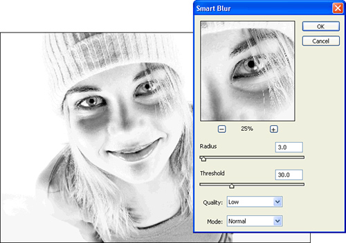
The photo still seems a bit too harsh for the calm, confident mood you’re after. Blur the edges to give a more soothing feeling. Choose Filter, Blur, Smart Blur and use a threshold of 30 and a radius setting of 3 pixels (see Figure. 12.15).
Finally, convert the image to the CMYK color space by choosing Image, Mode, CMYK Color.
Now that the design elements are complete, you can lay out and design the stationery. Although it’s possible to create business cards inside Illustrator (and, in some cases, it makes sense to do so), for this example, you will use InDesign. Start by launching InDesign CS3.
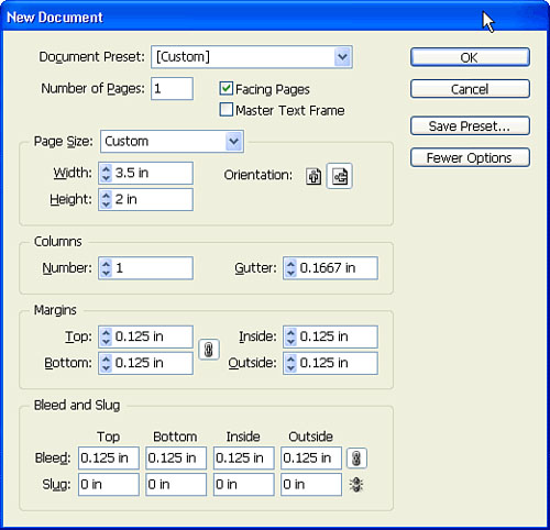
Create a new document, setting the Page Size to Custom, the Orientation to Landscape, and the Width to 3.5 inches and the Height to 2 inches. Set your margins to 0.125 inches all around and click the More Options button to set a Bleed of 0.125 inches all around as well (see Figure 12.16).
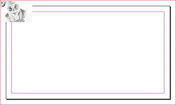
Place the Photoshop file from Version Cue (see Figure 12.17). You’ll have the image bleed off the card, so use the Scale tool to resize the image to fit within the card’s outside edges. Use the Selection tool to resize the picture frame to form neat edges.
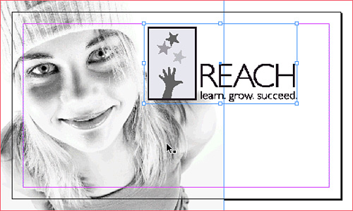
Now you can place the Illustrator logo from the Version Cue project. Scale the logo so it fits nicely within the card (see Figure 12.18).
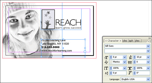
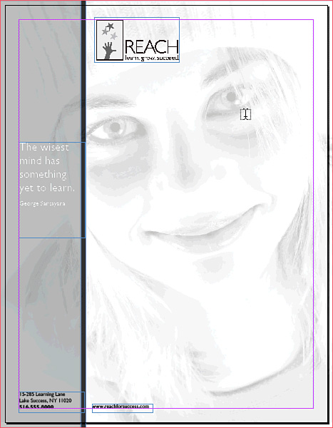
Enter the additional text information on the card. I used 8-point Gill Sans Light on 10-point leading to type 15-285 Learning Lane, Lake Success, NY 11020, 516.555.8000, www.reachforlearning.com. Bold the phone number and position the type under the logo (see Figure 12.19). Feel free to add your name and make yourself the CEO of the company, if you’d like. So you can see the outcome better, choose View, Display Performance, High Quality Display.
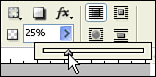
Although the card is shaping up nicely, the image in the background is demanding too much attention. Changing the opacity of the image will result in a more subtle background. Select the image with the Selection tool, and change the Opacity setting in the Control panel to a value of 25%.
Although the faded image looks good, it might be more effective to bring out the face along the left side with a gray overlay. Use the Rectangle tool to create a shape over the left one-third of the card. Change the fill color to black, and then change the Opacity setting in the Control panel to 25% (see Figure 12.20). The face is now nicely highlighted.
To create additional emphasis, use the Rectangle tool to create an 80% black bar between the face and the logo on the card.
Finish the business card with a great quote. Create a new text frame and type The wisest mind has something yet to learn.. Then set it to 16-point Gill Sans Regular with leading of 16 and tracking of –10. Position the quote over the photo on the left side of the card as four rows of text, and make the text white so it shows over the gray background. Then, add the attribution line George Santayana on a separate line as 6-point type.
Press the W key on your keyboard to view the final business card in Preview mode (see Figure 12.21). Save the file into your Version Cue project and remember to add a comment.

Next you’ll design the letterhead, which is very similar in design to the business card you just made. Create a new document in InDesign that is set to letter size 8.5 × 11 with a margin of 0.375 inches all around and a bleed of 0.125 inches all around as well.
Rather than redoing all the work you did for the business card, simply open the business card file and copy all the contents from it. Then switch back to the letterhead document and paste.
Scale the photo to 510% and position it so it fits correctly, bleeding off the edges of the page. Use the shaded sidebar with quote on the left edge, like in the business card. Select the gray rectangle and size it to 2 inches wide (plus extra for the bleed), and then select and size the dark gray bar to 1/8-inch wide and the height of the document and place it along the right side of the gray rectangle. Resize your quote text to 22-point with leading of 26, and make the text size for the attribution 12 point.
Scale the logo to 160% and position it. Next, select the address text, change it to 10-point type on 12-point leading, and position it in the bottom-left corner. Copy and paste the web address into a new text frame and position it to the right of the street address and phone number. The letterhead is now complete (see Figure 12.22), so save it into Version Cue and add a comment to the file.
Finally, you’ll create a standard #10 envelope. Create a new InDesign file, set to 9.5 inches wide and 4.125 inches tall. Set the margins to 0.375 inches; you don’t need a bleed because you won’t be using the photo or background colors in this design.
First, copy and paste the logo and the text from the letterhead file and remove the phone number (not necessary for an envelope). Position the text and the logo in the upper-left corner of the envelope and save the file to your Version Cue project with a comment to complete the envelope (see Figure 12.23).

Congratulations, you’ve just created a complete corporate identity!
In this chapter, you learned many tricks for using CS3 to create a logo as well as a business card and stationery to reinforce the corporate identity. To create the logo, you used Adobe Illustrator to make a vector version of an image using the Live Trace feature. You then created vector shapes to frame your logo and cleaned up the edges with a clipping mask. You also learned how to convert text to outlines to preserve its shape regardless of font availability. For the business card and stationery, you used InDesign to lay out print documents for a business card, letterhead, and envelope. You then placed your new logo, inserted and scaled an image (that you had edited in Photoshop), and applied and styled text.