
Hour 5. Grids and How to Use Them
What You’ll Learn in This Hour:
![]() Why designers use grids for layout
Why designers use grids for layout
![]() Two grid design techniques
Two grid design techniques
![]() How grids work in Bootstrap
How grids work in Bootstrap
![]() How to create a basic grid in Bootstrap
How to create a basic grid in Bootstrap
![]() Responsive web design (RWD) and how it relates to Bootstrap
Responsive web design (RWD) and how it relates to Bootstrap
For many people, the grid system is the number-one reason to use Bootstrap. It makes creating responsive websites quick and easy and ensures that your designs will look good because they are generated with a powerful grid system in the background.
This hour you will learn how grid systems work and why they are useful for design. You will also learn how to use Bootstrap to create your layout grids and how Bootstrap is responsive.
Grids in Design
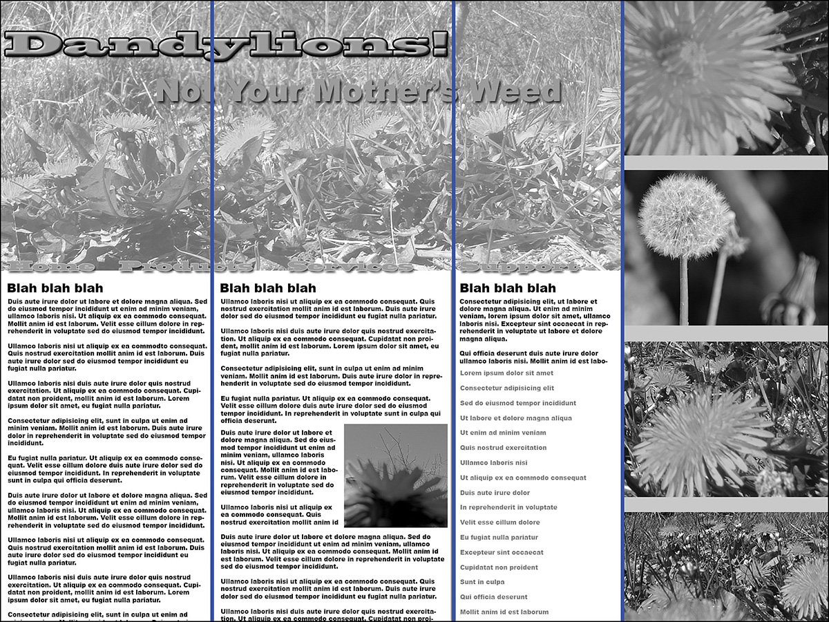
A design grid is a structure of intersecting vertical and horizontal lines that are used to arrange content. Figure 5.1 shows a website that is using a 12-column grid.

Although grids are defined as vertical and horizontal lines, most web designs focus primarily on the vertical columns. This is because web pages can vary in height based on content and browser size.
Why Use Grids in Web Design
Grids provide a structure to your designs. Web pages that are built without grids or with less structured grids aren’t going to look as good. For example, Figure 5.2 is a version of the same web page. Only the grid is less effective because it’s not as structured.
The structure of a grid helps make the web page more predictable. There is a rhythm to the structure that lets the eye move across the page. Web pages are usually read across horizontally either left to right or right to left, depending on the language. And vertical columns help to reinforce the grid structure.
The best web grids are flexible, adjusting in size to the width of the browser viewing it. This makes them work whether the page is being viewed in a small screen like a smartphone or a large, 30-inch monitor.
Some people don’t like using grids because they imagine that a grid layout is going to be boxy, blocky, and ugly. But they don’t have to be. You should always consider the grid to be a guideline, and then you can break elements out of the grid where it makes sense. Figure 5.3 shows a page with a 12-column grid for the content portion of the page, while the rest of the screen has a graphic that breaks the grid.

The Rule of Thirds
Many designers are familiar with this grid from photography. It divides the design area into thirds, both horizontally and vertically. In a photo, you then place the most important elements in the places where the grid intersects. Figure 5.4 shows how the rule of thirds might apply.

Although this is a good grid to use with graphics, it can be harder to implement in web design because it can be difficult to control the location of the intersections.
Caution: Three Equal Columns Can Be Very Boring
It can be tempting to use the rule of thirds to create a three-column website with three equal columns. This is bad both because it’s too rigid and because it really isn’t the rule of thirds. The rule of thirds helps you place the important content in a design at the intersection of the grid lines. But if you put the content in columns between the grid lines, that means no content will be in the intersection.
Try it Yourself: Use the Rule of Thirds to Create a Simple Layout
1. Open a graphics editor or get out a piece of paper.
2. Draw a rectangle to represent the web browser window.
3. Divide the rectangle into thirds vertically. Remember this is a mock-up, it doesn’t have to be perfect.
4. Then divide the rectangle into thirds horizontally.
5. Divide the first row into thirds again. You should have a drawing that looks like Figure 5.5.

6. Add in things like a logo, headlines, and content blocks, as shown in Figure 5.6.

The Golden Ratio
One of the reasons that the rule of thirds works well is because it approximates a relationship that is found in nature: the golden ratio. This ratio has been used in design since Greek and Roman times, and the proportions have been found in natural things like the arrangement of stems and branches on a plant and the veins in leaves. It may be because this ratio is found in nature that humans find it aesthetically pleasing in our designs.
Note: The Rule of Thirds Ratio Is Close to the Golden Ratio
The reason that the two-column design described in the previous section works aesthetically is because the 1/3 to 2/3 ratio for the columns is close enough to phi (φ) to suggest it aesthetically. When you’re working on your web designs, if you can’t get an exact phi ratio for your columns, using the rule of thirds in that way is a good alternative.
This ratio is an irrational number, phi (φ), and for our purposes can be simplified to 1.62. You can then use this to split a line into two sections by dividing the total length by phi (1.62). For example, if you have a line that is 1000 pixels wide, you could divide it into two sections as in Figure 5.7.

To use the golden ratio in your web designs, you should treat the line as the width of your design and divide it into columns using phi. You can add columns inside the initial columns using the same ratio.
The Bootstrap Grid System
Bootstrap includes a responsive, mobile first grid system that can have up to 12 columns in a design. And the columns are designed to respond to the width of the device and scale up and down appropriately. It uses easy-to-understand CSS classes to define the grid elements. And you can use Less mixins to adjust the grids to meet your site’s needs. There will be more about that in Hour 23, “Using Less and Sass with Bootstrap.”
Bootstrap defines four sizes of media queries by default (with three breakpoints):
![]() Extra small devices smaller than 768px wide such as small phones
Extra small devices smaller than 768px wide such as small phones
![]() Small devices more than 768px wide such as tablets
Small devices more than 768px wide such as tablets
![]() Medium-sized devices more than 992px wide such as small desktop monitors
Medium-sized devices more than 992px wide such as small desktop monitors
![]() Large devices more than 1200px wide such as large desktop monitors
Large devices more than 1200px wide such as large desktop monitors
There are a number of default grid options that Bootstrap modifies depending on the device viewing the grid. Table 5.1 explains these options.

How to Create Grids in Bootstrap
Grids are created in Bootstrap using CSS classes on the HTML content elements. You simply write your HTML and add appropriate classes to put the content into a grid.
Create a Basic Grid
The first thing you need is a container that will hold the grid elements. You have two options for containers: fixed width and fluid width. Both are responsive.
To create a responsive fixed-width layout, use the class .container. Listing 5.1 shows a <div> as a container.
LISTING 5.1 Responsive Fixed-Width Container
<div class="container">
<!-- rows go here -->
</div>
The class .container-fluid will create a fluid-width layout that is the same width as the viewport. Listing 5.2 demonstrates this.
LISTING 5.2 Responsive Fluid-Width Container
<div class="container-fluid">
<!-- rows go here -->
</div>
Note: Use the Classes on Nearly Any HTML Element
You can use the grid classes on any block-level HTML element, but it’s best to use them on elements that are typically used as containers such as <div> or the HTML5 container elements like <article>, <section>, <aside>, or <nav>.
After you have the container element to surround your entire grid, you need to set up rows to create horizontal groups of columns. Listing 5.3 shows how to use the .row class.
LISTING 5.3 Create a Horizontal Row of Columns
<div class="container">
<div class="row">
<!-- row contents goes here -->
</div>
</div>
The last thing to do is create your columns of content. Use the class prefixes from Table 5.1 to define different columns for different devices. Each class prefix is followed by a number. This is the number of columns the column should span. For example:
![]()
.col-md-1 spans 1 column. There can be up to 12 of these in a row.
![]()
.col-md-2 spans 2 columns. There can be up to 6 of these in a row.
![]()
.col-md-3 spans 3 columns. There can be up to 4 of these in a row.
![]()
.col-md-4 spans 4 columns. There can be up to 3 of these in a row.
![]()
.col-md-5 spans 5 columns. There can be up to 2 of these in a row, with 2 columns left over.
![]()
.col-md-6 spans 6 columns. There can be up to 2 of these in a row.
![]()
.col-md-7 spans 7 columns. There can be 1 of these in a row, with 5 columns left over.
![]()
.col-md-8 spans 8 columns. There can be 1 of these in a row, with 4 columns left over.
![]()
.col-md-9 spans 9 columns. There can be 1 of these in a row, with 3 columns left over.
![]()
.col-md-10 spans 10 columns. There can be 1 of these in a row, with 2 columns left over.
![]()
.col-md-11 spans 11 columns. There can be 1 of these in a row, with 1 column left over.
![]()
.col-md-12 spans 12 columns. There can be 1 of these in a row, filling the entire space.
To set up different grids for different sized devices, simply use multiple classes on your column elements. If your columns add up to more than 12, they will wrap automatically to the next line. For example, this column would be 12 wide in extra small devices, 6 wide in small devices, and 4 wide in medium and large devices:
<article class="col-xs-12 col-sm-6 col-md-4">
Note: Extra Small Defaults to Spanning 12 Columns
In the example <article class="col-xs-12 col-sm-6 col-md-4">, I included the class .col-xs-12, but that isn’t really required because the extra small devices default to the full width of the viewport, unless otherwise specified.
In the previous example, I did not define a .col-lg- class. This is because Bootstrap will set the styles for each device width for every device that width or larger. So, if I want the element to span four columns on both medium and large devices, I only need to set the medium class. If later I decide I want the element to span seven columns on large devices, I’ll need to add in the class .col-lg-7.
You don’t have to worry about the spacing of the columns or the gutter width between them. Bootstrap takes care of all that for you.
Responsive Column Resets
One issue you might run into with certain designs at certain breakpoints is that your columns don’t clear correctly, especially when one column is taller than others.
To fix this, you should use a .clearfix class and responsive utility classes. Sixteen classes are available to help, as explained in Table 5.2.


When an element is floated, it is removed from normal flow, so any element containing the floated element would only have the height of any non-floated content. Clearfix is a CSS style class that was created to help floated columns that don’t adjust the container height. In Bootstrap, you apply the class .clearfix to an element following the floated element.
Figure 5.8 shows a web page that should have one row and four columns in small devices and two rows and two columns in extra small devices. Listing 5.5 shows the HTML for it. As you can see, in an extra small device, it doesn’t display as desired.

LISTING 5.5 HTML for Columns That Don’t Float Correctly
<div class="container">
<div class="row">
<div class="col-xs-6 col-sm-3">This is a super long column
that might not load correctly in all browsers</div>
<div class="col-xs-6 col-sm-3">short column</div>
<div class="col-xs-6 col-sm-3">short column</div>
<div class="col-xs-6 col-sm-3">short column</div>
</div>
</div>
By adding a block that displays only on extra small devices, you can ensure that the columns display as you planned. Listing 5.6 shows this block added to the code.
LISTING 5.6 Adding the Extra Block
<div class="container">
<div class="row">
<div class="col-xs-6 col-sm-3">This is a super long column
that might not load correctly in all browsers</div>
<div class="col-xs-6 col-sm-3">short column</div>
<div class="clearfix visible-xs-block"></div>
<div class="col-xs-6 col-sm-3">short column</div>
<div class="col-xs-6 col-sm-3">short column</div>
</div>
</div>
The clearfix block will display only in extra small devices where the floating is incorrect.
Offsetting, Ordering, and Nesting Columns
You are not limited to columns starting in the first column of the row. You can move your columns over by using the offset classes. These classes are in the format .col-size-offset-#, where the size is xs, sm, md, or lg and the number (#) is the number of columns to move the element. For example, an element with the class .col-md-offset-4 would be given a margin of four columns on the left to move it four columns to the right. Figure 5.9 shows how this might look.

You can also change the order of columns. This can be useful for search engine optimization (SEO). You can place the most important content first and then reorder the columns to place less important things first in the design. Listing 5.7 shows two columns that are listed in one order, and Figure 5.10 shows how they display in another.
LISTING 5.7 Reposition Two Columns
<div class="container">
<div class="row">
<div class="col-md-8 col-md-push-4">The first column is eight
wide, pushed over four.</div>
<div class="col-md-4 col-md-pull-8">The second column is four
wide, pulled back eight.</div>
</div>
</div>

You order the columns with the .col-size-push-# and .col-size-pull-# classes. The push classes move the columns to the right, and the pull classes move the columns to the left.
You can also nest rows of the grid inside other columns. It’s important to remember that when you nest a row, you restart with 12 columns. So if you nest a row inside a 6-column wide column, the nested row will have 12 narrower columns. Otherwise, you create the nested rows the same way you create non-nested rows.
Responsive Web Layouts in Bootstrap
One of the benefits of Bootstrap is that it is responsive by default. When you create a grid layout in Bootstrap, it will be responsive automatically. It will automatically stack the grid in extra small devices.
But responsive designs can do more than just stack in extra small devices. And by using multiple classes on the same elements, you can define exactly how many columns each device breakpoint should have.
Every grid class has a size associated with it (xs, sm, md, and lg). So if you want to change the grid at each breakpoint, define those columns as separate classes.
For example, you might set up a design with stacked extra small devices, two columns in small devices, three columns in medium devices, and four columns with some offsetting in large devices. This would be done with the HTML in Listing 5.8.
LISTING 5.8 Adjusting the Responsiveness
<div class="container">
<div class="row">
<div class="col-sm-6 col-md-4 col-lg-3 col-lg-offset-1">Column
one</div>
<div class="col-sm-6 col-md-4 col-lg-3 col-lg-offset-1">Column
two</div>
<div class="col-sm-6 col-md-4 col-lg-3 col-lg-offset-1">Column
three</div>
</div>
</div>
Summary
In this hour you learned how grids work in web design, including how to use the rule of thirds and the golden ratio to create designs that are aesthetically pleasing. You learned why grids are so effective at making nice designs and what to do to avoid some of the pitfalls of grid design.
You also learned how to use Bootstrap to create a grid structure for your website layout. You learned how to create a container, rows, and columns. And you learned how to move those columns through offsetting and ordering.
You learned about how RWD is done in Bootstrap and how to make your layouts even more responsive, letting them adjust to up to four different device widths with three separate breakpoints.
Table 5.3 covers all the CSS classes learned in this hour.

Workshop
The workshop contains quiz questions to help you process what you’ve learned in this hour. Try to answer all the questions before you read the answers.
Q&A
Q. What if I don’t want my page to be responsive? Can I turn off responsiveness in Bootstrap?
A. Yes, you can remove the responsiveness in Bootstrap. Here’s how:
1. Remove the viewport meta tag from the <head> of your document.
2. Add a default width to the .container class with a style that comes after the Bootstrap CSS. For example:
.container { width: 960px !important; }
3. Remove any navbar collapsing and expanding behaviors.
4. Make sure all your grids have the .col-xs-* classes set on them.
5. Leave the Respond.js script in place because Bootstrap will still have media queries that need to be read in Internet Explorer 8.
Q. Are grids the only aspect of responsive design that Bootstrap does?
A. Bootstrap takes the primary feature of responsive web design—layout—and makes it easy to implement on websites. But there is a lot more to RWD than just layout. You can learn more about RWD in my other book, Sams Teach Yourself Responsive Web Design in 24 Hours.
Quiz
1. Which of the following is not a reason to use a grid for layout?
a. They speed up web design.
b. They provide rhythm to the layout.
c. They provide structure.
d. They help the eye move across the page.
2. True or False: Grids in web designs are always blocky and ugly.
3. True or False: You place the important content where the lines intersect in the rule of thirds.
4. What is the ratio for the golden ratio?
a. 1/3
b. 3.14 or pi
c. 1.62 or phi
d. 1.33
5. How many device sizes does Bootstrap support with its media queries?
a. 1
b. 2
c. 3
d. 4
6. True or False: All grid rows must be inside a container element with the .container class.
7. What does this line of code do?
<div class="clearfix visible-xs-block"></div>
a. Clears the design.
b. Creates a visible extra small row.
c. Displays a .clearfix block in extra small devices.
d. Nothing, these aren’t valid Bootstrap classes.
8. True or False: Bootstrap classes affect only the devices mentioned by the class—for example, .col-sm-3 affects only small devices.
9. What does the .col-xs-offset-4 class do?
a. Moves the column right four columns
b. Moves the column left four columns
c. Creates a four-column block for extra small devices
d. Repositions the column to the fourth location
10. What happens if the columns used are more than 12?
a. Nothing, the rows expand to fill the number of columns.
b. The columns wrap to the next line.
c. The last column is clipped to limit the row to 12.
d. The first column is clipped to limit the row to 12.
Quiz Answers
1. a. Grid layouts do nothing for speed on web pages.
2. False. This is a misconception of grid design.
3. True. After you divide the space into nine squares, the intersections are the best focal points.
4. c. 1.62 or phi
5. d. Bootstrap supports four device sizes with three breakpoints.
6. True. The rows must be inside an element with the .container class.
7. c. This line creates a .clearfix block that displays only on extra small devices.
8. False. The classes affect those devices and anything larger than that size.
9. a. The offset class moves the columns right four columns.
10. b. The columns wrap to the next line.
Exercises
1. Try the clearfix example in Listings 5.5 and 5.6. Test it in either a small device or by resizing your web browser down to the extra small size.
2. Test nesting a grid inside another column. Create a simple three-column layout, and then divide the first column into three more columns using a nested row.
3. Open your website in your HTML editor, and add a grid layout to the content. If you haven’t already planned your layout, then plan for at least two device sizes—extra small and either small or medium. Then set the columns using the small or medium classes. Don’t forget to offset or move columns that aren’t positioned exactly as you’d like them.