
Hour 9. Styling Forms
What You’ll Learn in This Hour:
 How to create basic HTML forms
How to style horizontal and inline forms with Bootstrap
How to style input controls and dropdown menus
How to build and use an input group
How to adjust the interactivity with Bootstrap classes
HTML forms are difficult to make look nice, but Bootstrap makes it easy. In this hour you learn how to use Bootstrap classes to style basic forms. You also learn about some of the options Bootstrap provides for creating forms in different designs.
Bootstrap supports HTML5 form controls. There also are several states you can set with Bootstrap to provide more information about the form fields. This hour teaches you how to change the sizes of the controls and how to add help text to the form fields.
Basic Forms
HTML forms are easy to add to your web pages. Listing 9.1 shows you the barebones HTML you might use for a form.
Caution: Bootstrap Does Not Give Your Forms an Action
Bootstrap is a framework for how the web page will look. Although you can use some Bootstrap components to add interactivity to your web pages, you will need to find or develop the scripts needed to submit web forms separately. In the examples in this hour, the <form> tags will not have any script in the action attribute. If you need more help learning how to make HTML forms work, you might want to look for a book on PHP that goes into greater depth on forms.
<form action="#">
<label for="firstName">First Name:</label>
<input type="text" autofocus required id="firstName"
placeholder="First Name"><br>
<label for="lastName">Last Name:</label>
<input type="text" required id="lastName"
placeholder="Last Name"><br>
<label for="email">Email:</label>
<input type="email" required id="email"
placeholder="Email Address"><br>
<label for="homePhone">Home Phone:</label>
<input type="tel" id="homePhone" placeholder="Home Phone"
pattern="([0-9]{3}) [0-9]{3}-[0-9]{4}"><br>
<label for="workPhone">Work Phone:</label>
<input type="tel" id="workPhone" placeholder="Work Phone"
pattern="([0-9]{3}) [0-9]{3}-[0-9]{4}"><br>
<label for-"url">URL:</label>
<input type="url" id="url" placeholder="URL"><br>
<label for="address1">Address</label>
<input type="text" id="address1"
placeholder="Address (line 1)"><br>
<label for="address2">Address</label>
<input type="text" id="address2"
placeholder="Address (line 2)"><br>
<label for="city">City</label>
<input type="text" id="city" placeholder="City"><br>
<label for="state">State</label>
<select id="state">
<option>State</option>
<option>Alabama</option>
<option>...</option>
<option>Washington</option>
</select><br>
<label for="zip">Zip Code</label>
<input type="number" id="zip" placeholder="Zip Code"><br>
<label for="country">Country</label>
<select id="country">
<option>United States</option>
<option>...</option>
</select><br>
<input type="submit" value="Contact">
</form>
As you can see in Figure 9.1, this results in a form that is difficult to read and has little style applied to it.

Note: Always Include <label> Tags
You might notice that the HTML for the form includes <label> tags for each control. This is important because your pages will not be accessible if you don’t label every form control. If you cannot use the <label> tag, you can use attributes like aria-label, aria-labelledby, or title to provide the information to screen readers. To learn more, visit the W3C website at http://www.w3.org/TR/aria-in-html/.
Unlike other HTML tags we’ve worked with before, you need to do more than add a class to the <form> tag. Some styles are applied to all the form controls, but to get better-looking forms, you need to wrap each label and control in a .form-group class and add the .form-control class to the controls themselves. Listing 9.2 shows how.
LISTING 9.2 Wrapping a Form Control in a Div
<div class="form-group">
<label for="firstName">First Name:</label>
<input type="text" autofocus required id="firstName"
placeholder="First Name" class="form-control">
</div>
If you wrap all the form controls in a similar <div>, you will end up with a form that looks like Figure 9.2.

As you can see, these classes give the table more space between the elements and the form controls are automatically sized to 100% of the current grid element.
Horizontal Forms
The default form in Bootstrap is vertical with the form labels directly above the controls. But Bootstrap offers two other layouts: horizontal forms and inline forms.
With horizontal forms, you can use the Bootstrap predefined grid classes to create a form where the labels are in one column and the controls are in another. You add the .form-horizontal class to your <form> tag, add the .control-label, and then add the grid classes around the labels and form controls.
Figure 9.3 shows how a horizontal form would look, and Listing 9.3 shows the HTML for the first two rows.

LISTING 9.3 First Two Rows of a Horizontal Form
<form action="#" class="form-horizontal">
<div class="form-group">
<label for="firstName" class="col-sm-3 control-label">First
Name:</label>
<div class="col-sm-9">
<input type="text" autofocus required id="firstName"
placeholder="First Name" class="form-control">
</div>
</div>
<div class="form-group">
<label for="lastName" class="col-sm-3 control-label">Last
Name:</label>
<div class="col-sm-9">
<input type="text" required id="lastName"
placeholder="Last Name" class="form-control">
</div>
</div>
Inline Forms
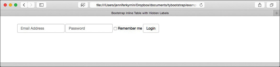
Sometimes you want the form elements to line up next to each other rather than stack vertically. In devices that are at least 768px wide, you can use the .form-inline class on the <form> or other container element to create an inline form as in Figure 9.4 and Listing 9.4.

<form action="#" class="form-inline">
<div class="form-group">
<label for="email">Email Address</label>
<input type="email" required id="email"
placeholder="Email Address" class="form-control">
</div>
<div class="form-group">
<label for="password">Password</label>
<input type="password" required id="password"
placeholder="Password" class="form-control">
</div>
<div class="checkbox">
<label>
<input type="checkbox"> Remember me
</label>
</div>
<button type="submit" class="btn btn-default">Login</button>
</form>
Note: HTML5 Doesn’t Require a <form> Tag
HTML5 allows you to put form controls anywhere on a page either inside or outside of a <form> tag. If you don’t use the action attribute on the <form> tag, you can activate your forms using JavaScript.
As you saw in Figure 9.4, including the labels and the placeholder text in the same form can look awkward, but you can use the .sr-only class to hide the labels from non-screen readers.
Caution: Do Not Use Placeholders Alone as Labels
It can be tempting to use the placeholder attribute as a label for your form elements. But this can make your pages inaccessible as screen readers, and older browsers don’t display placeholder text.
Try it Yourself: Create an Inline Form with Hidden Labels
1. Open your Bootstrap website in a web browser.
2. Create your web form. Be sure to use <div> tags around the entire form group, a <label> tag around the label, and another <div> tag around the form control:
<div class="form-group">
<label for="email">Email Address</label>
<div>
<input type="email" required id="email"
placeholder="Email Address" class="form-control">
</div>
</div>
3. Add the class .sr-only to the <label> tag:
<label class="sr-only" for="email">Email Address</label>
4. Open the form in a web browser to test that the labels are hidden. If you have access to a screen reader, you should test in that as well.
LISTING 9.5 HTML for an Inline Form with Hidden Labels
<form action="#" class="form-inline">
<div class="form-group">
<label for="email" class="sr-only">Email Address</label>
<div>
<input type="email" required id="email"
placeholder="Email Address" class="form-control">
</div>
</div>
<div class="form-group">
<label for="password" class="sr-only">Password</label>
<div>
<input type="password" required id="password"
placeholder="Password" class="form-control">
</div>
</div>
<div class="checkbox">
<label>
<input type="checkbox"> Remember me
</label>
</div>
<button type="submit" class="btn btn-default">Login</button>
</form>
Note: Check Your Form Field Widths
Bootstrap assigns a width of 100% for standard form controls. To create inline forms, the width is reset to auto. This can result in strange designs, so always test your inline forms. If you need to set a width on some of the fields, you can use the id attribute to set different widths on specific fields. For example:
#email { width: 100px; }
will set the width of the email form control in Listing 9.5 to 100 pixels.
Form Controls Supported by Bootstrap
HTML5 offers a lot of different form controls to collect specific data in your web forms, and Bootstrap offers support for most of them.
Basic Input Tags
The HTML5 <input> tag has 16 types:
checkbox
color
date
datetime
datetime-local
email
month
number
password
radio
search
tel
text
time
url
week
The HTML for the <input> tag looks like this in Bootstrap:
<input type="text" class="form-control" id="textField">
Change the id to reflect the name of the form field. You must include the type attribute and the class="form-control" for your input controls to display correctly. Use the correct type for the data you want to collect. Plus, you can use other <input> attributes as you need them.
Caution: Not All Types Change in All Browsers
The benefit of using the different specific HTML5 input types is that you can collect specific information, such as URLs or email addresses, numbers, or dates. Most modern browsers change the display of the different types to collect the data more effectively. But even if a month input type doesn’t display a calendar in the browser, it will still display as a text field that you can validate for the data you need. You can learn more about these in my book Sams Teach Yourself HTML5 Mobile Application Development in 24 Hours.
Bootstrap also supports the <textarea> form tag. This gives you a multiline input field. This field works the same as text areas outside of Bootstrap, but you don’t need the cols attribute because Bootstrap automatically sizes the control to 100% wide. The HTML looks like this:
<textarea id="textAreaField" rows="4" class="form-control">
</textarea>
Change the id to reflect the name of your text area. Add as many or as few rows as you need. As with all other form controls, include the class="form-control" so that it’s styled correctly.
If you need to create the effect of a read-only form field, you can do that with the .form-control-static class on a <p> tag:
<p class="form-control-static">[email protected]</p>
Place this where you would normally place a form control. The paragraph will then have properties more like a form control, but it will be read-only.
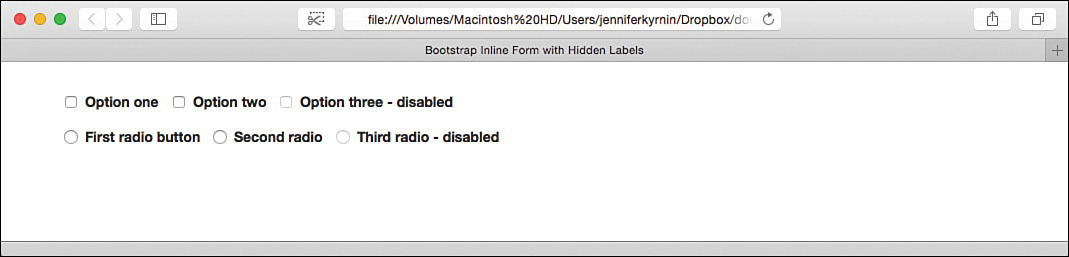
Checkboxes and Radio Buttons
Bootstrap adds a few additional classes for checkboxes and radio buttons. The two you always use are .checkbox and .radio. Place those in container element around the form control. You can create disabled controls with the standard HTML disabled attribute. But if you add the Bootstrap class .disabled to the container element, that will display a “not allowed” cursor when the label is moused over. Listing 9.6 shows how to create checkboxes and radio buttons in Bootstrap.
LISTING 9.6 Bootstrap Checkboxes and Radio Groups
<div class="checkbox">
<label>
<input type="checkbox" value="one">
Option one
</label>
</div>
<div class="checkbox">
<label>
<input type="checkbox" value="two">
Option two
</label>
</div>
<div class="checkbox disabled">
<label>
<input type="checkbox" value="three" disabled>
Option three - disabled
</label>
</div>
<div class="radio">
<label>
<input type="radio" value="r-one">
First radio button
</label>
</div>
<div class="radio">
<label>
<input type="radio" value="r-two">
Second radio
</label>
</div>
<div class="radio disabled">
<label>
<input type="radio" value="r-three" disabled>
Third radio - disabled
</label>
</div>
As you can see from Figure 9.6, when you mouse over the label of a disabled item, the cursor will change to give additional visual cues that the field is disabled.

You can also create inline checkboxes and radio groups with the .checkbox-inline and .radio-inline classes. Use these classes in place of the .checkbox and .radio classes in the container element. These will create form fields that look like Figure 9.7.
Sometimes it can be useful to have just a checkbox or radio button on your page without any label text at all. You can do this with Bootstrap, but best practices recommend that you include some type of label for accessibility. The easiest way is to include your label with the aria-label attribute, like this:
<input type="checkbox" id="soloCheckbox" value="value"
aria-label="Label for assistive devices">
Dropdown Menus
You can create dropdown menus with the HTML <select> and <option> tags. You create these just like you would normal HTML dropdown menus. Just make sure to use the .form-control class to have them styled correctly. Listing 9.7 shows a standard dropdown menu.
LISTING 9.7 A Standard Dropdown Menu
<select id="dropdown" class="form-control">
<option>pick one</option>
<option>one</option>
<option>two</option>
<option>three</option>
</select>
You can also use the multiple attribute to allow for multiple answers and the <optgroup> tag to group the menu options in the menu.
Sizing Form Controls
Bootstrap will let you size the width and height of form controls. To size the width of the controls, use the grid column classes such as .col-md-*. You learned about those in Hour 5, “Grids and How to Use Them.”
Sizing the height is just as easy. Add the classes .input-lg and .input-sm to the form controls you would like to make large or small, respectively:
<input type="text" id="textField" class="form-control input-lg">
<input type="text" id="textField" class="form-control input-sm">
You can also size all the elements inside a form group by adding .form-group-lg or .form-group-sm to the form group container:
<div class="form-group form-group-lg">
<div class="form-group form-group-sm">
This will size the labels and form controls within horizontal forms.
Help Blocks
Bootstrap provides the class .help-block to define blocks of text that describe and inform users about the form fields. Place that class on a <p> or <span> tag that follows the form field:
<span id="helpfield" class="help-block">This text describes a
form field.</span>
You should then associate the help text with the form field it applies to with the aria-describedby attribute. Screen readers will then announce the help text when the user focuses or enters the form control:
<input type="text" id="inputWithHelpBlock" class="form-control"
aria-describedby="helpfield">
Make sure the aria-describedby attribute points to the id of the help block for that element. You can include as many help blocks as you need in the form.
Input Groups
Some forms and form controls can benefit from additional elements around the control. Input groups let you add fields before and after (or both) the <input> form control to help customers fill out the form more efficiently.
Basic Input Groups
You can create a form control that has a dollar sign ($) before the form field, and two empty decimal points (.00) after the field. Figure 9.6 shows how this would look.
To create this form field, you use two additional classes: .input-group and .input-group-addon. An input group is a group of items that are related to the form control, and the add-ons connect to the form control as if they were part of it. Just make sure you don’t mix input groups with form groups or other grid elements. Always be sure that input groups are nested inside form groups/grid elements. Listing 9.8 shows the HTML for the form in Figure 9.8.
LISTING 9.8 Form with Input Group
<form action="#" class="form-inline">
<div class="form-group">
<div class="input-group">
<label for="cost" class="sr-only">Amount</label>
<div class="input-group-addon">$</div>
<div><input type="number" required id="cost"
placeholder="Amount" class="form-control"></div>
<div class="input-group-addon">.00</div>
</div>
</div>
<button type="submit" class="btn btn-default">Send Funds</button>
</form>

Sizing Input Groups
Input groups will remain a default size, but you can make them both larger and smaller to suit your needs with the classes .input-group-lg and .input-group-sm. Figure 9.9 shows the three sizes of input groups, and Listing 9.9 shows how you code them.

LISTING 9.9 Different-sized Input Groups
<p>
<div class="input-group input-group-lg">
<label for="username" class="sr-only">Username</label>
<span class="input-group-addon"><span
class="glyphicon glyphicon-user"></span></span>
<input type="text" required id="email" placeholder="Username"
class="form-control">
</div>
</p>
<p>
<div class="input-group">
<label for="username" class="sr-only">Username</label>
<span class="input-group-addon"><span
class="glyphicon glyphicon-user"></span></span>
<input type="text" required id="email" placeholder="Username"
class="form-control">
</div>
</p>
<p>
<div class="input-group input-group-sm">
<label for="username" class="sr-only">Username</label>
<span class="input-group-addon"><span
class="glyphicon glyphicon-user"></span></span>
<input type="text" required id="email" placeholder="Username"
class="form-control">
</div>
</p>
Caution: Use <span> When You Size Input Groups
In Listing 9.8, the listing group add-ons were added on container <div> elements. But if you use <div> tags when sizing the input groups, you can end up with controls that don’t match in size and look bad. If you want to test this, change the <span class="input-group-addon"> in the .input-group-lg input group in Listing 9.9 and then view it in Chrome.
Fancy Add-ons
You can add many things in input groups, including checkboxes and radio buttons, dropdown menus, buttons, and combinations of them all.
To add these, you simply add HTML to the .input-group-addon element. Listing 9.10 shows how to add a radio button or a checkbox as an add-on. Even though you can add other HTML to the add-on area, if you do more than a short block of text or code, you should test thoroughly in browsers and smaller devices to ensure it doesn’t mess up your input group.
LISTING 9.10 Radio Buttons and Checkboxes as Input Add-ons
<div class="row">
<div class="col-lg-6">
<div class="input-group">
<span class="input-group-addon">
<input type="checkbox" id="other" aria-label="Other"
value="other">
</span>
<input type="text" id="otherText" class="form-control"
aria-label="Other Text" placeholder="other text">
</div>
</div>
<div class="col-lg-6">
<div class="input-group">
<span class="input-group-addon">
<input type="radio" id="other2" aria-label="Other 2"
value="other2">
</span>
<input type="text" id="otherText2" class="form-control"
aria-label="Other Text 2" placeholder="other text">
</div>
</div>
</div>
As shown in Figure 9.10, the checkbox or radio button appears beside the input control just like the text blocks did in earlier examples.

You can also use buttons as input group add-ons. I discuss this in more detail in Hour 11, “Styling and Using Buttons and Button Groups.”
Interactivity in Bootstrap Forms
Bootstrap provides styles for form interactivity to make the forms easier to use. These include
Focus—The form field is selected in the browser.
Disabled—The form field is disabled.
Read-only—The form field is read-only.
Validation—The form field is successful, has a warning, or has an error.
Focus State
When a form control has focus, Bootstrap removes the default outline styles and adds a box-shadow. You can use custom CSS styles to change the colors to match your styles. Listing 9.11 shows the CSS to style the focus state of an input control <input type="text" id="formField">.
LISTING 9.11 CSS to Restyle an Input Field Focus State
#formField:focus {
border-color: #7B66E9;
outline: 0;
-webkit-box-shadow: inset 0 1px 1px rgba(0,0,0,.075),
0 0 8px rgba(170,158,232,0.5);
box-shadow: inset 0 1px 1px rgba(0,0,0,.075),
0 0 8px rgba(170,158,232,0.75);
}
Disabled and Read-Only States
When you add the attribute disabled to a form control, it prevents users from filling in the field and changes the look of the field. You can also add the attribute to a <fieldset> tag to disable all the form fields inside the set:
<input type="text" class="form-control" id="textfld" disabled>
Caution: Disabled Fieldsets Have Some Issues
A few issues exist with using the disabled attribute on the <fieldset> tag. If you use any <a> tags inside the set, they will not be disabled but only given a style of pointer-events: none. You should use JavaScript to disable these elements. Also, Internet Explorer 11 and below don’t support the disabled attribute on a <fieldset>. So you should add custom JavaScript as a fallback option.
You can make any form control read-only by adding the readonly attribute to the form:
<input type="text" class="form-control" id="textfld" readonly>
Validation States
You can define validation states for errors, warnings, and success using the classes .has-error, .has-warning, and .has-success. Figure 9.11 shows how these look; Listing 9.12 shows how the HTML looks.

LISTING 9.12 Validation States on Form Fields
<form>
<div class="form-group has-success">
<label for="textSuccess">Success</label>
<input type="text" class="form-control" id="textSuccess"
placeholder="Success">
</div>
<div class="form-group has-warning">
<label for="textWarning">Warning</label>
<input type="text" class="form-control" id="textWarning"
placeholder="Warning">
</div>
<div class="form-group has-error">
<label for="textError">Error</label>
<input type="text" class="form-control" id="textError"
placeholder="Error">
</div>
</form>
Add a feedback icon by adding the .has-feedback class to the form group and using the appropriate Glyphicon (discussed in more detail in Hour 10, “Images, Media Objects, and Glyphicons”) along with the .form-control-feedback class. Figure 9.12 is a form element with a feedback icon. Listing 9.13 shows the HTML.
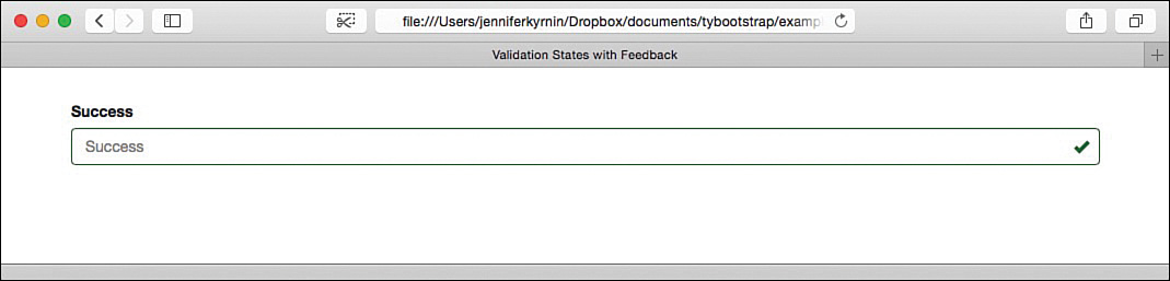
LISTING 9.13 Validation States with Feedback Icon
<div class="form-group has-success has-feedback">
<label for="textSuccess">Success</label>
<input type="text" class="form-control" id="textSuccess"
placeholder="Success">
<span class="glyphicon glyphicon-ok form-control-feedback"
aria-hidden="true"></span>
</div>
Summary
This hour covered creating and styling web forms. You learned how to create basic forms and lay them out vertically (the default), horizontally, and inline.
Bootstrap supports a large number of form controls. This hour covered basic input tags, checkbox and radio buttons, creating dropdown menus with the <select> and <option> tags, adjusting the size of the form fields, and adding help blocks to assist users with the form.
Input groups help make the text input fields easier to use by adding additional text, icons, and other fields. This hour explained how to use input groups and how to size them to work well with your design.
Finally, you learned about the many styles that Bootstrap provides for interacting with the forms. This hour covered the focus, disabled, and read-only states as well as the three validation states for forms.
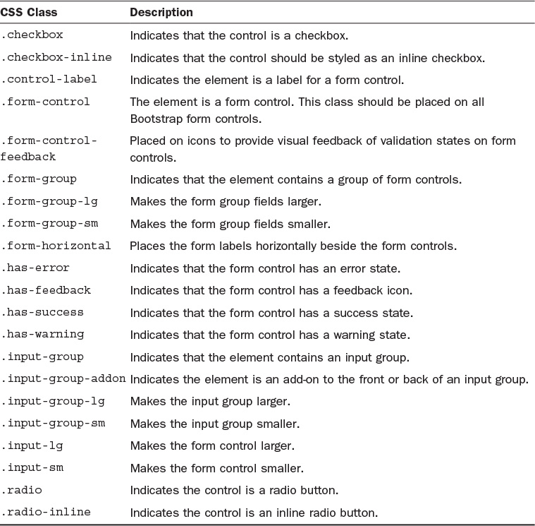
Table 9.1 shows the CSS classes Bootstrap adds for forms.
Workshop
The workshop contains quiz questions to help you process what you’ve learned in this hour. Try to answer all the questions before you read the answers.
A. A read-only form field can still get focus, and when the form is submitted, the value it has (if any) is submitted with the rest of the form. Disabled elements cannot get focus and are not submitted with the form fields. Bootstrap displays them with slightly different background colors, but otherwise they are the same.
Q. What is the difference between a static control and a read-only form control?
A. The read-only form control will still appear to be a fillable form element, while static controls will just look like text. Static controls are best used for fields that are never modified after they are created, such as usernames. This tells the reader what information is going to be automatically submitted, but there is no visual prompt to change it.
Q. Will Bootstrap form validation states show up in screen readers?
A. No. Like other contextual classes, the form validation states provide only visual feedback. You need to add aria-describedby attributes pointing to the validation labels so that screen readers know to read them. You can do this with help blocks that appear along with the validation states or with labels that are hidden with the .sr-only class.
Quiz
1. Why are labels important in Bootstrap forms?
a. Bootstrap won’t style a form control without a label.
b. Form controls won’t work without labels.
c. Labels make the form accessible to screen readers.
d. Labels are not required.
2. How does a horizontal form differ from a standard Bootstrap styled form?
a. Horizontal forms have the labels displayed on the same line as the form control, while regular tables place the label directly above the form control.
b. Horizontal forms take up 100% of the width, while regular forms take up only as much width as the control needs.
c. Horizontal forms have wider form labels than standard forms.
d. There is no difference. Horizontal forms are the default for Bootstrap.
3. True or False: The class .col-md-3 grid class is used on the form control to size horizontal forms.
4. True or False: Bootstrap automatically displays a calendar on date and datetime input controls.
5. Which of these is a Bootstrap class for styling input form controls?
a. .color
b. .url
c. .radio
d. .week
6. True or False: The multiple attribute is a feature of Bootstrap.
7. What does the .input-lg class do?
a. It makes all input tags in the input group larger.
b. It makes all input tags in the form group larger.
c. It makes all input tags in the form larger.
d. It makes the input tag it is applied to larger.
8. What is an input group in Bootstrap?
a. A group of input tags
b. Any group of form tags
c. A group of elements that create a standalone field with icons or text at the beginning or end (or both) of the input control
d. Any group of tags that create form fields
9. How can you make input groups smaller?
a. .input-sm
b. .input-group-sm
c. .form-group-sm
d. All of the above
10. What does Bootstrap do for focused form fields?
a. It changes the background color of the field.
b. It changes the box-shadow on the field.
c. It changes the font color of the field text.
d. It doesn’t change the field at all.
Quiz Answers
1. c. Labels make form controls accessible to screen readers.
2. a. Horizontal forms have the labels displayed on the same line as the form control, while regular tables place the label directly above the form control.
3. True.
4. False. Calendars are added by the browser or fallback scripts.
5. c. .radio is a class to help style radio buttons.
6. False. The multiple attribute is part of HTML, not specifically Bootstrap.
7. d. The .input-lg makes the input tag it is applied to larger.
8. c. An input group is a group of elements that create a standalone field with icons or text at the beginning or end (or both) of the input control.
9. b. .input-group-sm
10. b. It changes the box-shadow on the field.
Exercises
1. Add a form to your Bootstrap web page. Be sure to include form groups and input groups.
2. Add a dropdown menu as an add-on to an input group in your form. This works the same as adding a checkbox to an input group, except you use the <select> and <option> tags.