
Hour 12. Creating Navigation Systems with Bootstrap
What You’ll Learn in This Hour:
 How to build standard navigation elements
How to create dropdown and dropup menus
How to add site navigation with navbars
How to build breadcrumbs and pagination
How to create list groups
Navigation is an important part of any website. It’s how visitors get around and how the site owners position the content so it can be found.
Bootstrap offers several features for navigation. This hour you will learn how to create standard navigation and navbars, dropdown menus, breadcrumbs, and list groups, and even add pagination to your web pages.
Standard Navigation Elements
Navigation systems in Bootstrap are called navs. You use the base .nav class on the container element to create a nav. In HTML5 you should start with the <nav> element to define the navigation. This element can define navigation for the entire site, the page, or even just the section it’s in. Include a role="navigation" attribute on the <nav> element so your navigation is accessible. Your navigation will be in a list element such as <ul>, and each item will be an <li> element with a link (<a>).
The two types of standard navigation are
.nav-pills—Creates a small button for each navigation item
.nav-tabs—Turns the navigation elements into simple tabs
Try it Yourself: Build a Simple Navigation in Bootstrap
1. Open your Bootstrap page in an HTML editor.
2. Add the following HTML:
<nav role="navigation">
<ul>
<li role="presentation"><a href="#">Home</a></li>
<li role="presentation"><a href="#">About</a></li>
<li role="presentation"><a href="#">Articles</a></li>
<li role="presentation"><a href="#">Support</a></li>
</ul>
</nav>
3. Add the .nav class to the <ul> tag.
4. Add the .nav-pills class to the <ul> tag.
5. Add the .active class to the first <li> tag.

LISTING 12.1 HTML for Tabbed Navigation
<nav role="navigation">
<ul class="nav nav-tabs">
<li role="presentation" class="active"><a
href="#">Home</a></li>
<li role="presentation"><a href="#">About</a></li>
<li role="presentation"><a href="#">Articles</a></li>
<li role="presentation"><a href="#">Support</a></li>
</ul>
</nav>
If you use the .nav-pills class, you can create a vertical navigation with the added class .nav-stacked. This will convert the navigation elements to the width of the container. You can create a standard two-column layout as in Figure 12.2 by putting the navigation in one grid column and the main content in another.

As you can see in Listing 12.2, the column classes are placed right on the <nav> and <article> elements.
LISTING 12.2 Two-Column Layout with Stacked Pills Navigation
<!DOCTYPE html>
<html lang="en">
<head>
<meta charset="utf-8">
<meta http-equiv="X-UA-Compatible" content="IE=edge">
<meta name="viewport"
content="width=device-width, initial-scale=1">
<title>Bootstrap Stacked Navigation</title>
<!-- Bootstrap -->
<link href="css/bootstrap.min.css" rel="stylesheet">
<!-- HTML5 shim and Respond.js for IE8 support of HTML5
elements and media queries -->
<!-- WARNING: Respond.js doesn't work if you view the page
via file:// -->
<!--[if lt IE 9]>
<script
src="https://oss.maxcdn.com/html5shiv/3.7.2/html5shiv.min.js">
</script>
<script
src="https://oss.maxcdn.com/respond/1.4.2/respond.min.js"></script>
<![endif]-->
</head>
<body>
<div class="container">
<div class="row">
<nav role="navigation" class="col-sm-3">
<ul class="nav nav-pills nav-stacked">
<li role="presentation" class="active">
<a href="#">Home</a></li>
<li role="presentation"><a href="#">About</a></li>
<li role="presentation"><a href="#">Articles</a></li>
<li role="presentation"><a href="#">Support</a></li>
</ul>
</nav>
<article class="col-sm-9">
<h1>Lorem ipsum dolor sit amet.</h1>
<p>Lorem ipsum dolor sit amet, consectetur adipiscing elit.
Nam aliquam dolor sit amet erat porta auctor. Etiam eu
ultrices orci, at tincidunt metus. Nunc at mauris rutrum,
consectetur tellus ut, porttitor justo. Aenean vitae
bibendum risus. Proin eros elit, lobortis et metus at,
imperdiet tristique velit.</p>
</article>
</div>
</div>
</body>
</html>
You can make both tabs and pills the equal width with the .nav-justified class. This will resize the navigation links in browsers wider than 768px. Smaller than that, and the navigation links will be stacked. You can see how this looks with both pills and tabs in Figure 12.3.

If you want to disable sections of your navigation, just add the .disabled class to the <li> items. For example:
<li role="presentation" class="disabled"><a href="#">Games</a></li>
This will make the links gray and remove any hover effects. Keep in mind that the <a> tag will still function. Use JavaScript to disable the links completely.
Dropdowns
Dropdown menus are a great way to add some simple navigation to your pages. You add a container with the .dropdown class surrounding a button with the .dropdown-toggle class. (Learn more about buttons in Hour 11, “Styling and Using Buttons and Button Groups.”) Then you add the menu with the .dropdown-menu class. Listing 12.3 shows how it might look.
<div class="dropdown">
<button class="btn btn-default dropdown-toggle" data-toggle="dropdown">
Choose One...
<span class="caret"></span>
</button>
<ul class="dropdown-menu">
<li><a href="#">Item 1</a></li>
<li><a href="#">Item 2</a></li>
<li><a href="#">Item 3</a></li>
<li><a href="#">Item 4</a></li>
</ul>
</div>
After you have your dropdown menu, you need to be sure to include links to jQuery and the Bootstrap JavaScript at the bottom of your HTML document. For example:
<script src="http://code.jquery.com/jquery-latest.js"></script>
<script src="js/bootstrap.min.js"></script>
Here are a few other classes you can add to your dropdown menus:
.dropdown-menu-left—Forces the menu to display left aligned on the container (the default)
.dropdown-menu-right—Forces the menu to display right aligned on the container
.dropdown-header—Creates a header menu item
.divider—Creates a divider inside the menu
.disabled—Disables the menu item
Figure 12.4 shows how the .dropdown-header, .divider, and .disabled classes look on menu items.

Caution: Only One Level of Dropdown Menu
One thing that Bootstrap 3 doesn’t do right out of the box is help you create multilevel dropdown menus. One level is all you get. If you need a more complex navigation structure than just the one dropdown, you need to add custom CSS and JavaScript. You can find many articles on the Web to help. This Fiddle (http://jsfiddle.net/chirayu45/YXkUT/16/) is a good example.
Split Dropdowns
Split button dropdowns are dropdown menus created on a button group that make it appear to be one single button with a dropdown menu on one side.
To create this, you need to use a button group with two buttons: the action button with text on it and a dropdown button that just has the .caret icon class on it to trigger the dropdown menu.
Try it Yourself: Create a Split Button Dropdown Menu
1. Open your Bootstrap page in a web editor.
2. Create a button group with an action button:
<div class="btn-group">
<button class="btn btn-primary">Choose One...</button>
</div>
3. Add another button below the first, and make this one your dropdown toggle:
<button class="btn btn-primary dropdown-toggle"
data-toggle="dropdown">
<span class="caret"></span>
<span class="sr-only">Trigger Dropdown Menu</span>
</button>
4. Create a list with your dropdown links inside the button group container:
<ul class="dropdown-menu">
<li>...</li>
</ul>
5. Verify that you have linked to both jQuery and the Bootstrap JavaScript file at the bottom of the document, and then test it in your web browser.
LISTING 12.4 A Split Button Dropdown Menu
<div class="btn-group">
<button class="btn btn-primary">Choose One...</button>
<button class="btn btn-primary dropdown-toggle"
data-toggle="dropdown">
<span class="caret"></span>
<span class="sr-only">Trigger Dropdown Menu</span>
</button>
<ul class="dropdown-menu">
<li class="dropdown-header">Section 1</li>
<li><a href="#">Item 1</a></li>
<li><a href="#">Item 2</a></li>
<li class="disabled"><a href="#">Item 3</a></li>
<li class="divider"></li>
<li class="dropdown-header">Section 2</li>
<li><a href="#">Item 4</a></li>
<li><a href="#">Item 5</a></li>
</ul>
</div>

Dropup Variation
Sometimes you don’t want the menu to drop below the button or toggle element, but rather to go up above it. Bootstrap provides a way to do this too with the class .dropup.
All you do is apply the .dropup class to the button group container in the same way you would apply the .dropdown class. Listing 12.5 shows a simple dropup menu.
LISTING 12.5 A Simple Dropup Menu
<div class="btn-group dropup">
<button class="btn btn-default dropdown-toggle"
data-toggle="dropdown">
Choose One...
<span class="caret"></span>
</button>
<ul class="dropdown-menu">
<li class="dropdown-header">Section 1</li>
<li><a href="#">Item 1</a></li>
<li><a href="#">Item 2</a></li>
<li class="disabled"><a href="#">Item 3</a></li>
<li class="divider"></li>
<li class="dropdown-header">Section 2</li>
<li><a href="#">Item 4</a></li>
<li><a href="#">Item 5</a></li>
</ul>
</div>
Caution: Leave Space for Dropup Menus
You should not use dropup menus at the top of web pages because the top of the window could cut off the menu. Browsers do not add scrollbars when the menus appear, so they are impossible to see or click on if they open beyond the window frame.
Be sure to add text or other content above the HTML in Listing 12.5 so that it’s not cut off by the browser window as the caution notes.
One thing to note about using the .dropup class is that it works best on .btn-group elements. If you want your dropup menu to appear without being in a button group, you simply add the .btn-group class to the container but do not add multiple buttons. Listing 12.5 shows this.
Navbars
Navigation in web pages is often found in the form of navigation bars, or navbars, and Bootstrap adds some specific features for navbars. These work as headers for your website or web application. Bootstrap navbars
Start out collapsed in mobile views and can be toggled on and off
Include a place for your brand text or image
Can include buttons, button groups, dropdowns, and non-navigation links
Allow for forms including search boxes
Can be aligned to the right or left and fixed to the top or the bottom of the screen as well as positioned statically on the page
Have an inverted option for different colors
When you are building navbars in Bootstrap, it’s important to remember that Bootstrap is a mobile first framework. So everything you build is first designed for a mobile device, and then features for larger devices are added. Figure 12.6 shows the navigation in Listing 12.6 in a narrow window and a full-sized window.

LISTING 12.6 The HTML for a Navbar
<nav class="navbar navbar-default">
<div class="container-fluid">
<div class="navbar-header">
<button type="button" class="navbar-toggle collapsed"
data-toggle="collapse" data-target="#collapsedNav">
<span class="sr-only">Toggle navigation</span>
<span class="icon-bar"></span>
<span class="icon-bar"></span>
<span class="icon-bar"></span>
</button>
<a href="#" class="navbar-brand">
<img src="images/dandylion-logo.png"
style="height:100%; width: auto;" alt="Dandylions"/>
</a>
<p class="navbar-text"><strong>Dandylions</strong></p>
</div>
<div class="collapse navbar-collapse" id="collapsedNav">
<ul class="nav navbar-nav">
<li class="active"><a href="#">Home</a></li>
<li><a href="">Products</a></li>
<li><a href="">Support</a></li>
</ul>
<form class="navbar-form navbar-right" role="search">
<div class="form-group">
<input type="text" class="form-control"
placeholder="Search">
</div>
</form>
<ul class="nav navbar-nav navbar-right">
<li><a href="">Contact Us</a></li>
</ul>
</div>
</div>
</nav>
Caution: Watch Your Navbar Length
Bootstrap cannot tell how wide your navigation is going to be, and if it gets wider than the current window can handle, it will wrap to a second line. To prevent this, you can remove items from your navigation, reduce the width of the items in the navigation, display certain items only at larger widths with responsive utility classes (see Hour 13, “Bootstrap Utilities”), or change when your navbar switches from collapsed to horizontal mode with CSS.
The collapsing navigation is part of the navbar collapse plugin and is included in the Bootstrap JavaScript file. Be sure to include the collapse plugin in the Bootstrap JavaScript on your page; otherwise, your navigation will not toggle in mobile browsers.
To create a navbar in Bootstrap, you first add a <nav> element with the class .navbar. The most common type of navbar uses the .navbar-default class. Inside the <nav> element, you place a container div with either the .container or .container-fluid class on it to define where the navigation should display. Finally, you place your branding elements, buttons, links, form fields, and other navigation tools in your navbar as you like.
Navbar Headers and Brands
A navbar header is a section of the navigation that will be seen by most users. It usually contains things like branding and logos, buttons to toggle the navigation on and off, and other critical items. You define your navbar header with the class .navbar-header.
You can add a logo or brand to your Bootstrap navbar with the .navbar-brand class. You can use either text or an image for your navbar brand. Listing 12.7 shows a basic navbar brand using text.
<nav class="navbar navbar-default">
<div class="container-fluid">
<div class="navbar-header">
<a href="#" class="navbar-brand">Dandylions</a>
</div>
</div>
</nav>
Toggling the Navigation
To be responsive, navigation is usually collapsed and hidden in mobile browsers, and that means you need a way to let mobile users see the navigation. It’s best to group the toggle button with the brand so that mobile users get a better experience. You group them inside the .navbar-header you learned about previously.
You can create a toggle button however you want, but Bootstrap makes it easy to create a “hamburger” icon using only HTML and CSS. In Listing 12.8 you can see three span tags that read <span class="icon-bar"></span>. Each one of these creates a small line in the button, and three stacked creates the hamburger icon.
LISTING 12.8 Building a Navigation Toggle Button
<button type="button" class="navbar-toggle collapsed"
data-toggle="collapse" data-target="#collapsedNav">
<span class="sr-only">Toggle navigation</span>
<span class="icon-bar"></span>
<span class="icon-bar"></span>
<span class="icon-bar"></span>
</button>
The button uses the .navbar-toggle and .collapsed classes to indicate that this is a toggle button and that it should be shown only when the navbar is in a collapsed state. Here are two other attributes that you should be aware of:
data-toggle="collapse"—This is a data field that tells the JavaScript that this is a collapsed element. The script uses this field to know when to collapse and uncollapse the menu.
data-target="#collapsedNav"—This is a data field that tells the JavaScript which elements to collapse and uncollapse. Later in the menu, there will be a container element with the id of collapsedNav. This is what will appear and disappear when the navigation is toggled on and off.
The last thing you need to create a toggleable navigation system is the navigation that will be turned on and off. Add a container element <div> with the classes .collapse and .navbar-collapse. Be sure to give it an id that matches the data-target you listed in your toggle button. Then place all the navigation elements you want toggleable in that container. Figure 12.7 shows navigation that has been opened with the toggle.

Links, Text, Buttons, and Forms in Navbars
Most navbars are made up of links, buttons, and dropdown menus, and you can include all those things in your Bootstrap navbars as well as plain text.
Add links to your navbar with an unordered list. Give the list the classes .nav and .navbar-nav so they display correctly in the navbar. Listing 12.9 shows the HTML for a collapsible navbar section with three links.
LISTING 12.9 Collapsible Navbar with Three Links
<div class="collapse navbar-collapse" id="collapsedNav">
<ul class="nav navbar-nav">
<li class="active"><a href="#">Link</a></li>
<li><a href="#">Link</a></li>
<li><a href="#">Link</a></li>
</ul>
</div>
The collapse function won’t do anything other than disappear in larger screens until you have the JavaScript included in a complete Bootstrap page. See Listing 12.11 for a full listing.
Although you can simply add text to your navbar, this can result in some odd-looking layouts. So, Bootstrap provides the style .navbar-text to give your text the correct color and leading. In addition, a .navbar-link class is available for links in your navbar that aren’t part of the navigation. This gives them a more standard link look and feel. For example:
<p class="navbar-text">
We love <a href="" class="navbar-link">Weeds</a>!
</p>
You add buttons the same way you add buttons anywhere else on your web page—with the .btn and .btn-style classes. But you also should use the .navbar-btn class so the button is vertically centered in the navbar. For example:
<button class="btn btn-default navbar-btn"
type="button">Click Me</button>
Forms are added in a similar way, using the .navbar-form class. This ensures that the form is aligned correctly vertically in the navbar and collapses in smaller windows. Just be careful that you check your form fields in several browsers because some form controls require fixed widths to display correctly in the navbar. Listing 12.10 shows the HTML for a form and button.
LISTING 12.10 A Form and Button in a Navbar
<nav class="navbar navbar-default">
<div class="container-fluid">
<div class="collapse navbar-collapse" id="collapsedNav">
<form class="navbar-form navbar-right" role="search">
<div class="form-group">
<input type="text" class="form-control"
placeholder="Search">
</div>
</form>
<button type="button"
class="btn btn-default navbar-btn navbar-right">
Contact Us
</button>
</div>
</div>
</nav>
Figure 12.8 shows a navbar with several different components, and Listing 12.11 shows the HTML for it.
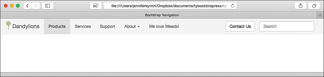
LISTING 12.11 HTML for a Navbar with Multiple Components
<!DOCTYPE html>
<html lang="en">
<head>
<meta charset="utf-8">
<meta http-equiv="X-UA-Compatible" content="IE=edge">
<meta name="viewport"
content="width=device-width, initial-scale=1">
<title>Bootstrap Navigation</title>
<!-- Bootstrap -->
<link href="css/bootstrap.min.css" rel="stylesheet">
<!-- HTML5 shim and Respond.js for IE8 support of HTML5
elements and media queries -->
<!-- WARNING: Respond.js doesn't work if you view the page
via file:// -->
<!--[if lt IE 9]>
<script
src="https://oss.maxcdn.com/html5shiv/3.7.2/html5shiv.min.js">
</script>
<script
src="https://oss.maxcdn.com/respond/1.4.2/respond.min.js"></script>
<![endif]-->
<style>
img#dandylionLogo {
height:100%; width: auto; display: inline; margin-top: -10px;
}
</style>
</head>
<body>
<nav class="navbar navbar-default">
<div class="container-fluid">
<div class="navbar-header">
<button type="button" class="navbar-toggle collapsed"
data-toggle="collapse"
data-target="#collapsedNav">
<span class="sr-only">Toggle navigation</span>
<span class="icon-bar"></span>
<span class="icon-bar"></span>
<span class="icon-bar"></span>
</button>
<a href="#" class="navbar-brand">
<img src="images/dandylion-logo.png" alt="Dandylion"
id="dandylionLogo" />Dandylions
</a>
</div>
<div class="collapse navbar-collapse" id="collapsedNav">
<ul class="nav navbar-nav">
<li class="active"><a href="#">Products</a></li>
<li><a href="#">Services</a></li>
<li><a href="#">Support</a></li>
<li class="dropdown">
<a href="#" class="dropdown-toggle"
data-toggle="dropdown" role="button"
aria-expanded="false">
About <span class="caret"></span>
</a>
<ul class="dropdown-menu" role="menu">
<li><a href="#">Articles</a></li>
<li><a href="#">Related Sites</a></li>
</ul>
</li>
</ul>
<p class="navbar-text">
We love <a href="" class="navbar-link">Weeds</a>!
</p>
<form class="navbar-form navbar-right" role="search">
<div class="form-group">
<input type="text" class="form-control"
placeholder="Search">
</div>
</form>
<button type="button"
class="btn btn-default navbar-btn navbar-right">
Contact Us
</button>
</div>
</div>
</nav>
<script src="http://code.jquery.com/jquery-latest.js"></script>
<script src="js/bootstrap.min.js"></script>
</body>
</html>
Changing the Navbar Colors and Alignment
Bootstrap navbars default to a light gray background color with darker gray highlights. But an alternative dark version exists that you can use by switching to the inverted navbar with the .navbar-inverse class. Figure 12.9 shows what that looks like.

Put the .navbar-inverse class on the container element for the navbar. This will change the colors to a black navigation bar with dark gray highlights. You will learn how to modify Bootstrap to use other colors in Hour 21, “Customizing Bootstrap and Your Bootstrap Website.”
You also can adjust where the navbar displays and whether it scrolls with the content. Having navigation fixed to the top or bottom of the screen can be useful for sites that have a lot of information or extremely long pages. Bootstrap lets you easily adjust your navigation position with these classes:
.navbar-static-top—Removes any padding and margin around the navbar to position it directly at the top of the page. The navbar will scroll with the rest of the page.
.navbar-fixed-top—Removes the padding and margin around the top of the navbar and positions it at the top of the window. Content will then scroll beneath it, but it will never leave the window.
.navbar-fixed-bottom—Removes the padding and margin around the bottom of the navbar and positions it at the bottom of the window. Content then scrolls beneath it, but it will never leave the window.
When you fix the navbar to the top of the window, you must add some CSS to your body tag so it won’t be covered by the navigation. The navbar starts out at 50px tall, but you should test values that work for your design:
body { padding-top: 70px; }
As shown in Figure 12.10, scrolling pushes the content underneath the fixed navbar.

You also can position the elements inside your navbar with the .navbar-left and .navbar-right classes. This adds a CSS float to the property in the indicated direction. Be aware that there is a limitation on the way .navbar-right elements are positioned, and the margins might look off. Be sure to test this in your browsers. This component is being looked at for revision in Bootstrap version 4.
Breadcrumbs and Pagination
Two other common forms of navigation are breadcrumbs and pagination. These are typically used as extra navigation for large sites or large documents.
Breadcrumbs create a site hierarchy that allows customers to discover where they are quickly and easily. Bootstrap automatically adds separators to your breadcrumb links. Turn an ordered list into breadcrumbs with the class .breadcrumb. You can then indicate the current page with the .active class. Listing 12.12 shows how.
LISTING 12.12 Bootstrap Breadcrumbs
<ol class="breadcrumb">
<li><a href="">Dandelions</a></li>
<li><a href="">Recipes</a></li>
<li><a href="">Drinks</a></li>
<li class="active">Dandelion Wine</li>
</ol>
Pagination gives links to multiple pages of content within your site or application. There are two ways to do it: standard pagination and the pager alternative.
To create pagination, write a list of links to the pages and add the class .pagination to it. Most pagination includes icons at the beginning and end of the list to enable customers to simply move to the next or previous page. Add those by adding previous and next links with the icons or characters you want to use. Listing 12.13 shows a standard Bootstrap pagination list.
LISTING 12.13 Standard Bootstrap Pagination
<ul class="pagination">
<li>
<a href="" aria-label="Previous">
<span class="glyphicon glyphicon-arrow-left"></span>
</a>
</li>
<li><a href="">1</a></li>
<li><a href="">2</a></li>
<li><a href="">3</a></li>
<li><a href="">4</a></li>
<li><a href="">5</a></li>
<li>
<a href="" aria-label="Next">
<span class="glyphicon glyphicon-arrow-right"></span>
</a>
</li>
</ul>
You can make your pagination links larger with the .pagination-lg class and smaller with the .pagination-sm class. By using the .active and .disabled classes, you can highlight the current page and deemphasize pages that don’t work (like the “previous” page on the first page of a document).
If you don’t want to list every page or you just need a simpler “next/previous” style pagination, Bootstrap provides the .pager class. Put this class on the unordered list, and then the two list items should be “Previous” and “Next.” If you add the classes .previous and .next to the list items, this will align them to the left and right sides of the container. Listing 12.14 shows a pager list with the links aligned to the sides.
LISTING 12.14 Pager List with Links to the Side
<ul class="pager">
<li class="previous"><a href="">
<span class="glyphicon glyphicon-arrow-left"></span> Previous
</a></li>
<li class="next"><a href="">
Next <span class="glyphicon glyphicon-arrow-right"></span>
</a></li>
</ul>
Figure 12.11 shows some breadcrumbs and pagination in Bootstrap.

List Groups
List groups are a component you can use to display simple and complex lists with your own custom content. They also can be used to create interesting vertical navigation.
To create a list group, build a standard HTML list and add the .list-group class to the container—either <ul> or <ol>. Then each <li> item in the list gets the .list-group-item class. Figure 12.12 shows what a simple list group looks like.

If you add badges to your list group (learn about badges in Hour 6, “Labels, Badges, Panels, Wells, and the Jumbotron”), they will be automatically aligned to the right. Listing 12.15 shows what the HTML for a list group with badges looks like.
LISTING 12.15 A List Group with Badges
<ul class="list-group">
<li class="list-group-item"><em>Taraxacum albidum</em>
<span class="badge">14</span></li>
<li class="list-group-item"><em>Taraxacum aphrogenes</em>
<span class="badge">3</span></li>
<li class="list-group-item"><em>Taraxacum brevicorniculatum</em>
<span class="badge">5</span></li>
<li class="list-group-item"><em>Taraxacum californicum</em>
<span class="badge">27</span></li>
<li class="list-group-item"><em>Taraxacum centrasiaticum</em>
<span class="badge">0</span></li>
</ul>
You can create a navigation menu by turning a group of links into a list group. You don’t even need the <ul> or <li> tags (although it’s more accessible to use them). Listing 12.16 shows how to turn a group of links into a navigation list group.
LISTING 12.16 A Group of Links as a List Group
<div class="list-group">
<a href="" class="list-group-item"><em>Taraxacum albidum</em></a>
<a href="" class="list-group-item active"><em>Taraxacum
aphrogenes</em></a>
<a href="" class="list-group-item"><em>Taraxacum
brevicorniculatum</em></a>
<a href="" class="list-group-item"><em>Taraxacum
californicum</em></a>
<a href="" class="list-group-item"><em>Taraxacum
centrasiaticum</em></a>
</div>
You can adjust how the list group items look with the .disabled and .active classes. Several contextual classes exist that you add to each list group item:
.list-group-item-info—Indicates the content is informative
.list-group-item-success—Indicates a successful or positive item
.list-group-item-danger—Indicates a dangerous or negative item
.list-group-item-warning—Indicates something that might be dangerous or difficult
As with all contextual classes, you should always provide alternatives for nonvisual browsers and screen readers if the classes provide information critical to the content.
Where list groups shine as vertical navigation is when you add the .list-group-item-heading and .list-group-item-text classes. These enable you to create linked blocks with headlines and descriptive text, as in Figure 12.13.

As shown in Figure 12.13, the list group describes several dandelion species, with the active item shown as a picture and the commonly misidentified one highlighted with a warning color. This gives you a great navigation structure for a photo gallery where you want to provide additional information about each navigation item. The HTML for Figure 12.13 is in Listing 12.17.
LISTING 12.17 A Fancy List Group
<div class="container">
<div class="row">
<div class="list-group col-md-4">
<a href="" class="list-group-item active">
<h4 class="list-group-item-heading"><em>Taraxacum
albidum</em></h4>
<p class="list-group-item-text">This is a white flowering
dandelion.</p>
</a>
<a href="" class="list-group-item">
<h4 class="list-group-item-heading"><em>Taraxacum
aphrogenes</em></h4>
<p class="list-group-item-text">A Paphos dandelion</p>
</a>
<a href="" class="list-group-item list-group-item-warning">
<h4 class="list-group-item-heading"><em>Taraxacum
brevicorniculatum</em></h4>
<p class="list-group-item-text">This is often incorrectly
identified as the <em>Taraxacum kok-saghyz</em> dandelion</p>
</a>
<a href="" class="list-group-item">
<h4 class="list-group-item-heading"><em>Taraxacum
californicum</em></h4>
<p class="list-group-item-text">This is the endangered
California Dandelion</p>
</a>
<a href="" class="list-group-item">
<h4 class="list-group-item-heading"><em>Taraxacum
centrasiaticum</em></h4>
<p class="list-group-item-text">The Xinjiang dandelion</p>
</a>
</div>
<img src="images/T_albidum01.jpg" alt="T. albidum"
class="col-md-4">
<p class="col-md-12">Content courtesy
<a href="http://en.wikipedia.org/wiki/Taraxacum">Wikipedia</a>
</div>
</div>
Summary
This hour covered the various ways you can create navigation and other lists of links in Bootstrap. You learned about the standard navigation elements such as buttons and links as well as dropdown menus. You also learned how to create navigation bars or navbars.
Navbars add a lot of functionality to your web pages with things like headers and brands as well as features in the navbars such as links, buttons, forms, and text. You also learned how to change the alignment of the navbars as well as the items in them and how to change the color from gray to black. In addition, this hour covered less standard navigation structures like pagination, breadcrumbs, and list groups. All the CSS classes from Hour 12 are listed in Table 12.1.


Workshop
The workshop contains quiz questions to help you process what you’ve learned in this hour. Try to answer all the questions before you read the answers.
Q&A
Q. What is the difference between a nav element and a navbar element?
A. These two elements are very similar. The easiest way to think of them is this: the nav class is for any navigation structure you might have on a page, from a table of contents for the page itself to the full site navigation. The navbar class is used almost exclusively for the primary site navigation. Although it can be used in other locations, it is designed to be positioned at the top or bottom of the page.
Q. I use Bootstrap 2 and noticed that the .nav-list and .nav-header classes have been removed. What do I use instead?
A. There isn’t a direct equivalent in Bootstrap 3, but using list groups as detailed previously or panel groups as detailed in Hour 6 are your best choices.
Quiz
1. What elements can you put .nav classes on?
a. Only the <nav> element
b. Only the <div> element
c. Only <nav> and <div> elements
d. Any block-level element
2. What is the difference between a .nav-pill and a .nav-tab?
a. The pill class creates a button for each navigation element, and the tab creates a tab.
b. The pill creates a button, and the tab creates a text link.
c. The pill creates a text link, and the tab creates a button.
d. The pill creates a menu, and the tab creates a tab.
3. What does the .dropdown-header class do?
a. Creates a header describing the dropdown menu.
b. Creates a header element in the navigation that indicates a dropdown menu.
c. Creates a header inside the dropdown menu.
d. Nothing; it’s not a valid Bootstrap class.
4. True or False: This is the correct HTML to create a drop-up menu: <button class="btn dropdown dropup" type="button">...</button>
5. How is a split dropdown different from a button group?
a. Button groups cannot contain dropdown menus.
b. Button groups must contain more than two buttons.
c. Split dropdowns do not use buttons.
d. They are not different.
6. Which of the following elements is allowed in a navbar?
a. Buttons
b. Forms
c. Text
e. None of the above
7. Why should you create collapsible navigation?
a. Navigation that collapses in smaller devices is more responsive and easier to use.
b. Navigation that collapses takes up less space, so there’s more room for content.
c. Collapsed navigation is what most people expect from web designs.
d. You should not create collapsible navigation as it is not mobile first.
8. Which HTML tags should you put the .breadcrumb class on?
a. <div>
b. The <ul> or <ol> tags
c. <p>
d. Any HTML tag you want to
9. Which of the following will create a pagination system for your page?
a. Method 1:
<ul class="pagination">
<li><a href="" aria-label="Previous"><</a></li>
<li><a href="">1</a></li>
<li><a href="">2</a></li>
<li><a href="" aria-label="Next">></a></li>
</ul>
b. Method 2:
<ul class="paginate">
<li>
<a href="" aria-label="Previous">
<span class="glyphicon glyphicon-arrow-left"></span>
</a>
</li>
<li>
<a href="" aria-label="Next">
<span class="glyphicon glyphicon-arrow-right"></span>
</a>
</li>
</ul>
c. Method 3:
<ul class="pager">
<li class="previous"><a href="">Previous</a></li>
<li class="next"><a href="">Next</a></li>
</ul>
e. A and C
f. All of the above
10. Where do badges get positioned in list groups?
a. They are positioned where you place them in the HTML.
b. They are automatically positioned to the left.
c. They are automatically positioned to the right.
d. They are automatically hidden.
Quiz Answers
1. d. You can put the .nav class on any block-level element, but for accessibility and best practices you should use the <nav> element.
2. a. The pill creates a button, and the tab creates a tab.
3. c. Creates a header inside the dropdown menu.
4. False. You use the .dropup class instead of the .dropdown class, not alongside it.
5. d. They are not different. A split dropdown is simply a two-button button group where one button is a dropdown menu with only the caret showing.
6. d. All of the above.
7. a. Collapsible navigation is easier to use on mobile and small screen devices.
8. b. Although you can put the class on any HTML tag, best practices say you should use a list tag—either <ul> or <ol>.
9. e. Methods 1 and 3. If you look carefully, Method 2 has the class .paginate, which is not a valid Bootstrap class.
10. c. Badges are automatically positioned on the right side of the list item in a list group.
Exercises
1. Add a navbar with a dropdown menu as well as two other navigation elements. Test using a fixed navbar by positioning it either on the top or the bottom of your web page.
2. Create a navbar that is fixed to the bottom of the page. Be sure to test your navigation in as many devices as you can.