
Hour 17. Popovers and Tooltips
What You’ll Learn in This Hour:
 How to add tooltips to Bootstrap pages
The difference between tooltips and popovers
How to add popovers
The options, methods, and events for popovers and tooltips
Tooltips and popovers are small blocks of content that appear over and around the existing text. Tooltips typically show up on hover-over links or other text, while popovers appear on click and are usually larger.
In this hour you learn how to create tooltips and popovers on your websites to add information for your customers. You also learn how to add these features unobtrusively without annoying your readers.
Tooltips
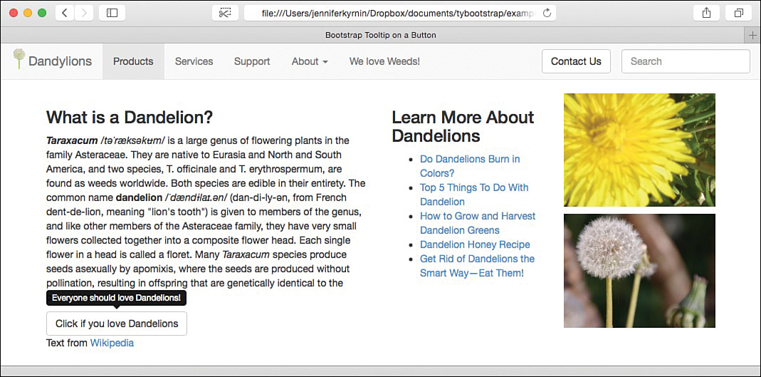
A tooltip is a small text block that appears next to the triggering element. Bootstrap tooltips are written in small white text on a black, rounded-corner rectangle. They have a small triangle pointing to the element that triggered them. Figure 17.1 shows a sample tooltip.

Most tooltips are triggered when the mouse hovers over the element, but you also can trigger them with a click.
Caution: Tooltips Can Annoy Customers
You should bear in mind that many people find hovering tooltips annoying. However, tooltips that are triggered with a click can be confusing because most customers expect to be taken somewhere else when they click rather than just opening a small text box. Be sure to test your tooltips with your customers, especially if the tooltips convey important information.
To build a tooltip on a link, you must add data-toggle="tooltip" to your link (<a>) and ensure there is a title attribute with the text you want the tooltip to display. You can give your link an href value if you want it to go somewhere on click; otherwise, point to a hash tag: href="#".
Note: Be Aware When Adding Tooltips to Hidden or Disabled Elements
You should not use a tooltip on elements that are hidden (display: none;) because the tooltip will be incorrectly positioned. Also, if you use a tooltip on a disabled element (with either the disabled attribute or the .disabled class), you should put a container <div> around the element and then put the tooltip on the container.
But before you rush out and add a tooltip to all your links, you need to do one more thing: initialize the tooltips.
The Tooltip and Popover plugins are opt-in for performance reasons. This is because they can be resource intensive. Plus, they often annoy customers as I mentioned in the previous Caution. So it’s important that when you add them to pages you do so with some forethought. You are required to initialize tooltips in your scripts. Listing 17.1 shows JavaScript to select all tooltips with the data-toggle attribute.
LISTING 17.1 Initialize Tooltips
$(document).ready(function(){
$(function () {
$('[data-toggle="tooltip"]').tooltip();
});
});
As with all other Bootstrap plugins, you need to include the Bootstrap JavaScript and jQuery. Listing 17.1 uses the document ready function jQuery function to ensure that everything is loaded before the tooltips are initialized. This will help your pages load more quickly.
When a tooltip is displayed on the page, it generates some HTML, as shown in Listing 17.2. Inside the HTML are several classes: .tooltip, .top, .tooltip-arrow, and .tooltip-inner. You can use these classes in your CSS to provide more styles to the tooltips.
LISTING 17.2 Tooltip-Generated HTML
<div class="tooltip top" role="tooltip">
<div class="tooltip-arrow"></div>
<div class="tooltip-inner">
Some tooltip text!
</div>
</div>
The one class that changes is top because this defines where the tooltip will display. The default is top, but with the placement option, you can position your tooltip on the top, right, bottom, or left. You also can use the keyword auto on your placement to tell the browser to position the tooltip dynamically. For example, if the placement is "auto top", the tooltip will display on the top if possible; otherwise, it will display on the bottom. This is particularly useful if the triggering element is near the edges of the screen.
Try it Yourself: Add a Tooltip on a Button
1. Open your bootstrap web page or create a new page with a bootstrap template.
2. Add a button somewhere on the page:
<button type="button" class="btn btn-default">
Click if you love Dandelions
</button>
3. Add a title attribute to the button, and include the text you want your tooltip to display.
4. Add the data-toggle="tooltip" attribute to the button.
5. Add data-trigger="click" to the button to change the trigger to when the button is clicked.
6. Add any other options as data-* attributes, such as the data-placement attribute to change the position of the tooltip.
7. Test your tooltip in a browser. It won’t work, and the title will show up when you mouse over the button.
8. Add a <script> at the bottom of the document to initialize the tooltip:
<script>
$(document).ready(function(){
$(function () {
$('[data-toggle="tooltip"]').tooltip();
});
});
</script>
9. Test it again. This time it will work.
<!DOCTYPE html>
<html lang="en">
<head>
<meta charset="utf-8">
<meta http-equiv="X-UA-Compatible" content="IE=edge">
<meta name="viewport"
content="width=device-width, initial-scale=1">
<title>Bootstrap Tooltip on a Button</title>
<!-- Bootstrap -->
<link href="css/bootstrap.min.css" rel="stylesheet">
<!-- HTML5 shim and Respond.js for IE8 support of HTML5
elements and media queries -->
<!-- WARNING: Respond.js doesn't work if you view the page via
file:// -->
<!--[if lt IE 9]>
<script
src="https://oss.maxcdn.com/html5shiv/3.7.2/html5shiv.min.js">
</script>
<script
src="https://oss.maxcdn.com/respond/1.4.2/respond.min.js"></script>
<![endif]-->
<style>
body { padding-top: 70px; }
img#dandylionLogo { height:100%; width: auto; display: inline;
margin-top: -10px; }
</style>
</head>
<body>
<nav class="navbar navbar-default navbar-fixed-top">
<div class="container-fluid">
<div class="navbar-header">
<button type="button" class="navbar-toggle collapsed"
data-toggle="collapse" data-target="#collapsedNav">
<span class="sr-only">Toggle navigation</span>
<span class="icon-bar"></span>
<span class="icon-bar"></span>
<span class="icon-bar"></span>
</button>
<a href="#" class="navbar-brand">
<img src="images/dandylion-logo.png" alt="Dandylion"
id="dandylionLogo" />Dandylions</a>
</div>
<div class="collapse navbar-collapse" id="collapsedNav">
<ul class="nav navbar-nav">
<li class="active"><a href="#">Products</a></li>
<li><a href="#">Services</a></li>
<li><a href="#">Support</a></li>
<li class="dropdown">
<a href="#" class="dropdown-toggle"
data-toggle="dropdown" role="button"
aria-expanded="false">
About <span class="caret"></span>
</a>
<ul class="dropdown-menu" role="menu">
<li><a href="#">Articles</a></li>
<li><a href="#">Related Sites</a></li>
</ul>
</li>
</ul>
<p class="navbar-text">We love
<a href="" class="navbar-link">Weeds</a>!</p>
<form class="navbar-form navbar-right" role="search">
<div class="form-group">
<input type="text" class="form-control"
placeholder="Search">
</div>
</form>
<button type="button"
class="btn btn-default navbar-btn navbar-right">
Contact Us
</button>
</div>
</div>
</nav>
<div class="container">
<div class="row">
<article id="mainarticle" class="col-lg-5 col-md-6 col-xs-12">
<h3>What is a Dandelion?</h3>
<p><span class="pronounce"><strong><em>Taraxacum</em></strong>
<em>/t 'ræksk
 m/</em></span> is a large genus of
flowering plants in the family Asteraceae. They are native
to Eurasia and North and South America, and two species,
T. officinale and T. erythrospermum, are found as weeds
worldwide. Both species are edible in their entirety.
The common name
<span class="pronounce"><strong>dandelion</strong>
<em>/'dænd la
la .n/</em></span> (dan-di-ly-n, from French
dent-de-lion, meaning "lion's tooth") is given to members
of the genus, and like other members of the Asteraceae
family, they have very small flowers collected together
into a composite flower head. Each single flower in a head
is called a floret. Many <em>Taraxacum</em> species produce
seeds asexually by apomixis, where the seeds are
produced without pollination, resulting in offspring that
are genetically identical to the parent plant.</p>
<button type="button" class="btn btn-default"
data-toggle="tooltip" data-placement="top"
data-trigger="click"
title="Everyone should love Dandelions!">
Click if you love Dandelions
</button>
</article>
<aside id="links" class="col-md-3 col-xs-12">
<h3>Learn More About Dandelions</h3>
<ul>
<li><a href="#">Do Dandelions Burn in Colors?</a></li>
<li><a href="#">Top 5 Things To Do With
Dandelion</a></li>
<li><a href="#">How to Grow and Harvest Dandelion
Greens</a></li>
<li><a href="#">Dandelion Honey Recipe</a></li>
<li><a href="#">Get Rid of Dandelions the Smart
Way@#8212Eat Them!</a></li>
</ul>
</aside>
<aside id="sidebar" class="col-lg-3 col-md-3 col-xs-12">
<p><img src="images/dandy.jpg" class="img-responsive"
alt=""/></p>
<p><img src="images/seeded.jpg" class="img-responsive"
alt=""/></p>
</aside>
<footer class="col-xs-12">
<p>Text from
<a href="http://en.wikipedia.org/wiki/Dandelion">
Wikipedia
</a></p>
</footer>
</div>
</div>
<script src="http://code.jquery.com/jquery-latest.js"></script>
<script src="js/bootstrap.min.js"></script>
<script>
$(document).ready(function(){
$(function () {
$('[data-toggle="tooltip"]').tooltip();
});
});
</script>
</body>
</html>
Caution: Button and Input Group Tooltips Require the container Option
If you are going to put tooltips on elements inside a .btn-group or .input-group, you have to specify the option container: 'body'. If you don’t, you might find the element grows wider or loses its rounded corners when the tooltip is triggered.
Tooltip Options
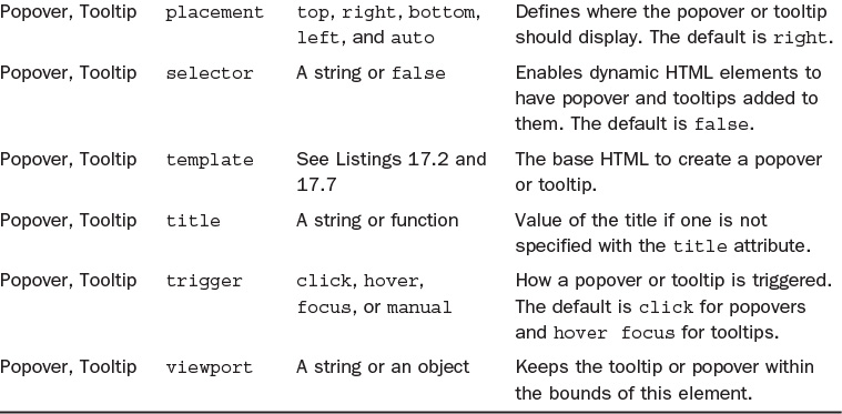
The Tooltip plugin offers several options you can use to adjust how your tooltips work:
animation—This applies a CSS fade transition to the tooltip. The value is true by default, and false turns off the fade.
container—This is false by default, but if turned on it allows you to append the tooltip to a specific element (for example, container: 'body'). This allows you to position the tooltip in the flow of the document near the triggering element. This prevents the tooltip from moving away from the triggering element when the window is resized.
delay—Defines a delay in milliseconds for how long until the tooltip is shown and hidden. If you write it as an object, you can define different values for showing and hiding (for example, delay: { "show": 200, "hide": 400 }). This will not apply when the trigger is manual.
html—Allows you to insert HTML into the tooltip. The default is false and uses the jQuery text method to insert content into the DOM. Be aware that setting it to true can open up your site to cross-site scripting (XSS) attacks.
placement—This indicates how to position the tooltip. The values are top, right, bottom, left, and auto. You also can use a function to determine the placement. This calls the function with the tooltip DOM node as its first argument and the triggering element DOM node as its second. The this context is set to the tooltip instance.
selector—When a selector is provided, this allows tooltips to be placed on elements that were dynamically created in the DOM using the jQuery on function. The default is false.
template—If you don’t like the base HTML for the tooltips, you can change it with the template option. The tooltip’s title will be injected into the .tooltip-inner element. The .tooltip-arrow becomes the arrow, and it should all be wrapped by an element with the .tooltip class. Listing 17.2 shows the default HTML.
title—If the title attribute is missing, this is the default value for the tooltip. The default is an empty string: ''. You also can set it to a function where the this reference is set to the element to which the tooltip is attached.
trigger—This defines how the tooltip is triggered. Possible values are click, hover, focus, and manual. You can pass multiple triggers separated by spaces. The default value is hover focus.
viewport—This keeps the tooltip within the bounds of this element. The default is { selector: 'body', padding: 0 }.
You can define all the options using data-* attributes or directly in your JavaScript.
Tooltip Methods
The Tooltip plugin provides five methods you can use to work with the tooltips:
$().tooltip(options)—This attaches a tooltip handler to an element collection with the options you define.
.tooltip('show')—This reveals the tooltip and returns to the caller before the tooltip has been shown. This is considered a manual triggering of the tooltip.
.tooltip('hide')—This hides the element’s tooltip. It returns to the caller before the tooltip has been hidden. This is considered a manual triggering of the tooltip.
.tooltip('toggle')—This toggles the element’s tooltip on or off. It returns to the caller before the tooltip has been shown or hidden. This is considered a manual triggering of the tooltip.
.tooltip('destroy')—This hides and destroys the element’s tooltip. Tooltips that are created using the selector option cannot be individually destroyed on descendant trigger elements.
Tooltip Events
Four events occur when the Tooltip plugin is used:
show.bs.tooltip—This fires immediately when the show method is called.
shown.bs.tooltip—This fires when the tooltip has been made visible to the user. It waits until any CSS transitions are complete.
hide.bs.tooltip—This event fires immediately when the hide method is called.
hidden.bs.tooltip—This event fires when the tooltip is completely hidden from the user, including any CSS transitions.
Popovers
In many ways, popovers are just like tooltips. They add overlays of content onto the web page when they are triggered. In fact, to use popovers, you have to have the Tooltip plugin enabled as well. But popovers give you a few more formatting options that aren’t available with tooltips. Figure 17.3 shows a basic popover.

To add a popover to your page, you need to include both the popover.js and the tooltip.js scripts, or you can use the bootstrap.js file. Similar to tooltips, you must initialize the popovers for them to work. The easiest way to initialize them is to select them by the data-toggle attribute just like you did with tooltips. Listing 17.4 shows an initialization script.
LISTING 17.4 Initialize Popovers
<script>
$(document).ready(function(){
$(function () {
$('[data-toggle="popover"]').popover();
});
});
</script>
After you’ve initialized the popovers, you can add them to your HTML. They are usually added to buttons. The biggest difference between popovers and tooltips is that popovers appear on click and remain on screen until the customer clicks the trigger again. Buttons make this functionality more obvious. Listing 17.5 shows the HTML to add a default popover.
LISTING 17.5 Popover on a Button
<button type="button" class="btn btn-default" data-toggle="popover"
title="Popovers are fun"
data-content="You can add titles and they stick.">
Click to see a Popover
</button>
You need just two attributes to create a simple popover: data-toggle and data-content. The title attribute adds a title to your popover, as shown in Figure 17.4.

If you want the popover to disappear with the next click—whether it’s on the trigger button or not—you can do that with the trigger option. Change the trigger to focus, but there are a few more things you need to do to get the dismiss-on-next-click popover to work correctly on all browsers:
You must use the <a> tag and not the <button> tag.
You need to include the role="button" attribute.
You should include the tabindex attribute, but it can be set to whatever value you like.
LISTING 17.6 Dismiss-On-Next-Click Popover
<a href="#" class="btn btn-default" role="button"
data-toggle="popover" data-trigger="focus"
title="Make this Popover Disappear"
data-content="Click anywhere and the popover will leave."
tabindex="0">
This is a Dismissable Popover
</a>
Try it Yourself: Add a Popover to a Page
1. Open a Bootstrap web page in your web editor.
2. Add a button to trigger your popover:
<button role="button" class="btn btn-default">
Dandelion Fun Fact
</button>
3. Add the data-toggle="popover" attribute to trigger a popover.
4. Add a title with the title attribute.
5. Add content in the data-content attribute.
6. Add styles to style the .popover, .popover-title, and .popover-content classes.

When a popover is triggered, the HTML in Listing 17.7 is added to the DOM. This includes the classes .popover, .popover-title, and .popover-content as well as the .arrow class. These give the popover its rounded corners, drop shadow, and background colors. You also can use them to style the popover to match your site design.
LISTING 17.7 The Default Popover Template
<div class="popover" role="tooltip">
<div class="arrow"></div>
<h3 class="popover-title"></h3>
<div class="popover-content"></div>
</div>
Popover Options
A lot of options are available that you can use with either the data-* attributes or directly in the JavaScript to adjust how your popovers work:
animation—Adds a CSS fade transition to the popover. The default is true.
container—This is false by default, but if turned on it allows you to append the popover to a specific element (for example, container: 'body'). This enables you to position the popover in the flow of the document near the triggering element. This prevents the popover from moving away from the triggering element when the window is resized.
content—Provides default content if the data-content attribute is not present. It can be built with a JavaScript function, and it will be called with the this reference set to the element to which the popover is attached.
delay—The number of milliseconds to delay showing and hiding the popover. You also can use an object such as delay: { "show": 300, "hide": 1000 }. The default is 0.
html—Enables you to insert HTML into the popover. The default is false and uses the jQuery text method to insert content into the DOM. Be aware that setting it to true can open up your site to cross-site scripting (XSS) attacks.
placement—Positions the popover to the top, right, bottom, or left. You can use the term auto, which automatically reorients the popover when required. For example, data-placement="auto right" places the popover on the right unless there isn’t enough room; then it places it on the left. The default value is right.
selector—When a selector is provided, this allows popovers to be placed on elements that were dynamically created in the DOM using the jQuery on function. The default is false.
template—If you don’t like the base HTML for the popovers, you can change it with the template option. The popover’s title will be injected into the .popover-title element. The popover’s content will be injected into the .popover-content element. The .arrow element becomes the arrow, and it should all be wrapped by an element with the .popover class. Listing 17.7 shows the default HTML.
title—Provides a default title if the title attribute is not present. It can be built with a JavaScript function and will be called with its this reference set to the element to which the popover is attached.
trigger—Defines how the popover is triggered. The possible values are click, hover, focus, and manual. You can pass several triggers separated by a space to allow your popover to be triggered in multiple ways. The default value is click.
viewport—This keeps the popover within the bounds of this element. The default is { selector: 'body', padding: 0 }.
Popover Methods
The Popover plugin provides five methods you can use to work with popovers:
$().popover(options)—This initializes the popovers for an element collection.
.popover('show')—This reveals the popover. It returns to the caller before the popover has been shown, which is considered a manual triggering of the popover. Popovers with both empty titles and content are never displayed.
.popover('hide')—This hides the element’s popover. It returns to the caller before the popover has been hidden. This is considered a manual triggering of the popover.
.popover('toggle')—This toggles the element’s popover on or off. It returns to the caller before the popover has been shown or hidden, which is considered a manual triggering of the popover.
.popover('destroy')—This hides and destroys the element’s popover. Popovers that are created using the selector option cannot be individually destroyed on descendant trigger elements.
Popover Events
Four events occur when the Popover plugin is used:
show.bs.popover—This fires immediately when the show method is called.
shown.bs.popover—This fires when the popover has been made visible to the user. It waits until any CSS transitions are complete.
hide.bs.popover—This event fires immediately when the hide method is called.
hidden.bs.popover—This event fires when the popover is completely hidden from the user, including any CSS transitions.
Summary
This hour you learned about two plugins that give your pages a dynamic flare and provide additional information to readers: Tooltip and Popover. These plugins create small text boxes that pop up and provide additional information when the user triggers them.
Table 17.1 describes the options for these plugins. Table 17.2 explains the methods they use, and Table 17.3 describes the events available on them. Table 17.4 covers the CSS classes you learned about in this hour.


Workshop
The workshop contains quiz questions to help you process what you’ve learned in this hour. Try to answer all the questions before you read the answers.
Q&A
Q. What is the difference between a modal, a popover, and a tooltip?
A. There are many ways to present information on websites, and these are all methods of getting a reader’s attention and presenting new information. The main difference between a modal and a tooltip or popover is that modals want the user to take some action. They often ask a question or present a form to be filled in. Popovers and tooltips just present some information. You can learn more about modals in Hour 15, “Modal Windows.”
Q. Popovers and tooltips seem very similar, but are they really different things?
A. In the Bootstrap world, there are two main differences between a popover and a tooltip. A popover is triggered by a click and has a headline as well as main text. A tooltip is triggered by hover or focus and just has text. In the real world, Bootstrap popovers are just fancy tooltips.
Q. Is it a good idea to use tooltips or popovers? Don’t people find them annoying?
A. This will depend on your website. But in general, the more tooltips you have, the more annoying they will be to users. And the larger the tooltips or popovers are, the more content they will cover, which will make them more annoying.
Be aware of what users expect. If they click a link, they expect to be taken to another location. If all that happens is a tooltip appears, they could get annoyed. Use tooltips and popovers where it adds value to your pages, but don’t go overboard. If you can, do user testing to discover whether your customers find them annoying.
Quiz
1. Which of the following triggers is the standard tooltip trigger?
a. Clicking on an element
b. Mousing over an element
c. Mousing near an element
d. Clicking near an element
2. True or False: You can only put tooltips on links (<a> tags).
3. Why is it a bad idea to use tooltips on elements with the display: none; style?
a. The style can be transferred to the tooltip, hiding it, too.
b. It won’t work unless you put it on a container around the hidden element.
c. They will end up displaying in the wrong place.
d. It’s not a bad idea. That works fine.
4. What do you need to add besides the data-toggle="tooltip" attribute to get a tooltip to display?
a. Nothing, data-toggle="tooltip" is all you need.
b. The title attribute, with the text for the tip.
c. The title attribute, and you need to initialize it.
d. Nothing; data-toggle="tooltip" is not the attribute to turn on tooltips.
5. What does the .auto class do to a tooltip?
a. It makes the tooltips appear automatically.
b. It automates the generation of tooltips.
c. It changes the color of the tooltip.
d. It changes the position of the tooltip, if necessary.
6. What is the difference between a tooltip and a popover?
a. A popover adds more formatting options.
b. A tooltip adds more formatting options.
c. A popover adds more positioning options.
d. A tooltip adds more positioning options.
7. Which scripts are required to use popovers?
a. The popover.js file
b. The tooltip.js file
c. A link to jQuery
d. All of the above
8. Which of these holds the popover content?
a. .popover
b. .popover-inner
c. .popover-content
d. .popover-title
9. Which event fires as a popover is being shown?
a. hide.bs.popover
b. show.bs.popover
c. shown.bs.popover
d. None
10. What can you do if you want to use an <aside> to contain your popovers rather than a <div>?
a. Change the popover with the data-template attribute.
b. Modify the popover with the data-html attribute.
c. Use the popover.html method.
d. Nothing. You can’t change that.
Quiz Answers
1. b. Mousing over an element.
2. False. You can also put them on <button> tags.
3. c. They will end up displaying in the wrong place.
4. c. The title attribute, and you need to initialize it.
5. d. It changes the position of the tooltip, if necessary.
6. a. A popover adds more formatting options.
7. d. All of the above.
8. c. .popover-content
9. b. show.bs.popover
10. a. Change the popover with the data-template attribute.
Exercises
1. Add a tooltip to a link on your page. Make sure that it adds value to the link and isn’t too long. Use the tooltip CSS classes (refer to Table 17.4) to style the tooltip to fit your website design.
2. Add a popover that disappears on the next click.