
Lesson 10
Understanding the CSS Box Model and Positioning
What You’ll Learn in This Lesson:
 How to conceptualize the CSS box model
- How to change the box model the browser uses
- How to position your elements
- How to control the way elements stack up
- How to manage the flow of text
In the preceding lesson, we mentioned the CSS box model a few times. This lesson begins with a discussion of the box model and explains how the information you learned in the preceding lesson helps you understand this model. It’s important to spend some time focusing on and practicing working with the box model because if you have a good handle on how the box model works, you won’t tear your hair out when you create a design and then realize that the elements don’t line up or that they seem a little “off.” You’ll know that, in almost all cases, something—the margin, the padding, the border—just needs a little tweaking, or you may need to just check which box model your page is using.
You’ll also learn more about CSS positioning, including stacking elements on top of each other in a three-dimensional way (instead of a vertical way). Finally, you’ll learn a little more about controlling the flow of text around elements by using the float property.
The CSS Box Model
Every element in HTML is considered a “box,” whether it is a paragraph, a <div>, an image, or something else. Boxes have consistent properties, whether we see them or not and whether the style sheet specifies them or not. They’re always present, and as designers, we have to keep their presence in mind when creating a layout.
Figure 10.1 is a diagram of the box model. The box model describes the way in which every HTML block-level element has the potential for a border, padding, and margin and, specifically, how the border, padding, and margin are applied. In other words, all elements have some padding between the content and the border of the element. In addition, the border might or might not be visible, but space for it is there, just as there is a margin between the border of the element and any other content outside the element.
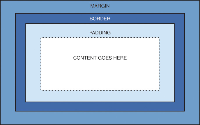
Here’s yet another explanation of the box model, going from the outside inward:
- The margin is the area outside the element. It never has color; it is always transparent.
- The border extends around the element, on the outer edge of any padding. The border can be of several types, widths, and colors.
- The padding exists around the content and inherits the background color of the content area.
- The content is surrounded by padding.
Here’s where the tricky part comes in: In the default box model, to know the true or rendered height and width of an element, you have to take into account all the elements of the box model. Think back to the example from the preceding lesson: Despite the specific indication that a <div> should be 250 pixels wide and 100 pixels high, that <div> had to grow larger to accommodate the padding in use. If you had added a border, those dimensions would have added to the width and height of the rendered element as well.
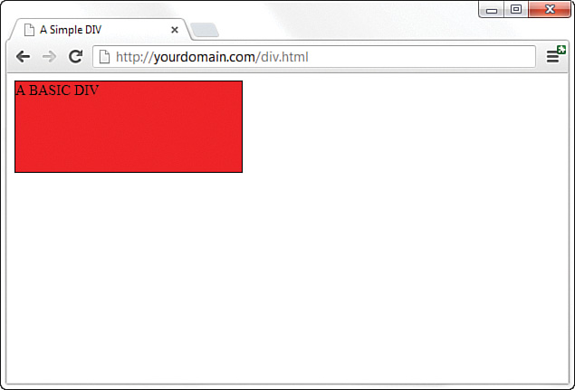
You already know how to set the width and height of an element by using the width and height properties. The following example shows how to define a <div> that is 250 pixels wide and 100 pixels high, with a red background and a black single-pixel border:
div {
width: 250px;
height: 100px;
background-color: #ff0000;
border: 1px solid #000000;
}
Figure 10.2 shows this simple <div>.
<div>.If we define a second element with these same properties but also add margin and padding properties of a certain size, we begin to see how the size of the element changes. This is because of the box model.
The second <div> is defined as follows, just adding 10 pixels of margin and 10 pixels of padding to the element:
div#d2 {
width: 250px;
height: 100px;
background-color: #ff0000;
border: 5px solid #000000;
margin: 10px;
padding: 10px;
}
The second <div>, shown in Figure 10.3, is defined as the same height and width as the first one, but the overall height and width of the entire box surrounding the element itself is much larger when margins and padding are put in play.

<div>, but the box model affects the rendered size of the second <div>.The total width the element takes up on the page is the sum of the following:
width + padding-left + padding-right + border-left + border-right +
margin-left + margin-right
The total height the element takes up on the page is the sum of the following:
height + padding-top + padding-bottom + border-top + border-bottom +
margin-top + margin-bottom
Therefore, the second <div> has an actual width of 300 (250 + 10 + 10 + 5 + 5 + 10 + 10) and an actual height of 150 (100 + 10 + 10 + 5 + 5 + 10 + 10).
Note
Throughout this course, you’ve been drilled in the use of the doctype declaration, and each bit of sample code includes a doctype. Continue this practice not only so that your code validates but because a very specific issue arises with some older versions of Internet Explorer and the CSS box model: If a doctype is not defined, some older versions of Internet Explorer manipulate the height and width of your elements in a way you did not intend. This causes browser incompatibility issues with your layout. So, remember to include a doctype.
By now, you can begin to see how the box model affects your design. Let’s say that you have only 250 pixels of horizontal space, but you’d like 10 pixels of margin, 10 pixels of padding, and 5 pixels of border on all sides. To strike a balance between what you’d like and what you have room to display, you must specify the width of your <div> as only 200 pixels so that 200 + 10 + 10 + 5 + 5 + 10 + 10 adds up to that 250 pixels of available horizontal space.
The mathematics of the model are important as well. In dynamically driven sites or sites in which user interactions drive the client-side display (such as through JavaScript events), your server-side or client-side code could draw and redraw container elements on the fly. In other words, your code will produce the numbers, but you have to provide the boundaries.
Note
There is one other set of properties in the CSS box model: the outline properties:
-
outline -
outline-width -
outline-style -
outline-color -
outline-offset
The outline properties act just like the border properties except that they do not take up any space in the box model. They also may not be rectangular.
Use these properties if you want to add a visible edge to elements without affecting the layout or changing the box model. Note that outlines do not have rounded corners (with the border-radius property) because they are not borders.
Changing the Box Model
At this point, you are probably wondering what the people who designed the CSS box model were thinking. In most design models, you start out with a given amount of space and work within it to position your elements. But with the default box model, you can stretch out well beyond your given amount of space completely without realizing it.
This is especially true with layouts that use flexible widths such as percentages, rems, or ems. Take this example:
div {
width: 50%;
height: 300px;
float: left;
padding: 0.25rem;
border: solid 1px aqua;
}
If you place two <div> elements in your HTML, you would expect them to line up side by side as they both should take up 50%. But they do not. This is because, as you learned in the previous section, the space the elements take up includes the padding, border, and margin. Luckily, CSS3 gives us a tool to change that: the box-sizing property.
This property takes one of two values:
- content-box—The
widthandheightvalues are assigned to the content box only, andpaddingandborderare added afterward. This is the default. - border-box—Any defined
paddingandborderare included inside the assignedwidthandheightvalues. This used to be called “quirks mode.”
To make the previous example work, just add box-sizing: border-box;, and the two <div> elements float side by side as expected.
Note
The box-sizing property does not have a “margin-box” value. If you need to create layouts with variable widths or heights and fixed margins, you need to use a different layout style, such as flexible boxes. You will learn more about these in Lesson 12, “Creating Layouts Using Modern CSS Techniques.”
Now that you’ve been schooled in the way of the box model, keep it in mind throughout the rest of the work you do in these lessons and in your web design. Among other things, it will affect element positioning and content flow, which are the two topics we tackle next.
The Whole Scoop on Positioning
Relative positioning is the default type of positioning HTML uses. You can think of relative positioning as being akin to laying out checkers on a checkerboard: The checkers are arranged from left to right, and when you get to the edge of the board, you move on to the next row. Elements that are styled with the block value for the display style property are automatically placed on a new row, whereas inline elements are placed on the same row, immediately next to the element preceding them. As an example, <p> and <div> tags are considered block elements, whereas the <span> and <code> tags are considered inline elements. There is also a third type of element—the inline-block element. The <img> tag is the most commonly used element of this type. Inline block elements are placed on the same row as other inline elements, but they can have width and height associated with them, whereas inline elements cannot.
The other type of positioning CSS supports is known as absolute positioning because it enables you to set the exact position of HTML content on a page. Although absolute positioning gives you the freedom to spell out exactly where an element is to appear, the position is still relative to any parent elements that appear on the page. In other words, absolute positioning enables you to specify the exact location of an element’s rectangular area with respect to its parent’s area, which is very different from relative positioning.
With the freedom of placing elements anywhere you want on a page, you can run into the problem of overlap, when an element takes up space another element is using. Nothing is stopping you from specifying the absolute locations of the elements so that they overlap. In this case, CSS relies on the z-index of each element to determine which element is on the top and which is on the bottom. You’ll learn more about the z-index of elements later in this lesson. For now, let’s look at exactly how you control whether a style rule uses relative or absolute positioning.
The type of positioning a particular style rule uses is determined by the position property, which can have any of the following four values:
- relative—The element is positioned relative to its current position in the document flow.
- absolute—The element is positioned based on its container element.
- fixed—The element is positioned relative to the browser window.
- static—The element is placed as it appears in the normal flow. This is the default.
Note
There is also another value, position: sticky;, which causes the element to toggle between relative and fixed, depending on the scroll position. It is relative until a scrolling offset position is reached, and then it is fixed. You should use this with the -webkit browser prefix (position: -webkit-sticky;) for widest support.
After specifying the type of positioning, you provide the specific position by using the following properties:
- left—The left position offset
- right—The right position offset
- top—The top position offset
- bottom—The bottom position offset
You might think that these position properties make sense only for absolute positioning, but they actually apply to all types of positioning except static. With relative positioning, the position of an element is specified as an offset relative to the original position of the element. So, if you set the left property of an element to 25px, the left side of the element shifts over 25 pixels from its original (relative) position. An absolute position, on the other hand, is specified relative to the parent of the element to which the style is applied. So, if you set the left property of an element to 25px under absolute positioning, the left side of the element appears 25 pixels to the right of the parent element’s left edge. On the other hand, using the right property with the same value positions the element so that its right side is 25 pixels to the right of the parent’s right edge.
You cannot set both horizontal or both vertical position properties on the same element. If you set both the left and the right positions (or both top and bottom) on an element, the left and top properties will take precedence in left-to-right documents.
Let’s return to the color-blocks example to see how positioning works. In Listing 10.1, the four colored blocks have relative positioning specified. As you can see in Figure 10.4, the blocks are positioned vertically.
Listing 10.1 Showing Relative Positioning with Four Color Blocks
<!doctype html>
<html lang="en">
<head>
<meta charset="utf-8">
<title>Positioning the Color Blocks</title>
<style>
div {
position: relative;
width: 250px;
height: 100px;
border: 5px solid #000;
color: black;
font-weight: bold;
text-align: center;
}
div#d1 {
background-color: red;
}
div#d2 {
background-color: green;
}
div#d3 {
background-color: blue;
}
div#d4 {
background-color: yellow;
}
</style>
</head>
<body>
<div id="d1">DIV #1</div>
<div id="d2">DIV #2</div>
<div id="d3">DIV #3</div>
<div id="d4">DIV #4</div>
</body>
</html>
The style sheet entry for the <div> element sets the position style property for the <div> element to relative. Because the remaining style rules are inherited from the <div> style rule, they inherit its relative positioning. In fact, the only difference between the div rule and the other div#d1 through div#d4 rules is the different background colors.
Notice in Figure 10.4 that the <div> elements are displayed one after the next, which is what you would expect with relative positioning. But to make things more interesting, which is what we’re here to do, you can change the positioning to absolute and explicitly specify the placement of the blocks. In Listing 10.2, the style sheet entries are changed to use absolute positioning to arrange the color blocks.
Listing 10.2 Using Absolute Positioning of the Color Blocks
<!doctype html>
<html lang="en">
<head>
<meta charset="utf-8">
<title>Positioning the Color Blocks</title>
<style>
div {
position: absolute;
width: 250px;
height: 100px;
border: 5px solid #000;
color: black;
font-weight: bold;
text-align: center;
}
div#d1 {
background-color: red;
left: 0px;
top: 0px;
}
div#d2 {
background-color: green;
left: 75px;
top: 25px;
}
div#d3 {
background-color: blue;
left: 150px;
top: 50px;
}
div#d4 {
background-color: yellow;
left: 225px;
top: 75px;
}
</style>
</head>
<body>
<div id="d1">DIV #1</div>
<div id="d2">DIV #2</div>
<div id="d3">DIV #3</div>
<div id="d4">DIV #4</div>
</body>
</html>
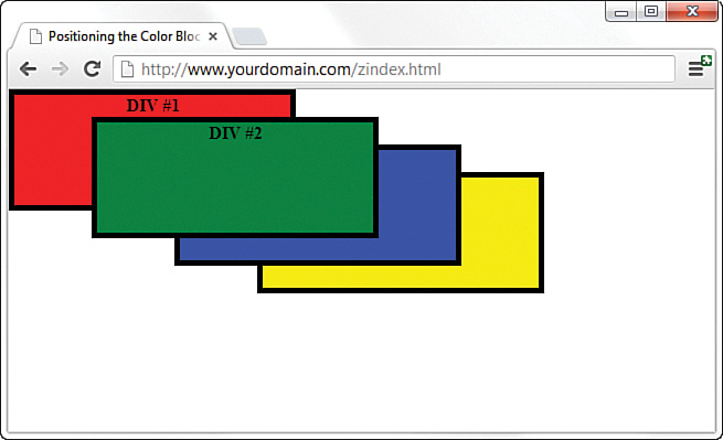
This style sheet sets the position property to absolute, which is necessary for the style sheet to use absolute positioning. In addition, the left and top properties are set for each of the inherited <div> style rules. However, the position of each of these rules is set so that the elements are displayed overlapping each other, as Figure 10.5 shows.
Now we’re talking layout! Figure 10.5 shows how absolute positioning enables you to place elements exactly where you want them. It also reveals how easy it is to arrange elements so that they overlap. You might be curious about how a web browser knows which elements to draw on top when they overlap.
The fixed position places an element inside the browser window and leaves it there. This is often used as a type of watermark on web pages because the element will remain where it is positioned on the page, and other page elements will scroll past it. Other elements will overlap the fixed element, but you can control where the element appears in the stack. The next section covers how you can control stacking order.
Controlling the Way Things Stack Up
In certain situations, you want to carefully control the manner in which elements overlap each other on a web page. The z-index style property enables you to set the order of elements with respect to how they stack on top of each other. The name z-index might sound a little strange, but it refers to the notion of a third dimension (z) that points into the computer screen, in addition to the two dimensions that go across (x) and down (y) the screen. Another way to think of the z-index is to consider the relative position of a single magazine within a stack of magazines. A magazine nearer the top of the stack has a higher z-index than a magazine lower in the stack. Similarly, an overlapped element with a higher z-index is displayed on top of an element with a lower z-index.
The z-index property is used to set a numeric value that indicates the relative z-index of a style rule. The number assigned to z-index has meaning only with respect to other style rules in a style sheet, which means that setting the z-index property for a single rule doesn’t mean much. On the other hand, if you set z-index for several style rules that apply to overlapped elements, the elements with higher z-index values appear on top of elements with lower z-index values. If you don’t set the z-index for an element, it is assumed to have a value of 0 with respect to other elements with set z-index values.
Note
Regardless of the z-index value you set for a style rule, an element displayed with the rule will always appear on top of its parent.
Listing 10.3 contains another version of the color-blocks style sheet and HTML that uses z-index settings to alter the natural overlap of elements.
Listing 10.3 Using z-index to Alter the Display of Elements in the Color-Blocks Sample
<!doctype html>
<html lang="en">
<head>
<meta charset="utf-8">
<title>Positioning the Color Blocks</title>
<style>
div {
position: absolute;
width: 250px;
height: 100px;
border: 5px solid #000;
color: black;
font-weight: bold;
text-align: center;
}
div#d1 {
background-color: red;
left: 0px;
top: 0px;
z-index: 0;
}
div#d2 {
background-color: green;
left: 75px;
top: 25px;
z-index: 3;
}
div#d3 {
background-color: blue;
left: 150px;
top: 50px;
z-index: 2;
}
div#d4 {
background-color: yellow;
left: 225px;
top: 75px;
z-index: 1;
}
</style>
</head>
<body>
<div id="d1">DIV #1</div>
<div id="d2">DIV #2</div>
<div id="d3">DIV #3</div>
<div id="d4">DIV #4</div>
</body>
</html>
The only change in this code from what you saw in Listing 10.2 is the addition of the z-index property in each of the numbered div style classes. Notice that the first numbered div has a z-index setting of 0, which should make it the lowest element in terms of the z-index, whereas the second div has the highest z-index. Figure 10.6 shows the color-blocks page as displayed with this style sheet, which clearly shows how the z-index affects the displayed content and makes it possible to carefully control the overlap of elements.
z-index to alter the display of the color blocks.
Note
The z-index property can be either positive or negative. So, if you want to force an item to be below another, you would change the z-index to a negative integer such as -1. This allows you to place positioned elements below other elements without explicitly setting the z-index for all of them.
Although the examples show colored blocks that are simple <div> elements, the z-index style property can affect any HTML content, including images.
Managing the Flow of Text
Now that you’ve seen some examples of placing elements relative to other elements or placing them absolutely, it’s time to revisit the flow of content around elements. The conceptual current line is an invisible line used to place elements on a page. This line has to do with the flow of elements on a page; it comes into play as elements are arranged next to each other across and down the page. Part of the flow of elements is the flow of text on a page. When you mix text with other elements (such as images), it’s important to control how the text flows around those other elements.
You’ve already seen two of these style properties in Lesson 9, “Working with Margins, Padding, Alignment, and Floating.” Following are some style properties that give you control over text flow:
- float—Determines how text flows around an element
- clear—Stops the flow of text around an element
- overflow—Controls the overflow of text when an element is too small to contain all the text
The float property controls how text flows around an element. It can be set to either left or right. These values determine where to position an element with respect to flowing text. So, setting an image’s float property to left positions the image to the left of flowing text.
As you learned in the preceding lesson, you can prevent text from flowing next to an element by using the clear property, which you can set to none, left, right, or both. The default value for the clear property is none, indicating that text is to flow with no special considerations for the element. The left value causes text to stop flowing around an element until the left side of the page is free of the element. Likewise, the right value means that text is not to flow around the right side of the element. The both value indicates that text isn’t to flow around either side of the element.
The overflow property handles overflow text, which is text that doesn’t fit within its rectangular area; this can happen if you set the width and height properties of an element too small. The overflow property can be set to visible, hidden, or scroll. The visible setting automatically enlarges the element so that the overflow text fits within it; this is the default setting for the property. The hidden value leaves the element the same size, allowing the overflow text to remain hidden from view. Perhaps the most interesting value is scroll, which adds scrollbars to the element so that you can move around and see the text.
Summary
This lesson began with an important discussion about the CSS box model and how to calculate the width and height of elements when considering margins, padding, and borders. You also learned how to change the default box model by using the box-sizing property. The lesson continued by tackling absolute positioning of elements, and you learned about positioning using z-index. You then learned about a few nifty style properties that enable you to control the flow of text on a page.
This lesson is brief but chock-full of fundamental information about controlling the design of your site. It is worth rereading and working through the examples so that you have a good foundation for your work.
Q&A
Q. An awful lot of web pages talk about the “box model hack” regarding margins and padding. Are you sure I don't have to use a hack?
A. At the beginning of this lesson, you learned that the HTML and CSS in this lesson (and others) all look the same in the current versions of the major web browsers. This is the product of several years of web developers having to do code hacks and other tricks before modern browsers began handling things according to CSS specifications rather than their own idiosyncrasies. In addition, there is a growing movement to rid Internet users of the very old web browsers that necessitated most of these hacks in the first place. So although we wouldn’t necessarily advise you to design only for the current versions of the major web browsers, we also wouldn’t recommend that you spend a ton of time implementing hacks for the older versions of browsers—which fewer than 2% of those on the Internet use, by the way. You should continue to write solid code that validates and adheres to design principles, test your pages in a suite of browsers and devices that best reflect your audience, and release your site to the world.
Q. How would I determine when to use relative positioning and when to use absolute positioning?
A. Although there are no set guidelines regarding the use of relative versus absolute positioning, the general idea is that absolute positioning is required only when you want to exert a finer degree of control over how content is positioned. This has to do with the fact that absolute positioning enables you to position content down to the exact pixel, whereas relative positioning is much less predictable in terms of how it positions content. This isn’t to say that relative positioning can’t do a good job of positioning elements on a page; it just means that absolute positioning is more exact. Of course, this also makes absolute positioning potentially more susceptible to changes in screen size, which you can’t really control.
Q. If I don’t specify the z-index of two elements that overlap each other, how do I know which element will appear on top?
A. If the z-index property isn’t set for overlapping elements, the element that appears later in the web page will appear on top. The easy way to remember this is to think of a web browser drawing each element on a page as it reads it from the HTML document; elements read later in the document are drawn on top of those that were read earlier.
Workshop
The Workshop contains quiz questions and exercises to help you solidify your understanding of the material covered.
Quiz
1. What’s the difference between relative positioning and absolute positioning?
2. Which CSS style property controls the manner in which elements overlap each other?
3. What HTML code could you use to display the words Where would you like to starting exactly at the upper-left corner of the browser window and display the words GO TODAY? in large type exactly 80 pixels down and 20 pixels to the right of the same corner?
4. How do you place an element so that it stays halfway down the browser window and on the right side and doesn’t move with scrolling?
5. What is another term for the border-box box model?
6. What are the four parts of the box model?
7. What is the default box-sizing value?
8. Can you specify both the left and right or both the top and bottom positions in absolute positioning?
9. How can you stop text from flowing around a left floated element?
10. What happens to content that overfills the content area when the overflow: hidden; property is set?
Note
Just a reminder for those of you reading these words in the print or e-book edition of this book: If you go to www.informit.com/register and register this book (using ISBN 9780672338083), you can receive free access to an online Web Edition that not only contains the complete text of this book but also features an interactive version of this quiz.
Answers
1. In relative positioning, content is displayed according to the flow of a page, with each element physically appearing after the element preceding it in the HTML code. Absolute positioning, on the other hand, enables you to set the exact position of content on a page.
2. The z-index style property controls the manner in which elements overlap each other.
3. You can use this code:
<span style="position:absolute;left:0px;top:0px;">
Where would you like to</span>
<h1 style="position:absolute;left:80px;top:20px;">GO TODAY?</h1>
4. Use the following CSS:
position: fixed;
top: 50%;
right: 0;
5. The border-box box model is sometimes called “quirks mode.”
6. The four parts of the box model are margin, border, padding, and content.
7. The default box-sizing value is content-box.
8. No, if you set both, the left or top statements will have precedence in left-to-right documents.
9. Set the clear: left; property.
10. The content disappears from sight on the screen. However, it is still visible in the HTML code.
Exercises
 Practice working with the intricacies of the CSS box model by creating a series of elements with different margins, padding, and borders and see how these properties affect their height and width.
- Find a group of images that you like and use absolute positioning and maybe even some
z-indexvalues to arrange them in a sort of gallery. Try to place your images so that they form a design (such as a square, triangle, or circle). - Add a watermark image to a page with the
position: fixed;andz-indexproperties.