
Lesson 15
Animating with CSS and the Canvas
What You’ll Learn in This Lesson:
 How to generate a CSS animation
- How CSS animations are different from transitions and how they are similar
- Creating keyframes to hold and control animations
- Using the HTML5
<canvas>element for self-contained animations
In Lesson 14, “Using CSS Transformations and Transitions,” you learned how to animate triggered actions on a website. While this is fun and can add some value to web pages, it is not the same as frame-based animation. As you’ll learn in this lesson, transitions are just the start of CSS animation.
This lesson takes you beyond the two-frame state of transitions (the beginning frame and the end frame) and teaches you how to add keyframes to the animations. This allows you to add as many state changes as you need and animate between them to create a full animated sequence. You’ll learn what keyframes are and how to use them, as well as how to control other aspects of your animations, including the iterations, the direction, and the timing.
This lesson also covers an HTML element, <canvas>, that is often used to create standalone animations with Scalable Vector Graphics (SVG) elements and other elements. You will learn how to draw shapes and text on the canvas as well as add images. You will also be introduced to animating canvas elements.
Understanding CSS Animation
CSS animations let you animate the transformations and transitions you learned in Lesson 14 but in a standalone fashion. You don’t need to have some trigger event in your document that starts the animation. CSS animation consists of two things: the styles that are animated and the keyframes that indicate the beginning and end states for each animation style. There are eight animation properties:
- animation-delay—Specifies the delay between when the element is loaded and when the animation starts.
- animation-direction—Determines whether the animation should alternate direction on each sequence or start at the beginning.
- animation-duration—Sets the length of time to complete one cycle of the animation.
- animation-iteration-count—Configures the number of times the animation should repeat. The keyword
infinitesays the animation should repeat forever. - animation-name—Defines the name of the
@keyframesrule to use in the animation. - animation-play-state—Allows the animation to be paused and resumed.
- animation-timing-function—Defines the acceleration curves for the animation to transition through the keyframes.
- animation-fill-mode—Defines the values applied to the animation before and after it executes.
You can combine all these properties in the shorthand animation property. The order does not matter.
But in order to use these properties, you need to set up a @keyframes rule in your CSS, as you’ll learn in the next section.
Defining Keyframes
With a keyframe, you define the state changes for an animation. You define a keyframe in a @keyframes rule in the CSS, like so:
@keyframes myAnimation {
from {
transform: scale(0.5);
background: red;
}
to {
transform: scale(1);
background: blue;
}
}
This example defines an animation called myAnimation. It will start at half the size of the default element and have a red background color. It will transition to the end state of full size with a blue background color. This animation performs the same changes as a transition rule, but it applies to the element automatically. You don’t need to trigger the animation. Listing 15.1 shows how you might apply this animation.
Listing 15.1 A Simple Animation
<!doctype html>
<html lang="en">
<head>
<meta charset="utf-8">
<title>A Simple Animation</title>
<style>
div {
width: 10rem;
height: 10rem;
margin: 3rem auto;
animation: myAnimation 5s infinite;
}
@keyframes myAnimation {
from {
transform: scale(0.5);
background: red;
}
to {
transform: scale(1);
background: blue;
}
}
</style>
</head>
<body>
<div></div>
</body>
</html>
The animation in Listing 15.1 uses the keywords from and to to define the start and end points of the animation. You can do similar things with transitions. Where animation keyframes really become useful is when you set the frames with percentages, like so:
@keyframes {
0% {
}
50% {
}
100% {
}
}
If the starting and/or ending states of the animation are the same as the element’s default, you can leave off the 0% and 100% styles, like so:
@keyframes {
50% {
}
}
Listing 15.2 shows how you might animate a headline so that it flies in from the top. If you examine the @keyframes rule, you see that the only animation translates the headline off the screen 100 pixels at the beginning (0%). The browser then animates the element to its final position automatically.
Listing 15.2 Animating a Headline
<!doctype html>
<html lang="en">
<head>
<meta charset="utf-8">
<title>Animating a Headline</title>
<style>
body {
background: #efefef;
}
h1 {
font-family: geneva, arial, helvetica, sans-serif;
font-size: 2rem;
text-align: center;
padding: 2rem 0;
color: red;
animation: myAnimation 2s;
}
@keyframes myAnimation {
0% {
transform: translateY(−100px);
}
}
</style>
</head>
<body>
<h1>My Headline</h1>
</body>
</html>
Adjusting Animations
Once you have an animation set up, you can use the CSS animation properties to get more control over how it looks. In the previous examples, you saw how to set the animation duration (animation: myAnimation 2s;) and how to make the animation loop forever (animation: myAnimation 5s infinite;). The animation properties should be fairly familiar to you if you’ve gone through Lesson 14.
Timing Your Animations
The first property to look at is the animation-timing-function property. Just like the equivalent transition-timing-function property, this property tells the browser how to accelerate and decelerate the animation along a curve. It takes the same possible values: ease, linear, ease-in, ease-out, ease-in-out, and cubic-bezier(P1x,P1y,P2x,P2y). The cubic-bezier() function takes four values that map to the four points that are part of a Bézier curve: P0, P1, P2, and P3 (see Figure 15.1). P0 is always 0,0, and P3 is always 1,1. The other two values define the curve radius points for the beginning and end of the curve.
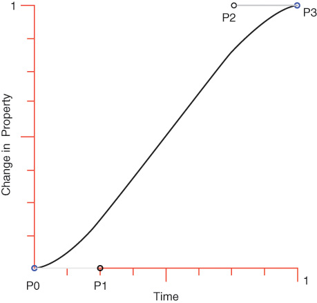
Each of the standard timing functions has an equivalent cubic-bezier() function:
-
linearis the same ascubic-bezier(0,0,1,1) -
easeis the same ascubic-bezier(0.25,0.1,0.25,1) -
ease-inis the same ascubic-bezier(0.42,0,1,1) -
ease-outis the same ascubic-bezier(0,0,.58,1) -
ease-in-outis the same ascubic-bezier(0.42,0,0.58,1)
But what makes this function so useful is that you can use it to create your own curves. One popular effect is to make an element bounce at the end. To create this effect, first place a <div> on a web page and style it to look like a ball:
.ball {
position: relative;
left: 75%;
background-color: #ffb33a;
width: 20rem;
height: 20rem;
border-radius: 10rem;
}
Build a @keyframes rule to move the ball across the screen horizontally:
@keyframes bounce {
0% {
left: 0%;
}
100% {
left: 75%;
}
}
Add the bounce animation to the ball:
animation: bounce 3s infinite;
The animation now uses the default timing function, ease. To make it bounce, you need to use something more like ease-out. You can see what ease-out looks like by adding the timing function to the CSS for the ball:
animation-timing-function: ease-out;
But this still doesn’t look like a bouncing ball. To create a bounce at the end, you need to use a cubic-bezier() function. The first point (P1) can be the same as the origin, or 0,0, but the second point (P2) needs to be higher than the destination point. In this case, let’s use the value 0.5, 1.5:
animation-timing-function: cubic-bezier(0, 0, 0.5, 1.5);
Listing 15.3 provides the full HTML and CSS for this example. If you try it out in your browser, you’ll see a big orange ball start on the left side of the screen and move to the right, before sliding into place on the right side.
Listing 15.3 Bouncy Ball
<!doctype html>
<html lang="en">
<head>
<meta charset="utf-8">
<title>Bouncy Ball</title>
<style>
.ball {
position: relative;
left: 75%;
background-color: #ffb33a;
width: 20rem;
height: 20rem;
border-radius: 10rem;
animation: bounce 3s;
animation-timing-function: cubic-bezier(0, 0, 0.5, 1.5);
}
@keyframes bounce {
0% {
left: 0%;
}
100% {
left: 75%;
}
}
</style>
</head>
<body>
<div class="ball"></div>
</body>
</html>
Note
While it’s possible to build your own Bézier curves by simply putting in numbers, there is a website that can help you build them more effectively: http://cubic-bezier.com. With this site, you can import curves you’re trying out and compare them to standard curves. This site makes creating custom timing functions for both animations and transitions much easier.
You may be wondering why the ball is positioned at 75% left rather than 100% left. When you position the element 100% left, it is placed mostly offscreen. If you want it to be placed up against the left border, without going over, you need to use the CSS calc() function. This does a calculation to create the result you want. In this case, you can make the ball end up 100% left but minus its own width (20rem), so that it’s fully onscreen, like so:
left: calc(100% − 20rem);
One other way you can affect the timing of your animations is with the animation-delay property. This acts exactly like the transition-delay property mentioned in Lesson 14. You set a time interval for the browser to wait before starting the animation. This can be any interval, from milliseconds (ms), to seconds (s), fractions of a second, and so on.
When you set a delay on your animations, you may notice that the animated elements do not behave as you expected them to. This is because animations do not affect the element before the first keyframe is played or after the last one is played. You can change this behavior with the animation-fill-mode property, which can take the following values:
- none—The animation does not affect the styles of the element either before or after running.
- forwards—The animated element keeps the styles set by the last keyframe.
- backwards—The element gets the styles set by the first keyframe, including during the
animation-delay. - both—Both the
forwardsandbackwardsvalues are applied.
Making an Animation Repeat
The bouncing ball animation is interesting, but if you miss it, you’ll never see it because it happens only once. By changing animation-iteration-count, you can change how many times the animation repeats. Put in a number to have it repeat a specific number of times or the keyword infinite to have it repeat indefinitely, like so:
animation-iteration-count: infinite;
When you add this line to the bouncing ball animation, there is a jarring point where the animation bounces back to the beginning abruptly. To fix this, you can adjust the animation-direction property to alternate. This tells the browser to change the direction and run it forward and then backward and then forward on any animation that has an iteration count of 2 or more.
The animation-direction property can take four possible values:
- normal—Plays the animation from start to finish. This is the default.
- reverse—Plays the animation backward, from finish to start.
- alternate—Plays the animation first from start to finish and then in reverse and so on until the iteration count is reached.
- alternate-reverse—Plays the animation first from finish to start and then in reverse and so on until the iteration count is reached.
To fix the bouncing ball, add alternation, like so:
animation-direction: alternate;
The full bouncing ball animation is shown in Listing 15.4. To make the bounce more interesting, we added a bounce to the timing function at the start of the animation.
Listing 15.4 Improved Bouncy Ball
<!doctype html>
<html lang="en">
<head>
<meta charset="utf-8">
<title>Bouncy Ball</title>
<style>
.ball {
position: relative;
left: calc(100% − 20rem);
background-color: #ffb33a;
width: 20rem;
height: 20rem;
border-radius: 10rem;
animation: bounce 3s;
animation-timing-function: cubic-bezier(0.5,−0.5, 0.5,1.5);
animation-iteration-count: infinite;
animation-direction: alternate;
}
@keyframes bounce {
0% {
left: 0%;
}
100% {
left: calc(100% − 20rem);
}
}
</style>
</head>
<body>
<div class="ball"></div>
</body>
</html>
Caution
As with anything that moves on your web pages, use care with your animations and transitions. Lots of motion, especially repetitive motion, can be annoying and distracting. In most situations, subtle changes are better than larger ones.
Naming and Pausing Your Animations
One thing that many designers forget is that you can pause animations with CSS by using the animation-play-state property. This takes the values paused and running. When an animation is paused, it is not animating, and when it is running, well, it’s running. One way to let a user stop an animation is by adding it to a pseudo-class such as :hover, like so:
.ball:hover {
animation-play-state: paused;
}
Finally, the last animation property is the animation-name property, which defines the @keyframe rule to use for the animation. This name is a custom identifier for each animation. You can also use the keyword none to turn off the animation.
Using the CSS Canvas
The HTML <canvas> element creates a rectangular region on a web page where you can draw anything you’d like by using JavaScript. You can use it to add images, create slide shows, build games, and display animations.
How to Use the Canvas
When you add the <canvas> element to a document, it creates a blank canvas in the browser. Because the canvas has no width, height, or content, the <canvas> element doesn’t display anything on the screen. Most of the time, you will also want to specify a width and height and give your canvas an ID, so you can reference it in your scripts, as in this example:
<canvas id="myCanvas" width="350" height="450"></canvas>
Of course, if this is all you write, there will simply be a blank 350 × 450-pixel space in your HTML. You can add a border around all canvases in the CSS so you can see them on the page:
canvas { border: solid thin black; }
Note
While most modern browsers support the <canvas> element, you can include fallback content inside this element that displays if the canvas content cannot display. It acts just like fallback content in other HTML5 elements, such as the <video> and <audio> elements.
A canvas gives you a place to draw, add pictures, and bring pictures to life with animation. To draw on the canvas, you need to add some JavaScript. Add a <script> element to the bottom of your HTML document, just above the closing </body>tag. Inside it, you can define both the canvas and the drawing context, like so:
<script>
var canvas = document.getElementById('myCanvas');
var context = canvas.getContext('2d');
</script>
Caution
In order to draw on a <canvas> element, you must pass the string 2d to the getContext() method. Otherwise, your <canvas> element will not display anything. If you draw on a <canvas> element and it’s blank, ensure that you’ve set the context first.
Drawing Shapes on the Canvas
It’s easy to draw shapes on a canvas. You can draw rectangles, circles, polygons, and lines with just a few lines of JavaScript.
Drawing a Rectangle or Square
To create a filled rectangle or square, you use the function fillRect(), like so:
context.fillRect(30, 30, 150, 150);
The first two values indicate where the rectangle should start drawing. They are the x and y coordinates from the upper-left corner of the canvas. Then you set the width and the height with the last two values. The line above should create a 150 × 150 square at 30 over and 30 down from the upper-left corner of the canvas. The square is black by default, but you can change that by adding a line above the fillRect() line that sets the color of the fill, like so:
context.fillStyle = "rgb(13, 118, 208)";
If you’d rather just draw the outline of a square, you use the function strokeRect(), like so:
context.strokeRect(35, 35, 150, 150);
You can use the strokeStyle() method to define the color of the stroke, like so:
context.strokeStyle = 'blue';
Drawing a Circle
Drawing circles involves using the arc() method. To understand how to draw a circle, imagine that you are physically drawing it with a protractor. You set the point of your protractor in the center of the circle, bend the angle so that the pen is at the radius, start drawing at a point, and lift the pen at a second point. You can draw a circle either clockwise or counterclockwise.
You can use the <canvas> element to draw a circle in the same way: Set the x and y coordinates for the center of the circle, the radius, the starting point on the circle (in radians), the ending point on the circle (in radians), and finally the direction of drawing—either clockwise (true) or counterclockwise (false). The syntax for this method is as follows:
arc(x, y, radius, startAngle, endAngle, clockwise);
Note
Arcs in the <canvas> element are measured in radians, not degrees. But because most of us find it easier to think in degrees (12 noon = 0°, 3 o’clock = 90°, and so on), it helps to have a conversion tool. In JavaScript, you can convert degrees to radians with the following expression:
var radians = (Math.PI/180)*degrees;
The easiest way to draw a circle is to first set the start and end points as variables, like so:
var startPoint = (Math.PI/180)*0;
var endPoint = (Math.PI/180)*360;
A circle is drawn as a path, so you set your starting point with the beginPath() method and then define the path as a circle with the arc() method:
context.beginPath();
context.arc(200,200,100,startPoint,endPoint,true);
But you still don’t have anything visible on the page while the path is on the canvas until you fill or stroke it with either the fill() method or the stroke() method:
context.fill();
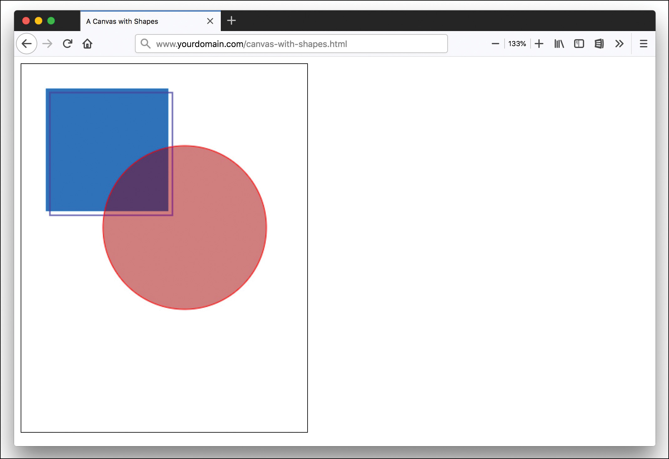
The fill keeps the same style unless you add a new fillStyle property above the fill() line. If you are stroking the circle, then you need to adjust strokeStyle instead. Listing 15.5 adds a stroked circle to the canvas, and Figure 15.2 shows how it would look.
Listing 15.5 A Canvas with Squares and a Circle
<!doctype html>
<html lang="en">
<head>
<meta charset="utf-8">
<title>A Canvas with Shapes</title>
<style>
canvas { border: solid thin black; }
</style>
</head>
<body>
<canvas id="myCanvas" width="350" height="450"></canvas>
<script>
var canvas = document.getElementById('myCanvas');
var context = canvas.getContext('2d');
context.fillStyle = "rgb(13, 118, 208)";
context.fillRect(30, 30, 150, 150);
context.strokeStyle = 'blue';
context.strokeRect(35, 35, 150, 150);
var startPoint = (Math.PI/180)*0;
var endPoint = (Math.PI/180)*360;
context.beginPath();
context.arc(200,200,100,startPoint,endPoint,true);
context.fillStyle = "rgba(155, 0, 0, 0.5)";
context.fill();
context.strokeStyle = "rgb(255, 0, 0)";
context.stroke();
</script>
</body>
</html>
Drawing Lines and Polygons
Like circles, lines and polygons are drawn using paths. You can use five methods to draw and use paths:
- beginPath()—This method creates a path on a canvas.
- closePath()—This method draws a straight line from the current point to the start. It doesn’t do anything when a path is already closed or on a path with only one point.
- stroke()—This draws an outline of a path.
- fill()—This fills in the shape of a path.
- moveTo()—This draws nothing but moves the drawing position to a new location on the canvas.
Caution
The first thing you should always do when drawing a path is specify the starting position of the path with the moveTo() command. The <canvas> element will treat your first construction that way, regardless of what the method actually is, and this will prevent you from getting surprising results.
To draw a line on a canvas, start a path with the beginPath() method and move your pointer to the starting point with moveTo(), like so:
context.beginPath();
context.moveTo(0,0);
The lineTo() method takes the x and y coordinates for the next point on the line:
context.lineTo(60,60);
But just as with circles, if you don’t stroke or fill the path, nothing will display. The default width of the line is 1 pixel, but you can change that with the lineWidth property. Then you stroke the line, like so:
context.lineWidth = 15;
context.stroke();
Note
If you don’t close the path and choose to fill the shape, the shape will close automatically, with a straight line from the last point on the path to the first point. You do not need to close the path with the closePath() method.
To draw a triangle, you do the same thing as with a line—first begin a new path and move to the starting point:
context.beginPath();
context.moveTo(20,30);
Then draw a line to the first point on the triangle:
context.lineTo(350,100);
And a second line to the second point on the triangle:
context.lineTo(250,400);
If you are not going to stroke the triangle, you don’t need to draw the path back to the origin because the fill() method will fill along a straight line to the origin:
context.fill();
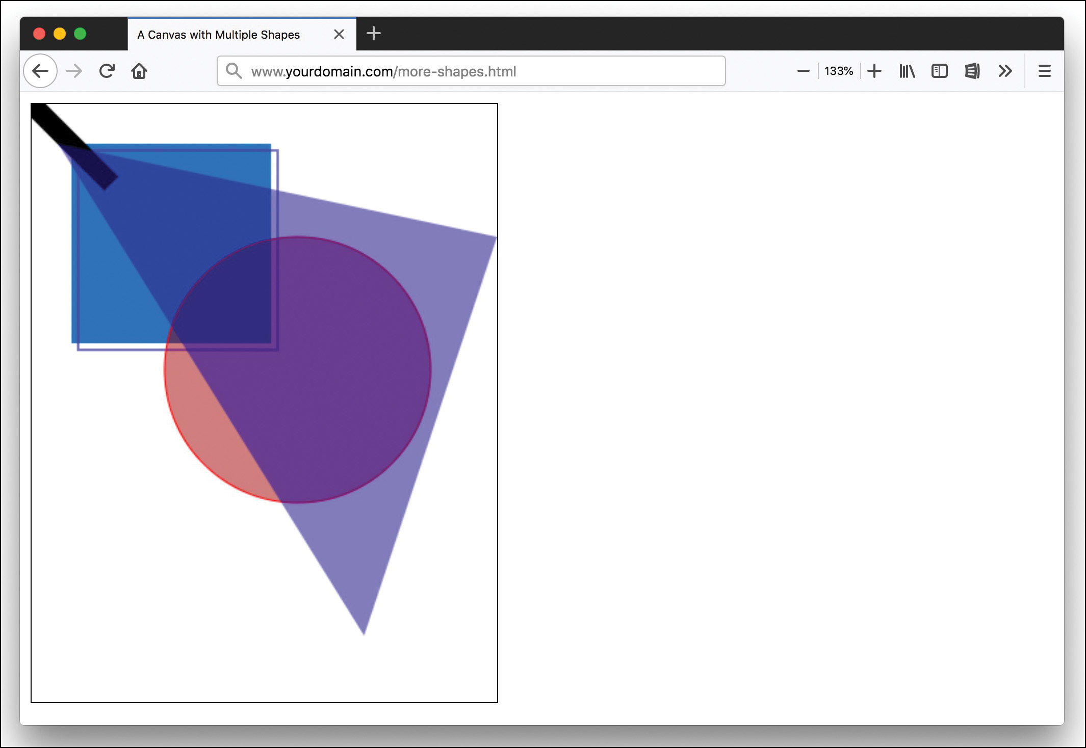
You can create a polygon that is as ornate as you like just by defining the points on the path. Listing 15.6 adds a line and a triangle to the canvas, as shown in Figure 15.3.
Listing 15.6 Adding More Shapes to the Canvas
<!doctype html>
<html lang="en">
<head>
<meta charset="utf-8">
<title>A Canvas with Multiple Shapes</title>
<style>
canvas { border: solid thin black; }
</style>
</head>
<body>
<canvas id="myCanvas" width="350" height="450"></canvas>
<script>
var canvas = document.getElementById('myCanvas');
var context = canvas.getContext('2d');
context.fillStyle = "rgb(13, 118, 208)";
context.fillRect(30, 30, 150, 150);
context.strokeStyle = 'blue';
context.strokeRect(35, 35, 150, 150);
var startPoint = (Math.PI/180)*0;
var endPoint = (Math.PI/180)*360;
context.beginPath();
context.arc(200,200,100,startPoint,endPoint,true);
context.fillStyle = "rgba(155, 0, 0, 0.5)";
context.fill();
context.strokeStyle = "rgb(255, 0, 0)";
context.stroke();
context.beginPath();
context.moveTo(0,0);
context.lineTo(60,60);
context.strokeStyle = "black";
context.lineWidth = 15;
context.stroke();
context.beginPath();
context.moveTo(20,30);
context.lineTo(350,100);
context.lineTo(250,400);
context.fillStyle = "rgba(0, 0, 155, 0.5)";
context.fill();
</script>
</body>
</html>
Adding Images to the Canvas
In order to display an image inside a <canvas> element, you need to reference an image object as a source file and then draw the image onto the canvas with the drawImage() method.
You have two choices for the first part: You can access an existing image on the page (in an <img> element), or you can create a new image with JavaScript. To create an image with JavaScript, first you add a new image to the DOM and populate it with the source file, like so:
var img = new Image();
img.src = "images/mckinley.jpg";
Once the image has loaded, run a function that draws it on the canvas at the x and y coordinates noted in the drawImage() method, like so:
img.onload = function() {
context.drawImage(img, 10,10);
}
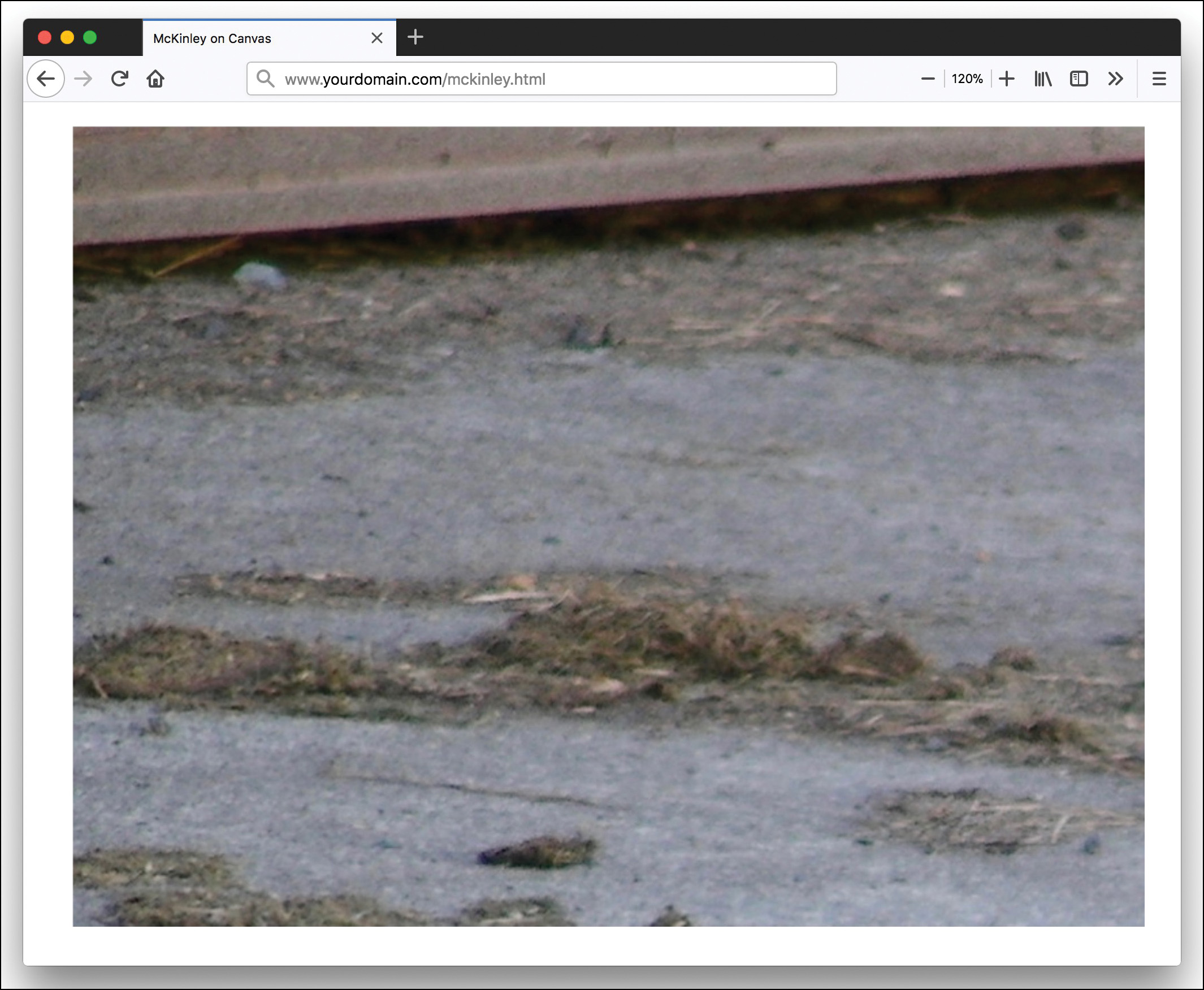
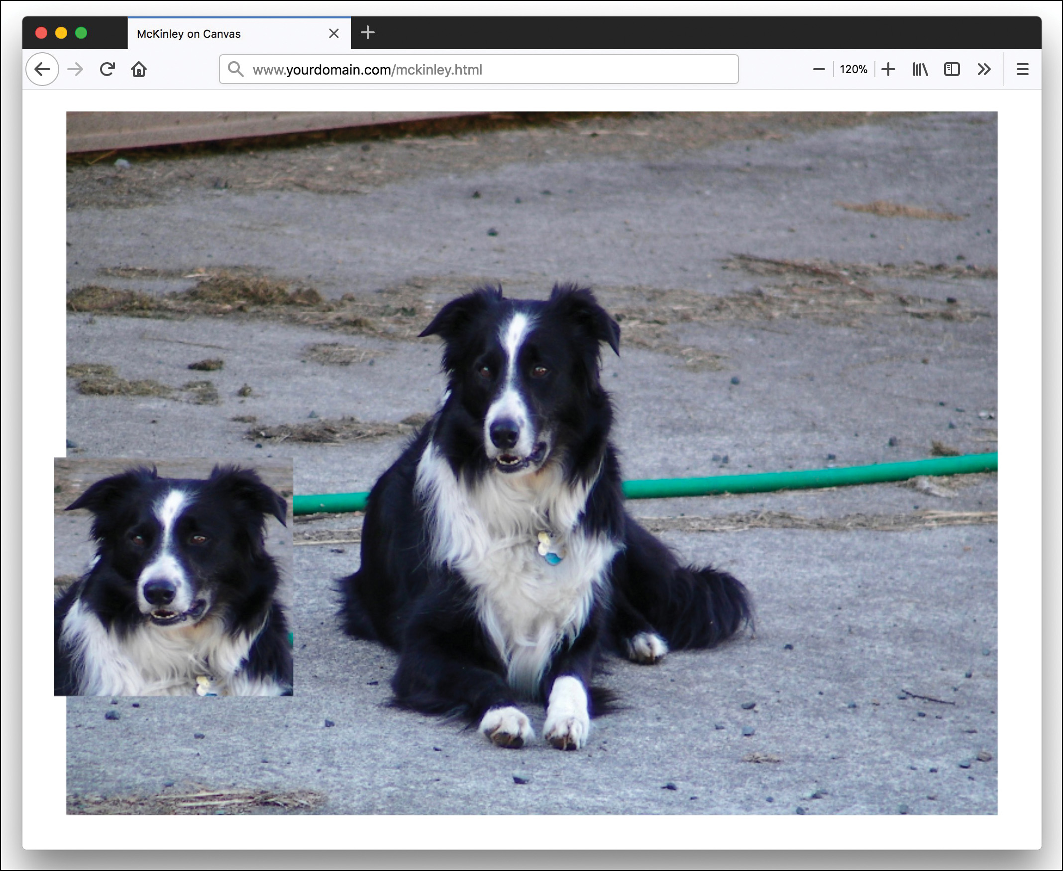
Listing 15.7 creates a canvas with a photo of a dog named McKinley. But as you see in Figure 15.4, all that is showing is the upper-left corner of the image—no dog to be seen.
Listing 15.7 Adding an Image to the Canvas
<!doctype html>
<html lang="en">
<head>
<meta charset="utf-8">
<title>McKinley on Canvas</title>
<style>
#myCanvas {
width: 800px;
height: 600px;
margin: 0 auto;
display: block;
}
</style>
<body>
<canvas width="800" height="600" id="myCanvas"></canvas>
<script>
var canvas = document.getElementById('myCanvas');
var context = canvas.getContext('2d');
var img = new Image();
img.src = "images/mckinley.jpg";
img.onload = function() {
context.drawImage(img, 10,10);
}
</script>
</body>
</html>
You can change the size of the image that is drawn or crop it to fit a certain section by using the drawImage() method. To change the size, you include four parameters:
context.drawImage(x, y, width, height);
The x and y coordinates specify where you want the image to be placed on the canvas. The width and height parameters are the new width and height for the image. You can scale the image up or down, but making an image larger often causes a lot of artifacts and makes the image look bad.
You can crop an image by including a clip path on the drawImage() method:
context.drawImage(clipx, clipy, clipwidth, clipheight, gox, goy, gowidth,
goheight);
The parameters in this syntax cover the coordinates to start the crop plus the width and height followed by the placement of the clip on the canvas with the width and height coordinates. Listing 15.8 shows how to add the image twice—first the full 780 × 680 image and then a cropped shot of McKinley’s head in the lower left. Figure 15.5 shows what this looks like.
Listing 15.8 Drawing, Scaling, and Cropping an Image on a Canvas
<!doctype html>
<html lang="en">
<head>
<meta charset="utf-8">
<title>McKinley on Canvas</title>
<style>
#myCanvas {
width: 800px;
height: 600px;
margin: 0 auto;
display: block;
}
</style>
<body>
<canvas width="800" height="600" id="myCanvas"></canvas>
<script>
var canvas = document.getElementById('myCanvas');
var context = canvas.getContext('2d');
var img = new Image();
img.src = "images/mckinley2.jpg";
img.onload = function() {
context.drawImage(img, 10,10, 780, 680);
context.drawImage(img, 842,344,532,594, 0,300,200,200);
}
</script>
</body>
</html>
Animating the Canvas
After you add things to the canvas, you can move them around. In fact, you already have enough knowledge to create a simple sprite animation. A sprite animation takes a graphic with several images composited together and displays a cropped section of the graphic. You animate it by changing which cropped area is displayed. This type of sprite animation has a big advantage: When the full image is loaded, all the animation parts are loaded.
First, you need to create a sprite image. For example, you can create a second version of the dog’s photo with his mouth open and then create a composite image with his mouth open and closed, as in Figure 15.6.
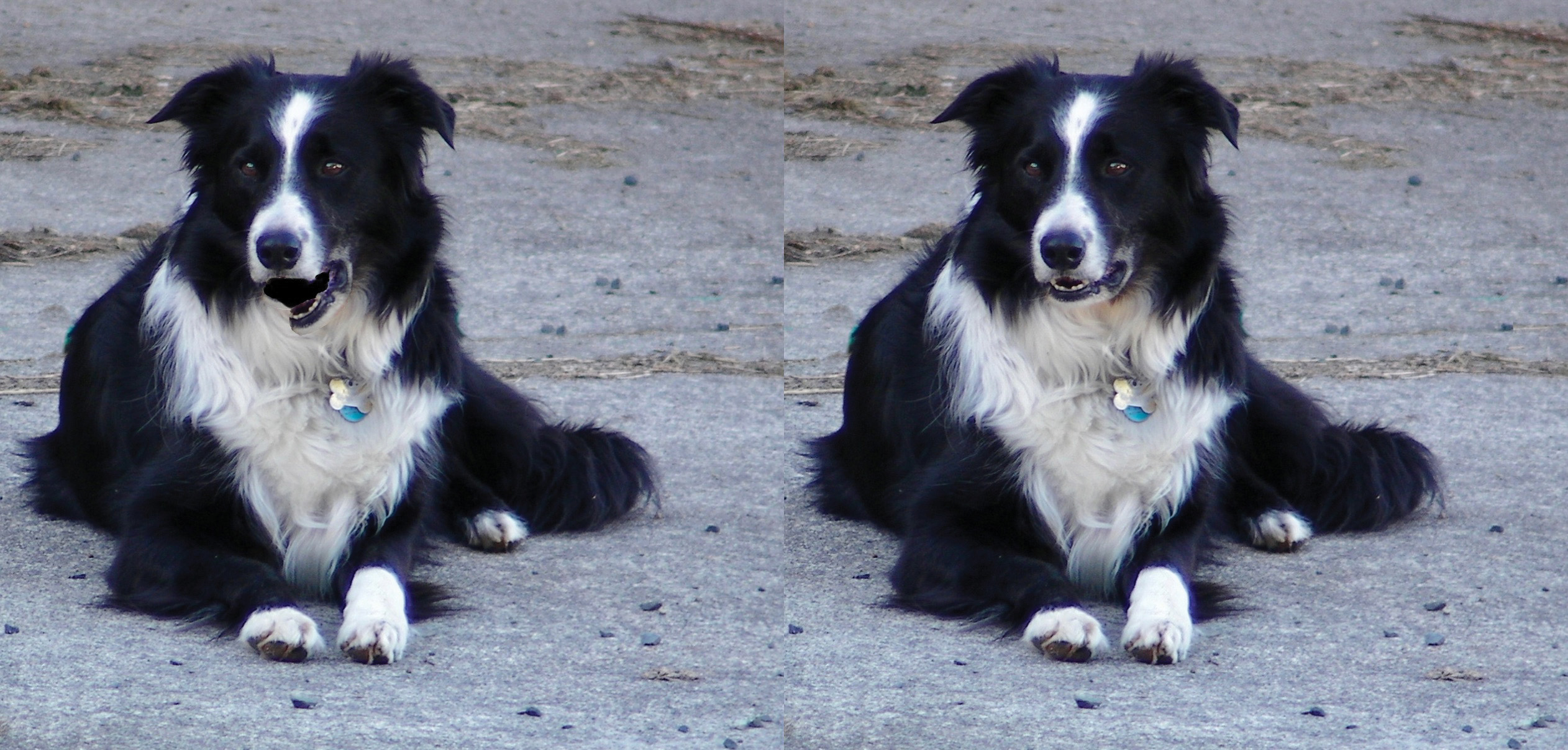
In this example, both images in the sprite are the same size—1262 × 1209. Creating sprites that are equal in size makes the sprite animation much easier to program.
Because this is going to be a <canvas> animation, add the <canvas> element and create the script with the canvas defined, like so:
<canvas id="myCanvas" width="1262" height="1209"></canvas>
<script>
var canvas = document.getElementById("myCanvas");
var context = canvas.getContext('2d');
</script>
As before, add the image with JavaScript:
var mckinleyImage = new Image();
mckinleyImage.src = "images/mckinley-talking-sprite.jpg";
The width and height of the single image is 1262 × 1209, so set those values in JavaScript as variables:
var width = 1262;
var height = 1209;
Now you need to start thinking about the animation. Sprite animation is similar to framed animation: At a specific interval, the screen switches from one frame (sprite) to the next. So you need to set variables for the number of frames and what frame number you’re currently on. Remember that JavaScript counts from zero, so for this animation, there are two sprite images, and the frames variable should be 1. To start with McKinley’s mouth open, the currentFrame should be 0:
var frames = 1;
var currentFrame = 0;
Then you build the image in the <canvas> element. You do this the same way as before, with the drawImage() method. But this time you need to put it inside a function so we can do the animation, as shown here:
var draw = function() {
context.drawImage(
mckinleyImage,
width * currentFrame,
0,
width,height,
0,0,
width,height
);
};
To add the animation, you need to increment currentFrame. But if it’s reached the total frames count, then it should reset to 0. Place the following in the draw function below where you drew the image:
if (currentFrame == frames) {
currentFrame = 0;
} else {
currentFrame++;
}
Then you can call the draw function with setInterval() to animate the picture:
setInterval(draw, 200);
One last thing you may need is a line to clear the canvas between frames. The <canvas> element has the method clearRect, which clears a rectangular portion of the canvas to make it ready for new drawings. By calling this method and setting it at the position 0,0, with the full canvas width and height, you clear the entire space:
context.clearRect(0, 0, width, height);
It is best to make this the first line of the draw function.
The full code for this animation is in Listing 15.9, and you can see it in action at https://htmljenn.com/mckinley-talking.html.
Listing 15.9 The Animated Dog
<!doctype html>
<html lang="en">
<head>
<meta charset="utf-8">
<title>McKinley Has a Lot to Say</title>
<style>
canvas {
transform: scale(0.5) translateY(−600px);
}
</style>
</head>
<body>
<canvas id="myCanvas" width="1262" height="1209"></canvas>
<script>
var canvas = document.getElementById("myCanvas");
var context = canvas.getContext('2d');
var mckinleyImage = new Image();
mckinleyImage.src = "images/mckinley-talking-sprite.jpg";
var width = 1262;
var height = 1209;
var frames = 1;
var currentFrame = 0;
var draw = function() {
context.clearRect(0, 0, width, height);
context.drawImage(
mckinleyImage,
width * currentFrame,
0,
width,height,
0,0,
width,height
);
if (currentFrame == frames) {
currentFrame = 0;
} else {
currentFrame++;
}
};
setInterval(draw, 200);
</script>
</body>
</html>
Choosing Between CSS Animation and Canvas Animation
At this point in the lesson, you may be wondering why anyone would want to use CSS animation or HTML <canvas> animation. They both have strengths and weaknesses, and if you’re more familiar with CSS or with JavaScript, you might feel that one is superior to the other. But if you’re new to both, they can be equally intimidating. So how do you decide which is better?
There is a widespread belief that CSS animations are faster than JavaScript animations on the canvas. This is because when you use transforms in a 3D context (such as transform: translate3d();), the browser uses the GPU and so renders it more quickly. There are 3D methods in JavaScript as well, but most designers forget to use them.
There are some things you can do with JavaScript that you simply cannot do with CSS. For example, you can’t seek to a specific spot in a CSS animation, nor can you smoothly reverse midstream. You can’t alter the speed or time scale of an animation without creating an entirely new animation.
One aspect of CSS animation that is annoying to most animators is that the keyframes are defined in percentages. But most animators think in terms of time rather than percentages. For example, you might think “The headline needs to fade in for 3 seconds and then bounce once before coming to rest at full opacity 1 second later.” How do you define that in percentages? And what if, after you’ve fiddled with the percentages for a while, the client responds, “It looks great, but the fade needs to be 5 seconds.”
One thing we miss in CSS animations is the ability to add multiple control points to the cubic-bezier() value. You can do this with JavaScript. You can also add physics-based motion with JavaScript.
We are not saying that you should never use CSS animations. CSS animations are great for basic transitions and rollovers and for adding fun features and games to your sites. You can build very complex games with CSS animations. Plus, if you need to keep all your presentation layer details in the CSS, then CSS animation is what you have to use.
JavaScript animation is harder to learn: It is possible to do a lot more with JavaScript, and the JavaScript you learned in this lesson barely scratches the surface of what you can do.
Summary
This lesson covered how to do animations in two ways: with CSS and with JavaScript on the HTML <canvas>. You learned how to create keyframe animation with CSS by defining the @keyframes rule and applying it to an element with the animation property. You then learned more about timing, looping, and pausing animations.
This lesson also covered the HTML <canvas> element, including how to use it to draw shapes like circles, rectangles, and polygons. You also learned how to add images to the canvas and then animate the images with simple sprite animation. Finally, you learned some of the reasons you might choose CSS animation or JavaScript animation.
Q&A
Q. When should I use CSS animations versus CSS transitions?
A. Bear in mind that a CSS transition is an animation, but it’s just very limited in scope. If you need an animation that has more than a start state and end state, you should use CSS animations. Also, if you need more granular control over the animation keyframes, then CSS animation is the right tool.
Q. What about SVG animation?
A. Using Scalable Vector Graphics (SVG) animation to create the motion is another way to create animations for your websites. There are many programs you can use to build SVG graphics and animate them. One popular tool to do this is Inkscape (https://inkscape.org/en/).
Workshop
The Workshop contains quiz questions and activities to help you solidify your understanding of the material covered. Try to answer all questions before looking at the “Answers” section that follows.
Quiz
1. What are two ways to create a @keyframes rule with a starting state and an ending state?
2. What keyframes are required to create an animation that will change to a new state at 50% and then back to the original state at the end?
3. What property defines how long an animation should play in one iteration?
4. How many points of a Bézier curve are defined in the cubic-bezier() value?
5. What is the keyword for the timing function value cubic-bezier(0,0,1,1)?
6. How many times will the animation animation: threeTimes 5s 4; play?
7. What function can calculate exact values from percentages in CSS properties?
8. What arguments does the arc() method take?
9. What method will place an image on the canvas?
10. If the first image on a sprite is 100 × 100, how big can the other images in the sprite be?
Note
Just a reminder for those of you reading these words in the print or e-book edition of this book: If you go to www.informit.com/register and register this book (using ISBN 9780672338083), you can receive free access to an online Web Edition that not only contains the complete text of this book but also features an interactive version of this quiz.
Answers
1. You can use either this:
@keyframes myAnimation {
from { ... }
to { ... }
}
or this:
@keyframes myAnimation {
0% { ... }
100% { ... }
}
2. Only the following is required:
@keyframes {
50% { }
}
3. The animation-duration property defines how long an animation should play in one iteration.
4. The cubic-bezier() value defines the x and y coordinates of two points on a curve.
5. This is a linear timing function value.
6. The animation will play four times and then stop.
7. The calc() function calculates exact values in CSS.
8. The arc() method draws a circle with the x and y coordinates of the center, as well as the starting and ending angles (in radians), and finally the direction to draw the path.
9. The drawImage() method draws images that are in the DOM onto the canvas.
10. All the images in a sprite file should be the same size, so they should all be 100 × 100.
Exercises
 Add a CSS animation to one of the elements on your web page. Use at least two keyframes and try animating using several different styles.
- Put a canvas on your web page with a large image on it. But instead of clipping the image or resizing it to fit, cycle through it with an animation to change what part of the image is displayed every few seconds.