
Lesson 27
Working with Web-Based Forms
What You’ll Learn in This Lesson:
 How HTML forms work
- How to create the front end of an HTML form
- How to name pieces of form data
- How to include hidden data in forms
- How to choose the correct form input controls for different situations
- How to validate form data
- How to submit form data
- How to use the
formobject with JavaScript
To this point, pretty much everything in these lessons has focused on getting information out to others. But you can also use your web pages to gather information from the people who read and interact with them.
Web forms enable you to receive feedback, orders, and other information from the users who visit your web pages. If you’ve ever used a search engine such as Google or Bing, you’re familiar with HTML forms—those single-field entry forms, each with a single button that, when clicked, gives you all the information you are looking for and then some. Product order forms are also an extremely popular use of forms; if you’ve ordered anything from Amazon.com or purchased something from an eBay seller, you’ve used forms. In this lesson, you’ll learn how to create your own forms, but you’ll learn only how to create the front end of those forms. Working with the server-side handling of forms requires knowledge of a programming language and is beyond the scope of these lessons.
How HTML Forms Work
An HTML form is part of a web page that includes areas where users can enter information to be sent back to you, to another email address that you specify, to a database that you manage, or to another system altogether, such as a third-party management system for your company’s lead generation forms, such as Salesforce.com.
Before you learn the HTML elements that are used to make your own forms, you should at least conceptually understand how the information from those forms makes its way back to you. The actual behind-the-scenes (the server-side or back-end) process requires knowledge of at least one programming language—or at least the ability to follow specific instructions when using someone else’s server-side script to handle the form input. At that point in the process, you should either work with someone who has the technical knowledge or learn the basics on your own. Simple form processing is not difficult, and your web hosting provider likely has several back-end scripts that you can use with minimal customization.
Note
PHP is the most popular server-side programming language, and it is supported by any web hosting provider that’s worth its salt. You can learn more about PHP at www.php.net, or you can just dive right in to learning this programming language (plus database interactivity) from the ground up in Sams Teach Yourself PHP, MySQL, and JavaScript All in One (ISBN: 978-0-672-33770-3). It is geared toward absolute beginners with PHP or any other programming language.
A form includes a button for the user to submit the form; that button can be an image that you create yourself or a standard HTML form button that is created when a form <input> element is created and given a type value of submit. When someone clicks a form submission button, all the information typed in the form is sent to a URL specified in the action attribute of the <form> element. That URL should point to a specific script that will process your form, sending the form contents via email or performing another step in an interactive process (such as requesting results from a search engine or placing items in an online shopping cart).
When you start thinking about doing more with form content than simply emailing results to yourself, you need additional technical knowledge. For example, if you want to create an online store that accepts credit cards and processes transactions, there are some well-established practices for doing so, all geared toward ensuring the security of your customers’ data. That is not an operation that you’ll want to enter into lightly; you’ll need more knowledge than these lessons provide.
Before you put a form online, you should look in the user guide for your web hosting provider to see what it offers in the way of form-processing scripts. You are likely to find a readily available Perl or PHP script that you can use with only minimal configuration.
Creating a Form
Every form must begin with an opening <form> tag, which can be located anywhere in the body of the HTML document. The <form> tag typically has three attributes, name, method, and action:
<form name="my_form" method="post" action="myprocessingscript.php">
The most common method is post, which sends the form entry results as a document. In some situations, you need to use method="get", which submits the results as part of the URL query string instead. For example, get is sometimes used when queries are submitted to search engines from a web form. Because you’re not yet an expert on forms, just use post unless your web hosting provider’s documentation tells you to do otherwise.
Note
The URL query string is the part of the URL after a question mark (?). It is made up of name=value pairs, separated by an ampersand (&) character, as in this example:
https://www.yourdomain.com/path/to/page.html?this=that&a=anything
The action attribute specifies the address for sending the form data. You have two options here:
- You can type the location of a form-processing program or script on a web server, and the form data will then be sent to that program. This is by far the most common scenario.
- You can type
mailto:followed by your email address, and the form data will be sent directly to you whenever someone fills out the form. Here’s an example:<formname="my_form"method="post"action="mailto:[email protected]">However, this approach is completely dependent on the user’s computer being properly configured with an email client. People accessing your site from a public computer without an email client will be left out in the cold.
The form created in Listing 27.1 and shown in Figure 27.1 includes just about every type of user input component you can currently use in HTML forms in modern browsers. Refer to this listing and figure as you read the following explanations of the types of input element.
Listing 27.1 A Form with Various User-Input Components
<!doctype html>
<html lang="en">
<head>
<meta charset="utf-8">
<title>Guest Book</title>
<meta name="viewport"
content="width=device-width, initial-scale=1">
<style>
fieldset {
width: 75%;
border: 2px solid #9435d4;
}
legend {
font-weight: bold;
font-size: 125%;
}
label.question {
width: 225px;
float: left;
text-align: left;
font-weight: bold;
}
span.question {
font-weight: bold;
}
input, textarea, select, button {
border: 1px solid #000;
padding: 3px;
}
#buttons {
margin-top: 12px;
}
#errors {
color: red;
font-weight: bold;
font-size: larger;
}
</style>
</head>
<body>
<h1>My Guest Book</h1>
<form name="gbForm"method="post"action="URL_to_script">
<output id="errors"></output>
<fieldset>
<legend>Personal Information</legend>
<p>
<label class="question"for="the_name">
What is your name?</label>
<input type="text"id="the_name"name="the_name"
placeholder="Enter your full name."
size="50"requiredautofocus>
</p>
<p>
<label class="question"for="the_email">What is your email
address?</label>
<input type="email"id="the_email"name="the_email"
placeholder="Please use a real one!"
size="50"required>
</p>
</fieldset>
<fieldset>
<legend>Survey Questions</legend>
<p>
<span class="question">Please check all that apply:</span><br>
<input type="checkbox"id="like_it"name="some_statements[]"
value="I really like your web site.">
<label for="like_it">I really like your web site.</label><br>
<input type="checkbox"id="the_best"name="some_statements[]"
value="It's one of the best sites I've ever seen">
<label for="the_best">It's one of the best sites I've ever
seen.</label><br>
<input type="checkbox"id="jealous"name="some_statements[]"
value="I sure wish my site looked as good as yours.">
<label for="jealous">I sure wish my site looked as good as
yours.</label><br>
<input type="checkbox"id="no_taste"name="some_statements[]"
value="I have no taste and I'm pretty dense, so your
site didn't do much for me.">
<label for="no_taste">I have no taste and I'm pretty dense, so
your site didn't do much for me.</label>
</p>
<p>
<label for="choose_scale"><span class="question">Please
rate my site on a scale of 1 (poor) to 10
(awesome):</span></label>
<input type="number"id="choose_scale"name="choose_scale"
min="1"max="10"step="1"value="5">
</p>
<p>
<span class="question">Please choose the one thing you love
Best about my web site:</span><br>
<input type="radio"id="the_picture"name="best_thing"
value="me">
<label for="the_picture">That amazing picture of you</label><br>
<input type="radio"id="the_animals"name="best_thing"
value="animals">
<label for="the_animals">All the animal photos, of course</label><br>
<input type="radio"id="the_dandelions"name="best_thing"
value="dandelions">
<label for="the_dandelions">The comprehensive dandelion
facts, by far</label><br>
<input type="radio"id="the_story"name="best_thing"
value="childhood story">
<label for="the_story">The inspiring recap of your suburban
childhood</label><br>
<input type="radio"id="the_treasures"name="best_thing"
value="Elvis treasures">
<label for="the_treasures">The detailed list of all your Elvis
memorabilia</label>
</p>
<p>
<label for="the_worst"><span class="question">
Please indicate the one thing I could improve about my web site:
</span></label><br>
<input type="text"id="the_worst"name="the_worst"
placeholder="There's nothing bad, is there?"
list="listOfBadChoices"size="50">
</p>
<p>
<label for="how_improve"><span class="question">What else
would you like to see on my web site?</span></label><br>
<select id="how_improve"name="how_improve"size="4"multiple>
<optgroup label="Preferred">
<option value="Nothing. It's perfect.">Nothing. It's
perfect.</option>
</optgroup>
<optgroup label="Likely">
<option value="More about the animals.">More about the
animals.</option>
<option value="More about the dandelions.">More about the
dandelions.</option>
</optgroup>
<optgroup label="Unlikely">
<option value="More about Elvis.">More about Elvis.
</option>
</optgroup>
</select>
</p>
</fieldset>
<fieldset>
<legend>Free for All!</legend>
<p>
<label for="message"><span class="question">Feel free to send
more praise, gift offers, etc.:</span></label>
<textarea id="message"name="message"rows="7"cols="55">
</textarea>
</p>
</fieldset>
<div id="buttons">
<input type="submit"value="Click Here to Submit"> or
<input type="reset"value="Erase and Start Over"> or
<button type="button"id="standardValues">Fill in Standard
Values</button>
</div>
</form>
<datalist id="listOfBadChoices">
<option value="nothing"></option>
<option value="nada"></option>
<option value="zip"></option>
<option value="zilch"></option>
<option value="I can't think of anything"></option>
</datalist>
</body>
</html>
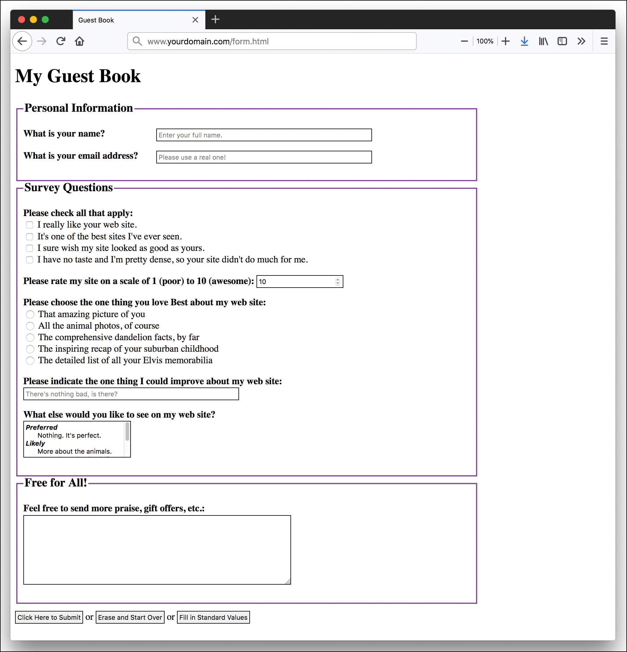
The code in Listing 27.1 uses a <form> element that contains quite a few <input> tags. Each <input> tag corresponds to a specific user input component, such as a check box or radio button. The input, select, text area, and button elements contain borders in the stylesheet, so it is easy to see the outline of each element in the form. Keep in mind that you can apply all sorts of CSS to those elements.
The next few sections dig into the details of the <input> tag and other form-related tags.
Accepting Text Input
To ask the user for a specific piece of information within a form, use the <input> tag. Although this tag does not explicitly need to appear between the <form> and </form> tags, putting it there is good practice and makes your code easier to follow. You can place <input> elements anywhere on the page alongside text, images, and other HTML tags. For example, to ask for someone’s name, you could type the following text followed immediately by an <input> field:
<p><label class="question"for="the_name">What is your name?</label>
<input type="text"id="the_name"name="the_name"
placeholder="Enter your full name."
size="50"required autofocus></p>
The type attribute indicates what type of form element to display—in this case a simple, one-line text entry box. (Each element type is discussed individually in this lesson.) In this example, note the use of the placeholder, required, and autofocus attributes. You’ll learn about the required attribute later in this lesson; the autofocus attribute automatically focuses the user’s cursor in this text field as soon as the browser renders the form. A form can have only one autofocus field. The placeholder attribute enables you to define some text that appears in the text box but disappears when you begin to type. Using this attribute, you can give the user a bit more guidance in completing your form.
Note
If you want the user to enter text without having the text displayed on the screen, you can use <input type="password"> instead of <input type="text">. Asterisks (***) are then displayed in place of the text the user types. The size, maxlength, and name attributes work exactly the same for type="password" as they do for type="text". Keep in mind that this technique of hiding a password provides only minimal protection against people reading the screen; no encryption or other protection is associated with the password being transmitted.
The size attribute indicates approximately how many characters wide the text input box should be. If you are using a proportionally spaced font, the width of the input will vary depending on what the user enters. If the input is too long to fit in the box, most web browsers automatically scroll the text to the left. This attribute is often left off of most modern forms, as designers define the width and height of the boxes in the CSS.
The maxlength attribute determines the number of characters the user is allowed to type into the text box. If a user tries to type beyond the specified length, the extra characters won’t appear. You can specify a length that is longer, shorter, or the same as the physical size of the text box. The size and maxlength attributes are used only for the input fields meant for text values, such as type="text", type="email", type="URL", and type="tel", but not check boxes and radio buttons since those have fixed sizes.
Naming Each Piece of Form Data
No matter what type an input element is, you must give a name to the data it gathers. You can use any name you like for each input item, as long as each one on the form is different (except in the case of radio buttons and check boxes, discussed later in this lesson). When the form is processed by a back-end script, each data item is identified by name. This name becomes a variable, which is filled with a value. The value is either what the user typed in the form or the value associated with the element the user selected.
For example, if a user enters Jane Doe in the text box defined previously, a variable is sent to the form-processing script; the variable is user_name, and the value of the variable is Jane Doe. Form-processing scripts work with these types of variable names and values.
Note
Form-processing scripts are oversimplified here for the sake of explanation within the scope of these lessons. The exact appearance (or name) of the variables made available to your processing script depends on the programming language of that script. But conceptually, it’s valid to say that the name of the input element becomes the name of the variable, and the value of the input element becomes the value of that variable on the back end.
To use this text field (or others) in JavaScript, remember that the text object uses the name attribute; you refer to the value of the field in the previous snippet like this:
document.formname.user_name.value
Labeling Each Piece of Form Data
Labeling your form data is not the same as using a name or id attribute to identify the form element for later use. Instead, the <label></label> tag pair surrounds text that acts as a sort of caption for a form element. A form element <label> provides additional context for the element, which is especially important for screen-reader software.
You can see two different examples in Listing 27.1. First, you can see the <label> surrounding the first question a user is asked (What is your name?). The use of the for attribute ties this label to the <input> element with the same id (in this case, the_name):
<p><label class="question" for="the_name">What is your name?</label>
<input type="text"id="the_name"name="the_name"
placeholder="Enter your full name."
size="50"requiredautofocus></p>
Note
The <label> element is used for more than just screen readers. It makes form fields more usable because when the user clicks the label, the focus is moved to that form field.
A screen reader would read to the user, “What is your name?” and then also say “text box” to alert the user to complete the text field with the appropriate information. In another example from Listing 27.1, you see the use of <label> to surround different options in a check box list (and also a list of radio buttons, later in the listing):
<p><span class="question">Please check all that apply:</span><br>
<input type="checkbox"id="like_it"name="some_statements[]"
value="I really like your web site.">
<label for="like_it">I really like your web site.</label><br>
<input type="checkbox" id="the_best" name="some_statements[]"
value="It's one of the best sites I've ever seen">
<label for="the_best">It's one of the best sites I've ever
seen.</label><br>
<input type="checkbox" id="jealous" name="some_statements[]"
value="I sure wish my site looked as good as yours.">
<label for="jealous">I sure wish my site looked as good as
yours.</label><b>
<input type="checkbox" id="no_taste" name="some_statements[]"
value="I have no taste and I'm pretty dense, so your site
didn't do much for me.">
<label for="no_taste">I have no taste and I'm pretty dense, so your
site didn't do much for me.</label></p>
In this situation, the screen reader would read the text surrounded by the <label> tag, followed by “check box,” to alert the user to choose one of the given options. Labels should be used for all form elements and can be styled using CSS in the same manner as other container elements; the styling does not affect the screen reader, but it does help with layout aesthetics and readability.
Grouping Form Elements
In Listing 27.1, you can see the use of the <fieldset> and <legend> elements three different times, to create three different groups of form fields. The <fieldset> element surrounds groups of form elements to provide additional context for the user, whether the user is accessing the form directly in a web browser or with the aid of screen-reader software. The <fieldset> element just defines the grouping; the <legend> element contains the text that will display or be read aloud to describe this grouping, such as the following from Listing 27.1:
<fieldset>
<legend>Personal Information</legend>
<p>
<label class="question"for="the_name">
What is your name?</label>
<input type="text"id="the_name"name="the_name"
placeholder="Enter your full name."
size="50"requiredautofocus>
...
</fieldset>
In this situation, when the screen reader reads the <label> associated with a form element, as you learned in the preceding section, it also appends the <legend> text. In the example above, it would be read as “Personal Information. What is your name? Text box.” The <fieldset> and <legend> elements can be styled using CSS, so the visual cue of the grouped elements can easily be made visible in a web browser (as you saw previously in Figure 27.1).
Including Hidden Data in Forms
Want to send certain data items to the server script that processes a form, but don’t want the user to see those data items? Use an <input> tag with a type="hidden" attribute. This attribute has no effect on the display; it just adds any name and value you specify to the form results when they are submitted.
If you are using a form-processing script provided by your web hosting provider, you might be directed to use this attribute to tell a script where to email the form results. For example, including the following code causes the results to be emailed to [email protected] after the form is submitted:
<input type="hidden"name="mailto"value="[email protected]">
You sometimes see scripts using hidden input elements to carry additional data that might be useful when you receive the results of the form submission; some examples of hidden form fields include an email address and a subject for the email. If you are using a script provided by your web hosting provider, consult the documentation provided with that script for additional details about potential required hidden fields.
Exploring Form Input Controls
Various input controls are available for retrieving information from the user. You’ve already seen one text-entry option; the next few sections introduce you to most of the remaining form-input options you can use to design forms.
Check Boxes
Besides the text field, one of the simplest input types is the check box, which appears as a small square. Users can click check boxes to select or deselect one or more items in a group. For example, the check boxes in Listing 27.1 display after text that reads “Please check all that apply,” implying that the user could indeed check all that apply.
The HTML for the check boxes in Listing 27.1 shows that the value of the name attribute is the same for all of them:
<span class="question">Please check all that apply:</span><br>
<input type="checkbox"id="like_it"name="some_statements[]"
value="I really like your web site.">
<label for="like_it">I really like your web site.</label><br>
<input type="checkbox"id="the_best"name="some_statements[]"
value="It's one of the best sites I've ever seen">
<label for="the_best">It's one of the best sites I've ever
seen.</label><br>
<input type="checkbox"id="jealous"name="some_statements[]"
value="I sure wish my site looked as good as yours.">
<label for="jealous">I sure wish my site looked as good as
yours.</label><br>
<input type="checkbox"id="no_taste"name="some_statements[]"
value="I have no taste and I'm pretty dense, so your
site didn't do much for me.">
<label for="no_taste">I have no taste and I'm pretty dense, so
your site didn't do much for me.</label>
</p>
The use of the brackets ([]) in the name attribute indicates to the back-end processing script that a series of values will be placed into this one variable instead of using just one value. (Well, it might be just one value if the user selects only one check box.) If a user selects the first check box, the text string I really like your web site. is placed in the website_response[] bucket. If the user selects the third check box, the text string I sure wish my site looked as good as yours. also is put into the website_response[] bucket. The processing script then works with that variable as an array of data rather just a single entry.
Note
If you find that the label for an input element is displayed too close to the element, just add a space between the close of the <input> tag and the start of the label text, like this:
<input type="checkbox" name="mini">
<label>Mini Piano Stool</label>
However, you might see groups of check boxes that do use individual names for the variables in the group. For example, the following is another way of writing the check box group:
<p>
<span class="question">Please check all that apply:</span><br>
<input type="checkbox" id="like_it" name="liked_site" value="yes"
value="I really like your web site.">
<label for="like_it">I really like your web site.</label><br>
<input type="checkbox" id="the_best" name="best_site" value="yes"
value="It's one of the best sites I've ever seen">
<label for="the_best">It's one of the best sites I've ever
seen.</label><br>
<input type="checkbox" id="jealous" name="my_site_sucks" value="yes"
value="I sure wish my site looked as good as yours.">
<label for="jealous">I sure wish my site looked as good as
yours.</label><br>
<input type="checkbox" id="no_taste" name="am_dense" value="yes"
value="I have no taste and I'm pretty dense, so your site
didn't do much for me.">
<label for="no_taste">I have no taste and I'm pretty dense, so your
site didn't do much for me.</label>
</p>
In this second list of check boxes, the variable name of the first check box is "liked_site", and the value (if checked) is "yes" when handled by a back-end processing script.
If you want a check box to be checked by default when the web browser renders the form, include the checked attribute. For example, the following code creates two check boxes, and the first one is checked by default:
<input type="checkbox" id="like_it" name="liked_site" value="yes"
value="I really like your web site." checked>
<label for="like_it">I really like your web site.</label><br>
<input type="checkbox" id="the_best" name="best_site" value="yes"
value="It's one of the best sites I've ever seen">
<label for="the_best">It's one of the best sites I've ever
seen.</label><br>
The check box labeled I really like your web site. is checked by default in this example. The user must click the check box to uncheck it and thus indicate that he or she has another opinion of your site. The check box marked It’s one of the best sites I've ever seen. is unchecked to begin with, so the user must click it to select it. Check boxes that are not selected do not appear in the form output.
To handle values from the checkbox object in JavaScript, you can use the following four properties:
- name—Specifies the name of the check box and also the object name.
- value—Specifies the “true” value for the check box—usually
on. This value is used by server-side programs to indicate whether the check box was checked or unchecked. In JavaScript, you should use thecheckedproperty instead. - defaultChecked—Specifies the default status of the check box, assigned by the
checkedattribute in HTML. - checked—Specifies the current value. This is a Boolean value:
truefor checked andfalsefor unchecked.
To manipulate the check box or use its value, you use the checked property. For example, this statement turns on a check box called same_address in a form named order:
document.order.same_address.checked = true;
The check box has a single method: click. This method simulates a click on the box. It also has a single event, onClick, that occurs whenever the check box is clicked. This happens whether the box was turned on or off, so you need to examine the checked property via JavaScript to see what action really happened.
Radio Buttons
Radio buttons, for which only one choice can be selected at a time, are almost as simple to implement as check boxes. The simplest use of a radio button is for yes/no questions or for voting when only one candidate can be selected.
To create a radio button, use type="radio" and give each option its own <input> tag. You use the same name for all the radio buttons in a group, but you don’t use the [] as you do with the check boxes because you don’t have to accommodate multiple answers:
<input type="radio" id="vote_yes" name="vote" value="yes" checked>
<label for="vote_yes">Yes</label><br>
<input type="radio" id="vote_no" name="vote" value="no">
<label for="vote_no">No</label>
The value attribute can be any name or code you choose. If you include the checked attribute, that button is selected by default. No more than one radio button with the same name can be checked.
When designing your form and choosing between check boxes and radio buttons, determine whether the question being asked or implied could be answered in only one way. If so, use a radio button.
Note
Radio buttons are named for their similarity to the buttons on old push-button radios. Those buttons used a mechanical arrangement so that when you pushed one button in, any other pressed button popped out.
In terms of scripting, radio buttons are similar to check boxes, except that an entire group of them shares a single name and a single object. You can refer to the following properties of the radio object:
- name—Specifies the name common to the radio buttons
- length—Specifies the number of radio buttons in the group
To access the individual buttons in JavaScript, you treat the radio object as an array. The buttons are indexed, starting with 0. Each individual button has the following properties:
- value—Specifies the value assigned to the button
- defaultChecked—Indicates the value of the
checkedattribute and the default state of the button - checked—Specifies the current state.
For example, you can select the first radio button in the radio1 group on the form1 form with this statement:
document.form1.radio1[0].checked = true;
However, if you do this, be sure you set the other values to false as needed. This is not done automatically. You can use the click method to do both of these actions in one step.
Like a check box, a radio button has a click method and an onClick event handler. Each radio button can have a separate statement for this event.
Selection Lists
You can create both scrolling lists and pull-down pick lists with the <select> tag. You use this tag together with the <option> tag, as shown in the following example (taken from Listing 27.1):
<p>
<label for="how_improve"><span class="question">What else
would you like to see on my web site?</span></label><br>
<select id="how_improve"name="how_improve"size="4"multiple>
<optgroup label="Preferred">
<option value="Nothing. It's perfect.">Nothing. It's
perfect.</option>
</optgroup>
<optgroup label="Likely">
<option value="More about the animals.">More about the
animals.</option>
<option value="More about the dandelions.">More about the
dandelions.</option>
</optgroup>
<optgroup label="Unlikely">
<option value="More about Elvis.">More about Elvis.
</option>
</optgroup>
</select>
</p>
Unlike the text input type that you learned about briefly in a previous section, the size attribute here determines how many items show at once on the selection list. If size="2" were used in the preceding code, only the first two options would be visible, and a scrollbar would appear next to the list so the user could scroll down to see the third and fourth options.
Including the multiple attribute enables users to select more than one option at a time; the selected attribute makes an option initially selected by default. When the form is submitted, the text specified in the value attribute for each option accompanies the selected option.
Note
If you leave out the size attribute or specify size="1", the list creates a simple drop-down pick list. A pick list doesn’t allow for multiple choices; it is logically equivalent to a group of radio buttons. The following example shows another way to choose yes or no for a question:
<select name="vote">
<option value="yes">Yes</option>
<option value="no">No</option>
</select>
The object for selection lists is the select object. This object has the following properties:
- name—Specifies the name of the selection list.
- length—Specifies the number of options in the list.
- options—Specifies the array of options. Each selectable option has an entry in this array.
- selectedIndex—Returns the index value of the currently selected item. You can use this to check the value easily. In a multiple-selection list, this indicates the first selected item.
The options array has a single property of its own, length, which indicates the number of selections. In addition, each item in the options array has the following properties:
- index—Specifies the index of the array.
- defaultSelected—Indicates the state of the
selectedattribute. - selected—Specifies the current state of the option. Setting this property to
trueselects the option. The user can select multiple options if themultipleattribute is included in the<select>tag. - name—Specifies the value of the
nameattribute. This is used by the server. - text—Specifies the text that is displayed in the option.
The select object has two methods—blur and focus—that perform the same purposes as the corresponding methods for text objects. The event handlers are onBlur, onFocus, and onChange, also similar to the event handlers of other objects.
Note
You can change selection lists dynamically; for example, choosing a product in one list could determine which options are available in another list. You can also add and delete options from the list.
Reading the value of a selected item is a two-step process. You first use the selectedIndex property and then use the value property to find the value of the selected choice. Here’s an example:
ind = document.mvform.choice.selectedIndex;
val = document.mvform.choice.options[ind].value;
This example uses the ind variable to store the selected index and then assigns the val variable to the value of the selected choice. Things are a bit more complicated with a multiple selection: You have to test each option’s selected attribute separately.
No HTML elements other than <option> and <optgroup> should appear between the <select> and </select> tags. The use of <optgroup>, as in the following snippet, enables you to create a group of options with a label that shows up in the list but can’t be selected as an “answer” to the form field:
<select name="grades" size="8">
<optgroup label="Good Grades">
<option value="A">A</option>
<option value="B">B</option>
</optgroup>
<optgroup label="Average Grades">
<option value="C">C</option>
</optgroup>
<optgroup label="Bad Grades">
<option value="D">D</option>
<option value="F">F</option>
</optgroup>
</select>
This snippet produces a drop-down list that looks like the example in Figure 27.2.
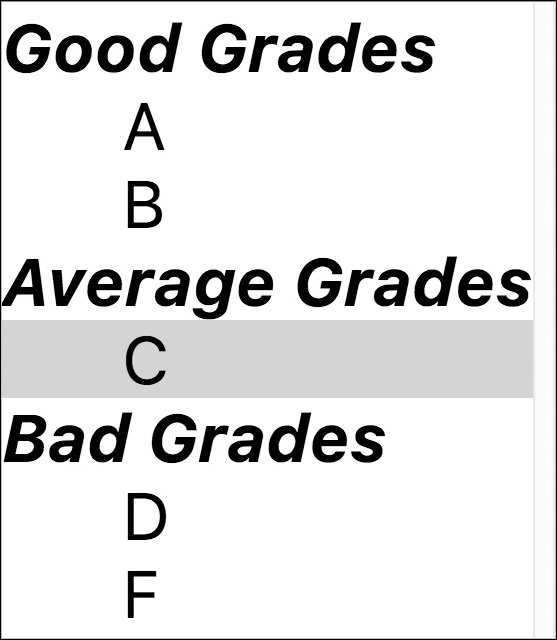
<optgroup> element.In this situation, only A, B, C, D, and F are selectable, but the <optgroup> labels are visible.
Text Fields, Text Areas, and Other Input Types
The <input type="text"> attribute mentioned earlier in this lesson allows the user to enter only a single line of text. When you want to allow multiple lines of text in a single input item, use the <textarea> and </textarea> tags to create a text area instead of just a text field. Any text you include between these two tags is displayed as the default entry in that box. Here’s the example from Listing 27.1:
<textarea id="message" name="message" rows="7" cols="55">
</textarea>
Note
If you’re adding a text input element, you don’t need the type="text" attribute. If you leave it off, web browsers will by default assume that it’s a text field.
As you have probably guessed, the rows and cols attributes control the number of rows and columns of text that fit in the input box. The cols attribute is a little less exact than rows and approximates the number of characters that fit in a row of text. Text area boxes do have a scrollbar, however, so the user can enter more text than can fit in the display area.
The text and textarea objects also have a few JavaScript methods you can use:
- focus—Sets the focus to the field. This positions the cursor in the field and makes it the current field.
- blur—Removes the focus from the field; the opposite of
focus. - select—Selects the text in the field, just as a user can do with the mouse. All the text is selected; there is no way to select only part of the text.
You can also use event handlers to detect when the value of a text field changes. The text and textarea objects support the following event handlers:
-
onFocus—Occurs when the text field gains focus. -
onBlur—Occurs when the text field loses focus. -
onChange—Occurs when the user changes the text in the field and then moves out of it. -
onSelect—Occurs when the user selects some or all of the text in the field. Unfortunately, there’s no way to tell exactly which part of the text was selected. (If the text is selected with theselectmethod described previously, this event is not triggered.)
If these event handlers are used, they should be included in the <input> tag declaration. For example, the following is a text field including an onChange event that displays an alert:
<input type="text" name="text1" onChange="window.alert('Changed.');">
Let’s turn back to the basic <input> element for a minute, however, because HTML5 provides many more type options for input than simply "text", such as built-in date pickers. Here are a few of the different input types (some new, some not) that are fully supported but that we haven’t discussed in any detail in this lesson:
-
type="email"—This appears as a regular text field, but when form validation is used, the built-in validator checks that it is a well-formed email address. Some mobile devices display relevant keys (the@sign, for example) by default instead of requiring additional user interactions. -
type="file"—This input type opens a dialog box to enable you to search for a file on your computer to upload. -
type="number"—Instead of creating a<select>list with<option>tags for each number, this type enables you to specifyminandmaxvalues and thestepbetween numbers to automatically generate a list on the browser side. You can see this in use in Listing 27.1. -
type="range"—Much like thenumbertype just covered, this type enables you to specifyminandmaxvalues and thestepbetween numbers, but in this case, it appears as a horizontal slider. -
type="search"—This appears as a regular text field, but with additional controls that are sometimes displayed to allow the user to clear the search box such as anxor a similar character. -
type="url"—This input type appears as a regular text field, but when form validation is used, the built-in validator checks that it is a well-formed URL. Some mobile devices display relevant keys (the.comvirtual key, for instance) by default instead of requiring additional user interactions.
You can stay up to date with the status of these and other <input> types by using the chart at https://developer.mozilla.org/en-US/docs/Web/HTML/Element/input.
Adding Data to Text Fields
Once you have a text field, you can add data to that field to provide customers with a list of suggested values. They can fill in the field with their own value instead, but either way, it gives them options.
To add data, you need to add a <datalist> to the page and then link to that list with the list attribute in the field where you want the data to appear. Here’s how it is done in Listing 27.1:
<p>
<label for="the_worst"><span class="question">
Please indicate the one thing I could improve about my web site:
</span></label><br>
<input type="text" id="the_worst" name="the_worst"
placeholder="There's nothing bad, is there?"
list="listOfBadChoices" size="50">
</p>
...
<datalist id="listOfBadChoices">
<option value="nothing"></option>
<option value="nada"></option>
<option value="zip"></option>
<option value="zilch"></option>
<option value="I can't think of anything"></option>
</datalist>
<datalist> is made up of a list of <option> elements. The <option> elements are a list of values that could be used in the input field. The id of the <datalist> matches the list value in the <input> field.
When the user gets to that <input> field, supporting browsers will show a drop-down of the options, as in Figure 27.3. The beauty of the <datalist> element is that browsers that don’t support it simply display a text field as usual.

<datalist> applied to it.
Using HTML5 Form Validation
Many features in HTML5 have made web developers very happy people. One of the simplest yet most life-changing might be the inclusion of form validation. Before HTML5 form validation existed, we had to create convoluted JavaScript-based form validation, which caused headaches for everyone involved.
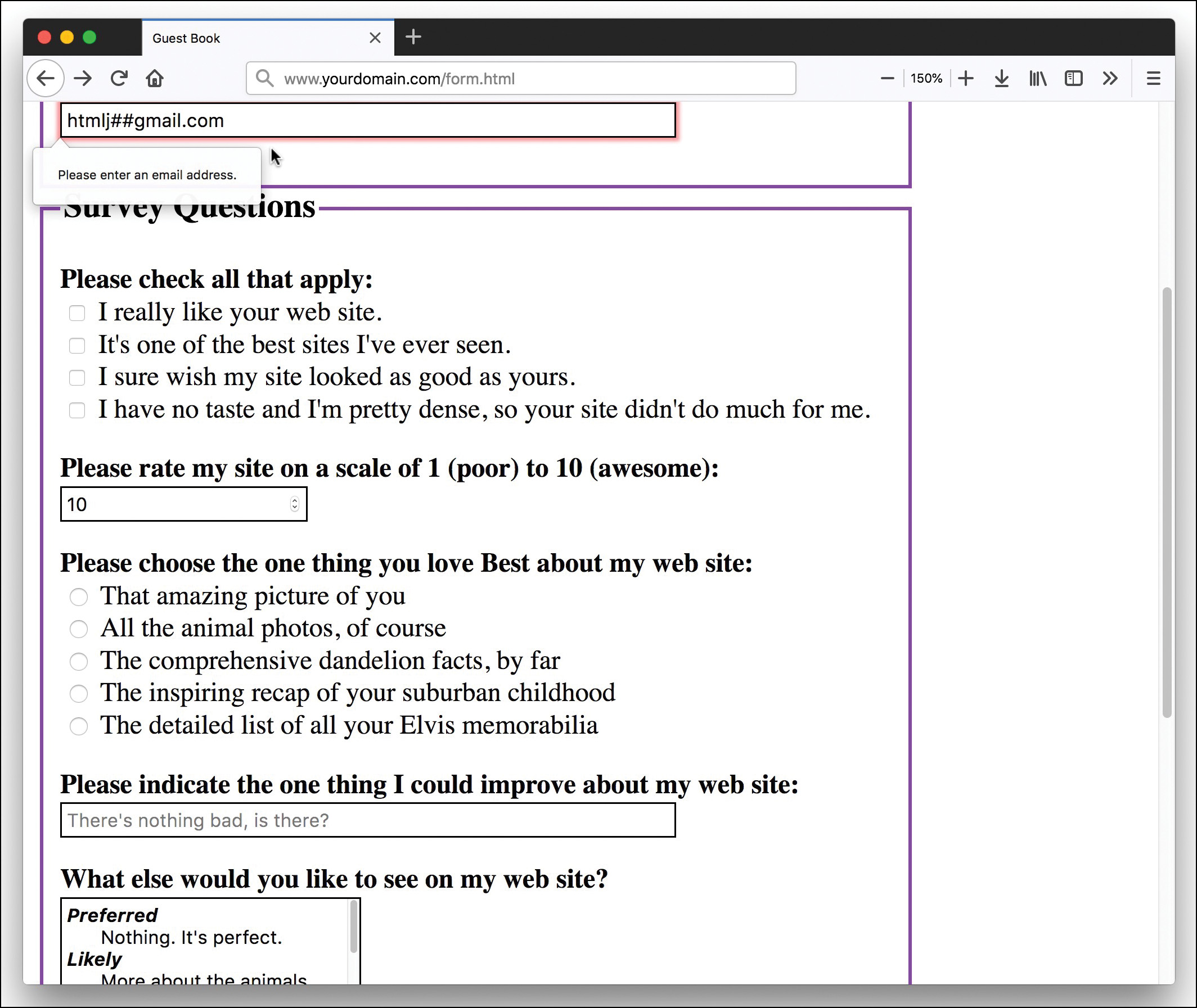
But no more! HTML5 validates forms by default, unless you use the novalidate attribute in the <form> element. Of course, if you do not use the required attribute in any form fields themselves or if you don’t use specific input type options, like email or url, there’s nothing to validate. As you learned in a previous section, not only are fields validated for content (any content at all), they are validated according to the type that they are. For example, Listing 27.1 includes a required field for an email address:
<p>
<label class="question" for="the_email">What is your email
address?</label>
<input type="email" id="the_email" name="the_email"
placeholder="Please use a real one!"
size="50" required>
</p>
In Figures 27.4 and 27.5, you can see that the form automatically validates for the presence of content but then also slaps you on the wrist when you try to enter a junk string in the field instead of an email address.

Note
Validation of email addresses begins and ends with the entry simply looking like an email address. This sort of pattern matching is really the only type of “validation” that you can do with email addresses, short of a time-consuming back-end processing script.
You can use the pattern attribute of the <input> field to specify your own pattern-matching requirements. The pattern attribute uses regular expressions, which is a large enough topic to warrant its own book, but here we consider a basic example. If you want to ensure that your <input> element contains only numbers and letters (no special characters), you could use the following:
<input type="text" id="the_text" name="the_text"
placeholder="Please enter only letters and numbers!"
size="50" pattern="[a-z,A-Z,0-9]" required>
The pattern here says that if the field contains any letter between a and z, letter between A and Z (case matters), and number between 0 and 9, it’s valid. To learn more about regular expressions without buying an entire book, take a look at the online tutorial at http://regexone.com.
Submitting Form Data
It is common for a form to include a button that submits the form data to a script on the server or invokes a JavaScript action. You can use the value attribute to put any label you like on the Submit button:
<input type="submit" value="Place My Order Now!">
Unless you change the style using CSS, a gray button is sized to fit the label you put in the value attribute. When the user clicks it, all data items on the form are sent to the email address or script specified in the form’s action attribute.
You can also include a Reset button that clears all entries on the form so that users can start over if they change their minds or make mistakes. Use the following:
<input type="reset" value="Clear This Form and Start Over">
If the standard Submit and Reset buttons look a little bland to you, remember that you can use CSS to style them. If that’s not good enough, you’ll be glad to know that there’s an easy way to substitute your own graphics for these buttons. To use an image of your choice for a Submit button, use the following:
<input type="image" src="button.gif" alt="Order Now!">
The button.gif image displays on the page, and the form is submitted when a user clicks the button.gif image. You can include any attributes normally used with the <img> tag, such as alt and style.
Another form element is a generic button type. When using type="button" in the <input> tag, you get a button that performs no action on its own but can have an action assigned to it by a JavaScript event handler (such as onclick).
Understanding the <button> Element
When working with forms, you can use the HTML <button></button> element to create a clickable button on the page that includes whatever content is inside the element. The <button> can have any of three type values: button, reset, or submit. The reset and submit values make the button work like the corresponding values for <input type="reset"> and <input type="submit"> elements. And the type="button" value is used to create standalone buttons that work with JavaScript. The button in Listing 27.1 looks like this:
<button type="button" id="standardValues">Fill in Standard Values</button>
This creates a button with the text Fill in Standard Values. If you leave it like this, it does nothing when it’s clicked, but you can add JavaScript to have the form filled in with the values you’d prefer, and then all the user has to do is submit the form. Listing 27.2 shows the JavaScript for this.
Listing 27.2 Populate the Form with Values
document.getElementById("standardValues").addEventListener("click",
function() {
document.getElementById("the_name").value = "Your Name";
document.getElementById("the_email").value= "[email protected]";
document.gbForm.like_it.checked = true;
document.gbForm.choose_scale.value = "10";
document.gbForm.the_best.checked = true;
document.gbForm.best_thing[2].checked = true;
document.getElementById("the_worst").value = "Nothing";
document.gbForm.how_improve.value = "More about the dandelions."
document.getElementById("errors").innerHTML =
"<p>Don't forget to give your feedback and submit the form.</p>";
document.gbForm.message.focus();
});
This script tells the browser that when the standardValues button is clicked, it should change the values of the various form fields. The last line places the cursor in the message field so the user can fill in a personal message and then submit the form.
You may also notice that this form attaches content to the errors field. This field is an <output></output> element, and it is intended to describe the output of forms. Error messages might not seem like an output of a form, exactly, but if you have something you’d like to add to a form dynamically, this is the element you should use. In Listing 27.1, the <output> element is at the top of the form, but you can place it anyplace you’d like the information to display.
Caution
Internet Explorer and Edge browsers do not support the <output> element. So, to use this most effectively, you should add a <div> or other element inside it and place your output inside that.
Using JavaScript for Form Events
The form object has two methods: submit and reset. You can use these methods to submit data or reset the form yourself, without requiring the user to click a button. You might want to do this, for example, to submit the form when the user clicks an image or performs another action that would not usually submit the form.
Caution
If you use the submit method to send data to a server or by email, most browsers will prompt the user to verify that he or she wants to submit the information. There’s no way to do this behind the user’s back.
The form object has two event handlers, onSubmit and onReset. You can specify a group of JavaScript statements or a function call for these events within the <form> tag that defines the form.
If you specify a statement or a function for the onSubmit event, the statement is called before the data is submitted to the server-side script. You can prevent the submission from happening by returning the value false from the onSubmit event handler. If the statement returns true, the data will be submitted. In the same fashion, you can prevent a Reset button from working with an onReset event handler.
Accessing Form Elements with JavaScript
The most important property of the form object is the elements array, which contains an object for each of the form elements. You can refer to an element by its own name or by its index in the array. For example, the following two expressions both refer to the first element in the form shown in Listing 27.1:
document.gbForm.elements[0]
document.gbForm.the_name
Note
Both forms and elements can be referred to by their own names or as indices in the forms and elements arrays. For clarity, the examples in this lesson use individual form and element names rather than array references. You’ll also find it easier to use names in your own scripts.
If you do refer to forms and elements as arrays, you can use the length property to determine the number of objects in the array: document.forms.length is the number of forms in a document, and document.gbForm.elements.length is the number of elements in the gbForm form.
You can also access form elements by using the W3C DOM. In this case, you use an id attribute on the form element in the HTML document and use the document.getElementById method to find the object for the form. For example, this statement finds the object for the text field called the_name and stores it in the name variable:
name = document.getElementById("the_name");
This enables you to quickly access a form element without first finding the form object. You can assign an id to the <form> tag and find the corresponding object if you need to work with the form’s properties and methods.
Displaying Data from a Form
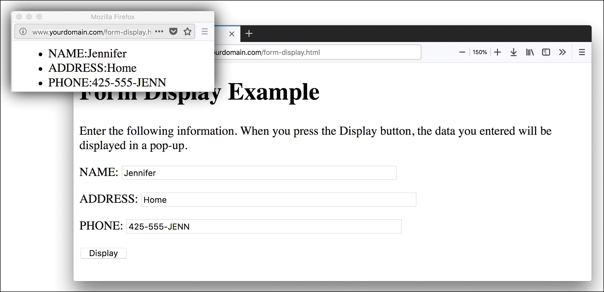
As a simple example of interacting with forms purely on the client side, Listing 27.3 shows a form with name, address, and phone number fields, as well as a JavaScript function that displays the data from the form in a pop-up window.
Listing 27.3 A Form That Displays Data in a Pop-up Window
<!doctype html>
<html lang="en">
<head>
<meta charset="utf-8">
<title>Form Display Example</title>
<meta name="viewport"
content="width=device-width, initial-scale=1">
</head>
<body>
<h1>Form Display Example</h1>
<p>
Enter the following information. When you press the Display
button, the data you entered will be displayed in a pop-up.
</p>
<form name="form1" method="get" action="">
<p>NAME: <input name="name" size="50"></p>
<p>ADDRESS: <input name="address" size="50"></p>
<p>PHONE: <input name="phone" size="50"></p>
<p><input type="button" value="Display" id="display"></p>
</form>
<script>
function display() {
dispWin = window.open('','NewWin',
'menubar=no,toolbar=no,status=no,width=400,height=100');
message = "<ul><li>NAME:" +
document.form1.name.value;
message += "<li>ADDRESS:" +
document.form1.address.value;
message += "<li>PHONE:" +
document.form1.phone.value;
message += "</ul>";
dispWin.document.write(message);
}
document.getElementById("display").addEventListener("click", display);
</script>
</body>
</html>
Here is a breakdown of how this simple HTML document and script work:
- The
<script>section at the bottom of the document defines a function calleddisplaythat opens a new window and displays the information from the form. It also includes the event listener on thedisplayelement to run thedisplayfunction when it’s clicked. - The
<form>tag begins the form. Because this form is handled entirely by JavaScript, the formactionhas no value. Themethodispostto ensure that no data is added to the URL. - The
<input>tags define the form’s three fields:yourname,address, andphone. The last<input>tag defines the Display button, which is set to run thedisplayfunction in the event listener in the script.
Figure 27.6 shows this form in action. The Display button has been clicked, and the pop-up window shows the results. Although this is not the most exciting example of client-side form interaction, it clearly shows the basics that provide a foundation for later work.
Summary
In this lesson you learned how to create HTML forms in which visitors can provide information that is sent to you when the forms are hooked up to a back-end processing script (which is beyond the scope of these lessons).
You learned about all the major form elements, including a little about how form-processing scripts interpret the names and value attributes of those elements. When you are ready to try a back-end form-processing script, you’ll be well versed in the front-end details, including how to access the form object in JavaScript.
This lesson stopped short of covering back-end form processing because server-side form handling requires an external script to process a form. However, there is plenty to do to set up a form that looks and acts just the way you want it to, including form validation, so you have a lot to practice before taking that next step into form interactivity.
Table 27.1 summarizes the HTML tags and attributes covered in this lesson.
Table 27.1 HTML Tags and Attributes Covered in Lesson 27
Tag/Attribute |
Function |
|
Indicates an input form. |
Attribute |
Function |
|
Gives the address of the script to process this form input. |
|
Indicates how the form input will be sent to the server. Normally set to |
|
Provides information for the form element to which it is associated. |
|
Groups a set of related form elements. |
|
Provides a label to a set of related form elements. |
|
Indicates an input element for a form. |
Attribute |
Function |
|
Gives the type for this input widget. Some possible values are |
|
Gives the unique name of this item, as passed to the script. |
|
Gives the default value for a text or hidden item. For a check box or radio button, it’s the value to be submitted with the form. For Reset or Submit buttons, it’s the label for the button. |
|
Shows the source file for an image. |
Attribute |
Function |
|
Is used for check boxes and radio buttons. Indicates that this item is checked. |
|
Puts focus on the element when the form is loaded. |
|
Indicates that the field should be validated for content, according to type (where appropriate). |
|
Indicates that the content of this field should be validated against this regular expression. |
|
Specifies the width, in characters, of a text input region. |
|
Specifies the maximum number of characters that can be entered into a text region. |
|
Indicates a multiline text entry form element. Default text can be included. |
Attribute |
Function |
|
Specifies the name to be passed to the script. |
|
Specifies the number of rows this text area displays. |
|
Specifies the number of columns (characters) this text area displays. |
|
Puts focus on the element when the form is loaded. |
|
Indicates that the field should be validated for content according to type (where appropriate). |
|
Indicates that the content of this field should be validated against this regular expression. |
|
Creates a menu or scrolling list of possible items. |
Attribute |
Function |
|
Shows the name that is passed to the script. |
|
Indicates the number of elements to display. If |
|
Allows multiple selections from the list. |
|
Indicates that the field should be validated for a selection. |
|
Indicates a grouping of |
Attribute |
Function |
|
Provides a label for the group. |
|
Indicates a possible item within a |
Attribute |
Function |
|
Selects the |
|
Specifies the value to submit if this |
|
Creates a clickable button in the form. |
Attribute |
Function |
|
Gives the unique name of this item, as passed to the script. |
|
Represents the output or results of a form. |
Q&A
Q. Is there any way to create a large number of text fields without dealing with different names for all of them?
A. Yes. If you use the same name for several elements in the form, their objects form an array. For example, if you defined 20 text fields with the name member, you could refer to them as member[0] through member[19]. This also works with other types of form elements.
Q. Since HTML5 contains form validation, do I ever have to worry about validation again?
A. Yes, you do. Although HTML5 form validation is awesome, you should still validate the form information that is sent to you on the back end. Back-end processing is beyond the scope of these lessons, but as a rule, you should never trust any user input; always check it before performing an action that uses it (especially when interacting with a database).
Workshop
The Workshop contains quiz questions and activities to help you solidify your understanding of the material covered. Try to answer all questions before looking at the “Answers” section that follows.
Quiz
1. What HTML elements do you use to create a guestbook form that asks someone for his or her name and gender?
<inputtype=name>for the name and<inputtype=gender>for the gender<inputtype=text>for the name and<inputtype=radio>for the gender<inputtype=name>for the name and<inputtype=radio>for the gender<inputtype=text>for the name and<inputtype=gender>for the gender
2. If you created an image named submit.gif, how would you use it as the Submit button for a form?
<inputtype="button"src="submit.gif"><inputtype="image"src="submit.gif"><imgtype="submit"src="submit.gif"><submittype="submit"src="submit.gif">
3. Which of these attributes of a <form> tag determines where the data will be sent?
actionmethodname
4. What are the two possible values of the method attribute of a form?
actionandgetactionandpostpostandgetgetandaction
5. Is the following a valid input field?
<input name="thisField">
Yes.
No. It needs a
typeattribute.No. It needs a
valueattribute.No. It needs a
widthattribute.
6. What does the novalidate attribute of a form do?
Indicates there are no valid form fields
Directs the browser to not validate the HTML of the form
Directs the browser to not validate the HTML of the page
Directs the browser to not validate the form fields
7. What is the <label> element used for?
Creates a label style
Indicates where the form field starts
Indicates where the form field ends
Defines the text to be read aloud by screen readers
8. Why are there brackets in the name of this form field?
<input type="checkbox" id="cb1" name="answers[]" value="one">
Indicates that the field will take multiple values
Indicates that the field is a required field
Indicates that the field should be validated with an external regular expression
No reason other than that the designer wanted to name the field with brackets.
9. What does the following JavaScript do?
document.entries.homeAddress.checked = true;
Checks the box called
entriesin thehomeAddressformChecks the box called
homeAddressin theentriesformMakes the element
entriesin thehomeAddressform a checkboxMakes the element
homeAddressin theentriesform a checkbox
10. How do you write a field that will collect a lot of text and is 10 rows high and 60 columns wide?
<textareaid="text"name="text"rows="10"columns="60"></textarea><textareaid="text"name="text"rows="10"cols="60"></textarea><inputtype="text"id="text"name="text"rows="10"columns="60"></input><textid="text"name="text"rows="10"cols="60"></text>
Note
Just a reminder for those of you reading these words in the print or e-book edition of this book: If you go to www.informit.com/register and register this book (using ISBN 9780672338083), you can receive free access to an online Web Edition that not only contains the complete text of this book but also features an interactive version of this quiz.
Answers
1. b. You use a text field for the name and radio buttons for the gender. The HTML code for the whole form would be similar to the following (with the appropriate doctype and other structural markup, of course):
<form name="form1" method="post" action="/scripts/formscript">
<input type="hidden" name="mailto" value="[email protected]">
<p><label for="name">Your Name:</label>
<input type="text" id="name" name="name" size="50"></p>
<p>Your Gender:
<input type="radio" id="male" name="gender"
value="male"> <label for="male">male</label>
<input type="radio" id="female" name="gender"
value="female"> <label for="female">female</label>
<input type="radio" id="go_away" name="gender"
value="mind your business"><label for="go_away">
mind your business</label></p>
<p><input type="submit" value="Submit Form"></p>
</form>
2. b. Use this code:
<input type="image" src="submit.gif">
3. a. The action attribute determines where the data is sent.
4. c. They are post and get.
5. a. Yes, it’s valid. If the <input> tag has no type, it defaults to text.
6. d. It tells the browser not to perform any validation actions.
7. d. It defines the text read aloud by screen readers and gives users a larger area to click to focus on the form field.
8. a. The brackets tell the processing script that a series of values will be placed in this value rather than just one.
9. b. It checks the box called homeAddress in the entries form.
10. b. Write the following:
<textarea id="text" name="text" rows="10" cols="60"></textarea>
Exercises
 Create a form using all the different types of input elements and selection lists to make sure you understand how each of them works.
- Learn a little bit about regular expressions and implement some custom validation by using the
patternattribute. - Investigate the form-handling options at your web hosting provider and use a script that the web hosting provider made available to you to process the form you created in the first exercise.