
Using Components
In Java, every part of a GUI is represented by a class in the Swing package. There is a JButton class for buttons, a JWindow class for windows, a JTextField class for text fields, and so on.
To create and display an interface, you create objects, set their variables, and call their methods. The techniques are the same as those you used during the previous three hours as you were introduced to object-oriented programming (OOP).
When you are putting a GUI together, you work with two kinds of objects: components and containers. A component is an individual element in a user interface, such as a button or slider. A container is a component that you can use to hold other components.
The first step in creating an interface is to create a container that can hold components. In an application, this container is often a window or a frame.
Windows and Frames
Windows and frames are containers that can be displayed in a user interface and hold other components. Windows are simple containers that do not have a title bar or any of the other buttons normally along the top edge of a GUI. Frames are windows that include all the common windowing features users expect to find when they run software—such as buttons to close, expand, and shrink the window.
You create these containers using Swing’s JWindow and JFrame classes. To make the Swing package of classes available in a Java program, use the following statement:
import javax.swing.*;
One way to make use of a frame in a Java application is to make the application a subclass of JFrame. Your program inherits the behavior it needs to function as a frame. The following statements create a subclass of JFrame:
import javax.swing.*;
public class MainFrame extends JFrame {
public MainFrame() {
// set up the frame
}
}
This class creates a frame but doesn’t set it up completely. In the frame’s constructor, you must do several things when creating a frame:
• Call a constructor of the superclass, JFrame.
• Set up the title of the frame.
• Set up the size of the frame.
• Set the frame’s look and feel.
• Define what happens when the frame is closed by a user.
You also must make the frame visible, unless for some reason it should not be displayed when the application begins running.
Most of these things can be handled in the frame’s constructor. The first thing the method must contain is a call to one of the constructors of JFrame, using the super statement. Here’s an example:
super();
The preceding statement calls the JFrame constructor with no arguments. You also can call it with the title of your frame as an argument:
super("Main Frame");
This sets the title of the frame, which appears in the title bar along the top edge, to the specified string. In this example, the text greeting “Main Frame” appears.
If you don’t set up a title in this way, you can call the frame’s setTitle() method with a string as an argument:
setTitle("Main Frame");
The size of the frame can be established by calling its setSize() method with two arguments: the width and height. The following statement sets up a frame that is 350 pixels wide and 125 pixels tall:
setSize(350, 125);
Another way to set the size of a frame is to fill it with components, and then call the frame’s pack() method with no arguments:
pack();
The pack() method sets the frame big enough to hold the preferred size of each component inside the frame (but no bigger). Every interface component has a preferred size, though this is sometimes disregarded, depending on how components have been arranged within an interface. You don’t need to explicitly set the size of a frame before calling pack()—the method sets it to an adequate size before the frame is displayed.
Every frame is displayed with a button along the title bar that can be used to close the frame. On a Windows system, this button appears as an X in the upper-right corner of the frame. To define what happens when this button is clicked, call the frame’s setDefaultCloseOperation() method with one of four JFrame class variables as an argument:
• setDefaultCloseOperation(JFrame.EXIT_ON_CLOSE)—Exit the program when the button is clicked.
• setDefaultCloseOperation(JFrame.DISPOSE_ON_CLOSE)—Close the frame and keep running the application.
• setDefaultCloseOperation(JFrame.DO_NOTHING_ON_CLOSE)—Keep the frame open and continue running.
• setDefaultCloseOperation(JFrame.HIDE_ON_CLOSE)—Close the frame and continue running.
A graphical user interface created with Swing can customize its appearance with a look and feel, a visual theme that controls how buttons and other components appear and how they behave.
Java 7 introduces an enhanced look and feel called Nimbus, but it must be turned on to be used in a class. You set a look and feel by calling the setLookAndFeel() method of the UIManager class in the main Swing package. The method takes one argument: the full name of the look and feel’s class.
The following statement sets Nimbus as the look and feel:
UIManager.setLookAndFeel(
"com.sun.java.swing.plaf.nimbus.NimbusLookAndFeel"
);
One last thing is required to make the frame visible: Call its setVisible() method with true as an argument:
setVisible(true);
This opens the frame at the defined width and height. You also can call it with false to stop displaying a frame.
Listing 13.1 contains the source code described in this section. In an empty Java file named SalutonFrame, enter these statements.
Listing 13.1. The Full Text of SalutonFrame.java
1: import javax.swing.*;
2:
3: public class SalutonFrame extends JFrame {
4: public SalutonFrame() {
5: super("Saluton mondo!");
6: setLookAndFeel();
7: setSize(350, 100);
8: setDefaultCloseOperation(JFrame.EXIT_ON_CLOSE);
9: setVisible(true);
10: }
11:
12: private void setLookAndFeel() {
13: try {
14: UIManager.setLookAndFeel(
15: "com.sun.java.swing.plaf.nimbus.NimbusLookAndFeel"
16: );
17: } catch (Exception exc) {
18: // ignore error
19: }
20: }
21:
22: public static void main(String[] arguments) {
23: SalutonFrame sal = new SalutonFrame();
24: }
25: }
Lines 22–24 of Listing 13.1 contain a main() method, which turns this frame class into an application. When you run the class, you see the frame shown in Figure 13.1.
Figure 13.1. Displaying a frame in an application.
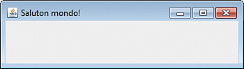
The only thing that SalutonFrame displays is a title—the Esperanto greeting “Saluton mondo!” The frame is an empty window because it doesn’t contain any other components yet.
To add components to a frame, you must create the component and add it to the container. Each container has an add() method that takes one argument: the component to display.
The SalutonFrame class includes a setLookAndFeel() method that designates Nimbus as the frame’s look and feel. The setLookAndFeel() method of the UIManager class is called in lines 14–16 to accomplish this.
The call to this method is placed inside a try-catch block, which enables errors that might occur to be handled. The try and catch statements are new because they haven’t been introduced yet. Dealing with errors using these statements is covered in Hour 18, “Handling Errors in a Program.”
At this point, all you need to know is that calling UIManager.setLookAndFeel() sets a GUI’s look and feel. Any error that might occur as a result will just cause a program to keep the default look and feel instead of Nimbus.
Buttons
One simple component you can add to a container is a JButton object. JButton, like the other components you are working with during this hour, is part of the java.awt.swing package. A JButton object is a clickable button with a label that describes what clicking the button does. This label can be text, graphics, or both. The following statement creates a JButton called okButton and gives it the text label OK:
JButton okButton = new JButton("OK");
After a component such as JButton is created, it should be added to a container by calling its add() method:
add(okButton);
When you add components to a container, you do not specify the place in the container where the component should be displayed. The arrangement of components is decided by an object called a layout manager. The simplest of these managers is the FlowLayout class, which is part of the java.awt package.
To make a container use a specific layout manager, you must first create an object of that layout manager’s class. You create a FlowLayout object with a statement, such as the following:
FlowLayout flo = new FlowLayout();
After you create a layout manager, you call the container’s setLayout() method to associate the manager with the container. The only argument to this method should be the layout manager object, as in the following example:
pane.setLayout(flo);
This statement designates the flo object as the layout manager for the pane container.
The next application you create, a class called Playback, is a Java application that displays a frame with three buttons. Enter the text from Listing 13.2 into a new empty Java file and save the file.
Listing 13.2. The Full Text of Playback.java
1: import javax.swing.*;
2: import java.awt.*;
3:
4: public class Playback extends JFrame {
5: public Playback() {
6: super("Playback");
7: setLookAndFeel();
8: setSize(225, 80);
9: setDefaultCloseOperation(JFrame.EXIT_ON_CLOSE);
10: FlowLayout flo = new FlowLayout();
11: setLayout(flo);
12: JButton play = new JButton("Play");
13: JButton stop = new JButton("Stop");
14: JButton pause = new JButton("Pause");
15: add(play);
16: add(stop);
17: add(pause);
18: setVisible(true);
19: }
20:
21: private void setLookAndFeel() {
22: try {
23: UIManager.setLookAndFeel(
24: "com.sun.java.swing.plaf.nimbus.NimbusLookAndFeel"
25: );
26: } catch (Exception exc) {
27: // ignore error
28: }
29: }
30:
31: public static void main(String[] arguments) {
32: Playback pb = new Playback();
33: }
34: }
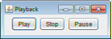
The Playback program creates a FlowLayout layout manager in line 10 and sets the frame to employ it in line 11. When three buttons are added to the frame in lines 15–17, they’re arranged by this manager.
When you run the application, your output should resemble Figure 13.2. You can click each of the buttons, but nothing happens in response because your program does not contain any methods to receive user input—that’s covered during Hour 15.
Figure 13.2. Displaying buttons on a GUI.
You can add many Swing user components to a container in this manner.
Labels and Text Fields
A JLabel component displays information that the user cannot modify. This information can be text, a graphic, or both. These components are often used to label other components in an interface, hence the name. They often identify text fields.
Because so many different user interface components must be introduced during this hour, the full source code used to create each figure is not listed here. You can find full versions of each program on the book’s website at www.java24hours.com on the Hour 13 page.
A JTextField component is an area where a user can enter a single line of text. You can set up the width of the box when you create the text field.
The following statements create a JLabel component and JTextField object and add them to a container:
JLabel pageLabel = new JLabel("Web page address: ", JLabel.RIGHT);
JTextField pageAddress = new JTextField(20);
FlowLayout flo = new FlowLayout();
setLayout(flo);
add(pageLabel);
add(pageAddress);
Figure 13.3 shows this label and text field side-by-side. Both of the statements in this example use an argument to configure how the component should look.
Figure 13.3. Displaying labels and text fields.
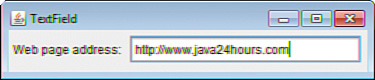
The pageLabel label is set up with the text “Web page address:” and a JLabel.RIGHT argument. This last value indicates that the label should appear flush right. JLabel.LEFT aligns the label text flush left, and JLabel.CENTER centers it. The argument used with JTextField indicates the text field should be approximately 20 characters wide. You also can specify default text that appears in the text field with a statement such as the following:
JTextField country = new JTextField("US", 29);
This statement would create a JTextField object that is 20 characters wide and has the text US in the field.
You can retrieve the text contained within the object with the getText() method, which returns a string:
String countryChoice = country.getText();
As you might have guessed, you also can set the text with a corresponding method:
country.setText("Separate Customs Territory of Taiwan, Penghu, Kinmen, and Matsu");
This sets the text to the official name of Chinese Taipei, which is the longest country name in the world.
Check Boxes
A JCheckBox component is a box next to a line of text that can be checked or unchecked by the user. The following statements create a JCheckBox object and add it to a container:
JCheckBox jumboSize = new JCheckBox("Jumbo Size");
FlowLayout flo = new FlowLayout();
setLayout(flo);
add(jumboSize);
The argument to the JCheckBox() constructor indicates the text to be displayed alongside the box. If you want the box to be checked, you use the following statement instead:
JCheckBox jumboSize = new JCheckBox("Jumbo Size", true);
You can present a JCheckBox singly or as part of a group. In a group of check boxes, only one can be checked at a time. To make a JCheckBox object part of a group, you have to create a ButtonGroup object. Consider the following:
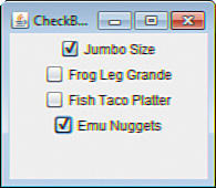
JCheckBox frogLegs = new JCheckBox("Frog Leg Grande", true);
JCheckBox fishTacos = new JCheckBox("Fish Taco Platter", false);
JCheckBox emuNuggets = new JCheckBox("Emu Nuggets", false);
FlowLayout flo = new FlowLayout();
ButtonGroup meals = new ButtonGroup();
meals.add(frogLegs);
meals.add(fishTacos);
meals.add(emuNuggets);
setLayout(flo);
add(jumboSize);
add(frogLegs);
add(fishTacos);
add(emuNuggets);
This creates three check boxes that are all grouped under the ButtonGroup object called meals. The Frog Leg Grande box is checked initially, but if the user checked one of the other meal boxes, the check next to Frog Leg Grande would disappear automatically. Figure 13.4 shows the different check boxes from this section.
Figure 13.4. Displaying check box components.
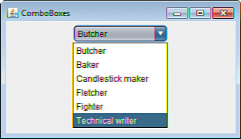
Combo Boxes
A JComboBox component is a pop-up list of choices that also can be set up to receive text input. When both options are enabled, you can select an item with your mouse or use the keyboard to enter text instead. The combo box serves a similar purpose to a group of check boxes, except that only one of the choices is visible unless the pop-up list is being displayed.
To create a JComboBox object, you have to add each of the choices after creating the object, as in the following example:
JComboBox profession = new JComboBox();
FlowLayout flo = new FlowLayout();
profession.addItem("Butcher");
profession.addItem("Baker");
profession.addItem("Candlestick maker");
profession.addItem("Fletcher");
profession.addItem("Fighter");
profession.addItem("Technical writer");
setLayout(flo);
add(profession);
This example creates a single JComboBox component that provides six choices from which the user can select. When one is selected, it appears in the display of the component. Figure 13.5 shows this example while the pop-up list of choices is being displayed.
Figure 13.5. Displaying combo box components.
To enable a JComboBox component to receive text input, you must call its setEditable() method with an argument of true:
profession.setEditable(true);
You must call this method before the component is added to a container.
Text Areas
A JTextArea component is a text field that enables the user to enter more than one line of text. You can specify the width and height of the component. The following statements create and add a JTextArea component with a width of 40 characters and a height of 8 lines and to a container:
JTextArea comments = new JTextArea(8, 40);
FlowLayout flo = new FlowLayout();
setLayout(flo);
add(comments);
Figure 13.6 shows this example in a frame.
Figure 13.6. Displaying text area components.
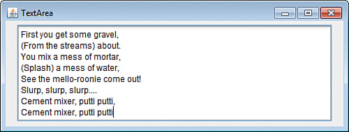
You can specify a string in the JTextArea() constructor to be displayed in the text area, using the newline character (
) to send text to the next line, as in the following:
Text area components behave in ways you might not expect—they expand in size when the user reaches the bottom of the area, and do not include scrollbars along the right edge or bottom edge. To implement the kind of text areas you see in other GUI software, you must place the area inside a container called a scroll pane, as you see in Hour 16, “Building a Complex User Interface.”
JTextArea comments = new JTextArea("I should have been a pair
"
+ "of ragged claws.", 10, 25);
Panels
The last components you learn to create during this hour are panels, which are created in Swing using the JPanel class. JPanel objects are the simplest kind of container you can use in a Swing interface. The purpose of JPanel objects is to subdivide a display area into different groups of components. When the display is divided into sections, you can use different rules for how each section is organized.
You can create a JPanel object and add it to a container with the following statements:
JPanel topRow = new JPanel();
FlowLayout flo = new FlowLayout();
setLayout(flo);
add(topRow);
Panels are often used when arranging the components in an interface, as you see in Hour 14, “Laying Out a User Interface.”
You add components to a panel by calling its add() method. You can assign a layout manager directly to the panel by calling its setLayout() method.
You can also use panels when you need an area in an interface to draw something, such as an image from a graphics file.
Another convenient use of JPanel is to create your own components that can be added to other classes. This is demonstrated in this hour’s workshop.