
What You’ll Learn in This Hour:
Core layout concepts
Panels
Decorators
How to choose the right panel for the job
Deciding how to arrange pieces of an application on the screen can be a daunting task. Additionally, the challenge of this task can be amplified by the technical difficulties of supporting diverse screen resolutions, window size changes, and other real-world layout issues. One of the great advantages of building applications with WPF is that the framework has deep support for intelligently managing these types of situations.
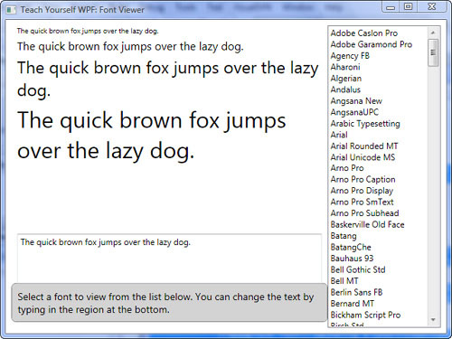
In this hour, we take a look at the layout options available in WPF by digging deeper into the Font Viewer from Hour 3.
Before we discuss the Font Viewer layout, it’s important to understand some basic concepts and terminology that will affect much of what you do.
Much of building a typical user interface in WPF consists of creating various types of controls, such as Button and TextBox. Panels are a special family of classes having the distinguishing capability of being able to arrange controls on the screen. For example, you might use a Grid to arrange a collection of Label and TextBox controls into a typical input form. In a different situation, you might use a DockPanel to “dock” your application’s Menu at the top of the Window and fill the remaining area with your main UI. Sometimes, you don’t need to arrange a control, but rather to extend its functionality or appearance. Another family of classes, related to panels, derives from the Decorator base class and fulfills this common need. The most common Decorator is Border, which draws a border around its enclosed control.
When it comes to panels and decorators, you can choose from a variety of options. We explore several of them in further detail later in this hour as well as discuss using nested panels for building more complex layouts.
By the Way
The term control is used to speak generally of elements that derive from the System.Windows.Controls.Control base class. Controls have a rich set of functionality that includes features such as mouse and keyboard input, data binding, layout, styles, and animation.
By the Way
An application developer can use other means to organize controls. It is common to use elements such as TabControl, GroupBox or Expander to aid in layout. These controls typically work in conjunction with panels or decorators to organize highly complex UIs. We discuss these in Hours 12, “Building a Contact Manager,” and 13, “Presenters and Views.”
Almost all the WPF elements that you will work with as you build interfaces derive from the System.Windows.FrameworkElement base class and inherit some common layout related properties. These properties serve to fine-tune the way the element is positioned within its parent. Let’s work with the basic properties Margin, VerticalAlignment and HorizontalAlignment.
In this section, we create a simple application with a Grid and one child control, a Button. As we progress, we’ll change some of the basic properties that Button inherits from FrameworkElement to discover how the overall layout is affected.
Open Visual Studio and create a new WPF Application project called
AlignmentAndMargin.Enter the following XAML in the
Window1.xamlfile:<Window x:Class="AlignmentAndMargin.Window1" xmlns="http://schemas.microsoft.com/winfx/2006/xaml/presentation" xmlns:x="http://schemas.microsoft.com/winfx/2006/xaml" Title="Alignment and Margin" Height="300" Width="300"> <Grid> <Button Height="35" Width="100" /> </Grid> </Window>
Run the application and notice that the
Buttonis centered both horizontally and vertically within theWindow.Exit the application and make the following change to the
Buttonelement:<Button Height="35" Width="100" HorizontalAlignment="Left" />
Notice how the designer updates the location of the button so that it is aligned to the left side of the window.
Now add a
VerticalAlignment:<Button Height="35" Width="100" HorizontalAlignment="Left" VerticalAlignment="Bottom" />
Try different combinations of horizontal (
Left,Right,Center,Stretch) and vertical (Top,Bottom,Center,Stretch) alignment to see how they affect layout differently.Now we will add some
Marginto all the sides:<Button Height="35" Width="100" HorizontalAlignment="Left" VerticalAlignment="Bottom" Margin="20" />
Using two numbers, you can specify left and right margins with the first and top and bottom margins with the second:
<Button Height="35"
        Width="100"
        HorizontalAlignment="Left"
        VerticalAlignment="Bottom"
        Margin="20 10" />
Use four numbers to specify left, top, right, and bottom margins, respectively:
<Button Margin="20 5 40 75" />
You can use spaces or commas to separate the parameters and double values for fine-grained control.
<Button Margin="20,5.75,40,75"/>
Continue to experiment with various combinations of these core layout properties.
After completing this task you should feel comfortable with some of the layout properties intrinsic to all FrameworkElements. These properties will be of great use in combination with various panels as you begin to master WPF.
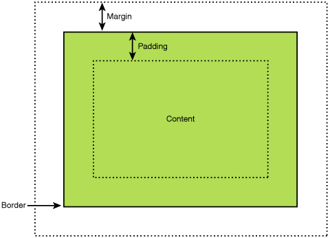
Making Sense of Margin and Padding
Margin and Padding, as shown in Figure 4.1, are two similar layout concepts that are often confused. Margin, present on all FrameworkElements, represents the amount of space around the outside of the element. This space ensures that the FrameworkElement has room between it and neighboring elements. Padding functions differently. It is present on elements that inherit from Control (itself derived from FrameworkElement) and allows the control to specify an amount of space inside itself. This inner space separates the control from its own content. A Button control illustrates this most clearly. Picture the space inside the Button, around its text, that prevents the Button’s border from shrinking to the size of its contents.
Panels, as mentioned previously, are the core means by which a WPF developer declares UI layout. Take another look at the MainWindow.xaml in the Font Viewer sample application. Two different panels are used in combination to create the general UI structure: DockPanel and StackPanel. Run the application and resize the window several times. Notice how the DockPanel keeps certain elements docked and the StackPanel keeps the TextBlock controls stacked vertically. The specified margins are also maintained.
By the Way
All layout described here is done using XAML, but the same layout can be accomplished by using code. Every Panel has a Children collection. This collection can be used to add or remove controls from the panel’s layout at runtime.
StackPanel is the simplest and one of the most useful layout controls for WPF. By default, it organizes its child elements by stacking them one on top of the other, like a list. StackPanel also has an Orientation property that can be set to Horizontal, causing the panel to stack its children from left to right.
Let’s take a look at how StackPanel functions in the context of a real application. This shows us the variety of options that WPF provides, even for simple layout scenarios. We’ll investigate how changing Orientation can drastically change layout and how other properties affect the Font Viewer in more minute ways.
Open the Font Viewer application and run it. Observe the layout of the four differently sized sample text regions.
Close the application and change the
StackPanel’s opening tag to this:<StackPanel Margin="8 0 8 8" Orientation="Horizontal">
Notice the change in the designer. Run the application and resize the window horizontally. The contents of the
StackPanelare stacked from left to right and clipped by the window boundaries.Close the application and remove the
StackPanel's Orientationattribute. This is obviously not what we want.Now add a
HorizontalAlignmentofRightto one or more of theTextBlockelements that are inside theStackPanel. Notice how this changes layout. The elements are still stacked vertically but within the list, they align themselves to the right.Try adding a
VerticalAlignmentofBottomto the firstTextBlock. Notice that the layout does not change. Now, change theStackPanel's Orientationback toHorizontal. The elements are now laid out from left to right, with the first element being vertically positioned near the bottom of the screen whereas the rest are at the top.Experiment by changing the
Marginon any of theTextBlockelements.
StackPanel is a good place to start when you need to lay out a list of elements. Though it is a simple option, StackPanel provides a diverse array of combinations when using its Orientation property in conjunction with the Alignment and Margin of its children.
By the Way
Interestingly, StackPanel is often used internally as the default layout for a number of other WPF controls. One example of such a control is ListBox, which we will look at in later hours.
WPF provides developers with a powerful layout option embodied in the DockPanel. This control is capable of attaching its children to any of its four sides and is often used as the root layout control of an application’s UI. We have followed this pattern in developing the Font Viewer, but before we can discuss how DockPanel works in this environment, let’s look at a very important related topic.
It is common in layout scenarios for controls to specify additional information about their layout that is specific to the panel they are hosted in. For example, in the Font Viewer, the list of fonts needs to tell the DockPanel that it should be placed along the left side. To provide the DockPanel with this information, we use an attached property: DockPanel.Dock. Attached properties are simply a way of connecting additional information to an element. This data can then be used by another source. In the preceding example, DockPanel declares a Dock property that can be attached to any of its children. When the DockPanel lays out its child controls, it queries each one of them for this information and uses that to organize the view appropriately. Attached properties always follow the form Source.Property; where “Source” is the class that declares (and will use) the property and “Property” is the name of the property being set.
Now that we understand the basics of attached properties, we can use them in the context of our sample application. In this exercise we use attached properties to learn how Dock affects the children of a DockPanel.
Begin by examining the
MainWindow.xamlin the Font Viewer. Notice that the root panel is aDockPanelwith four child elements:Border,ListBox,TextBox, andStackPanel. All these elements, except theStackPanel, have aDockPanel.Dockvalue set. Run the application or view the designer to see how the panel has arranged the items. Notice that theStackPanelfills the leftover space in theDockPanelafter all other controls are docked.Rearrange the
DockPanel’s children so that theListBoxis declared above theBorder. Notice how the docking remains the same but the layout is slightly altered, with theListBoxtaking precedence over the Border for space.Change the
Border's Dockproperty toBottomand theListBox's Dockproperty toRight. Run the application and resize the window several times (see Figure 4.2).Change the
Border's Dockproperty toRightand set itsWidthto 160. Notice that both theListBoxand theBorderare docked to the right. Whichever one is first in the list takes precedence, and anyMarginthat is applied still takes effect.Revert all your changes so that you are back to the original layout. Reorder the last two elements in the list so that the
StackPanelis above theTextBox. Remove theDockPanel.Dock="Bottom"from theTextBoxand add it to theStackPanel. Notice that theTextBoxnow fills all the remaining space. Whichever element is last in the list will be used to fill the remaining space.Change the
DockPanel’s start tag to this:<DockPanel Margin="8" LastChildFill="False">
Notice that the
TextBoxno longer fills the remaining space in theDockPanel.
By the Way
Because attached properties do not actually live on the object they are being set on, they can be a little unintuitive to set in code. WPF follows a pattern of using “Get” and “Set” static methods on the defining class to fulfill this need. For example, this is how you would set the Dock on a Button in code:
DockPanel.SetDock(theButton, Dock.Right);
The DockPanel is a powerful option for laying out a user interface. It is more complex than the StackPanel, but offers a great deal more “intelligence” in its layout mechanism. A vast assortment of arrangements can be handled with the DockPanel and/or the StackPanel. But if you cannot accomplish what you are aiming for, it’s likely the Grid will meet your needs.
The Grid is WPF’s all-purpose layout panel. It can achieve most of the same behavior as the previous controls and much more. This power comes with a price; the requirement of additional XAML and more attached properties. Let’s see how the Grid works.
Example 4.1. Simple Grid Layout
<Grid ShowGridLines="True"
      TextBlock.FontSize="20">
    <Grid.RowDefinitions>
        <RowDefinition />
        <RowDefinition />
    </Grid.RowDefinitions>
    <Grid.ColumnDefinitions>
        <ColumnDefinition />
        <ColumnDefinition />
    </Grid.ColumnDefinitions>

    <Button Content="0,0" />

    <Button Grid.Column="1"
            Content="0,1" />

    <Button Grid.Row="1"
            Content="1,0" />

    <Button Grid.Row="1"
            Grid.Column="1"
            Content="1,1" />
</Grid>
Open Visual Studio and create a new WPF Application project called
UseAGrid.In
Window1.xaml, replace the defaultGridwith the markup in Listing 4.1. Run the application and observe the layout behavior by resizing the window several times.Note that the resulting
Gridhas two rows and two columns. This is a result of theRowDefinitionsandColumnDefinitionselements. Also, observe how the attached properties determine what row and column the buttons will be placed in. Row and column indexes begin at zero and default to this value if not specified. This is why theButtonwith no declaredGrid.RoworGrid.Columnappears in row and column zero. It is for the same reason that only one parameter needs to be specified on all but the lastButton.Change the
RowDefinitionsandColumnDefinitionsto match the following code:<Grid.RowDefinitions> <RowDefinition Height="50" /> <RowDefinition /> </Grid.RowDefinitions> <Grid.ColumnDefinitions> <ColumnDefinition Width="*" /> <ColumnDefinition Width="2*" /> </Grid.ColumnDefinitions>
Run the program and resize the window several times. Notice that the top row maintains a height of 50 device-independent pixels and that the second column is always twice as wide as the first. You can place exact heights and widths on rows and columns, respectively. You can also indicate proportional sizing using the “*” notation.
Change the first
RowDefinitionto this:<RowDefinition Height="auto" />
Run the program. Notice that the first row is automatically sizing to the default size of its content—in this case
Buttons.Try adding additional rows and columns of buttons. Mix and match the different options for height and width. For example, you could define something like this:
<ColumnDefinition Width="34" />
<ColumnDefinition Width="1.5*" />
<ColumnDefinition Width="2*" />
<ColumnDefinition Width="auto" />
In this case, the first column would be 34 pixels wide, the last column would auto size to content and the middle columns would split the remaining space with the ratio 1.5:2.
Experiment by changing the vertical and horizontal alignment of the buttons as well as their
Margin.
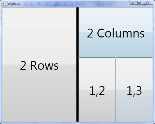
Hopefully this has given you a basic understanding of how to use a Grid to handle the layout of controls. You can do quite a lot more with a Grid. Take a look at Listing 4.2 and its depiction in Figure 4.3.
Did you Know?
When using a Grid for layout, you may want to set the Grid’s ShowGridLines property to True. This will draw the imaginary lines on the Grid so that you can be sure that your controls are being laid out properly. Before finishing the design of your UI, remember to remove this setting.
Example 4.2. Advanced Grid Layout
<Window x:Class="AdvancedGrid.Window1"
        xmlns="http://schemas.microsoft.com/winfx/2006/xaml/presentation"
        xmlns:x="http://schemas.microsoft.com/winfx/2006/xaml"
        Title="Window1"
        Height="480"
        Width="600">
    <Grid TextBlock.FontSize="48">
        <Grid.RowDefinitions>
            <RowDefinition />
            <RowDefinition Height="250" />
        </Grid.RowDefinitions>
        <Grid.ColumnDefinitions>
            <ColumnDefinition Width="2*" />
            <ColumnDefinition Width="auto" />
            <ColumnDefinition Width="*" />
            <ColumnDefinition Width="*" />
        </Grid.ColumnDefinitions>

        <Button Grid.RowSpan="2"
                Content="2 Rows" />

        <GridSplitter Grid.Row="0"
                      Grid.RowSpan="2"
                      Grid.Column="1"
                      Width="8"
                      Background="Black"
                      ResizeBehavior="PreviousAndNext"
                      ResizeDirection="Columns" />

        <Button Grid.Column="2"
                Grid.ColumnSpan="2"
                Content="2 Columns" />

        <Button Grid.Row="1"
                Grid.Column="2"
                Content="1,2" />
        <Button Grid.Row="1"
                Grid.Column="3"
                Content="1,3" />
    </Grid>
</Window>
The AdvancedGrid code demonstrates some further features of the Grid. Notice that besides just specifying the row and column of a control, we can also make child controls span multiple rows or columns. With these additional attached properties, the layout possibilities of the Grid are virtually limitless.
The GridSplitter is a special control capable of letting a user resize rows or columns of a Grid at runtime. You must place the control within a Grid, between the rows or columns you want to be resizable. Use the ResizeDirection property to indicate what the control will resize (rows or columns) and use ResizeBehavior to declare how the splitter will specifically interact with its own row/column as well as those around it. For example, will it resize its own column, or just the next one? A preferred practice is to place the GridSplitter in a row/column by itself and set the ResizeBehavior to PreviousAndNext. This makes the GridSplitter easier to manage and understand.
Did you Know?
Often, building real-world applications involves complex UI layout. Even the versatile panels discussed so far are frequently incapable of expressing an entire layout on their own. For most scenarios you will need to combine multiple different panels. In fact, WPF was designed for building highly composited user interfaces by making it easy to nest controls and panels in one another.
The WrapPanel is used less often than StackPanel, DockPanel, and Grid, but offers useful functionality nonetheless. Essentially, a WrapPanel is like a StackPanel, but it has the ability to “wrap” what it is stacking to the next line or column if it runs out of space.
Open the Font Viewer application in Visual Studio.
Locate the opening and closing
StackPaneltags. Change these tags toWrapPanel.There is no change observed in the designer, so run the application.
Resize the window in the horizontal direction several times. Notice that the
WrapPanelattempts to place theTextBlockson the same line, but when there is not enough space, it wraps them to the next line.WrapPanel, likeStackPanel, has anOrientationproperty. Set theOrientationtoVertical. Run the application and try resizing the window in the vertical direction.
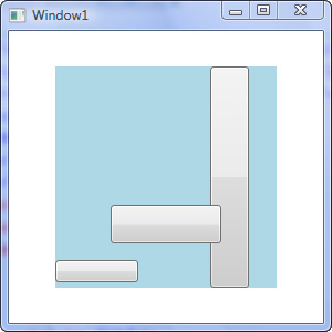
Canvas is different from all the Panels we have discussed so far. This difference lies in the fact that Canvas does not add any special dynamic layout behavior to its child controls. A canvas must have an exact Width and Height, and all its child elements must have an exact size and position as well. Canvas arranges controls at strict Left (x) and Top (y) positions using attached properties. Try out the XAML in Listing 4.3, visualized in Figure 4.4. Resize the window and try adding alignment; you’ll notice that these things have no effect on layout. Margin, however, will offset the control from its location.
By the Way
As an alternative to using Top and Left on elements displayed in a Canvas, you can use Bottom and Right. Using these attached properties causes the Canvas to position elements from its bottom and right borders, measuring the distance to the right or bottom border of the element being arranged.
Did you Know?
Occasionally, a Canvas (or any Panel) will contain elements that overlap, but that need to be drawn in a specific order. Use the special attached property, Panel.ZIndex, to specify the virtual Z coordinate of the element. Controls with higher ZIndex values are drawn on top of controls with lower values. If no ZIndex is specified, the child control will be rendered based on the order it was added to the panel’s Children collection.
Watch Out!
Although most panels will size to fit their children, if no size is declared for a Canvas it will collapse to zero.
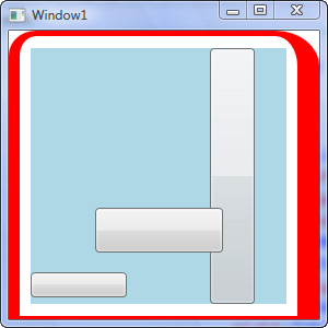
Example 4.3. Exact Positioning with Canvas
<Window x:Class="ExactPositionCanvas.Window1"
        xmlns="http://schemas.microsoft.com/winfx/2006/xaml/presentation"
        xmlns:x="http://schemas.microsoft.com/winfx/2006/xaml"
        Title="Window1"
        Height="300"
        Width="300">
    <Canvas Width="200"
            Height="200"
            Background="LightBlue">
        <Button Canvas.Left="50"
                Canvas.Top="125"
                Panel.ZIndex="100"
                Width="100"
                Height="35" />
        <Button Canvas.Right="25"
                Height="200"
                Width="35" />
        <Button Canvas.Bottom="5"
                Height="20"
                Width="75" />
    </Canvas>
</Window>
Decorators, as mentioned previously, add graphical decoration or behavior to other elements. A Decorator always has one Child that it decorates (although this child can be a Panel containing many other Controls).
Let’s look at two of the most common Decorators that you will use or encounter in WPF programming: Border and Viewbox.
Begin by creating a new WPF Application called
UsingDecorators. Enter the code from Listing 4.3 inWindow1.xaml.Surround the
Canvaswith aBorder, like this:<Border BorderThickness="2" BorderBrush="Red" CornerRadius="20"> <Canvas ...> </Border>
BorderThicknessandCornerRadiuscan each accept four parameters, indicating how the properties should be applied on each side or corner of the border. Additionally,BorderThicknesscan be declared with two parameters, signifying the left and right in the first parameter and the top and bottom in the second. Try this:<Border BorderThickness="10 5 20 3" BorderBrush="Red" CornerRadius="20 30 0 0"> <Canvas ...> </Border>
There are a lot of great uses for the
Bordercontrol. Let’s use it in conjunction with anotherDecorator,Viewbox. Change the code to this:<Border BorderThickness="10 5 20 3" BorderBrush="Red" CornerRadius="20 30 0 0"> <Viewbox Margin="10"> <Canvas ...> </Viewbox> </Border>
Adding the
Viewboxcauses the designer to stop displaying the layout preview. (This is a current limitation of the VS designer.) Run the application and resize the window several times to see the effect theViewboxhas on its content. Notice that it scales its child to fit all available space, as shown in Figure 4.5.
By now you should be familiar with the two most important decorators in WPF. Each of these decorators has a unique capability controlled by a specific set of properties. We have presented the most basic properties here. For another example of using a Border, take a look at the Border used for displaying instructions in the Font Viewer application. Experiment with the use of BackgroundColor and Padding. In the case of Viewbox, other properties allow further control of its behavior. Spend some time investigating properties like StretchDirection and Stretch. By altering these values, you can control exactly how the Viewbox’s content is scaled.
Laying out a user interface can be a tricky task. WPF provides a variety of tools to help you succeed, but you can easily become overwhelmed by the sheer number of possibilities. More often than not, a typical user interface will combine multiple Panels together to create the desired effect. Even in our simple font utility, you can see how we combined a DockPanel and a StackPanel to achieve our goals. Following is a list of recommendations to help you in your interface design:
Begin by using the simplest and most explicit
Panel.Do not be afraid to combine multiple
Panelsto achieve the effect you desire.Pay close attention to the runtime behavior of your layout. You may need to change your strategy to accommodate window resizing.
Try to choose layout options that allow for flexible sizing. Avoid setting hard-coded
HeightandWidthproperties when possible. Instead, if necessary, consider usingMinHeight,MinWidth,MaxHeight, andMaxWidth. These properties give WPF’s layout engine some flexible parameters by which it can work, rather than force it into a brittle layout strategy.If using a graphical UI tool such as the VS Designer or Expression Blend, keep a close eye on the
Marginproperties of your elements. Sometimes these tools get confused and alter these values in strange ways, resulting in unexpected layout behavior.Use
Canvasonly as a last resort. This panel was designed primarily for renderingDrawings, not UI. UsingCanvasfor ordinary layout scenarios can defeat the purpose of the WPF dynamic layout capabilities. If you want a similar effect, use aGridcontrol in combination withMarginset on its children. This creates a sort of relative canvas effect.
In this hour we explored many of the WPF layout options. We looked at several of these elements within the context of our first application, the Font Viewer. Hopefully you have taken the time to experiment with the variety of settings available through attached properties and the common layout properties of FrameworkElement. Using these properties with a combination of Panels, Decorators, and other elements will give your Windows application a rich and dynamic layout capable of displaying almost any user interface you can imagine.
Rebuild the Font Viewer with a different set of panels than were used in the original design.
Rebuild the Font Viewer using a single grid to lay out the entire application. Use one
GridSplitterto allow dynamic resizing of theListBox’s width and a secondGridSplitterto allow resizing of theTextBox’s height.Investigate the SDK to learn about
BulletDecorator. This is a lesser-known decorator, but useful in some specific scenarios.Using the search engine of your choice, look up “WPF Radial Panel” or “WPF Custom Panel” to learn about how to create your own custom panels or to see what others have already built.