
What You’ll Learn in This Hour:
Design a new application
Expand our control repertoire
Discover new methods of handling interaction
Componentize the UI with User Controls
With the foundation of preceding hours, we now have the tools we need to begin creating a more dynamic, real-world application. Over the course of the next few pages we’ll begin building the foundations for a simple text document editor.
In this hour, we set up the core layout and controls for our Text Editor.
Building a text document editor is no trivial task. Think about the document editing you’ve done over the years and the myriad of features these tools support to help you get the job done. Our goal is to support a basic set of features that will leverage as much as possible the built-in capabilities of WPF without having to write too much custom code. To that end, we’ll support the following features:
One of the first things to do when building a new application is to create a quick prototype of the layout. This helps to kick start the process of thinking about application usability. Let’s build a layout consistent with similar text editing applications:
Open Visual Studio and create a new WPF application. Call the application
TextEditor.Rename
Window1.xamltoMainWindow.xamland make the appropriate changes in theApp.xamlfile as well.Open
MainWindow.xamlfor editing.Add the following markup to create the basic application layout:
<Window x:Class="TextEditor.MainWindow"
        xmlns="http://schemas.microsoft.com/winfx/2006/xaml/presentation"
        xmlns:x="http://schemas.microsoft.com/winfx/2006/xaml"
        Title="Text Editor"
        Height="600"
        Width="800">
    <DockPanel>
        <Menu x:Name="menu"
              DockPanel.Dock="Top" />

        <ToolBarTray x:Name="toolbar"
                     DockPanel.Dock="Top" />

        <StatusBar DockPanel.Dock="Bottom">
            <TextBlock x:Name="status" />
        </StatusBar>

        <RichTextBox x:Name="body"
                     SpellCheck.IsEnabled="True"
                     AcceptsReturn="True"
                     AcceptsTab="True"
                     BorderThickness="0 2 0 0" />
    </DockPanel>
</Window>
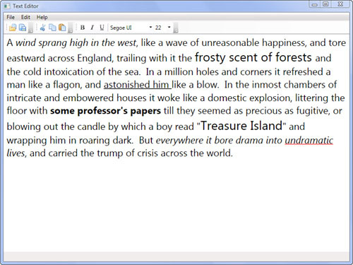
Run the application and you should see something that looks pretty empty. Don’t worry—when we’re done, it will look like Figure 8.1.
This is our basic application layout. It’s not very interesting at the moment, mainly because we have no items in our menu or icons in our ToolBarTray. We’ll remedy this shortly.
A ToolBar is a simple and attractive way to make an application more user-friendly. The Text Editor should have several toolbars supporting the most common quick-access features. Let’s expand our code in this way.
Open the
MainWindow.xamland locate theToolBarTray.Change the
ToolBarTrayto match the following markup.<ToolBarTray> <ToolBar> <Button ToolTip="Open"> <Image Source="Icons/folder_page.png" /> </Button> <Button ToolTip="Save"> <Image Source="Icons/page_save.png" /> </Button> </ToolBar> </ToolBarTray>
Right-click the project in Visual Studio and select Add, New Folder. Name the folder
Icons.Locate several
.pngicon files (or.gif,.jpg,.bmp,.tif,.ico) that you can use to represent the file operationsOpenandSave. For our sample, we are using icons licensed for use under the Creative Commons License 2.5. They can be found here: www.famfamfam.com/lab/icons/silk.Copy the icons into the
Iconsfolder.Right-click the
Iconsfolder in Visual Studio and select Add, Existing Item. Browse to theIconsfolder and select all the icons to add them to the project.Change the
Imageelements’Sourceproperties to match the names of the icon files you have chosen.Run the application to see the results.
So what is the preceding XAML doing for us? First, we have a ToolBarTray that provides a “home” for our toolbars to live in. It can host multiple ToolBar instances and allows the runtime to automatically arrange and size them. Inside the ToolBarTray, we have a single ToolBar hosting a collection of Buttons. Each button contains an Image element. You can point the Source property of an Image to almost any type of graphic and it can display it. We are taking advantage of the power of the Content property of the Button to display an image instead of static text.
Looking back at the previous code sample, you might think: “If we add several more toolbars and a menu, there’s going to be a massive amount of XAML crammed into one file.” XAML like that seems as if it would be difficult to navigate, understand, and maintain over time. This is the perfect scenario for introducing a UserControl into our application.
Right-click the project file in Visual Studio and select Add, User Control. Name the file
TextEditorToolbar.xaml.Replace the generated XAML with the markup found in Listing 8.1.
Add the following code to the
TextEditorToolbar.xaml.csfile:private void UserControl_Loaded(object sender, RoutedEventArgs e) { for (double i = 8; i < 48; i += 2) { fontSize.Items.Add(i); } }
Add corresponding icons to the
Iconsfolder and update their names in the markup.Open
MainWindow.xamland add the following Xml Namespace declaration to theWindow:xmlns:local="clr-namespace:TextEditor".In the
MainWindow.xamlreplace theToolBarTraywith the following markup:<local:TextEditorToolbar x:Name="toolbar" DockPanel.Dock="Top" />
Run the application.
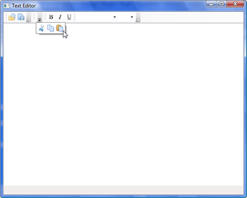
Try dragging and resizing the toolbars. If a
Toolbaris too small to display all its contents, the down arrow on the right will be enabled and you can click it to display the additional icons in aPopup. You can see the effects of this in Figure 8.2.
By the Way
Recall that Xml Namespace declarations can be placed on elements in XAML to import non-WPF types into the markup. The syntax is: xmlns:name=”clr-namespace:clrNamespace;assembly=assembly.dll". If the assembly is the same as the one in which the XAML exists, you do not have to declare it. The name “local” is commonly used in this scenario.
Example 8.1. Toolbars in a User Control
<UserControl x:Class="TextEditor.TextEditorToolbar"
             xmlns="http://schemas.microsoft.com/winfx/2006/xaml/presentation"
             xmlns:x="http://schemas.microsoft.com/winfx/2006/xaml"
             Loaded="UserControl_Loaded">
    <ToolBarTray>
        <ToolBar>
            <Button ToolTip="Open">
                <Image Source="Icons/folder_page.png" />
            </Button>
            <Button ToolTip="Save">
                <Image Source="Icons/page_save.png" />
            </Button>
        </ToolBar>
        <ToolBar>
            <Button ToolTip="Cut">
                <Image Source="Icons/cut.png" />
            </Button>
            <Button ToolTip="Copy">
                <Image Source="Icons/page_copy.png" />
            </Button>
            <Button ToolTip="Paste">
                <Image Source="Icons/page_paste.png" />
            </Button>
        </ToolBar>
        <ToolBar>
            <ToggleButton x:Name="boldButton"
                          ToolTip="Bold">
                <Image Source="Icons/text_bold.png" />
            </ToggleButton>
            <ToggleButton x:Name="italicButton"
                          ToolTip="Italic">
                <Image Source="Icons/text_italic.png" />
            </ToggleButton>
            <ToggleButton x:Name="underlineButton"
                          ToolTip="Underline">
                <Image Source="Icons/text_underline.png" />
            </ToggleButton>
            <Separator />
            <ComboBox x:Name="fonts"
                      MinWidth="100"
                      ItemsSource="{x:Static Fonts.SystemFontFamilies}"
                      ToolTip="Font" />
            <ComboBox x:Name="fontSize"
                      MinWidth="40"
                      ToolTip="Font Size" />
        </ToolBar>
    </ToolBarTray>
</UserControl>
We’ve added quite a few more Toolbars to the ToolBarTray. The first two are similar in nature, but the third needs some additional explanation.
As you may have guessed by now, a ToolBar can host any type of item. We’ve taken advantage of this rich functionality to add a set of ToggleButtons and two ComboBoxes, visually set apart with a Separator. We’ve encountered ToggleButton before, and it’s obvious what the purpose of Separator is. ComboBox, on the other hand, is a complex control. It is similar to ListBox, with which it shares many properties because of their common ancestor: Selector. For this application we used the same technique to set up a list of fonts as we did in the Font Viewer, but we have used a different technique to set up the list of font sizes. In this case, when the UserControl loads, we are manually adding available font sizes to the Items collection of the ComboBox. We do this by attaching an event handler to the Loaded event of the UserControl and calculating sizes with a simple for loop.
Did you Know?
From time to time you may want more control over the layout of toolbars in a ToolBarTray. To prevent a ToolBar from being movable, add the attached property ToolBarTray.IsLocked with a value of true to any ToolBar. If you need to control the positioning of toolbars, you can set their Band and BandIndex properties. These represent the row and column within the tray, respectively.
The Menu is one of the most common controls used in applications and provides a simple hierarchy of commands available to the user at any given time. Our next task is to further build up our application’s available options by fleshing out its main menu.
Add a new
UserControlto the project and give it the nameTextEditorMenu.xaml.Replace the generated XAML with the markup found in Listing 8.2.
Add the following code to the
TextEditorMenu.xaml.csfile:private void About_Click(object sender, RoutedEventArgs e) { MessageBox.Show( "Teach Yourself WPF in 24 Hours - Text Editor", "About" ); }
Open the
MainWindow.xamland locate theMenu. Replace it with the following markup:<local:TextEditorMenu x:Name="menu" DockPanel.Dock="Top" />
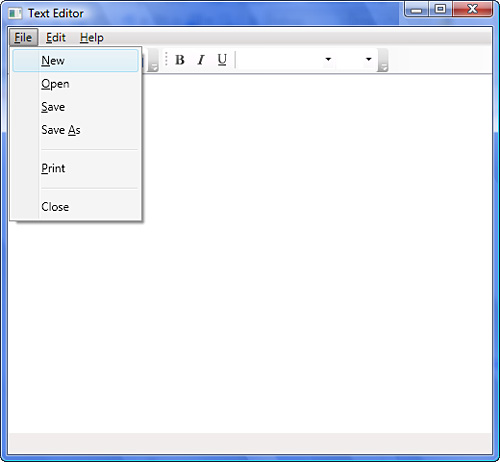
Run the application and browse the menu using your mouse or keyboard. See Figure 8.3.
Select Help, About to see the
MessageBox.
Example 8.2. A Menu Contained by a User Control
<UserControl x:Class="TextEditor.TextEditorMenu"
             xmlns="http://schemas.microsoft.com/winfx/2006/xaml/presentation"
             xmlns:x="http://schemas.microsoft.com/winfx/2006/xaml">
    <Menu>
        <MenuItem Header="_File">
            <MenuItem Header="_New" />
            <MenuItem Header="_Open" />
            <MenuItem Header="_Save" />
            <MenuItem Header="Save As" />
            <Separator />
            <MenuItem Header="_Print" />
            <Separator />
            <MenuItem Header="Close" />
        </MenuItem>
        <MenuItem Header="_Edit">
            <MenuItem Header="_Undo" />
            <MenuItem Header="_Redo" />
            <Separator />
            <MenuItem Header="Cu_t" />
            <MenuItem Header="_Copy" />
            <MenuItem Header="_Paste" />
            <MenuItem Header="_Delete" />
        </MenuItem>
        <MenuItem Header="_Help">
            <MenuItem Header="_About"
                      Click="About_Click" />
        </MenuItem>
    </Menu>
</UserControl>
A Menu has a Click event like a Button and a Header property that works the same as Content on Button. You can see this in the implementation of the About menu option. Right now you may be wondering why we haven’t hooked up Click handlers to all the menu items, like we did with About. You may have noticed that we didn’t wire handlers to anything in the toolbars as well. Wiring all these handlers and writing their code would be painful. This is magnified by the fact that several menu options do the same thing as the toolbars, which could result in duplicate code. We’re going to skip wiring most options for now, in favor of using a more elegant solution presented in a later hour.
The RichTextBox shares many features in common with its brother, TextBox. The most obvious difference is that RichTextBox supports formatted text. You won’t find a Text property on this control, but you will find a Document property of type FlowDocument. This special type of object is used to represent documents that are optimized for free-flowing text with column and pagination support. You’ve already been introduced to some of the types of items that a FlowDocument can display when we discussed Inlines and the TextBlock control. Inlines, however, are only a small part of what a FlowDocument is capable of rendering. A full discussion of FlowDocument and its capabilities is beyond the scope of this book, but we will use the RichTextBox to both load and save this type of document for the purposes of the Text Editor.
Example 8.3. Implementing the DocumentManager
using System.IO;
using System.Windows;
using System.Windows.Controls;
using System.Windows.Documents;
using Microsoft.Win32;

namespace TextEditor
{
    public class DocumentManager
    {
        private string _currentFile;
        private RichTextBox _textBox;

        public DocumentManager(RichTextBox textBox)

    {
        _textBox = textBox;
    }

    public bool OpenDocument()
    {
        OpenFileDialog dlg = new OpenFileDialog();

        if (dlg.ShowDialog() == true)
        {
            _currentFile = dlg.FileName;

            using (Stream stream = dlg.OpenFile())
            {
                TextRange range = new TextRange(
                    _textBox.Document.ContentStart,
                    _textBox.Document.ContentEnd
                    );

                range.Load(stream, DataFormats.Rtf);
            }

            return true;
        }

        return false;
    }

    public bool SaveDocument()
    {
        if (string.IsNullOrEmpty(_currentFile)) return SaveDocumentAs();
        else
        {
            using (Stream stream =
                new FileStream(_currentFile, FileMode.Create))
            {
                TextRange range = new TextRange(
                    _textBox.Document.ContentStart,
                    _textBox.Document.ContentEnd
                    );

                range.Save(stream, DataFormats.Rtf);
            }

            return true;
        }
    }

    public bool SaveDocumentAs()
    {
        SaveFileDialog dlg = new SaveFileDialog();

        if (dlg.ShowDialog() == true)
        {
            _currentFile = dlg.FileName;

               return SaveDocument();
            }

            return false;
        }
    }
}
Add a new
classto the project and give it the nameDocumentManager.cs.Use the code in Listing 8.3 to implement the
DocumentManager.Change the
MainWindow.xaml.csto look like this:using System.Windows; using System.Windows.Controls; using System.Windows.Input; namespace TextEditor { public partial class MainWindow : Window { private DocumentManager _documentManager; public MainWindow() { InitializeComponent(); _documentManager = new DocumentManager(body); if (_documentManager.OpenDocument()) status.Text = "Document loaded."; } } }
Run the application. Select an
.rtffile to edit or click Cancel to begin editing a new document.
By the Way
The status object is an instance of TextBox hosted inside the StatusBar. We haven’t mentioned StatusBar up to this point because it functions like little more than a simple container for other elements. It is an ItemsControl that lays out its children like a DockPanel by default. We’ll discuss ItemsControl in great depth in a later hour. StatusBar is useful for displaying simple controls that notify the user or provide important dynamic information that should always be available.
Building the Document Manager is an application of the principle of Separation of Concerns that we talked about in Hour 3, “Introducing the Font Viewer.” We don’t want our main window to get too cluttered with code for saving and loading documents, so we invent a new class with this sole responsibility. Our MainWindow will use an instance of the DocumentManager whenever it needs this functionality.
We are not going to wire all the methods of the DocumentManager up to menus and toolbars, because we will be covering that in great depth in the next two hours. However, it is important that you see how the DocumentManager gets .rtf documents in and out of the RichTextBox. The magic of saving and loading happens entirely through the power of the TextRange class. A TextRange represents a concrete selection of content within a document. In the case of both save and load operations, we create the range from the document’s start to its end because we want to replace the entire document by loading or save the entire document. You can, however, create a range from any portion of the document. After we have a TextRange, we call either the Save or Load method, passing in a Stream to write/read from and an option from the DataFormats enum. In this case we are interested only in .rtf, but you can save/load other types of documents as well by specifying a different DataFormats value.
Another point of interest about this code is the use of the OpenFileDialog and the SaveFileDialog. These are both standard dialog boxes provided by the framework for these common tasks. We are using them in the most basic way by accessing their FileName for use in creating a FileStream or calling the OpenFile method to get a Stream directly from the dialog. They each have many options and additional features available for more fine-grained control over saving and loading, though.
Did you Know?
You can restrict the file types available for saving and loading documents through file dialogs by setting the Filter property. It should be set to a list of alternating display names and file extensions, each separated by a pipe line. For example, if you wanted to allow only .rtf and .txt files you would use something like this: dlg.Filter = "Rich Text Document|*.rtf|Text Document|*.txt".
At this point we have constructed a solid UI for our Text Editor application. It is based on a layout derived from similar software and has a full application menu and default toolbars. We learned how to configure our toolbars to use icons, creating a more attractive look and feel, and we created a more maintainable application by splitting various parts into UserControls. To top it off, we can read .rtf and a variety of other formats into a RichTextBox using some simple classes and built-in dialog boxes.