
What You’ll Learn in This Hour:
Routed events
Bubbling and tunneling
Arguments for routed events
Attached events
Generic event handlers
WPF has introduced a rich system for tracking and responding to events. In this hour, we explore how this new event system functions, how it interacts with traditional events, and how you can leverage its power in your applications. Understanding this event model can be a little challenging. We’ll be digging deeper into the technology than in the previous hours.
An application in WPF consists of many elements in a tree. This can be seen in all our examples so far. A TextBlock could be nested inside a StackPanel, which could be inside a Grid, which could be in another StackPanel, and so on, until we finally arrive at the root Application. This can be very useful for composing the interface visually, but it presents a complication when we are interpreting user input.
For example, perhaps we want to respond to the MouseLeftButtonDown event on the following Border element:
        <Border>
            <StackPanel>
                <TextBlock>Click Me!</TextBlock>
                <Image Source="Icons/folder_page.png" />
            </StackPanel>
        </Border>
Image, TextBlock, and StackPanel also raise the MouseLeftButtonDown event. In fact, MouseLeftButtonDown is implemented on a low-level class, UIElement, which all the elements in WPF inherit from. This means we have four possible sources for the event, depending on which of these elements is actually clicked. In turn, we need to write four handlers.
To avoid this complexity, WPF introduces the concept of routed events. Routed events are similar to dependency properties in that they are part of the WPF library and they are built on top of mechanisms that already exist in the common language runtime (CLR).
If a user clicks the Image in our preceding example, WPF would route the event along the tree of elements until a handler was found. If no handler is implemented, the event continues beyond the Border all the way to the root element (which can be a Window or a Page).
Routed events can travel in two directions, depending on how the event is defined. The naming might be a little confusing because of the tree metaphor. Events are said to bubble up through the tree when they are moving toward the root element. Events are tunneling down when they are moving toward the leaves or away from the root element.
You are already familiar with standard event handlers. The signature for an event handler looks something like this:
void Handle_Event(object sender, EventArgs e)
The second parameter might be a derivative of EventArgs, depending on the class raising the event.
Routed events are handled the same way except that the basic signature uses a RoutedEventArgs.
void Handle_RoutedEvent(object sender, RoutedEventArgs e)
If you dig into it, you will discover that RoutedEventArgs derives from EventArgs as well. In this sense, routed events are really standard events with extra information passed in the argument—extra information that WPF uses to work its magic. Table 9.1 lists the properties specific to RoutedEventArgs.
Table 9.1. Properties Specific to RoutedEventArgs
Name | Description |
|---|---|
| The object that raised the event. This is a property you will generally be interested in. It’s useful to note that with routed events this is likely to be different from the |
| This returns original reporting source. That is the object that really raised the event. This property does not change as the event travels along its route. |
| A |
RoutedEvent | This identifies the type of event that was raised. Many events have the same signature, and a single handler might be responsible for several events. |
Understanding the differences between Source, OriginalSource, and the sender argument can be confusing.
Let’s write a small application that will help us explore these properties and how they are used.
Launch Visual Studio and create a new WPF Application named
UnderstandingRoutedEventArgs.In
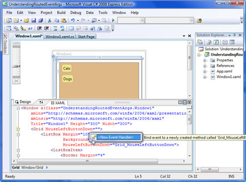
Window1.xaml, we are going to use aListBoxand a couple of items to demonstrate how events are routed. Add the following markup inside theGridelement:<ListBox Margin="10" Background="BurlyWood"> <ListBoxItem> <Border Margin="4" Padding="4" Background="Khaki" CornerRadius="6"> <TextBlock>Cats</TextBlock> </Border> </ListBoxItem> <ListBoxItem> <Border Margin="4" Padding="4" Background="Khaki" CornerRadius="6"> <TextBlock>Dogs</TextBlock> </Border> </ListBoxItem> </ListBox>
Begin adding an attribute on the
GridelementMouseLeftButtonDown. IntelliSense should kick in, and you should receive a prompt for creating a new event handler as shown in Figure 9.1.If you prefer to add it manually, place the following attribute on the
Grid.MouseLeftButtonDown="Grid_MouseLeftButtonDown"
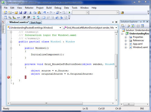
In the code-behind, add the following event handler:
        private void Grid_MouseLeftButtonDown(object sender, MouseButtonEventArgs e)
        {
        }
Inside the handler, we’ll add some code to help us see what is going on. Add the following inside the event handler
Grid_MouseLeftButtonDown:object source = e.Source; object originalSource = e.OriginalSource;
The parameter
MouseButtonEventArgsis derived fromRoutedEventArgs. We’re adding these variables to make it easier to see the values in the debugger.Place a breakpoint on the closing bracket of
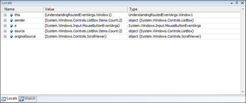
Grid_MouseLeftButtonDown. See where the breakpoint is in Figure 9.2. Run the application, and click somewhere on theListBoxwell below the bottomListBoxItem.When you hit the breakpoint, examine the Locals pane in Visual Studio. If the Locals pane is not visible, select Window, Reset Window Layout from the menu. The Locals pane should look like Figure 9.3.
Notice that the values of
sender,source, andoriginalSourceare all different.As mentioned previously,
sourcecontains the value we expect. It references theListBox, and that is the element that we clicked. TheListBoxelement, however, is a composite of other elements. We can see this by examining the value oforiginalSource. It is referencing aScrollViewer. There’s noScrollViewerin our markup, so where did this element come from? TheScrollVieweris one of the elements that make up theListBox. Many of the more complex controls in WPF are composites of simpler controls and elements such asBorder,StackPanel, andScrollViewer. (This will become clearer when we cover control templates in Hour 21, “Using Control Templates.”)In this case, the
ListBoxis vertically stretching to fill theWindow. TheListBoxItemelements collapse to be as small as possible. The internalScrollViewerstretches to fill the entireListBox, and this is the element that we really clicked.Finally,
senderis referencing theGridelement where we attached the event handler. TheGridis thesenderbecause that is where we captured the event. Stop the application now.To further demonstrate how the
senderis set, let’s bind theListBoxto the same event. Copy theMouseLeftButtonDownattribute from theGridand add it on theListBox. Don’t remove it from theGrid, though. TheListBoxnow looks like this:<ListBox Margin="10" Background="BurlyWood" MouseLeftButtonDown="Grid_MouseLeftButtonDown"> ... </ListBox>
Run the application again, and click the
ListBoxas before. When you hit the breakpoint, examine the Locals, and you will see that thesenderis now the same assource. That is, thesenderis theListBoxbecause that is where we attached the event handler.Press F5, or select Debug, Continue. We hit the breakpoint a second time! This is because the event continues to travel along its route. This time the sender is the
Gridagain.Stop the debugger, and add the following line to the event handler:
e.Handled = true;This will tell the routed event system that we are finished with the event. We consider it to be “handled,” and we are no longer interested.
Run the application again, and click the
ListBoxas before. Press F5 to continue past the breakpoint. We no longer hit the breakpoint twice. Because we setHandledtotrue, the event never makes it to the handler attached to theGrid.
Most of the time you will not be concerned with the specifics of routed events, and you will often handle them as if they were simply standard CLR events. The scenarios where you’ll really need to understand and leverage routed events occur when you are building (or compositing) your own custom controls.
You can also leverage them by creating a generic event handler on a parent element. Let’s create another simple application that uses a single generic handler to capture a routed event from a couple of different elements.
Launch Visual Studio and create a new WPF Application named
GenericEventHandler.In
Window1.xaml, we are going to add aStackPanelcontaining a fewButtonelements. Replace theGridelement with the following markup:<StackPanel> <Button Content="Red" Foreground="Red"/> <Button Content="Green" Foreground="Green" /> <Button Content="Blue" Foreground="Blue" /> </StackPanel>
Begin to add an attribute to the
StackPanelnamedButtonBase.Click. IntelliSense will again intervene, and you can accept its defaults. The final attribute should look like this:ButtonBase.Click="StackPanel_Click"
It will also inject the event handler into the code-behind:
private void StackPanel_Click(object sender, RoutedEventArgs e)
{
}
StackPaneldoes not have its ownClickevent. However, we can use an attached event to reference the events raised by its child elements. Attached events work very much like attached properties. They take the form ofType.EventName, whereTypeis the name of the class that owns the event.You might be surprised to see
ButtonBase.Clickinstead ofButton.Click. IntelliSense choosesButtonBasefor us because it is the control thatButtonderives from, andButtonitself does not implement any events. Actually, you can use either of the two interchangeably here, and the application will behave the same.Let’s add a place to provide the user with some feedback when we click one of our buttons. Add the following
TextBlockunder the lastButtonin theStackPanel:<TextBlock x:Name="Output" HorizontalAlignment="Center" Text="What color will you choose?" />
Modify the handler
StackPanel_Clickto look like this:private void StackPanel_Click(object sender, RoutedEventArgs e) { Button button = (Button) e.Source; Output.Text = string.Format( "You chose the color {0}!", button.Content); Output.Background = button.Foreground; }
Run the application and click the various buttons. We can respond to all the events from the
Buttonelements in a single handler that is attached to their container.
Let’s apply some of what we have learned so far to our Text Editor. When we left off in Hour 8, we had encapsulated the entire markup for the ToolBarTray in a user control. In the ToolBarTray we include two ComboBox elements—one for selecting the font family and another for selecting the font size; however, we have not yet implemented any functionality.
We want to respond to the SelectionChanged event raised by the ComboBox elements and apply the new values to the currently selected text in the RichTextBox. The problem is that the ComboBox elements are now encapsulated deep in the UserControl, and they are no longer in the same scope as our RichTextBox. We’d like to handle the SelectionChanged event in the same scope as our instance of _documentManager. Using the attached events we just discussed, we are able to do just that!
Let’s go ahead and add this to the Text Editor.
Open the
TextEditorproject that we began in Hour 8.Open
MainWindow.xamland locate theUserControlwe namedtoolbar, and then modify the markup so that it matches the following:<local:TextEditorToolbar x:Name="toolbar" DockPanel.Dock="Top" ComboBox.SelectionChanged="TextEditorToolbar_SelectionChanged" />
Notice that IntelliSense did not help us out here. IntelliSense doesn’t know anything about the internal composition of the
UserControl.We are attaching an event handler to the
UserControlitself that will handle all theSelectionChangedevents raised by anyComboBoxelement that it contains. Currently, we only have two, but it’s important to realize that anyComboBoxelements added in the future will be picked up by this handler.Open the code-behind for
MainWindow.xaml, and let’s begin to implement the handler we just referenced:private void TextEditorToolbar_SelectionChanged(object sender, SelectionChangedEventArgs e) { ComboBox source = e.OriginalSource as ComboBox; if (source == null) return; switch (source.Name) { case "fonts": //change the font face break; case "fontSize": //change the font size break; } body.Focus(); }
ComboBox.SelectionChangedis a routed event, and thusSelectionChangedEventArgsis a descendant ofRoutedEventArgs. We can use theOriginalSourceproperty to get a reference to theComboBoxthat raises the event from inside theUserControl.Because we are handling events raised by multiple elements, we need to identify which element we are dealing with. We use a
switchstatement based on theNameof theComboBox. If you examine the XAML of theUserControl, you’ll see that we named ourComboBoxelementsfontsandfontSize.Changing the font family and the font size involves formatting the contents of the
RichTextBox, and that should be the responsibility of theDocumentManagerclass, so we’ve temporarily added some place holder comments in the event handler that we’ll fill in after we extendDocumentManager.On the last line of the method,
body.Focus()returns the focus to theRichTextBoxfrom theComboBoxwe selected.Open
DocumentManager.csin the editor. The class encapsulates aRichTextBox, which in turn exposes a property calledSelection. This property represents the currently selected text in theRichTextBox.Selectionis of typeTextSelection, and it has a method,ApplyPropertyValue. This method accepts a dependency property and a value for setting the property. We can use this method to format the currently selected text. Add the following method toDocumentManager:public void ApplyToSelection(DependencyProperty property, object value) { if (value != null) _textBox.Selection.ApplyPropertyValue(property, value); }
Now we can flesh out the implementation of
TextEditorToolbar_SelectionChanged:private void TextEditorToolbar_SelectionChanged(object sender, SelectionChangedEventArgs e) { ComboBox source = e.OriginalSource as ComboBox; if (source == null) return; switch (source.Name) { case "fonts": _documentManager.ApplyToSelection(TextBlock. FontFamilyProperty, source.SelectedItem); break; case "fontSize": _documentManager.ApplyToSelection(TextBlock. FontSizeProperty, source.SelectedItem); break; } body.Focus(); }
All we are really doing is delegating the work to the
DocumentManagerclass.Run the application, enter some text, and try to change the font family and size.
The Text Editor is beginning to feel like a useful application, and we haven’t written very much code at all! However, users generally have a lot of expectations about the way an application ought to behave, especially if the functionality is as common as a text editor. If you play around with the application at this point, you’ll notice that the items on the toolbar do not change their state when you select formatted text in the RichTextBox. For example, if you type the following sentence:
The quick brown fox jumps over the lazy dog.And you increase the font size of “jumps” and then click “dog,” the ComboBox displaying the font size does not change to reflect the size of the selected text. This isn’t the behavior that we have come to expect from similar applications. Let’s change the Text Editor to behave as we expect.
Watch Out!
In general, it is a dangerous thing for developers to try to anticipate user needs. If you are developing software for someone else and you need to manage time and cost, avoid adding features the client hasn’t asked for. As software developers, we love thinking about the future, and contingencies, and what a user might need. Unfortunately, this often leads to bloated applications, unused features, and a cluttered interface. Not to mention the time lost that could have been used for developing features that are actually needed today. This is especially true in WPF, where adding sophisticated interfaces is easy. If you genuinely believe that a feature is necessary, present the idea to the client and have it become an explicit and acknowledged requirement.
This principle in software development, of building just what is needed now, is often called YAGNI—that is, You Aren’t Gonna Need It.
We know that we want to update the toolbar when the user changes the selected text in the
RichTextBox. We can use theSelectionChangedevent to do this. InMainWindow.xaml, modify theRichTextBoxso that it matches the following markup:<RichTextBox x:Name="body" SelectionChanged="body_SelectionChanged" SpellCheck.IsEnabled="True" AcceptsReturn="True" AcceptsTab="True" BorderThickness="0 2 0 0"/>
We’re not sure yet what we should do in the event handler. We’ll start with the minimal implementation for
body_SelectionChangedin the code-behind forMainWindow.xaml.private void body_SelectionChanged(object sender, RoutedEventArgs e) { //update the tool bar }
The completed markup for
MainWindow.xamlis shown in Listing 9.1.Example 9.1. The Markup for MainWindow.xaml in the Text Editor
<Window x:Class="TextEditor.MainWindow"
        xmlns="http://schemas.microsoft.com/winfx/2006/xaml/presentation"
        xmlns:x="http://schemas.microsoft.com/winfx/2006/xaml"
        xmlns:local="clr-namespace:TextEditor"
        Title="Text Editor"
        Height="600"
        Width="800">
    <DockPanel>
        <local:TextEditorMenu x:Name="menu"
                              DockPanel.Dock="Top" />

        <local:TextEditorToolbar x:Name="toolbar"
                                 DockPanel.Dock="Top"
                                 ComboBox.SelectionChanged="TextEditorToolbar_SelectionChanged" />

        <StatusBar DockPanel.Dock="Bottom">
            <TextBlock x:Name="status" />
        </StatusBar>

        <RichTextBox x:Name="body"
                     SelectionChanged="body_SelectionChanged"
                     SpellCheck.IsEnabled="True"
                     AcceptsReturn="True"
                     AcceptsTab="True"
                     BorderThickness="0 2 0 0"/>
    </DockPanel>
</Window>
Let’s think about this for a minute. We’d like to synchronize a lot of items on the toolbar with the selected text. We’ve already identified font size and font family, but there are also toggles for bold, underline, and italic.
All the controls are embedded in the
UserControlwe namedtoolbar. We can’t access them directly, so we need to add a method to theUserControlto help us out.Tackling all five of the formatting options is too much to think about at once, so we’ll begin with synchronizing just the font size.
Open the code-behind for
TextEditorToolbar.xaml, and we’ll add a method calledSynchronizeWiththat we will pass aTextSelectioninstance into. We’ll call this method to synchronize the toolbar with the currently selected text.public void SynchronizeWith(TextSelection selection) { object size = selection.GetPropertyValue(TextBlock.FontSizeProperty); if (size != DependencyProperty.UnsetValue) { fontSize.SelectedValue = (double)size; } }
First, we get the font size from the
TextSelectionargument. We need to call theGetPropertyValuemethod onselection. This is because we’re dealing with a dependency property that’s owned byTextBlock. After we get the value, we check to make sure that the dependency property has a valid value. Finally, we set theSelectedValueon theComboBoxnamedfontSize.Run the application now, enter some text, and then change the font size using the
ComboBox. Try setting a few different sizes on various places in the text. Click around the different sized text and you will notice that the value in theComboBoxis updated to reflect the selected text. Also note that theComboBoxdisplays nothing for text that has not been explicitly sized.Now let’s do the same thing for the bold toggle button. The “boldness” of the font is referred to as the font’s weight. We happen to have another dependency property,
FontWeightProperty, available to us. We can add the following code to theSynchronizeWithmethod:object weight = selection.GetPropertyValue (TextBlock.FontWeightProperty); if (weight != DependencyProperty.UnsetValue) { boldButton.IsChecked = ((FontWeight)weight == FontWeights.Bold); }
The code for the font’s weight is very similar to the code for the font’s size. If you suspect that the other three properties will be similar, you are correct. This is a good candidate for refactoring, both to simplify our code and to make it more readable. You can use the following abstraction for all the properties. Add this method to
TextEditorToolbar:private void Synchronize<T>(TextSelection selection, DependencyProperty property, Action<T> methodToCall) { object value = selection.GetPropertyValue(property); if (value != DependencyProperty.UnsetValue) methodToCall((T)value); }
This may be a bit confusing, so let’s go over it carefully. The
Synchronizemethod is generic. When we call it, we need to specify a type that corresponds to the type of the dependency property. We provide theTextSelectionto examine, the dependency property we are interested in, and a delegate that’s responsible for synchronizing the control on the toolbar.By the Way
You might not have encountered the generic delegate
Action<T>before.Action<T>is a simple delegate definition built in to the .NET framework. It’s equivalent to declaringdelegate void Action<T>(T obj);
in your code. It’s very handy in situations like this, where we would like a delegate method that doesn’t return anything and accepts a single argument of a specific type. If you are unfamiliar with delegates or generics in general, you should take a few moments to read about this feature of the CLR online.
With this new approach, we’ll need methods to pass as the delegates. Following are the two methods we’ll use for the font size and font weight. Go ahead and add them to the code-behind for
TextEditorToolbar.xaml:private void SetFontSize(double size) { fontSize.SelectedValue = size; } private void SetFontWeight(FontWeight weight) { boldButton.IsChecked = weight == FontWeights.Bold; }
Now let’s bring these new methods together in our refactored event handler:
        public void SynchronizeWith(TextSelection selection)
        {
            Synchronize<double>(selection, TextBlock.FontSizeProperty, SetFontSize);
            Synchronize<FontWeight>(selection, TextBlock. FontWeightProperty, SetFontWeight);
        }
Something that is not immediately obvious is that we have introduced a sort of feedback loop between the controls on the toolbar and the
RichTextBox. The handler forSelectionChangedonRichTextBoxchanges the values of the controls on the toolbar; in turn, these controls change the formatting on the text box. It’s not really a loop, inasmuch as the controls on the toolbar do not raise theSelectionChangedevent. Nevertheless, you’ll find the format unexpectedly changing.We can compensate for this by adding a Boolean to the
UserControlindicating whether we are in the process of synchronizing the toolbar. Add the following property using the new automatic property syntax:public bool IsSynchronizing {get;private set;}
Now we can modify the handler to set the value of this property:
        public void SynchronizeWith(TextSelection selection)
        {
            IsSynchronizing = true;

            Synchronize<double>(selection, TextBlock.FontSizeProperty, SetFontSize);
            Synchronize<FontWeight>(selection, TextBlock. FontWeightProperty, SetFontWeight);

            IsSynchronizing = false;
        }
The complete code, including the remaining three properties, is shown in Listing 9.2.
Example 9.2. The Code-Behind for
TextEditorToolbar.xamlusing System.Windows; using System.Windows.Controls; using System.Windows.Media; using System.Windows.Documents; using System; namespace TextEditor { /// <summary> /// Interaction logic for TextEditorToolbar.xaml /// </summary> public partial class TextEditorToolbar : UserControl { public TextEditorToolbar() { InitializeComponent(); } public bool IsSynchronizing { get; private set; } private void UserControl_Loaded(object sender, RoutedEventArgs e) { for (double i = 8; i < 48; i += 2) { fontSize.Items.Add(i); } } public void SynchronizeWith(TextSelection selection) { IsSynchronizing = true; Synchronize<double>(selection, TextBlock.FontSizeProperty, SetFontSize); Synchronize<FontWeight>(selection, TextBlock.FontWeightProperty, SetFontWeight); Synchronize<FontStyle>(selection, TextBlock.FontStyleProperty, SetFontStyle); Synchronize<TextDecorationCollection>(selection, TextBlock.TextDecorationsProperty, SetTextDecoration); Synchronize<FontFamily>(selection, TextBlock.FontFamilyProperty, SetFontFamily); IsSynchronizing = false; } private static void Synchronize<T>(TextSelection selection, DependencyProperty property, Action<T> methodToCall) { object value = selection.GetPropertyValue(property); if (value != DependencyProperty.UnsetValue) methodToCall((T)value); } private void SetFontSize(double size) { fontSize.SelectedValue = size; } private void SetFontWeight(FontWeight weight) { boldButton.IsChecked = weight == FontWeights.Bold; } private void SetFontStyle(FontStyle style) { italicButton.IsChecked = style == FontStyles.Italic; } private void SetTextDecoration(TextDecorationCollection decoration) { underlineButton.IsChecked = decoration == TextDecorations.Underline; } private void SetFontFamily(FontFamily family) { fonts.SelectedItem = family; } } }
We need to open the code-behind for the
MainWindow.xamland modify the event handlerTextEditorToolbar_SelectionChangedto check for theIsSynchronizingproperty. Here’s the modified handler:private void TextEditorToolbar_SelectionChanged(object sender, SelectionChangedEventArgs e) { if (toolbar.IsSynchronizing) return; ComboBox source = e.OriginalSource as ComboBox; if (source == null) return; switch (source.Name) { case "fonts": _documentManager.ApplyToSelection(TextBlock. FontFamilyProperty, source.SelectedItem); break; case "fontSize": _documentManager.ApplyToSelection(TextBlock. FontSizeProperty, source.SelectedItem); break; } body.Focus(); }
The complete code-behind for
MainWindow.xamlis shown in Listing 9.3.Run the application. At this point, you need to use
Ctrl+B,Ctrl+U, andCtrl+Ito modify the formatting of the text. These keyboard gestures are built in to theRichTextBox.Example 9.3. The Code-Behind for
MainWindow.xamlusing System.Windows; using System.Windows.Controls; using System.Windows.Input; namespace TextEditor { public partial class MainWindow : Window { private DocumentManager _documentManager; public MainWindow() { InitializeComponent(); _documentManager = new DocumentManager(body); } private void TextEditorToolbar_SelectionChanged(object sender, SelectionChangedEventArgs e) { if (toolbar.IsSynchronizing) return; ComboBox source = e.OriginalSource as ComboBox; if (source == null) return; switch (source.Name) { case "fonts": _documentManager.ApplyToSelection(TextBlock. FontFamilyProperty, source.SelectedItem); break; case "fontSize": _documentManager.ApplyToSelection(TextBlock. FontSizeProperty, source.SelectedItem); break; } body.Focus(); } private void body_SelectionChanged(object sender, RoutedEventArgs e) { toolbar.SynchronizeWith(body.Selection); } } }
If you examine the documentation, you’ll notice that all the controls in WPF have events beginning with Preview. Many of these preview events are owned by the UIElement class that all the controls in WPF derive from. For example, UIElement defines an event PreviewKeyDown. This event is raised when a key is pressed and the element is in focus.
So how does PreviewKeyDown differ from the KeyDown event, which is also owned by UIElement? If you check the documentation for KeyDown, it reads the same as PreviewKeyDown.
Both of these are routed events, but the difference between the two is that one bubbles and the other tunnels. Remember we mentioned earlier that bubbling means the event is moving up toward the root element, and tunneling means the event is moving down toward its origin. The prefix Preview is a convention adopted in WPF to show that an event is a counterpart to another event. Thus PreviewKeyDown is the counterpart to KeyDown.
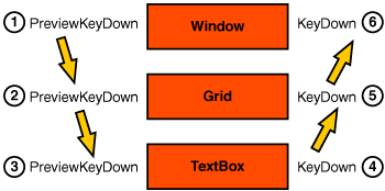
When you press a key with an element in focus, first the PreviewKeyDown event is raised by the root element and tunnels down the tree to the actual element that was in focus; then the KeyDown event is raised and bubbles back up to the root.
Consider the following very simple markup for a Window:
<Window x:Class="PreviewEvents.Window1"
        xmlns="http://schemas.microsoft.com/winfx/2006/xaml/presentation"
        xmlns:x="http://schemas.microsoft.com/winfx/2006/xaml"
        Title="Example of Preview Events"
        Height="300"
        Width="300">
    <Grid>
        <TextBox />
    </Grid>
</Window>
When a user clicks in the TextBox and then presses a key, the event travels as shown in Figure 9.4.
In one way, the pair of events behaves as a single event. If you mark the preview event as handled, WPF will not invoke the handler for its counterpart.
You probably will not be concerned with preview events very often. However, from time to time, you may encounter a scenario where they will come in handy. To help us visualize how these events are routed, let’s create a simple project.
Create a new project called
PreviewEvents.Open
Window1.xamland enter the markup from Listing 9.4. Notice that we wire theKeyDownandPreviewKeyDownevents for every element to a single handler.Example 9.4.
Window1.xamlCaptures All theKeyDownEvents<Window x:Class="PreviewEvents.Window1" xmlns="http://schemas.microsoft.com/winfx/2006/xaml/presentation" xmlns:x="http://schemas.microsoft.com/winfx/2006/xaml" KeyDown="Handler" PreviewKeyDown="Handler" Title="Window1" Height="300" Width="300"> <DockPanel KeyDown="Handler" PreviewKeyDown="Handler"> <ListBox x:Name="Output" DockPanel.Dock="Left" Margin="0 0 10 0" KeyDown="Handler" PreviewKeyDown="Handler"/> <Grid KeyDown="Handler" PreviewKeyDown="Handler"> <StackPanel KeyDown="Handler" PreviewKeyDown="Handler"> <Button KeyDown="Handler" PreviewKeyDown="Handler" Content="My Button"/> <TextBox KeyDown="Handler" PreviewKeyDown="Handler" Text="My TextBox"/> </StackPanel> </Grid> </DockPanel> </Window>
Now we implement the handler. The entire code-behind is in Listing 9.5. This handler logs the events by adding items to the
ListBox. Preview events are prefixed with “v” to indicate that they are tunneling down; theKeyDownevents are prefixed with “^” to indicate that they are bubbling up.We then check to see if
senderis the original source of the event. If so, we are at the bottom. That is the point where the event stops tunneling and begins to bubble. This is actually a hack and it won’t work for theListBox, but it’s good enough for this demonstration.Finally, we check to see if
senderis the root element. If it is, we are at the end of the event’s route.Example 9.5. Window1.xaml.cs Implements a General Handler
using System.Windows.Input;

namespace PreviewEvents
{
    public partial class Window1
    {
        public Window1()
        {
            InitializeComponent();
        }

        private void Handler(object sender, KeyEventArgs e)
        {
            bool isPreview = e.RoutedEvent.Name.StartsWith("Preview");
            string direction = isPreview ? "v" : "^";

            Output.Items.Add(string.Format("{0} {1}",
                                           direction,
                                           sender.GetType().Name));

            if (sender == e.OriginalSource && isPreview)
                Output.Items.Add("-{bounce}-");

            if (sender == this && !isPreview)
                Output.Items.Add(" -end- ");
        }
    }
}
Run the application. Click various elements and then press a key. This should help you gain an understanding of how the events are routed in WPF.
WPF adds a lot to the standard events found in the CLR. The principles and techniques surrounding routed events are important to keep in mind because they can help you simplify your code and make your application easier to maintain.
We discussed how routed events can either bubble or tunnel through the element tree in a WPF application, and we examined the properties available on RoutedEventArgs and gained an understanding of how to use them.