
What You’ll Learn in This Hour:
List controls and their relationships
ItemsControl
Customizing lists
Finishing the Contact Manager
In many of the previous hours, we have made use of various controls for displaying lists. We have touched them only on a surface level, frequently mentioning that we would cover them in detail at a later time. In this hour we finally dig into this powerful portion of the WPF control hierarchy and explore many of the great possibilities that it enables.
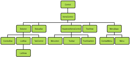
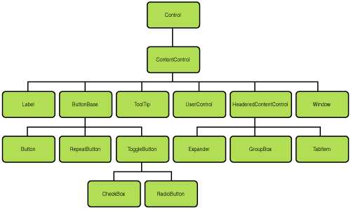
Take a few minutes to study Figures 16.1 and 16.2. If you look closely, you’ll see almost every control we have discussed thus far in the book represented somewhere in one of these two charts. There are a few notable exceptions, but almost every control we have used either inherits from ItemsControl or ContentControl. We know that ContentControl has a Content property that allows it to render almost anything, and we’ve seen references to ItemsControl throughout the book as it relates to lists. We could state that the primary difference between these two base classes is that ContentControl supports the rendering of a single item, whereas ItemsControl supports the rendering of multiple items.
For the remainder of this hour, we look at several important features of all ItemsControl derivatives. We’ll also pay special attention to classes that inherit from Selector. As we uncover important aspects of these base classes, we’ll extend the Contact Manager with some new features.
Looking back over Figure 16.1 we can see just how many controls there are that are related to ItemsControl. The good part about this is that everything we discuss here regarding the base class can be applied to the usage of every derivative.
The first order of business with an ItemsControl is being able to tell it what items should be displayed. This can be accomplished in two ways. The simplest and most intuitive way is to add items to its Items collection by calling the Add method and passing in the item. This can also be done in XAML by declaring multiple child elements. To see an example of where we have used this technique, open Shell.xaml in the Contact Manager. Near the top of the markup you see the definition of a StatusBar. We know from Figure 16.1 that StatusBar is an ItemsControl. In this case, its Items collection is being explicitly populated by three instances of StatusBarItem. In many cases you will want your lists to be data driven. For this second scenario, ItemsControl exposes an ItemsSource property. You can set any IEnumerable collection as the value and the ItemsControl will use this to generate the Items collection. If you open the SideBar.xaml, you will see an example of where we have used data binding to set the ItemsSource collection.
Setting up the items for an ItemsControl is pretty straightforward, but understanding how those items get rendered can be a little confusing. In the case of the above-mentioned StatusBar, it’s fairly obvious that it renders the StatusBarItem instances. But what about the ItemsControl in SideBar.xaml? It’s bound to a list of Contact instances. How does WPF determine how to render these? Following is a list of the steps that ItemsControl goes through to render the instances in its Items collection:
If the item inherits from
Visual, WPF already knows how to render this type and will treat it normally.If the item does not inherit from
Visual(likeContact), theItemsControlwill look for special instructions as detailed in the following:If the
DisplayMemberPathproperty is set, theItemsControlcreates aTextBlockand binds itsTextproperty to the property of the item indicated byDisplayMemberPath.If the
ItemTemplateis set to aDataTemplate, theItemsControluses the template to render each item.If the
ItemTemplateSelectoris set, WPF executes your custom code (a special class inheriting fromDataTemplateSelector), expecting you to provide it with aDataTemplatebased on the particular item in the collection.If none of the preceding properties is set, the
ItemsControlsearches theResourceshierarchy looking for aDataTemplatethat matches the item type. If none is found, theToStringmethod on the item is called and aTextBlockis used to display this value.
After the visuals are created for the display of the item, the
ItemsControluses itsItemContainerGeneratorto wrap that visual in an appropriate container. For example, if you were using aComboBox, it would wrap the visual in aComboBoxItem.The generated container would then be styled according to the following rules:
If the
ItemContainerStyleis set, theItemsControlwill use it to style each container.If the
ItemContainerStyleSelectorwas set, it would execute your custom code (a special class inheriting fromStyleSelector), expecting you to provide it with aStylebased on the particular item in the collection.If none of the preceding properties is set, the
ItemsControlsearches theResourceshierarchy looking for aStylethat matches the container type. If one is not found, the default style will be applied.
As alluded to previously, every ItemsControl has an ItemContainerGenerator. This class is responsible for generating appropriate containers for the data-bound UI. In the case of a ListBox, its generator would create instances of ListBoxItem, but in the case of ComboBox, the generator would produce instances of ComboBoxItem. Normally, a developer doesn’t need to interact with this directly. However, occasionally there is a need to determine what container instance is hosting a particular piece of data or vice versa. To do this, ItemContainerGenerator has several methods. We have found the most useful methods to be ItemFromContainer and ContainerFromItem.
Sometimes a user interface’s portrayal of data needs to be based on complex logic and can only be determined at runtime. In these cases, rather than setting the ItemTemplate for an ItemsControl, you want to use a DataTemplateSelector. To implement your special display logic, you must inherit from this class and override its SelectTemplate method. The code should look something like this:
public class MyTemplateSelector : DataTemplateSelector
{
    public override DataTemplate SelectTemplate(object item, DependencyObject container)
    {
        DataTemplate dataTemplate;

        //custom logic for determining the template

        return dataTemplate;
    }
}
The custom selector is generally instantiated in a Resources collection so that it can be referenced elsewhere and so that it can reference other templates stored in the resources also. At runtime, the item parameter of the SelectTemplate method refers to the data that is being displayed by the template, and the container parameter refers to the UI container that is hosting the data (such as a ListBoxItem). Typically, your custom selector implementation exposes properties for the different templates it needs so that they could be bound to other resources. The SelectTemplate method then programmatically determines which of these templates to use based on properties of the data item. By tackling the problem this way, you can still define your templates in XAML (bound using StaticResource), but have your custom selection logic in code.
By the Way
There is another way to alter the appearance of templates at runtime without resorting to custom code: Triggers. Triggers are discussed in Hour 22.
StyleSelector follows the same pattern as DataTemplateSelector, except that it has a SelectStyle method. The parameters are the same as SelectTemplate in the previous example, and the techniques used are the same as well.
As you can see, the ItemsControl is very flexible and can receive its item rendering instructions in a variety of ways. The most common scenarios are to either set DisplayMemberPath or to use a DataTemplate. In the case of SideBar.xaml, the default ToString is used. We’ll change this shortly.
The flexibility of ItemsControl is not limited to the rendering of its individual items, but also allows for the customization of their layout. To customize the layout, you set the ItemsPanel property to an instance of ItemsPanelTemplate. This template describes what type of Panel should be used to lay out the items. By default a VirtualizingStackPanel is used by most descendants of ItemsControl. This is a special type of StackPanel that is smart enough to not attempt the rendering of nonvisible elements. You could tell the ItemsControl to use a Grid, a Canvas, or any other Panel, though.
Another way in which the layout of an ItemsControl can be customized is by setting the GroupStyle (or the GroupStyleSelector) property. Using a CollectionViewSource, you can specify how items should be grouped. The ItemsControl understands these groups and will attempt to render them according to the GroupStyle.
An immense number of features are packed into this one control. Remember that everything that inherits from ItemsControl (everything in Figure 16.1) has these capabilities. Let’s apply some of these features specifically in our Contact Manager.
We are now going to work with the SideBar.xaml. Currently it displays a very simple, barely usable list of contacts. We’ll spice it up using some of our newfound knowledge. Let’s get started working on that now:
Open the Contact Manager project in Visual Studio if it is not already open.
Open the
SideBar.xamlfile.Replace the current
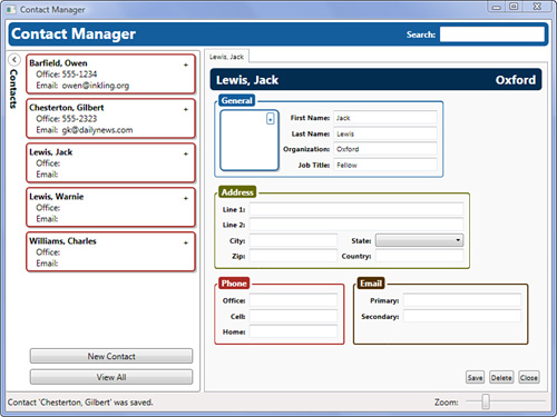
ItemsControlmarkup with what is found in Listing 16.1.Run the application. Create a few contacts and observe the appearance of the sidebar. You should see something similar to Figure 16.3.
Example 16.1. An ItemsControl with ItemTemplate
<ItemsControl Width="250"
              VerticalAlignment="Stretch"
              BorderThickness="0"
              ItemsSource="{Binding CurrentContacts}">
    <ItemsControl.ItemTemplate>
        <DataTemplate>
            <Grid Margin="2">
                <Border Margin="2 2 0 0"
                        CornerRadius="4"
                        Background="Gray"
                        Opacity=".5" />
                <Border BorderBrush="{StaticResource redBrush}"
                        BorderThickness="2"
                        CornerRadius="4"
                        Background="White"
                        Margin="0 0 2 2"
                        Padding="3">
                    <Grid>
                        <Grid.ColumnDefinitions>
                            <ColumnDefinition Width="Auto" />
                            <ColumnDefinition />
                        </Grid.ColumnDefinitions>
                        <Grid.RowDefinitions>
                            <RowDefinition />
                            <RowDefinition />
                            <RowDefinition />
                        </Grid.RowDefinitions>

                        <TextBlock Grid.ColumnSpan="2"
                                   FontWeight="Bold"
                                   Text="{Binding LookupName}" />

                            <TextBlock Grid.Row="1"
                                       Text="   Office: " />
                            <TextBlock Grid.Row="1"
                                       Grid.Column="1"
                                       Text="{Binding Path=OfficePhone,  Converter={StaticResource  phoneConverter}}"/>
                            <TextBlock Grid.Row="2"
                                       Text="   Email: " />
                            <TextBlock Grid.Row="2"
                                       Grid.Column="1"
                                       Text="{Binding PrimaryEmail}" />
                        </Grid>
                </Border>
                <Button Style="{StaticResource openButton}" />
            </Grid>
        </DataTemplate>
    </ItemsControl.ItemTemplate>
</ItemsControl>
It may not have occurred to you when we first introduced data templates in Hour 15, “Digging Deeper into Data Binding,” but you can use any type of element to create your template. In this case we’ve simulated a “contact card” style. Notice that from within a DataTemplate you can make full use of styles and converters (and even other templates). You can even catch events:
Add the following attached event declaration to the
ItemsControl:ButtonBase.Click="OpenContact_Click"
In the
SideBar.xml.csadd the following event handler:private void OpenContact_Click(object sender, RoutedEventArgs e) { Button button = e.OriginalSource as Button; if (button != null) Presenter.OpenContact(button.DataContext as Contact); }
Don’t forget to add the using statement to the top of the file:
using ContactManager.Model;Run the application. You should now be able to use the plus (+) buttons on each of the contact cards to open the contact.
As you can see, DataTemplates used as an ItemTemplate behave naturally, bubbling and tunneling events the same as anything else. We’re almost finished with the sidebar now. Let’s add some sorting to finish things off:
At the top of the
UserControladd the following resources definition:<UserControl.Resources> <CollectionViewSource x:Key="contactSource" Source="{Binding CurrentContacts}"> <CollectionViewSource.SortDescriptions> <cm:SortDescription PropertyName="LookupName" /> </CollectionViewSource.SortDescriptions> </CollectionViewSource> </UserControl.Resources>
For the
SortDescriptionto work, you need to add this Xml Namespace Declaration:xmlns:cm="clr-namespace:System.ComponentModel;assembly=WindowsBase"
Change the
ItemsControl.ItemsSourceto use our newCollectionViewSourcewith this binding:ItemsSource="{Binding Source={StaticResource contactSource}}"
Run the application, and you should have a fully interactive and sorted contact list.
As you can see, ItemsControl is quite powerful. We could not demonstrate every feature in this example, but we wanted to make you aware of the possibilities. We’ll use additional features such as ItemsPanel and GroupStyle in Hour 17, “Building a Media Viewer,” so you’ll be ready for it when you see it.
If we look again at Figure 16.1 we see that there is another important base class descended directly from ItemsControl. The Selector class is probably the next most important to understand because its functionality is shared by several very commonly used controls: ComboBox, ListBox, ListView, and TabControl. Selector takes all the functionality of ItemsControl and adds to it the capability to select one or more items. Several important properties come into play at this level. We would like to discuss those properties which we have found the most useful.
To begin with, you can determine which item is selected (or set the selected item) using the SelectedItem property. You can achieve the same effect by working with the SelectedIndex property. This second property represents which element index in the Items collection is selected. Anytime the selection changes, the SelectionChanged event is fired. You can handle this directly or using attached events, as we did with the ComboBox in the Text Editor toolbar from Hour 9. One final property to note is IsSynchronizedWithCurrentItem, which allows you to synchronize the selection across multiple selectors. For example, you might have two ComboBox instances bound to the same collection, and they need to keep their SelectedItem synchronized.
We’ve been using controls that inherit from Selector since the very beginning. But let’s take one more opportunity to examine some XAML and consider it based on our new understanding:
Open the
EditContactView.xamlfile and locate theComboBoxelement. You may want to use the Visual Studio shortcut, Ctrl+F, to more quickly find it.Notice that the
SelectedItemproperty, which it inherits fromSelector, is data bound to our model.ComboBoxalso has anItemsSourceproperty it inherits fromItemsControlthat is not yet set, preventing the control from actually displaying any states. To fix this, openApp.xaml.We are going to declare a global data source for our state list. Add the following markup to the application
Resourcescollection, inside theResourceDictionary:<ObjectDataProvider x:Key="stateNames" MethodName="GetNames" ObjectType="{x:Type Model:States}" />
You will need to add the following namespace declaration to the XAML as well:
xmlns:Model="clr-namespace:ContactManager.Model"
Return to the
EditContactView.xamland go to theComboBox. Add the following attribute to theComboBox:ItemsSource="{Binding Source={StaticResource stateNames}}"
Run the application. You should now be able to select states in the
ComboBox.Exit the application and return to Visual Studio.
Add the following attribute to the
ComboBox:IsSynchronizedWithCurrentItem="True"
Run the application again. Open several tabs with contacts in them. Change the selected
Statein one of the combo boxes.Go to another tab. Notice that the
Statechange in one tab has affected the other.Exit the application and return to Visual Studio.
Remove the
IsSynchronizedWithCurrentItemattribute because this is not the behavior that we want in this situation.
Hopefully this last task helped you to see how each of the base classes contributed functionality to ComboBox. Also, it is important to understand just how the IsSynchronizedWithCurrentItem property works, because using this in some scenarios can cause surprising and undesirable behavior.
To make the States available to our ComboBox, we’ve used a new technique. The ObjectDataProvider is a simple class that lets us point to an ObjectType and a Method. At runtime, the provider locates the ObjectType and calls the method to obtain a set of data. By placing this in the application resources, we have made available a single state list that the entire application can use.
In this hour we have taken a deep dive into the world of ItemsControl. As one of the most important base classes in WPF, this control provides a great deal of functionality that will affect much of what you build with this technology. This control allows for the rendering of multiple items, allowing for custom templating and stylization of each item in the list. Additionally, ItemsControl can arrange its items using any type of Panel and can perform grouping of items as well. For selectable lists, WPF offers Selector and its descendents, each one meeting a specific UI need and providing a wealth of UI possibilities.