
What You’ll Learn in This Hour:
Using Shapes
Drawing with the Path element
Understanding stroke and fill
Working with complex shapes
Just like the rest of WPF, the API for 2D drawing is both extensive and powerful. Our goal in this hour is to equip you with the basics you need to start working with WPF quickly, as well as providing a foundation for learning if your projects have a need to go deeper.
The WPF has a number of basic shapes built in. The shapes are
LinePolylinePolygonRectangleEllipsePath
All these classes live in the namespace System.Windows.Shapes.
The best way to understand how these shapes work is to see them in action. Let’s create a simple project for the purpose of understanding these classes.
Create a new project in Visual Studio called
LearningShapes.Open
Window1.xamland add the following markup inside theGrid.<Line X1="0" Y1="0" X2="100" Y2="100" Stroke="Red" />
Make sure that you are using the Split Pane view to view
Window1.xaml. Visual Studio’s live preview will display the XAML without your having to run the application. This makes it very easy for us to play with the various shapes. Figure 18.1 shows whatWindow1.xamllooks like at this point.
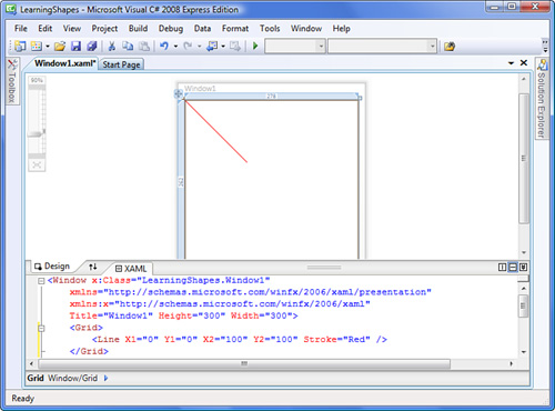
As you can see, Line draws a line between two points. For Line to render something visible, you need to provide at least one of the coordinate pairs and the stroke. The X and Y properties default to zero, so technically we could have omitted X1 and Y1 in the preceding example.
The coordinates are specified with respect to the upper-left corner of the element that contains the line. So when Y1 is 25, it means that the point is 25 pixels from the top. Increasing Y1 would move the point downward. Likewise, increasing X1 would move the point toward the right.
You can provide values for the coordinates that go beyond the bounds of the container. You can even provide negative values if you need to.
The Stroke property tells WPF what color the line should be. (Actually, it’s a not a color, but a brush. Brushes are a lot more interesting than simple colors. We’ll go into that in the next hour.) The Stroke property is common to all the shapes classes.
Let’s explore some of the other properties related to the stroke. We’ll draw two lines on top of each other for comparison.
In
Window1.xaml, replace the line with the following markup:<Line X1="20" Y1="20" X2="200" Y2="100" Stroke="Black" StrokeThickness="30"/>
This draws a very thick black line. The
StrokeThicknesstells WPF how thick the line should be in pixels. Now, we’ll draw a brightly colored line on top of it. Add this markup immediately after the previousLine:<Line X1="20" Y1="20" X2="200" Y2="100" Stroke="Fuchsia" StrokeThickness="20" StrokeStartLineCap="Round" StrokeEndLineCap="Square" StrokeDashCap="Triangle" StrokeDashArray="1.6 1.3"/>
The resulting lines are shown in Figure 18.2.
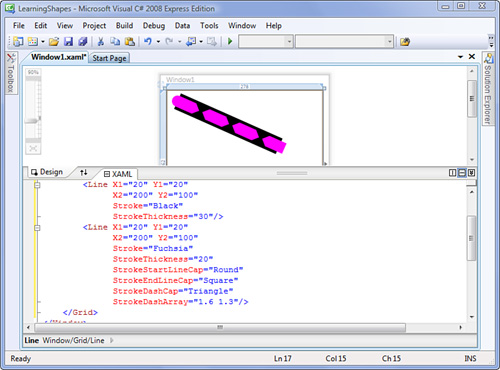
We have specified line caps for the fuchsia line using the StrokeStartLineCap and StrokeEndLineCap. A line cap tells WPF how to draw the ends of the line. Notice that the upper-left point of the black line is flat, and that the corresponding point on the fuchsia line is rounded. The StrokeStartLineCap defines the cap for the point of the line designated by X1 and Y1. StrokeEndLineCap handles the point designated by X2 and Y2.
The preceding example actually demonstrates all the possible values for line caps and how they are rendered. The default value for a line cap is Flat. Note that all line caps except for Flat extend beyond the endpoint of the line. That’s why the ends of the fuchsia line overlap the ends of the black line, even though they are the same length.
StrokeDashArray is a property that allows us to define the dashes and gaps in a line. The values in the array alternate between the length of the dash and the length of the gap. The values are also relative to the thickness of the stroke. So a value of 1.0 means that the length of the corresponding dash or gap is equal to the width of the stroke.
In our example, we are telling WPF to draw a dash that is 1.6 times the width of the stroke followed by a gap 1.3 times the width of the stroke. The array is not limited to two values; you can make something much more complicated if you like.
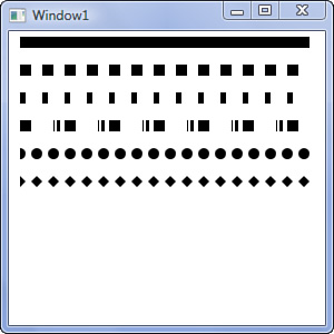
Listing 18.1 contains markup demonstrating some possible lines. Notice that the common properties of the lines have been moved into the resources.
Example 18.1. Several Lines in Window1.xaml
<Window x:Class="LearningShapes.Window1"
        xmlns="http://schemas.microsoft.com/winfx/2006/xaml/presentation"
        xmlns:x="http://schemas.microsoft.com/winfx/2006/xaml"
        Title="Window1" Height="300" Width="300">
    <StackPanel>
        <StackPanel.Resources>
            <Style TargetType="{x:Type Line}">
                <Setter Property="Stroke" Value="Black" />
                <Setter Property="StrokeThickness" Value="10" />
                <Setter Property="X2" Value="260" />
                <Setter Property="Margin" Value="10" />
            </Style>
        </StackPanel.Resources>

        <Line />
        <Line StrokeDashArray="1 1" />
        <Line StrokeDashArray="0.5 1.5"/>
        <Line StrokeDashArray="1 2 0.1 0.2 0.3 0.4"/>

        <!-- a dotted line-->
        <Line StrokeDashArray="0 1.5"
              StrokeDashCap="Round"/>

        <Line StrokeDashArray="0 1.5"
              StrokeDashCap="Triangle"/>

    </StackPanel>
</Window>
Sometimes the preview isn’t accurate when displaying the results of your XAML. Figure 18.3 shows what Listing 18.1 looks like when executed.
Polyline allows you to draw a line with multiple segments. It has a property, Points, that is similar to the StrokeDashArray. It takes a series of values that alternate between x and y coordinates. The following XAML snippets are equivalent:
<Polyline Points="10 10 200 10" Stroke="Red"/>
<Line X1="10" Y1="10" X2="200" Y2="10" Stroke="Red" />
They both draw a red line from 10,10 to 200,10. With Polyline you can continue to add segments. We could draw a square with the following snippet:
<Polyline Points="10,10 200,10 200,210 10,210 10,10" Stroke="Red"/>
Notice that in this snippet I have included commas to help group the x and y pairs. The commas are ignored by WPF; occasionally, you will see them used to delimit the pairs themselves, such as in this snippet:
<Polyline Points="10 10,200 10,200 210,10 210,10 10" Stroke="Red"/>
A Polyline can handle thousands of points. However, it’s difficult to manage that many points in XAML. In those cases, you will very likely be adding the points in code.
The Polygon shape is nearly identical to the Polyline. The primary difference is that a Polyline is open and a Polygon is closed. For example, we could create a square with the following snippet:
<Polygon Points="10 10 50 10 50 60 10 60" Stroke="Green"/>
Notice that our polygon has one less set of x,y values. This is because a Polygon automatically connects the end point with the start point.
In addition to Stroke, all the shapes also have a Fill property. Fill is analogous to the Background property that you have already seen on controls. Let’s try drawing a few shapes and adding some fills.
Create a new window in your
LearningShapesproject namedPoly.xaml. Replace theGridwith aWrapPanel. Set theBackgroundof theWindowtoPinkto add some contrast.First, we’ll draw a
Polyline. Add the following inside theWrapPanel:<Polyline Points="10 10 50 10 50 60 10 60" Stroke="Red" StrokeThickness="4" Fill="Orange"/>
Notice that the left side of the square does not contain a stroke.
Add a
Polygonto the WrapPanel with this markup:<Polygon Points="10 10 50 10 50 60 10 60" Fill="Yellow" Stroke="Green" StrokeThickness="6" StrokeLineJoin="Round"/>
This
Polygonhas the same points as the precedingPolyline, but there is a stroke on the left side. We’ve also added theStrokeLineJoinproperty. It tells the stroke how to render at the vertices or corners of thePolygon. In this case we are rounding the corners. It’s hard to notice the effect unless the stroke has some thickness.Our next Polygon demonstrates mitered corners. We need some angles that aren’t perpendicular to see this effect.
<Polygon Points="10 10, 30 20, 50 10, 50 60, 30 50, 10 60"
         Stroke="Green"
         StrokeThickness="6"
         StrokeLineJoin="Miter"
         StrokeMiterLimit="1"
         Fill="Yellow" />
The
StrokeMiterLimitdetermines how much of the corners are cut off. Values less than1are meaningless. You can experiment here by changing the property to something like1.2.StrokeThicknessalso affects how visible the miter is.A
Polygoncan intersect itself as well. This next one crosses itself twice:<Polygon Points="10 10, 30 60, 50 10, 50 60, 30 10, 10 60" Fill="Yellow" />
Here’s the markup for a star:
<Polygon Margin="10 10 0 0"
         Points="25 0, 33 17, 50 19, 38 32, 40 50,
         25 42, 10 50, 12 32, 0 19, 17 17"
   Fill="Yellow" />
We included the margin on the star to add some spaces; all our previous shapes are already offset by 10,10. It’s also useful to note that our collection of points can span multiple lines. The extra whitespace is ignored.
Finally, put the entire
WrapPanelelement inside of aViewBox. The complete markup forPoly.xamlis shown in Listing 18.2. SetPoly.xamlto be theStartupUriinApp.xamland run the application. Resize the window and you can get a better look at the behavior of the strokes. Figure 18.4 shows the application.
Example 18.2. Polyline, Polygons, and Fills
<Window x:Class="LearningShapes.Poly"
        xmlns="http://schemas.microsoft.com/winfx/2006/xaml/presentation"
        xmlns:x="http://schemas.microsoft.com/winfx/2006/xaml"
        Title="Poly" Height="300" Width="300"
        Background="Pink">
    <Viewbox>
        <WrapPanel>
            <Polyline Points="10 10 50 10 50 60 10 60"
                      Stroke="Red"
                      StrokeThickness="4"
                      Fill="Orange"/>
            <Polygon Points="10 10 50 10 50 60 10 60"
                     Fill="Yellow"
                     Stroke="Green"
                     StrokeThickness="6"
                     StrokeLineJoin="Round"/>
            <Polygon Points="10 10, 30 20, 50 10, 50 60, 30 50, 10 60"
                     Stroke="Green"
                     StrokeThickness="6"
                     StrokeLineJoin="Miter"
                     StrokeMiterLimit="1"
                     Fill="Yellow" />
            <Polygon Points="10 10, 30 60, 50 10, 50 60, 30 10, 10 60"
                     Fill="Yellow" />
            <Polygon Margin="10 10 0 0"
                     Points="25 0, 33 17, 50 19, 38 32, 40 50,
                     25 42, 10 50, 12 32, 0 19, 17 17"
                     Fill="Yellow" />
        </WrapPanel>
    </Viewbox>
</Window>

By the Way
Both Polygon and Polyline have a property called FillRule. FillRule controls which portions of a Polygon or Polyline are filled in. FillRule is meaningful only under certain conditions when you have a complicated shape that intersects with itself multiple times. If the fill of a shape is not what you expect, looking up this property in the documentation is a good place to start.
Often you will find that Line, Polyline, and Polygon are overkill. The two classes that you are likely to use frequently are Ellipse and Rectangle.
They are similar to the shapes we’ve already encountered. Fill and all the stroke properties we discussed are still applicable. However, with both Ellipse and Rectangle you do not need to specify any points. Instead, you provide the desired Width and Height. For circles and squares, set Width and Height to the same value.
By default, Ellipse and Rectangle are positioned at 0,0 with respect to their parent element. To relocate them you have to use Margin. The exception is when they are placed in a Canvas. In that case, you use the attached properties Canvas.Left and Canvas.Top. As it turns out, Canvas is the container you’ll most commonly place shapes in.
Let’s use a few Ellipse elements to create a logo for Media Viewer.
Open the
MediaViewerproject in Visual Studio.We’ll begin by defining a palette that we’ll use to theme the application. Add a new resource dictionary under the
Resourcesfolder namedColorsAndBrushes.xaml.Add the following brushes to our new resource dictionary:
<SolidColorBrush x:Key="yellowBrush" Color="#FFFFB03B"/>
<SolidColorBrush x:Key="orangeBrush" Color="#FFB64926"/>
<SolidColorBrush x:Key="redBrush" Color="#FF8E2800"/>
Let’s also go ahead and create a resource dictionary for all styles that we will use. Add it under
Resourcesand name itDefaultStyles.xaml. We’ll use both the styles and the brushes applicationwide, so let’s merge these dictionaries into the main dictionary for the application. OpenApp.xaml.Inside
Application.Resourcesadd the following:<ResourceDictionary> <ResourceDictionary.MergedDictionaries> <ResourceDictionary Source="ResourcesColorsAndBrushes.xaml" /> <ResourceDictionary Source="ResourcesDefaultStyles.xaml" /> </ResourceDictionary.MergedDictionaries> </ResourceDictionary>
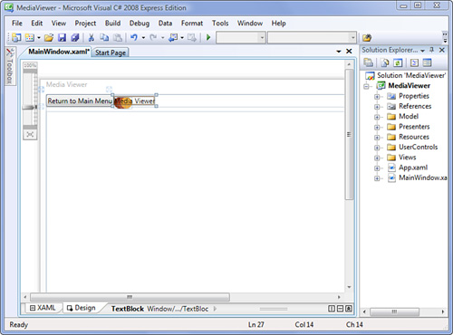
Now we are ready to start the real work. Open
MainWindow.xaml. We’re going to add a header to our application. It will contain the Home button that returns to the main menu, the logo and title of the application, and it will be accessible from each of the views in the application.Replace the existing
Buttonelement with the following:<StackPanel DockPanel.Dock="Top" Orientation="Horizontal" Margin="0 0 0 8"> <Button Content="Return to Main Menu" Click="Header_Click"/> <TextBlock Text="Media Viewer" VerticalAlignment="Center"/> </StackPanel>
Our logo for the application is very simple. It’s three overlapping circles of different colors. In between the
Buttonand theTextBlock, add the following:<Canvas> <Ellipse Fill="{StaticResource redBrush}" Width="20" Height="20" Canvas.Top="5"/> <Ellipse Fill="{StaticResource orangeBrush}" Width="20" Height="20" Canvas.Top="5" Canvas.Left="6"/> <Ellipse Fill="{StaticResource yellowBrush}" Width="20" Height="20" Canvas.Top="5" Canvas.Left="12"/> </Canvas>
Look at the live preview in the design pane and notice that the
TextBlockis on top of theCanvasand that our ellipses extend beyond the bounds of theStackPanel. This isn’t how we want the header to look. We’d like to have the logo completely inside theStackPanel, and we’d like to have theTextBlockto the right of the logo. You can see this illustrated in Figure 18.5.The problem is that the
Canvaselement has noWidthorHeight. Unlike other panels, it does not expand to contain its children. They spill outside of its bounds. If we provide aWidthof 35 and aHeightof 25, the elements align as we expect.Instead of plain text, let’s use a
Polygonto draw the silhouette of a house inside our home button. We’ll remove theContentproperty and add aPolygonelement. The result will be this:<Button Background="{StaticResource redBrush}" Click="Header_Click"> <Polygon Fill="{StaticResource yellowBrush}" Points="0,10 11,0 22,10 18,10 18,20 4,20 4,10" /> </Button>
If you are trying to follow the points, the
Polygonbegins at the left-most edge of the roof.While we are working on the header, let’s style the title a bit. First, we’ll add a brush for coloring text. We’ll add it to
ColorsAndBrushes.xaml:<SolidColorBrush x:Key="textBrush" Color="#FF000000"/>
Inside
DefaultStyles.xaml, we need to add a reference toColorAndBrushes.xaml.<ResourceDictionary.MergedDictionaries> <ResourceDictionary Source="ColorsAndBrushes.xaml" /> </ResourceDictionary.MergedDictionaries>
We’ll name the style
title. Place this inDefaultStyles.xaml:<Style x:Key="title" TargetType="{x:Type TextBlock}"> <Setter Property="FontSize" Value="20" /> <Setter Property="FontWeight" Value="Bold" /> <Setter Property="Foreground" Value="{StaticResource textBrush}" /> </Style>
Return to
MainWindow.xaml. Locate theTextBlockand point the style totitle.<TextBlock Style="{StaticResource title}" Text="Media Viewer" VerticalAlignment="Center"/>
The application now looks like Figure 18.6.
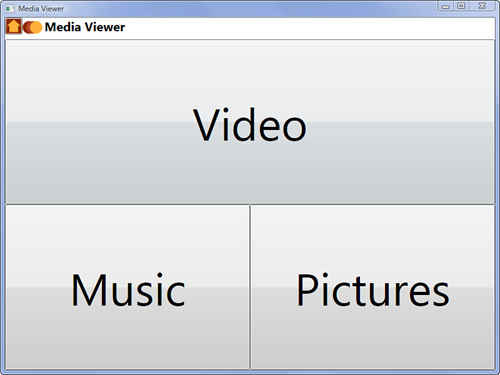
The complete markup for MainWindow.xaml is shown in Listing 18.3.
Example 18.3. MainWindow.xaml with Some Styling
<Window x:Class="MediaViewer.MainWindow"
        xmlns="http://schemas.microsoft.com/winfx/2006/xaml/presentation"
        xmlns:x="http://schemas.microsoft.com/winfx/2006/xaml"
        Title="Media Viewer"
        Height="600"
        Width="800"
        Loaded="MainWindow_Loaded">
    <DockPanel>
        <StackPanel DockPanel.Dock="Top"
                    Orientation="Horizontal"
                    Margin="0 0 0 8">
            <Button Background="{StaticResource redBrush}"
                    Click="Header_Click">
                <Polygon Fill="{StaticResource yellowBrush}"
                         Points="0,10 11,0 22,10 18,10 18,20 4,20 4,10" />
            </Button>
            <Canvas Width="35" Height="25">
                <Ellipse Fill="{StaticResource redBrush}"
                         Width="20" Height="20"
                         Canvas.Top="5"/>
                <Ellipse Fill="{StaticResource orangeBrush}"
                         Width="20" Height="20"
                         Canvas.Top="5" Canvas.Left="6"/>
                <Ellipse Fill="{StaticResource yellowBrush}"
                         Width="20" Height="20"
                         Canvas.Top="5" Canvas.Left="12"/>
            </Canvas>
            <TextBlock Style="{StaticResource title}"
                       Text="Media Viewer"
                       VerticalAlignment="Center"/>
        </StackPanel>
        <ContentControl x:Name="currentView" />
    </DockPanel>
</Window>
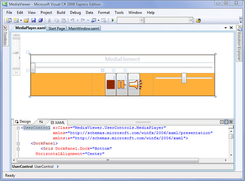
Let’s turn our attention to MediaPlayer.xaml. This user control contains the stop, play/pause, and mute buttons used in our application. Ultimately, we want the user control to look like Figure 18.7.
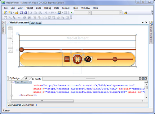
To do this, we’re going to need to modify the layout somewhat. This brings up an important aspect of WPF applications. We can significantly modify the layout of elements in the application without breaking the application.
Open
MediaPlayer.xaml.Locate the
Gridelement that is just inside theDockPanel. Modify the opening tag so that it looks like this:<Grid DockPanel.Dock="Bottom" HorizontalAlignment="Center" Width="400" Height="50" Background="{StaticResource yellowBrush}">
If you look back at Figure 18.7, you will notice that the control is divided into thirds. The first third is empty, the middle third contains the three buttons, and the final third contains the slider for adjusting the volume. To achieve this, we need to group the three buttons together, as well as reduce the number of columns in our outermost
Gridto three. After making these changes, ourGridnow looks like this:<Grid DockPanel.Dock="Bottom" HorizontalAlignment="Center" Width="400" Height="50" Background="{StaticResource yellowBrush}"> <Grid.ColumnDefinitions> <ColumnDefinition Width="*" /> <ColumnDefinition Width="*" /> <ColumnDefinition Width="*" /> </Grid.ColumnDefinitions> <Grid Grid.Column="1" HorizontalAlignment="Center"> <Grid.ColumnDefinitions> <ColumnDefinition Width="Auto" /> <ColumnDefinition Width="Auto" /> <ColumnDefinition Width="Auto" /> </Grid.ColumnDefinitions> <Button Content="Stop" Click="Stop_Click" /> <Button Grid.Column="1" Content="Play" Click="Play_Click" /> <ToggleButton Grid.Column="2" Content="Mute" IsChecked="{Binding ElementName=mediaElement, Path=IsMuted}" /> </Grid> <Slider Grid.Column="2" Minimum="0" Maximum="1" Value="{Binding ElementName=mediaElement, Path=Volume}"/> </Grid>
On both
Gridelements, we set theHorizontalAlignmenttoCenterboth to center the element in its parent and to make it collapse to the size of its content. To see the difference, remove the alignment on the innermostGrid. You’ll see in the live preview that it expands to fill all the space in the center column of its parentGrid.We set the
Widthof the column in the outer Grid to*because we want them to all be the same size, whereas we set the column in the inner grid toAutoso that they will collapse to the size of their content.Now, we’ll use a
Rectangleto make the Stop button look like the traditional Stop buttons on media players. Replace the Stop button with this:<Button Click="Stop_Click"> <Rectangle Width="18" Height="20" Fill="{StaticResource redBrush}" RadiusX="1" RadiusY="1" Stroke="{StaticResource orangeBrush}" StrokeThickness="1"/> </Button>
The
Rectangleelement behaves just like theEllipse. TheRectangleincludesRadiusXandRadiusYproperties. These allow you to round the corners on aRectangle. They are similar toCornerRadiusonBorder, but provide finer-grained control. Try changing their values and observing the change in the preview before we move on. The current value is very subtle.The Play button is a little more complicated. We want the content of the button to change depending on the state of the player. We’ll actually implement this when we discuss triggers in Hour 22. In the meantime, we add the content for both play and pause, and we’ll just hide the pause content.
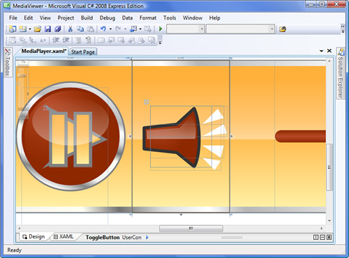
The icon for play is a simple triangle that we’ll draw with a
Polygon. For the Pause button, we want two parallel bars. There’s actually several ways to achieve this. We’ll use twoRectangleelements inside aCanvasfor the time being.Also, a
Buttoncan have only one child, so we’ll place both of these inside aGrid. The new markup for the play button is the following:<Button Grid.Column="1" Click="Play_Click"> <Grid> <Polygon Fill="{StaticResource yellowBrush}" Stroke="Gray" Points="0,0 18,10 0,18" /> <Canvas Visibility="Hidden"> <Rectangle Height="18" Fill="{StaticResource yellowBrush}" Stroke="{StaticResource orangeBrush}" Width="6"/> <Rectangle Height="18" Fill="{StaticResource yellowBrush}" Stroke="{StaticResource orangeBrush}" Width="6" Canvas.Left="8"/> </Canvas> </Grid> </Button>
Go ahead and run the application to see how the styling looks.
Even with all the classes we’ve discussed so far, limitations still exist. For example, we said earlier that we would like the mute button to look like Figure 18.8.
However, we haven’t yet discussed a way of drawing a shape that consists of straight lines and curves. In fact, the curves we’ve seen so far are ellipses.
WPF has a shape class called Path that allows you to define any sort of shape you can imagine. It is a powerful tool, and has many features. We are only going to scratch the surface of what you can do with it.
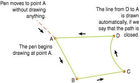
Path is not as intuitive as the other shapes. It may be easier to think of a Path element as a series of commands telling WPF what to draw. (Yes, that’s more imperative than declarative.) You can think of the commands as moving a virtual pen around the display. For example, you might have a set of commands like this:
Move the pen to point A.
Draw a line to point B.
Draw another line to point C.
Draw a curved line to point D.
Close the shape with a line back to point A.
Figure 18.9 helps illustrate this idea. Realize that you are not telling WPF to draw a line from A to B; rather, the pen is already at A, and you are drawing a line to B. That automatically makes B the beginning of the next segment.
Path has Fill and the same stroke properties as the previous shapes. However, it has a property called Data. You can set Data using a PathGeometry element or using a special syntax we’ll discuss later in the hour. I’ll show you some examples of each, but a thorough coverage of the subject is beyond the scope of this book.
Let’s use the PathGeometry element to begin drawing the mute button.
Open
MediaPlayer.xaml.Locate the
ToggleButtonthat we bound tomediaElement. We’re going to remove theContentattribute and place aCanvasinside theToggleButton. TheCanvaswill contain aPathdrawing the silhouette of a speaker, a secondPaththat will be the glossy highlight on the speaker, and a series ofPolygonelements that will be the sound coming out of the speaker. The resulting markup looks like this:<ToggleButton Grid.Column="2" IsChecked="{Binding ElementName=mediaElement, Path=IsMuted}"> <Canvas Width="20" Height="20"> <!-- the speaker --> <Path Fill="{StaticResource yellowBrush}" Stroke="{StaticResource redBrush}" StrokeLineJoin="Round"> <Path.Data> <PathGeometry> <PathFigure StartPoint="12,5" IsClosed="True"> <LineSegment Point="0,6" /> <PolyLineSegment Points="0,14 12,15 17,20" /> <ArcSegment Point="17,0" Size="30,30"/> </PathFigure> </PathGeometry> </Path.Data> </Path> <!-- highlight --> <Path Fill="White"> <Path.Data> <PathGeometry> <PathFigure StartPoint="13,6" IsClosed="True"> <PolyLineSegment Points="1,7 1,11 17.5,11" /> <ArcSegment Point="16.5,2" Size="30,30"/> </PathFigure> </PathGeometry> </Path.Data> </Path> <!-- sound waves --> <Polygon Points="20,5 25,0 27,3" Fill="{StaticResource redBrush}" /> <Polygon Points="20,10 28,9 27,6" Fill="{StaticResource redBrush}" /> <Polygon Points="20,13 26,17 27,13" Fill="{StaticResource redBrush}" /> <Polygon Points="20,17 24,21 26,18" Fill="{StaticResource redBrush}" /> </Canvas> </ToggleButton>
The user control should now look like Figure 18.10. Run the application and take a look at the new mute button.
Let’s take a closer look at the Path, in particular the PathGeometry element.
<PathGeometry>
    <PathFigure StartPoint="12,5"
                IsClosed="True">
        <LineSegment Point="0,6" />
        <PolyLineSegment Points="0,14 12,15 17,20" />
        <ArcSegment Point="17,0"
                    Size="30,30"/>

    </PathFigure>
</PathGeometry>
The first child element is PathFigure. A path figure is a single shape within the path. You are allowed to have multiple figures in the path. For example, if you wanted two circles in your path that were not touching, you could use two figures to accomplish this. On the figure we set IsClosed to True; this automatically draws a line from the last point to the first point. It’s the same difference that we found between a PolyLine and a Polygon. The StartPoint property is the point where we will begin drawing our figure. This is equivalent to point A in Figure 18.9.
Inside PathFigure, we have a series of segments. The first element, LineSegment, draws a single straight line from 12,5 to 0,6. That’s the top-left line of the speaker. The second element, PolyLineSegment, draws three lines. The first of the three lines goes from 0,6 to 0,14. It’s the right-most line on the speaker. The remaining two lines are the bottom of the speaker. We could easily have incorporated the first LineSegment into the PolyLineSegment, but we left it in for demonstration purposes.
The final segment draws the curved front of the speaker. The Size property indicates the radii of the ellipse that we are taking the arc from. Because we need a gentle curve for the face of the speaker, we used a large ellipse.
There are seven types of segments in all.
ArcSegmentBezierSegmentLineSegmentPolyBezierSegmentPolyLineSegmentPolyQuadraticBezierSegmentQuadraticBezierSegment
Covering all these segments is beyond the scope of the book. However, if you are interested in knowing more about computer graphics in general, you should take some time to research these classes as well as the principles underlying them.
ArcSegment has many more features than what we’ve mentioned here. Take a look at the official documentation if you would like to know more about the class.
One important thing to note about PathFigure and the segment classes is that they are available for data binding and animation. However, that they support these features means that they come with extra overhead. There’s a lightweight alternative if you don’t need those features.
Stream geometry is an alternative to path geometry. It uses a special syntax or mini-language for defining geometries.
If you use a tool such as Expression Blend or Expression Design to draw shapes in XAML, you will discover that most of the output is Path elements. However, these paths do not use figures. Instead, they employ the special mini-language in the Data attribute. For example, the XAML to produce the speaker that we just examined could also be expressed as the following:
<Path Fill="{StaticResource yellowBrush}"
      Stroke="{StaticResource redBrush}"
      Data="M12,5 L0,6 0,14 12,15 17,20 A30,30,0,0,0,17,0 z" />
This notation is much more concise than the original:
<Path Fill="{StaticResource yellowBrush}"
      Stroke="{StaticResource redBrush}"
      StrokeLineJoin="Round">
    <Path.Data>
        <PathGeometry>
            <PathFigure StartPoint="12,5"
                        IsClosed="True">
                <LineSegment Point="0,6" />
                <PolyLineSegment Points="0,14 12,15 17,20" />
                <ArcSegment Point="17,0"
                            Size="30,30"/>
            </PathFigure>
        </PathGeometry>
    </Path.Data>
</Path>
If you look carefully at the Data attribute, you’ll notice that it is a combination of letters and points. Just like in other places where we have encountered sets of points, the commas are optional. The points themselves are the same points used in the figure segments.
Mis a command to move to a given point.Lindicates that the following points are line segments.Auses the following seven points to draw an arc segment.Zis the command to close the figure.
There are many more commands. Additionally, commands are case sensitive. Uppercase letters work with absolute coordinates, and lowercase letters with relative coordinates. (Relative coordinates are often easier to understand.)
You can use this language to define path geometry as well. It is set to the Figures property on PathGeometry. However, most of the time you encounter it, it will be in the context of stream geometry.
If you are interested in learning more, check the official documentation under the topic of “Path Markup Syntax.”
This hour has been only an introduction to the topic of drawing in WPF. Nevertheless, a lot can be done just with the material we covered in this hour. Additionally, you are now better equipped to dig deeper into the graphics capabilities of WPF.
Look up “Stream Geometry” on MSDN. Gain a better understanding of when it is appropriate to use path geometry over stream geometry.
Research the topic of Bézier curves. You might also find useful information under the topic of “splines.” Build a WPF application that allows you to manipulate the points of a Bézier curve.