
What You’ll Learn in This Hour:
Defining colors
Defining brushes
Different types of brushes
Using colors and brushes
Colors and brushes are at the core of WPF. You can find them in almost every part of the API. Thus far, we have been glossing over them, allowing you to understand them on a mostly intuitive level. However, we now examine them more fully to take further advantage of WPF’s powerful features.
We’ve been using colors from the very beginning of this book, but we first drew attention to them in Hour 14, “Resources and Styles,” when we introduced resources. Here’s what we showed:
<Color x:Key="lightBlueColor">#FF145E9D</Color>
<Color x:Key="darkBlueColor">#FF022D51</Color>
<Color x:Key="redColor">#FFAA2C27</Color>
<Color x:Key="greenColor">#FF656A03</Color>
<Color x:Key="brownColor">#FF513100</Color>
You probably determined from this markup that WPF has an important class called Color. This class is the sole mechanism by which WPF understands what colors to paint your UI. However, WPF gives you a great amount of flexibility as to how you define your colors. The most common method is by using hexadecimal notation:
<Color x:Key="someColor">#FF0000FF</Color>
If you have a web programming background, this should be very familiar. The first two digits of hexadecimal represent the alpha channel (transparency), the next represent red, then green, and finally blue. This gives us eight bits (a maximum value of 255) for each channel, resulting in a total of thirty-two bits. Hexadecimal colors are always preceded by #. With this information, can you determine what color the preceding notation represents?
The first two digits,
FF, represent maximum (255) opacity.The second two digits,
00, represent zero red.The third two digits,
00, represent zero green.The last two digits,
FF, represent maximum (255) blue.
This tells us that the color defined is a 100% opaque, pure blue. Most design tools represent color in this fashion, and it is the preferred method for the web, so it is little wonder that this is the way you will define most of your colors in WPF. However, several other methods are available to you. Another popular method is to use ARGB values:
<Color A="255" R="0" G="0" B="255" />
Here we have defined the exact same color as the previous one, in a slightly more verbose fashion, by explicitly setting the alpha (A), red (R), green (G), and blue (B) values. Here’s one final (rarely used) mechanism:
<Color ScA="1" ScR="0" ScG="0" ScB="1" />
This method uses ScRGB to define colors, which represents each of the channels as a float value between 0 and 1.
Did you Know?
Should you find yourself needing to create colors manually in code, the Color class has a number of static factory methods for instantiating Color objects with the different schemes. Additionally, the Colors class defines a set of predefined colors based on the Unix X11 named colors. This is what enables XAML to understand the meaning of the word Blue in this markup: <Color>Blue</Color>.
With the technical details of color definition out of the way, developers or designers must now turn their attention to the selection of colors. Choosing a nice color scheme is very important. Making a poor choice can result in a hideous application. In both the Contact Manager and the Media Viewer, we used Adobe’s Kuler utility to help us make our choices. You can find it online at http://kuler.adobe.com/. It features many community designed color themes as well as the capability to modify or create new themes based on established principles of color theory.
It’s hard to discuss color without talking a little bit about color theory. Whether you decide to use Kuler or just “wing it,” having a basic understanding of these principles can help you to succeed where others have failed. The obvious starting point is primary colors. Figure 19.1 shows the most basic of color wheels representing the primary colors yellow, red, and blue. These colors are called primary because they cannot be formed from mixing any other colors. In fact, all other colors can be formed by mixing them in varying degrees.

If you mix each of the primary colors with one other primary color in equal amounts, you will create the secondary colors shown in Figure 19.2. This adds the colors orange, purple, and green to our palette.

Finally, if you mix each of the secondary colors with a primary color, you create the tertiary colors, shown in Figure 19.3. These colors are named by combining the primary and secondary color name. This gives us the colors yellow-orange, red-orange, red-purple, blue-purple, blue-green and yellow-green.

After you understand the basic concepts of the color wheel, you need to know how to select colors for your application. You may have heard the term complementary colors, which refers to colors that are directly across from each other on the color wheel, or analogous colors, which are right next to each other. In general, complementary colors create a strong contrast, whereas analogous colors tend to be more visually bland or mellow. You’ll want to experiment with colors that are similar or different in varying degrees until you can find a harmonious palette. Kuler is an application that we have found makes it easy to do this, by easily applying various color “rules” and adjusting until you have a satisfying product.
WPF rarely makes use of colors outright. Most of the time a Brush is used for drawing. Brushes are far more flexible than simple colors because they allow you to combine various colors and other visual effects in a variety of ways. Like colors, we’ve been using them from the beginning of the book—albeit in a very simplistic way. Let’s dive into our media application and learn how to make more use of this core drawing element:
Open the Media Viewer in Visual Studio.
Open the
ColorsAndBrushes.xamlfile for editing.Replace the existing resources with the following:
<Color x:Key="yellowColor" A="255" R="255" G="176" B="59" />
<Color x:Key="orangeColor" A="255" R="182" G="73" B="38" />
<Color x:Key="redColor" A="255" R="142" G="40" B="0" />
<Color x:Key="textColor" A="255" R="255" G="255" B="255" />
<Color x:Key="bgColor" A="255" R="0" G="0" B="0" />
<Color x:Key="paleColor" A="255" R="255" G="240" B="165" />

<SolidColorBrush x:Key="yellowBrush" Color="{StaticResource yellowColor}"/>
<SolidColorBrush x:Key="orangeBrush" Color="{StaticResource orangeColor}"/>
<SolidColorBrush x:Key="redBrush" Color="{StaticResource redColor}" />
<SolidColorBrush x:Key="textBrush" Color="{StaticResource textColor}"/>
<SolidColorBrush x:Key="bgBrush" Color="{StaticResource bgColor}" />
<SolidColorBrush x:Key="paleBrush" Color="{StaticResource paleColor}"/>
<SolidColorBrush x:Key="glossOutline" Color="#99FFFFFF" />
<SolidColorBrush x:Key="chromeOutline" Color="#FF808080"/>
<SolidColorBrush x:Key="controlOutline" Color="#FF333333" />
Open the
MainWindow.xamland change theBackgroundproperty of theWindowelement to be as follows:Background="{StaticResource bgBrush}"
Run the application.
What we’ve accomplished here is pretty simple. Previously we had a series of SolidColorBrushes, all hard-coded with the color details. Using our new knowledge of colors, we have more efficiently factored out several of the colors so that it will be easier for us to reuse them later. We’ve also gone ahead and defined a few additional colors and brushes that we will use later.
As previously stated, most WPF APIs make use of brushes. The Brush base class has several inheritors, the simplest of which is SolidColorBrush. A SolidColorBrush paints its designated area with a single color, defined by its Color property. That’s all there is to it.
Using solid colors everywhere can make an application look boring and sometimes unprofessional. In many cases, just the slightest color gradient can make a world of difference. The most common brush used for this purpose is LinearGradientBrush. Let’s see how to use it:
Open
ColorsAndBrushes.xamland add the following brush definition to the bottom of the resources:<LinearGradientBrush x:Key="yellowGradient" StartPoint="0.5,0" EndPoint="0.5,1"> <GradientStop Color="{StaticResource yellowColor}" Offset="0.4"/> <GradientStop Color="#FFFFF0A5" Offset="1"/> </LinearGradientBrush>
Open
MediaPlayer.xamland locate the Play button.Replace the content of the Play button with this markup:
<Grid Margin="4 0 0 0">
    <Polygon Fill="{StaticResource yellowGradient}"
             Stroke="{StaticResource chromeOutline}"
             Points="0,0 18,10 0,18">
    </Polygon>
    <Canvas Visibility="Hidden">
        <Rectangle Height="18"
                   Fill="{StaticResource yellowGradient}"
                   Stroke="{StaticResource chromeOutline}"
                   Width="6"/>
        <Rectangle Height="18"
                   Fill="{StaticResource yellowGradient}"
                   Stroke="{StaticResource chromeOutline}"
                   Width="6" Canvas.Left="8"/>
    </Canvas>
</Grid>
Run the application and navigate to the music view. Take notice of the subtle gradient effect that is now present on the Play button.
Linear gradients are significantly more complex than solid color brushes. The easiest way to understand their features is to look at Figure 19.4, which shows the same gradient, but with some annotations.
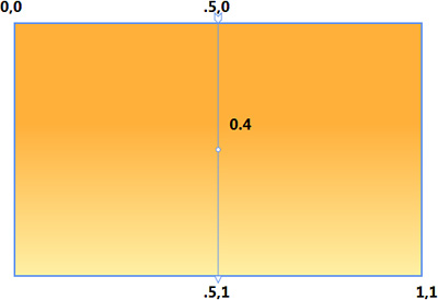
Every linear gradient is defined by a gradient axis. In the diagram, this is represented by the arrow-tipped line pointing straight down the middle. The axis is defined in terms of a coordinate space with 0,0 at the top-left corner and 1,1 at the lower right. By using the StartPoint and EndPoint properties of the LinearGradientBrush you can define this axis. By default they are set to 0,0 and 1,1, creating a diagonal gradient from the top-left corner to the bottom right. Because we want a vertical gradient, we have defined the start and end points as 0.5,0 and 0.5,1, respectively. After you have defined the axis, you should declare several instances of GradientStop. Each GradientStop has a Color and an Offset. The function of Color should be obvious. Offset is a decimal value from 0 to 1 that indicates where on the gradient axis the color should begin. If the first offset doesn’t begin at 0, a solid color will be rendered up to the point of the first offset. Likewise, if the last offset is less than 1, a solid color will be rendered after the offset. The color between two gradient stop offsets is a linear interpolation of the two. Looking back at Figure 19.4, you can see the offset at 0.4 and the resulting interpolation.
Besides linear gradients, WPF also offers radial gradient functionality through the RadialGradientBrush. Let’s spice up our media player’s Stop button:
Open
ColorsAndBrushes.xamland add the following markup to the bottom of the resources:<LinearGradientBrush x:Key="glossBrush" StartPoint="0.5,0" EndPoint="0.5,1"> <GradientStop Color="#00FFFFFF" Offset="0" /> <GradientStop Color="#66FFFFFF" Offset="1" /> </LinearGradientBrush> <RadialGradientBrush x:Key="redRadial" GradientOrigin="0.45,0.30"> <GradientStop Color="{StaticResource orangeColor}" Offset="0" /> <GradientStop Color="{StaticResource redColor}" Offset="1" /> </RadialGradientBrush>
Open the
MediaPlayer.xamland replace the contents of the Stop button with the following:<Border Width="18" Height="20" Background="{StaticResource redRadial}" CornerRadius="1" BorderBrush="{StaticResource controlOutline}" BorderThickness="1"> <Rectangle HorizontalAlignment="Center" VerticalAlignment="Top" Margin="0,1,0,0" Width="15" Height="10" Fill="{StaticResource glossBrush}" RadiusX="1" RadiusY="1" /> </Border>
Replace the contents of the
ToggleButtonwith the following:<Canvas Width="20" Height="20"> <!-- the speaker --> <Path Fill="{StaticResource redRadial}" Stroke="{StaticResource controlOutline}" StrokeLineJoin="Round"> <Path.Data> <PathGeometry> <PathFigure StartPoint="12,5" IsClosed="True"> <LineSegment Point="0,6" /> <PolyLineSegment Points="0,14 12,15 17,20" /> <ArcSegment Point="17,0" Size="30,30" /> </PathFigure> </PathGeometry> </Path.Data> </Path> <!-- highlight --> <Path Fill="{StaticResource glossBrush}"> <Path.Data> <PathGeometry> <PathFigure StartPoint="13,6" IsClosed="True"> <PolyLineSegment Points="1,7 1,11 17.5,11" /> <ArcSegment Point="16.5,2" Size="30,30" /> </PathFigure> </PathGeometry> </Path.Data> </Path> <!-- sound waves --> <Polygon Points="20,5 25,0 27,3" Fill="{StaticResource textBrush}" /> <Polygon Points="20,10 28,9 27,6" Fill="{StaticResource textBrush}" /> <Polygon Points="20,13 26,17 27,13" Fill="{StaticResource textBrush}" /> <Polygon Points="20,17 24,21 26,18" Fill="{StaticResource textBrush}" /> </Canvas>
Run the application and navigate to the music view. Observe the new look of the Stop and Mute buttons.
Like linear gradients, radial gradients are a little difficult to understand without a picture. Take a look at Figure 19.5 to see how the RadialGradientBrush works.
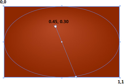
Similar to the LinearGradientBrush, all coordinates for the RadialGradientBrush are between 0,0 and 1,1. With a radial gradient, the gradient axis is defined by a line from the GradientOrigin to the perimeter of the ellipse. The gradient stops are relative to this axis and function the same as in a linear gradient. You can see from Figure 19.5 that the position of the gradient origin has been shifted from the exact center of the circle to produce the effect of a light source coming from the upper left. You can further customize the rendering of the gradient by setting the Center, RadiusX, and RadiusY properties. These properties allow you to move and resize the ellipse that governs how the gradient is drawn. Remember, all these properties must be set in terms of the 0,0 to 1,1 coordinate space.
Did you Know?
Declaring simple linear and radial gradients directly in XAML can be cumbersome. Although it is certainly possible to create brushes like this by hand, you will likely get the desired effects more quickly by using a tool such as Expression Blend or Adobe Illustrator to create them.
By the Way
Both LinearGradientBrush and RadialGradientBrush inherit from GradientBrush. This base class provides a number of properties that are common to both—GradientStops is the most obvious. However, several other lesser-used properties can be helpful in advanced scenarios. These include ColorInterpolationMode, MappingMode, and SpreadMethod.
WPF provides quite a few built-in brushes. One very powerful brush is DrawingBrush. It’s commonly used to paint backgrounds with complex images. Let’s take a look at how this is done.
Open
ColorsAndBrushes.xamland add the following brush definitions to the bottom of the resources:<LinearGradientBrush x:Key="chromeBrush" StartPoint="0.73,-0.053" EndPoint="0.341,0.967" SpreadMethod="Repeat"> <GradientStop Color="#FF727272" Offset="0.54" /> <GradientStop Color="#FFFFFFFF" Offset="1" /> <GradientStop Color="#FFFFFFFF" Offset="0" /> <GradientStop Color="#FFDADADA" Offset="0.46" /> <GradientStop Color="#FFFFFFFF" Offset="0.37" /> <GradientStop Color="#FFB7B7B7" Offset="0.30" /> <GradientStop Color="#FFEEEEEE" Offset="0.82" /> <GradientStop Color="#FF858585" Offset="0.90" /> <GradientStop Color="#FFFFFFF2" Offset="0.61" /> </LinearGradientBrush> <DrawingBrush x:Key="MediaControlPanelBackground" Stretch="UniformToFill"> <DrawingBrush.Drawing> <DrawingGroup> <GeometryDrawing Brush="{StaticResource chromeBrush}"> <GeometryDrawing.Pen> <Pen Brush="{StaticResource chromeOutline}" Thickness="0.5" /> </GeometryDrawing.Pen> <GeometryDrawing.Geometry> <RectangleGeometry RadiusX="25" RadiusY="25" Rect="0 0 400 50" /> </GeometryDrawing.Geometry> </GeometryDrawing> <GeometryDrawing Brush="{StaticResource yellowGradient}"> <GeometryDrawing.Geometry> <RectangleGeometry RadiusX="23" RadiusY="23" Rect="2 2 396 46" /> </GeometryDrawing.Geometry> </GeometryDrawing> <GeometryDrawing Brush="{StaticResource glossBrush}"> <GeometryDrawing.Geometry> <RectangleGeometry RadiusX="10" RadiusY="10" Rect="10 6 380 20" /> </GeometryDrawing.Geometry> </GeometryDrawing> </DrawingGroup> </DrawingBrush.Drawing> </DrawingBrush>
Open the
MediaPlayer.xaml. Locate the rootGridand change itsBackgroundproperty as follows:Background="{StaticResource MediaControlPanelBackground}"
Let’s make one more cosmetic change. Locate the volume slider and change its markup to match this:
<Slider Grid.Column="2"
        VerticalAlignment="Center"
        Margin="0,0,10,0"
        Minimum="0"
        Maximum="1"
        Value="{Binding Path=Volume, ElementName=mediaElement}" />
Run the application and navigate to the music view to see the changes. You should see something similar to Figure 19.6.

By the Way
Notice how the use of the SpreadMethod property affects the rendering of the LinearGradientBrush when it is used for the Pen in the outline of the drawing.
The DrawingBrush enables a wealth of complex scenarios that cannot be handled by simple gradient brushes. It allows you to specify an entire drawing that can then be used to paint anything that accepts a Brush. Notice the use of the Stretch property. Setting this to UniformToFill allows the drawing to scale to fit its target surface while preserving the aspect ratio. (This is analogous to the Stretch property on Viewbox.) DrawingBrush uses WPF geometries rather than shapes. The geometry classes are lower level and perform better, thus they are better suited to being contained by a brush. They have all the capabilities of shapes plus more.
The last brush we are going to discuss is the VisualBrush. It is by far the most powerful brush that WPF has to offer. Let’s see why:
Open
MediaPlayer.xamland replace theMediaElementwith the following markup:<Grid DockPanel.Dock="Top"> <Grid.RowDefinitions> <RowDefinition Height="3*" /> <RowDefinition Height="1*" /> </Grid.RowDefinitions> <MediaElement x:Name="mediaElement" VerticalAlignment="Bottom" LoadedBehavior="Manual" MediaOpened="mediaElement_MediaOpened" MediaEnded="mediaElement_MediaEnded" /> <Rectangle x:Name="reflection" Grid.Row="1" Width="{Binding Path=ActualWidth, ElementName=mediaElement}" MinHeight="24"> <Rectangle.Fill> <VisualBrush Visual="{Binding ElementName=mediaElement}" /> </Rectangle.Fill> <Rectangle.OpacityMask> <LinearGradientBrush EndPoint="0.5,0.5" StartPoint="0.5,0"> <GradientStop Color="#72000000" Offset="0" /> <GradientStop Color="#00FFFFFF" Offset="1" /> </LinearGradientBrush> </Rectangle.OpacityMask> </Rectangle> </Grid>
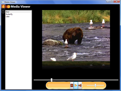
Run the application and navigate to the video view. Select a folder with videos and play a video. You should see something similar to Figure 19.7.
Did you Know?
Everything that inherits from UIElement has an OpacityMask property of type Brush. This means that you can apply arbitrary brushes to any element, which will affect its opacity. The LinearGradientBrush that has been applied to the Rectangle causes our reflection to fade out and appear more realistic.
The VisualBrush is WPF’s most powerful brush because it can paint its target with anything that inherits from Visual. Recall from earlier hours that Visual is one of the lowest-level base classes in WPF. Everything that can be visualized inherits from it. Thus, a VisualBrush can paint a surface with shapes, video, controls, and even 3D content, enabling many seemingly impossible scenarios. You can either create a visual specifically for the brush or use data binding as we have to bind the brush’s visual to another element in the UI. The effect of our VisualBrush binding is that we have a reflection of our playing video. One thing is wrong with our reflection, though. It doesn’t look quite right because it isn’t flipped like it would be in reality. We’ll fix this in the next hour.
Watch Out!
A VisualBrush is very powerful, but it is also the most resource-intensive option. Use it sparingly.
By the Way
Both DrawingBrush and VisualBrush inherit from TileBrush. This base class has a slew of additional properties for controlling alignment, tiling, and scaling of the brush when it is mapped onto a surface. TileBrush also has one other descendent, ImageBrush, which works similarly to the other brushes, but paints with an image.
In this hour we have finally given fair attention to WPF’s color and brush capabilities. Now that we have uncovered some of WPF’s hidden power, think back over earlier parts of the book when we used simple SolidColorBrushes. Every time we set a Background, Foreground, Fill, or Pen property, we were using WPF’s brush mechanism but only in the most simplistic way. With the knowledge you now have, you can customize any UI in seemingly endless ways just by changing the properties or type of a brush.