
What You’ll Learn in This Hour:
The rationale for triggers
Trigger types
Applying triggers to the Media Viewer
Triggers are the gateway to a wealth of WPF functionality. Up to now, our graphics and control templates have been fairly static and unresponsive to user input or changes in data. Triggers give us the power to change all that in a simple and intuitive way.
Triggers are a special feature of Style, ControlTemplate, DataTemplate, and FrameworkElement. Through the careful use of triggers, you can declaratively enable your UI and graphics to respond to mouse events, changes in dependency properties, and even changes in your application’s data model. Let’s look at one of the most common uses of a Trigger by adding some responsiveness to our media player buttons:
Open Visual Studio and load the Media Viewer project.
Open the
DefaultStyles.xamland navigate to themediaButtonStyle.Replace the existing
Stylewith the following markup:<Style x:Key="mediaButtonStyle" TargetType="{x:Type ButtonBase}"> <Setter Property="Template"> <Setter.Value> <ControlTemplate TargetType="{x:Type ButtonBase}"> <Grid Width="32" Height="32" Background="Transparent"> <ContentPresenter VerticalAlignment="Center" HorizontalAlignment="Center" /> <Border x:Name="highlight" Visibility="Hidden" CornerRadius="3" Background="{StaticResource mediaButtonHover}" BorderBrush="{StaticResource glossOutline}" BorderThickness="1"> </Border> </Grid> <ControlTemplate.Triggers> <Trigger Property="IsMouseOver" Value="True"> <Setter TargetName="highlight" Property="Visibility" Value="Visible" /> </Trigger> <Trigger Property="IsPressed" Value="True"> <Setter TargetName="highlight" Property="Opacity" Value="0.5" /> </Trigger> </ControlTemplate.Triggers> </ControlTemplate> </Setter.Value> </Setter> </Style>
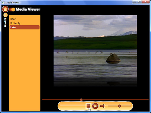
Run the application and navigate to the music view. Try mousing over the Stop and Mute buttons, as well as clicking them. The highlight effect should respond to your interactions. See Figure 22.1.
What we’ve done here is add a Triggers section to the ControlTemplate for our mediaButtonStyle. Here’s how it works:
When the
Buttonis created, WPF applies themediaButtonStyle.By default, the
highlight Borderis not visible.When the user mouses over the
Button, theIsMouseOverproperty becomesTrue.The first
Triggeris fired. ItsSetterlocates the element with the namehighlightand changes itsVisibilityproperty toVisible, causing theButtonto appear highlighted.When the user presses the
Button, theIsPressedproperty becomesTruein addition to theIsMouseOver.The second
Triggeris fired. ItsSetterchanges theOpacityof thehighlightto 0.5.When the user releases the mouse
Button, theIsPressedproperty becomesFalse.The second
Triggerhas itsSettereffect removed, causing theOpacityto return to 1.When the user moves their mouse off the
Button, theIsMouseOverproperty becomesFalse.The first
Triggerhas itsSettereffect removed, causing thehighlightto revert to aVisibilityofHidden.
Each Trigger in the collection is connected to a specific Property and Value of the control. When the specified Property matches the Value declared in the Trigger, it uses its Setters collection to alter the UI. When the trigger’s value ceases to match the property, the effects of the Setters are removed. If multiple triggers alter the same UI properties, the last one wins. The Setter elements used in a Trigger are the same as those used in a Style; however, most of the time you will need to specify a TargetName. This enables the Setter to reach into the ControlTemplate and alter the specific part of the template as needed. There’s no limit to the number of setters and triggers you can define. The only stipulation is that you must trigger and alter dependency properties only.
Did you Know?
If your triggers need to be activated by properties on elements within the ControlTemplate, use the SourceName property.
Let’s look at another, slightly different, application of triggers within our Media Viewer by fixing up the Play button:
Open the
MediaPlayer.xamlfile.Replace the contents of the Play button with the following:
<Grid Margin="4 0 0 0">
    <Polygon Fill="{StaticResource yellowGradient}"
             Stroke="{StaticResource chromeOutline}"
             Points="0,0 18,10 0,18">
        <Polygon.Style>
            <Style TargetType="{x:Type Polygon}">
                <Style.Triggers>
                    <Trigger Property="DataContext" Value="Playing">
                        <Setter Property="Visibility" Value="Hidden" />
                    </Trigger>
                </Style.Triggers>
            </Style>
        </Polygon.Style>
    </Polygon>
    <Canvas>
        <Rectangle Height="18"
                   Fill="{StaticResource yellowGradient}"
                   Stroke="{StaticResource chromeOutline}"
                   Width="6"/>
        <Rectangle Height="18"
                   Fill="{StaticResource yellowGradient}"
                   Stroke="{StaticResource chromeOutline}"
                   Width="6" Canvas.Left="8"/>
        <Canvas.Style>
            <Style TargetType="{x:Type Canvas}">
                <Setter Property="Visibility" Value="Hidden" />
                <Style.Triggers>
                    <Trigger Property="DataContext" Value="Playing">
                        <Setter Property="Visibility" Value="Visible" />
                    </Trigger>
                </Style.Triggers>
            </Style>
        </Canvas.Style>
    </Canvas>
</Grid>
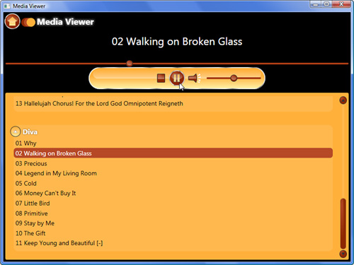
Run the application and navigate to the music view. Click the Play button. Click again to pause. You should see the graphics change as shown in Figure 22.2. (We wrote the code that sets the
DataContextin Listing 17.11.)
Style has a Triggers collection in addition to the one found on ControlTemplate. You may want to use this instead if your triggers are only responding to and altering properties on the control, rather than properties on elements within the ControlTemplate. This is the main difference in the uses of these two similar collections of triggers and the reason we have used it in this second example. In this case we want to change the Visibility of the two button graphics based on the state of the player. The Trigger is based on the DataContext of the Canvas/Polygon, which is inherited from the UserControl, where we set the different states. This makes the triggering simple.
As you’ve seen, basic triggers open up a lot of possibilities. However, sometimes triggering from simple dependency properties is not enough. The DataTrigger solves this problem by letting us use any data binding expression as the source of a trigger. Let’s fix our Mute button to see how this works:
Open
MediaPlayer.xamland locate theToggleButtonused for muting the sound.Replace the contents of the button with the following XAML:
<Grid>
    <Canvas Width="20"
            Height="20">
        <!-- the speaker -->
        <Path Fill="{StaticResource redRadial}"
              Stroke="{StaticResource controlOutline}"
              StrokeLineJoin="Round">
            <Path.Data>
                <PathGeometry>
                    <PathFigure StartPoint="12,5"
                                IsClosed="True">
                        <LineSegment Point="0,6" />
                        <PolyLineSegment Points="0,14 12,15 17,20" />
                        <ArcSegment Point="17,0"
                                    Size="30,30" />
                    </PathFigure>
                </PathGeometry>
            </Path.Data>
        </Path>
        <!-- highlight -->
        <Path Fill="{StaticResource glossBrush}">
            <Path.Data>
                <PathGeometry>
                    <PathFigure StartPoint="13,6"
                                IsClosed="True">
                        <PolyLineSegment Points="1,7 1,11 17.5,11" />
                        <ArcSegment Point="16.5,2"
                                    Size="30,30" />
                    </PathFigure>
                </PathGeometry>
            </Path.Data>
        </Path>
        <!-- sound waves -->
        <Polygon Points="20,5 25,0 27,3"
                 Fill="{StaticResource textBrush}" />
        <Polygon Points="20,10 28,9 27,6"
                 Fill="{StaticResource textBrush}" />
        <Polygon Points="20,13 26,17 27,13"
                 Fill="{StaticResource textBrush}" />
        <Polygon Points="20,17 24,21 26,18"
                 Fill="{StaticResource textBrush}" />
    </Canvas>
    <!--Off symbol-->
    <Canvas>
        <Canvas.Style>
            <Style TargetType="{x:Type Canvas}">
                <Setter Property="Visibility"
                        Value="Hidden" />
                <Style.Triggers>
                    <DataTrigger Binding="{Binding Path=IsMuted, ElementName=mediaElement}"
                                 Value="True">
                        <Setter Property="Visibility"
                                Value="Visible" />
                    </DataTrigger>
                </Style.Triggers>
            </Style>
        </Canvas.Style>
        <Ellipse Width="20"
                 Height="20"
                 Stroke="{DynamicResource bgBrush}"
                 Canvas.Left="0"
                 Canvas.Top="0"
                 StrokeThickness="3" />
        <Path Width="13.498"
              Height="16.446"
              Fill="{x:Null}"
              Stretch="Fill"
              Stroke="{DynamicResource bgBrush}"
              StrokeThickness="3"
              Canvas.Left="3.442"
              Canvas.Top="1.319"
              Data="M4.9424596,16.265143 L15.440304,2.8191997" />
    </Canvas>
</Grid>
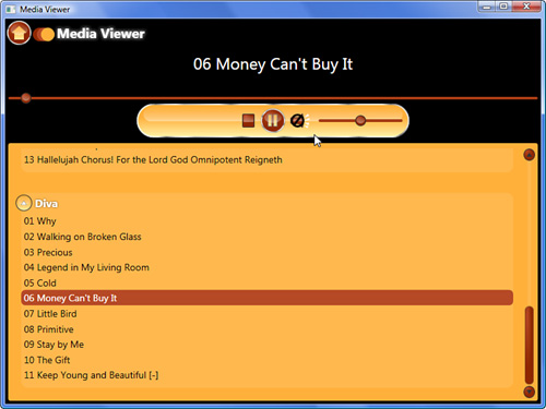
Run the application. Navigate to the audio or video view and try muting the sound. You should see something like Figure 22.3.
Notice how the “off symbol” Canvas has a Style with a DataTrigger. The two important properties of DataTrigger are Binding and Value. The Binding property allows you to use any valid data binding expression to declare what will be the source of the Trigger. When the bound property is equal to the Value, the Setters are applied. DataTrigger opens up the full power of data binding to be used in styles.
Did you Know?
Because the Binding property of a DataTrigger supports the full breadth of data binding features, you can use an IValueConverter to pump additional logic into your trigger bindings.
Besides their use in styles, data triggers are the main type of trigger used in the Triggers collection of a DataTemplate. The presence of these triggers allows you to change the appearance of rendered data based on property values of the data itself. To see how this works, we’ll revisit the Contact Manager.
Open the Contact Manager solution in Visual Studio.
Open the
SideBar.xamlfile and locate theDataTemplate.Within the
DataTemplate, find the secondBorderand add this attribute:x:Name="border"
Scroll down to the end of the
DataTemplateand add this markup:<DataTemplate.Triggers> <DataTrigger Binding="{Binding Address.State}" Value="Florida"> <Setter TargetName="border" Property="BorderBrush" Value="Orange" /> </DataTrigger> </DataTemplate.Triggers>
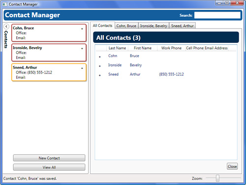
Run the application. Create a contact with a Florida address and save. You should see something similar to Figure 22.4.
EventTrigger is the final type of trigger that WPF currently offers. Essentially, its purpose is to enable declarative control over animations that are triggered by routed events. Let’s see how this works:
Return to the Media Viewer and open
DefaultStyles.xamland locate thefancyButtonStyle.Replace this style with the markup found in Listing 22.1.
Run the application and navigate to the music or video view. Mouse over the Play button and observe the animation. You should also see the same effect applied to the Home button in the application’s header.
Example 22.1. fancyButtonStyle
<Style x:Key="fancyButtonStyle"
       TargetType="{x:Type Button}">
    <Setter Property="Margin"
            Value="4" />
    <Setter Property="Template">
        <Setter.Value>
            <ControlTemplate TargetType="{x:Type ButtonBase}">
                <Grid HorizontalAlignment="Center"
                      VerticalAlignment="Center">
                    <Ellipse x:Name="chromeEdge"
                             Margin="-2"
                             Width="36"
                             Height="36"
                             Fill="{StaticResource chromeBrush}"
                             Stroke="{StaticResource chromeOutline}"
                             StrokeThickness="0.5"
                             RenderTransformOrigin="0.5,0.5">
                        <Ellipse.RenderTransform>
                            <RotateTransform />
                        </Ellipse.RenderTransform>
                    </Ellipse>
                    <Ellipse x:Name="bg"
                             Width="32"
                             Height="32"
                             Stroke="{StaticResource redBrush}"
                             Fill="{StaticResource redRadial}" />
                    <ContentPresenter HorizontalAlignment="Center"
                                      VerticalAlignment="Center" />
                    <Rectangle x:Name="gloss"
                               Margin="3.5"
                               Width="25"
                               Height="16"
                               Stroke="{StaticResource bgBrush}"
                               StrokeThickness="0"
                               RadiusX="20"
                               RadiusY="10"
                               Fill="{StaticResource glossBrush}"
                               VerticalAlignment="Top" />
                </Grid>
                <ControlTemplate.Triggers>
                    <EventTrigger RoutedEvent="UIElement.MouseEnter">
                        <BeginStoryboard>
                            <Storyboard Storyboard.TargetName="chromeEdge"
                                        Storyboard.TargetProperty="RenderTransform.Angle">
                                <DoubleAnimation To="90"
                                                 Duration="0:0:0.10" />
                            </Storyboard>
                        </BeginStoryboard>
                    </EventTrigger>
                    <EventTrigger RoutedEvent="UIElement.MouseLeave">
                        <BeginStoryboard>
                            <Storyboard Storyboard.TargetName="chromeEdge"
                                        Storyboard.TargetProperty="RenderTransform.Angle">
                                <DoubleAnimation To="0"
                                                 Duration="0:0:0.10" />
                            </Storyboard>
                        </BeginStoryboard>
                    </EventTrigger>
                    <Trigger Property="IsPressed"
                             Value="True">
                        <Setter Property="RenderTransform"
                                TargetName="chromeEdge">
                            <Setter.Value>
                                <TransformGroup>
                                    <RotateTransform Angle="90" />
                                </TransformGroup>
                            </Setter.Value>
                        </Setter>
                    </Trigger>
                </ControlTemplate.Triggers>
            </ControlTemplate>
        </Setter.Value>
    </Setter>
</Style>
Animation is a complex topic and is discussed in depth in Hour 23, so we won’t focus on that right now. The important part of this code is the EventTrigger. Notice the important RoutedEvent property, which is used to declare which event will trigger the action. Rather than having a collection of Setter elements, EventTrigger has a collection of TriggerActions. There are several inheritors of TriggerAction. We’ve used the BeginStoryboard TriggerAction to start an animation. Table 22.1 lists the other types of actions and their purposes.
Table 22.1. TriggerAction Inheritors
Name | Description |
|---|---|
| Begins an animation |
| Plays a sound file |
| Pauses an animation |
| Removes an animation |
| Resumes a paused animation |
| Skips the animation ahead to a specified time |
| Changes the speed of an animation |
| Skips the animation ahead to the end of its fill |
| Stops an animation |
As you can see, many things can be triggered with an EventTrigger. Because WPF defines a wealth of routed events (pretty much every important event), it is easy to wire up animation-related actions to almost anything.
If you look back at Listing 22.1, you’ll notice that we used two types of triggers in our ControlTemplate: EventTrigger and Trigger. In many cases, WPF allows the use of different types of triggers together. However, WPF places some restrictions on where you can use different types of triggers. Table 22.2 lists the different trigger collection locations and pairs them with the appropriate type of triggers to use.
Table 22.2. Trigger Usage
Trigger Collection | Allowed Trigger Types |
|---|---|
|
|
| All trigger types allowed. |
| All trigger types allowed. |
| All trigger types allowed, but it is generally a good practice to limit to |
From Table 22.2 it is obvious that the most limiting collection is FrameworkElement.Triggers. Otherwise, WPF is very flexible.
Sometimes a situation arises in which a simple Trigger can’t express the conditions under which a collection of setters should be applied. For these scenarios, WPF provides the MultiTrigger and the MultiDataTrigger. These represent more advanced versions of Trigger and DataTrigger, respectively. Instead of having a simple Property or Binding and a Value, they each have a collection called Conditions. To leverage this functionality, you add multiple Condition instances to this collection. When all the conditions are met, the setters will be applied. Here’s an example of what some XAML might look like for the Contact Manager:
<DataTemplate DataType="{x:Type local:Contact}">
    <Border x:Name="border"
            Background="Green">
        <TextBox Foreground="White"
                 Text="{Binding LookupName}" />
    </Border>
    <DataTemplate.Triggers>
        <MultiDataTrigger>
            <MultiDataTrigger.Conditions>
                <Condition Binding="{Binding Organization}"
                           Value="Blue Spire Consulting, Inc." />
                <Condition Binding="{Binding Address.City}"
                           Value="Tallahassee" />
            </MultiDataTrigger.Conditions>
            <MultiDataTrigger.Setters>
                <Setter TargetName="border"
                        Property="Background"
                        Value="Blue" />
            </MultiDataTrigger.Setters>
        </MultiDataTrigger>
    </DataTemplate.Triggers>
</DataTemplate>
In this scenario, the border’s background would be changed from green to blue only if the Contact.Organization property was equal to “Blue Spire Consulting, Inc.” and the Contact.Address.City was equal to “Tallahassee.” If either of these two conditions is not met, the background remains green.
Did you Know?
A Setter can be used to change out an entire Style or ControlTemplate. Often times a complex Style will use triggers to switch out different control templates depending on the values of the control. Just be aware that if the setter is part of a Style, it cannot switch itself out. The same applies to templates.
Triggers are a very powerful feature of WPF. They greatly expand the capabilities of Styles, ControlTemplates, and DataTemplates, allowing them to be dynamic and responsive. FrameworkElement is also extended with trigger capabilities for very specific animation-related scenarios. By combining triggers with animations, you can truly harness the power of WPF.