
Hour 11. Learning About Lists
List elements are used often in web development. Their versatility helps developers display content, navigation, and links with minimal effort. jQuery Mobile uses both ordered and unordered lists to display content and links in a mobile friendly way, while continuing the original ease of use.
Creating Standard and Inset Lists
While you may already be familiar with standard list behavior in HTML, jQuery Mobile brings some new options to list behavior and display. Whether you want to create a list that takes up the entire screen or create a list that appears to jump off the page, you can do it with jQuery Mobile.
Standard lists behave similar to buttons; they take up the full amount of space available to them. Inset lists still take up the full amount of space, but add rounded corners and a shadow to make the list appear to jump off the page.
Creating a Standard List
Using HTML, you can make a standard list by creating a ul element and placing li elements inside it. To make a standard list in jQuery Mobile you follow the same setup only you need to add an attribute of data-role="listview" to the ul element. Listing 11.1 shows the creation of a standard list.
Listing 11.1 Creating a Standard List
1: <ul data-role="listview">
2: <li data-role="list-divider">List Items</li>
3: <li>I am a list item!</li>
4: <li>I am another list item!</li>
5: <li data-role="list-divider">List Items with Links</li>
6: <li><a href="#">I am a link in a list item!</a></li>
7: <li><a href="#">I am another link in a list item!</a></li>
8: </ul>
On line 1 a standard list is created with the ul element and styled by jQuery Mobile because of the data-role="listview" attribute. If you do not include the data-role="listview" attribute, the standard list styles will be applied instead of the jQuery Mobile styles. This can be useful if you want to use a standard list without the styles that jQuery Mobile adds.
Lines 2 and 5 are both li elements, but they contain an extra attribute of data-role="list-divider". When used, this attribute changes the display styles of the li element to help create grouped content. The text within the element is displayed like a title to help users understand the grouping.
Lines 3 and 4 show some li elements that have been created. These two elements will be styled with a darker gray background and will not be clickable. Lines 6 and 7, however, will be styled with a lighter gray background and will be given an icon on the right to indicate that they are clickable. When links within a standard list are clicked, jQuery Mobile makes an AJAX request to the target and injects the results into the DOM and then triggers a page transition to bring it into view.
Figure 11.1 shows the standard list we made rendered in a mobile browser. Just like buttons and toolbars, the styling may be a little different based on the mobile browser you are using.
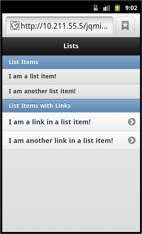
Figure 11.1 A standard list rendered in a mobile browser
Now that we have a standard list created, let’s take a look at creating an inset list.
Creating an Inset List
To create an inset list, you start by creating a standard list and then add an attribute of data-inset="true" to the ul element. This means that we could use the code from Listing 11.1 and only change the first line to make our list inset:
<ul data-role="listview" data-inset="true">
Figure 11.2 shows what our one-line change has done to our list.
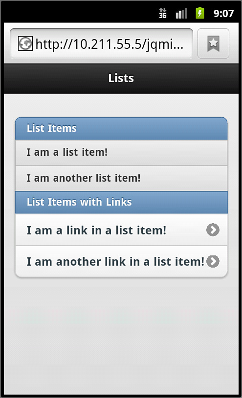
Figure 11.2 An inset list rendered in a mobile browser
Now that we know how jQuery Mobile styles standard lists and how to create inset lists, let’s learn about the extras we can do with lists.
Adding Extras to Lists
You may be wondering what extras can be added to a list. There are quite a few things we can do. We can add numbers, insert a counter, include thumbnail images, include an icon, and even create split lists. Let’s start with using numbered lists.
Using Numbered Lists
To create a numbered list you need to start with an ol lement and include li elements inside it. Each li element is automatically numbered based on the position it is placed in the ol element. Listing 11.2 shows the creation of a numbered list.
Listing 11.2 Creating a Numbered List
1: <ol data-role="listview">
2: <li data-role="list-divider">Numbered List Items with Links</li>
3: <li><a href="#">Polar</a></li>
4: <li><a href="#">Grizzly</a></li>
5: <li><a href="#">Brown</a></li>
6: <li><a href="#">Black</a></li>
7: </ol>
On line 1 we begin with an ol element that has an attribute of data-role="listview" to apply the jQuery Mobile styles to make this a numbered list. Just like the standard list if you omit the data-role="listview" attribute the styles will not be applied and it will remain an ordered list instead of being rendered as a numbered list.
Line 2 contains an li element that contains an attribute of data-role="list-divider". This works the same as it does in the standard list allowing this particular element to act as a separator. Even though it is an li element inside an ol element, it will not be numbered.
Lines 3-6 show four li elements with a elements with some text inside them. Just like the standard list, these elements will be styled with arrows on the right indicating that they can be clicked and tapped. Line 7 closes the ol element and completes our numbered list.
Figure 11.3 shows what a numbered list looks like on a mobile browser.
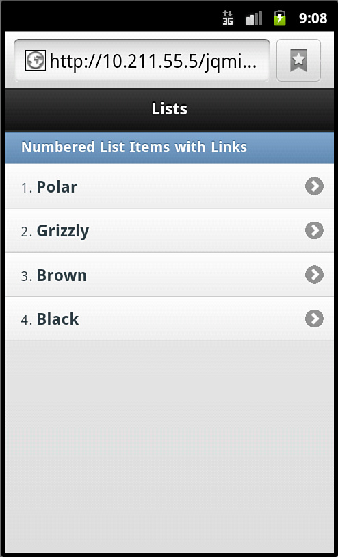
Figure 11.3 A numbered list rendered in a mobile browser
While this numbered list was not set up as an inset numbered list, it can be created as one by using the data-inset="true" attribute on the ol element.
Another thing we can do with numbers is add count bubbles.
Adding a Count
A style that is popular with some messaging or email apps is to display the number of items, or count of items, contained within a subsection or link. You can replicate this style using an element with class="ui-li-count" inside your li elements. Listing 11.3 shows a standard list with a count.
Listing 11.3 Implementing a Count in a Standard List
1: <ul data-role="listview">
2: <li data-role="list-divider">List Items with Links and a Count</li>
3: <li><a href="#">Bugs<span class="ui-li-count">5</span></a></li>
4: <li><a href="#">Comments<span class="ui-li-count">12</span></a></li>
5: <li><a href="#">Suggestions<span class="ui-li-count">8</span></a></li>
6: <li><a href="#">Tickets<span class="ui-li-count">27</span></a></li>
7: </ul>
Since we’ve already covered the basic setup of a standard list you should know what lines 1 and 2 are doing. Lines 3-6 should also look familiar as they contain li elements that each have an a element inside them. However, inside the a element is some text followed by a span element with an attribute of class="ui-li-count". You can see that each line has a different number inside the span element. This is the number that will appear in a “bubble” on the right side of the rendered list item bar. Figure 11.4 shows what this standard list looks like when rendered.
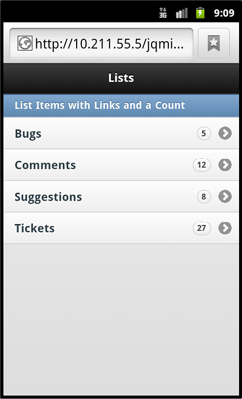
Figure 11.4 A standard list with a count applied rendered in a mobile browser
We are not limited to only adding a count or using a numbered list, we can also add icons and thumbnail images.
Using Icons and Thumbnails
When you are styling a list you may want to include an icon or thumbnail image with each item in the list. This is not only possible but is easy to do.
Adding a Thumbnail
A thumbnail image is a preview or smaller version of a full-sized image. Thumbnail images can be added to list items by including them inside an a element in your li element. Listing 11.4 shows a snippet of code taken from thumbnail_list.html that gives an example of how to add thumbnail images inside li elements.
Listing 11.4 Adding Thumbnails to List Items
1: <ul data-role="listview">
2: <li data-role="list-divider">List Items with Links and Thumbnails</li>
3: <li><a href="#"><img src="thumb_bridge.jpg" alt="Bay Bridge" />Bridges</a></li>
4: <li><a href="#"><img src="thumb_food.jpg" alt="Food" />Food</a></li>
5: <li><img src="thumb_sleepy.jpg" alt="People" />People</li>
6: <li><img src="thumb_grass.jpg" alt="Grass" />Nature</li>
7: </ul>
Lines 3 and 4 show li elements that contain an a element within them. When using links inside lists, the visual style will be changed for list items containing them. A hover and click-state style will be applied to the list item giving a visual clue to the user that it is a link. Within the a element is an img element that will be used at the thumbnail. After the img element is some text that will be displayed to the right of the thumbnail.
Lines 5 and 6 show that thumbnails can also be applied to li elements that do not contain an a element within them. These lines are also set up with the image first and then the text that should be displayed with the image. Figure 11.5 shows what the list items look like when they have thumbnail images applied to them.
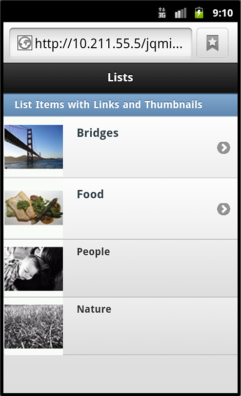
Figure 11.5 Using thumbnails with and without links
jQuery Mobile automatically reduces the size of whatever image is specified down to 80×80 pixels. If you elect to use an image smaller than 80 pixels wide or tall, the image is not resized but is used as is. Even though image resizing is handled somewhat automatically, it is still a good idea to presize your images to keep the file size of your image down and to format them how you want them.
Adding an Icon
Icon images are similar to thumbnails only much smaller. Where the thumbnail was an 80×80 pixel image, an icon is a 16×16 pixel image. While some automatic resizing is applied, I highly recommend you use resized images to save you from some possible image overlap issues with the text you include in your list item.
To use an icon, you start the same way you do when applying a thumbnail, only on the img element you need to add a class="ui-li-icon" attribute. Listing 11.5 shows a snippet of code from icon_list.html that shows an example of adding icons to list items.
Listing 11.5 Adding Icons to List Items
1: <ul data-role="listview">
2: <li data-role="list-divider">List Items with Links and Thumbnails</li>
3: <li><a href="#"><img class="ui-li-icon" src="icon_bridge.jpg" alt="Bay Bridge" />Bridges</a></li>
4: <li><a href="#"><img class="ui-li-icon" src="icon_food.jpg" alt="Food" />Food</a></li>
5: <li><img class="ui-li-icon" src="icon_sleepy.jpg" alt="People" />People</li>
6: <li><img class="ui-li-icon" src="icon_grass.jpg" alt="Grass" />Nature</li>
7: </ul>
The code should look familiar, since it is a modification to the code from Listing 11.4. In fact, the only change we really made was adding the class="ui-li-icon" attribute to the img elements, and changing the images that are used. While these were minor changes, they have quite an impact on the visible space used as Figure 11.6 demonstrates.
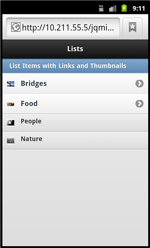
Figure 11.6 Icons used with list items
Note: Rounded Border Clipping
When using links inside lists, an arrow is automatically added and a background is applied behind the arrow that is actually square with all corners rounded to give it a circular appearance. Some devices and browsers clip the rounded background slightly and may make the image appear somewhat jagged.
Now that we have made our lists look more exciting and visually descriptive, let’s make them even more useful by using a split list.
Creating a Split List
A split list is a list that contains list items that have more than one link in them. When you place two a elements inside an li element, jQuery Mobile automatically creates a split list.
The first a element takes the majority of space of the list item leaving the second a element a small section with space for an icon on the right side of the list item. Because split lists are automatically created by adding a second link, you can mix other list extras together. Listing 11.6 shows a snippet of code used to make a split list.
Listing 11.6 Creating a Split List
1: <ul data-role="listview" data-split-theme="e">
2: <li data-role="list-divider">Split List</li>
3: <li>
4: <a href="#">
5: <h3>First link in a split list</h3>
6: <p>The icon on the right is the default icon</p>
7: </a>
8: <a href="#" title="Second Link">Second link in a split list</a>
9: </li>
10: <li>
11: <a href="#">
12: <img class="ui-li-icon" src="icon_bridge.jpg" alt="Bay Bridge" />
13: <h3>Use with an icon</h3>
14: <p>Yep, you can use icons with split lists</p>
15: </a>
16: <a href="#" title="Another link">Another split list link</a>
17: </li>
18: <li>
19: <a href="#">
20: <img src="thumb_grass.jpg" alt="Grass" />
21: <h3>Use with a thumbnail</h3>
22: <p>Wow, you can also use thumbnails in split lists.</p>
23: </a>
24: <a href="#" title="Titles are accessible">Another split list link</a>
25: </li>
26: </ul>
There is a lot going on here so we’re going to walk through most of the lines of code. When looking at line 1, in the previous examples we had only added the data-role="listview" attribute; this time we added data-split-theme="e". This changes the colors that will be applied to the icon used on the second link in the split list. Each theme swatch is assigned a different letter and is accessed by passing this letter into the attribute.
Line 2 does not have any surprises; it is an li element with the data-role="list-divider" attribute making it a differently styled list item.
Lines 3-9 show the first list item in our split list. Line 3 is the opening li element, and line 4 is the opening a element for the first link. To change the formatting up a little, Line 5 contains an h3 element that will style the text inside as a large bold title, while the text in the p element on line 6 will be displayed as a subtitle. Line 7 closes the first link, and line 8 contains the second link. The title attribute inside the a element on this line is important for accessibility. This is important because any text placed between the opening a element and closing a element will be removed. I placed the text “Second link in a split list” in-between the opening and closing a element, but when the page is rendered this text will not be shown, so having the title attribute set with a value is strongly recommended.
Lines 10-17 show another list item in our split list. Line 10 starts us out with an opening li element, and line 11 contains an opening a element to set up our first link. Line 12 shows that we are including an img element with an attribute of class="ui-li-icon", which is the required class for using an icon inside our list item. On line 13 we are using an h3 element again to add some title text to our list item, making line 14 a p element displaying some subtitle text. Line 15 closes the a element, and line 16 shows the second link being created.
Lines 18-25 show the last list item in our split list. This list item starts out like the other with an opening li element on line 18 and the opening a element on line 19. Line 20 then uses an img element that will be styled as a thumbnail for the list item. Line 21 is an h3 element that is used for title text, and line 22 is our p element that is used for subtitle text. Line 23 is the closing a element for our first link, and line 24 contains the a element for the second link. Line 25 is the closing li element for this list item, leaving line 26 to close out the entire split list.
In Figure 11.7 we can see what our split list that contains a plain list item, a list item with an icon, and a list item with a thumbnail looks like when rendered on a mobile browser.
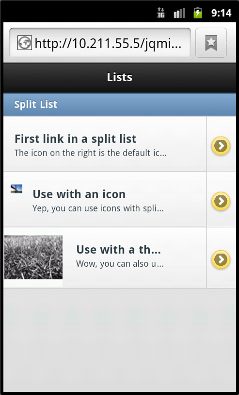
Figure 11.7 Split lists can be combined with other list item extras.
The default icon that is shown for the second link in the split list is an arrow. If you would prefer to use a different icon you can add another by adding another attribute to the ul element specifying one of the standard icon names. For example, if I wanted to change the default icon to a star, I would add data-split-icon="star" to the ul element for the list. Using the default settings of jQuery Mobile, you cannot specify more than one icon per list. That means that you have to overwrite styles inside your CSS if you want to use different icons.
Now that we’ve seen the extras that we can add to a list, let’s take a look at adding a search feature to it.
Searching List Content
If you are using a list to display a large number of items you may want to include a search filter to help users navigate through your selection to find what they need.
Creating a search filter is easier than you might think. All you need to do is add an attribute of data-filter="true" to the ul element of your list. Listing 11.7 shows a list with a search filter applied.
Listing 11.7 Adding a Search Filter to a List
1: <ul data-role="listview" data-filter="true">
2: <li data-role="list-divider">Signed Bands</li>
3: <li>Planned obscolencense</li>
4: <li>S.E.P. (Scortched Earth Policy)</li>
5: <li>Ground Pounder</li>
6: <li>Decibel Hertz</li>
7: <li>Ultra Violent Lights</li>
8: <li>Southern Tempo</li>
9: <li>Candy Lab</li>
10: <li>Brother Tobias</li>
11: <li>Silent Squall</li>
12: <li>Red Air Day</li>
13: <li>Fourty Floor</li>
14: <li>Marvelous Makeover</li>
15: <li>Anthem</li>
16: <li>Groupraiser</li>
17: <li>Nine Knights</li>
18: <li>Modulation</li>
19: <li>Saw the Sine</li>
20: </ul>
On line 1 the data-filter="true" attribute was applied on the opening ul element. Line 2 is an li element that contains a data-role="list-divider". We already know that this creates a list divider, but when using the search filter, the list divider is visible only as long as at least one thing comes back as a result. Lines 3-19 show li elements being created with different names in them for the purpose of demonstrating the search filter. Figure 11.8 shows what the list looks like with the search filter.
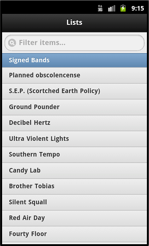
Figure 11.8 A populated list with a search filter to help find content
As you type into the search filter box, the displayed list automatically hides list items based on matches between the entered text and the list item text content. Text entered into the search filter is not case sensitive and filters even on partial matches. For example, if you were to put the code from Listing 11.7 into a page and type “rou” into the search filter, it would remove all entries except for “Ground Pounder” and “Groupraiser”.
Just in case you were wondering, the initial text inside the search filter can be changed from the default “Filter items...”. To change the text, you need to include the data-filter-placeholder="" attribute on your ul element with the value set to what you want displayed. You can also use search filters on inset lists. Listing 11.8 is an example of using an inset list with customized text in the search filter.
Listing 11.8 Customizing the Search Filter Text on an Inset List
1: <ul data-role="listview" data-filter="true" data-filter-placeholder="Find Album..." data-inset="true">
2: <li data-role="list-divider">Discography</li>
3: <li>Inverted Distortion</li>
4: <li>Tekknowlegy</li>
5: <li>Spectralillium</li>
6: <li>Bar Foo</li>
7: <li>Vigilante Hyperbole</li>
8: <li>4 Chords and 88 Keys</li>
9: </ul>
While the list data has changed, the only major code change to note is on line 1. Included in the ul element is data-filter-placeholder="Find Album..." and data-inset="true". While those changes are easy and small, they change things up nicely. Figure 11.9 shows what our customized text and inset list looks like now.
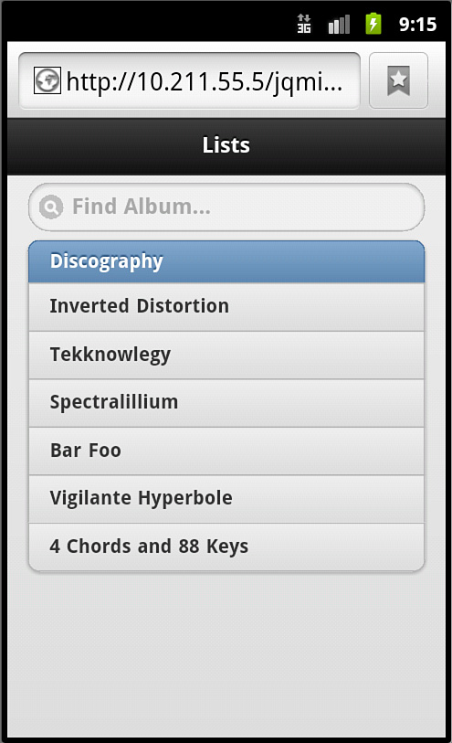
Figure 11.9 An inset list with customized search filter text
The last thing we are going to look at this hour is using a list within a form.
Using a List Within a Form
While you can always use a div element to help contain and style your form elements, another option is to use a list.
Using a list with a form is straightforward; you begin with a form element and then use list elements inside it to contain your form data. Listing 11.9 shows a form using a list.
Listing 11.9 Using List and Form Elements
1: <form name="login" id="login" action="process.php" method="POST">
2: <ul data-role="listview">
3: <li>
4: <label for="username">Username:</label>
5: <input type="text" name="username" id="username" value="" />
6: </li>
7: <li>
8: <label for="password">Password:</label>
9: <input type="password" name="password" id="password" value="" />
10: </li>
11: <li>
12: <input type="hidden" name="hiddenInput" id="hiddenInput" value="secret message" />
13: <input type="submit" name="loginSubmit" id="loginSubmit" value="Login" />
14: </li>
15: </ul>
16: </form>
Line 1 shows a form element with relevant attributes being set up. Line 2 is where we start our list by using a ul element with the data-role="listview" attribute. Line 3 is a starting li element that wraps both the label and input elements found on lines 4 and 5. Line 6 is the closing tag of the li element. Lines 7-10 are similar, showing another li element that contains a label and input element inside it. Line 11 begins another li element this time containing a hidden form input on line 12 and a submit button on line 13. Lines 14 and 15 are the closing elements for li and ul elements, respectively. Line 16 shows the closing tag of our form element.
This form was previously built using div elements with data-role="fieldcontain" attributes to help with the appearance of the form elements. By replacing the div elements with a list we changed the appearance of the form with gradient backgrounds and borders. Figure 11.10 shows what the form styled with a list looks like on a mobile browser.

Figure 11.10 The appearance of your form changes when used with a list
Summary
In this hour you learned how lists work when used with jQuery Mobile. Lists can be displayed either in full screen or inset, and both ul and ol elements can be used and styled with jQuery Mobile.
You learned about adding extras such as thumbnails, icons, and a count to list items. You also learned about split lists and how to use them with the other extras that can be added to list items.
You saw how to add a search filter to your list, how it works with list dividers, and how to customize the initial search filter text. You also learned that you can combine a list with a form to include a different visual style and that it can be used in place of div elements with the data-role="fieldcontain" attribute.
Q&A
Q. Is there a reason why I would or would not want to use inset lists?
A. I believe this comes down to personal preference and style. An example of when inset lists come in handy is when creating complex layouts that use media queries to hide or show content based on screen size. If your screen layout splits into multiple columns, a standard list will fill up the entire column but not include any side borders. This can give your list an incomplete feel.
Q. Do I always have to enter the number to display in the count manually?
A. No. But to make the number dynamic you need to include either a backend language to write the value out, or use some JavaScript to change the values on an event such as pageInit() or pageCreate().
Q. I included a thumbnail that was shorter than 80px. It looks wrong. Isn’t it supposed to center my image?
A. Unfortunately jQuery Mobile will not figure out the vertical center of your image. Instead it places it at the top and leaves empty space at the bottom. To fix this I suggest trimming your image manually in some photo-manipulation software and then placing it on either a transparent background or other color so that the image is 80×80 px with your image centered. If you look at Figure 11.5 you can see that is what I had to do with my thumbnail images because they came out at 80×60 px.
Workshop
The workshop contains a quiz and some exercises to help you check your comprehension and understanding.
Quiz
1. True or False: It is impossible to stop jQuery Mobile from styling your lists.
2. True or False: You can mix multiple list extras together to create uniquely styled list items.
3. How do you create a split list?
4. What is the default size for an icon when used with a list?
5. How do you add a count to a list item?
Answers
1. False. jQuery Mobile always checks for a data-role="listview" element on the ul element of your list before it styles it. If you do not include the attribute your list will use default styles instead of the jQuery Mobile ones.
2. True. You can mix almost any of the various extras together to make your lists stand out and perform the tasks you need. This includes mixing thumbnails with a count, or icons with a split list, and so on.
3. To create a split list you need to include two a elements inside a list item.
4. The default size of an icon is 16×16 pixels. This is different from the default icon size used with buttons, which is 18×18 pixels.
5. You create a count by adding an element with an attribute of class=" ui-li-count" that contains a number. This number is then displayed on the right side of the list item when rendered.
Exercises
1. Create either an inset or standard list and apply a thumbnail and a count.
2. Create a form and try adding various form elements to different list items. Experiment with how the list changes when displayed as an inset list.
3. Create an address book using list dividers and a search filter to quickly find a name that you are looking for.