
RichFaces is a JSF-based framework of GUI components that can easily be integrated into web applications, allowing rich user interfaces to be built up easily. RichFaces provides AJAX support for these components without the need for the developer to write JavaScript. RichFaces also provides skinning support, allowing the look and feel of RichFaces components to be quickly changed via a single configuration setting. All of this functionality is, of course, provided in a cross platform manner and works with Internet Explorer, Firefox, Safari, and Opera.
RichFaces comes bundled with each Seam release, so if you are developing Seam applications and wish to use RichFaces, there are no additional downloads needed. Sometimes, however, RichFaces is updated outside of the release schedule for Seam. So newer versions of RichFaces may be available, other than those supplied with Seam. In such a case, RichFaces can be downloaded from http://www.jboss.org/jbossrichfaces/downloads/.
Configuring an application to use RichFaces consists of two steps:
Adding JAR files to the web application.
Configuring the application's XML resources.
RichFaces is implemented as three JAR files, namely richfaces-api.jar, richfaces-impl.jar, and richfaces-ui.jar. Different versions of RichFaces may have the version number embedded in the file name (for example, richfaces-api-3.2.1.jar).
These JAR files are to be added to an application's WEB-INFlib folder, in order to make use of RichFaces. In an application generated by SeamGen, this is done for you automatically when you create a new project.
In addition to ensuring that the RichFaces JAR files are on your web application's classpath, the application's web.xml file needs to be configured. Within a Seam application, the only change that needs to be done to the web.xml file, is to specify which application skin is required. When generating a Seam application with SeamGen, the generator asks which skin is to be used for the application. The default, Blue Sky, uses the following settings within web.xml:
<context-param>
<param-name>org.richfaces.SKIN</param-name>
<param-value>blueSky</param-value>
</context-param>
Application skins allow the look and feel of the application to be quickly changed at development time by modifying the org.richfaces.SKIN parameter within the web.xml file. Changes to this parameter cause RichFaces to use different CSS values, to change colors, fonts, and so on.
RichFaces is supplied with the following eight different skins. To use any of these skins, simply set the org.richfaces.SKIN parameter value to the name of the skin required.
Within RichFaces, all of these skins are defined within the files of the <name>/skin.properties within the META-INF/skin folder of the richfaces-impl.jar file. It is therefore important that the correct capitalization of skin names is used—that is, the skin names are case-sensitive.
Note
It's possible to create custom skins easily using RichFaces if you want to tailor your application differently from the nine available skins. Developing skins involves creating .properties files that define the CSS properties for RichFaces components.
Further details on how to create different skins can be found on the RichFaces web site: http://www.jboss.org/file-access/default/members/jbossrichfaces/freezone/docs/devguide/en/html_single/index.html#Skinnability.
To use RichFaces components within a Facelets page, we need to define the namespace for the RichFaces components. This is achieved by specifying the namespace xmlns:rich=http://richfaces.org/rich within the <html/> or <ui:composition/> tags of the Facelets file, as shown in the following code snippet.
<ui:composition xmlns="http://www.w3.org/1999/xhtml"
xmlns:s="http://jboss.com/products/seam/taglib"
xmlns:ui="http://java.sun.com/jsf/facelets"
xmlns:f="http://java.sun.com/jsf/core"
xmlns:h="http://java.sun.com/jsf/html"
xmlns:rich="http://richfaces.org/rich"
template="layout/template.xhtml">
RichFaces contains over 70 different components. These components allow many different types of rich user interfaces to be built, using calendars, data tables, selectors, drag-and-drop, and so on.
A full list of RichFaces components can be found at http://www.jboss.org/file-access/default/members/jbossrichfaces/freezone/docs/tlddoc/index.html.
We'll now cover some of the more common controls in depth.
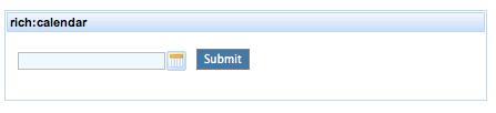
The <rich:calendar /> control allows pop-up calendars to be displayed within web pages, allowing users to easily select dates. The date selected in the calendar can be passed back to a member of a Seam component, allowing full integration between the web site view technology and the server-side components.
To add a <rich:calendar /> control to a web page, the following type of code should be added to the Facelets page.
<rich:calendar value="#{demo.theDate}" >
</rich:calendar>
This code will add an edit box with a calendar button to its right, as shown in the following image:
In this instance, the value of the calendar will be bound to the variable, theDate, within a Seam component called demo. In its simplest form, this Seam component would be written as:
package com.davidsalter.richfaces.entity;
import java.io.Serializable;
import java.util.Date;
import org.jboss.seam.annotations.Name;
@Name("demo")
public class Demo implements Serializable {
private Date theDate;
// Getters and setters omitted for brevity.
}
Note
The download bundle for Chapter 6 of this book contains the sample RichFaces demonstration application. The screenshots and code samples are taken from this application.
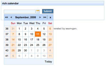
When the calendar button to the right of the calendar edit box is clicked, a pop-up calendar is displayed, as shown in the following screenshot. The calendar shows the current date and allows the user to select dates, change the month and year, and so on—all of the standard functionality you would expect a calendar to support.
The <rich:calendar /> component also supports different JavaScript hooks allowing JavaScript to be executed when events occur within the panel. The most common of these hooks are listed in the following table.
|
Hook |
Description |
|---|---|
|
onChanged |
Invoked when the calendar date is changed |
|
onCollapse |
Invoked when the pop-up calendar collapses |
|
onCurrentDateSelected |
Invoked when the current date is selected |
|
onDateMouseOut |
Invoked when the mouse leaves the date selector |
|
onDateMouseOver |
Invoked when the mouse is over the date selected |
|
onDateSelect |
Invoked when a date is selected |
|
onExpand |
Invoked when the calendar is expanded |
|
onInputKeyDown |
Invoked when a key is pressed down |
|
onInputKeyPress |
Invoked when a key is pressed down and released |
|
onInputKeyUp |
Invoked when a key is released |
Within applications, it can be useful to create individual panels, each of which can hold different pieces of information. For example, a web application could hold pictures within one panel, descriptions within another panel, and then navigation buttons within a third panel. RichFaces allows panels to be created by using the <rich:panel /> tag.
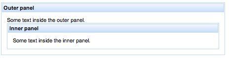
The <rich:panel /> tag can be created in its simplest form by creating a <rich:panel /> element. The header attribute allows the header text for the panel to be defined.
<rich:panel header="Outer panel">
Some text inside the outer panel.
<rich:panel header="Inner panel">
Some text inside the inner panel.
</rich:panel>
</rich:panel>
The <rich:panel/> component supports the styleClass, headerClass, and bodyClass attributes, allowing the look and feel of the component to be changed via CSS.
The <rich:panel /> component also supports different JavaScript hooks, allowing JavaScript to be executed when events occur within the panel.
|
Hook |
Description |
|
onClick |
Invoked when the panel is clicked with the mouse |
|
onDblClick |
Invoked when the panel is double-clicked with the mouse |
|
onKeyDown |
Invoked when a key is pressed down |
|
onKeyPress |
Invoked when a key is pressed and released |
|
onKeyUp |
Invoked when a key is released |
|
onMouseDown |
Invoked when the mouse button is pressed |
|
onMouseMove |
Invoked when the mouse is moved |
|
onMouseUp |
Invoked when the mouse button is released |
The <rich:modalPanel/> tag allows modal panels to be displayed within a web page. A modal panel takes the focus of the web application, causing all other regions of the web page to be disabled until the modal panel is closed. In the following screenshot, a modal panel is displayed showing the copyright information for an application. Until the Close link is clicked, the rest of the web page is disabled.
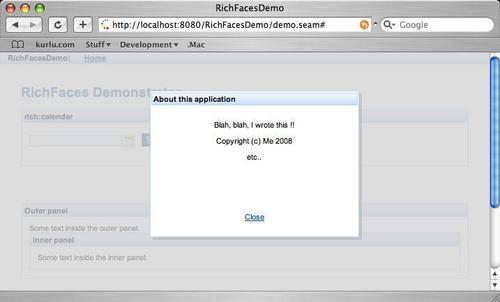
A modal panel can contain any content that is allowed on a standard web page (text, images, links, and so on). With the <rich:modalPanel />, the user can grab the title bar of the panel and drag the modal panel around the screen. Again, while this is being done, the panel retains its modal status, and the rest of the web page is not accessible.
The <rich:modalPanel /> has a JSF facet named header. A JSF facet is a section of a control that can be defined separately from the control itself. In this case, the header facet allows the header of the modal panel to be defined.
<f:facet name="header">
<h:outputText value="About this application" />
</f:facet>
To invoke and close the <rich:modalPanel /> components, RichFaces provides the following JavaScript show() and hide() functions:
#{rich:component('panelId')}.show()#{rich:component('panelId')}.hide()
Both of these methods take the Id of the modal panel to show or hide as a parameter. These methods can be used in the following manner:
<a href="#" onclick ="#{rich:component('panelId')}. show()">Click To Open</a>
<a href="#" onclick = "#{rich:component('panelId')}. hide()">Click to Close</a>
The following code shows how the modal panel, shown in the previous screenshot, was created. In this code fragment, we first create a RichFaces panel (<rich:panel />) to provide a visual panel on the page. Inside this, we add a link, About this application, which, when clicked, will cause the modal panel called aboutPanel to be displayed, Next, we define the modal panel (<rich:modalPanel />) by adding some simple code to display a message. We can add whatever markup we like to the modal panel—text, images, or a user input form. Finally, within the modal panel, we add a link, Close, which, when clicked, will close the form.
<rich:panel header="rich:modalPanel">
<a href="#" onclick ="#{rich:component('aboutPanel')}. show()">About this application</a>
<rich:modalPanel id="aboutPanel">
<f:facet name="header">
<h:outputText value="About this application" />
</f:facet>
<p align="center">Blah, blah, I wrote this !!</p>
<p align="center">Copyright (c) Me 2008</p>
<p align="center">etc..</p>
<rich:spacer height="50" />
<p align="center"><a href="#" onclick = "#{rich: component('aboutPanel')}.hide()">Close</a></p>
</rich:modalPanel>
</rich:panel>
The <rich:modalPanel /> component also supports different JavaScript hooks, allowing JavaScript to be executed when events occur, both within and outside the panel. The most common of these hooks are listed in the following table:
|
Hook |
Description |
|---|---|
|
onBeforeHide |
Invoked before the panel is hidden |
|
onBeforeShow |
Invoked before the panel is shown |
|
onHide |
Invoked after the panel is closed |
|
onMaskClick |
Invoked when the mouse is clicked outside the panel |
|
onMaskContextClick |
Invoked when the mouse is right-clicked outside the pane |
|
onMaskDblClick |
Invoked when the mouse is double-clicked outside the panel |
|
onMaskMouseDown |
Invoked when the mouse button is pressed outside the pane |
|
onMaskMouseMove |
Invoked when the mouse is moved outside the panel |
|
onMaskMouseOut |
Invoked when the mouse is moved outside of the panel |
|
onMaskMouseOver |
Invoked when the mouse is moved inside the panel |
|
onMaskMouseUp |
Invoked when the mouse button is released outside the panel |
|
onMove |
Invoked before the panel is moved |
|
onResize |
Invoked when the panel is resizing |
|
onShow |
Invoked after the panel is opened |
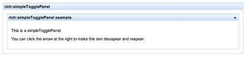
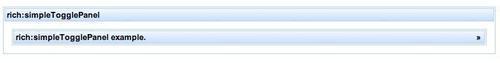
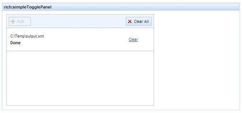
The <rich:simpleTogglePanel /> component allows a panel whose body can be toggled on and off by clicking on the >> or << button within the panel's title bar to be displayed within a RichFaces application. As is the case with the other types of panel we have looked at so far (<rich:panel/> and <rich:modalPanel/>), you can put any content within a <rich:simpleTogglePanel /> panel.
The following two screenshots show an example of the <rich:simpleTogglePanel /> component in both the expanded and the collapsed states.
The <rich:simpleTogglePanel /> panel has two main attributes that allow it to be defined, namely label and switchType.
|
Attribute |
Description |
|---|---|
|
|
This attribute defines the title of the panel. |
|
|
The
|
The following code snippet shows how to use the <rich:simpleTogglePanel /> component within a Facelets page.
<rich:simpleTogglePanel label="rich: simpleTogglePanel example." switchType="client">
<p>This is a simpleTogglePanel.</p>
<p>You can click the arrow at the right to make this text dissapear and reapear.</p>
</rich:simpleTogglePanel>
The <rich:simpleTogglePanel /> component also supports different JavaScript hooks, allowing JavaScript to be executed when events occur within the panel. The most common of these events are listed in the following table:
|
Hook |
Description |
|---|---|
|
onClick |
Invoked when the panel is clicked with the mouse |
|
onCollapse |
Invoked before the panel is collapsed |
|
onDblClick |
Invoked when the panel is double-clicked with the mouse |
|
onExpand |
Invoked before the panel is expanded |
|
onKeyDown |
Invoked when a key is pressed down |
|
onKeyPress |
Invoked when a key is pressed and released |
|
onKeyUp |
Invoked when a key is released |
|
onMouseDown |
Invoked when the mouse button is pressed down |
|
onMouseMove |
Invoked when the mouse is moved |
|
onMouseUp |
Invoked when the mouse button is released |
The <rich:fileUpload /> component allows the user to upload files to a web application for data processing. This could be used, for example, to store user photographs within a user registration system. This component is flexible, and allows the developer to fully manage different attributes of the upload process, namely:
File types that are allowed to be uploaded
The maximum file size that can be uploaded
The number of files that can be uploaded in one attempt
The look of the basic upload component is shown in the next screenshot. RichFaces allows all of its components to be changed visually by applying different CSS styles so that the look and feel of this component can be changed to meet your application's needs.
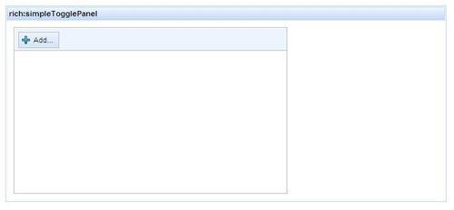
When the user clicks on the Add… button, they are presented with the standard file selection box that allows different files to be selected for upload. Depending on how the application is configured, the user can select one or more files to upload. When the user has selected the files to upload (up to the maximum number of files that can be uploaded), the Add… button is disabled.
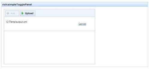
After selecting the files to upload, the user clicks the Upload button. The selected files are then uploaded one by one in the order in which they are specified in the upload list. The user can cancel a file upload at any time by clicking the Cancel button.
The <rich:fileUpload /> component has several properties that can be configured within the Facelets page, to define how the component works. The more common properties that you will probably need to set are detailed below. For further information on all of the properties, please see the RichFaces guide.
|
Property |
Description |
|---|---|
|
acceptedTypes |
A comma-separated list of file types that can be uploaded. If the user attempts to add a file type that is not in this list, then the file will not be added to the upload list. The |
|
autoclear |
This property specifies whether files are removed from the upload list after they are uploaded. If |
|
fileUploadListener |
This property specifies a method within a Seam component that is called whenever a file has been completely uploaded. |
|
immediateUpload |
This property specifies whether files are automatically uploaded when they are added to the upload list. If |
|
listHeight |
This property specifies the height of the upload file list. |
|
listWidth |
This property specifies the width of the upload file list. |
|
maxFilesQuantity |
This property specifies the maximum number of files that can be uploaded in one attempt. The default number of files is one. |
|
uploadData |
This property specifies a Seam component property that will contain a list of the uploaded files. |
The following code sample shows how a <rich:fileUpload /> control can be specified within a Facelets page:
<rich:panel header="rich:simpleTogglePanel">
<rich:fileUpload fileUploadListener= "#{richFacesDemo.uploadListener}" maxFilesQuantity="2" acceptedTypes="html,xml" >
</rich:fileUpload>
</rich:panel>
In this example, the uploadListener method on the richFacesDemo Seam component will be invoked when all of the files have been uploaded. The maximum number of files that can be uploaded at any time is two, and these can be either HTML or XML files.
Any of the properties of the upload component can be bound to the Seam components. In this example, only the fileUploadListener is bound to a Seam component.
The corresponding Seam component looks similar to the following:
package com.davidsalter.richfaces.actions;
@Stateless
@Name("richFacesDemo")
public class RichFacesDemoAction implements RichFacesDemo {
public void uploadListener(UploadEvent event) throws IOException {UploadItem item = event.getUploadItem();
if (item.isTempFile()) {
File file = item.getFile();
String name = file.getAbsolutePath();
System.out.println("Temporary File."+name);
} else {
System.out.println("Byte Array");
}
System.out.println("Uploaded file size: " + item. getFileSize());
System.out.println("Uploaded file name: " + item. getFileName());
}
}
The main method of interest within the Seam component is the uploadListener method.
public void uploadListener(UploadEvent event) throws IOException
This method takes an org.richfaces.event.UploadEvent object as its parameter. The UploadEvent class contains all of the information that we need to know about the uploaded file, which we can obtain by calling the UploadEvent.getUploadItem() method.
RichFaces has the ability to control the storage of the uploaded files as temporary files on disk or as byte[] in memory. It is beneficial to use temporary files if you are going to allow large files to be uploaded so that all of the available resources of the JVM are not used. Conversely, it is better to use a byte[] if you are allowing multiple smaller files to be uploaded. To define whether to use temporary files or a byte[] array, add an initialization parameter to the application's web.xml, setting the createTempFile parameter to either, respectively true or false.
<filter>
<filter-name>Seam Filter</filter-name>
<filter-class>
org.jboss.seam.servlet.SeamFilter
</filter-class>
<init-param>
<param-name>createTempFiles</param-name>
<param-value>true</param-value>
</init-param>
</filter>
Once we have obtained an instance of an UploadItem, we can invoke the isTempFile() method to determine whether RichFaces is returning a temporary file or a byte[].
To define the maximum size of a file that can be uploaded, we need to create an initialization parameter called maxRequestSize within the application's web.xml file.
<filter>
<filter-name>Seam Filter</filter-name>
<filter-class>
org.jboss.seam.servlet.SeamFilter
</filter-class>
<init-param>
<param-name>maxRequestSize</param-name>
<param-value>1048576</param-value>
</init-param>
</filter>
The <rich:fileUpload /> component also supports different JavaScript hooks, allowing JavaScript to be executed when events occur within the panel. The most common of these events are listed in the following table:
|
Hook |
Description |
|---|---|
|
onAdd |
Invoked when a file is added for upload |
|
onClear |
Invoked when the file upload list is cleared |
|
onClick |
Invoked when the panel is clicked with the mouse |
|
onCollapse |
Invoked before the panel is collapsed |
|
onDblClick |
Invoked when the panel is double-clicked with the mouse |
|
onError |
Invoked when an error occurs uploading a file |
|
onKeyDown |
Invoked when a key is pressed down |
|
onKeyPress |
Invoked when a key is pressed and released |
|
onKeyUp |
Invoked when a key is released |
|
onMouseDown |
Invoked when the mouse button is pressed down |
|
onMouseMove |
Invoked when the mouse is moved |
|
onMouseUp |
Invoked when the mouse button is released |
|
onSizeRejected |
Invoked when an upload fails because the file is too big |
|
onTypeRejected |
Invoked when an upload fails because the file type is not allowed |
|
onUploadCancelled |
Invoked when an upload is cancelled |
|
onUploadComplete |
Invoked when an upload is completed |
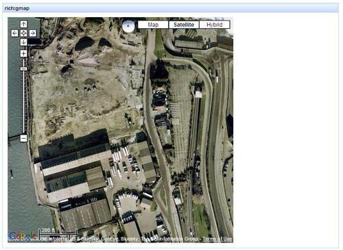
The <rich:gmap /> component allows you to easily embed Google Maps functionality into a RichFaces web page, as shown in the following screenshot. For full details of the Google Maps API, see http://code.google.com/apis/maps/.
This component provides many different attributes that can be specified within the Facelets file, to define the appearance of the map (location, scale, and so on). The most common properties that you will probably need to use are listed in the following table:
|
Property |
Description |
|---|---|
|
enableContinuousZoom |
This property defines whether continuous zooming is available within the Google Map. The default value is |
|
enableDoubleClickZoom |
This property defines whether double-clicking on a map will zoom in. The default value is |
|
enableDragging |
This property defines whether the map can be dragged in different directions to change the origin of the map. The default value is |
|
enableInfoWindow |
This property defines whether the information window is enabled. The default value is |
|
gmapKey |
This property holds the Google Maps key that is required to run Google Maps on an Internet site. For development on |
|
lat |
The initial latitude of the map. |
|
lng |
The initial longitude of the map. |
|
mapType |
This property stores the initial map display type:
|
|
showGMapTypeControl |
This property specifies whether the map will include buttons that are available for selecting the type of view to be displayed, including Street, Satellite, or Hybrid maps. The default value is |
|
showGScaleControl |
This property specifies whether the scale control is visible. The default property is |
|
zoom |
This property specifies the initial zoom level of the maps. The value can be within the 1-18 range, with the default value being 17. The higher the number, the closer the map is zoomed into the location. |
The following fragment from a Facelets page shows how the <rich:gmap /> component can be created.
<rich:panel header="rich:gmap">
<rich:gmap style="width:500px; height:500px" lat="51.5" lng="0.0" enableContinuousZoom="true" enableInfoWindow="false">
</rich:gmap>
</rich:panel>
In this code fragment, we first create a RichFaces panel component (<rich:panel/>) to act as a visual holder around the Google Map. Next, we create an instance of a Google map (<rich:gmap/>), styling it to have a width and height of 500 pixels. The map is centered on latitude of 51.5 degrees and a longitude of 0.0 degrees. In the map, we have enabled the continuous zoom functionality, but disabled the information window.
The <rich:gMap /> component also supports different JavaScript hooks, allowing JavaScript to be executed when events occur within the panel. The most common of these events are shown here:
|
Hook |
Description |
|---|---|
|
onClick |
Invoked when the map is clicked with the mouse |
|
onDblClick |
Invoked when the map is double-clicked with the mouse |
|
onInit |
Invoked after the map is initialized |
|
onKeyDown |
Invoked when a key is pressed down |
|
onKeyPress |
Invoked when a key is pressed and released |
|
onKeyUp |
Invoked when a key is released |
|
onMouseDown |
Invoked when the mouse button is pressed down |
|
onMouseMove |
Invoked when the mouse is moved |
|
onMouseUp |
Invoked when the mouse button is released |
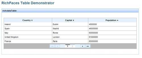
The <rich:dataTable /> component allows developers to display tabular data within an application. This component provides full control, allowing headers, footers, and any number of columns to be displayed within the table. The <rich:dataTable /> component also provides built-in support for the sorting and pagination of data.
The <rich:dataTable /> component has many properties that allow the component to be defined. The most common of these properties that you will need to use are defined in the following table:
|
Property |
Description |
|---|---|
|
|
The ID of the table |
|
|
The number of rows to be displayed on a single page of data |
|
|
The backing Seam component that contains the data to be displayed |
|
|
Variable to be used when iterating through the table to display the table contents |
Within a <rich:dataTable />, the header and footer facets are used to define what is displayed in the header and footer of the table. These facets can be ignored if they are not required, but they can be useful for displaying paging information for large tables.
To display a table, we need to specify the data to which the table is bound. This is achieved by setting the value attribute of the <rich:dataTable />. In the following example, we have bound the table to a Seam component called country.
<h:form>
<rich:dataTable id="myTable" value="#{countries}" var="country" rows="5">
<f:facet name="header">
Country vs Capital vs Population
</f:facet>
<rich:column sortBy="#{country.name}">
<f:facet name="header">Country</f:facet>
<h:outputText value="#{country.name}" />
<f:facet name="footer">Country</f:facet>
</rich:column>
<rich:column sortBy="#{country.capital}">
<f:facet name="header">Capital</f:facet>
<h:outputText value="#{country.capital}" />
<f:facet name="footer">Capital</f:facet>
</rich:column>
<rich:column sortBy="#{country.population}">
<f:facet name="header">Population</f:facet>
<h:outputText value="#{country.population}" />
<f:facet name="footer">Population</f:facet>
</rich:column>
<f:facet name="footer">
<rich:datascroller id="myDataScroller">
</rich:datascroller>
</f:facet>
</rich:dataTable>
</h:form>
To display different columns within the table, we use the <rich:column /> component. This component must be embedded within a <rich:dataTable /> component. For each column, we can define the header and footer that we wish to be displayed, via named header and footer facets respectively. The data that is to be displayed within the column is also specified, and is bound to the data table's var attribute while iterating through the data. In the previous example, each row in the table represents an entry of the Java class Country, and the columns displayed are simple bean properties of the class.
package com.davidsalter.richfaces.entity;
public class Country {
private String name;
private String capital;
private int population;
public Country(String name, String capital, int population) {
this.name = name;
this.capital = capital;
this.population = population;
}
// Getters & setters omitted for brevity.
}
If we want RichFaces to provide sorting of the columns within the table, we can specify the sortBy attribute on the columns. Each column for which this attribute is defined will become sortable by RichFaces, which will automatically add the sort button to the column headers (refer to the following image).
<rich:column sortBy="#{country.population}">
To add pagination to the data table, we can add a <rich:datascroller /> component into the table. This is typically added either to the header or the footer facet of the table.
Now that we've looked at the Facelets code to implement a <rich:dataTable />, let's look at the corresponding Seam code.
Because the data table is going to be made accessible through several web requests, we will declare the Seam component that will hold the data as a Stateful Session Bean. If we declared the Seam component as a Stateless Session Bean, we would have to load the data each time that the page is displayed. In the real world, this would mean making a database request each time the table is displayed. In this example, the data is statically generated. However, we will look at database persistence in the next chapter.
Similar to declaring a Stateless Session Bean, the Stateful bean must implement a business interface.
package com.davidsalter.richfaces.actions;
import javax.ejb.Local;
@Local
public interface TableDemo {
public void countryList();
public void remove();
}
The interface defines two methods, which can be seen in the following code for the TableDemoAction implementation class.
package com.davidsalter.richfaces.actions;
import com.davidsalter.richfaces.entity.Country;
import java.util.ArrayList;
import java.util.List;
import javax.ejb.Remove;
import javax.ejb.Stateful;
import org.jboss.seam.annotations.Factory;
import org.jboss.seam.annotations.Name;
import org.jboss.seam.annotations.datamodel.DataModel;
@Stateful
@Name("tableAction")
public class TableDemoAction implements TableDemo {
@DataModel
private List<Country>countries = null;
@Factory("countries")
public void countryList() {
if (countries==null) {
countries = new ArrayList<Country>();
countries.add(new Country("China", "Beijing", 1325000000));
countries.add(("France", "Paris", 65000000);
countries.add(new Country("Germany", "Berlin", 82000000));
countries.add(new Country("India", "New Delhi", 1140000000));
countries.add(new Country("Ireland", "Dublin", 4500000));
countries.add(new Country("Italy", "Rome", 60000000));
countries.add(new Country("Spain", "Madrid", 46000000));
countries.add(new Country("United Kingdom", "London", 61000000));
countries.add(new Country("United States", "Washington DC", 300000000));
}
}
@Remove
public void remove() {
}
}
In this class, we can see that we have used several Seam annotations, enabling us to write a Stateful Session Bean as the backing for our Facelets page.
The @DataModel annotation causes the list of countries to be exposed as a JSF javax.faces.model.DataModel object. RichFaces can use this object to display the tabular data. The @DataModel annotation also implicitly defines that the data is outjected, so there is no need to annotate the code with the @Out annotation.
@DataModel
private List<Country>countries = null;
The @Factory annotation is used to initialize the countries variable before it is outjected via the @DataModel annotation. In the Facelets page, we referenced the countries using JSF EL.
<rich:dataTable id="myTable"
value="#{countries}"
When this page is displayed, Seam attempts to find the component called countries. The first time that the page is displayed, the component cannot be found because it has not yet been created. Because Seam cannot find the component, it attempts to create the component via its factory—that is, by a method declared with the @Factory("countries") annotation.
In this sample code, the countryList() method is defined as the factory method for the countries component.
Because we are running within a Stateful Session Bean, the factory class is invoked only once when the instance of the Session Bean is created within the application server. The Session Bean is managed within the application server until the session ends. After the session ends, the annotated @Remove method is invoked (the remove() method, in this instance) to allow any clean up operations to be performed within the Session Bean.
The <rich:dataTable /> component also supports different JavaScript hooks, allowing JavaScript to be executed when events occur within the panel. The most common of these events are shown here:
|
Hook |
Description |
|---|---|
|
onClick |
Invoked when the table is clicked with the mouse |
|
onDblClick |
Invoked when the table is double-clicked with the mouse |
|
onKeyDown |
Invoked when a key is pressed down |
|
onKeyPress |
Invoked when a key is pressed and released |
|
onKeyUp |
Invoked when a key is released |
|
onMouseDown |
Invoked when the mouse button is pressed down |
|
onMouseMove |
Invoked when the mouse is moved |
|
onMouseOut |
Invoked when the mouse is moved off the table |
|
onMouseOver |
Invoked when the mouse is moved onto the table |
|
onMouseUp |
Invoked when the mouse button is released |
|
onRowClick |
Invoked when the mouse is clicked on a row |
|
onRowDblClick |
Invoked when the mouse is double clicked on a row |
|
onRowMouseDown |
Invoked when the mouse button is pressed down on a row |
|
onRowMouseMove |
Invoked when the mouse is moved over a row |
|
onRowMouseOut |
Invoked when the mouse is moved off a row |
|
onRowMouseOver |
Invoked when the mouse is moved onto a row |
|
onRowMouseUp |
Invoked when the mouse button is released on a row |
In this chapter, we've taken a look at RichFaces and learned that it's a JSF component library that allows us to easily build rich user interfaces within web applications. We've seen that Seam is fully integrated with RichFaces, and that applications generated by SeamGen require no special configuration to allow RichFaces to be used.
We listed all of the components available within RichFaces, and took an in-depth look at some of the more common components, such as the file upload and data table components.
In the next chapter, we'll continue our journey of learning Seam, by looking at how Seam manages data persistence.