
Most developers take their first steps into SharePoint development with Web Parts. If you work with ASP.NET, you might already know about Web Parts—though it's unlikely you've had a project that requires Web Parts. There is a good reason why Web Parts are used heavily in SharePoint but have never attained popularity in other projects. SharePoint is not only the application that best shows the power of Web Parts, it's the reason Web Parts exist. Users can use the personalization framework to create their own view of a page and arrange parts to suit their personal preferences.
For these reasons, the Web Part programming style plays a lead role in this book. In this chapter we cover
The constituent elements of SharePoint Web Parts
An introduction to the ASP.NET Web Part framework
Personalizing Web Parts and modifying the editor pane
Creating connectable Web Parts
Furthermore, a comprehensive collection of best practices helps you build Web Parts with sophisticated features.
During SharePoint 2007 development, the developer team was rewriting the Web Parts module. They did a great job on top of .NET 1.1, and the ASP.NET team was asked to incorporate the Web Parts functionality into the core ASP.NET library. In doing so, the ASP.NET team expanded the model and added many advanced features to ensure widespread support in SharePoint. Thus, ASP.NET Web Parts are heavily influenced by the needs of SharePoint. In SharePoint, some configuration options have been added, and an impressive number are available out of the box.
Web Parts are a basic building block for the UI. They integrate well with the UI, the administration, and with each other. End users can add Web Parts to pages, configure them, and use them without seeing a single line of code.
In this section we'll explain the basics of Web Parts.
Let's start with some of the benefits of using custom Web Parts:
Creating custom properties you can display and modify in the UI.
Implementing proprietary code without disclosing the source code.
Controlling access to content. With a custom Web Part, you can determine the content or properties to display to users, regardless of their permissions.
Interacting with the SharePoint object model.
Controlling the cache for the Web Part by using built-in cache tools.
Creating a base class for other Web Parts to extend.
With all these benefits, Web Parts provide great flexibility and customization in a modularized manner.
A Web Part is an ASP.NET user control that derives from the System.Web.UI.WebControls.WebPart class. This is an assembly that's provided by the framework as part of ASP.NET. The Web Part supports the management of the UI layout via zones. A zone is an area on the page where the Web Part can reside. If configured appropriately, an end user can drag Web Parts from a catalog into a zone, drag Web Parts from one zone to another, or remove the Web Part completely from any zone. Web Parts can be opened, closed, and hidden. You can consider a Web Part as a loosely coupled control. Web Parts support data connections between each other—meaning that one Web Part can raise an action within another. A control called WebPartManager holds all the active Web Part instances and the zone definitions. It acts like a director for the page.
SharePoint supports ASP.NET Web Parts directly. There is no need to derive from any SharePoint class to create a SharePoint Web Part. Instead, SharePoint supports a custom implementation of WebPartManager named SPWebPartManager. In addition, there is an SPLimitedWebPartManager class that supports environments that have no HttpContext or Page available. The reason for SharePoint-specific managers is, as for pages, that Web Parts are stored in serialized form in the content database. To read the stream from the database, the Web Part manager must provide the appropriate support. Building a Web Part is straightforward. Start by creating a class that inherits from the WebPart base class, as shown in Listing 6-1.
Example 6.1. A Very Basic WebPart Class
using System;
using System.ComponentModel;
using System.Runtime.InteropServices;
using System.Web;
using System.Web.UI;
using System.Web.UI.WebControls;
using System.Web.UI.WebControls.WebParts;
using Microsoft.SharePoint;
using Microsoft.SharePoint.WebControls;

namespace Apress.SP1010WebPartProject.WebParts
{
    [ToolboxItemAttribute(false)]
    public class WebPart1 : WebPart
    {

        public WebPart1()
        {
        }

        protected override void CreateChildControls()
        {
            Label1 control = new Label();
            control.Text = "Dynamic Label";
            Controls.Add(control);
            base.CreateChildControls();
        }

        protected override void RenderContents(HtmlTextWriter writer)
        {
            base.RenderContents(writer);
        }
    }
}
In the example, you can see that the content is created by overriding the CreateChildControls method. By default the Web Part is empty, so you're responsible for writing whatever content you need. This can be done using controls, as shown in the example. Another method writes directly into the output stream, using the RenderContents method parameter, HtmlTextWriter. This is usually more appropriate if a large amount of text or HTML is being written.
In this section you'll learn how to create your first elementary Web Part.
The following exercise shows how to create a basic Web Part using the appropriate template.
In the ASCX file you can now proceed as with any user control. There is a visual designer and a code editor window. There are no Web Part–specific modifications—you can program against the SharePoint API, and you can add ASP.NET as well as SharePoint controls.
Example 6.2. ASCX File of a Simple Web Part
<%@ Assembly Name="$SharePoint.Project.AssemblyFullName$" %>
<%@ Assembly Name="Microsoft.Web.CommandUI, Version=14.0.0.0,
                   Culture=neutral, PublicKeyToken=71e9bce111e9429c" %>
<%@ Register Tagprefix="SharePoint" Namespace="Microsoft.SharePoint.WebControls"
             Assembly="Microsoft.SharePoint, Version=14.0.0.0, Culture=neutral,
                       PublicKeyToken=71e9bce111e9429c" %>
<%@ Register Tagprefix="Utilities" Namespace="Microsoft.SharePoint.Utilities"
             Assembly="Microsoft.SharePoint, Version=14.0.0.0, Culture=neutral,
                       PublicKeyToken=71e9bce111e9429c" %>
<%@ Register Tagprefix="asp" Namespace="System.Web.UI"
             Assembly="System.Web.Extensions, Version=3.5.0.0, Culture=neutral,
                       PublicKeyToken=31bf3856ad364e35" %>
<%@ Import Namespace="Microsoft.SharePoint" %>
<%@ Register Tagprefix="WebPartPages" Namespace="Microsoft.SharePoint.WebPartPages"
             Assembly="Microsoft.SharePoint, Version=14.0.0.0, Culture=neutral,
                       PublicKeyToken=71e9bce111e9429c" %>
<%@ Control Language="C#" AutoEventWireup="true"
            CodeBehind="VisualWebPart1UserControl.ascx.cs"
    Inherits="VisualWebPartProject1.VisualWebPart1.VisualWebPart1UserControl" %>
<asp:Label runat="server" ID="lbl1" Font-Size="Large">Hello World</asp:Label>
In this example, only the Label element has been added.
Example 6.3. .webpart File with Basic Settings
<?xml version="1.0" encoding="utf-8"?>
<webParts>
  <webPart xmlns="http://schemas.microsoft.com/WebPart/v3">
    <metaData>
      <type name="VisualWebPartProject1.VisualWebPart1.VisualWebPart1,
                  $SharePoint.Project.AssemblyFullName$" />
      <importErrorMessage>$Resources:core,ImportErrorMessage;</importErrorMessage>
    </metaData>
    <data>
      <properties>
        <property name="Title" type="string">My First VisualWebPart</property>
        <property name="Description" type="string">My First WebPart</property>
      </properties>
    </data>
  </webPart>
</webParts>
In this example the properties Title and Description has been changed.
As mentioned several times in this book, pages must derive from a master page supported by SharePoint. Web Part pages are no exception. Using the default.master page as the basis for internal pages ensures that SPWebPartManager's sole instance is present, if required. There are no further settings or actions needed.
If additional zones are required, we use a slightly different approach. SharePoint defines its own zone model, which derives from the WebPartZone class. Employ the Microsoft.SharePoint.WebPartPages namespace instead of the one provided with ASP.NET. (Note that contrary to the standard SharePoint namespace naming convention, the type does not have the SP prefix.)
SharePoint Web Parts are an integral part of a SharePoint web site. There are many built-in Web Parts a developer may use. Also, there are many Web Parts available on the Internet that could meet your requirements. The various built-in SharePoint Web Parts are categorized as follows:
List and Library Web Parts: These include special lists such as Announcements and Calendar, as well as any other list in the site.
Filter Web Parts: These are used to filter the data based on user requirements, and include the Data Catalog Filter, User Filter, Date Filter, and Text Filter.
Outlook Web Parts: These display content in Microsoft Outlook using Microsoft Exchange Server.
Search Web Parts: These are used to provide search facilities on your site. Examples are Advanced Search, People Search, and Search Summary.
Miscellaneous Web Parts: These Web Parts include Content Editor Web Parts, Page Viewer Web Parts, and Form Web Parts.
Almost all the built-in SharePoint Web Parts are generic. That means that they have properties you can modify in SharePoint.
Consider the Content Editor Web Part, which, when in Edit mode, provides an option called Rich Text Editor, which allows the user to enter and format content. Another option is Source Editor, which allows you to edit the raw HTML that the Content Editor will render.
Similarly, in the Page Viewer Web Part, the user can set the link to display a web page, folder, or file in the Web Part. Therefore, the advantage of generic Web Parts is that users can configure them to suit their own requirements.
The method of creating a generic Web Part is more or less the same as creating an ASP.NET Web Part—the difference comes when you want to provide the user with the means to set some values or fields in the Web Part.
The developer has to set the fields as properties in the code to enable the user to edit the desired values. Apart from setting the fields as properties, you have to add several attributes to the property that are visible to the user when editing the Web Part. Apart from one for the category (SPWebCategoryName), all attributes are from the common ASP.NET namespace.
private string _name;

[
System.Web.UI.WebControls.WebParts.WebBrowsable(true),
System.Web.UI.WebControls.WebParts.Personalizable(PersonalizationScope.User),
System.Web.UI.WebControls.WebParts.WebDescription("Enter your name"),
Microsoft.SharePoint.WebPartPages.SPWebCategoryName("Custom Properties"),
System.Web.UI.WebControls.WebParts.WebDisplayName("Name")]
public string Name
{
   get { return _name; }
   set { _name = value; }
}
Several attributes, as shown in the example Name property, modify the design-time behavior of the Web Part. Here, design-time means both the control shown in a designer environment such as SharePoint Designer or Visual Studio 2010, and a Web Part page in Edit mode.
In the "Advanced Web Part Development" section later in the chapter, you'll find a complete description and further usage scenarios for these and other, more essential attributes.
Note
The attributes from System.ComponentModel, such as Category and Browsable, are deprecated.
All Web Parts render inside a chrome. The term refers to common UI elements such as titles and borders. You may interpret chrome as frame style. This style is simple but provides a consistent look and feel to all Web Parts. Primarily, it's designed to support the basic functionality that the SharePoint environment needs, such as the context menu that allows editing (which appears at the upper-right corner of the Web Part). The chrome functionality is part of the Web Part framework, which consists primarily of the WebPartZoneManager. If the Web Part is used as a simple control, without being in any zone, the chrome will not render. The Web Part will still be usable, but you're responsible for providing editing capabilities, if needed.
Web Parts provide a powerful way to extend the UI by adding features that have access to the API and allowing full control over parts of default pages. The security model protects you from just inserting a Web Part and letting it do something. This makes sense, because otherwise even end users could under certain conditions upload a Web Part and activate it. There are two ways to add a Web Part you trust to your installation. The first way is to use Code Access Security (CAS), or just adopt the corresponding settings from the built-in security models, such as WSS_Minimal or WSS_Medium. The other approach is to explicitly register a Web Part as safe, if you know exactly what it does. The second way is the default because it allows developers to gain control over the procedure. However, administrators will still have to execute the primary installation of a Web Part—and so, ultimately, they know what's going on. The methods described simplify the installation procedure.
Registering a Web Part as Safe
Whether you use the Visual Web Part or the regular Web Part project template, the procedure to register it as a safe control is somewhat automated. The file that contains the SafeControl instruction is named <webpart>.spdata. It is hidden by default. Usually you edit it by using the PropertyGrid and modifying the safe control entries file by file (see Figure 6-1). However, sometimes it's easier to edit the file directly, either if Visual Studio fails or you want to change several items at once. You must unhide all files in the project to view it. Usually there is no need to edit it—however, for example, if you change a namespace, the changes will not be tracked and the registration can fail. In these rare circumstances, you can use the property grid to edit the file.
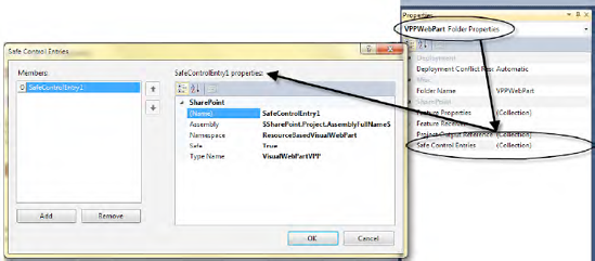
The properties defined here are specific to the Web Part. Select the Web Part item in Solution Explorer, press F4, and select the ellipses button in the Safe Control Entries row. Typically, the file these entries refer to looks like that shown in Listing 6-4.
Example 6.4. The Project Item That Defines the Files and Security Instructions
<?xml version="1.0" encoding="utf-8"?>
<ProjectItem Type="Microsoft.VisualStudio.SharePoint.WebPart"
DefaultFile="CustomWebPart.cs" SupportedTrustLevels="All"
             SupportedDeploymentScopes="Site"
             xmlns="http://schemas.microsoft.com/VisualStudio/2010/
                    SharePointTools/SharePointProjectItemModel">
  <Files>
    <ProjectItemFile Source="Elements.xml" Target="CustomWebPart"
                     Type="ElementManifest" />
    <ProjectItemFile Source="CustomWebPart.webpart" Target="CustomWebPart"
                     Type="ElementFile" />
  </Files>
  <SafeControls>
    <SafeControl Name="CustomWebPart"
                 Assembly="$SharePoint.Project.AssemblyFullName$"
                 Namespace="WebPartPageProject.MyWebParts"
                 TypeName="*" IsSafe="true" />
  </SafeControls>
</ProjectItem>
The <SafeControl> element at the end is responsible for the setting copied to web.config. You can modify this to reapply settings not applied automatically.
Dealing with Built-In Security
There are three configuration files in the SharePoint root under the subfolder CONFIG: wss_minimaltrust.config, wss_mediumtrust.config, and wss_usercode.config. The latter, wss_usercode.config, is specifically for sandboxed solutions. When code runs in the sandbox, the web.config file that references the trust file in the subfolder UserCode is used. This typically contains the following:
<trustLevel name="WSS_Sandbox" policyFile="..configwss_usercode.config" />
Regular solutions use the common trust files. These come with a specific set of restrictions. The default configuration is wss_miminaltrust, which is quite limited. Table 6-1 outlines the permissions available.
Table 6.1. Limitations for Web Parts Concerning Specific Trust Levels
Medium Trust | Minimal Trust | |
|---|---|---|
| Medium | Minimal |
| None | None |
| Unrestricted | None |
| Read access to | None |
| None | None |
| Read, write, append, and | None |
|
| None |
| None | None |
| None | None |
Performance counters | None | None |
| Default printing | None |
| None | None |
| None | None |
|
| |
| None | None |
|
| None |
| None | None |
|
| None |
| Connect to origin host (if configured) | None |
[a] Declared in the | ||
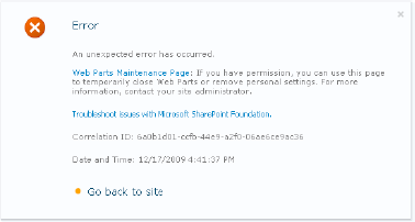
This means that if you use any of the disallowed permissions mentioned in the table, the execution engine will reject the attempt with a security exception (see Figure 6-2).
In the following example, the Web Part has code that attempts to write to the event log:
protected override void CreateChildControls()
{
    base.CreateChildControls();
    Label l = new Label();
    EventLog log = new EventLog("Application");
    log.WriteEntry("WebPart was Displayed", EventLogEntryType.Information,
                    10000, 4);
    l.Text = "Hello Security Web Part";
    Controls.Add(l);
}
Because the error message is not very instructive, and could be difficult even for an administrator to decipher, you should add a security permission attribute to your code:
[ToolboxItemAttribute(false)]
[EventLogPermission(System.Security.Permissions.SecurityAction.Demand)]
public class WebPartMinimalTrust : WebPart
{
    // Code removed for sake of clarity
}
In this case, the error occurs earlier (see Figure 6-3), and SharePoint can catch it before the Web Part is added.
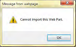
In fact, the error message from SharePoint is no better. But instead of an unexpected error being generated, the process is stopped by the permission check and the Web Part is not added.
Tip
If your Web Part requires a particular permission, always add the corresponding permission attribute to aid the runtime in checking the permissions before the class is instantiated.
If medium trust is sufficient, you can consider setting it as the default trust level. However, for Web Parts requiring classes you can't access with medium trust, you must provide a custom code access policy. Sandboxed solutions do not allow overwriting the CAS policy.
Providing Web Part–Specific CAS Policy
If a Web Part needs some specific CAS policy, you can add the information to the deployment package. In addition, the administrator must provide the -allowCasPolicies parameter when installing the solution using the stsadm tool. This ensures that the administrator has ultimate control over what a new Web Part can do.
To use a custom CAS policy, do the following:
Change the installation target to
WebApplication.Add the CAS policy XML to the package.
Set the assembly attribute,
AllowPartiallyTrustedCallers.
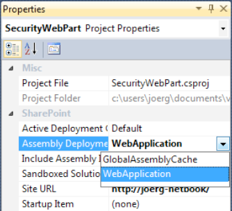
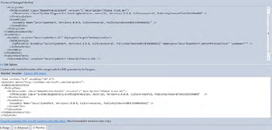
Using the same Web Part as before and Visual Studio 2010 to create the package, this is very easy. First, set the Assembly Deployment property of the current Web Part project to WebApplication (see Figure 6-4). This deploys the assembly—not into the GAC, but into a less trusted file location of your project target.
Second, add the custom policy to the package designer. Open the package designer by double-clicking Package.package. Then select the Manifest tab and enter the CAS data into the template windows. The content is merged into the package file shown in the preview pane, as shown in Figure 6-5.
Third, add the required attribute to the assemblyinfo.cs file:
[assembly: AllowPartiallyTrustedCallers()]
Finally, build and deploy the package again. You can now add it to the current installation and use the formerly blocked classes. The CAS policy should be completed to allow at least the typical permissions a Web Part demands. The XML would then look as shown in Listing 6-5.
Example 6.5. Definition for a Custom CodeAccessSecurity Section
<CodeAccessSecurity>
 <PolicyItem>
  <PermissionSet class="NamedPermissionSet" version="1"
                 Description="Permission set for my Web Part">
  <IPermission class="AspNetHostingPermission" version="1" Level="Minimal" />
  <IPermission class="SecurityPermission" version="1"
               Flags="Execution,ControlPrincipal,
                       ControlAppDomain,ControlDomainPolicy,
                       ControlEvidence,ControlThread" />
  <IPermission class="Microsoft.SharePoint.Security.SharePointPermission,
               Microsoft.SharePoint.Security, Version=14.0.0.0, Culture=neutral,
               PublicKeyToken=71e9bce111e9429c"
               version="1" ObjectModel="True" />
  <IPermission class="System.Security.Permissions.EnvironmentPermission, mscorlib,
                       Version=2.0.0.0, Culture=neutral,
                       PublicKeyToken=b77a5c561934e089" version="1"
               Read="UserName" />
<IPermission class="System.Security.Permissions.FileIOPermission, mscorlib,
Version=2.0.0.0, Culture=neutral,
PublicKeyToken=b77a5c561934e089" version="1"
Read="$AppDir$ "
Write="$AppDir$"
Append="$AppDir$"
PathDiscovery="$AppDir$" />
</PermissionSet>
<Assemblies>
<Assembly Name="VisualWebPartProject1" />
</Assemblies>
</PolicyItem>
</CodeAccessSecurity>It's necessary to add all these permissions because the custom CAS file does not merge. Instead, it replaces the common definitions. Thus, the definition must contain all permissions required to execute the Web Part.
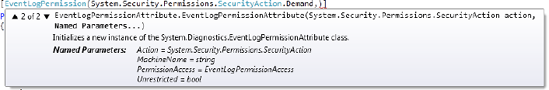
The settings in the CAS file depend on the permissions you need. That's why the IPermission element is not described elsewhere. The only common attribute is the class attribute that specifies the fully qualified name of the permission class. In the next example, this is the EventLogPermissionAttribute. All the other attributes are extracted from the named parameters. Figure 6-6 illustrates how to view all the named parameters at once in Visual Studio.
If you add enum values, the value is sufficient; the enum type does not need to be explicitly stated. The engine will extract it from the property's type.
Writing controls or text directly into a Web Part's body seems an odd approach for a complex UI. A visual designer tool would make the task much easier. In Visual Studio 2010, there is a new project template, Visual Web Part, to fulfill that role. This is, however, not that new. The template simply scaffolds a conglomeration of files that consists of a traditional Web Part and an ASP.NET user control (ASCX). The user control designer appears as the Visual Web Part designer. This is the way it worked before, except that now the template saves you a few seconds when you start developing. A skeleton of the main class file is shown in Listing 6-6.
Example 6.6. Skeleton of a Visual Web Part
using System;
using System.ComponentModel;
using System.Runtime.InteropServices;
using System.Web;
using System.Web.UI;
using System.Web.UI.WebControls;
using System.Web.UI.WebControls.WebParts;
using Microsoft.SharePoint;
using Microsoft.SharePoint.WebControls;

namespace Apress.SP2010.VisualWebPart
{
    [ToolboxItemAttribute(false)]
    public class VisualWebPart1 : WebPart
    {
        // Visual Studio might automatically update this path
        // when you change the Visual Web Part project item.
        private const string _ascxPath = @"˜/_CONTROLTEMPLATES/VisualWebParts/
                                VisualWebPart1/VisualWebPart1UserControl.ascx";

        public VisualWebPart1()
        {
        }

        protected override void CreateChildControls()
        {
            Control control = this.Page.LoadControl(_ascxPath);
            Controls.Add(control);
            base.CreateChildControls();
        }

        protected override void RenderContents(HtmlTextWriter writer)
        {
            base.RenderContents(writer);
        }
    }
}
The Visual Web Part contains a constant value that points to the control's relative path. The CreateChildControls method has been overwritten to load the control dynamically using the LoadControl method provided by the Page class. All of your Web Part UI design is applied to the user control.
Warning
Renaming a path such as the _ascxPath variable requires you to carefully check related files, such as element.xml. There are several tight connections between these files that Visual Studio does not track completely.
However, when you create controls that load their content in a different way, as Silverlight controls do, there is no need to use the Visual Web Part template. Remember that the Visual Web Part requires you to add an additional file to the deployment package. This means that it ends up deployed to the CONTROLTEMPLATES folder or one of its subfolders. That might be permissible for most projects, but you would have to check whether it violates any conditions imposed by a server administrator. Deploying files into the SharePoint root (14 hive) prevents you from creating a sandboxed solution. That's why Visual Web Parts can't be used in a project that has the Sandboxed Solution property set to True.
The Visual Web Part template creates everything you need to deploy it as a feature. When you deploy the Web Part, the feature is installed and activated. You can add and debug the Web Part immediately, which makes for a great developer experience. However, if you plan to deploy the Web Part as part of a project or as a standalone solution, you have to consider the various settings in the Visual Studio template.
The project provides several files that create the Web Part and define its appearance within the SharePoint site. By default, the feature is deployed to the referenced site collection. Figure 6-7 shows the standard structure that is created.
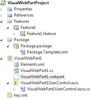
The folder VisualWebPart1 contains the Web Part itself. VisualWebPart1UserControl.ascx is the markup file (see Listing 6-7), which when first created contains the code shown in Listing 6-8.
Example 6.7. Markup of the "Visual" Part
<%@ Assembly Name="$SharePoint.Project.AssemblyFullName$" %>
<%@ Assembly Name="Microsoft.Web.CommandUI, ..." %>
<%@ Register Tagprefix="SharePoint" Namespace="Microsoft.SharePoint.WebControls"
             Assembly="Microsoft.SharePoint, ..." %>
<%@ Register Tagprefix="Utilities" Namespace="Microsoft.SharePoint.Utilities"
             Assembly="Microsoft.SharePoint, ..." %>
<%@ Register Tagprefix="asp" Namespace="System.Web.UI"
             Assembly="System.Web.Extensions, ..." %>
<%@ Import Namespace="Microsoft.SharePoint" %>
<%@ Register Tagprefix="WebPartPages" Namespace="Microsoft.SharePoint.WebPartPages"
             Assembly="Microsoft.SharePoint, ..." %>
<%@ Control Language="C#" AutoEventWireup="true"
CodeBehind="VisualWebPart1UserControl.ascx.cs"
Inherits="VisualWebPartDashboard.VisualWebPart1.VisualWebPart1UserControl" %>This is simply time-saving and housekeeping code. The first line references the assembly that is created by your project, via a placeholder. The assembly is usually deployed to the GAC, and the line references it at runtime. The second line contains a reference to Microsoft.Web.CommandUI, the assembly that contains the ribbon support. The next few lines reference and import the corresponding namespaces to get access to the SharePoint controls. The last line defines the control itself and references the code-behind file.
The code-behind (see Listing 6-8) file is essentially empty, except for the Load event handler to get you started.
Example 6.8. The Code-Behind for the User Control
using System;
using System.Web.UI;
using System.Web.UI.WebControls;
using System.Web.UI.WebControls.WebParts;
using Microsoft.SharePoint;
using Microsoft.SharePoint.Utilities;

namespace Apress.SP2010.VisualWebPartProject
{
    public partial class VisualWebPart1UserControl : UserControl
    {
        protected void Page_Load(object sender, EventArgs e)
        {
        }
    }
}
In the same folder, the Web Part definition (.webpart) describes what you see within SharePoint when adding the Web Part to a page (Listing 6-9).
Example 6.9. Web Part Definition File with Basic Properties
<?xml version="1.0" encoding="utf-8"?>
<webParts>
  <webPart xmlns="http://schemas.microsoft.com/WebPart/v3">
    <metaData>
      <type name="Apress.SP2010.VisualWebPartProject.VisualWebPart1,
                  $SharePoint.Project.AssemblyFullName$" />
      <importErrorMessage>$Resources:core,ImportErrorMessage;</importErrorMessage>
    </metaData>
    <data>
      <properties>
        <property name="Title" type="string">VisualWebPart1</property>
        <property name="Description" type="string">My Visual WebPart</property>
      </properties>
    </data>
  </webPart>
</webParts>
The metadata describes the class's name and the assembly's full name, again using the placeholder. The <importErrorMessage> element contains a message that appears if an end user can't import a Web Part previously exported by somebody else. Users can—if they have the appropriate permissions—export a Web Part as a file and import it elsewhere. That means that users can move Web Parts across site and server boundaries.
If there are Web Part dependencies that are not found on the target SharePoint system, the error message is displayed. In the preceding example, the message extracted from the resources of the core RESX file via the $Resources expression is the default one. You could replace it with any useful text here. Inside the <data> element, some properties are defined. (See the "Understanding Properties" section later in the chapter for more information regarding what you can write in here.) We recommend you provide at least a title and a short description, as these are helpful when dealing with the Web Part later.
Note
Using .dwp files instead of .webpart files is deprecated, and is supported for backward compatibility only.
The features manifest contains the manifest file elements.xml (see Listing 6-10). It specifies where to store the Web Part (Web Part catalog) and where the Web Part itself is defined (VisualWebPart1.webpart file, as shown previously).
Example 6.10. The elements.xml File
<?xml version="1.0" encoding="utf-8"?>
<Elements xmlns="http://schemas.microsoft.com/sharepoint/" >
  <Module Name="VisualWebPart1" List="113" Url="_catalogs/wp">
    <File Path="VisualWebPart1VisualWebPart1.webpart"
          Url="VisualWebPartDashboard_VisualWebPart1.webpart"
          Type="GhostableInLibrary" >
      <Property Name="Group" Value="Custom" />
    </File>
  </Module>
</Elements>
In addition, the solution package and the feature definition are part of the template. This aspect is common to all deployable projects and explained in greater depth in Chapter 7. Primarily, it contains the name and description, and optionally an icon that represents the feature. It also contains the settings that define the scope in which the feature becomes visible.
As with any other class project, you are supposed to edit the AssemblyInfo.cs file. Because the project's assembly is deployed as part of the feature, someone can inspect the file, looking for metadata. Editing the AssemblyInfo.cs file is equivalent to editing the settings of the project's Properties pane. You can edit either of these to set the appropriate file data, such as copyright notice, file title and description, and company information.
[assembly: AssemblyTitle("My VisualWebPart")]
[assembly: AssemblyDescription("Something really useful")]
[assembly: AssemblyConfiguration("")]
[assembly: AssemblyCompany("Apress")]
[assembly: AssemblyProduct("VisualWebPart Product")]
[assembly: AssemblyCopyright("Copyright © Apress 2009")]
[assembly: AssemblyTrademark("")]
[assembly: AssemblyCulture("")]
The settings are preset when the project is created but are not updated to match your changes. The assembly title, for example, follows the project's name. However, if you change the project name later, the corresponding assembly title attribute remains unchanged.
To put an assembly into the GAC, it must have a strong name. The project template comes with a predefined key.snk file that contains a key to sign the assembly. We strongly recommend replacing this key file with one key file common to all your projects so that you have a unique token for all assemblies created as part of a project.
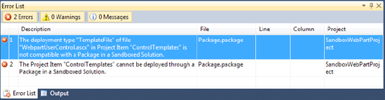
If you create a new Visual Web Part project, the Sandbox option appears disabled. That's a significant impediment. Loading a file from the root folder of the SharePoint installation—the 14 hive—is not allowed in a sandboxed solution. This is reasonable, as you can imagine what would happen if a hosting provider or Microsoft SharePoint Online installation allowed everybody to deploy such Web Parts to a shared host. However, that's exactly what the Visual Web Part project template does. Visual Studio knows this, so you cannot create a sandboxed Web Part. Even trying to fool it by creating an empty sandboxed solution and adding a Web Part to it will fail once you try to create the package (see Figure 6-8).
If you really need a Web Part running in a sandboxed solution, you are supposed to use a regular (not Visual) Web Part. Create a new, empty SharePoint solution, add a Web Part to it, and you're done. However, the visual experience has gone—you are limited to building the UI via code only.
Creating Visual Web Parts using Visual Studio 2010 is relatively easy. The project template includes everything you need for a designer surface and the required deployment elements. Compared with SharePoint 2007, there is nothing special or new. The template simply follows the best practices. It creates a custom control (ASCX) file and uses Visual Studio's built-in designer to scaffold the control. It overrides the CreateChildControl method and loads the control dynamically.
The complete solution consists of the following Web Part–related elements:
For deployment support, the solution also contains the feature and solution package files. (See Chapter 9 for more information.) The deployment determines the way how a Web Part becomes part of a SharePoint application.
The basic code used to load a custom control is as shown in Listing 6-11.
Example 6.11. A Visual Web Part Class That Loads a User Control
using System;
using System.Runtime.InteropServices;
using System.Web.UI;
using System.Web.UI.WebControls;
using System.Web.UI.WebControls.WebParts;
using Microsoft.SharePoint;
using Microsoft.SharePoint.WebControls;

namespace SimpleWebPart.VisualWebPart1
{
    public class VisualWebPart1 : WebPart
    {
        protected const string _ascxPath =
            @"˜/_CONTROLTEMPLATES/SimpleWebPart/VisualWebPart1/
              VisualWebPart1UserControl.ascx";

        public VisualWebPart1()
        {
        }

        protected override void CreateChildControls()
        {
            try
            {
                Control control = this.Page.LoadControl(_ascxPath);
                Controls.Add(control);
            }
            finally
            {
                base.CreateChildControls();
            }
        }

        protected override void Render(HtmlTextWriter writer)
        {
            base.Render(writer);
        }
    }
}
@"˜/_CONTROLTEMPLATES/SimpleWebPart/VisualWebPart1/
VisualWebPart1UserControl.ascx";
public VisualWebPart1()
{
}
protected override void CreateChildControls()
{
try
{
Control control = this.Page.LoadControl(_ascxPath);
Controls.Add(control);
}
finally
{
base.CreateChildControls();
}
}
protected override void Render(HtmlTextWriter writer)
{
base.Render(writer);
}
}
}This code implies that the Web Part's content is deployed as a custom control to the virtual CONTROLTEMPLATES folder. That makes the Web Part global to the server. To reiterate, Web Parts are reusable components that can be used in many applications on a server, so this is the most robust strategy for your controls. Of course, you can also use other methods, such as writing HTML to the output stream, to create the content.
Two additional XML files control how the Web Part is deployed. The Web Part appears in the Web Part gallery, as well as in several dialogs that end users access to add elements. The .webpart file provides additional information, as shown in Listing 6-12.
Example 6.12. Namespace and Property Definition in the .webpart File
<?xml version="1.0" encoding="utf-8"?>
<webParts>
  <webPart xmlns="http://schemas.microsoft.com/WebPart/v3">
    <metaData>
      <type name="SimpleWebPart.VisualWebPart1.VisualWebPart1,
                  $SharePoint.Project.AssemblyFullName$" />
      <importErrorMessage>$Resources:core,ImportErrorMessage;</importErrorMessage>
    </metaData>
    <data>
      <properties>
        <property name="Title" type="string">VisualWebPart1 Title</property>
        <property name="Description" type="string">VisualWebPart1
                                                    Description</property>
      </properties>
    </data>
  </webPart>
</webParts>
The <property> element overrides the default settings of the corresponding property from the WebPart base class. That means you can either override these properties in code or set values in the .webpart file. The declarative way using the XML file is the preferred technique.
If a text portion begins with $Resources, it references an assembly containing compiled resource data. Here it's the core assembly that SharePoint comes with. You can replace this string with any hard-coded one or assign your own resource file. (For more information, see the Chapter 8.) Using resource files is the preferred way to implement localization.
Web Parts in SharePoint are ASP.NET Web Parts. This means that the programming methods are similar. The code-behind might use the SharePoint API and the chrome ensures a consistent look and feel, but everything you can do is provided by ASP.NET.
Web Part controls support the personalization of a page. The page developer can decide what parts of the page are editable. If you have only static pages and no part is reusable, a Web Part does not make much sense. But you can also use Web Parts to make the work of a page developer easier. By developing Web Parts you enable the page developer to use these modules and decide later where on the page they can appear. Once the layout is fixed, the editing option can be disabled.
Web Parts can come from any third-party supplier. Web Parts are sold by many companies, and many more are free or available as open source. That makes it easy to add them to your pages or replace them with newer or improved versions any time. All this is possible without recompiling and redeploying your application. That adds a significant level of flexibility to your application design.
As with any other aspect of ASP.NET, understanding the control's life cycle is crucial to understanding its behavior. There are four life cycle steps that allow you to add custom code: OnInit, OnLoad, OnPrerender, and OnUnload.
OnInit occurs first, and allows you to access the uninitialized elements that have been added by the designer to the Web Part. It calls CreateChildControls implicitly to ensure that all elements render themselves. Overriding this method is the most robust way to add content programmatically. This ensures that you don't disturb the life cycle events and that the elements appear at the correct time.
OnLoad signals that the control is properly loaded and initialized. Any programmatic manipulation of existing elements should be placed here. It's safe to add synchronous operations here, such as database access or SharePoint list access.
For launching asynchronous processing, the best practice is to override the OnPreRender event. (Asynchronous processing is covered in depth in the section "Asynchronous Web Parts," later in this chapter.) A long-running external call, such as data retrieval from a web service or a database, blocks the current thread and will slow down the application if the thread pool runs out of threads. This can happen even if the CPU load is low. Asynchronous programming of long-running external calls frees the threads faster. When the external call returns, the runtime requests the thread again, processes the changes—for example, by populating a Gridview with the data—and completes rendering the page. That's best done in the PreRender step. The PreRenderComplete step is available at the page level only.
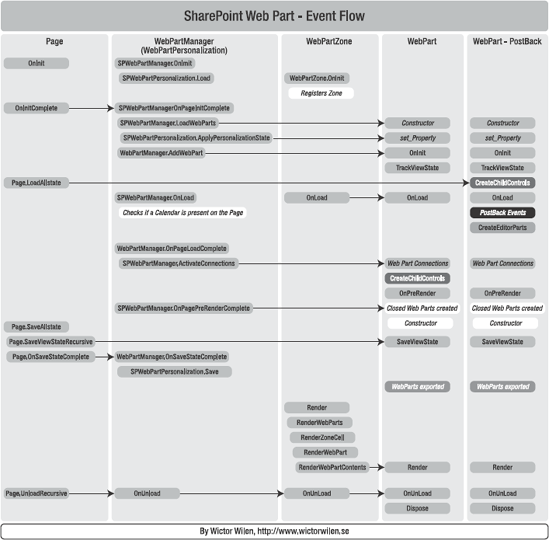
Closing and disposing of any connections made and other garbage collection tasks are best placed in the OnUnload step. In this step there is no more access to the controls because the rendering is done. All life cycle events are explained in Table 6-2. Figure 6-9 explains the relations between the events.
Table 6.2. Life Cycle Events for Web Parts
Source | Description | |
|---|---|---|
| Control | Fired after initialization. |
| Control | Fired after loading is completed. |
| Control | Creates child controls. |
| Control | Called to ensure that |
| Control | Fired after all internal processing and before the controls render. This is the last step you can use to modify controls. |
| Page | Fires if the page is executed asynchronously, and shows that rendering can be completed. |
| Control | Renders the Web Part, including the outer elements and chrome. |
| Control | Renders the Web Part inside the outer elements and with styles, but no chrome. |
There are five segments in the event model chart, from left to right:
Page: Events and methods happening in the page (System.Web.UI.Pagederivatives).WebPartManager: Events and methods in theSPWebPartManager(inherited fromWebPartManager).WebPartZone: Methods called inWebPartZonethat render theWebPartcontrols.WebPart: Events that occur during a normal view of aWebPart.WebPartpostback: Postback-specific event flow, which is a bit different from the normalWebPartflow. (Note thatCreateChildControlsoccurs before theOnLoadand connections.)
Some events and methods are not specific to Web Parts. Instead, they are inherited from base classes. Understanding these base classes is vital for Web Part development.
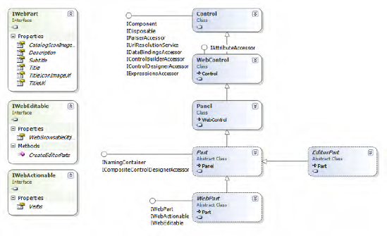
The inheritance from Control and the implementation of the IComponent interface build the foundation of a Web Part. As you can see, there is no dependency on SharePoint. Consequently, you can create Web Parts in any ASP.NET-aware environment and use them in SharePoint. In the hierarchy (in Figure 6-10), notice the Panel class toward the middle. A Panel renders as a <div> element in HTML, implying a rectangular surface. Hence, all Web Parts have a Width and Height property. The Web Part–specific behavior originates with the WebPart base class. This base class's elements are implementations of the IWebPart, IWebEditable, and IWebActionable interfaces.
The WebPartManager enables any layout of zones. Zones are rectangular areas constructed from any valid HTML—usually tables—and tagged with <asp:webpartzone> tags. Inside the tag, the <contenttemplate> element is used to define where the Web Part can appear. When a user opens a page for the first time, all the Web Parts appear in Browse mode. Technically, each Web Part supports three actions: minimize, maximize, and remove. If the page is in Design mode, the user can move Web Parts from one zone to another. In Edit mode, the user can modify the customizable properties of the currently selected Web Part. A predefined property zone is responsible for rendering the appropriate UI. Catalog mode gives access to currently invisible Web Parts so that a user can add them to the page. The five modes are
Browse: This is default mode, showing the final page layout.
Design: In this mode, you can minimize or move Web Parts.
Edit: In this mode, you can edit the properties of the currently selected Web Part.
Catalog: This mode shows additional Web Parts that you can add to any zone.
Connect: This mode allows you to add data connections between Web Parts.
SharePoint provides several predefined Web Part pages. Adding such a page means that you add an ASPX page that has a layout with zones arranged in some way. You may want to add your own page if you create custom application pages or if you desire a different layout. (See Chapter 8 for more details on programming such pages.)
In the following exercise, an application page contains the Web Part zones. To create the project, perform the following steps.
ADDING A PRIVATE WEB PART PAGE
Create a new Empty SharePoint Solution project.
Add the
LAYOUTSfolder by right-clicking in the Solution Explorer tree and choosing Add
Right-click the folder and choose Add
Select Application Page from Template Explorer.
Add the code shown in Listing 6-13.
When you're done coding the page, deploy it using Visual Studio. Open the page directly from the _layouts/<project> folder, where <project> is a placeholder for your project's name.
Listing 6-13 shows a page with embedded code that allows two modes: Design and Browse.
Example 6.13. A Custom Web Part Page
<%@ Assembly Name="$SharePoint.Project.AssemblyFullName$" %>
<%@ Import Namespace="Microsoft.SharePoint.ApplicationPages" %>
<%@ Register TagPrefix="SharePoint" Namespace="Microsoft.SharePoint.WebControls"
    Assembly="Microsoft.SharePoint, ..." %>
<%@ Register TagPrefix="SharePoint" Namespace="Microsoft.SharePoint.WebPartPages"
    Assembly="Microsoft.SharePoint, ..." %>
<%@ Register TagPrefix="Utilities" Namespace="Microsoft.SharePoint.Utilities"
    Assembly="Microsoft.SharePoint, ..." %>
<%@ Register TagPrefix="asp" Namespace="System.Web.UI"
    Assembly="System.Web.Extensions, ..." %>
<%@ Register TagPrefix="asp" Namespace="System.Web.UI.WebControls.WebParts"
    Assembly="System.Web.Extensions, ..." %>
<%@ Import Namespace="Microsoft.SharePoint" %>
<%@ Assembly Name="Microsoft.Web.CommandUI, ..." %>

<%@ Page Language="C#" AutoEventWireup="true" CodeBehind="WebPartPage.aspx.cs"
         Inherits="WebPartPageProject.Layouts.WebPartPageProject.WebPartPage"
         DynamicMasterPageFile="˜masterurl/default.master" %>

<asp:Content ID="PageHead"
             ContentPlaceHolderID="PlaceHolderAdditionalPageHead" runat="server">
</asp:Content>
<asp:Content ID="Main" ContentPlaceHolderID="PlaceHolderMain" runat="server">
<h1>
Webpart Introduction</h1>
<table width="100%" border="1">
<tr>
<td colspan="2">
<asp:WebPartZone runat="server" ID="headerZone"
HeaderText="Header Zone">
</asp:WebPartZone>
</td>
</tr>
<tr>
<td style="width:50%">
<asp:WebPartZone runat="server" ID="leftZone"
HeaderText="Left Zone">
</asp:WebPartZone>
</td>
<td style="width:50%">
<asp:WebPartZone runat="server" ID="rightZone"
HeaderText="Right Zone">
</asp:WebPartZone>
</td>
</tr>
<tr>
<td colspan="2">
<asp:CatalogZone runat="server" ID="catZone">
<ZoneTemplate>
<asp:PageCatalogPart runat="server" ID="catalogZonePart"
Title="Page Parts">
</asp:PageCatalogPart>
<asp:DeclarativeCatalogPart runat="server"
ID="declarativeZonePart" Title="Catalogue">
<WebPartsTemplate>
<SharePoint:ListViewWebPart runat="server"
id="listView1" Title="Authors"
ListName="32AF232D-375A-4504-9076-261F347448CF" />
<SharePoint:ListViewWebPart runat="server"
id="listView2" Title="Tasks"
ListName="4F6DEED2-3A62-49EE-A3F7-080E5BCBAB82" />
</WebPartsTemplate>
</asp:DeclarativeCatalogPart>
</ZoneTemplate>
</asp:CatalogZone>
</td>
</tr>
<tr>
<td colspan="2">
<asp:LinkButton runat="server" ID="lnkMode"
Text="Browse Mode" OnClick="lnkMode_Click"></asp:LinkButton>
<asp:LinkButton runat="server" ID="lnkCatM"
Text="Catalog Mode"
OnClick="lnkCatMode_Click"></asp:LinkButton>
</td></tr>
</table>
</asp:Content>
<asp:Content ID="PageTitle" ContentPlaceHolderID="PlaceHolderPageTitle"
runat="server">
Application Page
</asp:Content>
<asp:Content ID="PageTitleInTitleArea" ContentPlaceHolderID="PlaceHolderPageTitleInTitleArea"
runat="server">
My WebPart Page
</asp:Content>This page contains several zones to place Web Parts and a Catalog zone where the user can select more Web Parts. In the example, a table defines the position of the zones. This is usually the easiest way to place Web Parts at particular locations. (All styles and descriptive aspects are omitted for the sake of clarity. Consider adding more useful error-checking and validation code to extend the user experience when defining private Web Part pages, such as shown in Listing 6-14.)
Example 6.14. Code-Behind for the Custom Web Part Page
using System;
using Microsoft.SharePoint;
using Microsoft.SharePoint.WebControls;
using Microsoft.SharePoint.WebPartPages;
using System.Web.UI.WebControls.WebParts;

namespace WebPartPageProject.Layouts.WebPartPageProject
{
    public partial class WebPartPage : LayoutsPageBase
    {
        SPWebPartManager spWebPartManager;
        protected void Page_Load(object sender, EventArgs e)
        {
            spWebPartManager = WebPartManager.GetCurrentWebPartManager(this)
                               as SPWebPartManager;

            if (spWebPartManager.SupportedDisplayModes.Contains(
                                WebPartManager.CatalogDisplayMode))
            {
                lnkCatM.Visible = true;
            }
            else
            {
                lnkCatM.Visible = false;
            }
        }

        protected void lnkCatMode_Click(object sender, EventArgs e)
        {
            spWebPartManager.DisplayMode = WebPartManager.CatalogDisplayMode;
        }

        protected void lnkMode_Click(object sender, EventArgs e)
        {
if (spWebPartManager != null)
{
if (lnkMode.Text == "Design Mode")
{
spWebPartManager.DisplayMode = WebPartManager.BrowseDisplayMode;
lnkMode.Text = "Browse Mode";
}
else
{
spWebPartManager.DisplayMode = WebPartManager.DesignDisplayMode;
lnkMode.Text = "Design Mode";
}
}
}
}
}The code-behind class contains only the LinkButton event handlers to change the zone modes. The SPWebPartManager is retrieved in the page's Load event. If Catalog mode is currently supported, the appropriate LinkButton is made visible (see Figure 6-11).
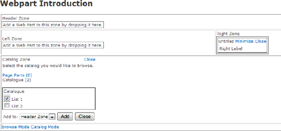
On clicking the LinkButton control, the page switches into Design mode. You can now move Web Parts around—from zone to zone. This is performed by JavaScript that supports drag-and-drop operations. In the example, the current text displayed by LinkButton is set dynamically to represent the available state, determined from the SPWebPartManager control.
This merely demonstrates that it's possible to build Web Part–enabled application pages. When you use the predefined templates for Web Part pages, you simply develop the Web Part itself. The remaining section explains in depth the capabilities of Web Part development.
SPWebPartManager manages all Web Parts on a page. It is defined in the default master page and has the ID m. To get a reference, you can use the WebPartManager class:
var m = WebPartManager.GetCurrentWebPartManager(this) as SPWebPartManager;
(The preceding code assumes that you're on an application page. If the code runs inside a Web Part or a user control, use this.Page, instead of this.) To get the currently supported modes, use m.SupportedDisplayModes, which returns a value of the WebPartDisplayModes enumeration. Under certain circumstances—such as when no HttpContext is available—SPLimitedWebPartManager is used. It supports only a subset of the features available in SPWebPartManager.
WebPartZone is a container that holds the Web Parts. Web Parts can't exist outside such a container. You can define Web Parts within a ZoneTemplate statically or let the user add one or more dynamically.
EditorZone allows for the editing of a Web Part's properties. To activate the Edit mode, set SPWebPartManager's DisplayMode property:
m.DisplayMode = WebPartManager.EditDisplayMode;
If the user has set something that makes the page no longer work properly, you can offer a reset option. This invokes the following method:
m.Personalization.ResetPersonalizationState();
CatalogZone can contain several catalogs. Catalogs allows users to select Web Parts from a predefined selection. User can remove Web Parts. To add a Web Part to the page again, a catalog is required, too. To switch to Catalog mode, use the following call:
m.DisplayMode = WebPartManager.CatalogDisplayMode;
There are three catalog controls available:
PageCatalogPart: All removed Web Parts are listed here. By default this catalog is empty. If you don't provide aPageCatalogPartcontrol, then the user won't be able to readd removed Web Parts. You can omit this control if closing of Web Parts is disabled, too.DeclarativeCatalogPart: This catalog contains a list of statically defined Web Parts available on the page.ImportCatalogPart: This zone allows the user to upload and import Web Part definition files.
ConnectionsZone allows the definition of connections between data Web Parts. Typically, this creates a parent/child relationship or a list/details view using two different Web Parts.
A Web Part is a user control that implements at least the abstract WebPart base class. This includes several base classes and interfaces that the Web Part manager employs to interact with a custom Web Part (see Figure 6-12).
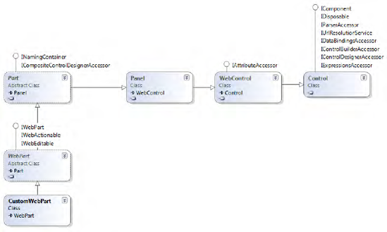
The WebControl class provides the basic behavior of a user control. The Panel class, next in the hierarchy, ensures that the control appears as a rectangle. The IWebPart interface provides the descriptive aspects, with such properties as Title, Description, and TitleIconImageUrl. IWebActionable provides the Verbs property, a collection of so-called verbs. A verb defines an action and usually appears in the context menu of the Web Part as a menu item. The WebPartVerb class is a Web Part–specific implementation that supports a checked state (Checked property), a ClientScriptHandler and ServerClickHandler to launch the action, and menu item–specific properties such as Enabled, Text, Visible, and ImageUrl.
Along with the Web Part's properties, many attributes can be used to modify the design-time experience. Remember that a Web Part's design time is when the user adds it to a Web Part page. The attributes decorating the Web Part properties are responsible for
Personalizing behavior
Customizing the property pane and the properties' behavior
Controlling the connectivity between Web Parts
Table 6-3 summarizes the attributes available.
Table 6.3. Web Part Attributes to Modify Properties
Name | Description |
|---|---|
| Controls whether the property is visible in the property grid. |
| Activates the per-user settings. |
| Provides a friendly name for the property grid. |
| Identifies the callback method that acts as the control's data provider. |
| Identifies the callback method that acts as the control's data consumer. |
| Determines in what scope the property data is stored. It is normally set to |
| Provides a description that appears as a tooltip in the property grid. |
| Defines the category under which the property appears. |
The first five attributes are standard ASP.NET attributes found in the System.Web.UI.WebControls.WebParts namespace, while the others are SharePoint-specific attributes from the Microsoft.SharePoint.WebPartPages namespace.
Web Parts support many features and sophisticated customization options. This section explains more advanced techniques for the SharePoint page editor, SharePoint Designer, and the design-time experience.
SharePoint Web Parts are intended to enable personalized versions of a page. The ASP.NET Web Part framework supports this via the Personalizable attribute. Internally, the location of a Web Part, the current state (closed or open), and other personalizable settings are stored in the database.
[Personalizable(true)]
public string myProperty
{
  ...
}
The attribute has several overloads. Either you simply turn the personalization on (true) or use one of the following two options: PersonalizationsScope.User or PersonalizationsScope.Shared. You can decide for each property whether each user is allowed to store his or her own value. If the property is shared, the user needs additional rights to change the value. From the perspective of SharePoint, he or she must be permitted to edit the shared version of the page.
For a property to be made personalizable, it must meet the following requirements:
It must be public.
It must have both public getter and setter accessors.
It must not be decorated with the
ReadOnlyAttribute.It must not be an indexer.
A property marked with ReadOnly is still visible in the property pane.
Web Parts are intended to be used by end users. That increases the expectations of your components. Web Parts are—barring extremely simple ones—highly configurable components. SharePoint users normally cannot access web.config or Central Administration. Therefore, you have to provide any required configuration settings and keep in mind that inexperienced users will use your component, too.
As shown in the previous sections, you can use attributes on properties to add metainformation that supports the design-time experience. For the end user, the time they add or move a Web Part is the design time. The property pane is what appears at the right-hand side of the page. It's a simplified way—using HTML—to present properties in much the same style as the property grid in Visual Studio. The property grid uses reflection to gather information about properties (both the underlying data type and any custom attributes) and manage the UI.
Note
The term property is used intentionally. You cannot use public fields or methods to show settings in the property pane. The reflection mechanism looks only for public properties, and further investigates attributes solely on those public properties.
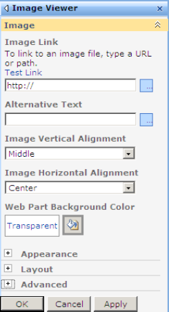
The metainformation needed for each property in the property pane is
The name (e.g., "Alternative Text" in Figure 6-13)
The type that controls the UI element (e.g.,
TextBoxforString)An optional description (e.g., the "To link to an image . . ." text)
A category that manages where the element appears (e.g., Layout or Advanced)
To have full control of the property pane, you need a complete grasp of how properties work.
Properties of a programming language like C# seem to be a simple thing. However, when a property controls the design of the property pane and the behavior in code, it's more than just a simple property.
A property consists of
A name: This is the name that appears by default in the pane and is used in code.
A type: This is the type used in code. To support a UI, the type must be converted into another type that a specific control supports.
A description: This is a descriptive name shown in the UI and managed by an attribute. It has no meaning in code and is an optional element. Use
WebDescriptionAttributeto decorate the property.A category: The property pane is divided in categories. This element is managed by an attribute. It's optional because the property pane provides a default category. Use
WebCategoryAttributeto decorate the property.A type converter: This is optional if the editable type and the internal type differ. If the internal type is complex, such as a color (
System.Drawing.Color), and the UI provides a simple text box (returnsSystem.String), a conversion is necessary. Using a type converter is the standard .NET way to convert values between types using custom code.A readonly flag: This disables user access to publicly visible properties. The property is still writable from code and is still visible in the property pane. Mark a property with the
ReadOnlyAttributeto put the input control into the disabled state.A browsable flag: Turns on or off visibility in the pane without affecting public access to the property via code. Use the
WebBrowsableattribute to make the property visible in the property pane.An editor flag:
HtmlDesignerAttributeprovides a custom editor page for a value and appears as a pop-up window, extending the property's UI.
A Web Part can control more of its own behavior by overriding properties and methods. For some functions, the implementation of additional classes is required.
Note
FriendlyNameAttribute, which was used in previous versions, is deprecated. Use WebDescriptionAttribute instead.
Depending on their type, properties can create specific controls in the property pane. Table 6-4 shows the default mapping between types and controls.
Table 6.4. Types That Show as a Particular Control (All Other Types Create a TextBox)
Type | Control |
|---|---|
|
|
|
|
|
|
|
|
|
|
|
|
You may wonder how the Height and Width properties in Figure 6-14 render with the more sophisticated control. The editing zone at the right of a Web Part page in Edit mode is indeed a <EditZone> control. There are several predefined editors that handle a subset of the default properties exposed by a Web Part (inherited from either a WebPart or Part class).
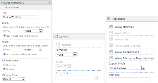
Figure 6.14. Predefined Web Part editor parts (from left to right: AppearanceEditorPart, LayoutEditorPart, and BehaviorEditorPart)
If you scroll down the editor pane, you'll find the categories you defined using the WebCategoryAttribute, and probably a section called Miscellaneous that contains all the editable properties that don't have a category. As shown in Figure 6-14, the internally used editors provide a more impressive user experience. (In the next section, you'll find more information about custom editor panes.)
Storing more complex values than just strings or integers is more complicated. Editing these properties with the standard generated interface using the WebBrowsable and Personalizable attributes does not work, since it only accepts basic types, as shown earlier. To make these properties editable, you have to build an editor part and control the properties in the SyncChanges and ApplyChanges methods.
Using the standard approach of marking properties using specific attributes, you can make a Web Part editable as required. But the default user experience for editing is still suboptimal. Firstly, the properties to be edited are located in their own category at the bottom of the list—not easy to find for inexperienced or untrained users. Secondly, the properties often have dependencies and require validation.
ASP.NET contains an abstract class called EditorPart. This class is used with the ASP.NET WebPart class to create customized tool panes. By inheriting from this control, you can customize the appearance and functionality of the tool pane and use standard ASP.NET constructs such as auto postbacks and validations. Start with a new class that inherits from System.Web.UI.WebControls.WebParts.EditorPart. In this class, you have to override two abstract methods and add the controls that you want to use.
The custom editing section exists once per Web Part. Other than for common editor controls, you don't need an attribute to decorate a property. Instead, you must override the CreateEditorParts method. This method returns an EditorPartCollection that contains all EditorPart objects presented in the editor pane. That includes but is not limited to the standard parts explained previously. However, by default all properties get a generic input control. To avoid duplicate controls, you must exclude the property you wish to be editable in the customized part. This can be done by removing the WebBrowsable attribute or setting its initial value to false. The latter approach is recommended so that others reading the code can see that this is a publicly editable property with some controls found elsewhere:
[WebBrowsable(false)]
You can add one or more controls to a custom editor pane. If you have just one property, it's very simple:
public override EditorPartCollection CreateEditorParts()
{
    List<EditorPart> editorParts = new List<EditorPart>();
    EditorPart part = new CustomEditorPart();
    part.ID = this.ID + "_stateEditorPart";
    editorParts.Add(part);
    EditorPartCollection coll = base.CreateEditorParts();
    return new EditorPartCollection(coll, editorParts);
}
This method returns a merge of the existing EditorParts and the custom ones. In this example only one additional EditorPart, named CustomEditorPart, has been added. The ID property must be explicitly set to some unique name. Because only one instance of the EditorPart is usually present on a page, a static suffix is adequate. The skeleton of such a control looks as shown in Listing 6-15.
Example 6.15. Skeleton of an EditorPart Control
using System;
using System.Collections.Generic;
using System.Linq;
using System.Text;
using System.Web.UI.WebControls;
using System.Web.UI.WebControls.WebParts;

namespace Apress.SP2010.WebPartPageProject.MyWebParts
{
    public class CustomEditorPart : EditorPart
    {

        public CustomEditorPart()
            : base()
        {
        }

        protected override void CreateChildControls()
        {
base.CreateChildControls();
}
public override bool ApplyChanges()
{
EnsureChildControls();
return true;
}
public override void SyncChanges()
{
EnsureChildControls();
}
}
}The controls that appear in the editor must be added to the control collection in either the CreateChildControls or the Render method. This is similar to the way you create the content of a Web Part. In this example, the custom editor creates a list of RadioButton elements instead of a DropDown control. This requires some conversion between the underlying Enum type and the string types used for list items. A reference to the WebPart control gives access to the values to create the appropriate controls and write the values back:
private CustomWebPart webPart;
private readonly Type enumType = typeof(CustomWebPart.States);
Adding Controls
The controls are added in the CreateChildControls method. This is where you should place most of your control logic in editor parts, Web Parts, and so on.
private RadioButtonList rbl;

protected override void CreateChildControls()
{
   base.CreateChildControls();
   // Instead of a drop-down list, create a couple of radio buttons
   rbl = new RadioButtonList();
   webPart = (CustomWebPart)this.WebPartToEdit;

   var items = from i in Enum.GetNames(enumType)
               select new ListItem(i)
               {
                  Selected = Enum.GetName(enumType,
                                  webPart.ControlStatesDrop).Equals(i)
               };
   rbl.Items.AddRange(items.ToArray());
   base.Controls.Add(rbl);
}
This method creates the RadioButtonList, in which each item represents an Enum value. The LINQ statement converts the Enum values into ListItem controls and sets the currently selected item. The complete list appears with the current value set. Now you need to retrieve and apply changes.
The SyncChanges method is used by the EditorPart to get the values from the Web Part into the editor part.
public override void SyncChanges()
{
    EnsureChildControls();
    rbl.Items.FindByValue(Enum.GetName(enumType,
                           webPart.ControlStatesDrop)).Selected = true;
}
Firstly, the method ensures that all the controls are present. This calls the CreateChildControls method if required. Then the RadioButton element is retrieved, which matches the currently selected value. Again, the enumType field helps, using the Enum class to transform an enumeration value into a string representation.
Applying Changes
The ApplyChanges method is executed when you click OK or Apply, and sets the property values of your Web Part. SyncChanges is always called directly after the ApplyChanges method to make sure that the properties are in sync.
public override bool ApplyChanges()
{
    EnsureChildControls();
    if (rbl.SelectedIndex >= 0)
    {
        webPart.ControlStatesDrop = (CustomWebPart.States)Enum.Parse(enumType,
                                                          rbl.SelectedValue);
        return true;
    }
    else
    {
        return false;
    }
}
Again, the EnsureChildControls method call ensures that the controls are properly loaded. The currently selected value is parsed and written back to the Web Part's property.
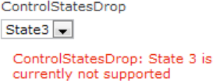
In the previous examples we assumed that users don't make any mistakes. We accept any incoming value. That's far from real-world experience, and therefore some validation has to be added. As the properties render automatically, there must be some way to expose an error message. That's done by throwing a WebPartPageUserException.
[Personalizable(true)]
[WebBrowsable(true)]
public States ControlStatesDrop
{
     get
     {
         if (ViewState["States"] == null)
         {
ViewState["States"] = States.State2;
}
return (States) Enum.Parse(typeof(States), ViewState["States"].ToString());
}
set
{
if (value == States.State3)
{
throw new WebPartPageUserException("State 3
is currently not supported");
}
ViewState["States"] = value;
}
}The exception puts a red message from the constructor's parameter into the editor pane and a generic message on top (see Figure 6-15).
The message appears when the page is posted back, when either OK or Apply is clicked. The message appears above the controls if a custom EditorPart is used as shown in Figure 6-16.
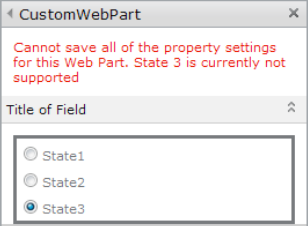
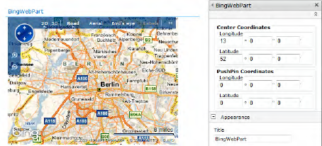
The previous sections explained the basic tasks required to customize the editable section of a Web Part. In this section is an example of a complete Web Part together with a custom editor—putting all the pieces of the puzzle together. Custom editors are often advantageous if you deal with custom types, such as geographic coordinates. The Web Part explained here creates a little map using the Bing client library, and the custom editor allows the setting of the region as well as the coordinates of a pushpin—a specific location within the map. The error handler checks whether the coordinates of the pushpin are within the map region.
The Web Part itself defines the minimum required properties. WebBrowsable is set to false to suppress the generic editors (Listing 6-16).
Example 6.16. The WebPart Class with a Call to the User Control
using System;
using System.ComponentModel;
using System.Runtime.InteropServices;
using System.Web;
using System.Web.UI;
using System.Web.UI.WebControls;
using System.Web.UI.WebControls.WebParts;
using Microsoft.SharePoint;
using Microsoft.SharePoint.WebControls;
using System.Collections.Generic;

namespace Apress.SP2010.WebPartPageProject.BingWebPart
{
    [ToolboxItemAttribute(false)]
    public class BingWebPart : WebPart
    {
        private const string _ascxPath =
             @"˜/_CONTROLTEMPLATES/WebPartPageProject/
                BingWebPart/BingWebPartUserControl.ascx";

        public BingWebPart()
        {
        }

        protected override void CreateChildControls()
        {
            BingWebPartUserControl control = this.Page.LoadControl(_ascxPath)
                                             as BingWebPartUserControl;
            Controls.Add(control);
            base.CreateChildControls();
        }

        protected override void RenderContents(HtmlTextWriter writer)
        {
            base.RenderContents(writer);
        }

        public override EditorPartCollection CreateEditorParts()
        {
            List<EditorPart> parts = new List<EditorPart>();
            EditorPart edit = new CoordinatesEditorPart();
            edit.ID = this.ID + "_coordEditor";
            parts.Add(edit);
            return new EditorPartCollection(base.CreateEditorParts(), parts);
        }

        [WebBrowsable(false)]
        [Personalizable(true)]
        public Coordinates CenterCoordinate
        {
            get;
set;
}
[WebBrowsable(false)]
[Personalizable(true)]
public Coordinates PushPin
{
get;
set;
}
}
}This code defines the properties that center the map and define a pushpin (marker) that you can set into the map. The code to manage the map is based on JavaScript and defined in the Web Part's markup section (see Listing 6-17).
Example 6.17. The User Controls Markup Part
%@ Assembly Name="$SharePoint.Project.AssemblyFullName$" %>
<%@ Assembly Name="Microsoft.Web.CommandUI, Version=14.0.0.0, Culture=neutral,
             PublicKeyToken=71e9bce111e9429c" %>
<%@ Register Tagprefix="SharePoint" Namespace="Microsoft.SharePoint.WebControls"
             Assembly="Microsoft.SharePoint, ..." %>
<%@ Register Tagprefix="Utilities" Namespace="Microsoft.SharePoint.Utilities"
             Assembly="Microsoft.SharePoint, ..." %>
<%@ Register Tagprefix="asp" Namespace="System.Web.UI"
             Assembly="System.Web.Extensions, ..." %>
<%@ Import Namespace="Microsoft.SharePoint" %>
<%@ Register Tagprefix="WebPartPages" Namespace="Microsoft.SharePoint.WebPartPages"
             Assembly="Microsoft.SharePoint, ..." %>
<%@ Control Language="C#" AutoEventWireup="true"
    CodeBehind="BingWebPartUserControl.ascx.cs"
   Inherits="WebPartPageProject.BingWebPart.BingWebPartUserControl" %>
<script type="text/javascript"
        src="http://dev.virtualearth.net/mapcontrol/mapcontrol.ashx?v=6.2">
</script>
<script type="text/javascript">

/// <reference path="http://dev.virtualearth.net/mapcontrol/mapcontrol.ashx?v=6.2" />
function GetMap() {
    var map = new VEMap('<% = spBingMap.ClientID %>'),
    var lat = document.getElementById('<% = latField.ClientID  %>').value;
    var lng = document.getElementById('<% = lngField.ClientID  %>').value;
    var latlng = new VELatLong(lat, lng);
    map.LoadMap(latlng, 10, 'r', false);
}
window.onload = function () {
    GetMap();
}
</script>
<div id="spBingMap" runat="server" style="position:relative; width:400px; height:300px"></div>
<asp:HiddenField runat="server" ID="latField" Value="52.222" />
<asp:HiddenField runat="server" ID="lngField" Value="13.297" />
Even this user control has a code-behind to set or get the values from hidden fields and the dimensions of the <div> container (see Listing 6-18).
Example 6.18. The User Control's Code-Behind
using System;
using System.Web.UI;
using System.Web.UI.WebControls;
using System.Web.UI.WebControls.WebParts;
using System.Globalization;

namespace Apress.SP2010.WebPartPageProject.BingWebPart
{
    public partial class BingWebPartUserControl : UserControl
    {
        protected void Page_Load(object sender, EventArgs e)
        {
        }

        public Unit Width
        {
            get { return Unit.Parse(spBingMap.Style[HtmlTextWriterStyle.Width]); }
            set { spBingMap.Style[HtmlTextWriterStyle.Width] = value.ToString(); }
        }

        public Unit Height
        {
            get { return Unit.Parse(spBingMap.Style[HtmlTextWriterStyle.Height]); }
            set { spBingMap.Style[HtmlTextWriterStyle.Height] = value.ToString(); }
        }

        public decimal Longitude
        {
            get { return Convert.ToDecimal(latField.Value); }
            set { latField.Value = value.ToString(CultureInfo.InvariantCulture); }
        }

        public decimal Latitude
        {
            get { return Convert.ToDecimal(lngField.Value); }
            set { lngField.Value = value.ToString(CultureInfo.InvariantCulture); }
        }

    }
}
Using the Unit type is just a suggestion. Use the strongest possible type to simplify testing and validation.
Next, the user control is loaded within the CreateChildControls method. By overriding the CreateEditorParts method, the custom editor is shown to support the Coordinates type. This type is used to deal flexibly with complex values, like geographical coordinates (see Listing 6-19).
Example 6.19. A Helper Class That Supports Private Types
using System;
using System.Collections.Generic;
using System.Linq;
using System.Text;
using System.Globalization;
using System.Web.UI;

namespace Apress.SP2010.WebPartPageProject.BingWebPart
{

    public struct DegMinSec
    {
        public int Deg { get; set; }
        public int Min { get; set; }
        public int Sec { get; set; }
    }

    public struct Coordinates
    {

        public Coordinates(DegMinSec lat, DegMinSec lng) : this()
        {
            SetLongitude(lng);
            SetLatitude(lat);

        }

        public static Coordinates Empty
        {
            get
            {
                return new Coordinates();
            }
        }

        public static bool operator ==(Coordinates c1, Coordinates c2)
        {
            return (c1.Latitude == c2.Latitude && c1.Longitude == c2.Longitude);
        }

        public static bool operator !=(Coordinates c1, Coordinates c2)
        {
            return (c1.Latitude != c2.Latitude || c1.Longitude != c2.Longitude);
        }

        public decimal Latitude { get; set; }
        public decimal Longitude { get; set; }

        public bool IsInRange(Coordinates from, Coordinates to)
        {
            return (
this.Longitude > from.Longitude && this.Latitude > from.Latitude &&
this.Longitude < to.Longitude && this.Latitude < to.Latitude);
}
public DegMinSec LatitudeDegrees
{
get
{
return GetDegMinSec(Latitude);
}
}
public DegMinSec LongitudeDegrees
{
get
{
return GetDegMinSec(Longitude);
}
}
private static DegMinSec GetDegMinSec(decimal longlat)
{
int deg = (int)Math.Truncate(longlat);
decimal mins = (longlat - deg) * 60;
int min = (int)Math.Truncate(mins);
int sec = (int)(mins - min) * 60;
return new DegMinSec()
{
Deg = deg,
Min = min,
Sec = sec
};
}
public void SetLongitude(DegMinSec t)
{
Longitude = t.Deg + t.Min + t.Sec;
}
public void SetLatitude(DegMinSec t)
{
Latitude = t.Deg + t.Min + t.Sec;
}
public override string ToString()
{
return String.Format(CultureInfo.CurrentCulture, "{0}:{1}",
Latitude, Longitude);
}
}
}The operator overloads make it easier when later checking the values. It makes sense to deal with business data objects like this instead of scalar types. The DegMinSec struct defined at the beginning simplifies converting values between the degrees/minutes/seconds format and the decimal format, which map libraries like Bing prefer. This makes designing the user controls simpler. The first user control is the definition for one triplet of data (see Listing 6-20).
Example 6.20. The Markup of the Custom Editor
<%@ Assembly Name="$SharePoint.Project.AssemblyFullName$" %>
<%@ Assembly Name="Microsoft.Web.CommandUI, Version=14.0.0.0, Culture=neutral,
PublicKeyToken=71e9bce111e9429c" %>
<%@ Register TagPrefix="SharePoint" Namespace="Microsoft.SharePoint.WebControls"
Assembly="Microsoft.SharePoint, ..." %>
<%@ Register TagPrefix="Utilities" Namespace="Microsoft.SharePoint.Utilities"
Assembly="Microsoft.SharePoint, ..." %>
<%@ Register TagPrefix="asp" Namespace="System.Web.UI"
Assembly="System.Web.Extensions, ..." %>
<%@ Import Namespace="Microsoft.SharePoint" %>
<%@ Register TagPrefix="WebPartPages" Namespace="Microsoft.SharePoint.WebPartPages"
Assembly="Microsoft.SharePoint, ..." %>
<%@ Control Language="C#" AutoEventWireup="true"
CodeBehind="CoordinatesEditor.ascx.cs"
Inherits="WebPartPageProject.BingWebPart.CoordinatesEditor" %>
<fieldset>
<legend>
<asp:Label runat="server" ID="lblControl" Font-Bold="true"></asp:Label></legend>
<fieldset title="Longitude">
<legend>Longitude </legend>
<asp:TextBox ID="TextBoxDegLng" runat="server" Width="50px"></asp:TextBox>
°
<asp:TextBox ID="TextBoxMinLng" runat="server" Width="50px"></asp:TextBox>"
<asp:TextBox ID="TextBoxSecLng" runat="server" Width="50px"></asp:TextBox>'
</fieldset>
<fieldset title="Latitude">
<legend>Latitude </legend>
<asp:TextBox ID="TextBoxDegLat" runat="server" Width="50px"></asp:TextBox>
°
<asp:TextBox ID="TextBoxMinLat" runat="server" Width="50px"></asp:TextBox>"
<asp:TextBox ID="TextBoxSecLat" runat="server" Width="50px"></asp:TextBox>'
</fieldset>
</fieldset>The code-behind file (see Listing 6-21) sets or gets the values.
Example 6.21. The Code-Behind Class of the Custom Editor
using System;
using System.Web.UI;
using System.Web.UI.WebControls;
using System.Web.UI.WebControls.WebParts;
using WebPartPageProject.BingWebPart;

namespace Apress.SP2010.WebPartPageProject.BingWebPart
{
public partial class CoordinatesEditor : UserControl
{
protected void Page_Load(object sender, EventArgs e)
{
}
public Coordinates Coordinate
{
set
{
DegMinSec lat = value.LatitudeDegrees;
DegMinSec lng = value.LongitudeDegrees;
TextBoxDegLat.Text = lat.Deg.ToString();
TextBoxMinLat.Text = lat.Min.ToString();
TextBoxSecLat.Text = lat.Sec.ToString();
TextBoxDegLng.Text = lng.Deg.ToString();
TextBoxMinLng.Text = lng.Min.ToString();
TextBoxSecLng.Text = lng.Sec.ToString();
}
get
{
DegMinSec lat = new DegMinSec();
DegMinSec lng = new DegMinSec();
lat.Deg = Int32.Parse(TextBoxDegLat.Text);
lat.Min = Int32.Parse(TextBoxMinLat.Text);
lat.Sec = Int32.Parse(TextBoxSecLat.Text);
lng.Deg = Int32.Parse(TextBoxDegLng.Text);
lng.Min = Int32.Parse(TextBoxMinLng.Text);
lng.Sec = Int32.Parse(TextBoxSecLng.Text);
return new Coordinates(lat, lng);
}
}
public string Title
{
get { return lblControl.Text; }
set { lblControl.Text = value; }
}
}
}There is nothing ambitious here. The code does not contain any validation or error checking, for the sake of clarity. Consider adding the necessary validator controls and exposing error messages to the Web Part control. This user control is used twice to define the custom editor for the coordinates and the pushpin value. This is done in the EditorPart implementation shown in Listing 6-22.
Example 6.22. The Editor Part That References Custom Controls
using System;
using System.Collections.Generic;
using System.Linq;
using System.Text;
using System.Web.UI.WebControls.WebParts;
using System.Web.UI.WebControls;
namespace Apress.SP2010.WebPartPageProject.BingWebPart
{
    public class CoordinatesEditorPart : EditorPart
    {

        private const string _ascxPath = @"˜/_CONTROLTEMPLATES/WebPartPageProject/
                                          BingWebPart/CoordinatesEditor.ascx";

        public CoordinatesEditorPart()
            : base()
        {
        }

        BingWebPart webPart;
        CoordinatesEditor center;
        CoordinatesEditor pushp;

        protected override void CreateChildControls()
        {
            center = this.Page.LoadControl(_ascxPath) as CoordinatesEditor;
            center.Title = "Center Coordinates";
            pushp = this.Page.LoadControl(_ascxPath) as CoordinatesEditor;
            pushp.Title = "PushPin Coordinates";
            Controls.Add(center);
            Controls.Add(pushp);
            base.CreateChildControls();
            webPart = (BingWebPart)this.WebPartToEdit;
            center.Coordinate = webPart.CenterCoordinate;
            pushp.Coordinate = webPart.PushPin;
        }

        public override bool ApplyChanges()
        {
            EnsureChildControls();
            if (pushp.Coordinate != Coordinates.Empty)
            {
                webPart.CenterCoordinate = center.Coordinate;
                webPart.PushPin = pushp.Coordinate;
            }
            return true;
        }

        public override void SyncChanges()
        {
            EnsureChildControls();
            webPart.CenterCoordinate = center.Coordinate;
            webPart.PushPin = pushp.Coordinate;
        }
    }
}
The CreateChildControls method creates the two sections that comprise the user control. They are bound to the Web Part by the SyncChanges and ApplyChanges methods. It's recommended that you add the appropriate error-checking code to ApplyChanges to avoid invalid values being saved. Now all the pieces of a complex Web Part with a custom editor are available. The two user controls can be saved to the CONTROLTEMPLATES folder. In the Visual Studio project, the XML in Listing 6-23 defines the target.
Example 6.23. The Project Item File for the Bing Map Web Part
<?xml version="1.0" encoding="utf-8"?>
<ProjectItem Type="Microsoft.VisualStudio.SharePoint.VisualWebPart"
             SupportedTrustLevels="FullTrust" SupportedDeploymentScopes="Site"
             xmlns="http://schemas.microsoft.com/VisualStudio/2010/
                    SharePointTools/SharePointProjectItemModel">
  <Files>
    <ProjectItemFile Source="Elements.xml" Target="BingWebPart"
                     Type="ElementManifest" />
    <ProjectItemFile Source="BingWebPart.webpart" Target="BingWebPart"
                     Type="ElementFile" />
    <ProjectItemFile Source="..BingWebPartBingWebPartUserControl.ascx"
                     Target="CONTROLTEMPLATESWebPartPageProjectBingWebPart"
                     Type="TemplateFile" />
    <ProjectItemFile Source="..BingWebPartCoordinatesEditor.ascx"
                     Target="CONTROLTEMPLATESWebPartPageProjectBingWebPart"
                     Type="TemplateFile" />
  </Files>
  <SafeControls>
    <SafeControl Name="SafeControlEntry1"
                 Assembly="$SharePoint.Project.AssemblyFullName$"
                 Namespace="WebPartPageProject.BingWebPart" TypeName="*"
                 IsSafe="true" />
  </SafeControls>
</ProjectItem>
The entries correspond with the settings for the path to the ASCX file defined in the user control.
Warning
Using visual controls that install ASCX files in the CONTROLTEMPLATES folder precludes you from using sandboxed solutions.
With all this, you can create and deploy the Web Part and get the results, as shown previously in Figure 6-17.
Even if it is possible to use a custom editor pane, it is sometimes better to hook into SharePoint's client framework. This is especially true if the data types become more complex. For the pop-up that appears when the ellipses button (...) is clicked, you have to provide a regular web page.
To accomplish this, decorate the property you want to edit with such a pop-up with HtmlDesignerAttribute. It's defined in the Microsoft.SharePoint.WebPartPages namespace. Adding this with the using statement is not recommended, because in this namespace several classes have the same name as in System.Web.UI.WebControls.WebParts, and name resolution conflicts will result. Instead, use the using statement with a named assignment:
using WPP = Microsoft.SharePoint.WebPartPages;
The property is decorated as shown in the prior sections. There is just one new attribute:
[WebBrowsable(true)]
[Personalizable(true)]
[WebDisplayName("Complex Url")]
[WPP.HtmlDesignerAttribute(@"/_layouts/VisualWebPartEditor/PopupEditor.aspx",
     DialogFeatures = "center:yes; dialogHeight:40px",
     HtmlEditorBuilderType = BrowserBuilderType.Dynamic)]
public string ComplexUrl
{
    get;
    set;
}
The attribute requires at least a URL for the pop-up. This can be any folder to which your SharePoint web has access. In the example, the LAYOUTS folder is used. The attribute cannot resolve the ˜ token, so you must provide a completely resolved relative name here. The DialogFeatures parameter takes JavaScript values that are similar to those used in the window.open() function. Finally, set the HtmlEditorBuilderType to the Dynamic option—the only one supported in this context.
This is sufficient to make the page pop up on demand. The page requires some JavaScript code to retrieve the current value and return the modified one. In addition, you can use the very simple dialog.master master page to ensure a consistent look and feel. This master page provides head and body sections, as well as predefined buttons to close and cancel.
A minimal but complete page could look like Listing 6-24.
Example 6.24. Pop-Up Editor Using the dialog.master Master Page
<%@ Assembly Name="$SharePoint.Project.AssemblyFullName$" %>
<%@ Import Namespace="Microsoft.SharePoint.ApplicationPages" %>
<%@ Register TagPrefix="SharePoint" Namespace="Microsoft.SharePoint.WebControls"
    Assembly="Microsoft.SharePoint, ..." %>
<%@ Register TagPrefix="Utilities" Namespace="Microsoft.SharePoint.Utilities"
    Assembly="Microsoft.SharePoint, .." %>
<%@ Register TagPrefix="asp" Namespace="System.Web.UI"
    Assembly="System.Web.Extensions, ..." %>
<%@ Import Namespace="Microsoft.SharePoint" %>
<%@ Assembly Name="Microsoft.Web.CommandUI, ..." %>

<%@ Page Language="C#" AutoEventWireup="true" CodeBehind="PopupEditor.aspx.cs"
         Inherits="VisualWebPartEditor.Layouts.VisualWebPartEditor.PopupEditor"
         MasterPageFile="˜/_layouts/dialog.master" %>

<asp:Content runat="server" ContentPlaceHolderID="PlaceHolderAdditionalPageHead">
    <script language="javascript" type="text/javascript">

    var isOkay = false;
    var oldValue = "";

    function addOnLoadEvent(func) {
        var oldonload = window.onload;
if (typeof window.onload != 'function') {
window.onload = func;
} else {
window.onload = function () {
if (oldonload) {
oldonload();
}
func();
}
}
}
function addOnUnLoadEvent(func) {
var oldonunload = window.onunload;
if (typeof window.onunload != 'function') {
window.onunload = func;
} else {
window.onunload = function () {
if (oldonunload) {
oldonunload();
}
func();
}
}
}
addOnLoadEvent(function () {
var input = window.dialogArguments;
var field = document.getElementById("<%= urlField.ClientID %>");
oldValue = input;
field.value = input;
});
addOnUnLoadEvent(function () {
var field = document.getElementById("<%= urlField.ClientID %>");
window.returnValue = (isOkay) ? field.value : oldValue;
});
function CloseOkButton() {
isOkay = true;
doCancel();
}
</script>
</asp:Content>
<asp:Content runat="server" ContentPlaceHolderID="PlaceHolderDialogDescription">
Edit the URL field.
</asp:Content>
<asp:Content runat="server" ContentPlaceHolderID="PlaceHolderDialogBodyMainSection">
Please enter a valid URL:
<asp:TextBox runat="server" ID="urlField" />
</asp:Content>The major part is the script code required to add the window.onload and window.onunload events to take over the current parameter and write back to the Web Part. Two helper functions ensure that the events are added to probably existing events. The load event function reads window.dialogArguments, a string passed to the pop-up internally via the showModalDialog function. It is written into the TextBox control. For more ambitious solutions, consider writing the value into a hidden field for further reference. During the unload event, the current value is written into window.returnValue. The Web Part receives this internally and without further coding.
One final step is required to change the behavior of the supplied OK button from the dialog.master page. In the page's code-behind, the client click event is changed to invoke a private function, CloseOkButton. It sets the variable isOkay to indicate that the value should be taken and then forces the dialog to close. The default behavior is to simply post back the page and leave it open.
namespace VisualWebPartEditor.Layouts.VisualWebPartEditor
{
    public partial class PopupEditor : LayoutsPageBase
    {
        protected void Page_Load(object sender, EventArgs e)
        {
            ((Microsoft.SharePoint.WebControls.DialogMaster)Master).
                          OkButton.OnClientClick = "CloseOkButton();";
        }
    }
}
The code assumes that you indeed use the dialog.master page and the associated code from the DialogMaster class. Here you have access to the controls defined on this page.
If everything is deployed and run, it creates a dialog with some predefined styles taken from the master page. The result is shown in Figure 6-18.
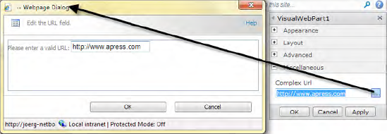
The example page is an ASPX page that allows you to use the master page. However, you can create a simple page using plain HTML and code the complete active portion on the client side using JavaScript. Consider using web services or other advanced scripting techniques for more comprehensive tasks.
The SharePoint Web Part infrastructure supplies a standardized set of interfaces called connection interfaces that allow Web Parts to exchange information with each other at runtime. For example, SharePoint's built-in List Web Part can provide a row of data to any other Web Part that can consume that row. Technically, this becomes a send/receive pipeline.
The interfaces ensure a high level of abstraction. Developers can create connectable Web Parts using data connection without knowing anything about the other connecting Web Parts—only these interfaces. As for the other Web Part classes and interfaces, the technique is completely taken from ASP.NET; no SharePoint-specific interfaces or classes are used.
To connect anything, two pieces are required. This requires a little extra effort for the initial steps with data connections. However, several built-in Web Parts provide data connections and can be used as data providers. Generally, the provider is the sending component while the consumer is the receiving component. Sending and receiving implies a communication channel. However, the connection is made via callbacks instead. To create a provider and a consumer, you need methods decorated with the ConnectionProvider and ConnectionConsumer attributes, respectively. Both methods use one common interface that is shared between the controls. The interface is used to transfer a specific data structure.
In the first example that follows, the interface is used to transfer the state of a RadioButton group and show the selection in another Web Part:
public interface ICurrentSelection
{
   int SelectionID { get; }
}
The provider implements this interface and sends it using a public method:
[ConnectionProvider("Selection ID", AllowsMultipleConnections = true)]
public ICurrentSelection GetMyProvider()
{
  return this;
}
The consumer receives the data from the provider:
private ICurrentSelection myProvider;

[ConnectionConsumer("Selection ID")]
public void RegisterMyProvider(ICurrentSelection provider)
{
  this.myProvider = provider;
}
During the render process, the Web Part accesses the object to retrieve the transferred data:
protected override RenderContents(HtmlTextWriter writer)
{
  if (this.myProvider != null)
  {
    lblSelection.text = myProvider.SelectionID;
  }
  else
{
lblSelection.text = "";
}
}While this works well with private interfaces, you will find that the types of data being transferred often have similar schemas. ASP.NET provides three predefined generic interfaces for the common types of data. (An example using these interfaces is in the section "Advanced Connection Scenarios.")
The predefined generic interfaces are ideal for lists and similar common data. If you want to transfer private data, such as business objects, you have to define your own interface. This is straightforward. In this section is a simple pair of Web Parts that connect and interact. This is a complete example, composed of the following files:
The feature can be defined either directly or by using the property grid of the particular solution item. In this example, the packaging is using the manually edited files, as shown next.
The package defines what SharePoint receives as a solution. This includes the assembly, as well as the settings for web.config (as shown in Listing 6-25).
Example 6.25. Definition File for Connected Web Parts
<Solution xmlns="http://schemas.microsoft.com/sharepoint/"
          SolutionId="62ad2e91-9449-45ca-a42d-42f7762fad72">
  <Assemblies>
    <Assembly Location="WebPartPageProject.dll"
              DeploymentTarget="GlobalAssemblyCache">
      <SafeControls>
        <SafeControl Assembly="WebPartPageProject, ..."
Namespace="WebPartPageProject.ConnectedWebPart"
TypeName="SourceWebPart"
SafeAgainstScript="True" Safe="True" />
<SafeControl Assembly="WebPartPageProject, ..."
Namespace="WebPartPageProject.ConnectedWebPart"
TypeName="TargetWebPart"
SafeAgainstScript="True" Safe="True" />
</SafeControls>
</Assembly>
</Assemblies>
<FeatureManifests>
<FeatureManifest Location="WebPartPageProject_Feature1Feature.xml" />
</FeatureManifests>
</Solution>The file contains the instructions to register the Web Parts as "safe," along with the feature definition file:
<Feature xmlns="http://schemas.microsoft.com/sharepoint/"
        Title="WebPartPageProject Feature1"
        Id="cd61bb69-d05b-4572-8532-de6a2b0ea90d" Scope="Site">
  <ElementManifests>
    <ElementManifest Location="TargetWebPartElements.xml" />
    <ElementFile Location="TargetWebPartTargetWebPart.webpart" />
    <ElementManifest Location="SourceWebPartElements.xml" />
    <ElementFile Location="SourceWebPartSourceWebPart.webpart" />
  </ElementManifests>
</Feature>
This includes the manifest files and the Web Part definitions. For the sake of clarity, these files are simplified as much as possible. The source Web Part's manifest file is shown in Listing 6-26.
Example 6.26. The Source Web Part Definition
<?xml version="1.0" encoding="utf-8"?>
<Elements xmlns="http://schemas.microsoft.com/sharepoint/" >
  <Module Name="SourceWebPart" List="113" Url="_catalogs/wp">
    <File Path="SourceWebPartSourceWebPart.webpart" Url="SourceWebPart.webpart"
          Type="GhostableInLibrary">
      <Property Name="Group" Value="Custom" />
    </File>
  </Module>
</Elements>
The *.webpart definition referenced there is shown in Listing 6-27.
Example 6.27. The Web Part Property Definition
<?xml version="1.0" encoding="utf-8"?>
<webParts>
  <webPart xmlns="http://schemas.microsoft.com/WebPart/v3">
    <metaData>
      <type name="WebPartPageProject.ConnectedWebPart.SourceWebPart,
                  $SharePoint.Project.AssemblyFullName$" />
      <importErrorMessage>$Resources:core,ImportErrorMessage;</importErrorMessage>
</metaData>
<data>
<properties>
<property name="Title" type="string">SourceWebPart</property>
<property name="Description" type="string">Source of a connected WebPart</property>
</properties>
</data>
</webPart>
</webParts>The target Web Part is very similar. First, Listing 6-28 shows the manifest file.
Example 6.28. The Manifest File for the Target Web Part
<?xml version="1.0" encoding="utf-8"?>
<Elements xmlns="http://schemas.microsoft.com/sharepoint/" >
  <Module Name="TargetWebPart" List="113" Url="_catalogs/wp">
    <File Path="TargetWebPartTargetWebPart.webpart" Url="TargetWebPart.webpart" Type="GhostableInLibrary">
      <Property Name="Group" Value="Custom" />
    </File>
  </Module>
</Elements>
Second, Listing 6-29 shows the *.webpart definition file.
Example 6.29. The Manifest File for the Source
<?xml version="1.0" encoding="utf-8"?>
<webParts>
  <webPart xmlns="http://schemas.microsoft.com/WebPart/v3">
    <metaData>
      <type name="WebPartPageProject.ConnectedWebPart.TargetWebPart,
                  $SharePoint.Project.AssemblyFullName$" />
      <importErrorMessage>$Resources:core,ImportErrorMessage;</importErrorMessage>
    </metaData>
    <data>
      <properties>
        <property name="Title" type="string">TargetWebPart</property>
        <property name="Description" type="string">Target of a connected WebPart
        </property>
      </properties>
    </data>
  </webPart>
</webParts>
Now we have all the definitions to get the Web Parts deployed and running. Next, let's inspect the code.
The goal for the pair of Web Parts in the preceding example is an image selector. The source part should show a list of images from which the user can select one. Once selected, the second (target) Web Part should display the selected image. The data transferred from one component to the other is the file name. This is exactly what you have to define in the interface as part of your project:
using System;

namespace WebPartPageProject.ConnectedWebPart
{
    public interface IImageSelectorProvider
    {
        string ImageName { get; }
    }
}
The source Web Part uses some SharePoint controls, especially the SPGroupedDropDownList. This simplifies the selection process by grouping the images using their file extensions.
Tip
For more information about using SharePoint controls, refer to Chapter 10.
The code for the complete sender control is shown in Listing 6-30.
Example 6.30. The Sender WebPart's Complete Code
using System;
using System.IO;
using System.ComponentModel;
using System.Web.UI;
using System.Web.UI.WebControls;
using System.Web.UI.WebControls.WebParts;
using Microsoft.SharePoint;
using Microsoft.SharePoint.WebControls;
using Microsoft.SharePoint.Utilities;
using System.Web.UI.HtmlControls;

namespace Apress.SP2010.WebPartPageProject.ConnectedWebPart
{
    [ToolboxItemAttribute(false)]
    public class SourceWebPart : WebPart, IImageSelectorProvider
    {

        private GroupedDropDownList list;

        public SourceWebPart()
        {
        }

        protected override void CreateChildControls()
        {
            base.CreateChildControls();
            try
            {
// Few controls with IDs sent to target
string path = SPUtility.GetGenericSetupPath("TEMPLATE\IMAGES");
// Group Drop Box
SPHtmlSelect dlGroup = new SPHtmlSelect();
dlGroup.ID = this.ID + "dlGroup";
dlGroup.Height = 22;
dlGroup.Width = 100;
Controls.Add(dlGroup);
SPHtmlSelect dlCandidate = new SPHtmlSelect();
dlCandidate.ID = this.ID + "dlCandidate";
dlCandidate.Height = 22;
Controls.Add(dlCandidate);
Button b = new Button();
b.Text = "Select Image";
Controls.Add(b);
Controls.Add(new HtmlGenericControl("br"));
HtmlGenericControl lblText = new HtmlGenericControl("span");
lblText.ID = this.ID + "lblText";
lblText.InnerText = "No image selected";
Controls.Add(lblText);
list = new GroupedDropDownList();
list.GroupControlId = dlGroup.ID;
list.CandidateControlId = dlCandidate.ID;
list.DescriptionControlId = lblText.ID;
string filter = (Page.IsPostBack && dlGroup.Items.Count > 0) ?
                                dlGroup.Items[dlGroup.SelectedIndex].Value : "*.*";
foreach (string file in Directory.GetFiles(path, filter))
{
  list.AddItem(
    Path.GetFileName(file),
    Path.GetFileNameWithoutExtension(file),
    file,
    Path.GetExtension(file).ToLowerInvariant());
}
Controls.Add(list);
}
catch
{
}
}
protected override void RenderContents(HtmlTextWriter writer)
{
base.RenderContents(writer);
}
public string ImageName
{
get
{
return (list == null) ? null : list.Value;
}
}[ConnectionProvider("Image Name", AllowsMultipleConnections=false)]
public IImageSelectorProvider GetCustomerProvider()
{
return this;
}
}
}To make the Web Part into a connected one, you have to implement the IImageSelectorProvider interface. (Actually, as mentioned earlier, any interface that defines the data object you wish to transfer will do.) Furthermore, one method must be decorated with the ConnectionProvider attribute. In the preceding example, the ConnectionProvider attribute is defined with a name, "Image Name," which appears in the connection dialog.
As you can see in Figure 6-19, the connection menu dialog creates a virtual item named Send <Provider Name> To (in this example, it's Send Image Name To). Keep this in mind when naming the provider so that you create useful and self-explanatory menu items. The ConnectionProvider attribute has several properties. The most important ones are
AllowMultipleConnections: If set tofalse, only one other Web Part can connect.DisplayName: This overrides the value used in the constructor.ConnectionPointType: This is the type of the connection interface, if a callback is used (see the "Advanced Connection Scenarios" section for more information).
Our example Web Part uses the GroupedDropDownList control. This control creates a client-side environment to select values using a two-stage drop-down list. This requires two <select> elements created by HtmlSelect and a <span> element that shows the final selection. The span is created using the HtmlGenericControl class. Once the appropriate IDs have been set to associate the drop-down lists with the GroupedDropDownList control, the UI appears as shown in Figure 6-19. The control itself has no UI. You must perform all layout changes with HTML elements. At a minimum, you should set the element's height, as the default value is inappropriate.
The advantage of the GroupedDropDownList control is how easily you can fill it with items. Merely define a group as a string value, and the items get grouped in the first drop-down and filtered automatically in the second.
Because the Web Part appears in two stages—after the first call and after a regular postback—you must recognize this and set the filters appropriately:
string filter = (Page.IsPostBack && dlGroup.Items.Count > 0) ?
dlGroup.Items[dlGroup.SelectedIndex].Value : "*.*";In this code, the current selection is taken to use the value of the group drop-down to filter the selection drop-down. A simple GetFiles call applies the filter:
foreach (string file in Directory.GetFiles(path, filter))
{
list.AddItem(
Path.GetFileName(file),
Path.GetFileNameWithoutExtension(file),
file,
Path.GetExtension(file).ToLowerInvariant());
}The whole grouping is done internally. A foreach loop adds all values using the GetExtension method to create the grouping instruction.
That's all you need to add the Web Part to a page. It will start interrogating the images folder and create a UI, as shown in Figure 6-20.
Next, we require the target Web Part to receive the selection. This Web Part is much easier to build and simply displays either an error message or an image (see Listing 6-31).
Example 6.31. The Target WebPart's Complete Code
using System;
using System.ComponentModel;
using System.Web.UI;
using System.Web.UI.WebControls;
using System.Web.UI.WebControls.WebParts;
using Microsoft.SharePoint;
using Microsoft.SharePoint.Utilities;

namespace Apress.SP2010.WebPartPageProject.ConnectedWebPart
{
    [ToolboxItemAttribute(false)]
    public class TargetWebPart : WebPart
    {

        private IImageSelectorProvider customerProvider;

        public TargetWebPart()
        {
}
[ConnectionConsumer("Image Name")]
public void RegisterCustomerProvider(IImageSelectorProvider provider)
{
this.customerProvider = provider;
}
protected override void CreateChildControls()
{
base.CreateChildControls();
Image img = new Image();
if (customerProvider != null && customerProvider.ImageName != null)
{
string path = "/_layouts/images/";
img.ImageUrl = SPContext.Current.Web.Url + path
+ customerProvider.ImageName;
Controls.Add(img);
}
else
{
Label l = new Label();
if (customerProvider == null)
{
l.Text = "No Connection established.";
}
else
{
l.Text = "No image selected.";
}
l.ForeColor = System.Drawing.Color.Red;
Controls.Add(l);
}
}
protected override void RenderContents(HtmlTextWriter writer)
{
base.RenderContents(writer);
}
}
}The vital code is the method decorated with the ConnectionConsumer attribute. It must match the name of the ConnectionProvider attribute. The transferred object matches the interface. The name of the method doesn't matter—something self-explanatory is always recommended. Once the provider control is present, the consumer control has access to it. You must check in the CreateChildControls method whether the provider is already present. The first time, when the page loads and nothing is selected, the provider returns null. If the page loads again and the postback source is not the provider Web Part, the source property will return null again. Both values are used to create an appropriate error message, as shown in Figure 6-20. If everything works, the transferred image name is used to construct an absolute path and the image is displayed on the page (see Figure 6-21).
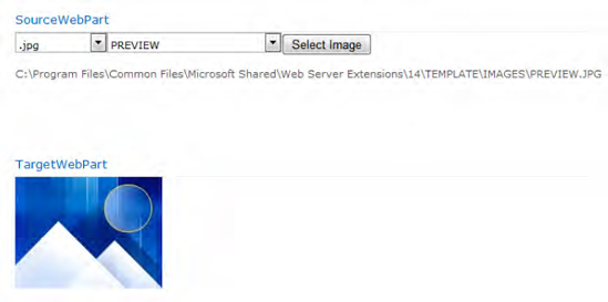
The established connection can now interact between the two Web Parts, wherever they are on the page. Imagine that such a channel can be established between one source and many targets, allowing the user to choose a Web Part from several that display the same data in different forms and styles, all from the same source. This greatly improves the flexibility and power of Web Parts at little cost.
One of the classic connection scenarios is the master-detail pattern. It's made up of a master view, such as a list that appears as a grid, and a detail view that shows the details for the currently selected row in some customized format. It's a straightforward pattern that is followed by several built-in Web Parts.
If you need to build a customized solution for a similar scenario, with both master and detail parts, you can use the predefined data providers designed to transport the selection. That adds a quasipattern to your Web Part and enables connection to Web Parts developed by others using the same pattern.
ASP.NET's Web Part support includes three interfaces that support generic connections:
IWebPartTableIWebPartFieldIWebPartRow
All three interfaces (see Figure 6-22) provide a callback method and a delegate to support it.
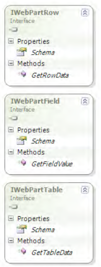
The delegates are FieldCallback, RowCallBack, and TableCallback, respectively. TableCallback accepts an ICollection type to support multiple tables, while the others accept any object. The following example shows a Web Part that contains a list of data. The user's current selection is provided by the IWebPartField interface to a consuming Web Part.
The next example retrieves all the lists from the current web and exposes a connection using the IWebPartField interface to trigger another Web Part to consume this connection. The master Web Part, created first, displays the data using an SPGridView control (see Listing 6-32).
Example 6.32. A WebPart That Implements IWebPartField
using System;
using System.ComponentModel;
using System.Web.UI;
using System.Web.UI.WebControls;
using System.Web.UI.WebControls.WebParts;
using Microsoft.SharePoint;

namespace Apress.SP2010.WebPartPageProject.ConnectedWebParts
{
    [ToolboxItemAttribute(false)]
    public class MasterWebPart : WebPart, IWebPartField
    {

        private SPGridView webLists;
        public string ListName { get; set; }

        public MasterWebPart()
        {
        }

        protected override void CreateChildControls()
        {
            base.CreateChildControls();
            SPWeb web = SPContext.Current.Web;
            var lists = web.Lists.Cast<SPList>();
            webLists = new SPGridView();
            webLists.AutoGenerateColumns = false;
            webLists.DataSource = lists;
            webLists.Columns.Add(new BoundField()
            {
                DataField = "Title",
                HeaderText = "List Name"
            });
            webLists.Columns.Add(new BoundField()
            {
                DataField = "ItemCount",
                HeaderText = "No Items"
            });
            webLists.Columns.Add(new CommandField()
            {
                HeaderText = "Action",
                ControlStyle = { Width = new Unit(70) },
                SelectText = "Show Items",
                ShowSelectButton = true
            });
            webLists.DataKeyNames = new string[] { "Title" };
            webLists.DataBind();
            Controls.Add(webLists);
            webLists.SelectedIndexChanged +=
                new EventHandler(webLists_SelectedIndexChanged);
        }

        void webLists_SelectedIndexChanged(object sender, EventArgs e)
        {
            ListName = webLists.SelectedValue.ToString();
        }


        public void GetFieldValue(FieldCallback callback)
        {
            callback(Schema.GetValue(this));
        }

        public PropertyDescriptor Schema
        {
            get
            {
                PropertyDescriptorCollection props =
                                TypeDescriptor.GetProperties(this);
                return props.Find("ListName", false);
            }
        }

        [ConnectionProvider("List Name Selection Provider")]
        public IWebPartField GetFieldInterface()
        {
            return this;
        }

    }
}
The SPGridView is constructed with three columns, and uses the Title field as the key to retrieve the selected value. The grid shows just the Title and the ItemCount properties. A command field is used to create a callback that retrieves the current value and sends it to the connected detail Web Part (shown next). There are three crucial parts in the master Web Part:
The
GetFieldInterfacemethod, which exposes the interface. Again, the name doesn't matter; it's the return value that the Web Part manager is looking for. The attribute decorating the method ensures that the Web Part manager can find it.The
Schemaproperty, which exposes the value's source. This requires the source to be a property (a public field will not suffice); it must be declaredpublic, and it must return a serializable value. Here, theListNamemethod of typestringis eminently suitable.The
GetFieldValuemethod, exposed by theIWebPartFieldinterface, which receives the callback used in the consumer to retrieve the value. TheFieldCallbackdelegate is predefined, but any similar construct will suffice.
Once the connection details are completed, the consumer Web Part can be constructed. Since it is only a consumer, its code is less complicated, as shown in Listing 6-33.
Example 6.33. A Web Part That Receives an Object of Type IWebPartField
using System;
using System.ComponentModel;
using System.Web.UI;
using System.Web.UI.WebControls;
using System.Web.UI.WebControls.WebParts;
using Microsoft.SharePoint;

namespace Apress.SP2010. WebPartPageProject.ConnectedWebParts
{
    [ToolboxItemAttribute(false)]
    public class DetailWebPart : WebPart
    {
        public DetailWebPart()
        {
            dataLabel = new Label();
        }

        private Label dataLabel;

        protected override void CreateChildControls()
        {
            base.CreateChildControls();
            Controls.Add(dataLabel);
        }

        [ConnectionConsumer("List Name Consumer",
                             AllowsMultipleConnections = false)]
        public void SetFieldInterface(IWebPartField field)
        {
            field.GetFieldValue(new FieldCallback(SetLabel));
        }

        private void SetLabel(object fieldData)
        {
            if (fieldData != null)
            {
                SPList list = SPContext.Current.Web.Lists[fieldData.ToString()];
                dataLabel.Text = String.Format("List {0} with {1} items.",
                    list.Title,
                    list.ItemCount);
            }
        }

    }
}
The SetFieldInterface method is again needed to inform the Web Part manager to which Web Part it can connect. The attribute is again the key—the name doesn't matter. The method can now use the predefined callback that it hands over to the producer Web Part. This means that the master calls the SetLabel method implicitly. The fieldData parameter is whatever the master exposes. It's of type object, which is both easy to use (since you can transfer any value) and problematic (because users might connect to Web Parts that expose values your code can't handle). Consider adding error-checking routines here, or at least put a try...catch clause around the consumer's methods. In the examples, all such code is stripped out for the sake of clarity. Figure 6-23 shows the result the example code produces.
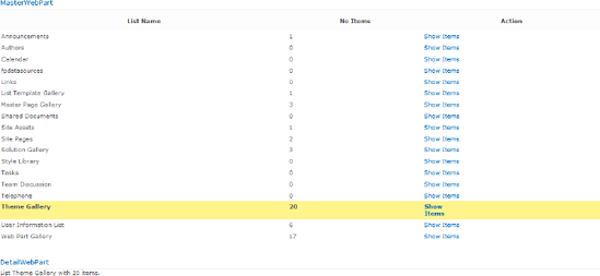
The other predefined interfaces come with similar object relationships that make advanced connection scenarios easy to build. We won't include any examples, as they would simply repeat the preceding example, with minor changes.
In the previous examples, you saw how to connect Web Parts. Transferring the value the classic way via postbacks is well known and available out of the box. Users might expect today that things are becoming more "magical"—with Ajax being used in the background. SharePoint 2010 uses Ajax at many points, and a well-developed custom Web Part designed for such an environment should use it as well. In Chapter 2, you got a first insight into Ajax as a base technology. Based on that knowledge, you can now enhance the Web Parts to make them Ajax-driven.
Note
For an introduction to Ajax, refer to Foundations of ASP.NET AJAX, by Robin Pars, Laurence Moroney, and John Grieb (Apress, 2007).
Ajax-enabled Web Parts are quite similar to their non-Ajax counterparts. However, they require three fundamental changes:
The source Web Part must invoke an action in the background.
The target Web Part must receive the event and have an updatable region.
The interface that connects both must define some kind of callback event.
The easiest way to do this is to use controls that support Ajax out of the box. In the following example, an UpdatePanel encapsulates both the control that invokes the callback and the region that is updated silently. The following project does exactly the same as the last example—it retrieves some images from a folder and updates another Web Part to display the selected image. For the sake of brevity, the initial steps and configuration files are skipped. The required changes are in the interface definition, its implementation, and the additional controls created in the CreateChildControls method.
The interface looks like this:
public interface IEventWebPartField
{
   event EventHandler ImageChanged;
   string ImageName { get; }
}
The event is necessary to invoke the update in the target, called from the source when the user changes the selected image. Listing 6-34 shows the implementation.
Example 6.34. A WebPart That Exposes Data via Ajax (using Statements Have Been Removed for Readibility)
[ToolboxItemAttribute(false)]
public class AjaxSourceWebPart : System.Web.UI.WebControls.WebParts.WebPart,
                                 IEventWebPartField
{

    private GroupedDropDownList list;

    public AjaxSourceWebPart()
    {
    }

    protected override void OnInit(EventArgs e)
    {
        base.OnInit(e);
        WebPartManager.ConnectionsActivated +=
              new EventHandler(WebPartManager_ConnectionsActivated);
    }

    void WebPartManager_ConnectionsActivated(object sender, EventArgs e)
    {
        if (!Page.IsPostBack)
        {
            //
        }
    }

    protected override void CreateChildControls()
    {
         base.CreateChildControls();
         try
         {

             // Few controls with IDs sent to target
             string path = SPUtility.GetGenericSetupPath("TEMPLATE\IMAGES");
// Group Drop Box
SPHtmlSelect dlGroup = new SPHtmlSelect();
dlGroup.ID = this.ID + "dlGroup";
dlGroup.Height = 22;
dlGroup.Width = 100;
Controls.Add(dlGroup);
SPHtmlSelect dlCandidate = new SPHtmlSelect();
dlCandidate.ID = this.ID + "dlCandidate";
dlCandidate.Height = 22;
Controls.Add(dlCandidate);
// Put the button into the panel
UpdatePanel panel = new UpdatePanel()
{
ID = this.SkinID + "updatePanel",
ChildrenAsTriggers = false,
UpdateMode = UpdatePanelUpdateMode.Conditional
};
Button b = new Button();
b.Text = "Select Image";
b.Click += new EventHandler(Button_OnClick);
panel.ContentTemplateContainer.Controls.Add(b);
Controls.Add(panel);
// Register for async
ScriptManager sc = ScriptManager.GetCurrent(Page);
if (sc != null)
{
    sc.RegisterAsyncPostBackControl(b);
}
//
Controls.Add(new HtmlGenericControl("br"));
HtmlGenericControl lblText = new HtmlGenericControl("span");
lblText.ID = this.ID + "lblText";
lblText.InnerText = "No image selected";
Controls.Add(lblText);
list = new GroupedDropDownList();
list.GroupControlId = dlGroup.ID;
list.CandidateControlId = dlCandidate.ID;
list.DescriptionControlId = lblText.ID;
string filter = (Page.IsPostBack && dlGroup.Items.Count > 0) ?
dlGroup.Items[dlGroup.SelectedIndex].Value : "*.*";
foreach (string file in Directory.GetFiles(path, filter))
{
list.AddItem(
Path.GetFileName(file),
Path.GetFileNameWithoutExtension(file),
file,
Path.GetExtension(file).ToLowerInvariant());
}
Controls.Add(list);
}
catch
{}
}
protected void Button_OnClick(object sender, EventArgs e)
{
OnImageChanged();
}
protected override void RenderContents(HtmlTextWriter writer)
{
base.RenderContents(writer);
}
public string ImageName
{
get
{
return (list == null) ? null : list.Value;
}
}
[ConnectionProvider("Image Name", AllowsMultipleConnections=false)]
public IEventWebPartField GetCustomerProvider()
{
return this;
}
public event EventHandler ImageChanged;
protected void OnImageChanged()
{
if (ImageChanged != null)
{
ImageChanged(this, EventArgs.Empty);
}
}
}The first thing you need is an UpdatePanel, added in CreateChildControls. It contains the button that used to post back the form. To capture the button click as a server event instead, the button (b) is registered as an asynchronous source within the ScriptManager:
ScriptManager sc = ScriptManager.GetCurrent(Page);
if (sc != null)
{
sc.RegisterAsyncPostBackControl(b);
}It's nice to know that SharePoint 2010 is Ajax-enabled by default, and you don't need to register, configure, or enable anything to get it working. The button's Click event invokes the private event defined through the interface. The target Web Part hooks its handler to this event and receives the click (see Listing 6-35). Thus, as it did in the last example, it can retrieve the image's file name.
Example 6.35. A WebPart That Receives Data via Ajax (using Statements Have Been Removed for Readibility)
[ToolboxItemAttribute(false)]
public class AjaxTargetWebPart : WebPart
{

        private IEventWebPartField customerProvider;
        private UpdatePanel panel;

        public AjaxTargetWebPart()
        {
        }

        [ConnectionConsumer("Image Name")]
        public void RegisterCustomerProvider(IEventWebPartField provider)
        {
            this.customerProvider = provider;
            this.customerProvider.ImageChanged += new
                  EventHandler(customerProvider_ImageChanged);
        }

        void customerProvider_ImageChanged(object sender, EventArgs e)
        {
            panel.Update();
        }

        private string ImageName
        {
            get
            {
                return customerProvider.ImageName;
            }
        }

        protected override void CreateChildControls()
        {
            base.CreateChildControls();
            Image img = new Image();
            panel = new UpdatePanel();
            if (customerProvider != null && ImageName != null)
            {
                string path = "/_layouts/images/";
                img.ImageUrl = SPContext.Current.Web.Url + path + ImageName;
                panel.ContentTemplateContainer.Controls.Add(img);
            }
            else
            {
                Label l = new Label();
                if (customerProvider == null)
                {
                    l.Text = "No Connection established.";
                }
else
{
l.Text = "No image selected.";
}
l.ForeColor = System.Drawing.Color.Red;
panel.ContentTemplateContainer.Controls.Add(l);
}
Controls.Add(panel);
}
protected override void RenderContents(HtmlTextWriter writer)
{
base.RenderContents(writer);
}
}The Image element is also placed in another UpdatePanel. There is nothing to register here. The click event from source Web Part is finally routed through to the Update method of the UpdatePanel. The registration happens within the RegisterCustomerProvider method, which is called when the connection is established. That's all you need to get two Web Parts working smoothly together.
The Web Part Page Services Component (WPSC) adds more dynamic capabilities. Some services and events can be used to interact between the client and the server.
Only Web Parts that inherit directly from the Microsoft.SharePoint.WebPartPages.WebPart class can access the WPSC object model. The SharePoint-specific Web Part adds the necessary script code. However, this capability is related to client-side programming, which we cover in greater depth in Chapter 12.
Properties are used to set values for a Web Part, and a Web Part's appearance can be customized using attributes. To execute actions, the user must click a link somewhere on the page. In SharePoint Web Parts, these action links are part of the drop-down menu each Web Part possesses. The technique to create custom action links uses so-called verbs.
To get one or more entries in the drop-down menu, you must override the Verbs property and return a WebPartVerbCollection, which contains WebPartVerb objects. The WebPartVerb type has several settings to control the appearance of the menu item, as shown in Table 6-5.
Table 6.5. WebPartVerb Settings That Modify the Context Menu Items
Description | |
|---|---|
| If set to |
| This is the description used as a tooltip. |
| This enables or disables the item. |
| This is the URL to an icon, which appears in front of the item. |
| This is the text on the item. |
The constructor of the verb object has three overloads. It takes either a client script event handler, a server script handler, or both. While the client script is a JavaScript method, the server-side handler is a callback of the type WebPartEventHandler.
The client script can be any JavaScript. To handle the script properly, it's recommended to place just a function call there. Use the ClientScript object of the Page class to add the required script methods. The example code assumes you have a Label named l available and created in CreateChildControls.
protected override void OnPreRender(EventArgs e)
{
   base.OnLoad(e);
   if (!Page.ClientScript.IsClientScriptBlockRegistered("ClientVerbScript"))
   {
     Page.ClientScript.RegisterClientScriptBlock(Page.GetType(), "ClientVerbScript",
        String.Format(@"<script>
                         function SetBlueColorOnClient() {{
                         var label = document.getElementById('{0}'),
                         label.style.color = 'Blue';
                          }}
                         </script>", l.ClientID));
   }
}
Because the Web Part can appear multiple times on a page, it's necessary to check whether the script has already been added using the IsClientScriptBlockRegistered method. Each such block has a specific name that's used internally to reference it. You can register script at the beginning or end of the page. Usually scripts are placed at the beginning of the page. This works well if they get called for the first time after the page is loaded completely. A user can reach a verb that is bound to a menu item once the page is loaded at the earliest; hence, the script is working fine.
For the server-side event, the handler is just an event handler method as it would be for any other event, such as Click.
The WebPartEventHandler class is used to hold the callback method. For each menu item, exactly one WebPartVerb object is required, and it must be included in the collection returned by the Verbs property. The type returned is WebPartVerbCollection. The collection's constructor takes two parameters: the first parameter ensures that the default Web Part menu items are still present. Theoretically, you could omit this and void the menu. The second parameter takes the new menu items. A generic List<WebPartVerb> object is recommended. The following code adds two verbs: a client-side and a server-side click event handler.
public override WebPartVerbCollection Verbs
{
    get
    {
        List<WebPartVerb> verbs = new List<WebPartVerb>();
        // Client-Side Handler
        WebPartVerb verbClient = new WebPartVerb(this.ID + "clientVerb1",
                                     "SetBlueColorOnClient()");
        verbClient.Text = "Set Blue Color (Client)";
        verbClient.Description = "Invokes a JavaScript Method";
        verbs.Add(verbClient);
        // Server-Side Handler
        WebPartEventHandler handler = new
                                       WebPartEventHandler(SetRedColorServerClick);
        WebPartVerb verbServer = new WebPartVerb(this.ID + "serverVerb1", handler);
        verbServer.Text = "Set Red Color (Server)";
        verbServer.Description = "Invokes a post back";
        verbs.Add(verbServer);
        // add
        return new WebPartVerbCollection(base.Verbs, verbs);
    }
}
The server event handler has easy access to the SharePoint object model. For the client event handler, using the client object model is makes it possible to access the server. This is explained in-depth in Chapter 12. JavaScript allows you to directly access the server quite easily. The server side works in the same way. You have to ensure that the controls already exist:
private void SetRedColorServerClick(object sender, WebPartEventArgs e)
{
    EnsureChildControls();
    l.ForeColor = System.Drawing.Color.Red;
}
The context menu is available at the designated position and exposes the menu items in the same order as the verbs appear in the collection (see Figure 6-24).
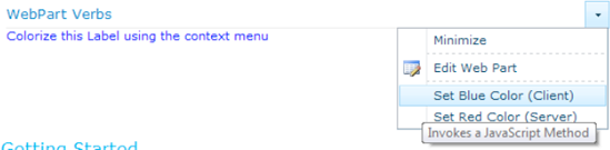
Using the asynchronous pattern to create application pages is common in ASP.NET sites. To understand why it is often appropriate to program asynchronously, remember how the worker process handles requests.
To handle as many parallel incoming requests as possible, the ASP.NET engine creates a thread pool that makes a number of threads available to handle requests. This thread pool is limited and usually set to a number that the processor architecture can handle efficiently. If there are more incoming requests than threads, IIS starts queuing up requests, dramatically slowing down the response time. The internal page-processing time is not that critical. Using the Developer Dashboard, you'll find that they range from a few milliseconds to a few hundred milliseconds. Thus, each thread is being freed after several milliseconds and becomes available for the next request. If the pool has 20 threads, then around 100 requests per second can be handled. For most installations, at least for an intranet, this is perfectly adequate—especially because it's for just one server.
However, things deteriorate rapidly if the page-processing time increases significantly. It may not be because the code is slow, but because of calls to external components. For example, a database call for some reporting or analysis services can take several seconds to respond. Even a web service call, an RSS feed, or another similar external connection can prolong the page-processing time. During the time the code waits for an answer, the CPU runs in idle mode. However, the thread is still blocked, and eventually IIS starts queuing requests because the pool runs out of threads.
Asynchronous programming is a simple pattern that starts an external operation in wait mode while the original thread is returned to the pool. Once the external source responds—with or without a result—the thread is requested again from the pool, and the page is processed up to the end. The total page-processing time is still the same. For a single user, the whole asynchronous pattern changes nothing. But while the page is idle (awaiting the response from the external call), the CPU can serve dozens of requests from other users. That discharges the thread pool, which is the reason to program asynchronously.
There is no asynchronous Web Part pattern by design. Only pages can be handled asynchronously. However, this is a per-task action. This means that you can register tasks on a page that the page handler can process asynchronously. Registering such tasks can be performed at any time during the PreRender step. This step is accessible through the OnPreRender event handler even from a Web Part, and this is where you can add the Web Part's tasks as part of the page's tasks.
An asynchronous task uses a callback pattern that consists of three methods: one called at the beginning, one at the end, and one, optionally, if a timeout occurs. The timeout method is optional, but you can treat it as mandatory, because all external calls might fail. The basic code to create such a task looks like this:
protected override void OnPreRender(EventArgs e)
{
   this.Page.RegisterAsyncTask(
      new PageAsynchTask(
        new BeginEventHandler(BeginMethod),
        new EndEventHandler(EndMethod),
        new EndEventHandler(TimeOutMethod),
        null,
        true)
      );
}
The fourth parameter is a private value that is transferred to the handler. It's set to null if the parameter is not required. The fifth parameter ensures that the task runs in parallel, if other tasks are registered on the same page at the same time. This happens if you add the same Web Part more than once.
In this example, you don't see any particular call invoking the methods. However, there is such a call—the ExecuteRegisteredAsyncTasks method. Under some circumstances, it might be necessary to know when the threads start. If there is no such call, the ASP.NET engine launches ExecuteRegisteredAsyncTasks immediately before the PreRenderComplete event.
When you call the external source, you must use a method that supports asynchronous access. Mimicking this by starting another thread will not help; any thread requested in a .NET application can only come from the solitary thread pool. Fortunately, asynchronous requests are widely supported in the framework.
In the next example (see Listing 6-36), the WebRequest class from the System.Net namespace is used to retrieve an RSS feed from a remote—and possibly slow—server.
Example 6.36. An Asynchronous WebPart
using System;
using System.ComponentModel;
using System.Runtime.InteropServices;
using System.Web.UI;
using System.Web.UI.WebControls;
using System.Web.UI.WebControls.WebParts;
using Microsoft.SharePoint;
using Microsoft.SharePoint.WebControls;
using System.Net;
using System.IO;
using System.Xml.Linq;
using System.Xml;
using System.Web.UI.HtmlControls;

namespace Apress.SP2010.WebParts.AsynchWebPart
{
    [ToolboxItemAttribute(false)]
    public class FeedWebPart : WebPart
    {
        public FeedWebPart()
        {
            currentState = State.Undefined;
        }

        private enum State
        {
            Undefined,
            Loading,
            Loaded,
            Timeout,
            NoAsync
        }

        private WebRequest rssRequest;
        private WebResponse rssResponse;
        private XDocument xml;
        private State currentState;

        protected override void OnPreRender(EventArgs e)
        {
            base.OnPreRender(e);
            if (String.IsNullOrEmpty(FeedUrl))
                return;
            if (WebPartManager.DisplayMode == WebPartManager.DisplayModes["Design"])
                return;
            Page.AsyncTimeout = TimeSpan.FromSeconds(10); // 10 sec
            Page.RegisterAsyncTask(
                new PageAsyncTask(
                    new System.Web.BeginEventHandler(BeginRSSRead),
                    new System.Web.EndEventHandler(EndRSSRead),
                    new System.Web.EndEventHandler(TimeOutRSSRead),
                    null,
                    true));
        }

        private IAsyncResult BeginRSSRead(object sender, EventArgs e,
AsyncCallback cb, object state)
{
currentState = State.Loading;
rssRequest = HttpWebRequest.Create(FeedUrl);
return rssRequest.BeginGetResponse(cb, state);
}
private void EndRSSRead(IAsyncResult ar)
{
rssResponse = rssRequest.EndGetResponse(ar);
Stream response = rssResponse.GetResponseStream();
XmlReader reader = XmlReader.Create(response);
xml = XDocument.Load(reader);
currentState = State.Loaded;
WriteControls();
}
private void TimeOutRSSRead(IAsyncResult ar)
{
currentState = State.Timeout;
WriteControls();
}
private void WriteControls()
{
switch (currentState)
{
case State.Loaded:
HtmlGenericControl ctrl = new HtmlGenericControl("pre");
ctrl.InnerText = xml.ToString();
Controls.Add(ctrl);
break;
case State.Timeout:
Label lt = new Label();
lt.Text = "RSS Feed timed out";
lt.ForeColor = System.Drawing.Color.Red;
Controls.Add(lt);
break;
case State.NoAsync:
Label nl = new Label();
nl.Text = "Asynch not supported.";
Controls.Add(nl);
break;
default:
Label ll = new Label();
ll.Text = "Loading...";
Controls.Add(ll);
break;
}
}
[Personalizable(true)]
[WebBrowsable(true)]
[WebDescription("RSS Feed URL")][WebDisplayName("Feed URL")]
[Category("Feed Properties")]
public string FeedUrl
{
get;
set;
}
}
}The asynchronous tasks are defined in OnPreRender. This is the last opportunity in the pipeline to do so, because the methods are invoked in the following PreRenderComplete state. The code that writes the output is very simple. It checks the state of the control, (e.g., Undefined, Loading, or Loaded) using the internal enumeration, State. The only property defined for this Web Part is FeedUrl, which stores the selected RSS feed.
The example demonstrates the basic tasks required to invoke an asynchronous call. It starts with the BeginGetResponse call to retrieve the data:
rssRequest.BeginGetResponse(cb, state);
The output is plain XML, written to the page—not very useful, but this is a simplistic example to make the code as easy to read as possible.
A more challenging task is the creation of an asynchronous call if the framework does not explicitly support this. This is discussed in the following section.
As long as you have some predefined classes that support the asynchronous pattern, the implementation is relatively easy. You just need to call the Begin... and End... methods respectively, and hand over the IAsyncResult object. If your underlying source does not support this pattern, you must implement your own stack. The next example reads the data off a feed from the local hard disk. The file stream reader does not support asynchronous access. The challenge here is to implement such access using the common pattern around the IAsyncResult interface (see Listing 6-37).
Example 6.37. An Asynchronous Data Source
using System;
using System.Collections.Generic;
using System.Linq;
using System.Text;
using System.Xml.Linq;
using System.IO;

namespace Apress.SP2010.WebParts.AsynchWebPart
{

    public abstract class AsyncTask<T> where T : new()
    {
        public T Result { get; protected set; }
        private Action task;
        private Action taskFinished;
public AsyncTask()
{
}
public AsyncTask(Action finishHandler)
{
taskFinished = finishHandler;
}
public virtual IAsyncResult OnBegin(object sender, EventArgs e,
AsyncCallback cb, object data)
{
task = new Action(Execute);
return task.BeginInvoke(cb, data);
}
public virtual void OnEnd(IAsyncResult result)
{
if (taskFinished != null)
{
taskFinished.Invoke();
}
task.EndInvoke(result);
}
public virtual void OnTimeout(IAsyncResult result)
{
Result = default(T);
}
public abstract void Execute();
}
public class ReadFileAsync : AsyncTask<XDocument>
{
public string FileName { get; set; }
public ReadFileAsync(string fileName, Action finishCallback)
: base(finishCallback)
{
if (String.IsNullOrEmpty(fileName))
throw new ArgumentException("fileName");
if (!File.Exists(fileName))
throw new FileNotFoundException();
FileName = fileName;
}
public override void Execute()
{
XDocument xdoc = XDocument.Load(FileName);Result = xdoc;
}
}
}For the Begin and End calls, you need a delegate. Because these are simple triggers that do not return anything, the predefined Action class is the optimal choice. The Execute method is where the file is actually read from disk. That's bit nonsensical, because this is the End phase of the asynchronous call, and that means the time is not consumed in the background, but just later in the phase. It would make more sense if you had to prepare the call, for instance, by reading a number of folders first, or by doing some authentication in the Begin phase, to get the results later in the End phase, as shown. That would indeed free the thread while something is being waited for. However, the pattern shown is perfectly adequate to demonstrate how to create an asynchronous call.
This section contains a number of recommended best practices for Web Part developers. They are intended to improve the performance and usability of the Web Parts, and to assist you in creating Web Parts that integrate well with other components of a Web Part page.
There are several common techniques known to ASP.NET developers that aid with building stable and reliable components. Because Web Parts run in the more complex context of SharePoint, some additional action should be taken to deal with this environment as well.
Your Web Part should handle all exceptions, rather than risk the possibility of causing the Web Part page to stop responding. If an exception is not handled properly, it could prevent the user from using the editing mode of the page, and as a last resort, remove the Web Part. SharePoint 2010 provides some techniques to restore a previous version of the page or remove a nonfunctional Web Part. However, maintaining control over what happens with your code is preferable.
You can achieve this by placing the sections of code that might throw exceptions in a try block and writing code to handle these exceptions in a catch block:
private void SetSaveProperties()
{
   if (this.Permission !=
      Microsoft.SharePoint.WebPartPages.Permissions.None)
   {
      try
      {
         SaveProperties = true;
      }

      catch (Exception ex)
      {
      // Setting SaveProperties can throw many exceptions.
      // Two examples are:
// 1) SecurityException if the user doesn't have the "ObjectModel"
// SharePointPermission or the "UnsafeSaveOnGet"
// SharePointPermission
// 2) WebPartPageUserException if the user doesn't have sufficient
// rights to save properties (e.g., the user is a Reader)
errorText = ex.Message;
}
}
}Because Web Parts are managed by the user at runtime, you should render your Web Part with a UI that is appropriate for each user's permissions. To do this, always check the Permissions property before rendering the Web Part—if the value is None, you should suppress the portions of your Web Part UI that require certain permissions. For example, if a Web Part displays a Save button, you can disable or hide it if the user does not have permissions to save changes. Catching the exception that the runtime will throw if you launch an action without proper permissions is not a good practice. An exception is not intended for handling foreseeable situations. Missing permissions can occur, and therefore you should handle them explicitly in code.
If a user is unable to use your Web Part as you designed it, two things could be happening:
The user is in the Reader role, and the Web Part is not in a Web Part zone. Although the Web Part may be designed to be dynamic, if a user adds it to a blank page, it becomes a static Web Part. Static Web Parts cannot save changes in either shared or personal view.
The user is anonymous. Without proper authentication, the Web Part will not work.
You can edit property values in a number of places outside of your Web Part's UI:
In the Web Part description (
.webpart) fileIn the tool pane
In an HTML editor compatible with SharePoint, such as SharePoint Designer
Because of this, whenever you attempt to save changes to the database, you should not make assumptions about the state of your properties. For example, you cannot assume that properties are unchanged because you disabled them in the UI, or that properties are valid because you validated them when they were entered in the UI.
To ensure that you account for all the different places those properties can be set; we recommend that you place your validation code in the property's setter method.
By default, when an exception occurs, the Web Part infrastructure redirects the user to an error page and renders a generic error message. To specify your own error message to the end user, use the WebPartPageUserException class:
if (ex is WebPartPageUserException)
{
   errorText.Text = ex.Message;
}As with any web control or application, you should thoroughly validate all user-supplied data before performing operations with that data. This validation can help to protect your code, not only against accidental misuse, but also from deliberately malicious attacks that use the UI to target the code.
As an integral part of the SharePoint platform, Web Parts need careful development regarding performance and power.
There are some ways to render client-side script for a Web Part page:
Place the script in an external file and register the script for the page.
Place the script as a resource in the assembly and use web references.
Send the code to the client for each request.
If you have multiple Web Parts that share client-side script, you can improve performance and simplify maintenance by placing the script in an external file or web reference and registering the script for the page. In this way, the code is cached on the client computer on first use and does not need to be resent to the client for each subsequent request. In addition, the page registration ensures that the code is only added once to the page, even if the same Web Part is used several times.
To register client-side script shared by multiple Web Parts via a web reference, proceed as shown in the next exercise.
If your Web Part is working with large amounts of data, you can significantly improve its performance by using the following techniques in your code.
Use an asynchronous pattern for any external operation that could take a significant amount of time. In particular, if a database or HTTP request is made, an asynchronous fetch allows other parts to continue processing without being blocked. (See the "Asynchronous Web Parts" section earlier in the chapter for more information.)
Caching
Use a Web Part cache to store property values and to expedite data retrieval. Values are stored in the Web Part cache on a per-part or per-user basis by specifying the storage type in the call to the PartCacheRead and PartCacheWrite methods. You can also determine the type of cache to use—either the content database or the ASP.NET Cache object—by setting the value of the WebPartCache element in the web.config file. The cache objects must be serializable.
Web Parts are intended to be used by end users, and this isn't limited to working with the UI that the Web Part exposes. Moreover, a user can personalize a Web Part, move it around, change its appearance, and create connections. The explicit support requires far more effort than creating just a plain control. It is this extra effort that allows you to unleash the true power of Web Parts.
When you export a Web Part, you create a Web Part description (.webpart) file automatically. The .webpart file is an XML document that represents the Web Part and its property values. Users can import this file to add the Web Part with all the properties set.
By default, each property is included in the .webpart file whenever you export a Web Part. However, you may have properties that contain sensitive information (e.g., a date of birth). The Web Part infrastructure enables you to identify a property as controlled, allowing you or the user to choose to exclude the value if the Web Part is exported. Only properties that are exported when the user is in personal view can be controlled; in shared view, all property values are exported because it is unlikely that sensitive information would be included on a shared page.
There are two properties that cooperate to provide this functionality:
The
ControlledExportproperty of theWebPartStorageAttributeclass: If set totrue, the property is specified as a controlled property. The default value isfalse.The
ExportControlledPropertiesproperty of theWebPartclass: This is used at runtime to determine whether controlled properties are exported when the user is in personal view. The default value isfalse, which prevents controlled properties from being exported while in personal view.
[WebPartStorage (Storage.Personal, ControlledExport=true)]
The ExportControlledProperties property maps directly to the Export Mode drop-down in the Advanced category of the tool pane (see Figure 6-25), enabling the user to set this value at runtime. By default, this check box is not selected, which prevents controlled properties from being exported. The user has to explicitly select this check box to allow different behavior. This option applies only to controlled properties.
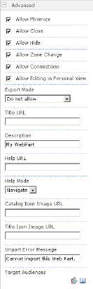
The Advanced category in the tool pane appears only in the view in which the Web Part was added. For example, if the Web Part is added in shared view, the Advanced section appears in the tool pane only when you are modifying properties in the shared page. If it is added in personal view, the Advanced section of the tool pane appears only when you are modifying properties in personal page of a My Site scenario. In either case, the setting determines how properties are exported only when the user is exporting in personal view.
Implement the IDesignTimeHtmlProvider interface in your Web Part to ensure correct rendering on designer surfaces. If you do not implement this interface, and a user opens a Web Part page in design view, your part appears only as the message, "There is no preview available for this part."
Following is an example of a simple IDesignTimeHtmlProvider implementation:
namespace Apress.SP2010.WebParts.MyWebParts
{
   [XmlRoot(Namespace = "MyNamespace")]
   public class DesignTimeHTMLSample :
      Microsoft.SharePoint.WebPartPages.WebPart, IDesignTimeHtmlProvider
   {
      private string designTimeHtml = "This is the design-time HTML.";
      private string runTimeHtml = "This is the run-time HTML.";

      public string GetDesignTimeHtml()
      {
         return SPEncode.HtmlEncode(designTimeHtml);
      }
      protected override void RenderWebPart(HtmlTextWriter output)
      {
         output.Write(this.ReplaceTokens(runTimeHtml));
      }
   }
}Because the tool pane is where users modify Web Part properties, you should be aware of how your properties appear in it. Following are some attributes (see Table 6-6) you should use to ensure that your users can work with your Web Part properties easily in the tool pane.
Table 6.6. Attributes to Control the Property Pane
Description | |
|---|---|
| Controls how the property name is displayed. This name should be user-friendly. For example, a property named |
| Specifies the tooltip shown when the mouse pointer lingers over the property. Write the property description so that a user can figure out how and why they should set the property. Try to minimize users having to navigate away from your UI and seek help in the documentation to set a property. |
| Describes the general section in which the property appears: Advanced, Appearance, Layout, or Miscellaneous. If possible, avoid the Miscellaneous category, which is used if no category is assigned for a property. Because this category title is not descriptive, your user has no indication of what is included in Miscellaneous without expanding it. |
A custom property is also placed in the Miscellaneous category if you attempt to include it in the Appearance, Layout, or Advanced categories. These categories are reserved for base class properties only.
For example, the following statements demonstrate the attributes for a custom property that is a string displayed as a text box in the tool pane.
// Create a custom category in the tool pane.
[Category("Custom Properties")]
// Assign the default value.
[DefaultValue(c_MyStringDefault)]
// Make the property available in both Personalization
// and Customization modes.
[WebPartStorage(Storage.Personal)]
// The caption that appears in the tool pane.
[FriendlyNameAttribute("My Custom String")]
// The tooltip that appears when pausing the mouse pointer over
// the friendly name in the tool pane.
[Description("Type a string value.")]
// Display the property in the tool pane.
[Browsable(true)]
You can customize the appearance of your properties in the tool pane in several ways. You can expand or collapse specific categories when the pane opens. Use the Expand method of either the WebPartToolPart or CustomPropertyToolPart class to expand selected categories.
You can also hide base class properties. Use the Hide method of the WebPartToolPart class to hide selected properties. To control the order of tool parts within a tool pane, use the array passed to the GetToolParts method of the WebPart class.
Use the HTMLEncode method of the SPEncode class as a security precaution to help prevent malicious script blocks from being able to execute in applications that execute across sites. You should use HTMLEncode for all input that is rendered to the client. This will convert dangerous HTML tags to more secure escaped characters.
Following is an example of using the HTMLEncode method to render HTML to a client computer:
protected override void RenderWebPart(HtmlTextWriter output)
{
   output.Write("<font color='" + SPEncode.HTMLEncode(this.Color) + "'>"
      + "Your custom text is: <b>" + SPEncode.HTMLEncode(this.Text)
      + "</b></font><hr>");
}Web Part zones have properties that control whether a user can persist changes. If you attempt to save changes to a Web Part without the correct permissions, it could result in an unhandled exception. For this reason, you should account for any combination of permissions for your Web Part.
Following are the properties in the WebPartZone class that determine whether a Web Part can save properties:
AllowCustomization: Iffalse, and the user is viewing the page in shared view, the Web Part cannot persist any changes to the database.AllowPersonalization: Iffalse, and the user is viewing the page in personal view, the Web Part cannot persist any changes to the database.LockLayout: Iftrue, changes to theAllowRemove,AllowZoneChange,Height,IsIncluded,IsVisible,PartOrder,Width, andZoneIDproperties are not persisted to the database, regardless of the current view.
Fortunately, the Web Part infrastructure does a lot of the work. You can check the Permissions property, which takes into account the values of the zone's AllowCustomization and AllowPersonalization properties. If, however, your UI permits changes to the properties controlled by the LockLayout property, you must explicitly check this value, typically in the property setter.
The following code illustrates how you can get a reference to a Web Part's containing zone to check the LockLayout property:
WebPartZone myParent = (this.Page.FindControl(this.ZoneID));
Web Part property values can be specified in one of two ways. One way is as XML elements contained in the Web Part. For example:
<WebPartPage:ContentEditorWebPart runat=server>
<WebPart>
   <title>My content Web Part</title>
   <description>This is cool</description>
</WebPart>
</WebPartPages:ContentEditorWebPart>
The other way, commonly used for ASP.NET controls, uses attributes of the Web Part:
<WebPartPage:ContentEditorWebPart runat=server title="My content Web Part" description="this is cool" />
Because of how the Web Part infrastructure handles property values, we recommend that you define your properties as simple types so that they work correctly if specified as attributes of the Web Part. As shown in the examples, the editor can handle the attributes as strings only. Any type other than System.String would need a serialization/deserialization round trip. For numbers or colors this might be effortless, but for more complex types this could become painful for the user of the Web Part. If your code requires a value to be a complex type, you can convert the string value to a complex type as required by your program.
There is no guarantee of the order that properties are displayed in the tool pane. For this reason, you should avoid writing Web Part properties that are dependent on each other and that both appear in the tool pane.
Web Part galleries can contain numerous custom Web Parts, so the Web Part infrastructure provides search functionality to help users quickly find the Web Part they need (see Figure 6-26).
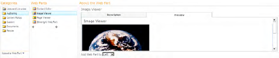
The search function uses the Title and Description properties of your Web Part to build the response, so you should provide comprehensive information in these fields to increase the chance of your Web Part being discovered by Search. In addition, each Web Part in the Web Part list has an icon that appears on the left. By default, the Web Part infrastructure uses generic icons for each Web Part; however, you can customize this icon using the PartImageLarge property.
Be sure to create previews for your Web Parts so that administrators are able to review the parts included in the Web Part gallery.
In your RenderWebPart method, you can determine whether you are in preview mode using the following code:
if (this.Parent.GetType().Fullname = "Microsoft.SharePoint.WebPartPages.WebPartPreview")
If you are in preview mode, you should render the HTML for the content you want to appear in the preview—typically an image. The chrome and title bar are provided by the infrastructure, with the Web Part title appearing in the title bar. The next exercise explains how to display the Web Part preview.
We recommend that you localize the FriendlyName, Title, and Description attributes. By planning for localization in the development phase, you can provide a more customer-friendly UI and save on the costs associated with localizing your Web Part after development. The Web Part infrastructure provides a simple way to localize certain attributes (FriendlyName, Category, and Description) of your custom properties, making it easier for users to work with them in the tool pane. (See Chapter 8 for more information.)
Ensure that when anonymous access is on, the user can view the Web Part page without logging in. You do not want to prompt users for a login if the site has anonymous access enabled. You can determine whether anonymous access is enabled by querying the AllowAnonymousAccess property of the SPWeb class. If this value is true, anonymous access is enabled, and you should not perform any action that requires credentials.
If you use resources, it's possible to get confused regarding the exact names of the embedded data. Even using the formula Namespace + Path + File, you don't always get the whole string correct. If you are in a debug session and are able to use the Immediate window, you can read all the names of the embedded resources using the code shown in Figure 6-27.
If it is not displayed here, it is not an embedded resource in this assembly. First check the build action (as shown in Figure 6-28) and the AssemblyInfo.cs file to make sure that the resource is embedded as a web resource. If it is present and your code still doesn't work, double-check the string—it's case sensitive.
In this chapter, you learned the basics of Web Part development, plus several methods to extend them. On top of the Web Part UI that SharePoint provides, you saw how to add custom editor panes, pop-up dialogs, and error-checking methods. Using verbs, you can extend the default Web Part context menu.
Connectable Web Parts provide a well-defined pattern to form master/detail relationships. Using callbacks, you can make such connections via Ajax calls, and let Web Parts talk silently to each other.
All this is mostly covered by ASP.NET-driven Web Parts. However, the integration in SharePoint has some bells and whistles you need to know to get access to Web Parts as one of the most powerful extensibility concepts SharePoint provides.