
The SharePoint user interface (UI) provides a professional look and feel for modern business applications. In this chapter you will gain deep insight into the SharePoint UI. It includes standard UI elements required to build custom applications, as well as custom extensions to existing SharePoint functionality. The many developer tips in this chapter reveal fast and efficient ways to build sophisticated applications on top of the SharePoint framework.
This chapter includes
Insights into the different types of master pages
A look into SharePoint navigation
The concepts behind SharePoint theming
Opportunities to extend the SharePoint UI
SharePoint offers a collection of interdependent UI artifacts:
Master pages
Navigation providers
Themes
UI extensions
This chapter provides a walkthrough for each of these mechanisms, which can extend a SharePoint environment and aid in developing custom application pages. With master pages and the placeholder concept, an ASP.NET developer can modify existing pages or create his or her own pages. The differences between the various types of navigation are highlighted in this chapter, and you will learn how to create custom navigation providers. Furthermore, the concept of theming is explained. UI extensions include custom actions (added to context and regular menus), and the new ribbon and its various features.
A good technical understanding of these base types will give you a strong foundation—and a head start—for developing your own custom SharePoint applications.
Master pages were introduced in version 2.0 of ASP.NET. Master pages are templates that other pages can use to maintain a consistent layout and functionality throughout an application. Single master pages define the standard look and feel for all pages or a group of pages. Hence, master pages ease the manageability of web-based applications.
The architecture of master pages uses the concept of merging. A page refers to a master page, and the ASP.NET Framework merges the two together to build one page, as illustrated in Figure 10-1.Technically, a master page is an ASPX page that inherits from System.UI.MasterPage. It usually consists of code, web controls, and one or more placeholders. The placeholders are regions whose content is specified in each ASPX page that utilizes the master page. An example of a basic master page follows:
<%@Master language="C#"%>
<%@ Import Namespace="Microsoft.SharePoint" %>
<%@ Import Namespace="Microsoft.SharePoint.ApplicationPages" %>

<html id="HTML1″ runat="server">
<head id="HEAD1″ runat="server">
     <link rel="stylesheet" type="text/css" href="/_layouts/1031/styles/core.css" />
</head>
<body>
     <form id="Form1" runat="server" >
     <div>
          <asp:ContentPlaceHolder id="MyPlaceHolder" runat="server">
               Hello World - I am a Master Page
          </asp:ContentPlaceHolder>
     </div>
...
A master page is identified by three main characteristics:
Its file extension is
.master—for example,default.master.It begins with the
@Masterdirective—<%@Master language="C#" %>. Note that ASPX pages usually begin with the@Pagedirective.It contains one or more
ContentPlaceHoldertags.
A master page is almost the same as an ordinary ASP.NET page. The difference is that a master page can have special sections built with ContentPlaceHolder controls that allow content pages to replace them with their own content.
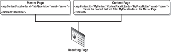
Content pages in ASP.NET are pages that reference a master page. They contain an attribute that instructs the compiler to merge the page with the referenced master page. This attribute is part of the @Page directive tag and is called MasterPageFile.
<%@ Page Language="C#" AutoEventWireup="true"
         MasterPageFile="˜/MyMasterPage.Master"
         CodeBehind="Default.aspx.cs" Inherits="WebApp._Default" %>
Content pages implement <content> tags to inform the compiler to override specified ContentPlaceHolder controls in the master page.
<asp:Content ID=""MyContent" ContentPlaceHolderId="MyPlaceHolder" runat="server">
     Hello World - I am a content page and I have overwritten the master page content
</asp:Content>
Content pages are not required to supply unique content for all the ContentPlaceHolder controls in a master page. If a content page does refer to a ContentPlaceHolder, then the code inside the particular content tag will override the corresponding ContentPlaceHolder section in the master page. If a content page does not implement a particular ContentPlaceHolder, the markup defined on the master page for that ContentPlaceHolder will be rendered.
SharePoint is based entirely on the concept of master pages. Almost all of the built-in ASP.NET pages in SharePoint inherit from a master page. Thus, if you want to modify the look and feel of all the SharePoint pages, you can do this by customizing the referenced master pages. This defines a centralized place for customizations instead of modifying every web page in the entire SharePoint portal. There are several types of master pages in SharePoint:
System master page (default master page)
Site master page (custom master page)
Application master page
Dialog master page
Specific master pages (
minimal.master,simple.master)
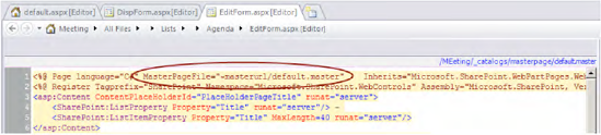
The system master page—also known as the default master page—is used for most of the built-in ASPX pages within SharePoint. It's typically used for pages related to lists and libraries on existing SharePoint sites (see pages such as DispForm.aspx, EditForm.aspx, NewForm.aspx, and AllItems.aspx). It's also used for common pages like default.aspx and application pages residing in the _layouts directory (see Figure 10-2).
A system master page is referenced by a predefined token, ˜masterurl/default.master, in the ASP.NET @Page directive, as shown in Figure 10-3.
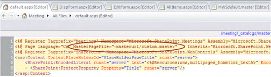
A site master page—also known as a custom master page—is mostly used when one or more pages are required to have a master page that is different from the system master page. An example for this is the Meeting Workspace site definition, which contains a default.aspx page based on a site master page.
A site master page is referenced by the token ˜masterurl/custom.master in the ASP.NET @Page directive (see Figure 10-4).
Application master pages are used for application pages. Application pages are SharePoint administrative pages that are usually used during site administration. They are static ASP.NET pages stored on the file system, unlike most other pages in SharePoint that are stored in the database. Application master pages can be found in the same directory as the application pages: %Program FilesCommon FilesMicrosoft Sharedweb server extensions14TEMPLATELAYOUTS (see Figure 10-5).
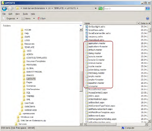
The most important master page for developing application pages, especially in previous versions of SharePoint, is application.master. This page has been used in nearly all application pages within the LAYOUTS folder. SharePoint 2010 has introduced the new concepts of site and system master pages within your own application pages. These are described later in this chapter, in the "Master Page Tokens" section.
In SharePoint 2007, the placeholders used in the various master page types were different, especially between site and system master pages and application pages. With SharePoint 2010, the placeholders for the site and system master pages and those for the application master pages have been standardized. Table 10-1 gives an overview of the most important placeholders.
Table 10.1. Placeholder IDs in Master Pages
Content Placeholder | Description |
|---|---|
| Additional content that needs to be within the |
| Additional body styles in the page header |
| Border element for the main page body |
| Right margin of the main page body |
| A date picker for navigating in a calendar when a calendar is visible on the page |
| The form digest security control, which generates a security validation or message digest to help prevent the type of attack whereby a user is tricked into posting data to the server without knowing it. |
| The global navigation breadcrumb trail |
| Top navigation menu for the page |
| Bottom of the left navigation area |
| Left navigation area |
| Border element on the left navigation bar |
| Data source for the left navigation menu |
| Top of the left navigation area |
| The page's main content |
| A place to show page-level commands—for example, wiki commands such as Edit Page, History, and Incoming Links |
Description of the page contents | |
| Page icon in the upper-left area of the page |
| The page |
| Page title shown immediately below the breadcrumb trail. |
| Search box area |
| Site name |
| Additional styles in the page header |
| Shadows for the title area |
| Main content breadcrumb area |
| Left border of the title area |
| Right margin of the title area |
| Top navigation area |
| Extra content that needs to be at the bottom of the page |
| Empty by default in Windows SharePoint Services (can be used for additional page-editing controls) |
| The page-editing controls when the page is in Edit mode (after clicking Site Actions  |
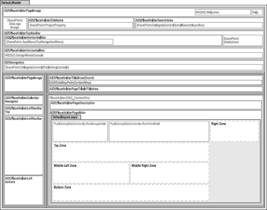
Figure 10-6 illustrates the layout of the placeholders within the master page.
Improvements with SharePoint 2010
Master pages in SharePoint 2010 allow much more control over customization and branding of application pages. In previous versions, site administrators were forced to leave users with an inconsistent look and feel between content and application pages, mainly because the master page of the application pages (application.master) could only be modified by a system administrator. The largest weakness was the uncertainty about changes in the next SharePoint update or hotfix. There was a slight chance that changes to application.master would be overwritten by such an update, and there was no safe way of changing the application pages included in the LAYOUTS folder. In order to eliminate this inconsistency, the following matters have been addressed in SharePoint 2010:
Application pages now use the same master page as content pages.
Administrators can turn off custom master pages for application pages.
Content and application pages now contain the same content placeholders.
Default application pages can be easily redirected.
Master Page Tokens for Application Pages
In previous SharePoint versions, application pages and content pages used different master pages with different content placeholders. The master pages for the application pages could not be changed easily. Most of the application pages used the application.master master page contained in the LAYOUTS folder. The inability to change the master page for application pages created an inconsistent look and feel. With SharePoint 2010, application pages use the same master page as content pages. Hence, the long-awaited support for the ˜masterurl/default.master and ˜masterurl/custom.master tokens in application pages has been added. This allows a site designer to change the master page for the content pages and have the application pages automatically reflect the same master page appearance.
For example, the @Page directive of the ASP.NET page that shows all lists of a site (_layouts/viewlsts.aspx) now references the system master page (˜masterurl/default.master). In the previous SharePoint version, the file viewlsts.aspx started with this directive:
<%@ Page Language="C#"
         Inherits="Microsoft.SharePoint.ApplicationPages.ViewListsPage"
         MasterPageFile="˜/_layouts/application.master" ...   %>
In SharePoint 2010 this has been changed to the following:
<%@ Page Language="C#"
         DynamicMasterPageFile="˜masterurl/default.master"
         Inherits="Microsoft.SharePoint.ApplicationPages.ViewListsPage" ... %>
In order to support referencing the site's master pages, all application pages had to be changed. The tag that referenced the original master page file was removed from the ASPX file. A code-behind file, specifying the site master page, was added. Individual page code was changed to comply with the new master pages as well.
Content placeholder differences between master pages are taken into account by SharePoint 2010. Content placeholders can be inserted or removed, depending on how the master pages use the placeholder. The goal is to maintain as much of the same look and feel as possible.
The content placeholders in custom application pages will need to conform to the site master page. A new DynamicMasterPageFile attribute replaces the old MasterPageFile reference as well.
A deeper look inside that implementation shows that the class Microsoft.SharePoint.WebControls.UnsecuredLayoutsBasePage has been extended with the DynamicMasterPageFile property. This class serves as a base class for LayoutsBasePage, which itself is the base class for most of the application pages, such as ViewListsPage (LAYOUTS/viewlsts.aspx). Examining this class with .NET Reflector shows that during the page initialization (OnPreInit), a new master page handling has been implemented. If the old MasterPageFile property exists, the two common master pages, application.master and simple.master, will be replaced by applicationv4.master and simplev4.master. This enhances compatibility with pages formerly made with SharePoint 2007.
string masterPageUrl = this.MasterPageFile.ToLowerInvariant();
if (masterPageUrl != null)
{
    if (!(masterPageUrl == "/_layouts/application.master"))
    {
        if (masterPageUrl == "/_layouts/simple.master")
        {
             this.MasterPageFile = "/_layouts/simplev4.master";
        }
    }
    else
    {
        this.MasterPageFile = "/_layouts/applicationv4.master";
} }
In the other case, which is the default for SharePoint, the MasterPageFile property is null and the new DynamicMasterPageFile property contains a dynamic token, such as ˜masterurl/default.master. In this case, the code looks like this:
if ((ver <= 3) || !SPControl.GetContextWeb(this.Context).MasterPageReferenceEnabled)
{
customMasterUrl = this.DetermineMasterPage(ver);
}
else if (((this.DynamicMasterPageFile != null) &&
SPControl.GetContextWeb(this.Context).MasterPageReferenceEnabled) &&
((this.DynamicMasterPageFile.Length > 1) &&
(this.DynamicMasterPageFile[0] == '˜')))
{
string str6;
string str3 = null;
int index = this.DynamicMasterPageFile.IndexOf('/'),
if (index >= 0)
{
str3 = this.DynamicMasterPageFile.Substring(0, index);
}
if (((str6 = str3.ToUpperInvariant()) == null)
|| !(str6 == "˜MASTERURL"))
{
customMasterUrl = null;
}
else
{
string str7 = this.DynamicMasterPageFile.
Substring("˜MASTERURL".Length).ToUpperInvariant();
if (str7 != null)
{
if (!(str7 == "/DEFAULT.MASTER"))
{
if (str7 == "/CUSTOM.MASTER")
{
customMasterUrl = SPControl.GetContextWeb(this.Context).
CustomMasterUrl;
}
}
else
{
customMasterUrl = SPControl.GetContextWeb(this.Context).
MasterUrl;
}
}
}
}The tokens work as expected. For ˜masterurldefault.master, SPWeb.MasterUrl is returned, and for ˜masterurl/custom.master, SPWeb.CustomMasterUrl is returned.
Of interest in this code snippet is that, if the SharePoint version is 3 or below (2007 or 2003) or the property MasterPageReferenceEnabled is set to false, the method DetermineMasterPage is called. It looks like this:
protected internal string DetermineMasterPage(int ver)
{
   switch (ver)
   {
      case 1:
      case 2:
      case 3:
          return "/_layouts/layoutsv3.master";
    }
    return "/_layouts/v4.master";
}
That's the mechanism to use default layout master pages for application pages.
Safeguards for Application Pages
The DetermineMasterPage method is also used for a new SharePoint feature to "autorepair" master pages that contain errors. If, for instance, a custom control within a user-defined master page throws an exception, all the application pages that use this master page will become broken and inaccessible. To overcome this, a detection mechanism for master page errors is implemented that switches automatically to a working master page if such an error occurs.
However, allowing application pages to reference dangerous master pages that can contain any custom code has potential security implications. There are some critical pages that have safeguards for broken master pages. If a broken master page is detected, the application page will automatically use the default master page. Pages implementing this feature include
RecycleBin.aspxReGhost.aspxReqAcc.aspxSettings.aspx
These files will try to load the dynamic master page and fall back to a ghosted version of the default master page if an error occurs. If the default master page fails to load, the user will be notified of the error to aid further investigation. This behavior is disabled for postback events. If you want to use this safeguard functionality for your own application pages, you merely set the UnsecuredLayoutsBasePage.RequiresHighReliability property to true.
Turning Off Dynamic Master Page Support
Dynamic master pages can be turned off at the web application level. This new option is controlled by the MasterPageReferenceEnabled property of the SPWeb object. It returns the value from the current web application. A code snippet for this property follows:
public bool MasterPageReferenceEnabled
{
    get
    {
        return this.Site.WebApplication.MasterPageReferenceEnabled;
    }
}
Compiled application pages can now reference user-customized master pages, which are untrusted and may be compiled or not. By introducing the dynamic master page handler (the DynamicMasterPageFile attribute of the page), the master page is evaluated in a way that is transparent to the page parser filter, which usually prohibits referencing uncompiled and therefore untrusted master pages. Hence, by using the MasterPageReferenceEnabled property in conjunction with the DynamicMasterPageFile property, application pages are allowed to reference any master pages.
Redirecting Default Application Pages
Imagine you wish to implement a custom error page or need to change the layout of the default login page. For such needs, SharePoint 2010 introduces the ability to redirect the seven default application pages to custom application pages. The seven pages are
/_LAYOUTS/AccessDenied.aspx/_LAYOUTS/Confirmation.aspx/_LAYOUTS/Error.aspx/_LAYOUTS/Login.aspx/_LAYOUTS/ReqAcc.aspx/_LAYOUTS/SignOut.aspx/_LAYOUTS/WebDeleted.aspx
In order to replace those existing application pages, a replacement page must be created and stored in the LAYOUTS directory on the server. This can be accomplished by deploying a replacement page within a feature and a feature event receiver that sets the mapping, for instance. For implementation, the SPWebApplication class provides a method called UpdateMappedPage. By using this method, you can map the default application pages to custom ones:
using (SPWeb web = SPContext.Current.Web)
{
    web.Site.WebApplication.UpdateMappedPage(
        SPWebApplication.SPCustomPage.AccessDenied,"/_LAYOUTS/MyAccessDenied.aspx");
}
This example maps the default page for AccessDenied to a custom application page MyAccessDenied.aspx. The UpdateMappedPage method expects the enumeration type SPWebApplication.SPCustomPage as its first parameter. This enumeration has the following possible values: AccessDenied, Confirmation, Error, Login, None, RequestAccess, Signout, and WebDeleted. To retrieve custom mappings, you can use the method SPWebApplication.GetMappedPage. The redirection itself is located within the application runtime inside the Microsoft.SharePoint.ApplicationRuntime.SPVirtualPathProvider class. The SPVirtualPathProvider.GetFile method calls the SPLayoutsMappedFile.GetFile method that looks up the custom page mappings. Here's a snippet of the SPVirtualPathProvider.GetFile method:
public override VirtualFile GetFile(string virtualPath)
{
    VirtualFile file = null;
    if ((virtualPath == null) || SPRequestModule.IsExcludedPath(virtualPath))
    {
        file = SPLayoutsMappedFile.GetFile(virtualPath, base.Previous);
        if (file == null)
        {
file = base.Previous.GetFile(virtualPath);
}
return file;
}
}The SPLayoutsMappedFile.GetFile method calls the private method MapLayoutsVirtualPath, which looks up the requested virtual path by using the GetMappedPage method of the SPWebApplication class. The implementation of GetMappedPage used here takes the page URL as a parameter and ensures that the mapped URL will be returned. For example, if /_LAYOUTS/AccessDenied.aspx is the first parameter, it returns /_LAYOUTS/MyAccessDenied.aspx if this mapping exists.
private static string MapLayoutsVirtualPath(string virtualPath)
{
string str = null;
if (virtualPath == null)
{
return str;
}
SPWebApplication context = SPWebApplication.Context;
if (context == null)
{
return null;
}
return context.GetMappedPage(virtualPath);
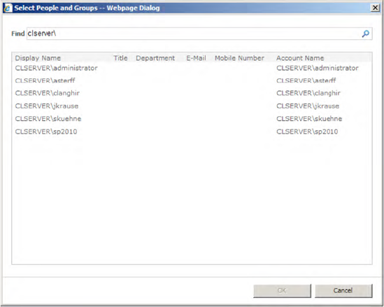
}Dialog master pages (dialog.master) reside in the LAYOUTS folder, too. They are commonly used for pop-up dialogs, such as the various picker dialogs used to select data.
An example is the Select People and Groups dialog, shown in Figure 10-7.
If you need to build a custom dialog for your SharePoint application, you should reference the dialog.master page. It contains several relevant ASP.NET content placeholders for your use depending on your specific requirements (see Table 10-2).
Table 10.2. Placeholders in dialog.master
Placeholder | Description |
|---|---|
| Contains the dialog header, including the three placeholders for an image, a description, and a help link. |
| Contains the dialog image in the upper-left corner. |
| Contains the description text for the dialog. |
| Contains the help link in the upper-right corner. |
| Contains the dialog body. |
| Contains the header within the dialog body. |
| Contains the class name for the main body section. The default value is |
| Contains the main content. For developers, this is the placeholder to insert content. |
| Contains the footer within the dialog body. |
| Contains content that is displayed to the left of the buttons at the bottom. |
| Contains additional buttons to the left of the default buttons. |
| Contains additional buttons to the right of the default buttons. |
In addition to PlaceHolderDialogBodyMainSection, the placeholders at the bottom of the dialog are also important. As shown in the following simplified extract of dialog.master, there are various placeholders, such as PlaceHolderAdditionalPreButton and PlaceHolderAdditionalButton, next to the OkButton and CancelButton placeholders.
<!-- Dialog Button Section Begins -->
<tr id="buttonRow">
     <td width="100%" height="0%" class="ms-dialogButtonSection" style="">
          <table id='Buttons' cellspacing="0" cellpadding="0"
                 width="100%" border="0">
               <tr height="10"><td colspan="3"></td></tr>
               <tr >
                    <td width="100%" colspan="3">
                         <asp:ContentPlaceHolder
                               id="PlaceHolderDialogPrebuttonSection"
runat="server"/>
</td>
</tr>
<tr>
<td width="100%">
<asp:ContentPlaceHolder
id="PlaceHolderAdditionalPreButton"
runat="server">
 
</asp:ContentPlaceHolder>
</td>
<td class="ms-dialogButtonCell" style="padding-right:15px">
<asp:Button UseSubmitBehavior="false" runat="server"
class="ms-ButtonHeightWidth"
OnClick="OkButton_Click" Text="Ok" id="OkButton"/>
</td>
<td class="ms-dialogButtonCell" style="padding-right:10px">
<input type="button" id="CancelButton"
class="ms-ButtonHeightWidth"
value="Cancel" onclick="doCancel();" />
</td>
<td class="ms-dialogButtonCell" style="padding-right:10px">
<asp:ContentPlaceHolder
id="PlaceHolderAdditionalButton" runat="server"/>
</td>
</tr>
<tr height="10"><td colspan="3"></td></tr>
</table>
</td>
</tr>
<!-- Dialog Button Section Ends -->The following example for a custom dialog page inherits from System.Web.UI.Page. Since the OK button belongs to dialog.master, it is not directly accessible within the page. You have to first cast the master page property to DialogMaster before you can access the OK button. Then you can attach a Click event and write your own custom actions for it.
public class MyCustomDialog : System.Web.UI.Page
{
    protected override void OnInit(EventArgs e)
    {
        ((DialogMaster)this.Page.Master).OkButton.Click += btnOk_Click;
        base.OnInit(e);
    }
    protected void btnOk_Click(object sender, EventArgs e)
    {
        // do something
    }
}ASP.NET pages within SharePoint that use site or system master pages are commonly known as content pages. In addition to these content pages, there are application pages that focus on special functions for the SharePoint application rather than content.
Content pages are designed to be customizable. SharePoint users with appropriate rights (designer) are allowed to modify those pages according to their needs using SharePoint Designer. For security reasons, those pages are not permitted to contain inline code or unsafe controls. A designer is only allowed to change basic settings, such as the alignment or some attributes of placeholders. In addition, you may insert custom web controls (inherited from System.Web.UI.WebControls.WebControl) that are explicitly marked as SafeControl in web.config. Content pages are saved directly into the content database.
In contrast to content pages, application pages may use inline code. Nearly all application pages shipped with SharePoint contain a reference to a class that is defined in the Microsoft.SharePoint.ApplicationPages.dll assembly (%SharePointRoot%14CONFIGBIN). The following excerpt is from the file LAYOUTS/viewlsts.aspx:
<%@ Page Language="C#"
    DynamicMasterPageFile="˜masterurl/default.master"
    Inherits="Microsoft.SharePoint.ApplicationPages.ViewListsPage"
    EnableViewState="false"
    EnableViewStateMac="false"    %>
The page class ViewListsPage is derived from the Microsoft.SharePoint.WebControls.LayoutsBasePage class. A detailed description of how to create your own application pages can be found in Chapter 3.
SharePoint 2010 provides two master pages that are used in different scenarios. While master pages are designed for using with the old and new UIs, there are also some simplified master pages, namely minimal.master and simple.master.
The most important master page for SharePoint 2010 is v4.master. This master page can be found in the directory %SharePointRoot%14TEMPLATEGLOBAL and also in the directory %SharePointRoot%14TEMPLATELAYOUTS. The two files are identical copies, where the first one is used as the default master page (e.g., for blank sites or team sites) and the second one is intended to be used by application pages. The master page v4.master provides the ribbon bar and other web controls, such as menus, navigations, stylesheets, and JavaScript references.
An additional master page, used for example by Office web applications and the search site, is minimal.master, which is likewise stored in both the GLOBAL and the LAYOUTS directories. It is, as the name implies, a very minimalistic master page that has next to nothing on it. It doesn't even have navigation.
Very similar to minimal.master, SharePoint offers the simple.master and the simplev4.master pages. These master pages are used particularly for login and error application pages residing in the LAYOUTS directory. The second one (simplev4.master) is automatically used with SharePoint 2010, even if the first one is referenced explicitly (look at section "Master Page Tokens for Application Pages" in this chapter for more information).
SharePoint content pages usually refer to master pages from the SharePoint master page gallery. You might assume that there would be hard-coded paths inside each content page to the master page. However, it would be suboptimal if the whole master page needed to be changed (e.g., from default.master to mycompany.master)—every content page would have to be modified. To avoid this, SharePoint uses tokens, which are dynamically replaced at runtime.
SharePoint offers two tokens that are dynamically replaced by the appropriate values of the current SPWeb object: SPWeb.MasterUrl and SPWeb.CustomMasterUrl (see Table 10-3).
Table 10.3. SharePoint Dynamic Master Page Tokens
Token | Object Property | Synonyms |
|---|---|---|
|
| Default master page, system master page |
|
| Custom master page, site master page |
The dynamic token ˜masterurl/default.master is usually used in the forms and views of a site. In contrast to the previous SharePoint versions, SharePoint 2010 uses this dynamic token heavily—it is in most of the application pages, such as viewlsts.aspx. The token is embedded in the @Page directive as follows:
<%@Page language="C#" MasterPageFile="˜masterurl/default.master" ... @>
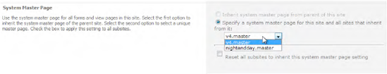
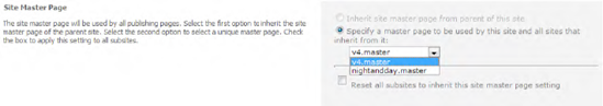
When calling an ASP.NET page, SharePoint automatically replaces the token ˜masterurl/default.master at runtime with the value of the property MasterUrl of the SPWeb object. If you want to change the master page for this token with the SharePoint GUI, navigate to Site Settings
Note
The menu item Site Settings
The following example shows how to access the SPWeb.MasterUrl property using the object model:
using (SPWeb web = SPContext.Current.Web)
{
   web.MasterUrl = "/_catalogs/masterpage/mysystem.master";
   web.Update();
}
Figure 10-8 shows how to change the SPWeb.MasterUrl property through the SharePoint UI.
The second dynamic token, ˜masterurl/custom.master, works in a similar manner to default.master. The @Page directive of an ASP.NET page looks like this:
<%@Page language="C#" MasterPageFile="˜masterurl/custom.master" ... @>
At runtime, this token is replaced with the contents of the CustomMasterUrl property of the SPWeb object. You can change the master page specified for this token by browsing to Site Settings
using (SPWeb web = SPContext.Current.Web)
{
    web.CustomMasterUrl = "/_catalogs/masterpage/mysite.master";
    web.Update();
}
Static tokens are direct references to master pages. This means that SharePoint will replace these tokens with the corresponding URL paths (see Table 10-4).
Assuming your ASPX page is at http://mySiteCollection/mySite/default.aspx and your static token is ˜sitecollection/mycompany.master, then your master page file has to be stored at this URL:
http://mySiteCollection/mycompany.master
On the other hand, if your static token is ˜site/mycompany.master, then your master page has to be stored here:
http://mySiteCollection/mySite/mymaster.master
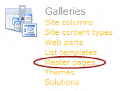
SharePoint master pages have their own library, called the master page gallery. This is a location on the site where a site administrator can access and modify SharePoint master pages. To access a SharePoint master page gallery, go to a SharePoint site collection, and then to the site settings, and click "Master pages," as shown in Figure 10-10.
The advantage of storing master pages in the SharePoint master page gallery is that you have easy access to the master pages. Furthermore, you can make changes to a master page and upload it to the master page gallery when you are done. If your content page already refers to that master page, the end user will see your master page changes as soon as it is checked in.
In a standalone ASP.NET application (without SharePoint), the master page typically lives on the file system, and a direct reference is made to the physical file. In SharePoint there are two different places where master pages are stored:
Site and system master pages are stored in the master page gallery (within the content database).
Application master pages are stored in the file system under
%SharePointRoot%14TEMPLATELAYOUTS.
Note
Master pages in the master page gallery are not allowed to use code at all. Only layout changes and web controls that are marked as SafeControls in the web.config file are allowed, for security reasons.
To reference master pages that reside in master page galleries, you have to use static and dynamic master page tokens.
You'll often need to apply a custom master page to your SharePoint site and all the sites within it. Sometimes you'll even need to apply your master page to all the site collections contained within all your web applications operating within a farm. This is easy to accomplish when you are customizing a site for the first time, since most subwebs are set up to inherit from their parent site.
Consequently, when you customize the parent site, it will apply to all the children. It's more challenging, however, when a site collection has already been in use, and you want to create a new custom page that applies to all the child sites, even if someone has explicitly declared not to inherit the master page from the parent site. Furthermore, you have to consider what happens when you deactivate the feature, assuming you realize this functionality is a feature. When the feature is deactivated, does that mean that you have to reset all the sites back to the default.master master page, thereby erasing all the customizations people have made?
This is exactly what the following example illustrates. It creates a custom master page as a feature. It includes code that applies the master page to all the child sites, ensures that the feature can be successfully uninstalled, and reverts all the sites back to their original master page.
public override void FeatureActivated(SPFeatureReceiverProperties properties)
{
    SPSite site = properties.Feature.Parent as SPSite;
    if (site == null) return;
    String customizedMasterUrl = "/_catalogs/masterpage/MyCustomMasterPage.master";

    SPWeb rootWeb = site.RootWeb;
    rootWeb.AllProperties["OldMasterUrl"] = rootWeb.MasterUrl;
    rootWeb.AllProperties["OldCustomMasterUrl"] = rootWeb.CustomMasterUrl;
    rootWeb.MasterUrl = customizedMasterUrl;
    rootWeb.CustomMasterUrl = customizedMasterUrl;
    rootWeb.Update();
    foreach (SPWeb subWeb in rootWeb.Webs)
    {
        ProcessSubWebs(subWeb, true);
    }
}

private void ProcessSubWebs(SPWeb web, bool isActivation)
{
    if (isActivation)
    {
        web.AllProperties["OldMasterUrl"] = web.MasterUrl;
        web.AllProperties["OldCustomMasterUrl"] = web.CustomMasterUrl;
        web.MasterUrl = web.Site.RootWeb.MasterUrl;
        web.CustomMasterUrl = web.Site.RootWeb.MasterUrl;
}
else
{
DeactivateWeb(web);
}
web.Update();
foreach (SPWeb subWeb in web.Webs)
{
ProcessSubWebs(subWeb, isActivation);
}
}The example code ensures that the feature's parent (in this case, site collection) exists. If not, it exits having done nothing. The next step is to record the current master and custom master pages for the top-level site. Properties are added to SPWeb to persist this information.
Note
You should not use the SPWeb.Properties property, as this will return only a subset of properties. Instead, make sure you use SPWeb.AllProperties. When adding a property to the property bag, if it doesn't exist, it will be created, and if it already exists, it will be overwritten.
Next, the root-level site's MasterUrl and CustomMasterUrl properties can be reset. After that, call SPWeb.Update to save the changes. Then you need to recursively iterate through all the child sites and point them to this top-level site's master page.
The next step is to write code to deactivate the feature. This is slightly more complicated because there are several manual checks to implement. To revert the deployment of the solution package back to the original state, you have to manually set all the subsites back to their original master pages (after you've determined if that master page still exists), and then ensure that the custom master page is deleted correctly.
public override void FeatureDeactivating(SPFeatureReceiverProperties properties)
{
    SPSite site = properties.Feature.Parent as SPSite;
    if (site == null) return;

    SPWeb rootWeb = site.RootWeb;
    DeactivateWeb(rootWeb);
    rootWeb.Update();

    foreach (SPWeb subWeb in rootWeb.Webs)
    {
        ProcessSubWebs(subWeb, false);
    }

    if (rootWeb.MasterUrl != customizedMasterUrl)
    {
        try
        {
            bool fileExists = rootWeb.GetFile(customizedMasterUrl).Exists;
SPFile file = rootWeb.GetFile(customizedMasterUrl);
SPFolder masterPageGallery = file.ParentFolder;
SPFolder temp = masterPageGallery.SubFolders.Add("Temp");
file.MoveTo(temp.Url + "/" + file.Name);
temp.Delete();
}
catch (ArgumentException)
{
return;
}
}
}
private void DeactivateWeb(SPWeb web)
{
String defaultMasterUrl = "/_catalogs/masterpage/default.master";
if (web.AllProperties.ContainsKey("OldMasterUrl"))
{
string oldMasterUrl = web.AllProperties["OldMasterUrl"].ToString();
try
{
bool fileExists = web.GetFile(oldMasterUrl).Exists;
web.MasterUrl = oldMasterUrl;
}
catch (ArgumentException)
{
web.MasterUrl = defaultMasterUrl;
}
string oldCustomUrl = web.AllProperties["OldCustomMasterUrl"].ToString();
try
{
bool fileExists = web.GetFile(oldCustomUrl).Exists;
web.CustomMasterUrl =
web.AllProperties["OldCustomMasterUrl"].ToString();
}
catch (ArgumentException)
{
web.CustomMasterUrl = defaultMasterUrl;
}
web.AllProperties.Remove("OldMasterUrl");
web.AllProperties.Remove("OldCustomMasterUrl");
}
else
{
web.MasterUrl = defaultMasterUrl;
web.CustomMasterUrl = defaultMasterUrl;
}
}Begin by checking that the parent site collection exists. Next, deactivate the top-level site. Inside DeactivateWeb, check if the OldMasterUrl property still exists in the web's properties collection. If it doesn't, there is no alternative but to revert back to default.master. If the OldMasterUrl property exists, you have to make sure that the file it points to still exists.
Note
Although it may seem intuitive that accessing the SPFile.Exists property would return True or False, in fact, if a file doesn't exist, it throws an ArgumentException error.
As previously described, you need to follow the same procedure for the OldCustomMasterUrl property. If either original master page doesn't exist in SharePoint any longer at its old location, revert it back to default.master. Finally, you can delete the custom properties because they are no longer needed. Then you can iterate through this same process for every child site.
Going back to the DeactivateFeature method, the next step is to delete the custom master page from the /_catalogs/masterpage directory. Unfortunately, there seems to be a bug in SharePoint where you cannot delete a master page that was installed by a feature, even if no reference to that master page exists. It will throw an error saying, "This item cannot be deleted because it is still referenced by other pages." A quick workaround is to move the master page to another folder and then delete that folder.
SharePoint comes with several navigation artifacts, all of which are aimed at ensuring a great end-user experience. For developers, it is especially important to understand the underlying SharePoint navigation concepts, in case one day you need to build your own navigation control or extend the existing controls. On the next few pages you'll be introduced to the different navigation elements and their usage.
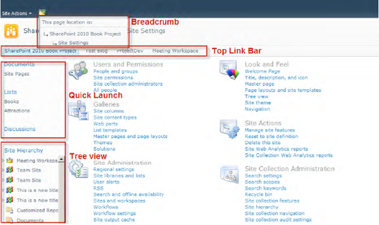
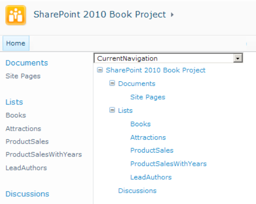
SharePoint provides several navigation controls that are usually defined within master pages. There are four main navigation controls that are rendered on pages by default (see Figure 10-11):
Top link bar navigation
Quick launch navigation
Breadcrumb navigation
Tree view navigation
Note
Tree view navigation is turned off by default. Site administrators can show or hide it by going to Site Settings
The SharePoint navigation controls are fully based on the data-driven navigation concepts from ASP.NET. Hence, a navigation control requires a site map provider that supplies the data structure to be filtered and displayed.
The top link bar normally appears at the top of each page. If the page contains a ribbon tab, the top link bar is placed within the Browse tab of the ribbon bar. From a technical perspective, the top link bar is a navigation menu containing links usually to sites that are at least one level below the current site in the site hierarchy. Each SharePoint site (SPWeb) can either have its own top link bar or inherit the top link bar from its parent site.
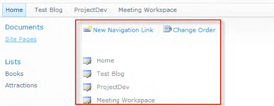
Site administrators are able to customize the navigation links in the top link bar. New navigation link items can be added and existing ones can be modified and sorted (see Figure 10-12).
When adding navigation link items, those items are treated internally as external links. Otherwise, if you create a new site and it is added automatically to the top link bar by SharePoint, then it is regarded as an internal link. The difference between external and internal links is in the security-trimming functionality. External links are always displayed, regardless of whether the user is authorized to view the page or not. In contrast, internal links are security-trimmed. That means that internal links are only displayed if the user is authorized to view the link's destination page. It is not possible to create internal links manually by using the SharePoint UI, but you can easily overcome that by using the API, as shown in Listing 10-1.
Example 10.1. Adding Internal and External Links to the Top Link Bar
using (SPWeb web = SPContext.Current.Web)
{
        SPNavigationNode newInternalNode =
                new SPNavigationNode("New Home", "default.aspx", false);

        SPNavigationNode newExternalNode =
                new SPNavigationNode("BING", "http://www.bing.com", true);

        web.Navigation.TopNavigationBar.AddAsLast(newInternalNode);
        web.Navigation.TopNavigationBar.AddAsLast(newExternalNode);

        web.Update();
}
As shown in Listing 10-1, the constructor of the SPNavigationNode class requires linkTitle, URL, and a Boolean value for isExternal, which indicates whether the navigation link should be internal (false) or external (true).
Tip
The default UI for SharePoint Foundation sites does not allow managing a top navigation hierarchy. Only a flat list of navigation links is supported. To work around this, you can use the object model and nest a couple of SPNavigationNode instances to build a hierarchy. The web control itself supports hierarchies and displays them using flyout menus.
Within the v4.master master page, the top link bar is, by default, defined as follows:
<SharePoint:AspMenu
                 Id="TopNavigationMenuV4"
                 Runat="server"
                 EnableViewState="false"
                 DataSourceID="topSiteMap"
                 UseSimpleRendering="true"
                 UseSeparateCss="false"
                 Orientation="Horizontal"
                 StaticDisplayLevels="2"
                 MaximumDynamicDisplayLevels="1"
                 SkipLinkText=""
                 CssClass="s4-tn" />
The properties StaticDisplayLevels and MaximumDynamicDisplayLevels specify how the navigation control renders hierarchies. The first property defines how many hierarchy levels should be rendered without flyout menus. The second property defines that, beginning from the third level (StaticDisplayLevels+1), one level (the third) will be rendered within a flyout menu. Another interesting property is UseSimpleRendering. When this property is set to true, the SharePoint navigation menu is rendered using a simple HTML list (with UL and LI elements) instead of using complex nested <div> and <table> tags. The resulting HTML is clean, short, and easy to understand.
The data source that defines the SharePoint navigation provider and the starting node ID looks like this:
<asp:SiteMapDataSource
                ShowStartingNode="False"
                SiteMapProvider="SPNavigationProvider"
                Id="topSiteMap"
                runat="server"
                StartingNodeUrl="sid:1002"/>
The StartingNodeUrl property points to the top link bar, which is represented by the hard-coded value sid:1002.
The quick launch is intended for navigation within a site and usually contains links to lists and libraries. The quick launch navigation usually appears on the left of each page in a site.
To customize the quick launch navigation, you can use the SharePoint UI (see Figure 10-13).
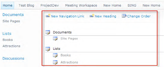
The quick launch navigation works in a very similar manner to the top link bar navigation, as described previously. In comparison to the top link bar, the SharePoint UI supports at least two hierarchy levels: heading and navigation link. Internally, these two levels are just normal, nested SPNavigationNode elements. To access the quick launch programmatically, you can use the following line:
SPNavigationNodeCollection allNodes = web.Navigation.QuickLaunch;
As with the top link bar, you can easily add, modify, or remove navigation link items. You can also overcome the limitation of two hierarchy levels by working with nested SPNavigationNode instances. The web control definition in the v4.master master page is quite similar to that for the top link bar. The differences are shown in bold in the following code.
<SharePoint:AspMenuId="V4QuickLaunchMenu"Runat="server" EnableViewState="false"DataSourceID="QuickLaunchSiteMap"UseSimpleRendering="true" UseSeparateCss="false"Orientation="Vertical"StaticDisplayLevels="2"MaximumDynamicDisplayLevels="0"SkipLinkText="" CssClass="s4-ql"/>
The property MaximumDynamicDisplayLevels is set to 0. This means that flyout menus are deactivated by default. You have to manually modify this property in the master page (e.g., via SharePoint Designer) to use flyout menus.
The data source for the quick launch navigation points to the StartingNodeUrl value sid:1025, which represents the quick launch, as shown here:
<asp:SiteMapDataSource
                ShowStartingNode="False"
                SiteMapProvider="SPNavigationProvider"
Id="QuickLaunchSiteMap"
runat="server"
StartingNodeUrl="sid:1025"/>The breadcrumb navigation displays a hierarchical path from the current navigation position to the root. In the v4.master page, the breadcrumb trail is defined using a PopoutMenu web control:
<SharePoint:PopoutMenu
runat="server"
ID="GlobalBreadCrumbNavPopout"
IconUrl="/_layouts/images/fgimg.png"
IconOffsetX=0
IconOffsetY=112
IconWidth=16
IconHeight=16
AnchorCss="s4-breadcrumb-anchor"
AnchorOpenCss="s4-breadcrumb-anchor-open"
MenuCss="s4-breadcrumb-menu">
<div class="s4-breadcrumb-top">
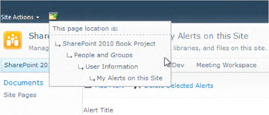
<asp:Label runat="server" CssClass="s4-breadcrumb-header" Text="This page location is:" />
</div>
<asp:ContentPlaceHolder id="PlaceHolderTitleBreadcrumb" runat="server">
<SharePoint:ListSiteMapPath
runat="server"
SiteMapProviders="SPSiteMapProvider,SPContentMapProvider"
RenderCurrentNodeAsLink="false"
PathSeparator=""
CssClass="s4-breadcrumb"
NodeStyle-CssClass="s4-breadcrumbNode"
CurrentNodeStyle-CssClass="s4-breadcrumbCurrentNode"
RootNodeStyle-CssClass="s4-breadcrumbRootNode"
NodeImageOffsetX=0
NodeImageOffsetY=321
NodeImageWidth=16
NodeImageHeight=16
NodeImageUrl="/_layouts/images/fgimg.png"
HideInteriorRootNodes="true"
SkipLinkText="" />
</asp:ContentPlaceHolder>
</SharePoint:PopoutMenu>As you can see, the breadcrumb navigation is built up from the two site map providers SPSiteMapProvider and SPContentMapProvider. These providers are explained later on in this chapter.
Modifying the breadcrumb navigation is only recommended if you plan to implement your own navigation provider.
Note
Usually, the built-in SharePoint application pages in the LAYOUTS folder override the PlaceHolderTitleBreadcrumb placeholder and provide a ListSiteMapPath control with a small change to the SiteMapProviders property: SiteMapProviders="SPSiteMapProvider,SPXmlContentMapProvider". The SPXmlContentMapProvider class ensures the correct breadcrumb navigation within application pages. (Also see the section "The SPXmlContentMapProvider Class" later in this chapter.)
The tree view navigation displays the site contents—such as lists, libraries, and sites—that are below the current site in a hierarchical structure. It usually appears under the quick launch navigation on the left of a page. Notice that the tree view navigation is turned off by default. Site administrators can control the visibility of the tree view under Site Settings
<SharePoint:SPHierarchyDataSourceControl
 runat="server"
 id="TreeViewDataSourceV4"
 RootContextObject="Web"
 IncludeDiscussionFolders="true"
/>

  <Sharepoint:SPTreeView
        id="WebTreeViewV4"
        runat="server"
        ShowLines="false"
        DataSourceId="TreeViewDataSourceV4"
        ExpandDepth="0"
        SelectedNodeStyle-CssClass="ms-tvselected"
        NodeStyle-CssClass="ms-navitem"
        SkipLinkText=""
        NodeIndent="12"
        ExpandImageUrl="/_layouts/images/tvclosed.png"
        CollapseImageUrl="/_layouts/images/tvopen.png"
        NoExpandImageUrl="/_layouts/images/tvblank.gif" />
The SPTreeView web control is populated with the data source TreeViewDataSourceV4, which provides the property RootContextObject="Web". The tree view initially renders all the subsites of the current site (SPWeb.Webs), followed by the libraries and lists, and finishing with the content pages. No SharePoint navigation provider is required.
ASP.NET features a data-driven navigation system that uses hierarchical data sources and associated controls. It is much easier to create a site navigational system and track the current position of the user if you use the Menu, TreeView, or SiteMapPath control. As is common in ASP.NET, these controls use a provider to obtain data from a specific data source. The objective of ASP.NET's site navigation feature is to allow developers to specify a site map that describes the logical structure of a web site. This structure can be readily displayed with the SiteMapPath, TreeView, and Menu web controls of ASP.NET. Usually, these controls use XmlSiteMapProvider to read site map information from a .sitemap XML file.
If your web project requires a site map data source other than a static XML file, you can implement your own site map provider. This is done by creating a class, which inherits from the abstract System.Web.SiteMapProvider class and implements at least the abstract members described in Table 10-5.
Table 10.5. Exposed Abstract Members of the SiteMapProvider Class
Method | Description |
|---|---|
| Retrieves an instance of the |
| Retrieves the child nodes of a specific |
| Retrieves the parent node of a specific |
| Retrieves the root node of all the nodes that are managed by the current provider. This method is called internally by various site navigation classes to ensure that the navigation data has been loaded by the provider. This method must not return a null node. |
A very simplistic implementation of a site map provider looks like the following snippet:
public class MySiteMapProvider : SiteMapProvider
{
    SiteMapNode rootNode = null;

    public MySiteMapProvider()           {}

    public override void Initialize(string name,
                  System.Collections.Specialized.NameValueCollection attributes)
    {
        // Initialize static siteMap
        this.rootNode = new SiteMapNode(this, "rootNode", "/default.aspx", "Home");
        this.rootNode.ChildNodes.Add(new SiteMapNode(this, "childNode1",
                                                           "/page1", "SubPage 1"));
        this.rootNode.ChildNodes.Add(new SiteMapNode(this, "childNode2",
                                                           "/page2", "SubPage 2"));
    }

    public override SiteMapNode FindSiteMapNode(string rawUrl)
    {
switch (rawUrl)
{
case "/default.aspx": return this.rootNode;
case "/page1.aspx": return this.rootNode.ChildNodes[0];
case "/page2.aspx": return this.rootNode.ChildNodes[1];
default: return null;
}
}
public override SiteMapNodeCollection GetChildNodes(SiteMapNode node)
{
SiteMapNodeCollection children = new SiteMapNodeCollection();
if (node != null && node.HasChildNodes)
{
foreach (SiteMapNode cNode in node.ChildNodes) children.Add(cNode);
}
return children;
}
public override SiteMapNode GetParentNode(SiteMapNode node)
{
return (node == null) ? null : node.ParentNode;
}
protected override SiteMapNode GetRootNodeCore()
{
return rootNode;
}
}This example shows the principles behind ASP.NET site map providers. All the various SharePoint site map providers are based upon this concept, and it's not difficult to write your own provider to meet your particular requirements.
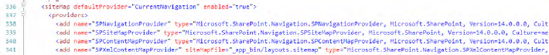
SharePoint offers its own site map providers—called navigation providers—which are declared in the web.config file in the root directory of the web application (usually C:inetpubWSSVirtual Directories80web.config). These named navigation providers can be found at the <SiteMap> element within the <System.Web> section, as shown in Figure 10-14.
For SharePoint Foundation, the following navigation providers are defined:
SPNavigationProviderSPSiteMapProviderSPContentMapProviderSPXmlContentMapProviderSPXmlAdminContentMapProvider(only available in a Central Administration web application)
All these providers share the same namespace: Microsoft.SharePoint.Navigation. They are included in the assembly Microsoft.SharePoint.dll.
This provider acts as a base class for SharePoint site map providers that are specialized for SharePoint site navigation, such as the top link bar and the quick launch. It is generally used for SharePoint Foundation or SharePoint Server implementations without the Publishing feature enabled.
The SPSiteMapProvider class is used for default breadcrumb navigation. It provides SiteMapNode site objects (SPWeb) in the site hierarchy, starting from the underlying site collection (SPSite). For example:
Site collection
Site 1
Site 2
Subsite 2a
Subsite 2b
Site 3
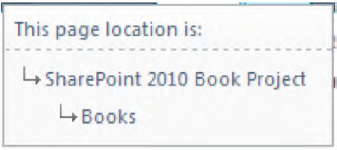
This provider is also used for default breadcrumb navigation. It adds content information of the current page to the breadcrumb trail, such as information about lists, folders, items, and list forms.
Consider a practical example. Assume that you have a list named Books, and you are viewing the default view, /Lists/Books/AllItems.aspx. In this situation, SPContentMapProvider would return a navigation node named Books (see Figure 10-15).
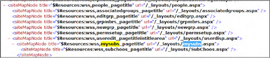
This provider is used for breadcrumb navigation within application pages. The class is derived from System.Web.XmlSiteMapProvider and uses an XML file as a data source. The provider uses a siteMapFile attribute, which by default points to an XML site map file in the _app_bin folder of the current web application. This file contains the site map for most of the application pages in the LAYOUTS folder. For example, the application page mysubs.aspx contains a section along these lines:
<SharePoint:ListSiteMapPath
                runat="server"
                SiteMapProviders="SPSiteMapProvider,SPXmlContentMapProvider" ... />
The file app_bin/layouts contains a siteMapNode hierarchy, as shown in Figure 10-16.
The resulting application page is shown in Figure 10-17.
In addition to those provided by SharePoint Foundation, SharePoint Server adds some further navigation providers to the web.config file of a web application. Table 10-6 summarizes the SharePoint Server navigation providers.
Table 10.6. SharePoint Server Navigation Providers
Provider | Description |
|---|---|
| Quick launch navigation provider for the Central Administration site |
| CMS provider for combined navigation |
| Provider for current navigation |
| CMS provider for current navigation |
| CMS provider for current navigation; no output encoding |
| Provider for navigation in extended search pages |
| Provider for global navigation |
| CMS provider for global navigation |
| MySite left navigation provider that returns areas and is based on the current user context |
| MySite provider that returns areas and is based on the current user context |
| Quick launch navigation provider for shared service administration sites |
| Provider for categories of a site directory |
| Provider for navigation in portal usage pages |
The main difference between these additional providers and the SharePoint Foundation navigation providers is the NavigationType property. Most of the SharePoint Server navigation providers use one of three different navigation types (see Table 10-7).
The results of the different navigation providers are not always transparent and traceable. If you want to test that a navigation provider works as you expect, simply write a small application page that allows you browse through all available navigation providers (see Figure 10-18).
The example application page contains a DropDownList and a TreeView element. DropDownList allows you to select a navigation provider and TreeView displays the navigation hierarchy.
<%@ Page Language="C#" AutoEventWireup="true" DynamicMasterPageFile="˜masterurl/default.master"
    CodeFile="NavigationProviders.aspx.cs" Inherits="NavigationProviders"
    CodeFileBaseClass="Microsoft.SharePoint.WebControls.LayoutsPageBase" %>

<asp:Content ContentPlaceHolderId="PlaceHolderMain" runat="server">

    <asp:DropDownList id="ddlNavProviders" runat="server" AutoPostBack="True"
        OnSelectedIndexChanged="ddlNavProviders_SelectedIndexChanged" />

    <asp:TreeView id="navTreeView" runat="server"></asp:TreeView>

</asp:Content>
The code-behind class first initializes DropDownList with all the navigation providers defined in web.config. By selecting a navigation provider, the SiteMapDataSource pointing to the selected provider is bound to the TreeView.
using System;
using System.Web;
using System.Web.UI.WebControls;
using Microsoft.SharePoint;
using Microsoft.SharePoint.WebControls;

public partial class NavigationProviders : LayoutsPageBase
{
    protected void Page_Load(object sender, EventArgs e)
    {
        if (!IsPostBack)
        {
            // Init the DropDown element with all available navigation providers
            ddlNavProviders.DataSource = SiteMap.Providers;
            ddlNavProviders.DataTextField = "Name";
            ddlNavProviders.DataBind();
        }
    }

    protected void ddlNavProviders_SelectedIndexChanged(object sender,
                                                        EventArgs args)
    {
       // Bind the selected navigation provider to the TreeView
       SiteMapDataSource ds = new SiteMapDataSource();
       ds.Provider = SiteMap.Providers[ddlNavProviders.SelectedItem.Text];
       navTreeView.DataSource = ds;
       navTreeView.DataBind();
    }
}
This example is useful if you wish to check which navigation providers are currently available in your SharePoint web application. Furthermore, it can be interesting to examine the resulting navigation hierarchy for some navigation providers.
A theme is a collection of graphics and Cascading Style Sheet (CSS) files that define the look and feel of a web site. Themes serve as an instrument to apply colors and fonts to UI elements on SharePoint sites.
This section provides a high-level overview over the infrastructure of themes, and suggests ways to extend the capabilities of themes by using CSS. This is especially useful to designers who want to use themes as a quick and easy technique to apply colors and fonts to SharePoint sites without any knowledge of CSS or the details of the SharePoint CSS infrastructure.
The themes used in SharePoint 2010 use the same file extension (THMX) and structure as theme files used in Microsoft Office 2007 and Microsoft Office 2010 client applications, such as Microsoft PowerPoint 2010.
Note
SharePoint themes are totally unrelated to (and incompatible with) the themes provided by the ASP.NET Framework.
SharePoint 2007 provided several default files and entry points you could customize to change the look and feel and behavior of content pages. Such customizations often required full-scale branding efforts that included customizing code and editing multiple files. Custom styles were supported by using customized, user-defined CSS files, but modifying the look and feel of a site or site collection required deep knowledge of CSS syntax and coding conventions. SharePoint 2010 introduces two new features that make it easier and less code-intensive to customize the UI. A new master file called v4.master and the new concept of theming are the foundations for customization.
As Figure 10-19 shows, there are several customization levels. Each of these features exists along with other design and branding options. These options range from minimal complexity requiring minimal developer involvement to a large degree of complexity, which requires the expertise of a web developer.
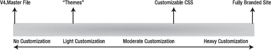
You can use the v4.master file that is installed by default if you just want to use the SharePoint default colors and fonts. However, if you want to change the look and feel of a SharePoint site, you now have three options with varying degrees of customization depth and flexibility. Table 10-8 explains these options.
Table 10.8. Customization Levels
Level | Description |
|---|---|
No customization | The |
Light customization | You can modify fonts and colors of your site by applying a THMX file. You or a designer can apply a theme by using a simple web-based UI that requires no knowledge of CSS. With themes, you get broad and clear control of colors and fonts. Also, recoloring of images is supported. |
Moderate to heavy customization | A designer is able to modify all design elements of a page layout that are controlled by CSS, including fonts, font sizes, colors, spacing, and background images. Customizable CSS requires detailed knowledge of CSS and the SharePoint page layout structure. |
If you want to fully brand your SharePoint site, you need skilled and experienced designers and web developers who are deeply familiar with the SharePoint page layout structure and the default CSS files. Full branding provides the most specific and precise control, but it is not straightforward. You have to ensure that all pages are consistent and that all changed UI elements are displayed correctly. |
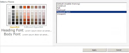
One goal of the SharePoint theming infrastructure is to provide a quick and easy way to uniformly apply combinations of colors and fonts that does not require learning CSS or site-branding intricacies. You simply define some basic colors and fonts through an integrated styling page, as shown in Figure 10-20. You can access this page under Site Settings
The ability to easily change colors and fonts is appealing. If you take it one step further to customizing your CSS styles, you need to know how to use the theme colors within a custom stylesheet. To address this, SharePoint provides a way to dynamically modify styles that are already being used on sites, whereby these styles can then be used in themes. If an existing site has been customized using CSS, you can mark that CSS with a markup syntax that is specifically designed to be used with themes on SharePoint sites. Elements that are denoted with this CSS syntax will be themed when a theme is applied. An example for a custom CSS file could look like the following:
.myCssClass
{
                /*[ReplaceColor(themeColor:"Light2")]*/
                Color:#FFFFFF;
}
In this example, the color #FFFFFF (white) will be replaced dynamically with Light2, the named color of the current theme.
SharePoint 2010 themes are fully compatible with the Office themes introduced with Microsoft Office 2007. Every theme you create within SharePoint will result in a THMX file, containing collections of colors, fonts, and images. These files can be exported to or imported from Office applications, such as PowerPoint. Such files can be used as starting points for further customization or as default sources of UI styling elements.
Themes offer a way to change the look and feel of a site, without knowledge of CSS or professional web developer skills. Themes are separate from but related to CSS. They work alongside other design options, such as CSS file customization and full-branding initiatives that use the talents of professional web designers and web developers.
While themes afford a way to modify the look and feel of a site, they do not affect how CSS, SharePoint programmability, and branding work. Themes do not interfere with professionals who want to use more advanced or technical approaches for branding SharePoint sites—they simply provide a lighter-weight option for site design.
The infrastructure of the themes feature supports consistent application of colors, images, and fonts across SharePoint sites.
To understand how the themes infrastructure supports this functionality, you need to understand how the themes feature works in Windows SharePoint Foundation.
SharePoint makes it possible to use themes with both SharePoint Server 2010 sites and SharePoint Foundation 2010 sites. The new approach to themes in this release simplifies the required steps and reduces the number of steps to customize the site design. SharePoint 2010 addresses performance issues of earlier versions by instructing the browser to get only one set of CSS files when applying a theme.
Instead of creating a custom CSS file for a theme, you can annotate the actual CSS file with variables that are unique to themes and translated into valid values within the CSS. These variables are stored as comments in the CSS file, so they are completely supported by web standards. Creating a new theme simply involves defining new values for those variables. All UI elements in SharePoint 2010 can be themed. When you apply a theme, it is applied to all UI elements and controls—the following list provides some examples:
Compared with older SharePoint versions, the theme infrastructure of SharePoint 2010 has completely changed:
Inline styles (i.e., any styles that include style="" attributes and the <font> tag) cannot be overridden by the CSS that SharePoint Foundation 2010 uses, and therefore you cannot apply a theme to them. Themes apply only to CSS styles that are defined in a CSS file stored in a location that can be themed. These styles contain markup syntax for Web Parts, controls, and the ribbon. Style declarations within a master page or page layout file cannot be themed.
The elements, attributes, and variables defined in a THMX file define the colors, fonts, and image colors that are applied to a site. The THMX file contains all the information that the server needs to correctly apply the style elements defined in this file to the UI elements of a SharePoint site.
You can extend your CSS files so that your controls and Web Parts adhere to the theme. However, if you do not design a control with the requirements of themes in mind, you might, for example, choose to use inline styles. This would create a problem because SharePoint Server cannot override inline styles.
If your control or Web Part uses its own CSS files, then you can override inline styles in a way that makes it possible to apply themes to them. You do this by first determining which styles are used by the control or Web Part, then adding those styles to the site's CSS file, and finally annotating them with the appropriate variables. This ensures that the styles that your control or Web Part uses are processed by the SharePoint themes engine and overridden properly.
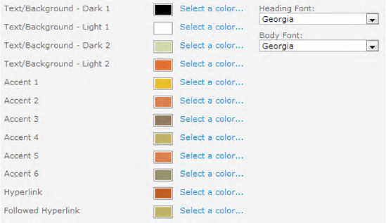
Generally, themes for Office have 12 color slots. The first four horizontal colors are for text and backgrounds (Dark1, Light1, Dark2, and Light2). Text that is created with light colors will be legible over the dark colors, and text that is created with dark colors will be legible over the light colors. The next six colors are accent colors (Accent1 to Accent6) that are visible over the four possible background colors. The last two colors are reserved for hyperlinks and followed hyperlinks. Finally, there are two different fonts: one for headings and one for body content. Figure 10-21 shows the fonts and color slots.
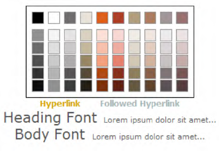
The five subsequent rows beneath the main colors are populated with tints (lighter variations) and shades (darker variations) of the specified theme colors (see Table 10-9). These tints and shades are set automatically, based on the original color, and cannot be altered programmatically.
Table 10.9. Variations with Tints and Shades
Variation | Dark1 | Dark2 | Light1 | Light2 | Accent1 to 6 |
|---|---|---|---|---|---|
Lightest |
|
|
|
|
|
Lighter |
|
|
|
|
|
Medium |
|
|
|
|
|
Darker |
|
|
|
|
|
Darkest |
|
|
|
|
|
Tip
Microsoft offers a Theme Builder application that enables you to create your own themes. You can find it at http://connect.microsoft.com/ThemeBuilder.
The new dynamic stylesheets use transparent comments to create a relationship between a theme and default CSS values. The next example shows a stylesheet definition, .myclass, that is defined with white foreground color. This white default color should be replaced according to the theme that is currently active. To do so, just define a CSS selector for the class:
.myclass
{
                Color:#FFFFFF;
}
Then add the theme variable above the color:
.myclass
{
                /*[ReplaceColor(themeColor:"Light1")]*/
                Color:#FFFFFF;
}
The color declaration is replaced by whatever the theme's Light1 color is. The following example adds 50 percent shading to the color Light2:
.myclass
{
                /*[ReplaceColor(themeColor:"Light2",themeShade:"0.5")]*/
                Color:#FFFFFF;
}
Another way to add 50 percent shading is to add the variation name to the color instead of explicitly adding the shading factor:
.myclass
{
                /*[ReplaceColor(themeColor:"Light2-Medium")]*/
                Color:#FFFFFF;
}
Theming Attributes
Applying a theme essentially consists of taking unprocessed CSS files and resources such as images and applying the specified theme settings to those files. The theme settings that you specify are stored in a THMX file, and SharePoint applies these to all of the appropriate CSS files and images. SharePoint includes a set of attributes that you can use to specify that certain CSS elements should use a variable that is specified in the THMX file. Table 10-10 lists those attributes.
Table 10.10. Theming Attributes
Name | Description |
|---|---|
| Replaces the |
| Replaces the |
| Recolors an image specified in the following CSS rule |
The themes engine reads and executes these statements to apply the specified colors, fonts, and images to a site. To change the value of a CSS attribute, the user specifies a different attribute/value pair in the CSS file.
Theming Attributes of Internal CSS
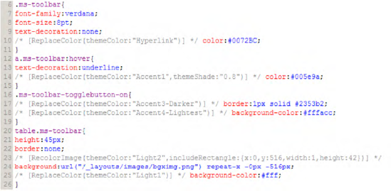
Most CSS files used in SharePoint are extended with special CSS comments that are interpreted by the themes engine. For instance, the example in Figure 10-22, a screenshot from the coreV4.css file, changes some of the colors of the ms-toolbar CSS class.
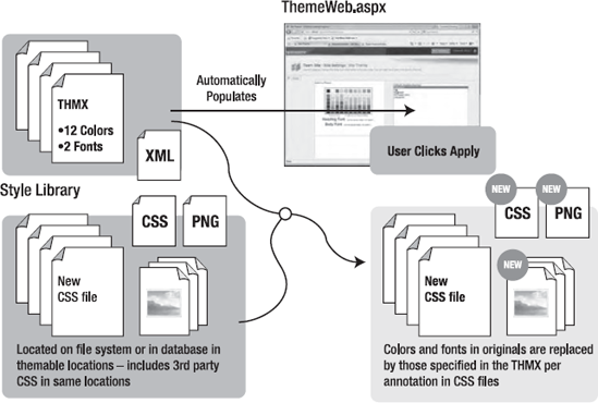
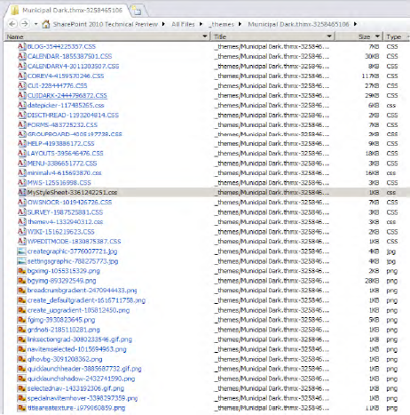
For example, by applying the theme Municipal Dark, a new preprocessed theme CSS file called corev4-4159570246.css is automatically created in the virtual folder /_themes/Municipal%20Dark.thmx-3258465106 of the web. A random autogenerated number is added as a suffix to the file and directory names. The reference to this themed version of the stylesheet is simple and already implemented in almost all master pages:
<!—CSS LINK -->
     <SharePoint:CssLink runat="server" Version="4" />
<!— /CSS LINK -->
The rendering result of the tag <SharePoint:CssLink> is shown in Figure 10-23. You can see that there are several stylesheets to be included.
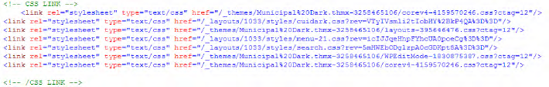
As you can see, the created file /_themes/Municipal%20Dark.thmx-3258465106/corev4-4159570246.css is now automatically used as a CSS reference. Figure 10-24 shows a screenshot of the resultant file.
If a theme is to be applied to a site, the THMX file is first read into memory. Then all the CSS and PNG files that are located in themable locations (either in the file system or the content database) are processed. The processing task takes each file and applies the required changes to it. For example, in stylesheets, all themed attributes will be processed, and then the changed file will be copied into a new location. Also, all themable PNG images will be processed and changed according to the applied theme.
Note
When applying a theme, the included images could also be modified through theming attributes such as RecolorImage. Note that currently only PNG images are supported.
Figure 10-25 shows the processing of themes.
A common requirement for developers is to design Web Parts, custom controls, and application pages that support theming.
With the new theme infrastructure of SharePoint 2010, this is relatively easy to accomplish. In the example that follows, these steps are accomplished:
Creating a Stylesheet File with Theming Attributes
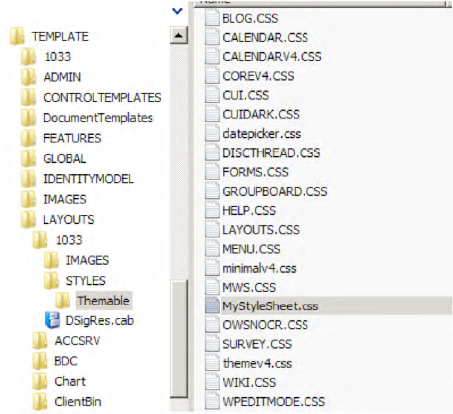
First, create a stylesheet file and save it as MyStyleSheet.css in the 14 hive under TEMPLATELAYOUTS1033styles. It should contain the following style definition:
.myStyle
{
                text-decoration:underline;
                /* [ReplaceColor(themeColor:"Accent1")] */ color:#FF0000;
}
Copying the Stylesheet File to the /Themable Directory to Mark It Themable
Next, copy this file to the /Themable subdirectory (see Figure 10-26). This is necessary because only files within this directory will be processed when applying a theme.
Note
The stylesheet file must always exist in the /styles directory, because if no theme is activated, the file from the style directory is used (without preprocessing the CSS attributes). If the file also exists in the /Themable directory, it is automatically used when a theme is activated.
Applying a Theme
Next, activate a theme in your web by choosing Site Actions
After applying the theme, all the .css files of the styles/themable directory will be processed and copied to the virtual path site/_themes/THEMENAME (see Figure 10-28).
Creating an Application Page That Uses the Stylesheet
Finally, create a simple application page that uses the new stylesheet. In the LAYOUTS folder of the SharePoint root, create an ASPX page that looks like this:
<%@ Page Language="C#" AutoEventWireup="true"
DynamicMasterPageFile="˜masterurl/default.master"
Inherits="Microsoft.SharePoint.WebControls.LayoutsPageBase" %>
<%@ Register Tagprefix="SharePoint" Namespace="Microsoft.SharePoint.WebControls"
Assembly="Microsoft.SharePoint, Version=14.0.0.0, Culture=neutral, PublicKeyToken=71e9bce111e9429c" %>
<%@ Import Namespace="Microsoft.SharePoint" %>
<asp:content ID="Content1" ContentPlaceHolderId="PlaceHolderAdditionalPageHead"
runat="server">
<SharePoint:CssLink ID="CssLink1" runat="server"
DefaultUrl="Themable/MyStyleSheet.css" />
</asp:content>
<asp:Content ID="Content2" ContentPlaceHolderId="PlaceHolderMain" runat="server">
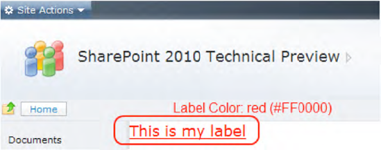
<asp:label ID="Label1" Font-Size="Large" runat="server" CssClass="myStyle" Text="This is my label" />
</asp:Content>The layout for this page without a theme applied results in a red underlined label (color #FF0000) as shown in Figure 10-29.
The generated HTML source code for this example shows the link to the (unthemed) stylesheet (Figure 10-30).
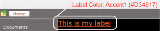
When the Municipal Dark theme is applied, the label is displayed in the theme color Accent1 (color #D34817), as shown in Figure 10-31.
In contrast to the stylesheet link in Figure 10-31, the generated HTML source code now shows the link to the themed stylesheet (see Figure 10-32).
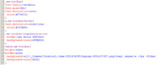
The stylesheet itself in the themes directory contains only the processed result—all the comments have been eliminated:
.myStyle
{
                text-decoration:underline;
                 color:#D34817;
}One of the most obvious UI features of SharePoint 2010 is the context-sensitive ribbon interface, already familiar from Office 2007. There are many extensibility points from which you can customize the built-in functionality. For example, you can extend the ribbon interface to include new menu items. The UI also contains a status bar positioned below the ribbon bar to indicate the status of the current page. This section shows how to use custom actions to extend the SharePoint UI with your own menu items or ribbon elements.
Note
SharePoint 2010 also provides many client-side elements, mostly implemented with JavaScript, to extend the UI. A brief description, including many examples, of the client-side dialog framework and the status bars and notification areas can be found in Chapter 12.
Using features, you can easily add your custom actions to menus of the SharePoint UI. SharePoint offers specific extension points where you can hook into and extend the standard UI. The implementation of these extension points is usually based on the following web controls:
The FeatureMenuTemplate control is used as a kind of placeholder for several menu items. Close inspection of the SharePoint default master page reveals that the Site Actions menu contains a FeatureMenuTemplate element. This element contains some static menu items (MenuItemTemplate) and can be extended by defining custom actions within features.
The FeatureLinkSection control is usually used to extend overview pages for SharePoint sites and Central Administration. Figure 10-33 contains an excerpt of the default master page that determines the menu items of the Site Actions menu.
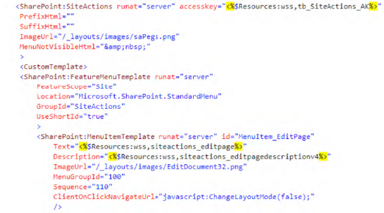
The code snippet displayed in Figure 10-33 is responsible for displaying the Site Actions menu shown in Figure 10-34.
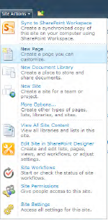
To understand the behavior of these two web controls, peruse the code of the FeatureMenuTemplate control (see Figure 10-35). As you can see in the CreateChildControls section, there is a GetCustomMenuItemActions method call that returns all available custom actions as SPCustomActionElement instances.
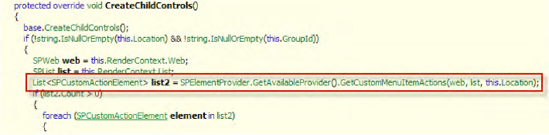
From this we can conclude that extensions to those web controls can only be created by using SharePoint features containing correctly registered custom actions. Although it is possible to change menu items in code in your application pages, it is bad practice; you should instead use features with custom actions. To define a custom action, you have to build a feature (see Listing 10-2). Features are described in detail in Chapter 7.
Example 10.2. Example feature.xml File
<Feature
  Id="7F762A93-2205-499B-84E3-125423D86E31"
  Title="Add a link to user section"
  Description="Feature that adds a link to Welcome User section"
Scope="WebApplication"
  xmlns="http://schemas.microsoft.com/sharepoint/">
  <ElementManifests>
    <ElementManifest Location="Elements.xml" />
  </ElementManifests>
</Feature>
Listing 10-2 shows a feature definition file (feature.xml) that references the elements.xml file, as displayed in Listing 10-3.
Example 10.3. Example elements.xml File with a Custom Action Definition
<Elements xmlns="http://schemas.microsoft.com/sharepoint/">
    <CustomAction
        Id="myCustomAction"
        GroupId="PersonalActions"
        Location="Microsoft.SharePoint.StandardMenu"
        Sequence="1000"
        Title="Open custom page"
        Description="Open my custom page"
        ImageUrl="_layouts/1033/images/KpiListView.png">
        <UrlAction Url="˜site/_layouts/myCustomPage.aspx"/>
    </CustomAction>
</Elements>
The CustomAction element defined in the elements.xml file adds an additional menu item to the PersonalActions menu, as shown in Figure 10-36.
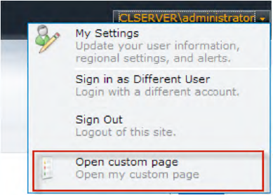
This example shows that it's very easy to extend the SharePoint standard UI. The CustomAction element has some important properties that are only described briefly here. Additional information can be found in the MSDN library or the SharePoint SDK.
To define a custom action for a particular menu, you must first identify the menu. The property Location defines the menu—for example, Microsoft.SharePoint.SiteSettings or Microsoft.SharePoint.StandardMenu. The GroupID property defines an area within the menu (see Table 10-11 for some examples).
Table 10.11. Location and GroupID Properties for StandardMenu
Location | GroupID | Description |
|---|---|---|
|
| Actions menu in list and document library views |
|
| Site actions menu for surveys |
|
| New menu in list and document library views |
|
| Menu showing "Welcome username" and usually containing "Sign in" and "Sign out" items. |
|
| Settings menu in list and document library views |
|
| Site settings links for surveys |
|
| Site actions menu |
|
| Upload menu in list and document library views |
The third important property of a custom action is the UrlAction, which usually includes a URL that is opened when clicking an action item. SharePoint supports various URL tokens, described in Table 10-12.
Table 10.12. Supported URL Tokens for Custom Actions
Token | Description |
|---|---|
| URL relative to the current web site ( |
| URL relative to the current site collection ( |
| ID that identifies the item within a list |
| URL of the current item |
| GUID of the current list |
| Absolute URL of the current web site ( |
To give you a better understanding of how to use custom actions, this section will present examples on how to do the following:
List all custom actions
Extend site settings
Add nested menus
To give you a look at the UI customization possibilities, this example shows how to build an application page that displays all the custom actions of all the enabled features. This can be very helpful, especially if you aren't sure which Location or GroupId property you need. It's also very interesting to explore SharePoint and see what custom actions are available (see Figure 10-37).
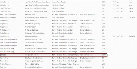
Figure 10.37. List of custom actions (Feature, Id, Location, GroupId, Sequence, RegistrationType, and RegistrationId)
Start by building a new application page containing a Repeater control to display the custom action properties, as shown in Listing 10-4.
Example 10.4. Application Page Containing a Repeater to Display Custom Action Properties
<%@ Page Language="C#" AutoEventWireup="true" DynamicMasterPageFile="˜masterurl/default.master"
    CodeFile="ListAllCustomActions.aspx.cs" Inherits="ListAllCustomActions"
    CodeFileBaseClass="Microsoft.SharePoint.WebControls.LayoutsPageBase" %>
<asp:Content ID="Content1" ContentPlaceHolderId="PlaceHolderMain" runat="server">
<asp:Repeater runat="server" ID="rptCustomActions" EnableViewState="false">
<HeaderTemplate>
<table>
<tr>
<td class="ms-vh2">Feature</td>
<td class="ms-vh2">Id</td>
<td class="ms-vh2">Location</td>
<td class="ms-vh2">GroupId</td>
<td class="ms-vh2">Sequence</td>
<td class="ms-vh2">RegistrationType</td>
<td class="ms-vh2">RegistrationId</td>
</tr>
</tr>
</HeaderTemplate>
<ItemTemplate>
<tr>
<td class="ms-vb2"><%# Eval("Feature") %></td>
<td class="ms-vb2"><%# Eval("Id") %></td>
<td class="ms-vb2"><%# Eval("Location") %></td>
<td class="ms-vb2"><%# Eval("GroupId") %></td>
<td class="ms-vb2"><%# Eval("Sequence")%></td>
<td class="ms-vb2"><%# Eval("RegistrationType")%></td>
<td class="ms-vb2"><%# Eval("RegistrationId")%></td>
</tr>
</ItemTemplate>
<FooterTemplate>
</table>
</FooterTemplate>
</asp:Repeater>
</asp:Content>Listing 10-4 defines an application page containing a Repeater control with a table for displaying the custom action definitions. The code-behind is shown in Listing 10-5.
Example 10.5. Code-Behind for the Application Page
public partial class ListAllCustomActions : LayoutsPageBase
{
    protected void Page_Load(object sender, EventArgs e)
    {
        List<CustomActionContainer> containers = new List<CustomActionContainer>();
        foreach (SPFeatureDefinition feature in SPFarm.Local.FeatureDefinitions)
        {
            containers.AddRange(FindCustomActionsForFeature(feature));
        }
        rptCustomActions.DataSource = containers;
        rptCustomActions.DataBind();
    }

    protected List<CustomActionContainer>
FindCustomActionsForFeature(SPFeatureDefinition feature)
{
List<CustomActionContainer> retVal = new List<CustomActionContainer>();
foreach (SPElementDefinition element in
feature.GetElementDefinitions(CultureInfo.CurrentCulture))
{
if (element.XmlDefinition.Name == "CustomAction")
{
CustomActionContainer c = new CustomActionContainer();
c.Feature = feature.DisplayName;
c.Id = GetAttributeValue(element.XmlDefinition,"Id");
c.GroupId = GetAttributeValue(element.XmlDefinition, "GroupId");
c.Location = GetAttributeValue(element.XmlDefinition, "Location");
c.Sequence = GetAttributeValue(element.XmlDefinition, "Sequence");
c.RegistrationType = GetAttributeValue(element.XmlDefinition,
"RegistrationType");
c.RegistrationId = GetAttributeValue(element.XmlDefinition,
"RegistrationId");
retVal.Add(c);
}
}
return retVal;
}
private String GetAttributeValue(XmlNode node, String attributeName)
{
String retVal = String.Empty;
if (node.Attributes[attributeName] != null)
retVal = node.Attributes[attributeName].Value;
return retVal;
}
}
public class CustomActionContainer
{
public String Feature { get; set; }
public String Id { get; set; }
public String GroupId { get; set; }
public String Location { get; set; }
public String Sequence { get; set; }
public String RegistrationType { get; set; }
public String RegistrationId { get; set; }
}The code in the Page_Load method of the code-behind class iterates through all the available features for the current SharePoint farm (SPFarm.Local.FeatureDefinitions). Next, for every feature and element definition in it, it checks if there's a custom action element definition. For every custom action definition, it collects the attributes into a helper class (CustomActionContainer) and returns a list of CustomActionContainer objects, which is bound to the repeater.
The result is a simple HTML table that contains values for the properties Feature, Id, GroupId, Location, Sequence, RegistrationType, and RegistrationId.
If you build your own complex SharePoint applications, you are often faced with the need to add some custom administrative pages to offer configuration of various application settings. To do this you can, for example, easily extend the site settings page (/_layouts/settings.aspx) with custom sections and links (see Figure 10-38).
You can use the same principle to extend the setting pages of the Central Administration web site.
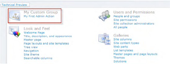
Listing 10-6 shows two XML elements: CustomActionGroup, which is for a section, and CustomAction, which is for displaying a link within this section. CustomActionGroup is placed in the location Microsoft.SharePoint.SiteSettings; CustomAction is also placed in this location, but its GroupID points to CustomActionGroup.
Example 10.6. Adding a Custom Action Group and a Custom Action to the Site Settings (elements.xml)
<CustomActionGroup
    Id="Apress.SP2010.myCustomGroup"
    Title="My Custom Group"
    Description="This is my custom group"
    ImageUrl="_layouts/images/SiteSettings_SiteCollectionAdmin_48x48.png"
    Location="Microsoft.SharePoint.SiteSettings"
    RequiredAdmin="Delegated"
    Sequence="1" />

  <CustomAction
    Id="myFirstAdminAction"
    Title="My First Admin Action"
    Description="This is a short description of my first admin action."
    Location="Microsoft.SharePoint.SiteSettings"
    GroupId="Apress.SP2010.myCustomGroup"
    Sequence="100" >
    <UrlAction Url="˜site/_layouts/sp2010/myFirstAdminPage.aspx" />
</CustomAction>Using nested menus is a powerful technique for custom actions. For example, you may have seen that the Site Actions menu can have flyout menus (Figure 10-39 contains examples). Normally, you add a single menu item, without any subitems. However, two properties of CustomAction—namely, ControlAssembly and ControlClass—allow us to assemble our own web controls for hierarchical menu structures. Here's how:
Create a web control that renders itself in the form of
MenuItemTemplates.Register this class as a safe control in the
web.configfile.Add a custom action with a web control reference to the
elements.xmlfile of your feature.Add custom actions as menu items for your custom implementation.
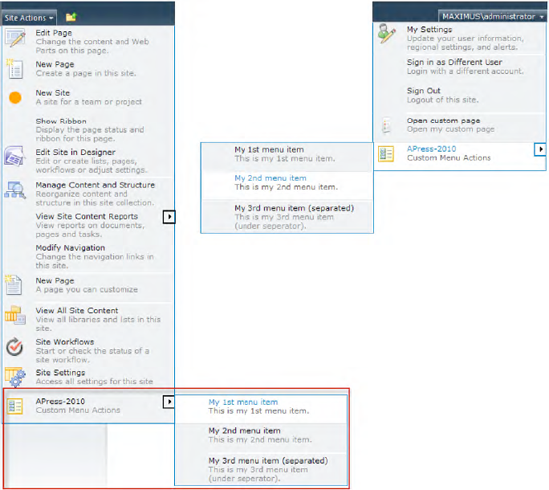
The idea is to create a web control containing three child controls: one SubMenuTemplate control and two FeatureMenuTemplate controls.
All three controls are SharePoint web controls, defined in the namespace Microsoft.SharePoint.WebControls. Note that FeatureMenuTemplate is a control that renders existing custom actions for a defined Location and GroupId. You can use these two FeatureMenuTemplate instances to dynamically add further menu items through custom actions.
To make this work, you need to use a little trick: in the OnPreRender method, you need to ensure that the custom action menu item controls of FeatureMenuTemplate are added directly to SubMenuTemplate. These menu item controls are automatically initialized in the CreateChildControls method of the FeatureMenuTemplate class. Then check if there are controls within FeatureMenuTemplate and add them to SubMenuTemplate. Listing 10-7 shows an example implementation for nested menus.
Tip
By implementing your custom menu behavior, it is possible to dynamically modify items in the page load event. For example, you could process custom URL tokens for automatic URL rewriting or add additional information to menu items.
Example 10.7. CustomAppMenu.cs: Custom Web Control Implementation
namespace Apress.SP2010.NestedMenu
{
    public class CustomAppMenu : WebControl
    {
        protected SubMenuTemplate customSubMenu;
        protected FeatureMenuTemplate customMenuTemplate1;
        protected FeatureMenuTemplate customMenuTemplate2;

        protected override void CreateChildControls()
        {
            customSubMenu = new SubMenuTemplate();
            customSubMenu.Text = "APress-2010";
            customSubMenu.Description = "Custom Menu Actions";
            customSubMenu.ImageUrl = "/_layouts/images/lg_ICASCX.gif";
            this.Controls.Add(customSubMenu);

            customMenuTemplate1 = new FeatureMenuTemplate();
            customMenuTemplate1.FeatureScope = "Site";
            customMenuTemplate1.Location = "APress.CustomMenu";
            customMenuTemplate1.GroupId = "APress";
            this.Controls.Add(customMenuTemplate1);

            customMenuTemplate2 = new FeatureMenuTemplate();
            customMenuTemplate2.FeatureScope = "Site";
            customMenuTemplate2.Location = "APress.CustomMenu";
            customMenuTemplate2.GroupId = "APress2";
            this.Controls.Add(customMenuTemplate2);
        }
protected override void OnPreRender(EventArgs e)
{
while (customMenuTemplate1.Controls.Count > 0)
{
MenuItemTemplate menuItem = customMenuTemplate1.Controls[0]
as MenuItemTemplate;
if (menuItem!=null) customSubMenu.Controls.Add(menuItem);
}
// Separator
MenuSeparatorTemplate subMenuSep = new MenuSeparatorTemplate();
customSubMenu.Controls.Add(subMenuSep);
while (customMenuTemplate2.Controls.Count > 0)
{
MenuItemTemplate menuItem = customMenuTemplate2.Controls[0]
as MenuItemTemplate;
if (menuItem != null) customSubMenu.Controls.Add(menuItem);
}
base.OnPreRender(e);
}
}
}After compiling the preceding class into a strongly named assembly, you need to add it to the GAC or the bin folder of your web application. Then ensure that the namespace of your web control implementation is registered as a safe control within the web.config file (see Listing 10-8).
Example 10.8. web.config: Registering the Namespace as a Safe Control
<SafeControl Assembly="Apress.SP2010, Version=1.0.0.0, Culture=neutral,
             PublicKeyToken=4113b8ec9b28df52"
             Namespace="Apress.SP2010.NestedMenu" TypeName="*" Safe="True" />
Note
If you use a Visual Studio SharePoint Project Template, the GAC registration is done automatically when deploying the project.
Specifying Custom Actions for Menu Extension
To use the web control implementation, you have to add a CustomAction element to the elements.xml file of the feature. This CustomAction element defines the Location and GroupId properties for the control, and it references the class and assembly names via the ControlAssembly and ControlClass properties (see Listing 10-9).
Example 10.9. elements.xml: Custom Action That References a Web Control Class
<CustomAction
      Id="Apress_MenuExtension"
      GroupId="SiteActions"
      Sequence="1"
      Location="Microsoft.SharePoint.StandardMenu"
      ControlAssembly="Apress.SP2010, Version=1.0.0.0, Culture=neutral, PublicKeyToken=4113b8ec9b28df52"
      ControlClass="Apress.SP2010.NestedMenu.CustomAppMenu">
</CustomAction>
Specifying Custom Actions for Submenu Items
In the final step, you fill out the FeatureMenuTemplate placeholders of the custom class implementation with custom menu items. These placeholders are identified by their Location and GroupId properties. The sample code shown in Listing 10-10 adds two menu items to the first FeatureMenuTemplate (Location=Apress.CustomMenu, GroupId=APress) and one item to the second FeatureMenuTemplate (Location=Apress.CustomMenu, GroupID=Apress2).
Example 10.10. elements.xml: Adding Menu Items as Custom Actions
<CustomAction
    Id="apressMenuItem1"
    Title="My 1st menu item"
    Description="This is my 1st menu item."
    Location="APress.CustomMenu"
    GroupId="APress"
    Sequence="100" >
    <UrlAction Url="˜site/_layouts/sp2010/page01.aspx" />
  </CustomAction>

  <CustomAction
    Id="apressMenuItem2"
    Title="My 2nd menu item"
    Description="This is my 2nd menu item."
    Location="APress.CustomMenu"
    GroupId="APress"
    Sequence="200" >
    <UrlAction Url="˜site/_layouts/sp2010/page02.aspx" />
  </CustomAction>

  <CustomAction
    Id="apressMenuItem3"
    Title="My 3rd menu item (separated)"
    Description="This is my 3rd menu item (under separator)."
    Location="APress.CustomMenu"
    GroupId="APress2"
    Sequence="100" >
    <UrlAction Url="˜site/_layouts/sp2010/page03.aspx" />
</CustomAction>With SharePoint 2010, the ribbon interface of Microsoft Office has been ported to the Web (see Figure 10-40). The ribbon interface is designed to help users quickly find the commands they need to complete a task. Commands are organized in logical groups, which are collected in tabs. Each tab relates to a type of activity, such as editing items or lists. To reduce clutter, some tabs are only displayed when they are needed, based on the current context.
Note
This section contains only a short overview of the SharePoint Command UI and its ribbon interface. For an in-depth description of programming the Command UI, please take a look at Chapter 11.
The various SharePoint ribbon bars are defined in one XML file under the 14 hive: /14/TEMPLATE/GLOBAL/XML/CMDUI.XML. This file contains a definition for the SharePoint Command UI. The simplified XML structure looks like this:
<CommandUI>
  <Ribbon>
    <Tabs>
      <Tab ID="Ribbon.TrackTab" Command="TrackTab" ...>
        <Groups>
          <Group ID="Ribbon.TrackTabNotifications"
                 Command="NotifictionsGroup" ...>
            <Controls>
              <Button  ID="Ribbon.TrackTabNotificationsControls.MyButton"
                       Command="MyButton" ...>
As the sample shows, each tab contains groups that in turn contain controls, such as buttons and menus. Every element from the tab is identified by an ID and has a command that is executed if the matching event (normally a click) occurs. The example XML excerpt of CMDUI.XML in Figure 10-41 shows how ribbon tabs and their related controls are defined.
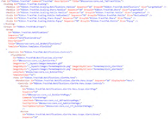
If you wish to customize the SharePoint ribbons, the straightforward way to do this is using custom actions. You don't need to make any changes to the default CMDUI.XML. Instead, you can add new elements, or modify and remove existing elements using normal custom actions and deploy them with a feature.
As mentioned, every control on a ribbon has a command ID. To respond to a command, implement a JavaScript command handler in your custom actions. Such a handler could be implemented like this:
<CustomAction>
  ...
  <CommandUIHandlers>
    <CommandUIHandler Command="NewRibbonButtonCommand" *#*
                      CommandAction="javascript:alert('This is my new button!')," />
  </CommandUIHandlers>
  ...
</CustomAction>
The following sections show some examples of how to add to and modify existing ribbon bars.
To add a button, you have to define the location on the ribbon where you want the button to appear. In the following example, a button is added to the List tab of a custom list toolbar (RegistrationID=100).
<Elements xmlns="http://schemas.microsoft.com/sharepoint/">

  <CustomAction Id="Ribbon.List.Actions.AddAButton"
                Location="CommandUI.Ribbon"
                RegistrationId="100"
                RegistrationType="List"
                Title="My custom Ribbon Button">
    <CommandUIExtension>
      <CommandUIDefinitions>
        <CommandUIDefinition
        Location="Ribbon.List.Actions.Controls._children">
          <Button Id="Ribbon.List.Actions.NewRibbonButton"
                  Command="MyNewRibbonButtonCommand"
                  Image16by16="/_layouts/images/newtargetapp16.png"
                  Image32by32="/_layouts/images/newtargetapp32.png"
                  LabelText="My custom button"
                  TemplateAlias="o1" />
        </CommandUIDefinition>
      </CommandUIDefinitions>
      <CommandUIHandlers>
        <CommandUIHandler Command="MyNewRibbonButtonCommand"
                          CommandAction="javascript:alert('This is my custom button!')," />
      </CommandUIHandlers>
    </CommandUIExtension>
  </CustomAction>

 </Elements>
The result of this custom action is shown in Figure 10-42.
To remove a button from the ribbon, you define the location of the button you want to remove. You use a HideCustomAction element to remove a button from the ribbon. The following example removes the Connect to Outlook button from the Library tab in the Actions group for a document library.
<HideCustomAction Id="RemoveRibbonButton"
Location="CommandUI.Ribbon.Library.Actions.ConnectToClient">
  </HideCustomAction>
Replacing a button on the ribbon bar also begins by specifying the button to be replaced. The following procedure replaces the Open with Access button on the List tab in the Actions group for a custom list.
<Elements xmlns="http://schemas.microsoft.com/sharepoint/">
<CustomAction Id="Ribbon.List.Actions.ReplacementButton"
                Location="CommandUI.Ribbon"
                RegistrationId="100"
                RegistrationType="List"
                Title="Replace a Ribbon Button">
    <CommandUIExtension>
      <CommandUIDefinitions>
        <CommandUIDefinition Location="Ribbon.List.Actions.OpenWithAccess">
          <Button Id="Ribbon.List.Actions.OpenWithAccess.ReplacementButton"
                  Command="ReplacementButtonCommand"
                  Image16by16="/_layouts/images/msg16.gif"
                  Image32by32="/_layouts/images/msg32.gif"
                  LabelText="Open with Access (replaced)"
                  TemplateAlias="o1" />
        </CommandUIDefinition>
      </CommandUIDefinitions>
      <CommandUIHandlers>
        <CommandUIHandler Command="ReplacementButtonCommand"
                          CommandAction="javascript:alert('You cannot  open this list with Access.')," />
      </CommandUIHandlers>
    </CommandUIExtension>
  </CustomAction>
</Elements>
After activating the feature with the custom action for ribbon button replacement, the ribbon bar will be rendered as shown in Figure 10-43.
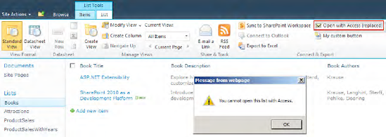
This chapter explained the different types of master pages and how to use them in your own application pages. Understanding and using master pages in your own custom web controls and application pages are indispensable skills for every professional SharePoint developer.
This chapter also provided insight into the SharePoint navigation concepts, together with some practical examples.
It also introduced the SharePoint theming infrastructure, including the dramatic changes compared to previous versions of SharePoint, and an in-depth explanation of what is going on under the hood.
Extending the SharePoint UI with your own custom actions is the foundation for building professional SharePoint-based solutions. Finally, you learned how to enhance standard SharePoint menus with custom menu items and customize the ribbon bar.